Welcome to part 2 of the “how to build an affiliate funnel” series!
In the previous post, we discussed the buyer’s journey and the different funnel types we’ll be building to create a high-converting funnel as an Elegant Themes affiliate. In this post, we’ll make the first funnel type – a lead generation funnel.
Lead generation is the most crucial step in your journey as an online entrepreneur. A high-converting lead generation funnel will give you a much better chance at success.
What Is a Lead Generation Funnel?
Lead generation means turning your website visitors into email list subscribers. It’s the most efficient way to grow your brand and generate sales. If done right, your acquisition funnel can help you:
- Segment your audience by interest
- Building highly targeted email lists, with each targeting a particular segment of people
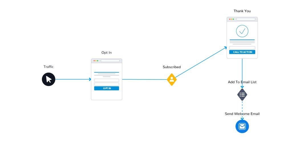
An acquisition funnel for you as an affiliate will have three steps:
- An opt-in page where people can enter their contact information
- A thank you / opt-in confirmation page where people get redirected after entering their contact information.
- A “welcome” email that’s sent to new subscribers to confirm they’ve joined your email list.
When you connect the steps, you should come up with a flow that looks similar to this:
Step 1- Define Who You’ll be marketing to
We need to be clear on who exactly we’re targeting with a pain point we can help them with. For that, we need to have a clear customer avatar.
Elegant Themes’ user base consists primarily of web design agencies and web design freelancers. The reason for that is our offering helps agencies and freelancers much more than other people.
Divi helps them build WordPress websites fast and allows them to design for their clients without buying additional licenses.
Read: How to create a customer avatar.
A clear customer avatar we’re targeting will help you understand the elements you need in your activation funnel as an affiliate. For the rest of this guide, I’ll use a hypothetical avatar that looks like this:
- Male or Female.
- Age 25-45.
- A freelancer or a web design agency owner.
- They want a fast way to build websites.
- They want to grow their portfolio fast.
Now that we’re clear on who we’ll be targeting let’s move to the next step.
Step 2: Create a Lead Magnet
People rarely opt-in to a CTA that says, “Subscribe to our newsletter.” That’s why you need a lead magnet.
A lead magnet is anything you give away for free to people in exchange for their contact information. However, creating any random lead magnet won’t help you move far. Therefore, try to switch your mindset a little when making your lead magnet and think about the following question:
Who is it you want to subscribe to your email list?
You don’t want someone interested in car parts and DIY home improvement to subscribe to your marketing newsletter because they aren’t interested in marketing or web design.
So try to understand what your users want. Try to find actual pain points that your audience is having. Once you have figured out the pain points, see if you can fix them with a simple solution that won’t take too much of your time or effort.
Great lead magnets are usually easy to digest while providing immense value. Please read our detailed guide on how to create a lead magnet here.
Based on the avatar above, I’ll choose a lead magnet that’ll target the people I’m interested in talking to specifically with a lead magnet that’s relevant to their pain point:
“My 3-Steps Strategy to Start or Grow Your Web Design Freelance Business in 2023.”
And to make our lead magnet offer even more convincing, add a few extra details on the page, such as:
- Create a portfolio of 21 projects in the next 7 days or less.
- Create a good-looking website to showcase your projects.
- Keep your name or freelance name infant of potential customers even before they need your services.
Step 3 – Design the Lead Generation Funnel Pages
Now that we have the lead magnet, it’s time to design the pages you need for your lead generation funnel.
Divi comes with everything you need to create the perfect landing page. Let’s start by creating a new page in WordPress and applying the “Blank Page” template to it.
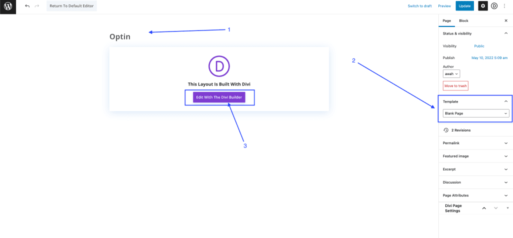
Then click on the “Edit With The Divi Builder” button, which should redirect you to the page with the Divi builder enabled so we can start with the design of our opt-in page.
We’ll be using one of the premade layouts to keep this simple. Therefore, once the page loads, click on “Browser Layouts.”
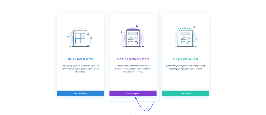
Doing so will load the layout library. Choose the Podcaster layout pack, which happens to be a design I like, but you can choose whichever layout you prefer.
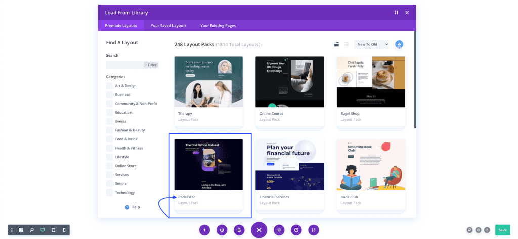
Click on the layout pack from the library window to open the different layouts inside the pack and the layout pack’s details. We’ll build on top of the “Landing” design, so make sure it’s selected, and then click on “Use This Layout”:
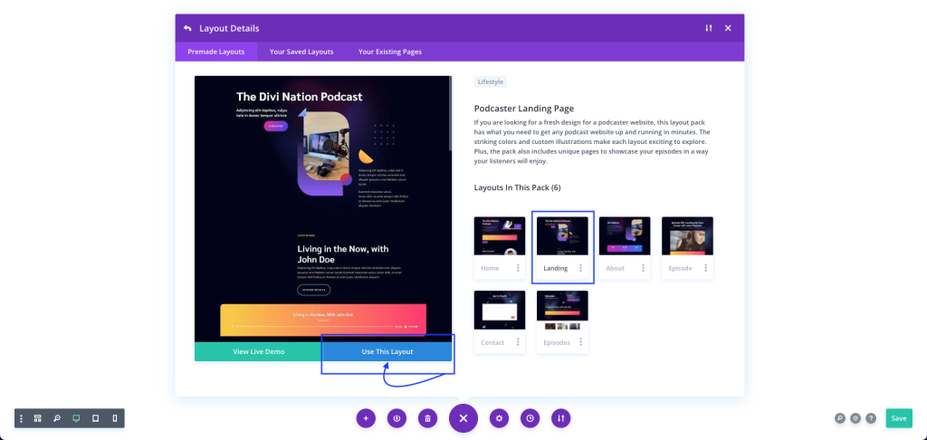
By doing so, Divi will load the layout onto the page, and we’ll be ready to start editing our landing page. Before we proceed, we’ll need two main items on the page:
- An opt-in form that people can use to enter their information
- A headline and a description section
If you were to scroll down towards the footer of the layout we just imported, you’d see that we have a section that looks very close to what we want:
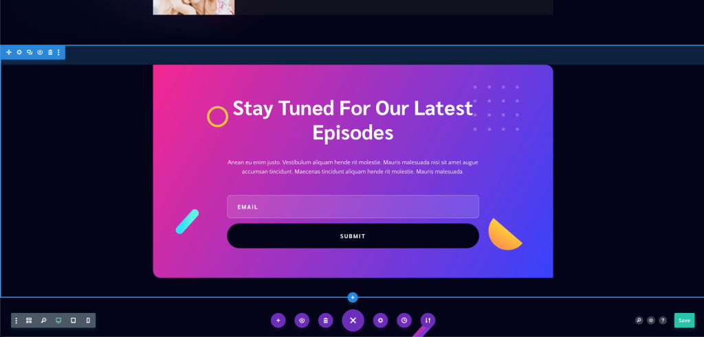
Once you find it, it’s time to start the design process. Start by removing every section on the page except the opt-in section like the image above.
Our page now should look exactly like this:
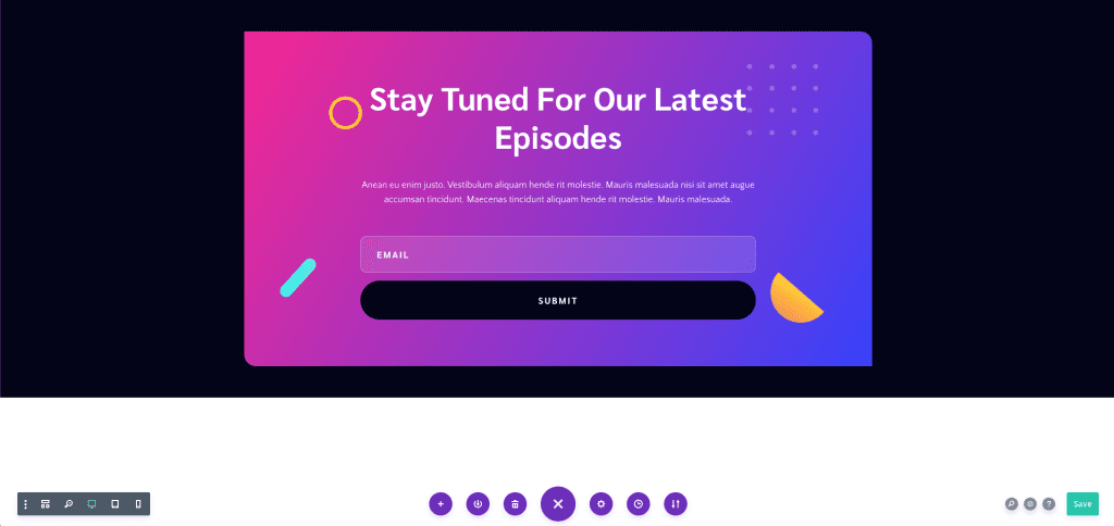
The page is only two-thirds full, which won’t look great in front of users. So we’ll change the section height to fill the entire screen.
Open the section settings, click on the “Design” tab, and scroll down to the “Sizing” settings.
Set the “Min Height” option to 100vh (100% of the screen’s height). Doing so will make the section fill the entire screen, and by doing so, our section should look like this:
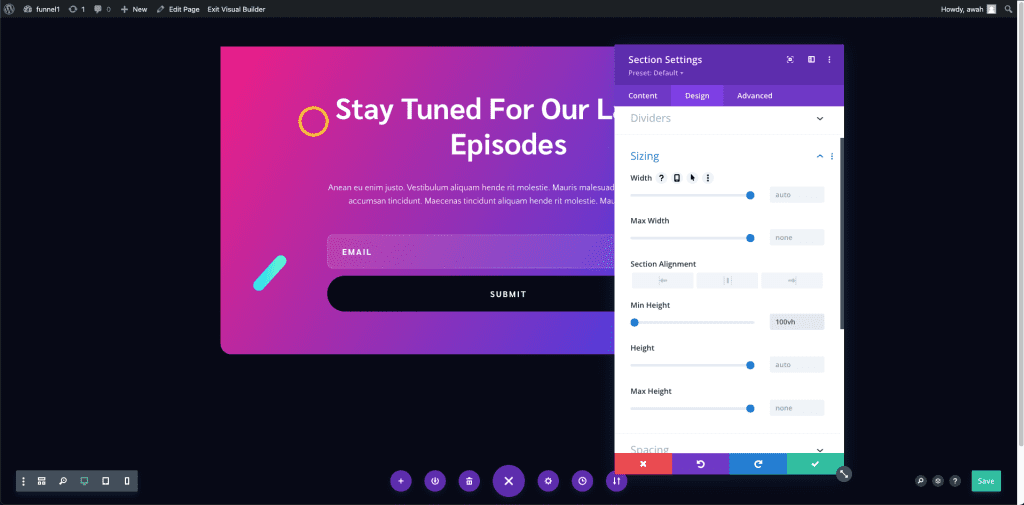
Setting the minimum height to fill the screen will ensure that our design never has any off-brand areas, which is essential to portray some professionalism.
The next step will be to center the row in the middle of our section. Open the row settings, navigate to the “Advanced” tab and scroll down to “Position.”
We’ll switch the position of our row to “Absolute” and then click on the middlebox under the “Location” setting, as shown in the image below:
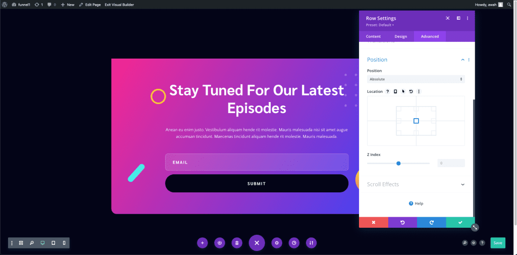
Our row is now centered, and our section is a full screen which means our page is ready for editing the content.
Next, we’ll edit our headline and our opt-in form. Divi allows you to edit the content of your page inline without opening the modules themselves. So we’ll update the headlines with the name of our lead magnet and a description of our lead magnet.
It’s an excellent habit to collect first names through your opt-in form because it’ll allow you to personalize the emails you send. Check out our Email Opt-in Module documentation page to learn all the control options you have. Make sure also to update the form button’s call to action.
When you finish editing your headlines and description, your final page should look something close to the following:
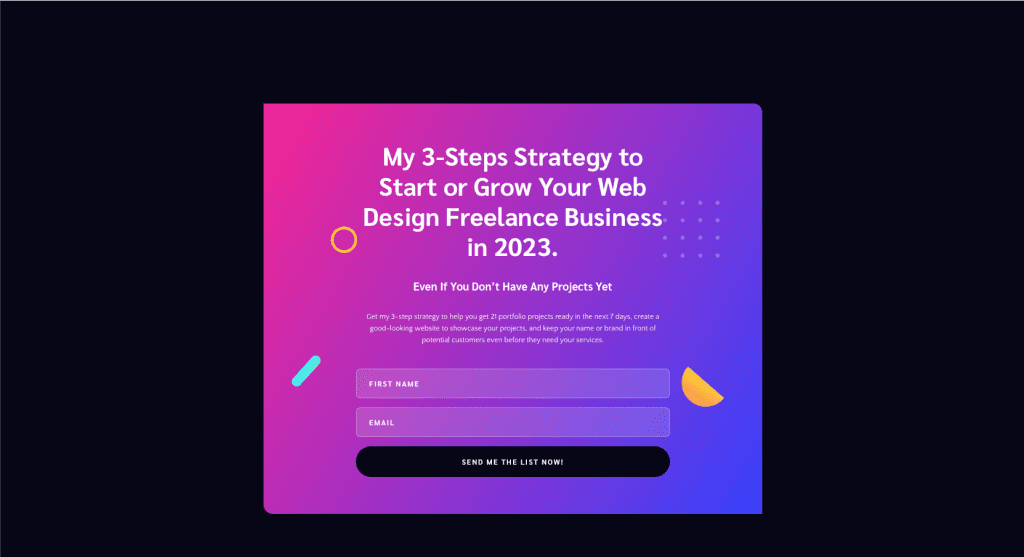
Ensure you connect the opt-in form to the email service you use (e.g., MailChimp) and test it to ensure you’ve set it up correctly.
MailChimp is an excellent email service, mainly because it’s free for up to 1000 subscribers and has fantastic features. So if you don’t already have an email service provider, I recommend you give it a try.
Alternatively, if you’d like a more DIY solution, FluentCRM is an excellent option that integrates with Divi’s Email Opt-in module and gives you great control over your workflow.
Now that your opt-in page is complete, the next step will be to create our opt-in confirmation page, which we’ll redirect users to after they subscribe. An easy way to do so while keeping everything “on-brand” is to copy the opt-in page you made and edit it to become your thank you page.
Your “Thank You” page will include two things:
- A “Thank You” headline
- A message to show the user exactly what to do.
It’s an excellent habit to tell your users exactly what to do as a next step. If your email service requires a double opt-in or has that enabled, make sure you let the user know to check their inbox and confirm their email address.
Alternatively, you could let them know to check their inbox for their requested resource. Here’s a finalized version of the thank you page:
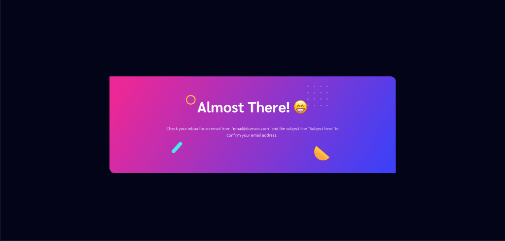
Remember the design and the “copy” of your landing pages should fit your brand, personality, and tone. With that, our landing page designs are ready. Click the button below to download the designs.
Step 3: Writing Your “Welcome” Email
Now that the landing pages are ready, the next step in your lead generation funnel is to write your welcome email.
The welcome email is crucial to the entire relationship between you and your leads. It’s the first impression your leads get from you. We’ve adapted DigitalMarker’s welcome email and prepared a template that you can edit to write your welcome email, which you can get here.
Read more: 7 tips to writing emails that convert.
There are vital components your email needs to have:
1. A good subject line – Your subject line should be straightforward and easy to understand.
2. A personalized greeting – a warm welcome can go far when building your relationship with your audience. There are many dos and don’ts but try to be your true self.
3. The benefit statement – let your leads know what to expect from you and what benefits they stand to get now that they have joined your email list. Is it exclusive events or offers? Is it educational material dedicated to their interest? Be specific and don’t assume they already know what to expect.
4. Share the resource they request – remember your leads subscribed for a specific resource. Yes, the first email is to build a relationship with them, but they still don’t know you and probably don’t care much about what you have to say yet. So, make sure you share the resource they requested.
5. Tell them what to do next – your lead generation funnel’s goal is to build an active email list. To do so, you need to ask your leads to take action. Any action taken by your lead asserts their “commitment” to you a little more, and therefore, the more “easy” actions they can take, the better. Some activities you can ask your leads to do include
- Following you on social media
- Subscribing to your YouTube channel
- Inviting their friends to join your email list
- Replying to your email
- Whitelisting your email address
- Watching a video
6. Be open to hearing from them – it won’t be great if it’s not in both directions like any relationship. Therefore, make sure you make it clear to your audience that you’re open to hearing from them. You could ask them a relevant question about your niche and the resource they requested or through a plain old “I’m here to help if you need anything.
7. Have an open loop – end your email with an open loop, which is intriguing your lead by teasing the next email they’ll be getting.
8. Include an unsubscribe link – adding an unsubscribe link will make your leads feel at ease by knowing they could opt out. Your email service provider usually automatically sets this, but make sure it’s there if it’s not.
Once you have your welcome email written and set up in your email provider, test your workflow again and make sure:
- Your opt-in page redirects you to the correct thank you page.
- Your welcome email is being sent to new subscribers.
Here are some resources to help you write better welcome emails:
- 10 Essential Elements of an Effective Welcome Email
- 10 Great Examples of Welcome Emails to Inspire Your Own Strategy
How to Measure the Success of Your Lead Generation Funnel
To measure the success of your lead generation funnel, you need to look at the different elements in the funnel. So far, we have:
- An opt-in page
- A thank you page
- A welcome email
The opt-in page’s goal is to convert people into email subscribers, which means the page’s success is based on how many people opt in. This is referred to as the conversion rate and the opt-in rate in our specific case.
Understanding the conversion rate of your landing pages, whether opt-in pages, sales pages, or blog posts, is essential for your long-term success, especially if you’re buying traffic, which we’ll cover at later stages in this guide.
To calculate your conversion rate, you should first have a specific goal. In the current funnel we built, the goal is to have people join your email list, and that means we want to know the percentage of unique visitors that opted in.
An easy way to calculate it would be through the following formula:

To apply the formula to your data, open your Google Analytics account and get two pieces of information:
- The number of unique users who saw just the opt-in page
- and then the number of users who saw the “thank you” page
Your “thank you” page users will be the number of conversions (opt-ins), and therefore, assuming 200 users saw the opt-in page, and 30 saw the “thank you” page, your calculations would be:
Conversion rate is (30 / 200 ) x 100 = 15%
A typical conversion rate for an email opt-in landing page is between 5% and 15%. However, achieving a 30% or 40% conversion rate isn’t impossible and achievable with a few tweaks to your page.
Let’s keep things simple so you can launch, and in a later post in this series, I’ll cover how we can build upon and improve your lead generation landing page.
What’s Next?
Now that you created your first lead generation funnel, it’s time to move on to our next step, building a monetization funnel.
Resources and downloads from this post:

