Section dividers are part of a long-awaited Divi update that changes the entire look and feel of any website. Within the Divi update announcement blog post, a ton of design examples we’re included and they simply blew us away.
To help you get started with these new section dividers, we’re going to show you how to recreate each one of these examples. Not only can you use them for your own website or next project, but they will also help you understand how section dividers within Divi work.
- 1 What You Need to Know
- 2 Let’s See the Good Stuff
- 3 How to Recreate the Section Divider Examples with Divi
- 4 Recreate Example #1
- 5 Recreate Example #2
- 6 Recreate Example #3
- 7 Recreate Example #4
- 8 Recreate Example #5
- 9 Recreate Example #6
- 10 Recreate Example #7
- 11 Recreate Example #8
- 12 Final Thoughts
What You Need to Know
Before we show you all of the examples and how to recreate them, there are some things you need to know (and understand) before you start:
- Always start off each section by choosing a background color
- You can always add a gradient background on top of your background color, but the background color needs to be there
- The color difference between neighboring sections allow a bottom divider to pick up on the color of the next section
- Likewise, this color difference allows a top divider to pick up on the color of the previous section
- We’re recreating the section dividers of each example only
Let’s See the Good Stuff
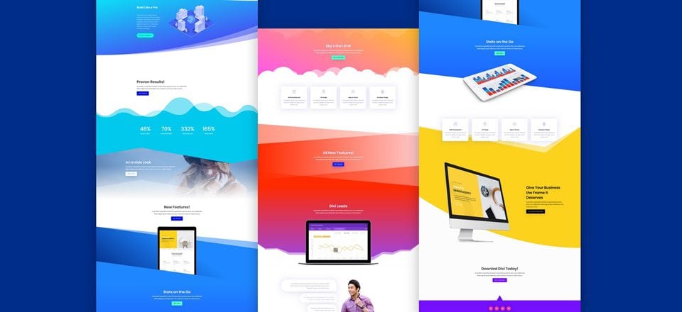
Let’s take a quick look at the different examples we’ll be recreating. After every example showcase, you can find a button that will take you to the tutorial steps of that specific example.
Example #1
Example #2
Example #3
Example #4
Example #5
Example #6
Example #7
Example #8
How to Recreate the Section Divider Examples with Divi
Subscribe To Our Youtube Channel
Recreate Example #1

Section 1
Background Color
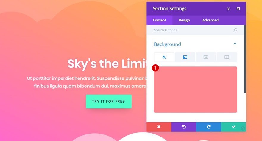
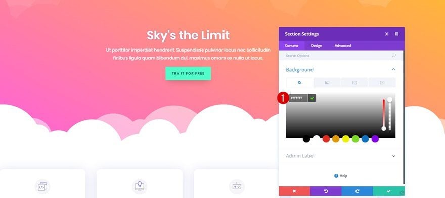
We’ve mentioned at the beginning of this post that you should always start off by choosing a background color for your section, even if you’re going to add a gradient background on top of it. For this example, use ‘#ff8790’.
Gradient Background
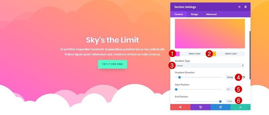
On top of the background color, we’re adding the following beautiful gradient background:
- First Color: #ff56f0
- Second Color: #ffbe28
- Gradient Type: Linear
- Gradient Direction: 28deg
- Start Position: 0%
- End Position: 100%
Top Divider
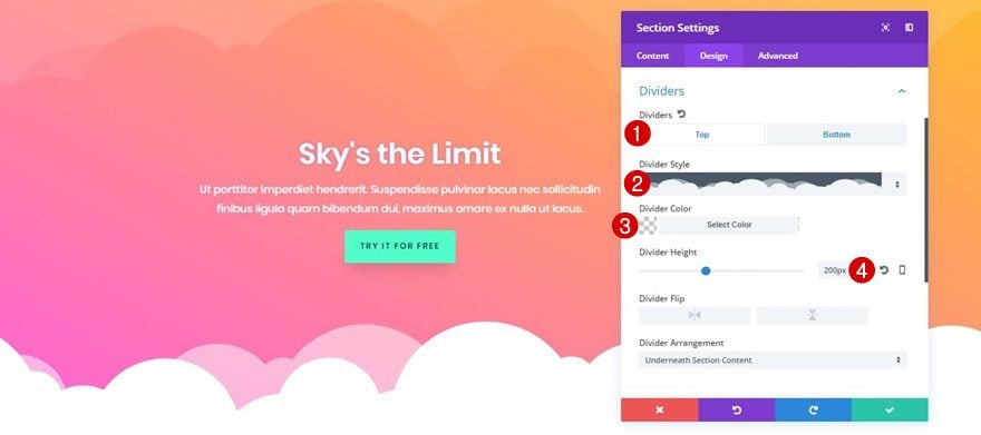
The first section you’re working on contains both a top and a bottom section divider. The divider style and settings are almost the same. However, the top divider is a lot more subtle which gives a kind of reflection effect. To achieve the exact same top section divider, use the following settings:
- Divider Style: Find in List
- Divider Color: rgba(255,255,255,0.13)
- Divider Height: 200px
You can choose for yourself, depending on the modules and rows you’re using, whether or not you want the divider to appear underneath the section content or on top of it.
Bottom Divider
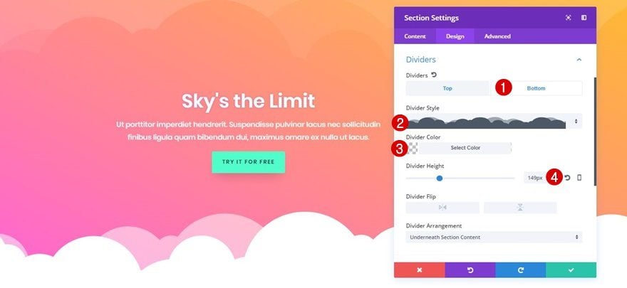
The bottom divider of this example contains the following settings:
- Divider Style: Find in List
- Divider Color: Clear
- Divider Height: 149px
Section 2
Background Color
To create a beautiful transition between both sections, without having to set a color for the divider, we’re going to add a background color to the second section of this example. Although you could use whichever color you want, we’ve chosen the ‘#FFFFFF’ white color code to emphasize the contrast between both sections.
Recreate Example #2

Section 1
Background Color
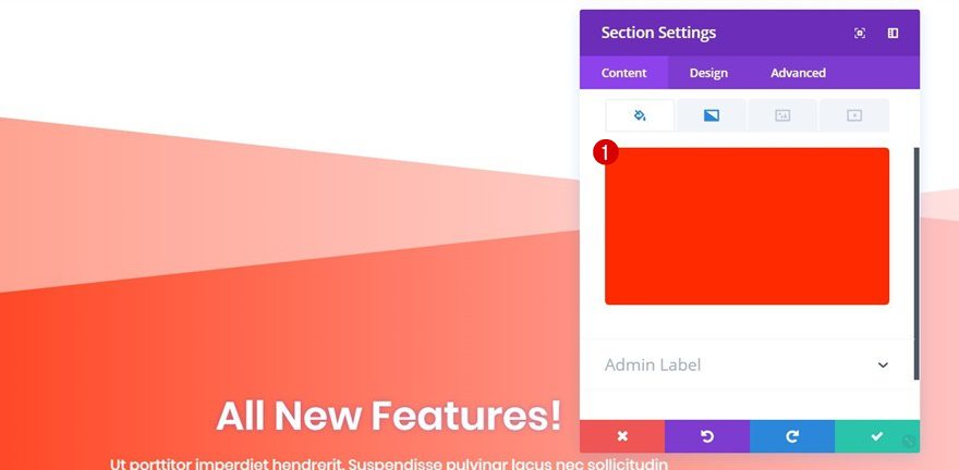
Again, start off by choosing a background color for your first section. In this case, we’re using ‘#ff2a00’.
Gradient Background
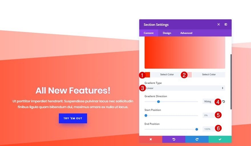
On top of the background color of your section, add the following gradient background:
- First Color: #ff2a00
- Second Color: #ffc9c9
- Gradient Type: Linear
- Gradient Direction: 90deg
- Start Position: 0%
- End Position: 100%
Top Divider
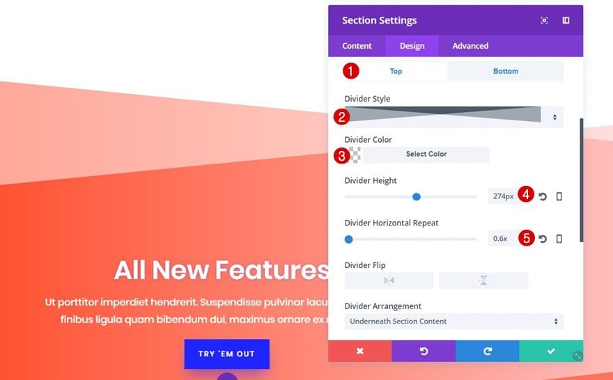
Move on to the Design tab of your section, open the Dividers subcategory and use the following top section divider:
- Divider Style: Find in List
- Divider Color: Clear
- Divider Height: 274px
- Divider Horizontal Repeat: 0.6x
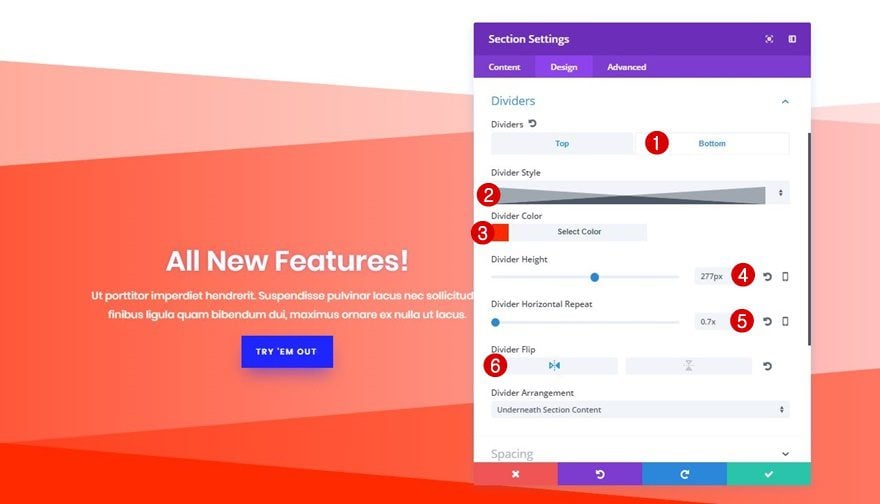
Bottom Divider
The bottom divider that we’re using is almost the same. One of the things that differ is that this divider needs to be horizontally flipped. Use the following settings to achieve the same bottom divider:
- Divider Style: Find in List
- Divider Color: #ff2a00
- Divider Height: 277px
- Divider Horizontal Repeat: 0.7x
- Divider Flip: Horizontal
Section 2
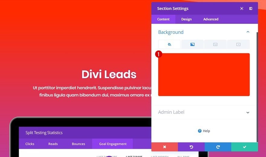
Background Color
We’re, again, using ‘#ff2a00’ as the background color for our second section.
Gradient Background
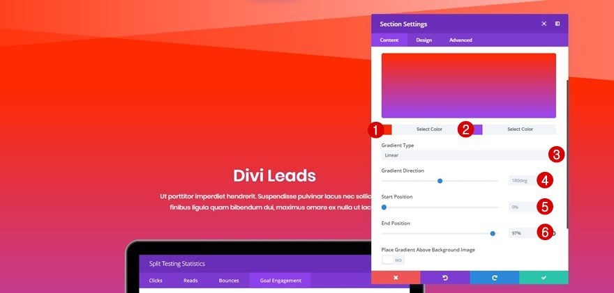
On top of our background color, let’s add a gradient background. We’re matching the gradient background of the second section with the bottom divider color that’s being used in the previous section. This will allow us to have a smooth transition. The exact gradient background that’s being used is the following one:
- First Color: #ff2a00
- Second Color: #9b47ef
- Gradient Type: Linear
- Gradient Direction: 180deg
- Start Position: 0%
- End Position: 87%
Bottom Divider
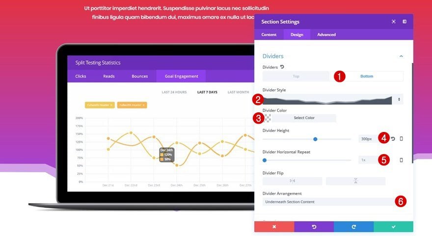
The next and last divider we’ll need for this example is the following bottom divider:
- Divider Style: Find in List
- Divider Color: Clear
- Divider Height: 300px
- Divider Horizontal Repeat: 1x
- Divider Arrangement: Underneath Section Content
We’re placing the section divider below the section content that’s provided to make the laptop mockup overlap with the divider.
Recreate Example #3

Section 1
Background Color
Start by adding the ‘#FFFFFF’ white color code to the first section containing all of the content you’re sharing.

Bottom Divider
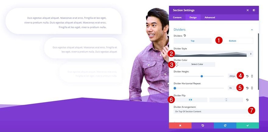
The bottom divider that you’ll add to this section is meant to match perfectly with the next section. One thing that’ll help you do that is keeping the divider color clear. These are the settings you need for the bottom divider of your first section:
- Divider Style: Find in List
- Divider Color: Clear
- Divider Height: 282px
- Divider Horizontal Repeat: 0x
- Divider Flip: Horizontal
- Divider Arrangement: On Top of Section Content
Section 2
Background Color
We’re choosing the ‘#7d3bd2’ as the background color of our next section. This is the color the bottom divider of your previous section will inherit.

Gradient Background
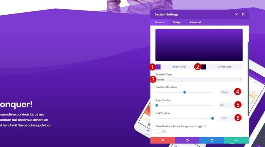
On top of our background color, we’re adding the following gradient background:
- First Color: #7125ce
- Second Color: #150044
- Gradient Type: Linear
- Gradient Direction: 180deg
- Start Position: 0%
- End Position: 100%
Top Divider
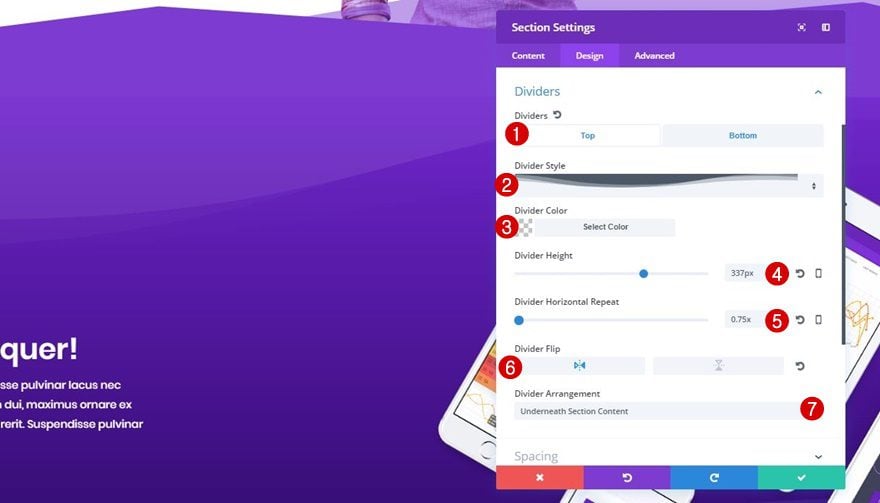
Move on to the Design tab of your section, open the Dividers subcategory and use the following top divider:
- Divider Style: Find in List
- Divider Color: rgba(255,255,255,0.05)
- Divider Height: 337px
- Divider Horizontal Repeat: 0.75x
- Divider Flip: Horizontal
- Divider Arrangement: Underneath Section Content
Bottom Divider
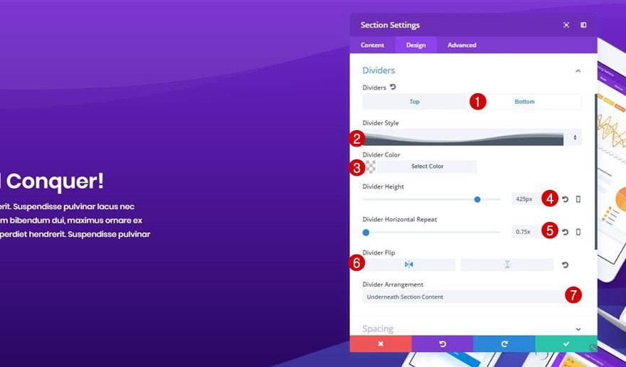
Next, we’re using a bottom divider that matches our top divider with the following settings:
- Divider Style: Find in List
- Divider Color: Clear
- Divider Height: 337px
- Divider Horizontal Repeat: 0.75x
- Divider Flip: Horizontal
- Divider Arrangement: Underneath Section Content
Section 3
Background Color
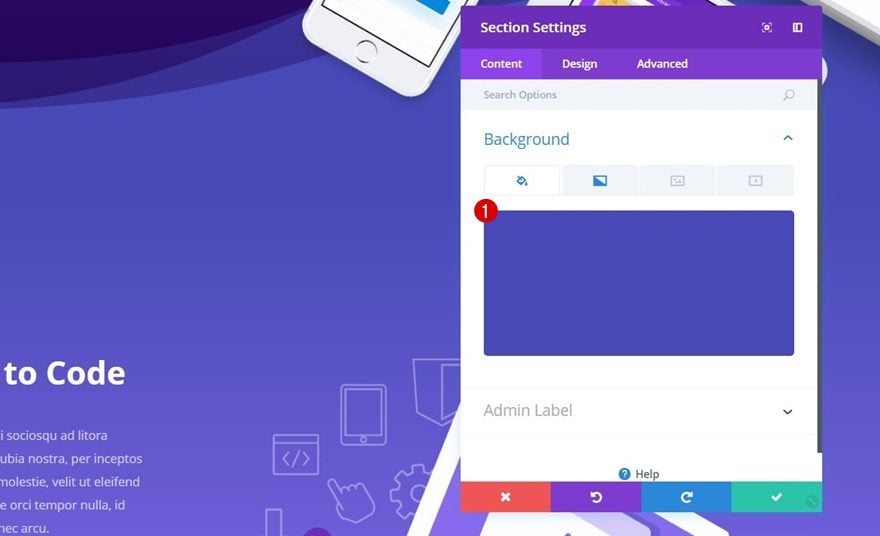
For the last section of this example, add ‘#474ab6’ as the background color.
Gradient Background
To make our example look even better, we’re using the following gradient background on top of the background color:
- First Color: #474ab6
- Second Color: #9271f6
- Gradient Type: Linear
- Gradient Direction: 180deg
- Start Position: 0%
- End Position: 100%

Bottom Divider
Last but not least, we’re applying the following bottom divider for this section:
- Divider Style: Find in List
- Divider Color: Clear
- Divider Height: 200px
- Divider Horizontal Repeat: 1x
- Divider Flip: Horizontal
- Divider Arrangement: Underneath Section Content

Recreate Example #4

Section 1
Background Color
Add a new section (with all the rows and modules you need) and add ‘#FFFFFF’ as the background color of that section.
Section 2
Background Color
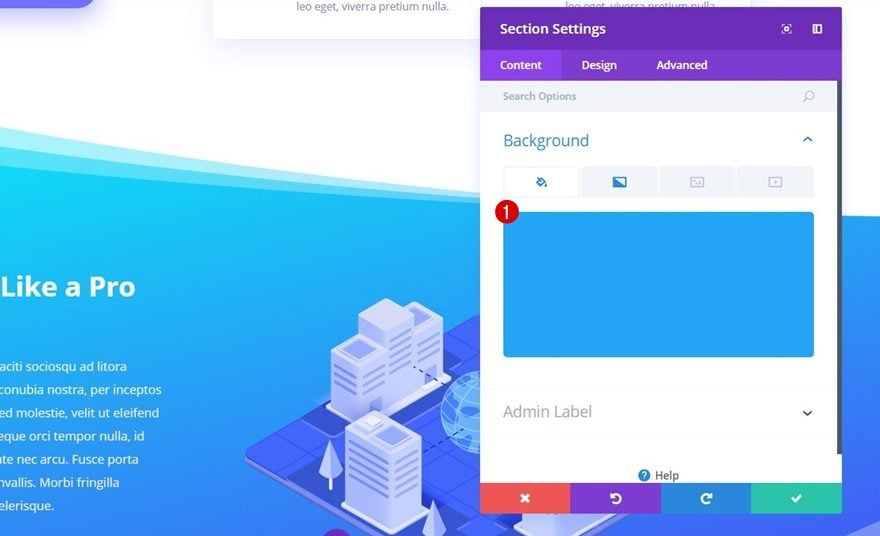
The next section will enjoy ‘#24a5f6’ as its background color.
Gradient Background
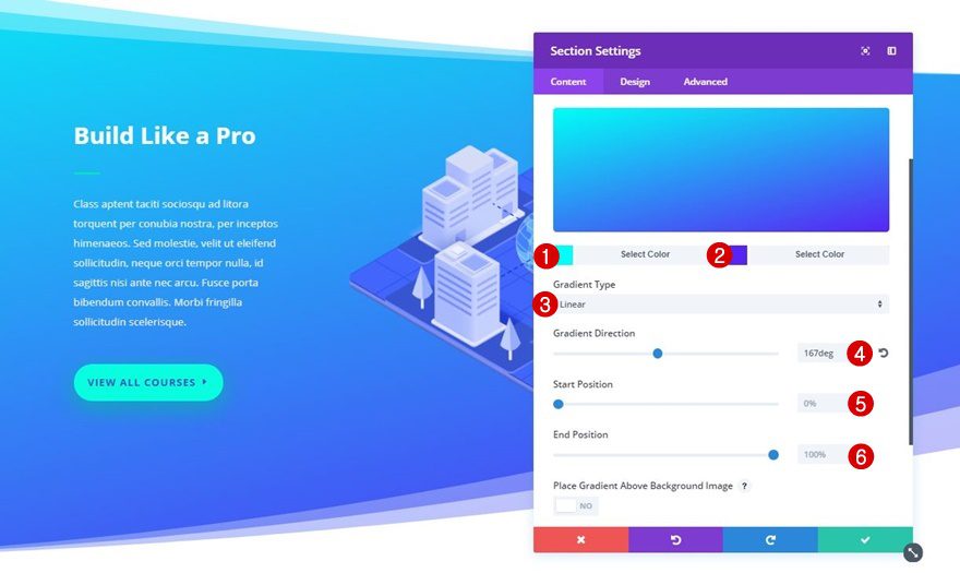
With on top of it, the following gradient background:
- First Color: #00fff6
- Second Color: #5824f4
- Gradient Type: Linear
- Gradient Direction: 167deg
- Start Position: 0%
- End Position: 100%
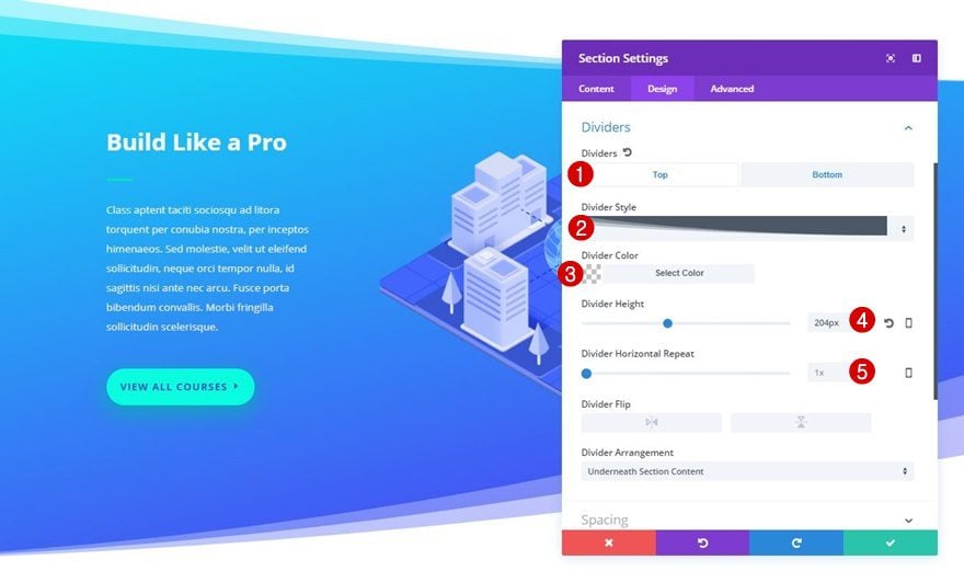
Top Divider
Move on to the Design tab, open the Dividers subcategory and add the following top divider to your section:
- Divider Style: Find in List
- Divider Color: Clear
- Divider Height: 204px
- Divider Horizontal Repeat: 1
Bottom Divider
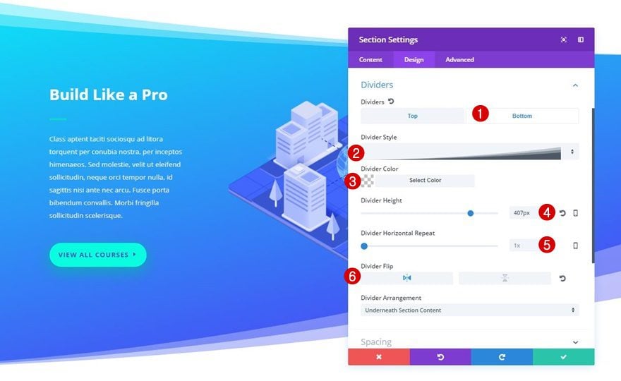
For the bottom divider, we’re using the following settings instead:
- Divider Style: Find in List
- Divider Color: Clear
- Divider Height: 407px
- Divider Horizontal Repeat: 1x
- Divider Flip: Horizontal
Recreate Example #5

Section 1
Background Color
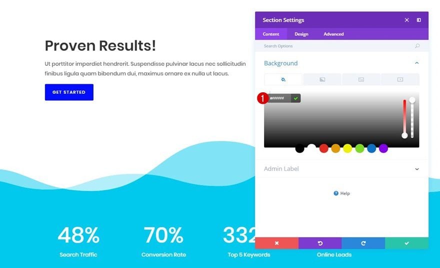
The first section we’re using for this example contains ‘#FFFFFF’ as its background color.
Bottom Divider
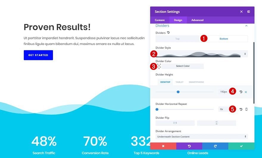
We’re also applying the wavy bottom divider to this section by using the following settings:
- Divider Style: Find in List
- Divider Color: Clear
- Divider Height: 192px (Desktop), 140px (Tablet & Phone)
- Divider Horizontal Repeat: 0x
Section 2
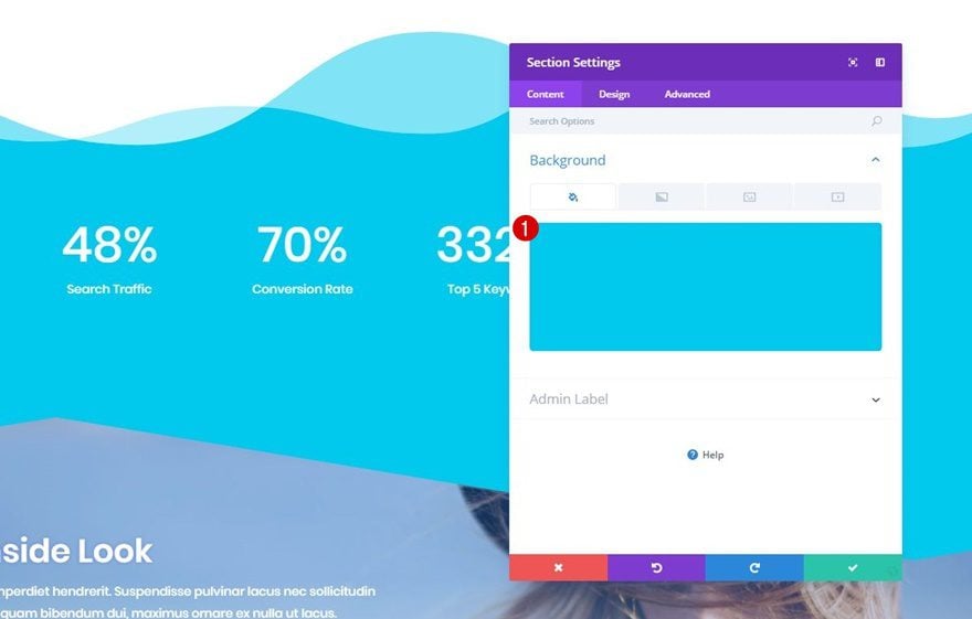
Background Color
The second section we’re using doesn’t include any section dividers at all. The only thing you’ll need to do is add ‘#00c9ed’ as the background color.
Section 3
Background Color
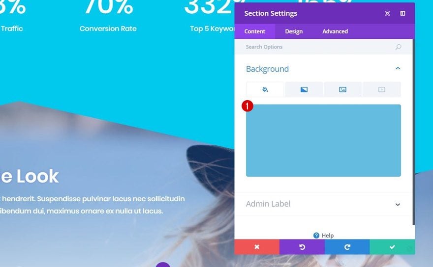
The last section makes use of ‘#64bde0’ as its background color.
Gradient Background
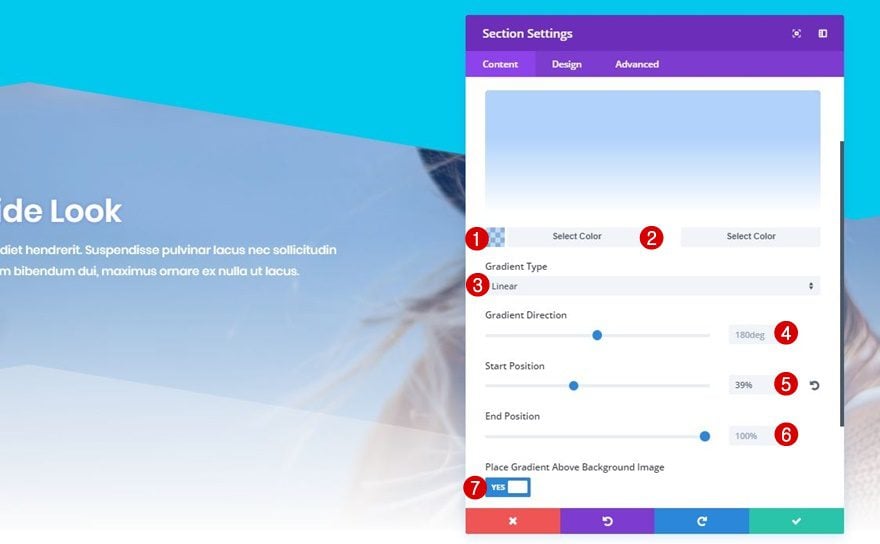
On top of that, we’re combining a gradient background with a background image. Add the following gradient background to your section:
- First Color: rgba(30,135,255,0.3)
- Second Color: #ffffff
- Gradient Type: Linear
- Gradient Direction: 180deg
- Start Position: 39%
- End Position: 100%
- Place Gradient Above Background Image: Yes
Background Image
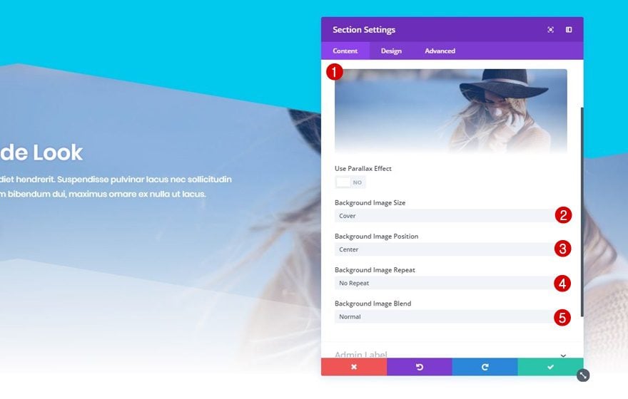
Right after you’ve added the gradient background, add a background image of choice to your section in combination with the following settings:
- Background Image Size: Cover
- Background Image Position: Center
- Background Image Repeat: No Repeat
- Background Image Blend: Normal
Top Divider
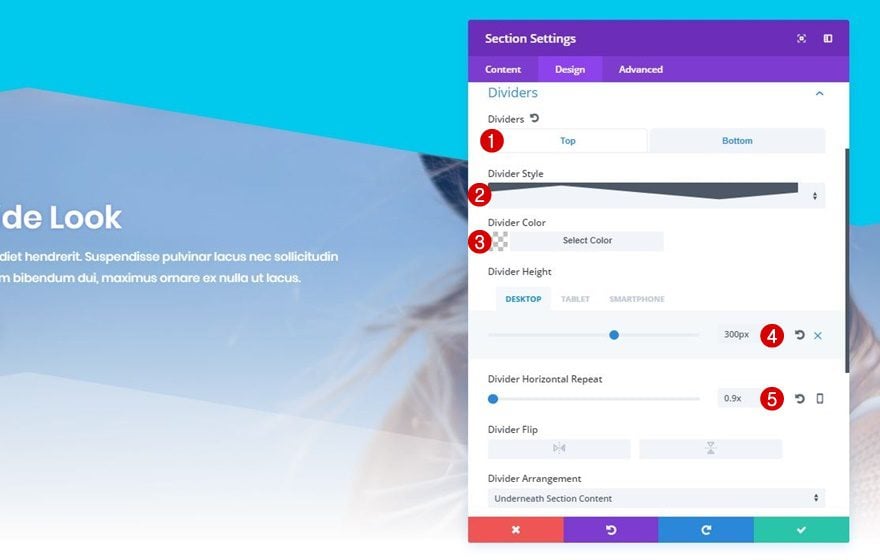
Move on to the Design tab, open the Dividers subcategory and use the following top divider for your section:
- Divider Style: Find in List
- Divider Color: Clear
- Divider Height: 300px (Desktop), 180px (Tablet & Phone)
- Divider Horizontal Repeat: 0.9x
Bottom Divider
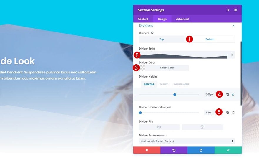
To finish off this example, use the following bottom divider for this last section:
- Divider Style: Find in List
- Divider Color: rgba(247,247,247,0.29)
- Divider Height: 300px (Desktop), 180px (Tablet & Phone)
- Divider Horizontal Repeat: 0.9x
Recreate Example #6

Section 1
Background Color
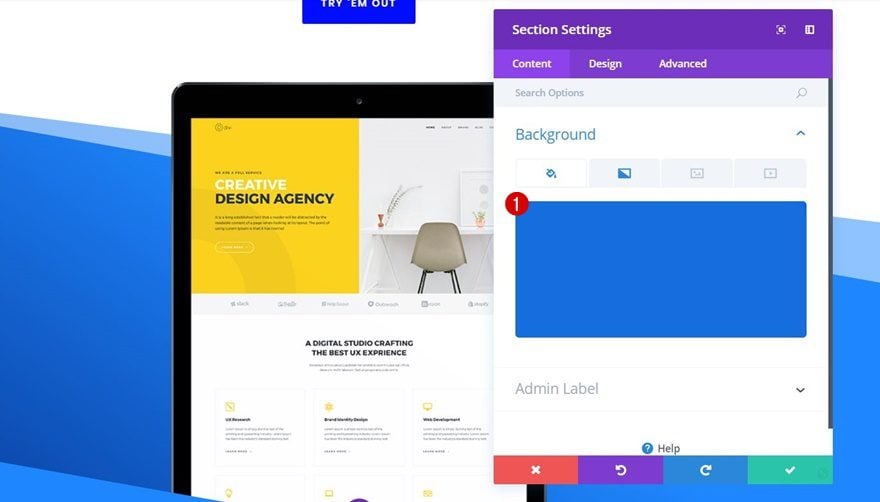
Choose ‘#166dde’ as the background color for the first section of this example.
Gradient Background
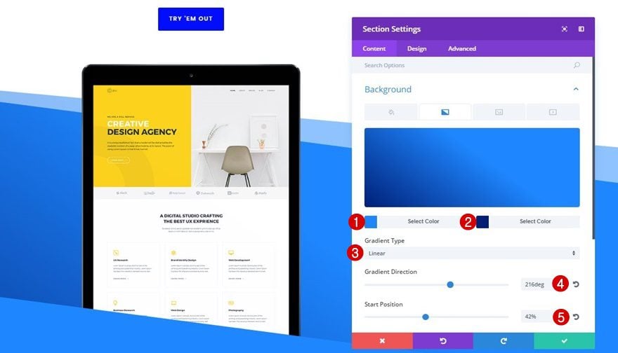
Then, add the following gradient background to this section as well:
- First Color: #1e87ff
- Second Color: #001f77
- Gradient Type: Linear
- Gradient Direction: 216deg
- Start Position: 42%
- End Position: 100%
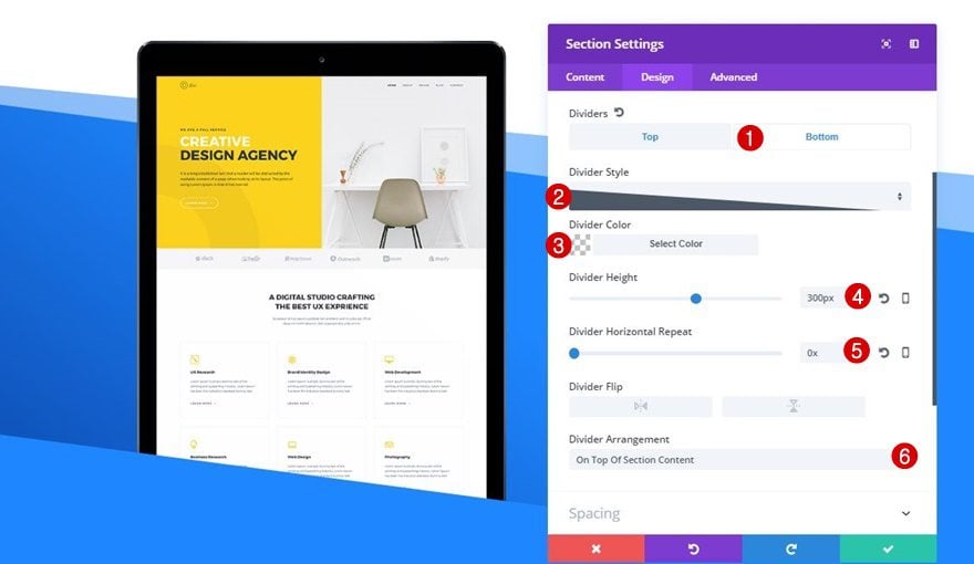
Top Divider
The top divider we’re using for this section has the following settings:
- Divider Style: Find in List
- Divider Color: #FFFFFF
- Divider Height: 300px (Desktop), 100px (Tablet & Phone)
- Divider Horizontal Repeat: 1x
- Divider Arrangement: Underneath Section Content

Bottom Divider
And it contains a bottom divider as well:
- Divider Style: Find in List
- Divider Color: Clear
- Divider Height: 300px
- Divider Horizontal Repeat: 0x
- Divider Arrangement: On Top Of Section Content
Section 2
Background Color
The second section contains ‘#1e87ff’ as its background color.

Gradient Background
In combination with the following subtle gradient background:
- First Color: #1e87ff
- Second Color: #1e4fff
- Gradient Type: Linear
- Gradient Direction: 180deg
- Start Position: 0%
- End Position: 100%

Bottom Divider
And last but not least; we’re adding a bottom divider to this second section as well to complete our example:
- Divider Style: Find in List
- Divider Color: Clear
- Divider Height: 500px (Desktop), 280px (Tablet), 200px (Phone)

Recreate Example #7

Section 1
Background Color
Add a new section, add the needed rows and modules to it and select ‘#FFFFFF’ as its background color.
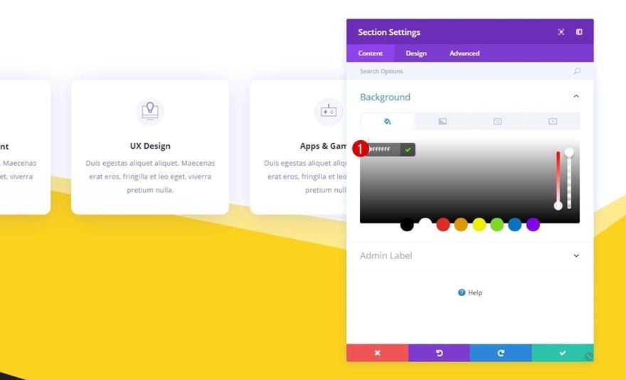
Bottom Divider
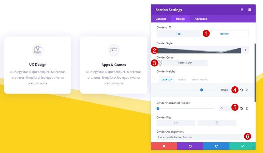
Move on to the Design tab right away, open the Dividers subcategory and use the following bottom divider:
- Divider Style: Find in List
- Divider Color: Clear
- Divider Height: 400px (Desktop), 180px (Tablet), 120px (Phone)
- Divider Horizontal Repeat: 0x
- Divider Arrangement: Underneath Section Content
Section 2
Background Color
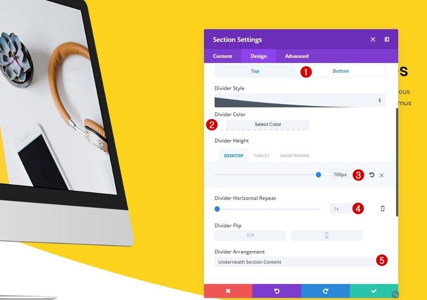
The background color you apply to your second section will automatically be applied to the bottom divider of your previous section (if the divider color is clear). We’re using the ‘#fcd21d’ color code as the background color of our second section.
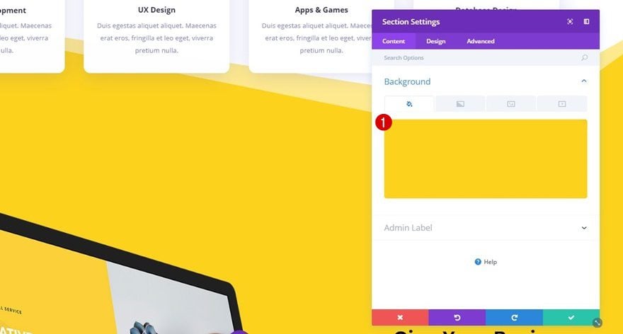
Bottom Divider
Lastly, add the following bottom section divider to your second section:
- Divider Style: Find in List
- Divider Color: #FFFFFF
- Divider Height: 700px (Desktop), 140px (Tablet & Phone)
- Divider Horizontal Repeat: 1x
- Divider Arrangement: Underneath Section Content
Recreate Example #8
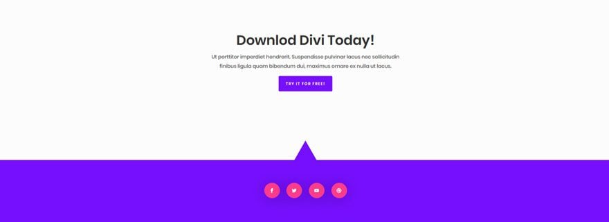
Section 1
Background Color
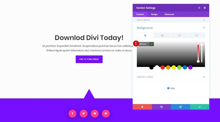
Start by adding ‘#fcfcfc’ as the background color of the first section.
Bottom Divider
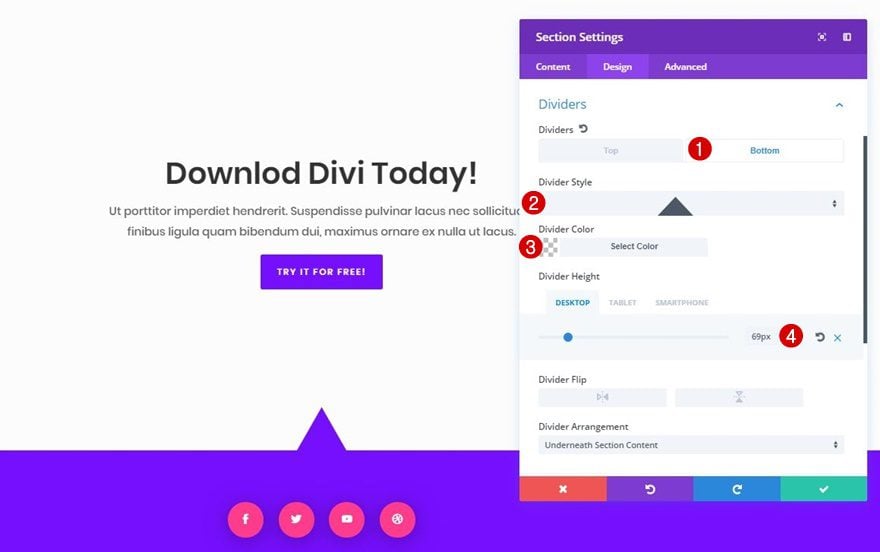
Move on to the Design tab, open the Divider subcategory and use the following bottom divider:
- Divider Style: Find in List
- Divider Color: Clear
- Divider Height: 69px (Desktop), 46px (Tablet), 38px (Phone)
Section 2
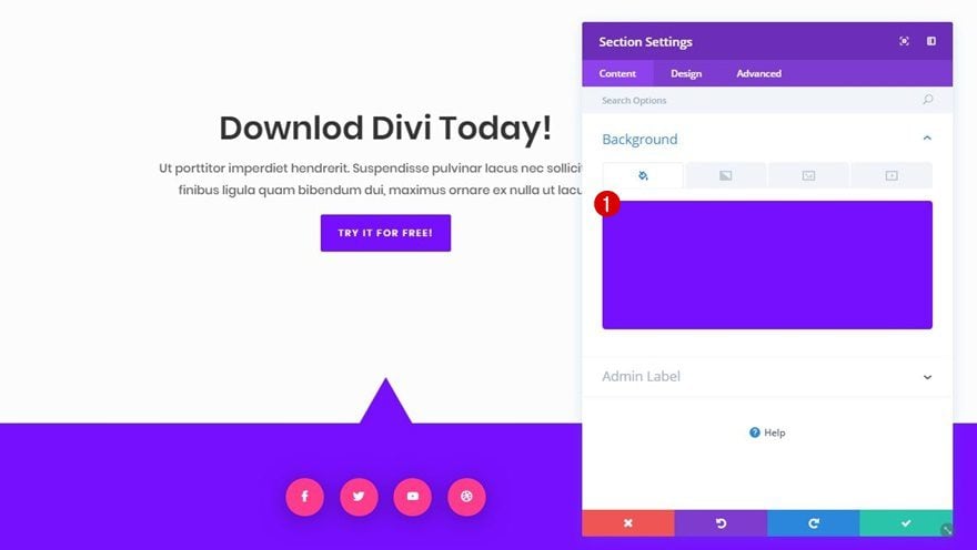
Background Color
Finish off this example, add ‘#770fff’ as the background color of your second section.
Final Thoughts
In this post, we’ve gone through some awesome section dividers which you can add to any type of website. Recreating these examples allow you to quickly comprehend the way section dividers work and how you can use them to impress visitors and get the best out of the website you’re creating without having to use any photo editing software. If you have any questions or suggestions; make sure you leave a comment in the comment section below!





This is just too freaking amazing.. after years.. finally.. we have this feature…. ooooooooooooooooooooooooo yeahhhhhhhhhhhh!!!
Excellent feature and tutorial. It is amazing what can be done with Divi.
Fantastic! Great post!! Thank you elegant themes!
Great post! Just one question: which version of Divi are you using? on my site, using Divi 3.0.105 which I just loaded today, the “Divider Style” line doesn’t show an image of the style, but just the name of the style, ex. “Arrow 2.”
How can I see what the styles look like, before I choose one? I’ve had to try several before I found one i liked, each time I use this feature.
Cool
Any tips on using dividers between sections containing full width video?
Wow great design
Thank you dear
When I added a stylized divider like this it removed the CSS formatting from my head and primary navigation. The only way to get it back was to delete the divider. Any ideas why this might have happened and how I could repair it?
Yes I also am having a similar issue. I created a page exactly as outlined in the video. However, when I added my customary sticky bar at the top of the page, it doesn’t appear like it does on all of my other pages. This bar is very important to me as it contains my contact info.
That looks nice, I’m wondering if the are some video to watch ?
Really enjoyed this video. Favorite post in a very long time for sure. Would love to have the layout for the page created in the video.
This feature and accompanying examples are absolutely amazing!
looks pretty, but can you fix your new authentication that broke my site two weeks ago? i’m hesitant to build anymore divi sites till you show more progress on what you hath broken.
Thank you Donjete!
These tutorials are a great resource and will be using one very soon.
Nice blog. Examples well-demonstrated on using Divi Section Dividers. Useful. Thanks!
It’s been four days since I’ve received any update emails from Elegant Themes. Since then the emptiness 🙁
Has something changed?
Redownload
download the plugin from the members area.
Thank you! I’ve been waiting for this post.