The versatility of Divi makes it ideal for eCommerce websites. It integrates well with WooCommerce and other eCommerce platforms. It stands to reason there are a lot of eCommerce websites out there built with Divi. In this article, we’ll look at 20 examples of eCommerce websites built with Divi to help spark your imagination.
These sites have interesting layouts, shop pages, and product pages. Most include interesting styling for the shop and product pages, and some include WooCommerce add-ons. I’ll point out what stands out to me the most. The websites are in no particular order.
- 1 1. East of Africa
- 2 2. Sweet Cecilys
- 3 3. Modern Pink Paper
- 4 4. One Leaf Designs
- 5 5. The Bro Basket
- 6 6. Natural Care Shop
- 7 7. Apis Australia
- 8 8. Lahlay
- 9 9. Leoca
- 10 10. The Scruffy Gentleman
- 11 11. Veez
- 12 12. Coco Cuscino
- 13 13. Tarte and Berry
- 14 14. Nikki Hill Apothecary
- 15 15. Spikes and Sparrow
- 16 16. Kickbike
- 17 17. Unsalted Boutique
- 18 18. Maison Flowers
- 19 19. Basami Shop
- 20 Ending Thoughts
1. East of Africa

East of Africa has a sharp homepage design that focuses on the company. The page has several calls to action to see the various products. The category pages include a header with a large logo and a navigation menu that scrolls with the header. The pages include a search box and suggested categories. The product pages show the product in two columns. The layout is simple and includes suggested products.
2. Sweet Cecilys
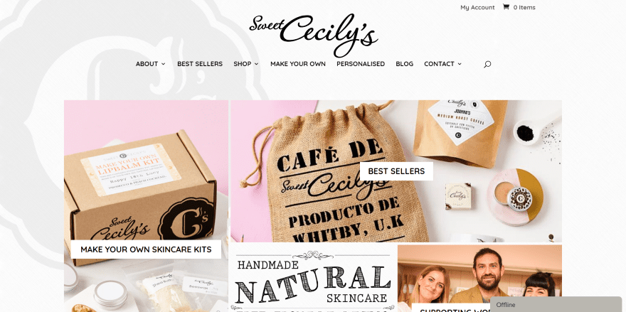
Sweet Cecilys displays images as links to the store categories within a multi-column layout that looks similar to a magazine. The background shows a portion of the company’s logo. The category pages include the same background pattern as the homepage and displays the products within four columns. The category pages have WooCommerce widgets in the sidebar that are styled to match the products. The product pages use the sidebar and add social sharing buttons and related products. This site has some amazing product photography.
3. Modern Pink Paper
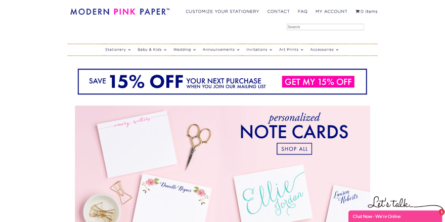
Modern Pink Paper’s homepage looks like a store and uses soft colors to attract the target audience. It includes CTAs to different categories. The primary category pages use the same image for each category but they show the title over the image. The secondary category pages show the products with a filter. The product pages have a lot of color and personalization options. The buyer can select the color, add a name for personalization, choose to see the product before it ships, and add messages and notes. The product description uses an accordion for the FAQ.
4. One Leaf Designs

One Leaf Designs displays product images in a full-width slider with a shop CTA followed by a section with the best sellers. The shop page shows the products in a boxed section that overlaps the header. The product pages show the product with a box shadow for all of the images. The text is styled to match the site. It includes links to other products the visitor might like.
5. The Bro Basket
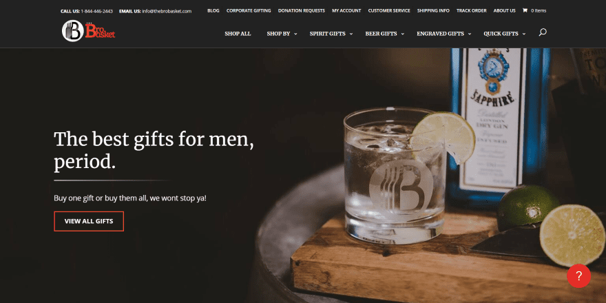
The Bro Basket shows a full-screen header with a shop CTA. A section shows the shop categories using images with overlays. Another section shows hand-selected products. The category pages show several sections about the company and what they do. These sections include services in 3D cards. Those further away are blurred. The description area of the product pages includes a full-width video or customizations. They also include related products. I love the photography on this website.
6. Natural Care Shop
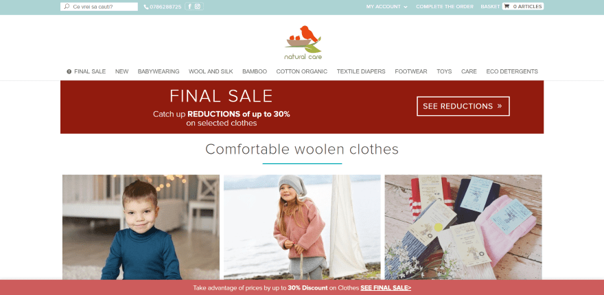
Natural Care Shop has a nice store design with images that link to the categories. It uses soft colors to appeal to the target audience. The category pages include WooCommerce sidebar widgets and CTA’s in the footer. The products are shown with large images. The product pages have styled icons and similar products in both a widget and as CTA images.
7. Apis Australia
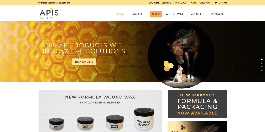
Apis Australia includes a full-width shop CTA in the header along with a category section that shows several products in an image. The shop page uses the same background to display behind the shop module. Another shop section shows complementary products over the same background. The products are shown with box shadows. The product pages are simple but include text styling to match the site and related products.
8. Lahlay
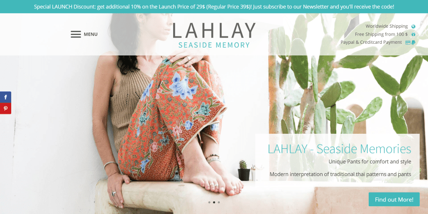
Lahlay shows a full-screen slider with CTAs for several products. It includes a mega-menu that hides on scroll. Several sections on the homepage showcase the products with large images and box shadows. Several other sections provide product information with images. The category pages show lots of photos and information in styled accordions, along with a styled shop module. The products are displayed in popups. This site has one of the most interesting category/product pages that I’ve seen.
9. Leoca
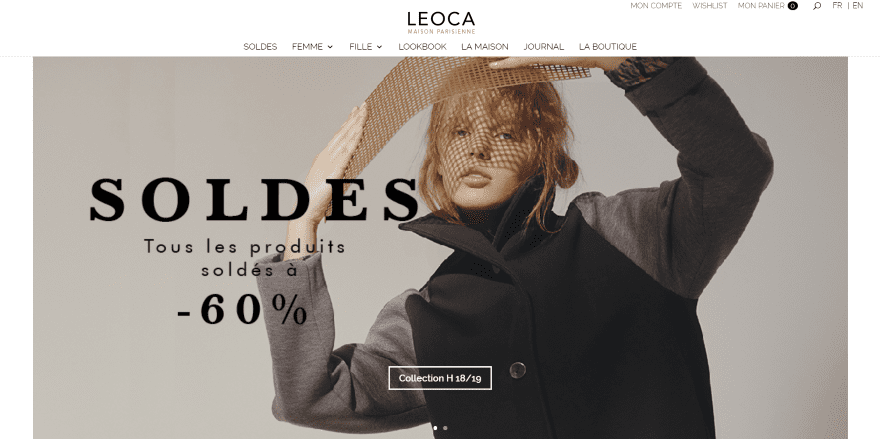
Leoca displays a full-screen header with a shop CTA. The next section shows large images that link to categories. They include the category titles. The category pages show a full-screen image along with the category title. The next section showcases a product followed by a shop module with large images and hover animation for the overlays to show sizes and a heart to add the product to your wishlist. The product pages show lots of large images along with options.
10. The Scruffy Gentleman

The Scruffy Gentleman provides a product search box under the header followed by a full-width background image in parallax. Featured products scroll over it and overlap the next section of featured products. Another section shows a CTA in parallax followed by new items in the store. The shop page follows a similar design and adds a WooCommerce sidebar. The product pages show in full-width and include large images.
11. Veez
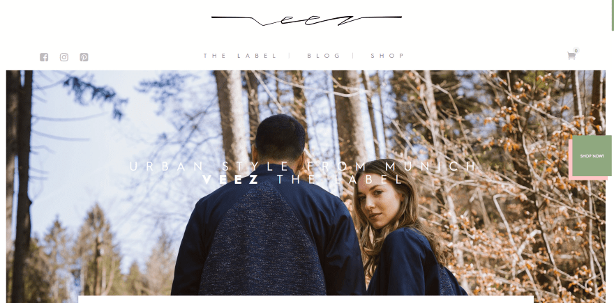
Veez includes a shop button that remains on screen as you scroll. The homepage shows categories with images as links that are styled with overlapping text and boxes. The category pages show an image and title to introduce the section followed by a shop module and a button to reveal more. The product pages have lots of interesting styling. They show the product with lots of large images in multiple columns. Another section shows more products from the category.
12. Coco Cuscino
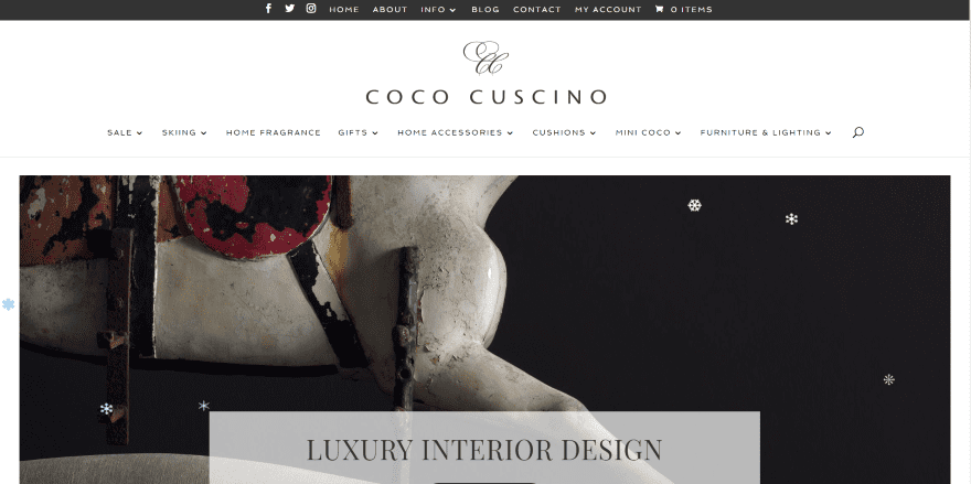
Coco Cuscino includes a full-screen slider with a shop CTA for the different categories. Scrolling shows a slider of the latest products with a section title to the left. Another section includes CTAs to different categories. The category and product pages are simple and have border, button, and text styling, and a custom footer. The product page includes a box shadow.
13. Tarte and Berry
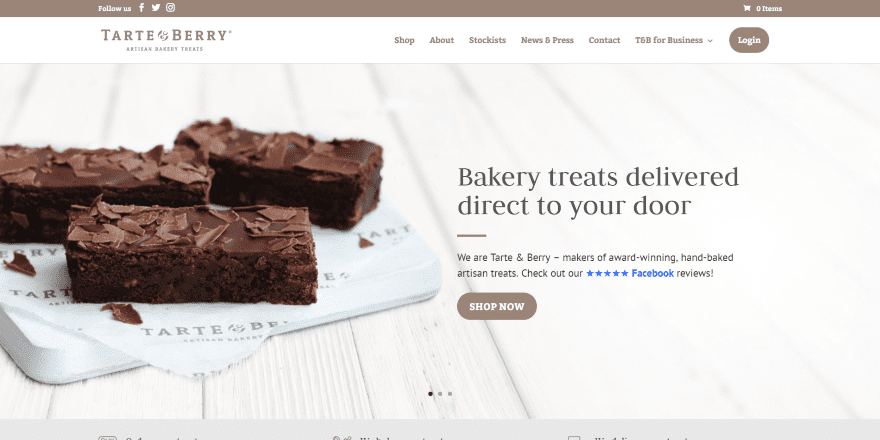
Tarte and Berry displays the products in a full-screen slider using the Ken Burns effect and a shop CTA. A slim section shows the purchasing process with icons. Following this is a large list of products and a testimonial section. The shop page follows this same design, but without the slider. The product pages are styled to match the site and include a box to add a custom message. The description shows the ingredients. The page also shows related products.
14. Nikki Hill Apothecary
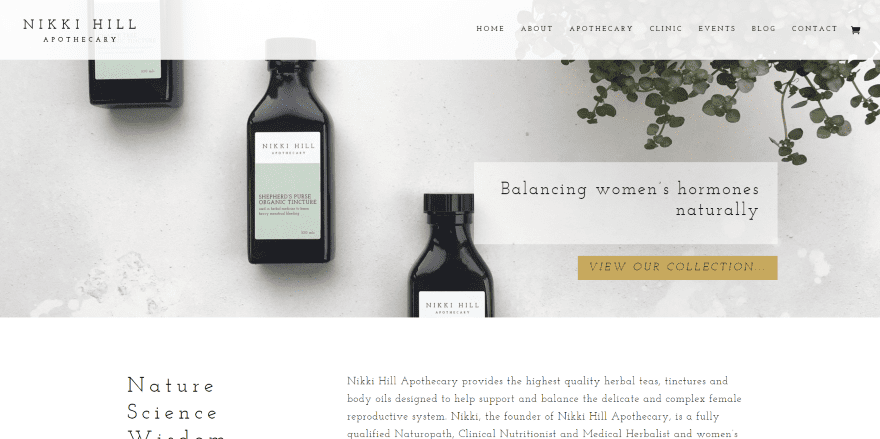
Nikki Hill Apothecary uses a soft and elegant design to showcase the products. The header shows a CTA followed by information about the company. A multi-column section shows images as links to categories. The category pages are clean and include styling to match the site. The product pages have custom styling, which includes the tabs of the description area. Under the product is a suggested product within a styled box. The photography in this site sets it apart.
15. Spikes and Sparrow
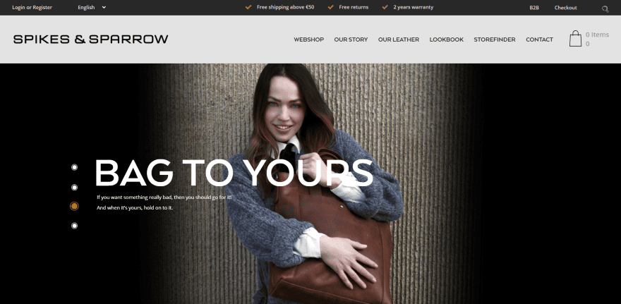
Spikes and Sparrow shows a full-width slider to showcase products. The slider has styled navigation on the left side. The next section shows categories in a multi-column layout using images with styled text overlays. The shop pages show the products with a styled WooCommerce sidebar. The product pages look elegant with their branded colors. They don’t show a lot of info, but they do include the product in other colors.
16. Kickbike
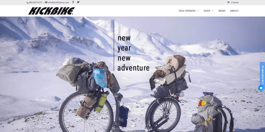
Kickbike shows a full-width slider with a shop CTA. The homepage provides several articles and links about the company, shop sections, and lots of info about the products. The category pages include a full-screen image followed by an information section, the shop section in full-width, and then an FAQ. The product pages are simple but use lots of large photos and related products.
17. Unsalted Boutique
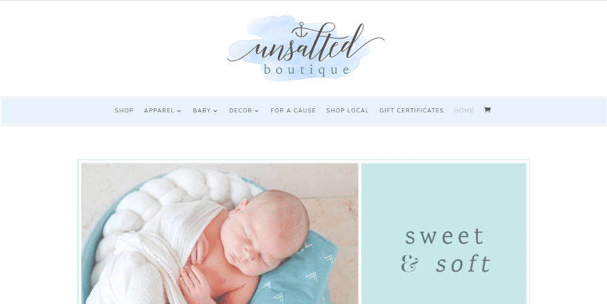
Unsalted Boutique uses soft colors behind the menu, sections, blocks of text, etc. to attract the target audience. A CTA displays within a slider and uses an image with a colored box for text. Colored boxes are used throughout the site to identify the categories. The homepage includes several of these shop sections. The category links open the product page where you can choose the specific product from a dropdown box. The product page also shows related products.
18. Maison Flowers
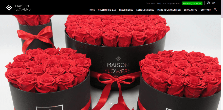
Maison Flowers shows a product image as a parallax background in the full-screen hero section. Scrolling shows a styled shop module with a flower icon in the overlay and a section with images for categories with hover animation. The category pages match the homepage but have a small image with a styled overlay. The product pages use the same header and a large product title, and it includes a personal message box to personalize the gift. The page also has a section to show shipping and purchase information and two other sections with similar products.
19. Basami Shop
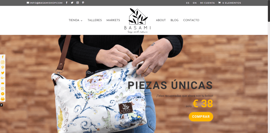
Basami Shop shows a shop CTA in a full-screen slider. A section of other products and a section of favorites include box shadows. The category pages show categories in the sidebar, a description of the category, and then the products. The product pages show a large image of the product, the product gallery, and then the description area. This area is styled to match the site and includes related products.
Ending Thoughts
That’s our look at 20 examples of eCommerce websites built with Divi to help spark your imagination. These sites are great examples of what can be done with Divi. Many have elegant landing pages with styled shop modules to focus on the products. There are several excellent examples of shop pages, category pages, and product pages. It’s easy to see how product photography can make a simple design stand out. There’s sure to be something here to help you design any kind of eCommerce website for your next Divi project.
We want to hear from you. Which of these Divi eCommerce websites are your favorites? Let us know what you think about them in the comments.
Featured Image via TeraVector / shutterstock.com



First one “East of Africa” is “Powered by Shopify”
We are a large clothing manufacturer – SUPA Factory. We built our company website with DIVI. It is by far the best wordpress software we have ever used. So simple and intuitive!
Thanks, for the ideas for my ecommerce for babies gifts. Best regards.
Could you tell me how this is done:
“Lahlay shows a full-screen slider with CTAs for several products.”
I have been working all day on my site. I have a gallery slider I would like to add call to action buttons on the images but have not been able to figure it out.
I would also like that slider/images to be up underneath my header navigation bar like this site is showing. Is it possible to put a gallery slider under that area?
Thanks!
Jan Stephenson
Love them all for different reasons, thanks to those who share their ideas. Can someone think about a ballroom studio layout
How bout the WooCommerce update you promised months ago?
Thanks for the inspiration!
The “20 Examples of Divi eCommerce Websites” show how unfitting Divi is for WooCommerce.
#sadbuttrue
That’s an interesting thing to say. Can you elaborate? What do you use instead?
Hi!
Thanks for the collection.
We work with Divi alot and we have some projects to show, how can we get in this list?
I personally like the layout of Tarte and Berry. I’ll definitely try this one. Thankyou for sharing!
Wow! It’s amazing. I just love all the websites layout. Keep sharing!
Wow, I am really impressed by your list of Divi E-commerce theme.
Thanks For Posting the above list of theme.
Very nice examples!
I love Divi Theme, all theme is awesome. Especially One Leaf Designs is very simple and unique.
I love them!
great post
I love them
I’m wondering for search modules on those site .. it seems has to tweak the search script right ? because if not .. then the result will includes the blog articles not just product right ?
The #14 image does not correspond to the website presented by you. Please check.
Thanks for featuring Tarte and Berry, although the thumbnail is wrong! 😀