For all you Divi bloggers out there looking for fresh ways engage people with your blog posts, the Divi Post Title Module is a great place to start. The Post Title Module allows you to style the post title (and featured image) in a variety of ways for countless stunning designs. This allows you to create some beautiful articles that hook your potential readers from the first glimpse. Today, I’m going to show you four stunning ways that you can style the Divi Post Title Module to help pull your readers in.
Let’s get started!
Sneak Peek
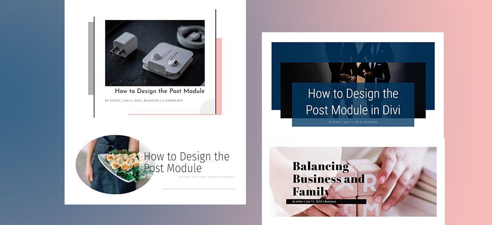
Here is a quick peek at the post title module designs featured in this tutorial.
#1 Abstract Framing
#2 Overlapping Text and Featured Image
#3 Unique Content Backgrounds for Readability
#4 Stacking Effect with Dual Featured Images
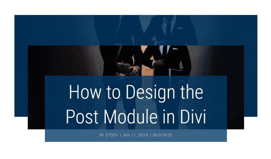
Getting Started
Subscribe To Our Youtube Channel
All you really need for this tutorial is Divi. We will be creating new posts and using the Divi Builder to create the post title designs. You will also need a few images to serve as featured images.
The Setup for New Posts
For this tutorial, I will be using the Divi Builder to build example post title designs on a new post. In order to get setup for the builds in this tutorial, you will need to do the following:
- Create a new post.
- Add a Title to your post.
- Add a Featured Image to your post.
- Deploy the Divi Builder.
- Choose to Build From Scratch
- under Divi Page Settings, select the No Sidebar page layout and select to Hide the post title.
- Then click to Build on the Front End or deploy the Desktop view mode on the backend so that you can design the page visually.
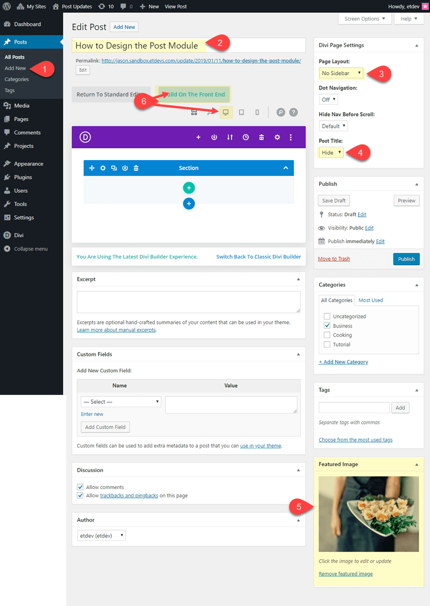
It is up to you whether or not your want to create a new post for each design or simply add multiple post title designs to one post. Just keep in mind that if you add multiple post titles in one post, they will inherit the same page title and featured image.
#1 Abstract Framing

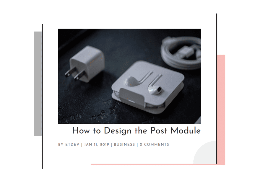
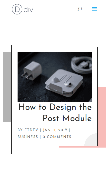
This clean post title design has subtle abstract framing elements that will work well your featured image and post title. The framing effect is created using some custom border and box shadow styling.
Here’s how to do it.
Make sure you setup the new post as described in the beginning of this article (Add Title, Featured Image, No sidebar page layout, hide default post title). Add a new section with a one-column row to your post. Then add the post title module to the row.
In the Post Title Settings, set the Featured Image Placement as follows:
Featured Image Placement: Above Title
Then update add a background gradient to add a small abstract design element in the bottom right corner of the module.
Background Gradient Left Color: rgba(0,0,0,0.06)
Background Gradient Right Color: rgba(0,0,0,0)
Gradient Type: Radial
Radial Direction: Bottom Right
Start Position: 10%
End Position: 0%
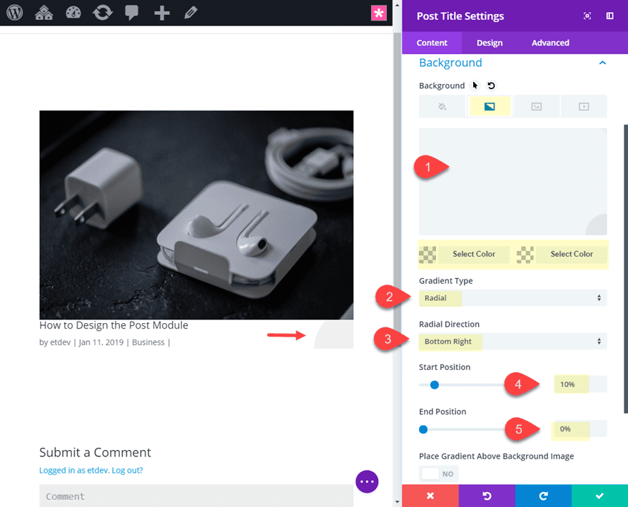
Continue update the rest of the design as follows:
Title Font: Josefin Sans
Title Text Alignment: right
Title Text Size: 36px
Title Line Height: 1.7em (desktop), 1.3em (tablet and smartphone)
Meta Font: Josefin Sans
Meta Font Style: TT
Meta Text Alignment: left
Meta Letter Spacing: 2px
Meta Line Height: 2em
Custom Margin: -5vw top
Custom Padding: 5vw top, 5vw bottom, 5vw left, 5vw right
Right Border Width: 4px
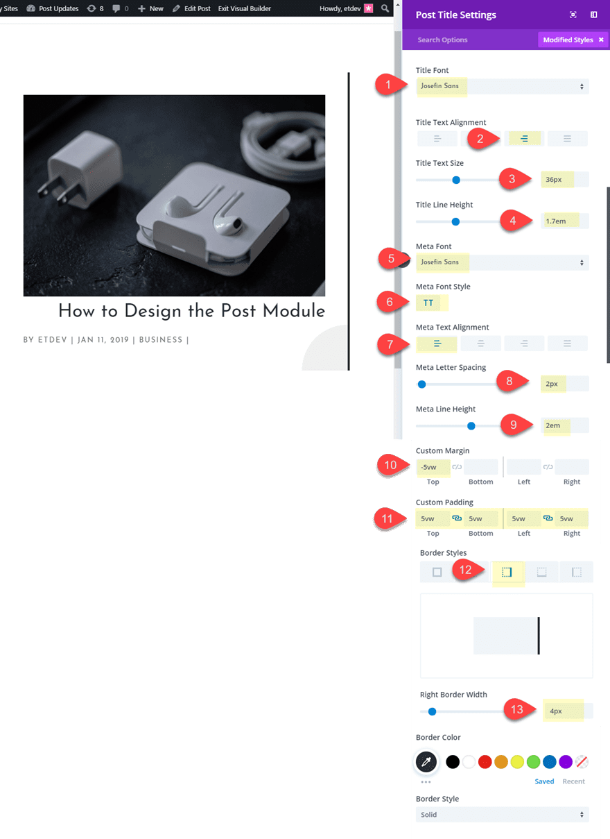
The -5vw margin pulls the module up outside of the row in order for the right border to stand above the left border we will be adding to the row.
Now let’s add an abstract design element using box shadow:
Box Shadow: see screenshot
Box Shadow Horizontal Position: 112px
Box Shadow Vertical Position: 85px
Box Shadow Spread Strength: -80px
Shadow Color: rgba(224,43,32,0.3)
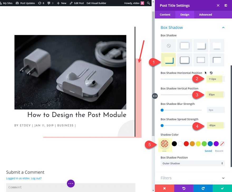
Save settings.
Now open the row settings to resize it and create the left side of the frame design using a border and a box shadow.
Custom Width: 700px
Right Border Width: 4px
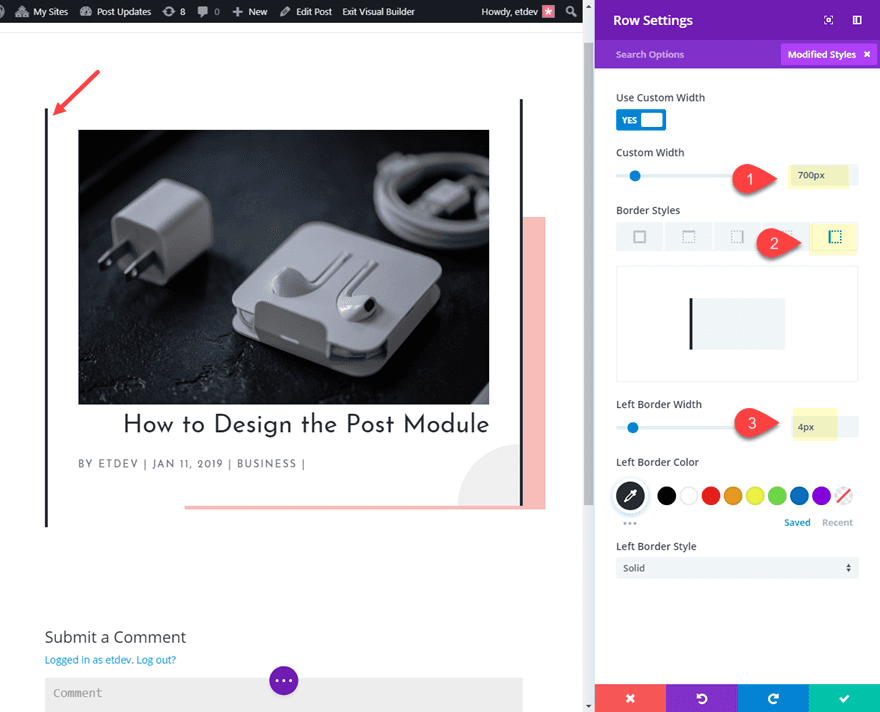
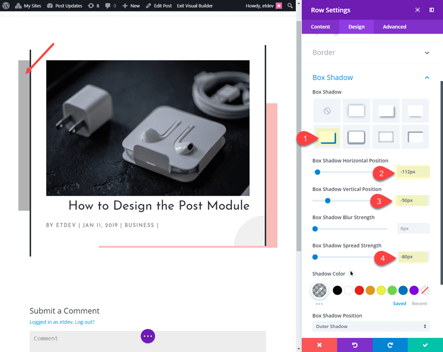
Box Shadow: see screenshot
Box Shadow Horizontal Position: 112px
Box Shadow Vertical Position: 85px
Box Shadow Spread Strength: -80px
Shadow Color: rgba(224,43,32,0.3)
Now let’s check out the final design.

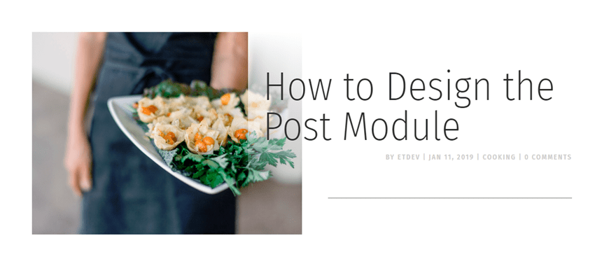
#2 Overlapping Text and Featured Image

Create a new section with a two column row. Then add an image module in the left column.
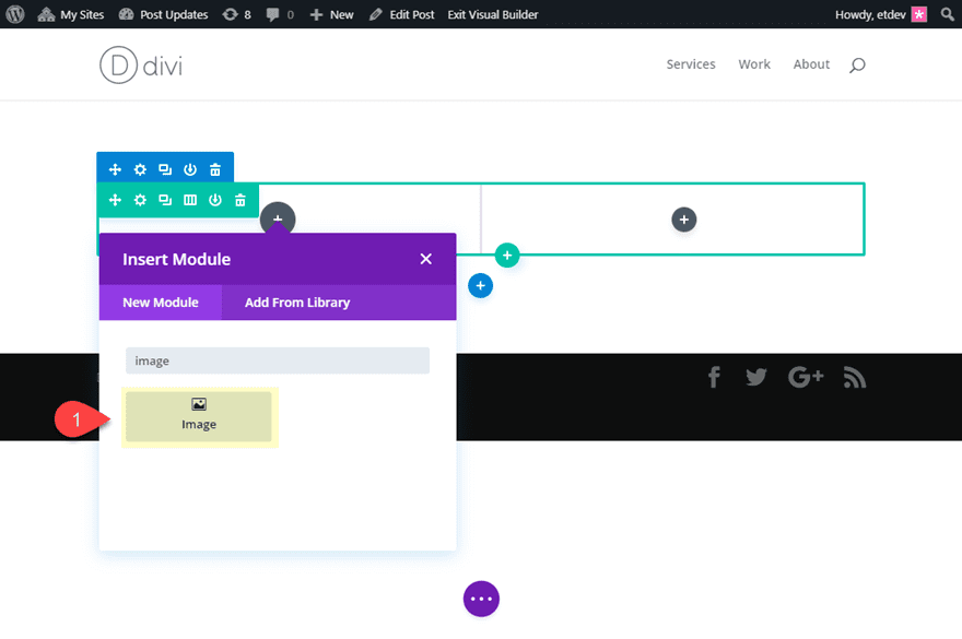
This is going to serve as our featured image using dynamic content. Open the image settings and delete the mock image and click the dynamic content icon in the top right of the image preview box. Then select Featured Image from the list to add the featured image to the page.
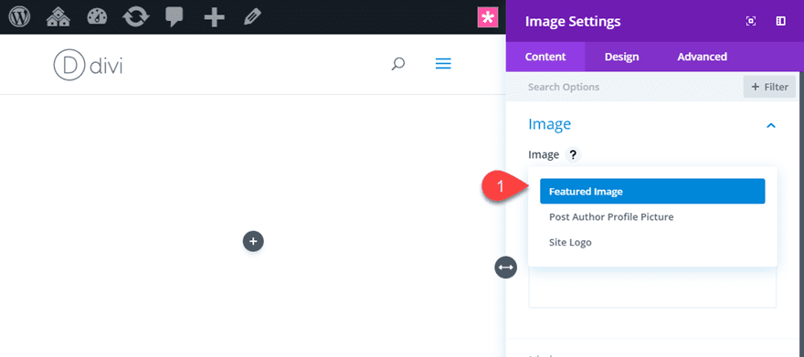
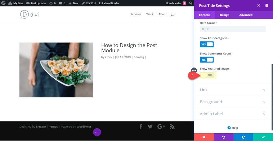
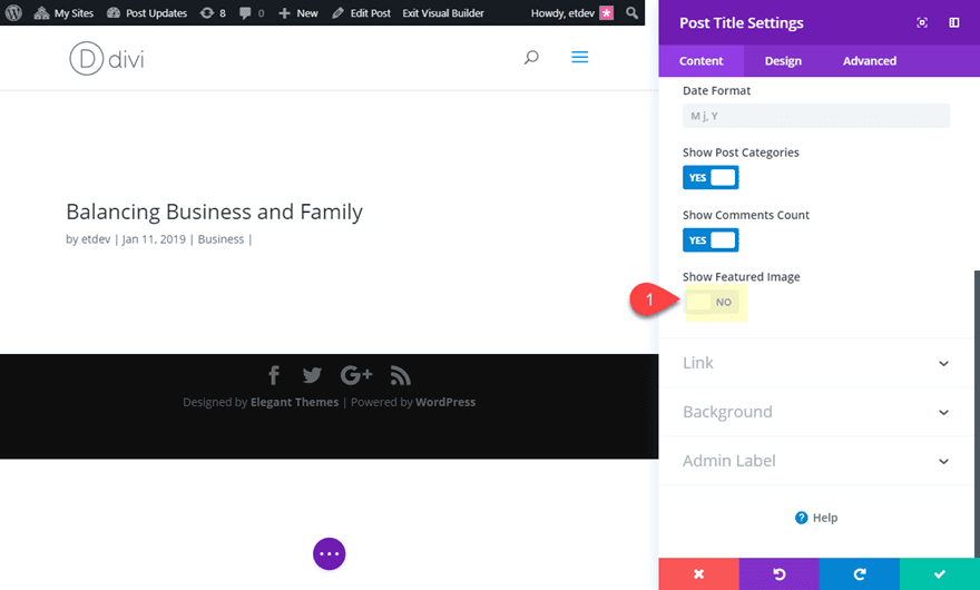
Now add a post title module to the right column. Open the settings and hide the featured image by setting the Show Featured Image option to NO.
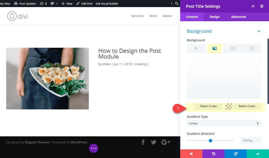
Then add a background gradient to the post title module.
Background Gradient Left Color: #ffffff
Background Gradient Right Color: rgba(255,255,255,0)
This will become visible once we add some negative margin to overlap the image.
Update the rest of the design as follows:
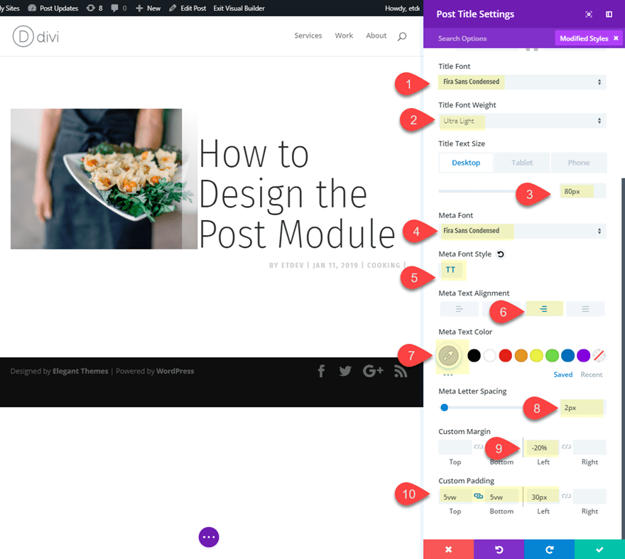
Title Font: Fira Sans Condensed
Title Font Weight: Ultra Light
Title Text Size: 80px (desktop), 70px (tablet), 45px (smartphone)
Meta Font: Fira Sans Condensed
Meta Font Style: TT
Meta Text Alignment: right
Meta Text Color: #cccccc
Meta Letter Spacing : 2px
Custom Margin: -20% left (desktop), 0% (tablet and smartphone)
Custom Padding: 5vw top, 5vw bottom, 30px left
Now let’s give it a box shadow to create a line under the title.
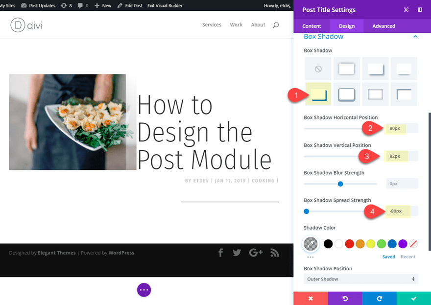
Box Shadow: see screenshot
Box Shadow Horizontal Position: 80px
Box Shadow Vertical Position: 82px
Box Shadow Spread Strength: -80px
Save setting and open the row settings to adjust the gutter width.
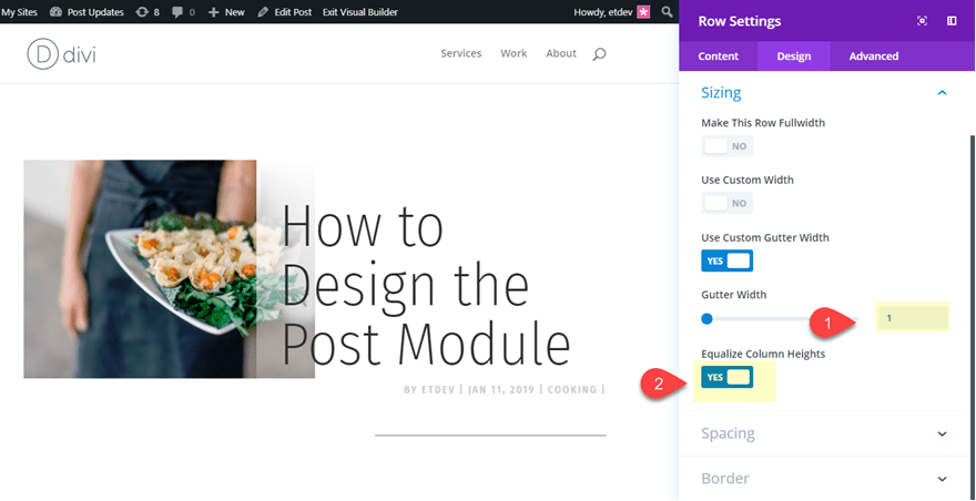
Gutter Width: 1
Equalize Column Heights: YES
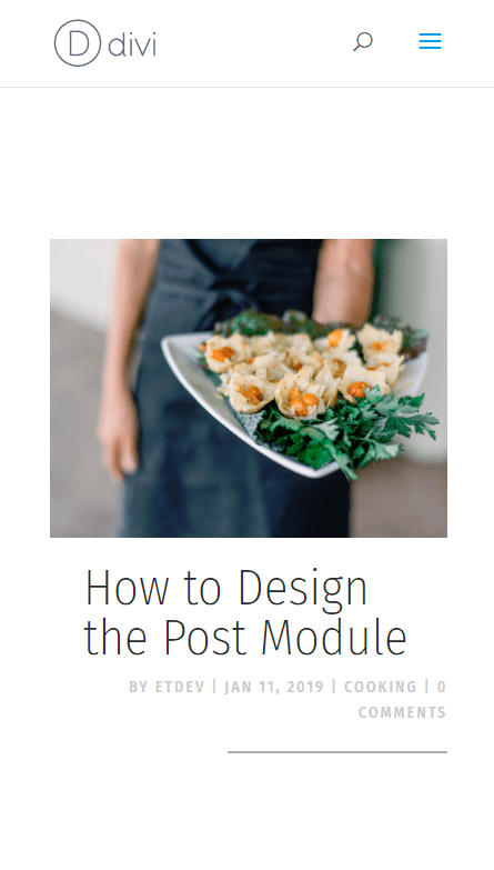
Now check out the final design.

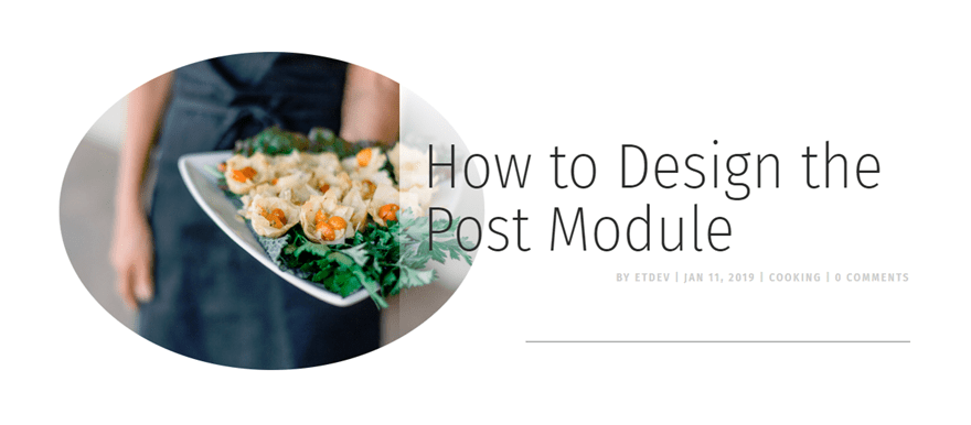
Alternative Rounded Image Design
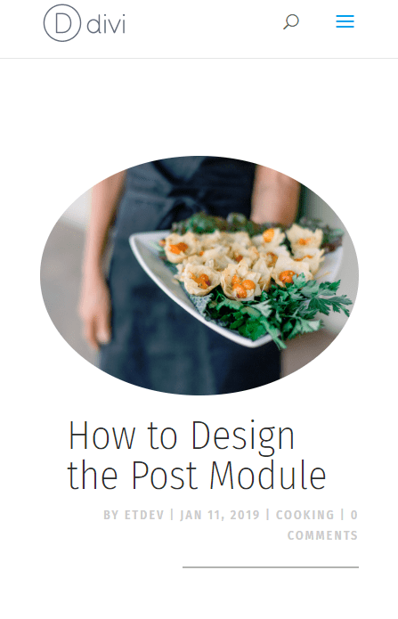
With just a few small tweaks you can make the featured image circular and adjust the post tile to be vertically centered. To do this open the image settings and update the following:
Rounded Corners: 50%
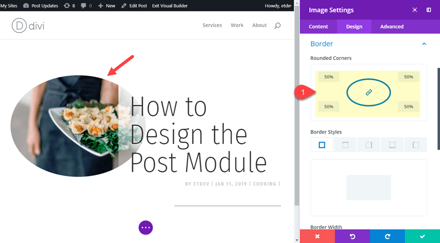
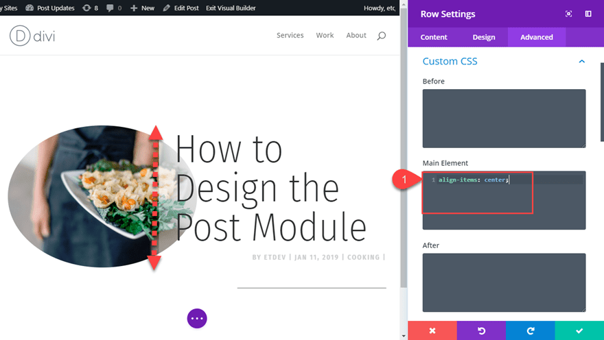
Then open the row settings and add the following custom CSS under the Main Element:
align-items: center;
This works only if you have Equalize Column Heights set to YES which activates the flex property allowing us to align the items vertically.
Here is the final design.

#3 Unique Content Backgrounds for Readability

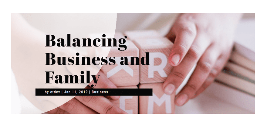
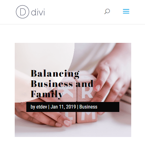
This post title design incorporates background gradients to make the title and meta text more readable with a featured image background.
Here is how to do it.
Create a new section with a one-column row. Then add the post title module to the row.
Then update the post title module settings to hide the featured image.
Title Font: Abril Fatface
Title Text Color: #121212
Title Text Size: 75px (desktop), 50px (tablet), 30px (smartphone)
Title Letter Spacing: 2px
Title Line Height: 1.1em
Meta Font: Roboto Condensed
Meta Text Color: #ffffff
Meta Text Size: 16px
Meta Letter Spacing : 2px
Meta Line Height: 2em
Width: 60% (desktop), 90% (tablet), 100% (smartphone)
Custom Padding: 3vw left
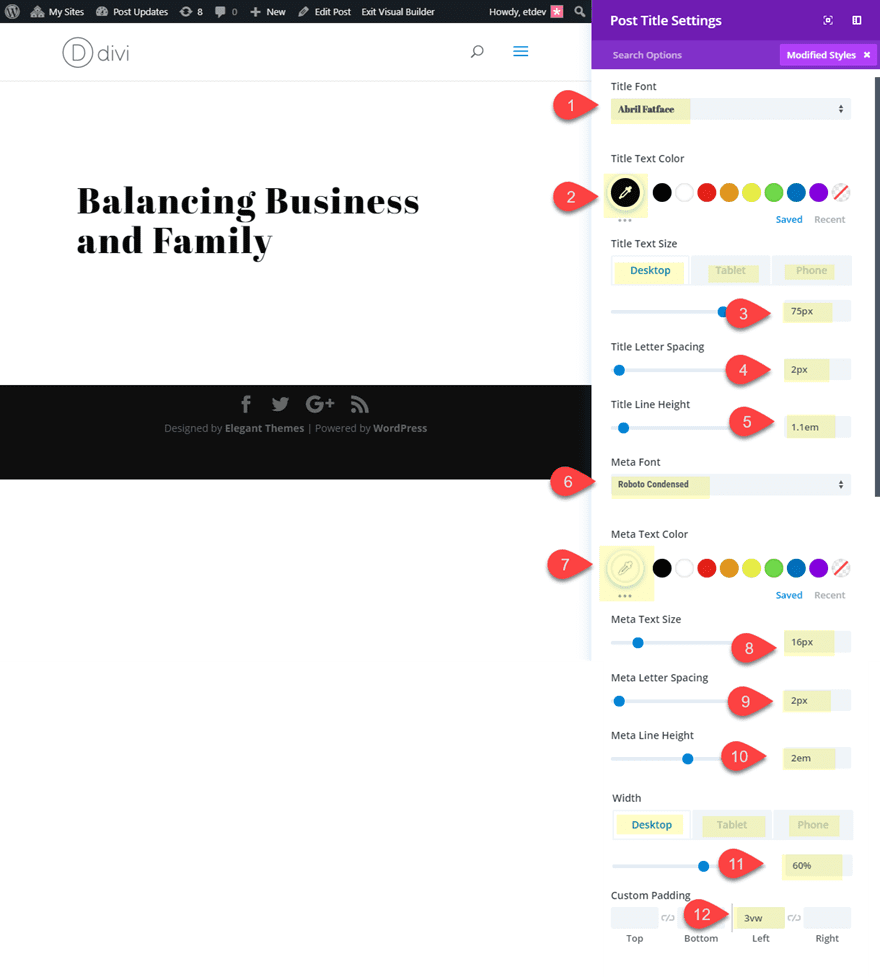
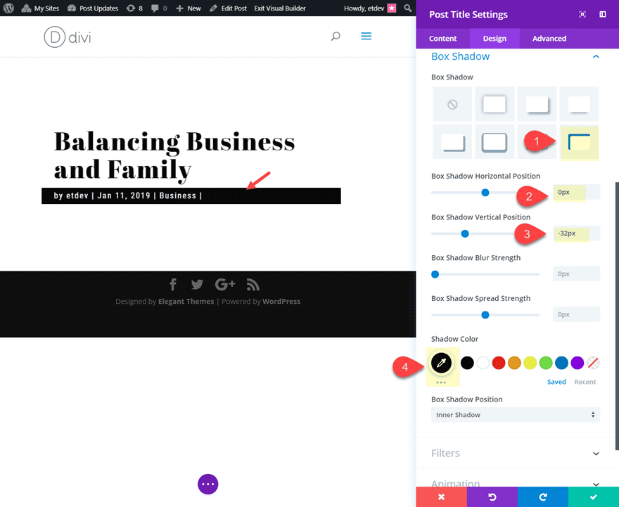
Now let’s add a box shadow to serve as a background to the meta text and make it readable.
Box Shadow: see screenshot
Box Shadow Horizontal Position: 0px
Box Shadow Vertical Position: -32px
Box Shadow Color: #121212
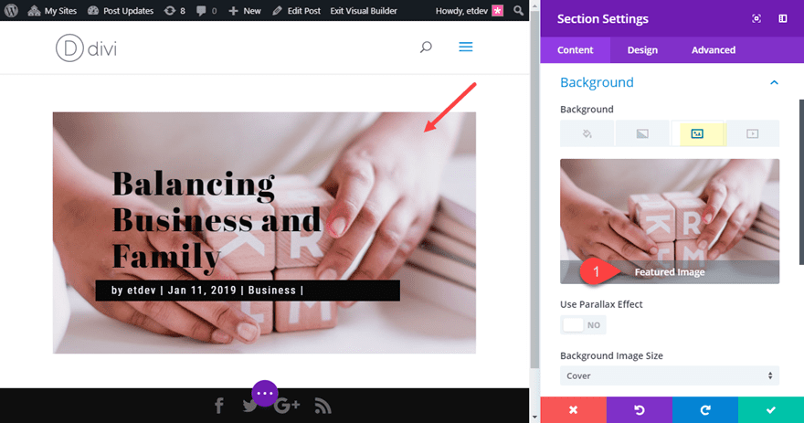
Now we are going to add our featured image to the section background using dynamic content. Open the section settings and click the dynamic content icon in the top right of the background image preview box. Then select featured image from the list to add the featured image to the section.
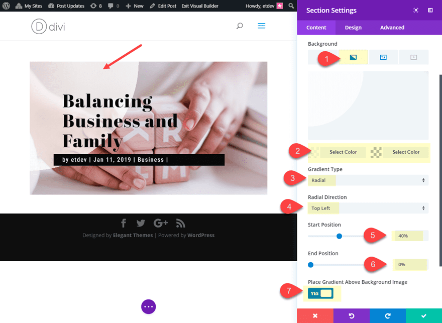
Now let’s add our gradient background element to make the post title text more readable. Simply click the gradient tab and update the following:
Background Gradient Left Color: rgba(255,255,255,0.76)
Background Gradient Right Color: rgba(255,255,255,0)
Gradient Type: Radial
Radial Direction: Top Left
Start Position: 40%
End Position: 0%
Place Gradient Above Background Image: YES
Now let’s see the final design.

#4 Stacking Effect with Dual Featured Images

This design incorporates some box shadows to give the effect of stacking the elements that make up the post title module and the section background. It also uses two versions of the featured image (dynamically) for a unique design element.
Here’s how to do it.
Create a new section with a one-column row. Then add the post module to the row and update the featured image placement to Title/Meta Background Image.
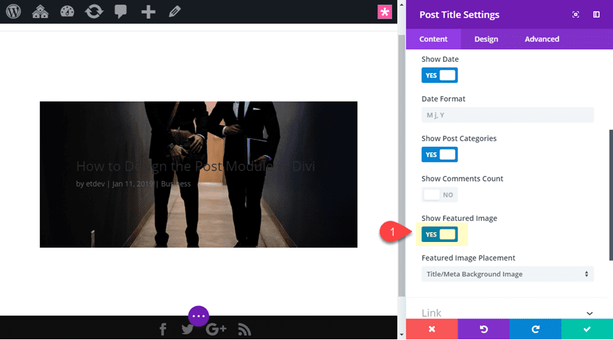
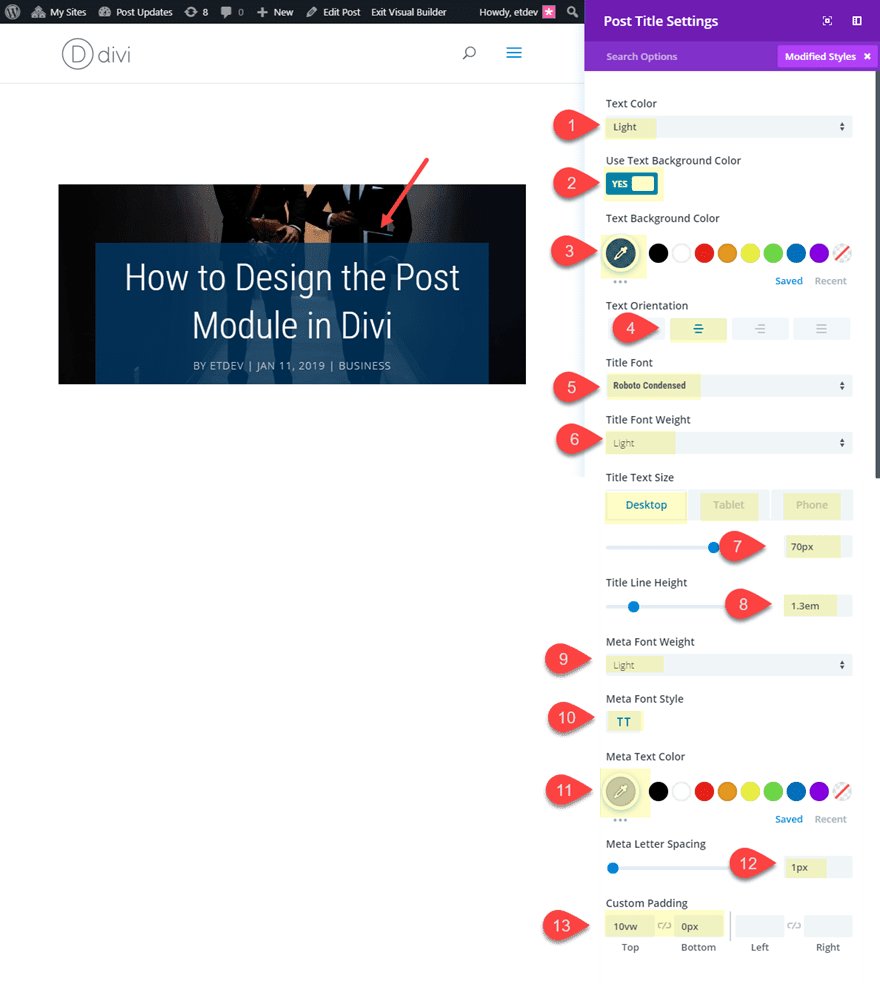
Then update the design settings as follows:
Text Color: light
Text Background Color: rgba(1,59,104,0.79)
Text Orientation: center
Title Font: Roboto Condensed
Title Font Weight: Light
Title Text Size 70px (desktop), 50px (tablet), 30px (smartphone)
Title Line Height: 1.3em
Meta Font Weight: Light
Meta Font Style: TT
Meta Text Color: #cccccc
Meta Letter Spacing: 1px
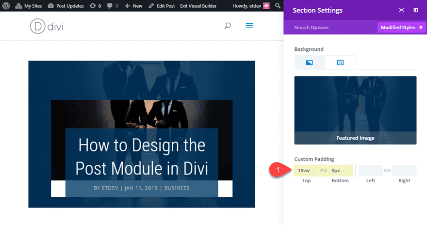
Custom Padding: 10vw top, 0px bottom
Now let’s add our first box shadow to create our first stacking layer.
Box Shadow: see screenshot
Box Shadow Horizontal Position: 0px
Box Shadow Vertical Position: -46px
Shadow Color: #ffffff
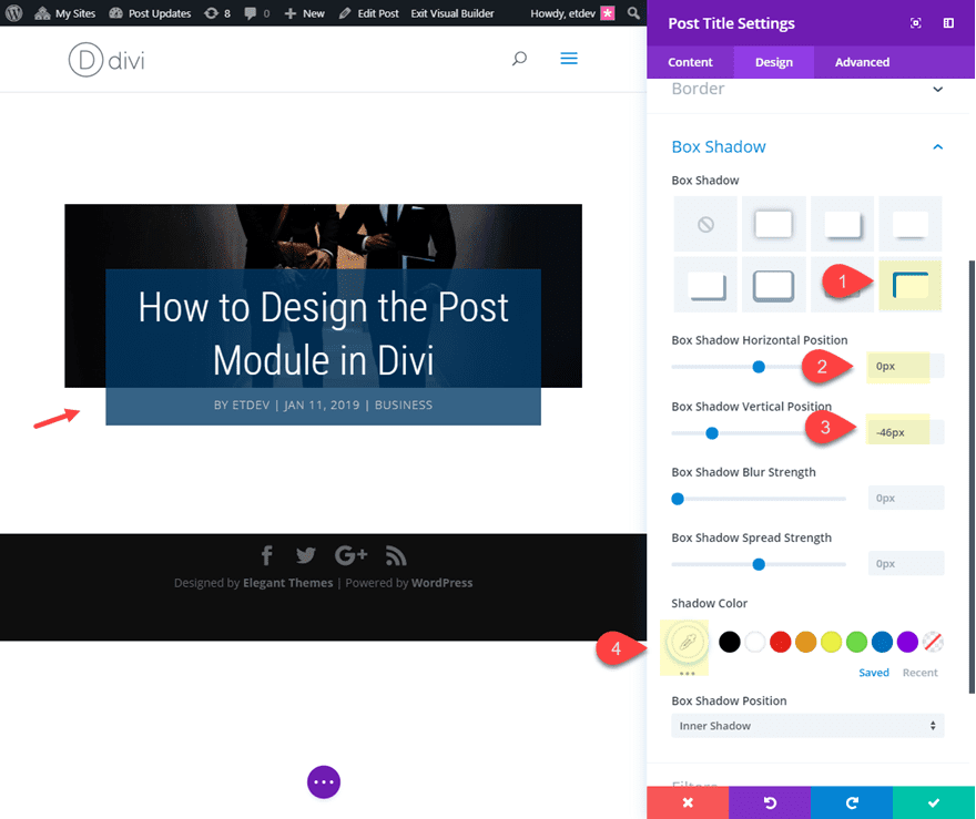
You can see that this also serves as a creative way to divide the title and the meta text as well.
Now save your settings and open the section settings. Add the featured image to your background as dynamic content. Then add a gradient as follows:
Background Gradient Left Color: rgba(1,59,104,0.79)
Background Gradient Right color: rgba(1,59,104,0.79)
Place Gradient Above Background Image: YES
This additional featured image background design is a unique way to give your post title a unique design that will change dynamically with each new featured image.
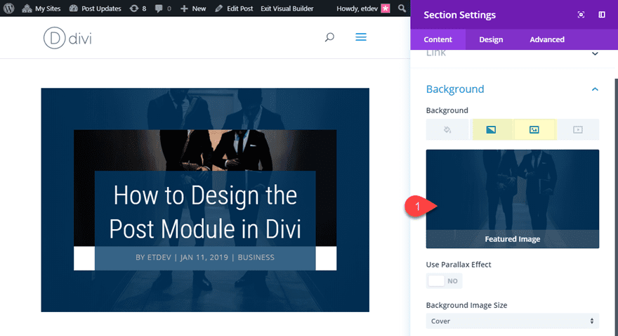
Next, add some custom padding.
Custom Padding (desktop): 10vw top, 0px bottom
Custom Padding (smartphone): 0vw top, 0px bottom
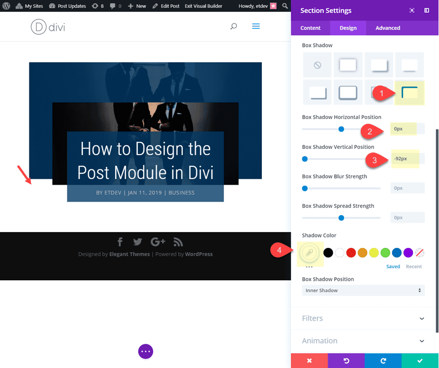
Then add another box shadow to continue the stacking effect.
Box Shadow: see screenshot
Box Shadow Horizontal Position: 0px
Box Shadow Vertical Position: -92px
Shadow Color: #ffffff
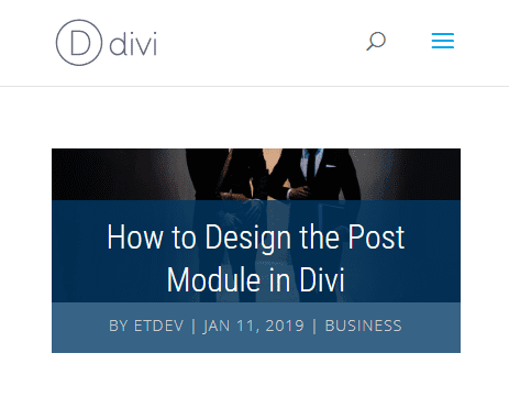
To finish off the design, open the row settings and update the following:
Make This Row fullwidth: YES
Gutter Width: 1
Custom Padding (desktop): 0px top, 0px bottom, 6% left, 6% right
Custom Padding (smartphone: 0px top, 0px bottom, 0% left, 0% right
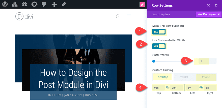
Now check out the final design.

Final Thoughts
With these post title designs, you should have a pretty good grasp of what’s possible with the Divi post title module and the Divi Builder. With just a few design tweaks, combined with the power of dynamic content for featured images, you can create countless unique post title styles for your blog posts. If anything, I hope these will inspire you to create some stunning post titles on your own.
For more related design inspiration, check out our blog post on beautiful and engaging dynamic blog post hero sections and the secret to designing broken grid layouts in Divi.
I look forward to hearing from you in the comments.
Cheers!



In some of the last settings, it states to make the box shadow vertical position -92px for the section. However, the builder will reset to -80px and will not allow anything past that. Any ideas why?
This is a quirk going between the classic backend editor and the visual editor. Visual editor will allow that setting.
These tutorials are great! I wish there were more Post templates tutorial I love them. I”m great at following instructions not so much coming up with my own design ideas! Thanks for the tutorials 🙂
How can we apply a design to all new posts? Without of course coping them?
Unfortunately, this isn’t possible yet. We will incorporate this functionality with the release of the theme builder. https://www.elegantthemes.com/blog/theme-sneak-peeks/divi-feature-sneak-peek-the-divi-theme-builder
Jason, nice article. Some useful and inspiring stuff here for me!
Is there a ETA for this theme builder? Will it be able to change the way in which categories (posts) and search results are displayed?
This “theme builder” sounds amazing, but the post is from may 2018… that doesn’t look too promising…
I’m sorry but these are far from being stunning and I leave it at that!
I constantly check your blog because I’m used to finding good content here. Please don’t just post anything to fill the content void! otherwise you’ll lose your organic readership.
Great article. Thanks for sharing this useful information.
Glad you liked it, Mr Jatt.
I enjoyed this lesson a lot. I have a question. Does this change the look of the post title when the Blog module is used?
Thank you!
MissBianca,
Thanks for the question. This has no effect on the blog module. You will need to style how you want the posts to be displayed on the blog module separately.
Wow, nice work Jason. Once again these Tuts are invaluable for learning how to style different areas of a web site basically using Divi’s settings straight out of the box. Should be enough stimulus there to get the creative juices flowing. Cheers.