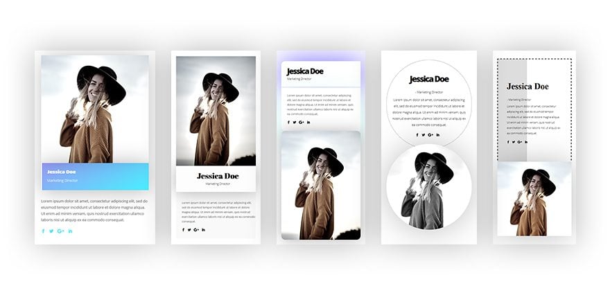
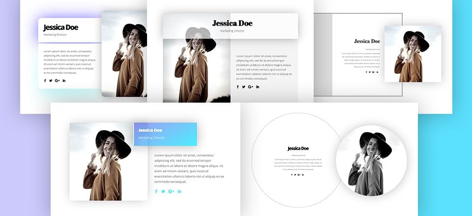
All the new Divi feature updates that have happened over the last couple of months have undeniably expanded the range of possibilities you have when designing websites. For this tutorial, we’ve created 5 different ways to get creative with the Divi Person Module without using any additional CSS code. The main goal of this post is to inspire you before starting your next Divi project. The Person Module is often used to share more information about team members or share testimonials. With these 5 different examples, you’re ready to give your pages a design boost.
Let’s get to it!
Preview
Before we dive into the tutorial, let’s take a quick look at the outcome on different screen sizes.
Desktop

Mobile
Subscribe To Our Youtube Channel
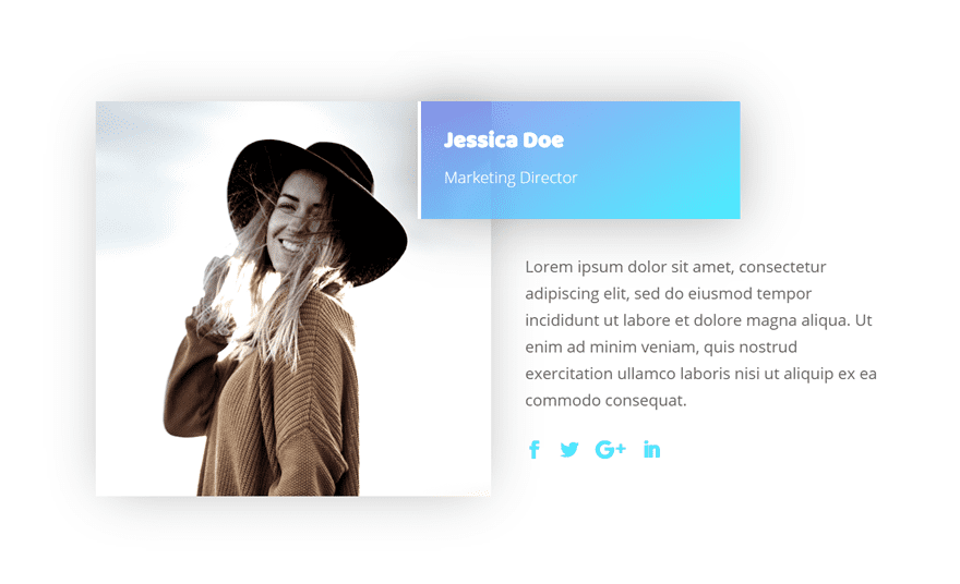
Recreate Example #1
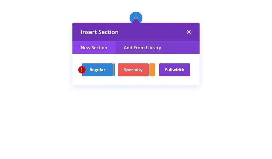
Add New Section
Let’s start creating the first example! Open a new or existing page and add a regular section.
Add New Row
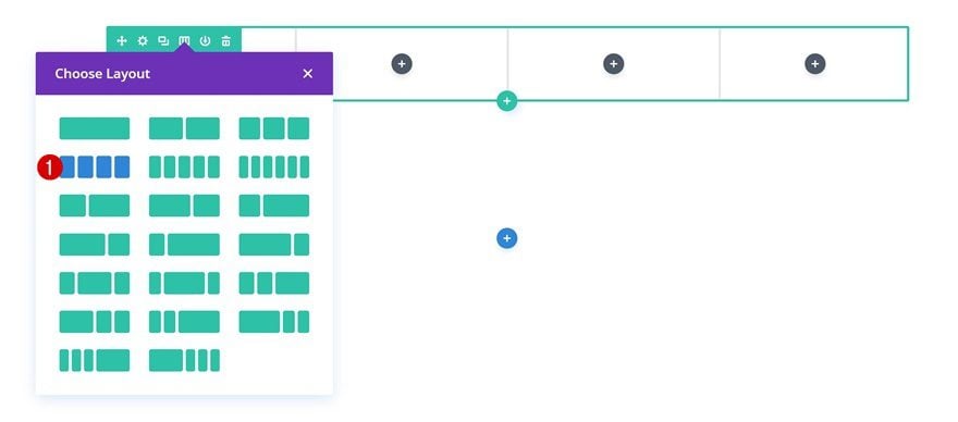
Column Structure
Without modifying the section settings, add a new row using the following column structure:
Sizing
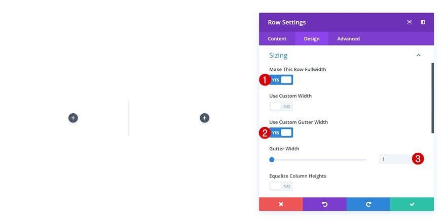
Open the row settings and make some changes to the sizing settings.
- Make This Row Fullwidth: Yes
- Use Custom Gutter Width: Yes
- Gutter Width: 1
Spacing
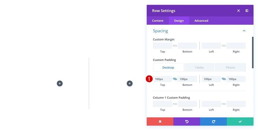
Next, open the spacing settings and add some custom padding values.
- Top Padding: 100px (Desktop), 80px (Tablet & Phone)
- Bottom Padding: 100px (Desktop), 80px (Tablet & Phone)
- Left Padding: 100px (Desktop), 30px (Tablet), 25px (Phone)
- Right Padding: 100px (Desktop), 30px (Tablet), 25px (Phone)
Add Image Module to Column 1
Upload Image
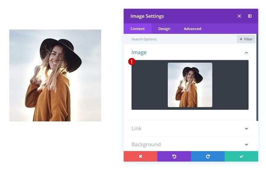
Time to start adding modules! Add an Image Module to the first column and upload a squared image of choice.
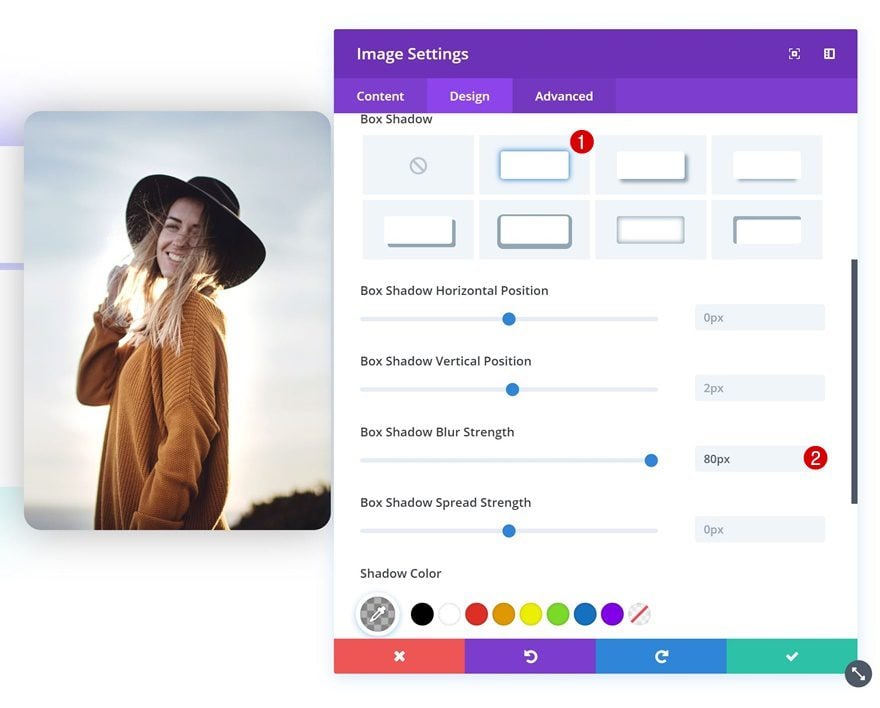
Box Shadow
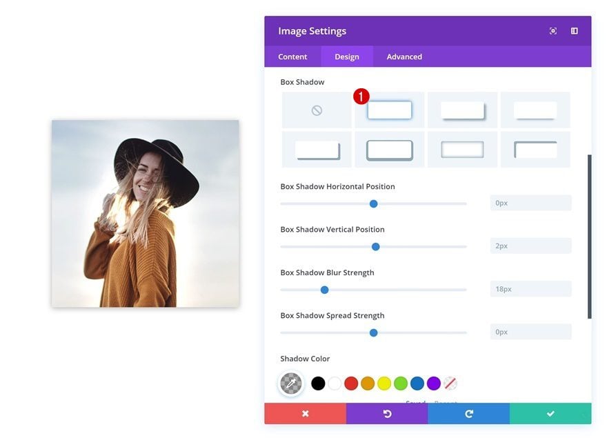
Continue by going to the design tab and applying a subtle box shadow.
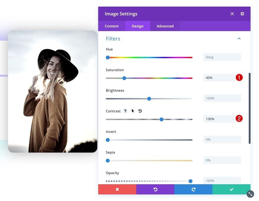
Filters
You can also play around with the filters settings to add an effect to your image.
- Saturation: 40%
- Contrast: 130%
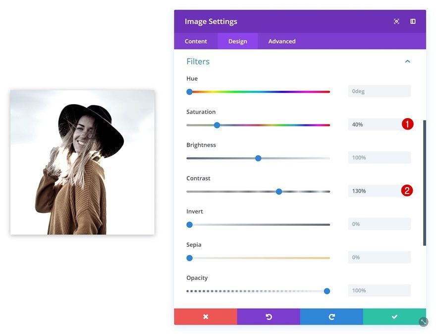
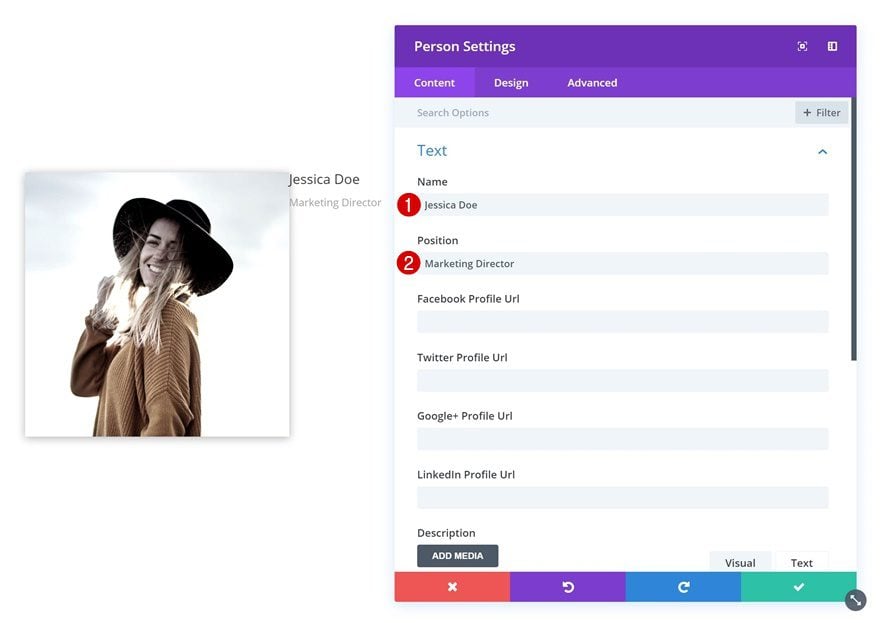
Add Person Module #1 to Column 2
Add Content
The next module we’ll need is a Person Module. Go ahead and add one to the second column and fill in the name and position fields.
Gradient Background
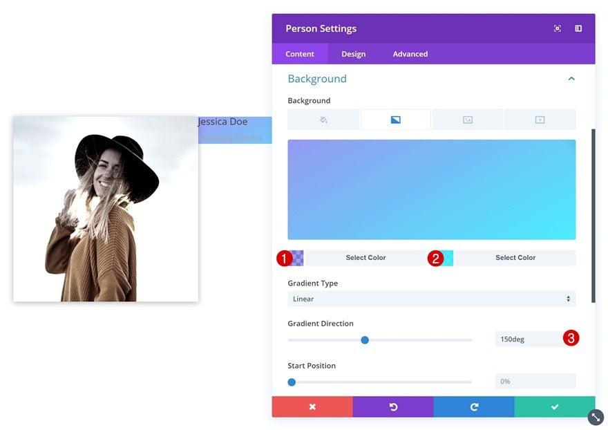
Add a gradient background to this module.
- Color 1: rgba(11,15,229,0.41)
- Color 2: rgba(45,237,255,0.87)
- Gradient Direction: 150deg
Title Text Settings
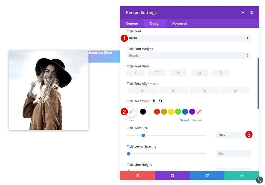
Then, change the title text settings in the design tab.
- Title Font: Baloo
- Title Text Color: #ffffff
- Title Text Size: 20px
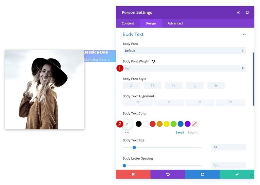
Body Text Settings
Modify the body text settings as well.
- Body Font Weight: Light
- Body Text Color: #ffffff
Spacing
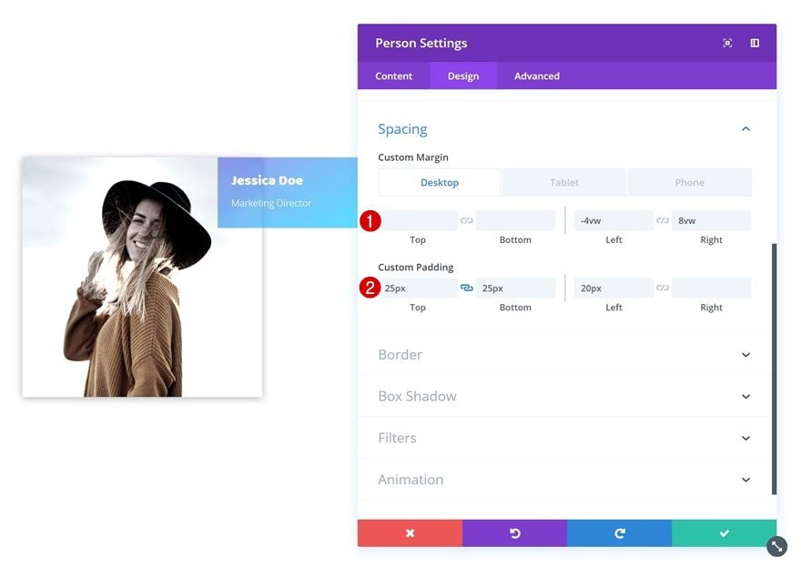
And add some custom margin and padding values in the spacing settings.
- Left Margin: -4vw (Desktop & Tablet), 0vw (Phone)
- Right Margin: 8vw (Desktop & Tablet), 0vw (Phone)
- Top Padding: 25px
- Bottom Padding: 25px
- Left Padding: 20px
Border
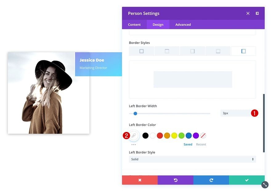
We’re also adding a subtle left border to the module.
- Left Border Width: 3px
- Left Border Color: #ffffff
Box Shadow
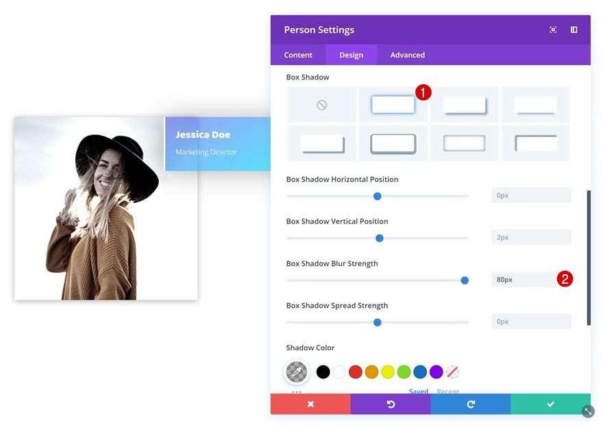
Along with a box shadow that’ll help you create depth on the page.
- Box Shadow Blur Strength: 80px
Add Person Module #2 to Column 2
Add Content
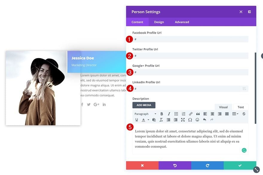
Add another Person Module right below the previous one. We’re using this module to show the social media profiles and the description.
Icon Settings
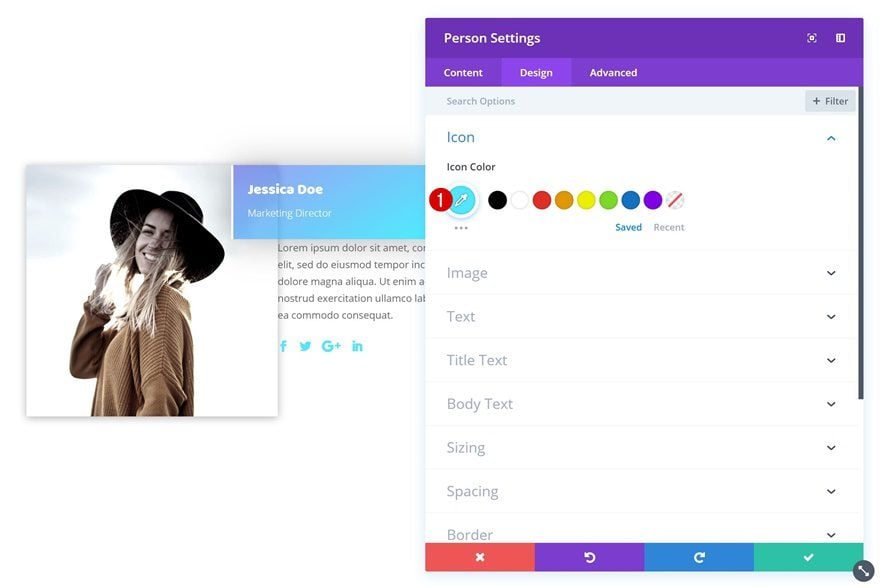
Go to the design tab and change the icon color in the icon settings.
- Icon Color: #50e8fe
Spacing
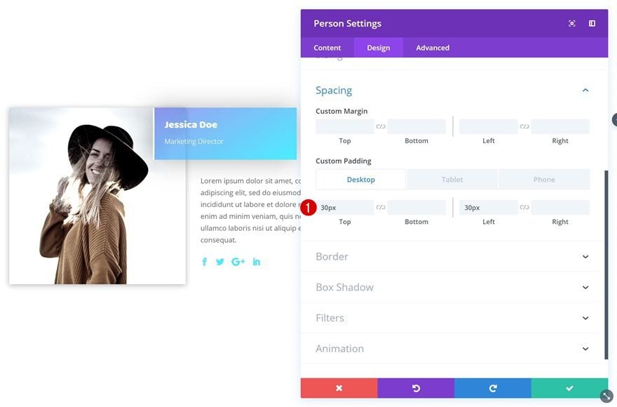
Last but not least, open the spacing settings and add some custom padding values.
- Top Padding: 30px
- Left Padding: 30px (Desktop & Tablet), 0px (Phone)
Recreate Example #2
Add New Section
On to the next example! Add a new section to your page.

Add New Row
Column Structure
Add a new row to this section using the following column structure.
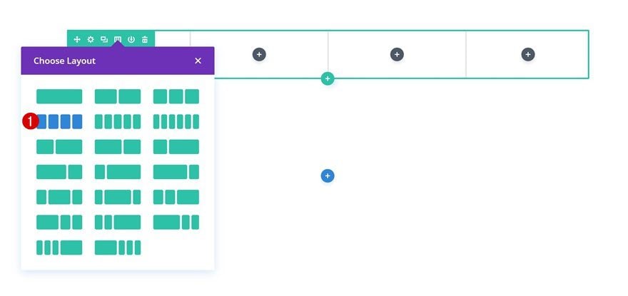
Column 2 Background Color
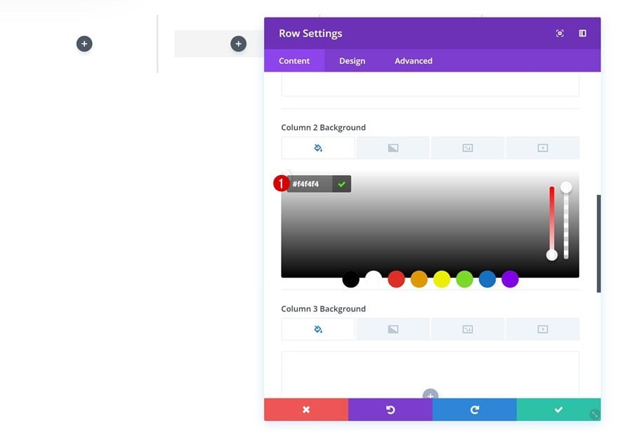
Without adding any modules yet, open the row settings and add a column 2 background color.
- Column 2 Background Color: #f4f4f4
Sizing
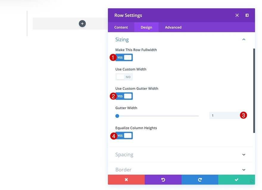
Then, go to the design tab and make some changes to the sizing settings.
- Make This Row Fullwidth: Yes
- Use Custom Gutter Width: Yes
- Gutter Width: 1
- Equalize Column Heights: Yes
Spacing
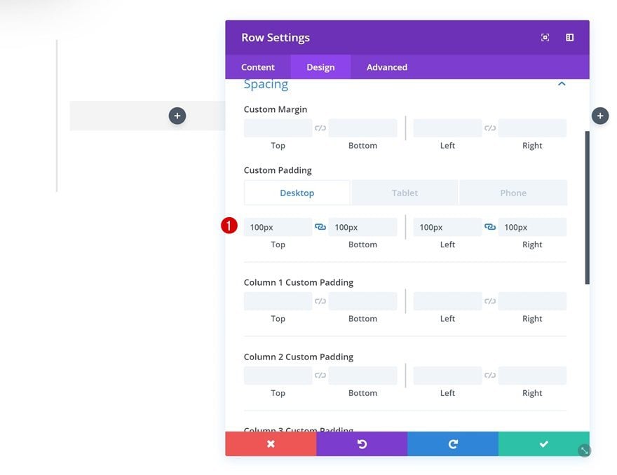
Add some custom padding values in the spacing settings as well.
- Top Padding: 100px (Desktop), 80px (Tablet & Phone)
- Bottom Padding: 100px (Desktop), 80px (Tablet & Phone)
- Left Padding: 100px (Desktop), 30px (Tablet), 25px (Phone)
- Right Padding: 100px (Desktop), 30px (Tablet), 25px (Phone)
Add Image Module to Column 1
Upload Image
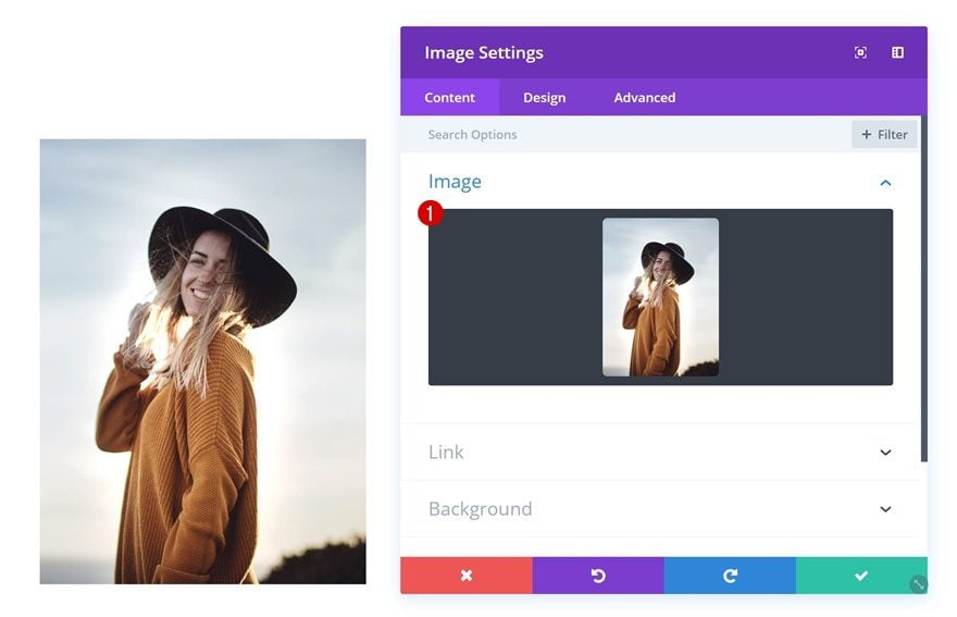
Time to start adding modules! The first module we’ll need is an Image Module in column 1. Upload an image of choice.
Box Shadow
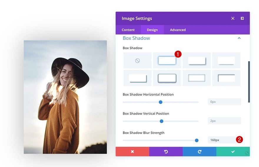
Then, add a box shadow to the image.
- Box Shadow Blur Strength: 160px
Filters
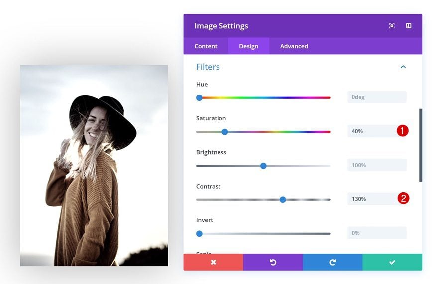
You can also play around with the filters settings.
- Saturation: 40%
- Contrast: 130%
Add Person Module #1 to Column 2
Add Content
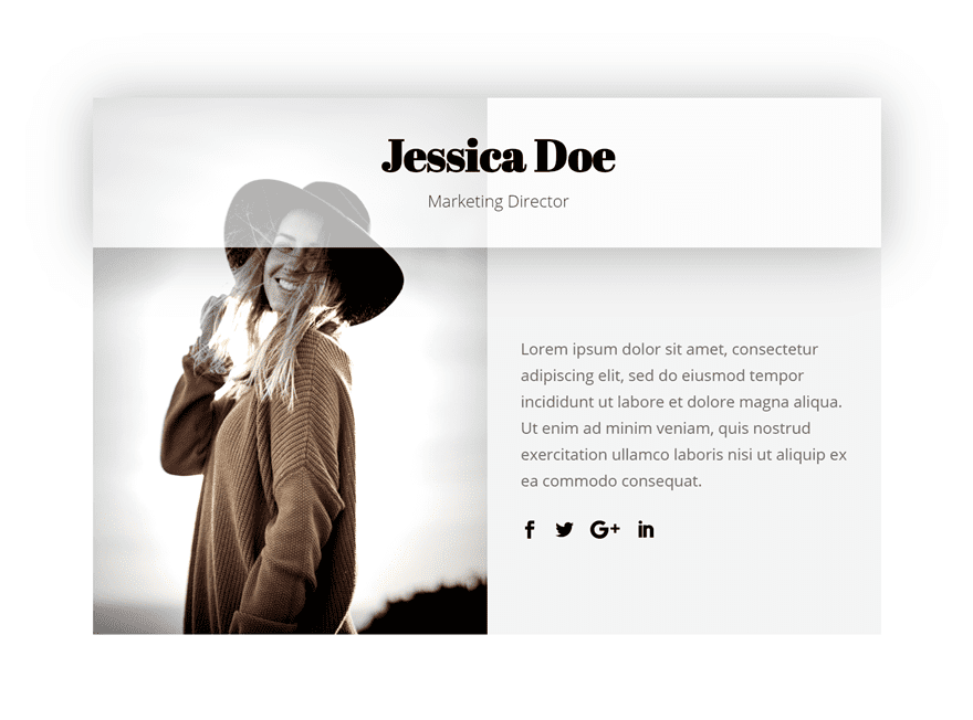
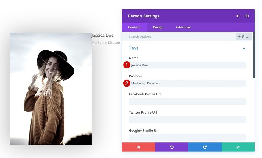
In the second column, the first module we’ll need is a Person Module. Fill in the name and position fields.
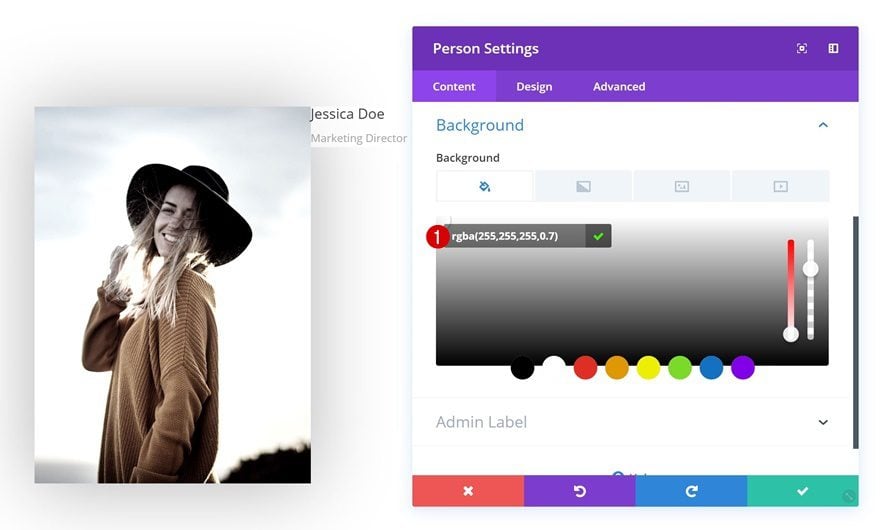
Background Color
Go to the background settings and add a transparent background color.
- Background Color: rgba(255,255,255,0.7)
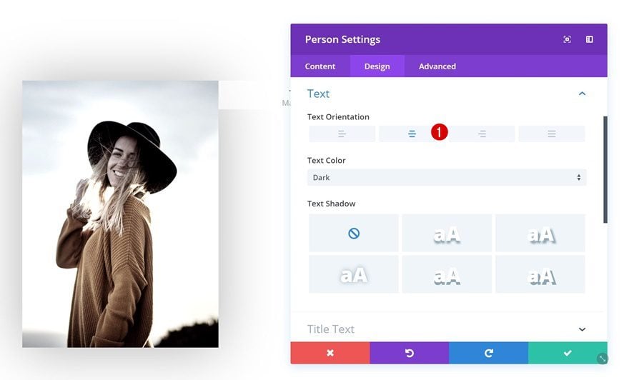
Text Settings
Then, change the text orientation in the text settings.
- Text Orientation: Center
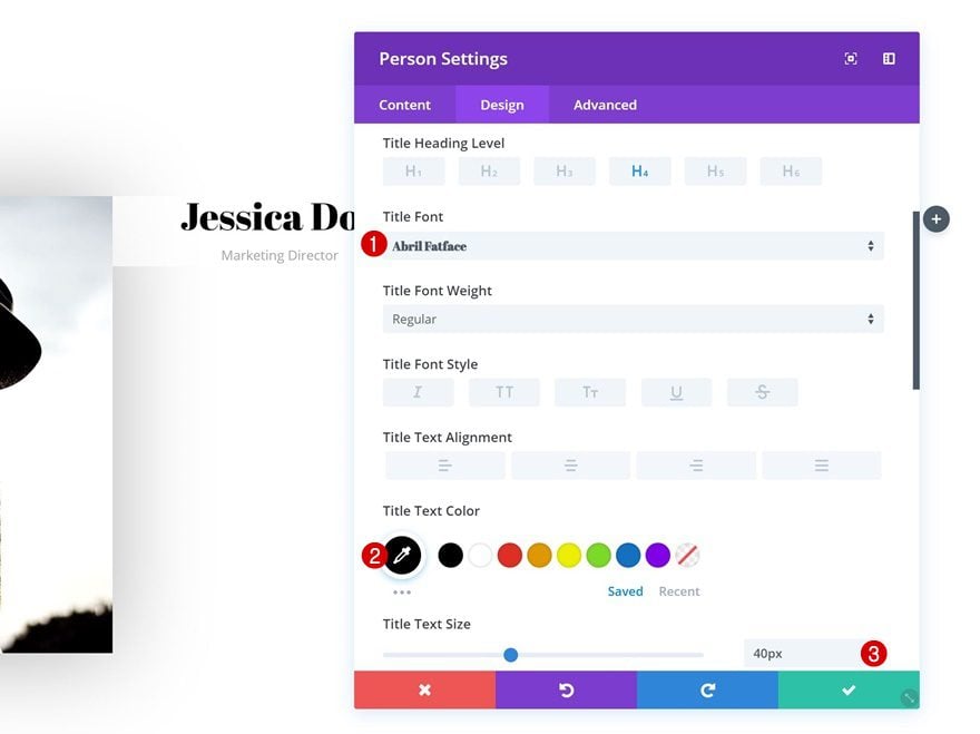
Title Text Settings
Change the title text settings as well.
- Title Font: Abril Fatface
- Title Text Color: #000000
- Title Text Size: 40px
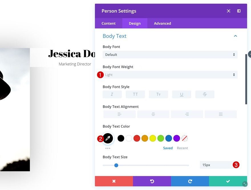
Body Text Settings
Along with the body text settings.
- Body Font Weight: Light
- Body Text Color: #000000
- Body Text Size: 15px
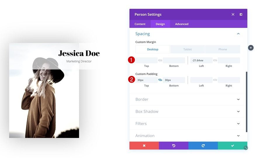
Spacing
We’re creating an overlap by using some negative left margin in the spacing settings.
- Left Margin: -21.64vw (Desktop), -46.1vw (Tablet), 0vw (Phone)
- Top Padding: 30px
- Bottom Padding: 30px
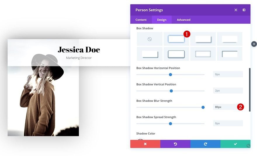
Box Shadow
And we’re applying a subtle box shadow as well.
- Box Shadow Blur Strength: 80px
Add Person Module #2 to Column 2
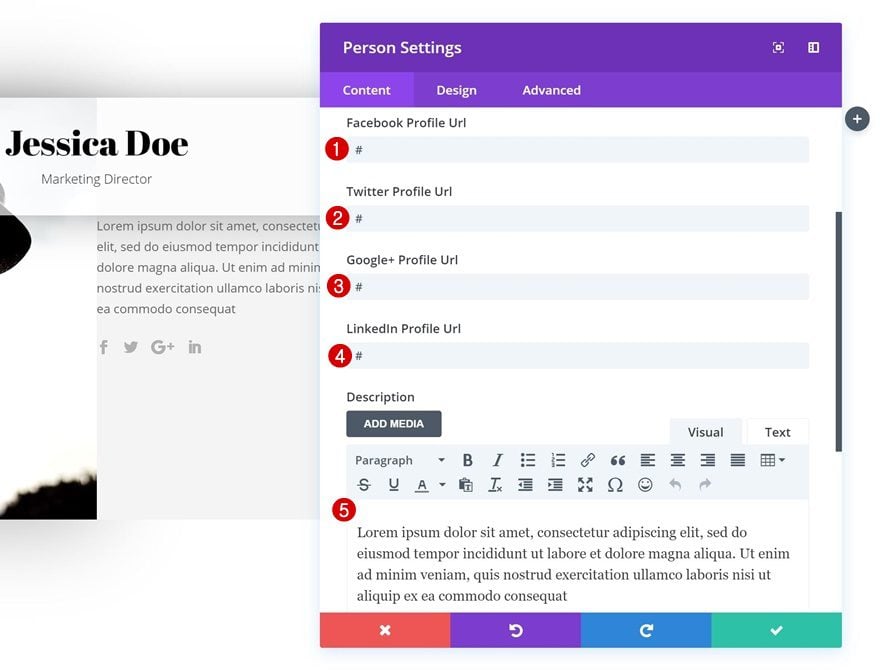
Add Content
The second module we need in column 2 is another Person Module. Here, we’re adding the social media links and description.
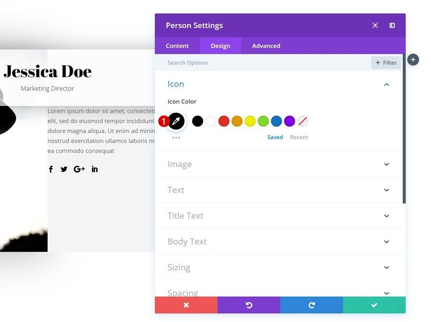
Icon Settings
Continue by going to the design tab and changing the icon color in the icon settings.
- Icon Color: #000000
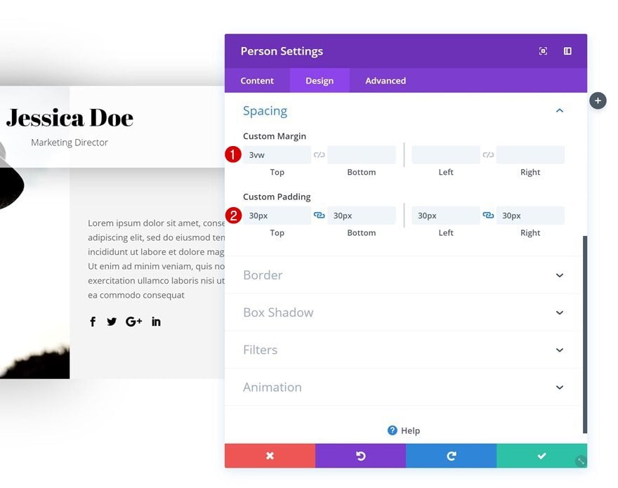
Spacing
Add some custom margin and padding values as well.
- Top Margin: 3vw
- Top Padding: 30px
- Bottom Padding: 30px
- Left Padding: 30px
- Right Padding: 30px
Recreate Example #3
Add New Section
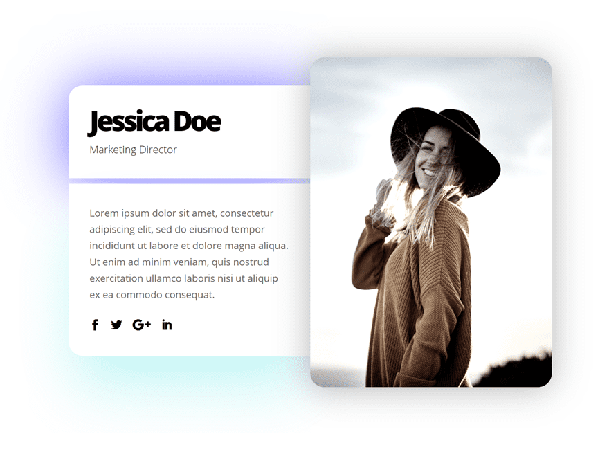
On to the third example! Add a new section to your page.

Add New Row
Column Structure
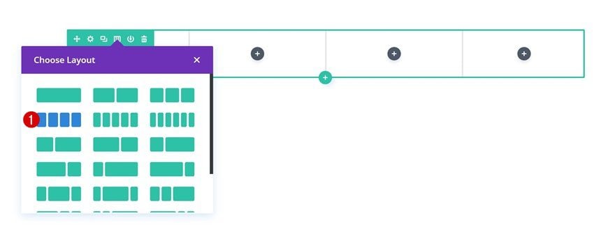
Then, add a new row to the section using the following column structure:
Sizing
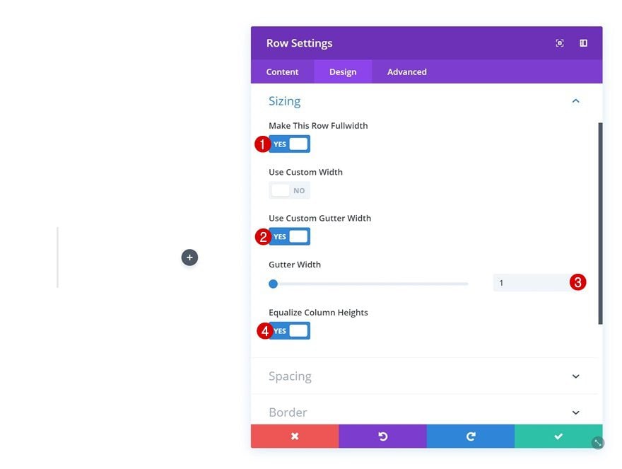
Open the row settings and change the sizing settings.
- Make This Row Fullwidth: Yes
- Use Custom Gutter Width: Yes
- Gutter Width: 1
- Equalize Column Heights: Yes
Spacing
Add some custom padding values as well.
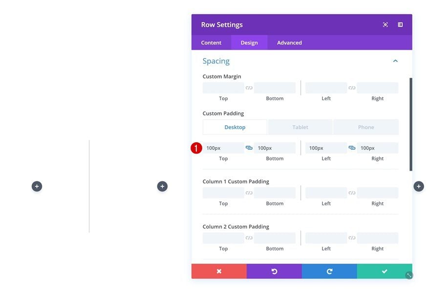
- Top Padding: 100px (Desktop), 80px (Tablet & Phone)
- Bottom Padding: 100px (Desktop), 80px (Tablet & Phone)
- Left Padding: 100px (Desktop), 30px (Tablet), 25px (Phone)
- Right Padding: 100px (Desktop), 30px (Tablet), 25px (Phone)
Add Person Module #1 to Column 1
Add Content
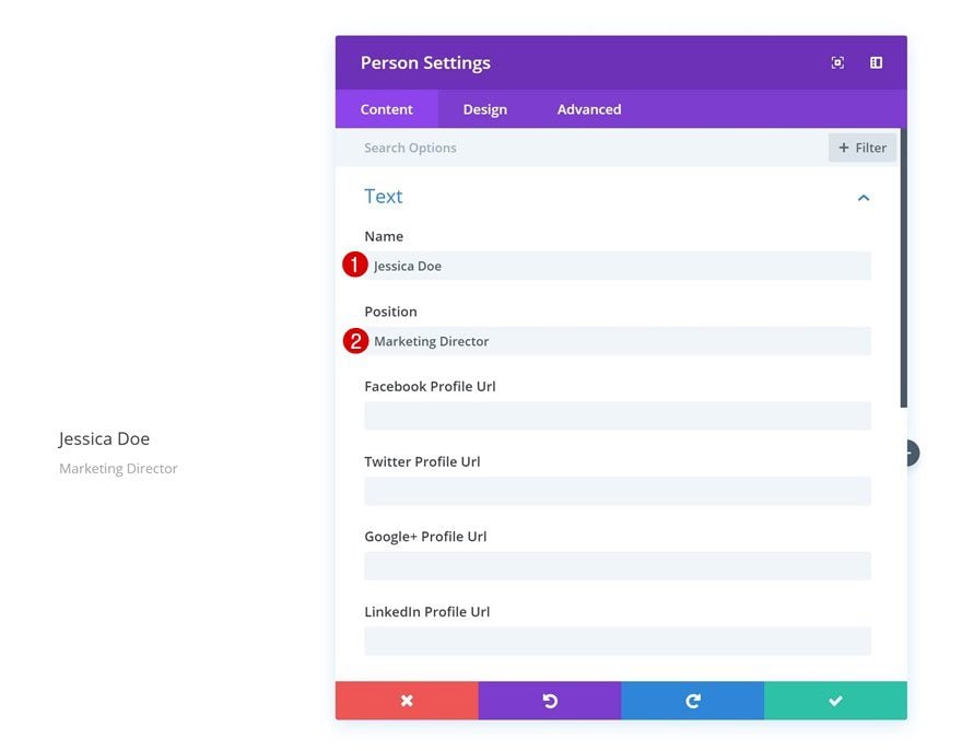
Time to start adding modules! Add the first Person Module to column 1 and fill in the name and position fields.
Background Color
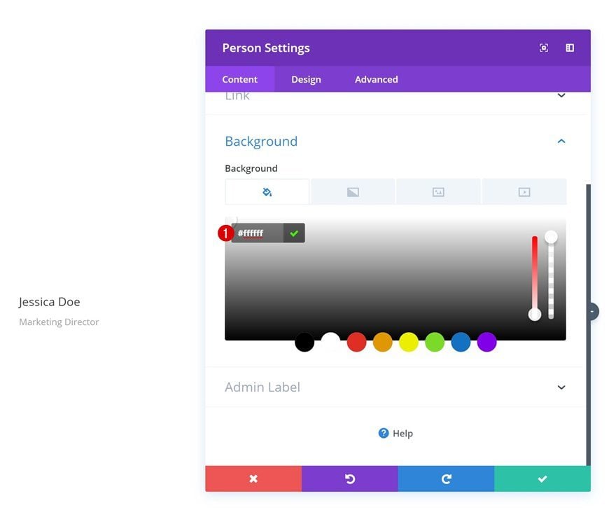
Then, add a background color to the module.
- Background Color: #ffffff
Title Text Settings
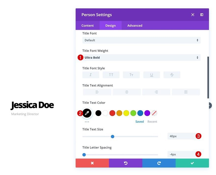
Modify the title text settings as well.
- Title Font Weight: Ultra Bold
- Title Text Color: #000000
- Title Text Size: 40px
- Title Letter Spacing: -4px
Body Text Settings
Do the same for the body text settings.
- Body Font Weight: Light
- Body Text Color: #000000
- Body Text Size: 15px
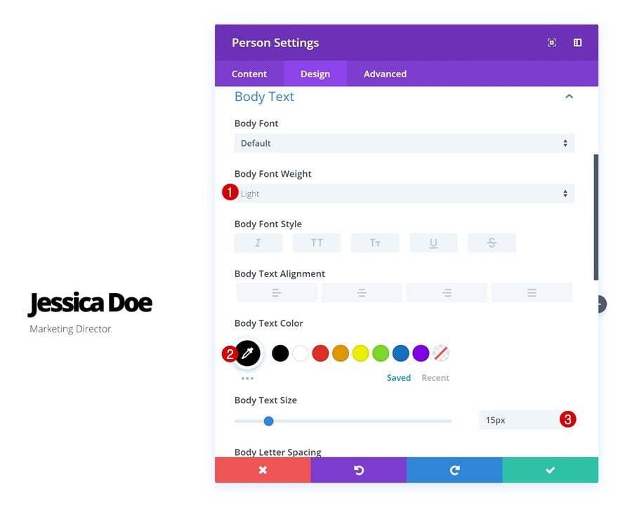
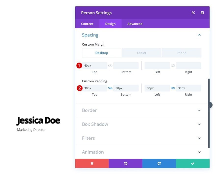
Spacing
Continue by going to the spacing settings and add some custom margin and padding values.
- Top Margin: 40px (Desktop), 0px (Tablet & Phone)
- Top Padding: 30px
- Bottom Padding: 30px
- Left Padding: 30px
- Right Padding: 30px
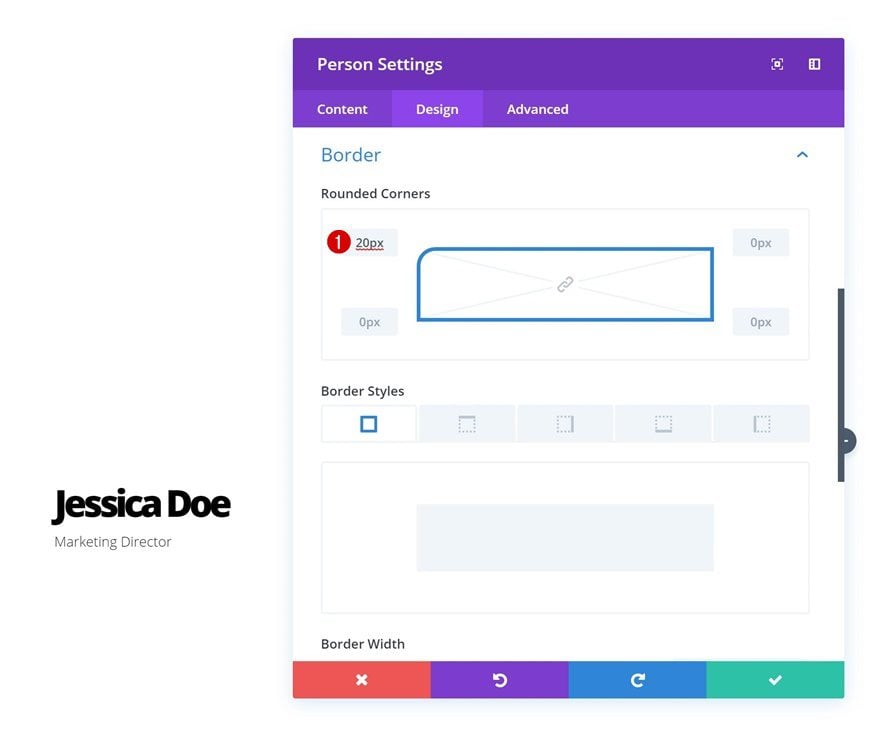
Border
Add ’20px’ to the top left corner in the border settings as well.
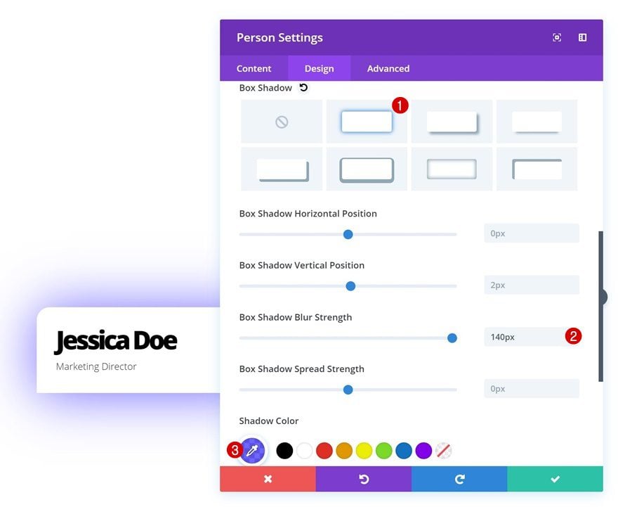
Box Shadow
And give the module a colorful box shadow.
- Box Shadow Blur Strength: 140px
- Shadow Color: rgba(31,15,255,0.66)
Add Person Module #2 to Column 1
Add Content
On to the second person module in column 1! Use this module to display the social media links and description.
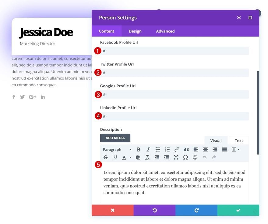
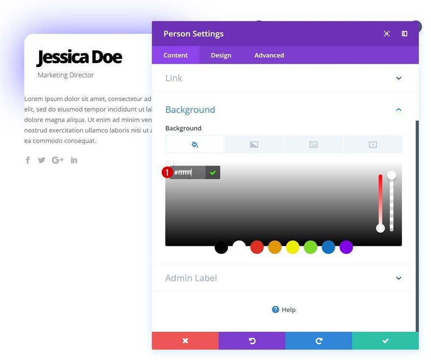
Background Color
Then, go to the background settings and add a white background color.
- Background Color: #ffffff
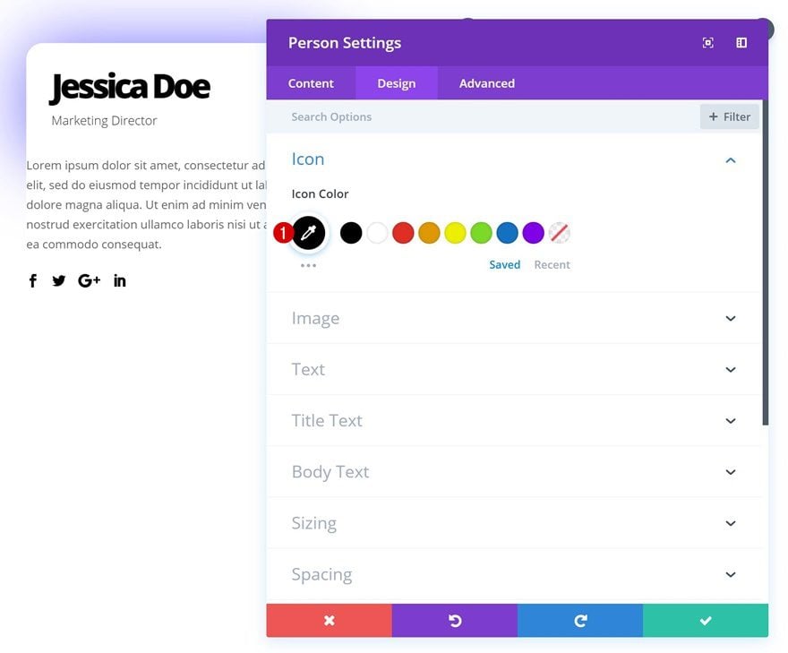
Icon Settings
Change the icon color as well.
- Icon Color: #000000
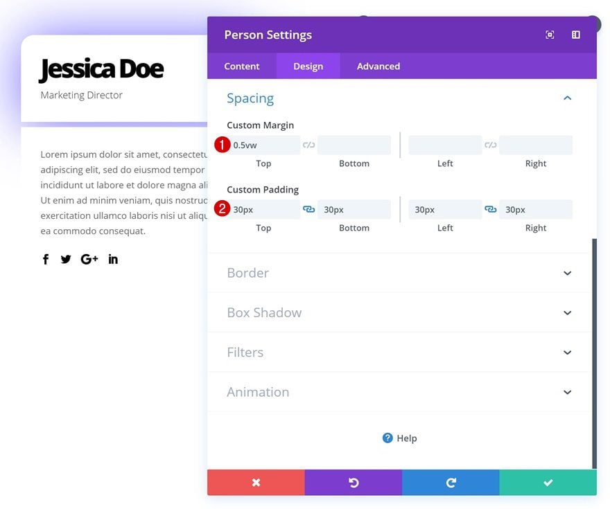
Spacing
Continue by adding some custom spacing values in the spacing settings.
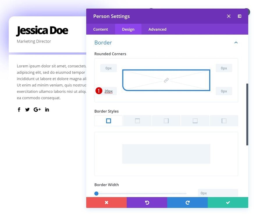
Border
And add ’20px’ to the bottom left corner.
Box Shadow
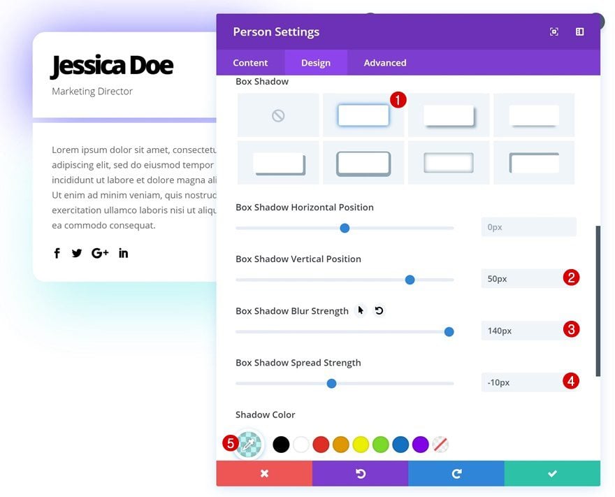
Last but not least, add the box shadow.
- Box Shadow Vertical Position: 50px
- Box Shadow Blur Strength: 140px
- Box Shadow Spread Strength: -10px
- Shadow Color: rgba(2,219,219,0.26)
Add Image Module to Column 2
Upload Image
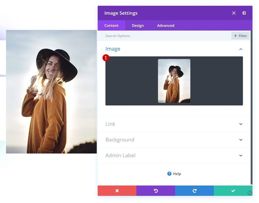
The next module we’ll need is an image module. Go ahead and add one to the second column and upload an image of choice.
Border
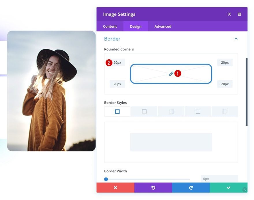
Give this module ’20px’ of rounded corners in the border settings.
Box Shadow
And add a subtle box shadow.
Filters
Again, feel free to play around with the filters settings to change the appearance of the image.
Recreate Example #4
Add New Section
On to the fourth example! Add a new section to your page.

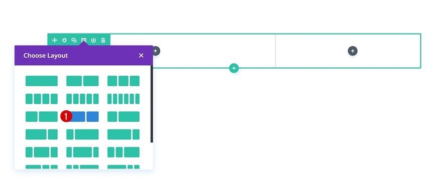
Add New Row
Column Structure
Continue by adding a new row to the section using the following column structure:
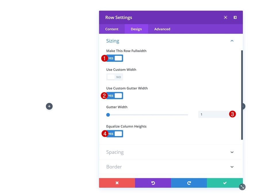
Sizing
Without adding any modules yet, open the row settings and modify the sizing settings.
- Make This Row Fullwidth: Yes
- Use Custom Gutter Width: Yes
- Gutter Width: 1
- Equalize Column Heights: Yes
Spacing
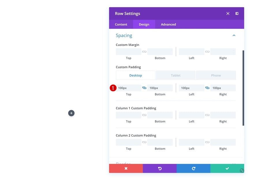
Change the spacing settings as well.
- Top Padding: 100px (Desktop), 80px (Tablet & Phone)
- Bottom Padding: 100px (Desktop), 80px (Tablet & Phone)
- Left Padding: 100px (Desktop), 30px (Tablet), 25px (Phone)
- Right Padding: 100px (Desktop), 30px (Tablet), 25px (Phone)
Add Person Module to Column 1
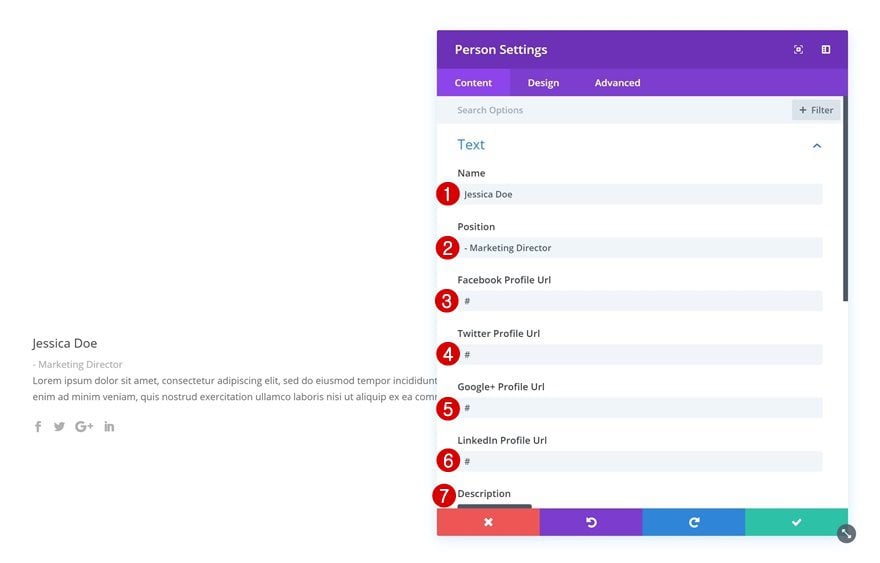
Add Content
Time to start adding modules! Add a Person Module to column 1 and fill in all the fields.
Icon Settings
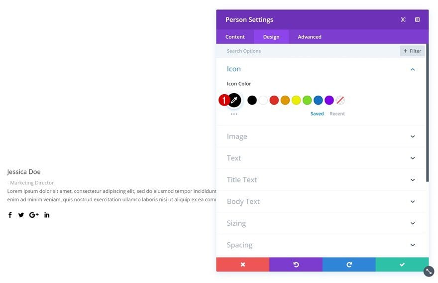
Then, go to the icon settings and change the icon color.
- Icon Color: #000000
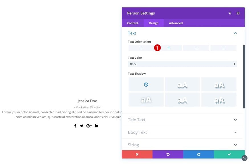
Text Settings
Change the text orientation in the text settings as well.
- Text Orientation: Center
Title Text Settings
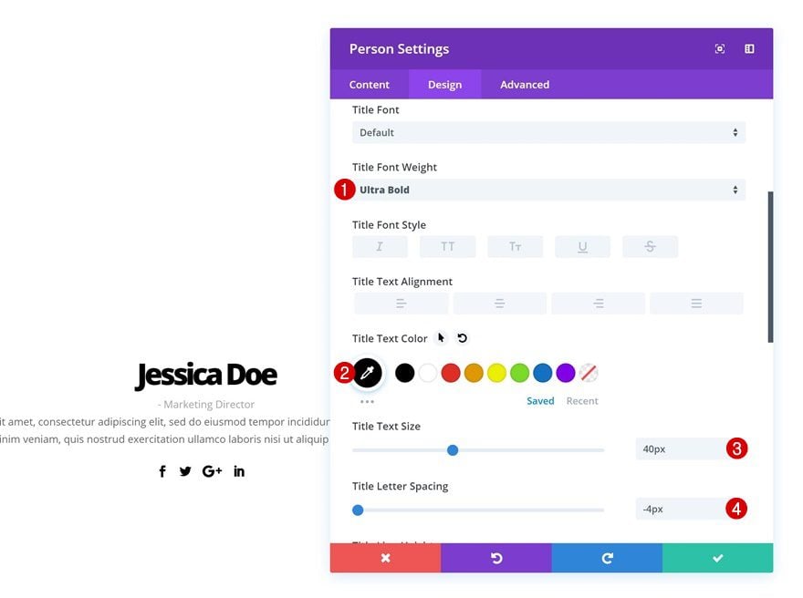
Then, open the title text settings and make some changes.
- Title Font Weight: Ultra Bold
- Title Text Color: #000000
- Title Text Size: 40px
- Title Letter Spacing: -4px
Body Text Settings
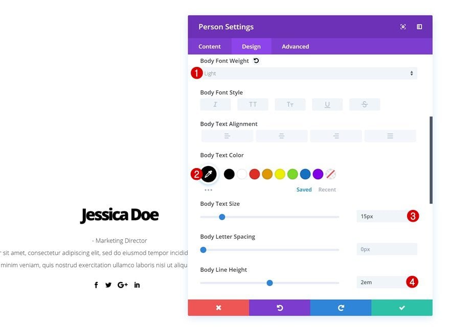
Modify the body text settings as well.
- Body Font Weight: Light
- Body Text Color: #000000
- Body Text Size: 15px
- Body Line Height: 2em
Spacing
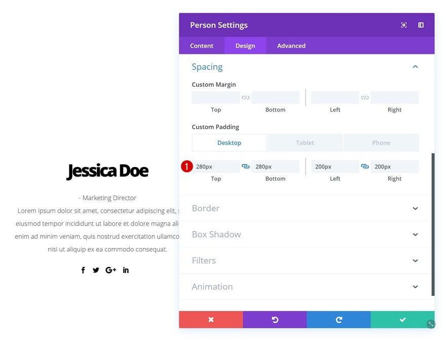
And create a shape using custom padding values in the spacing settings.
- Top Padding: 280px (Desktop), 200px (Tablet), 50px (Phone)
- Bottom Padding: 280px (Desktop), 200px (Tablet), 50px (Phone)
- Left Padding: 200px (Desktop), 150px (Tablet), 20px (Phone)
- Right Padding: 200px (Desktop), 150px (Tablet), 20px (Phone)
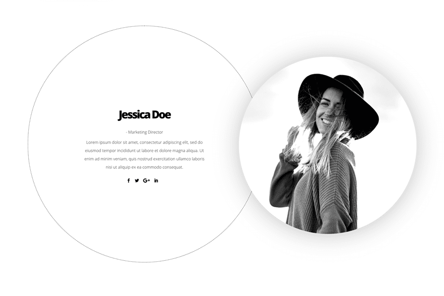
Border
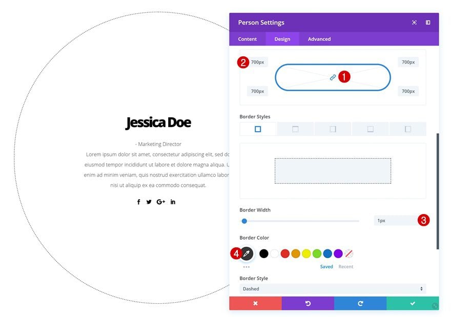
Create a circle by adding ‘700px’ to each one of the corners in the border settings and add a subtle border as well.
- Border Width: 1px
- Border Color: #333333
Add Image Module to Column 2
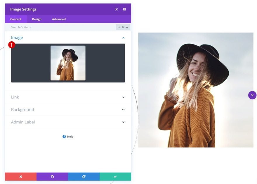
Upload Image
Continue by adding an Image Module to the second column and upload a squared image of choice.
Spacing
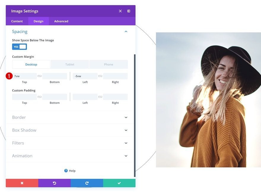
Modify the spacing settings of this module.
- Top Margin: 7vw (Desktop), -15vw (Tablet), -5vw (Phone)
- Left Margin: -5vw (Desktop), 0vw (Tablet & Phone)
Border
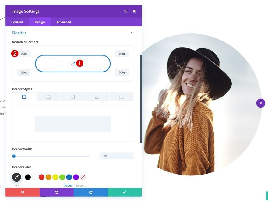
Create a circle shape out of this image by adding ‘1000px’ to each one of the corners of the module.
Box Shadow
Add a subtle box shadow as well.
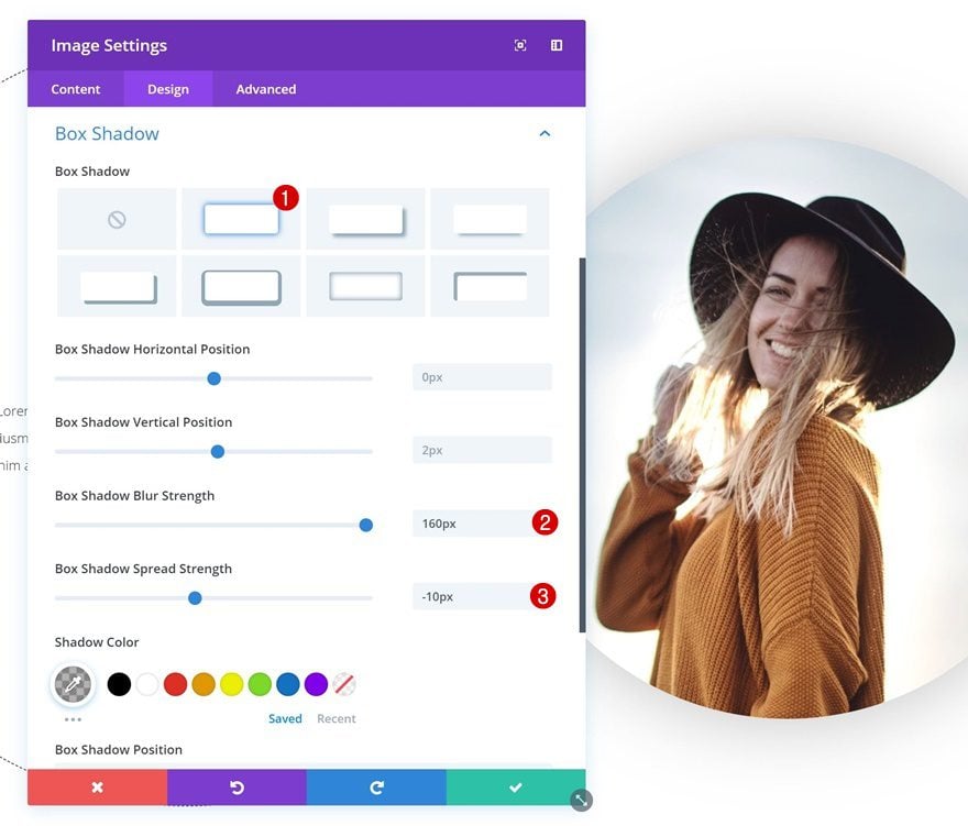
- Box Shadow Blur Strength: 160px
- Box Shadow Spread Strength: -10px
Filters
And finish the design by playing around with the filters settings of the image.
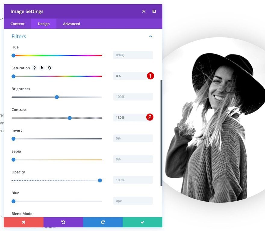
- Saturation: 0%
- Contrast: 130%
Recreate Example #5
Add New Section
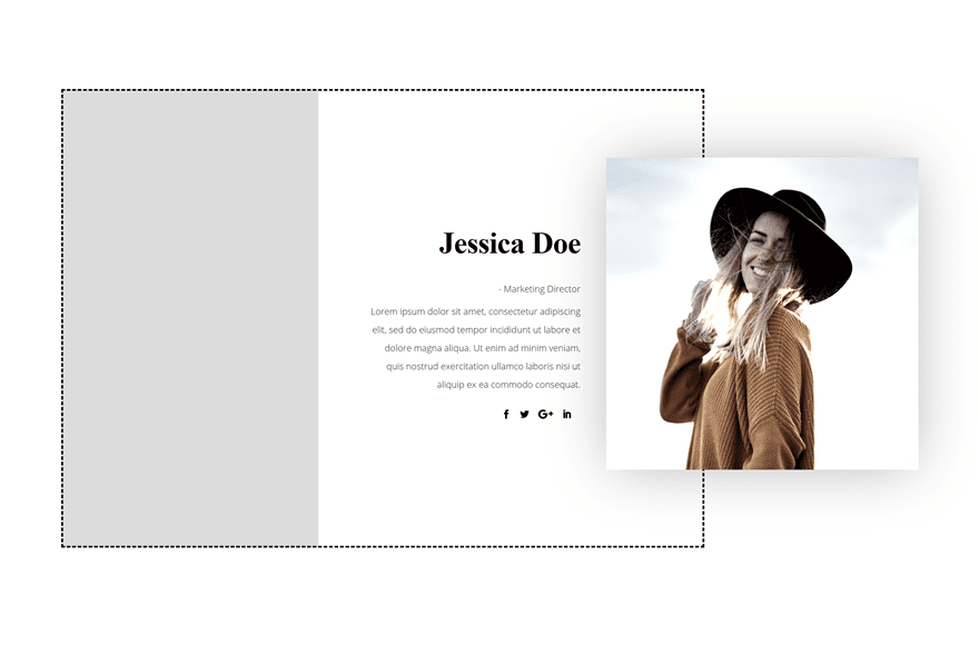
On to the next and last example! Add a new section to your page.

Add New Row
Column Structure
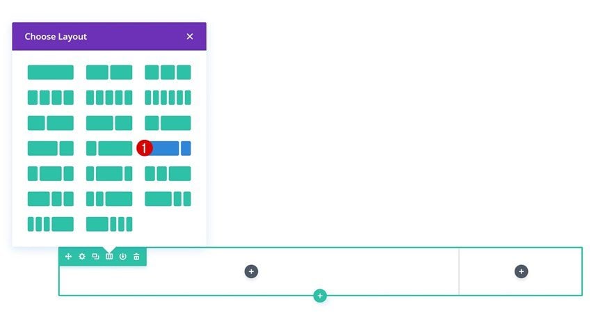
Continue by adding a new row using the following column structure:
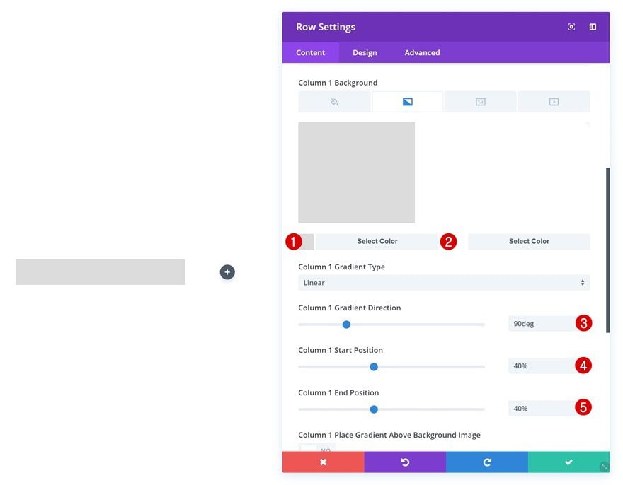
Column 1 Gradient Background
Open the row settings and add a column 1 gradient background.
- Color 1: #dddddd
- Color 2: #ffffff
- Column 1 Gradient Direction: 90deg
- Column 1 Start Position: 40%
- Column 1 End Position: 40%
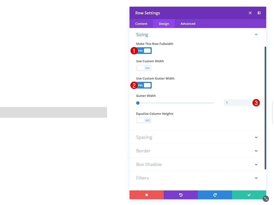
Sizing
Then, go to the sizing settings and make some changes.
- Make This Row Fullwidth: Yes
- Use Custom Gutter Width: Yes
- Gutter Width: 1
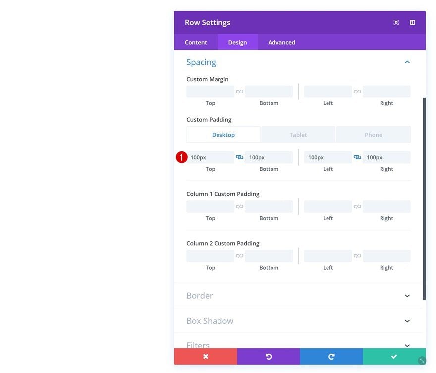
Spacing
Add some custom padding values to the row as well.
- Top Padding: 100px (Desktop), 80px (Tablet & Phone)
- Bottom Padding: 100px (Desktop), 80px (Tablet & Phone)
- Left Padding: 100px (Desktop), 30px (Tablet), 25px (Phone)
- Right Padding: 100px (Desktop), 30px (Tablet), 25px (Phone)
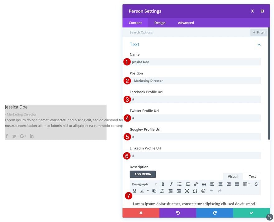
Add Person Module to Column 1
Add Content
Time to start adding modules! Add a Person Module to column 1 and fill in all the fields.
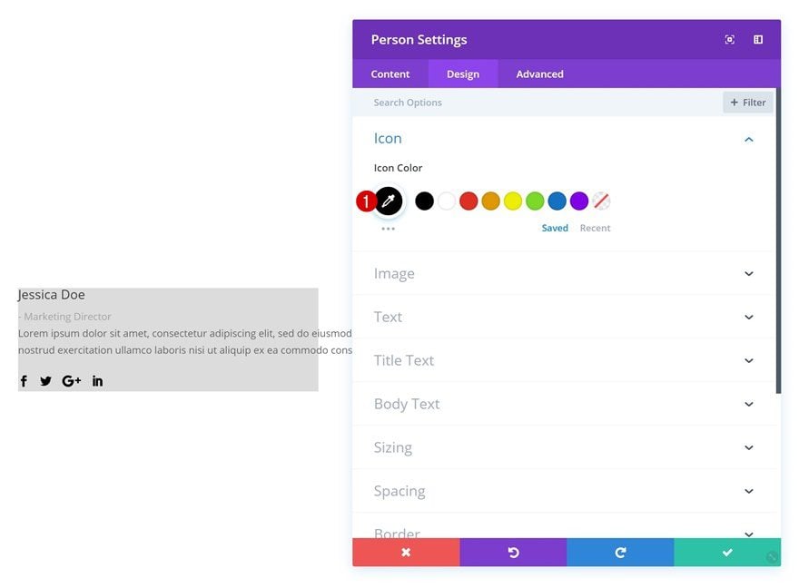
Icon Settings
Then, change the icon color in the icon settings.
- Icon Color: #000000
Text Settings
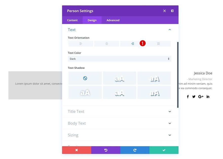
Change the text orientation in the text settings as well.
- Text Orientation: Right
Title Text Settings
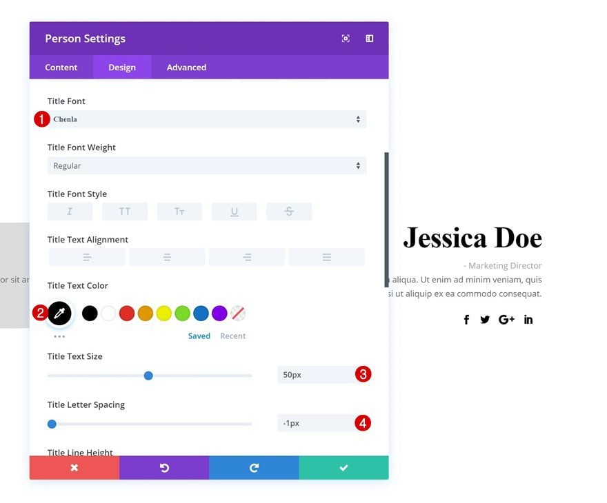
Next, make some changes to the title text settings.
- Title Font: Chenla
- Title Text Color: #000000
- Title Text Size: 50px
- Title Letter Spacing: -1px
Body Text Settings
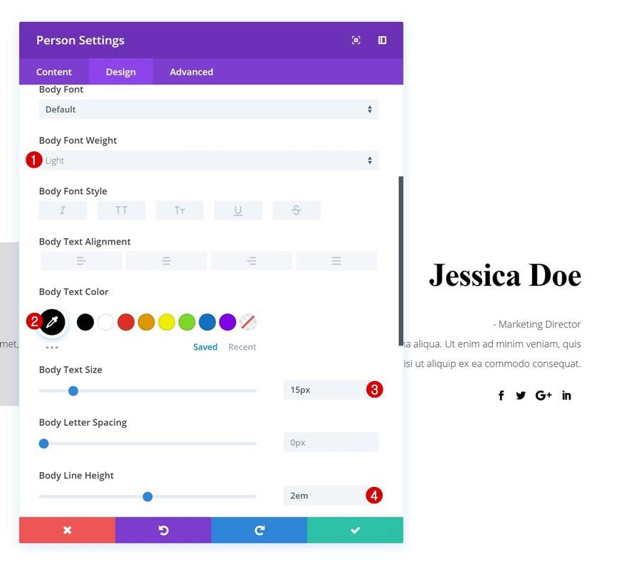
Do the same for the body text settings.
- Body Font Weight: Light
- Body Text Color: #000000
- Body Text Size: 15px
- Body Line Height: 2em
Spacing
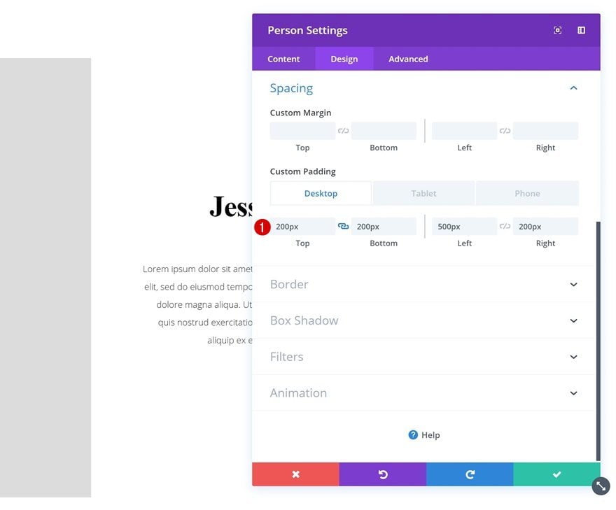
Continue by adding some custom padding values to the spacing settings of the module.
- Top Padding: 200px (Desktop), 100px (Tablet & Phone)
- Bottom Padding: 200px (Desktop), 100px (Tablet & Phone)
- Left Padding: 500px (Desktop), 250px (Tablet), 50px (Phone)
- Right Padding: 200px (Desktop), 100px (Tablet), 50px (Phone)
Border
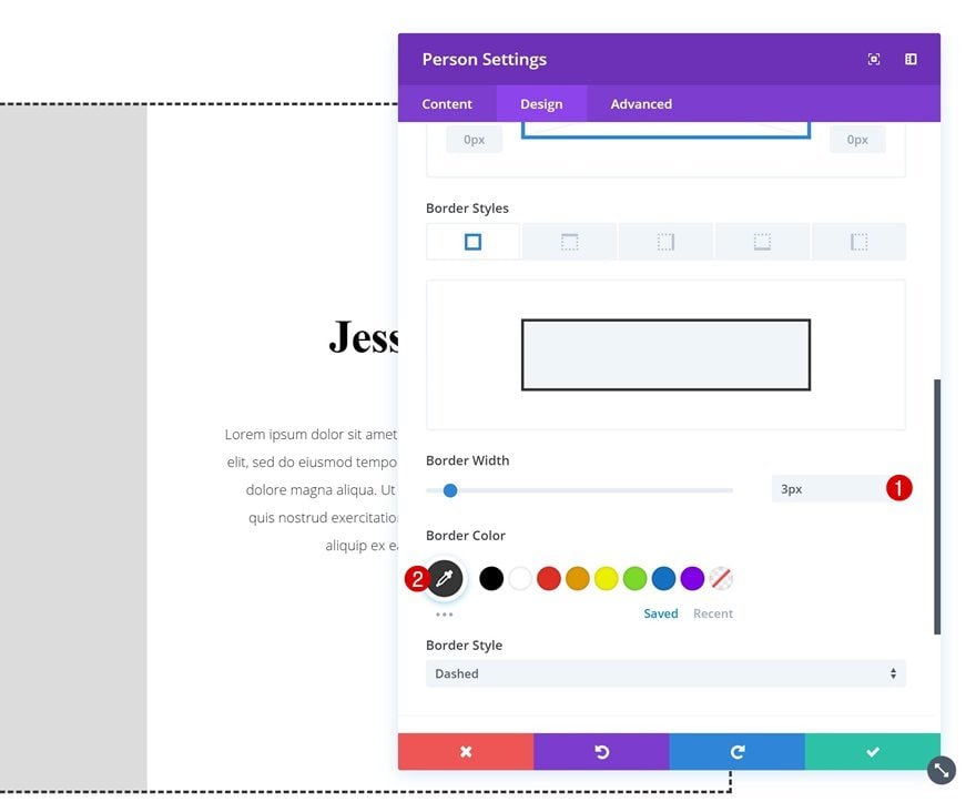
Lastly, add a border to the module.
Add Image Module to Column 2
Upload Image
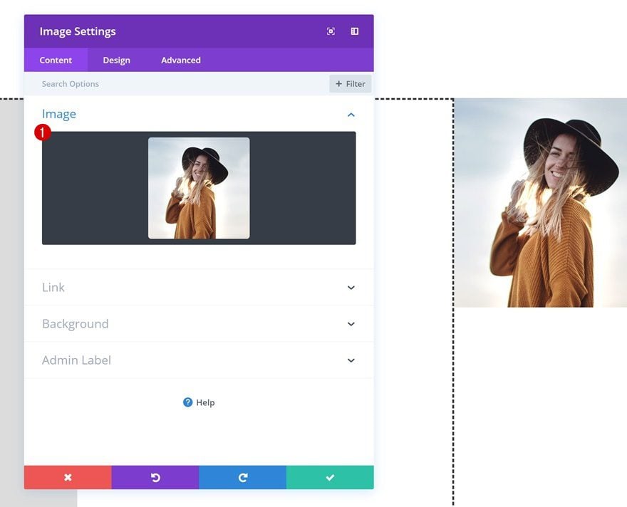
The next module we’ll need is an Image Module in column 2. Go ahead and upload a squared image of choice.
Spacing
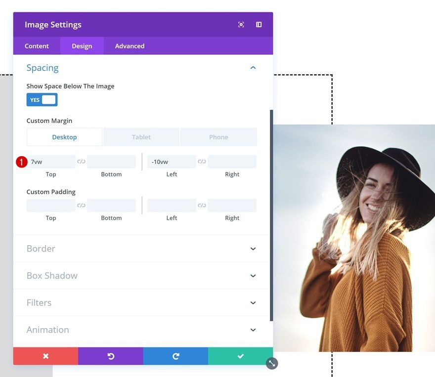
Then, make some changes to the spacing settings of this module.
- Top Margin: 7vw (Desktop), -2vw (Tablet & Phone)
- Left Margin: -10vw (Desktop), 0vw (Tablet & Phone)
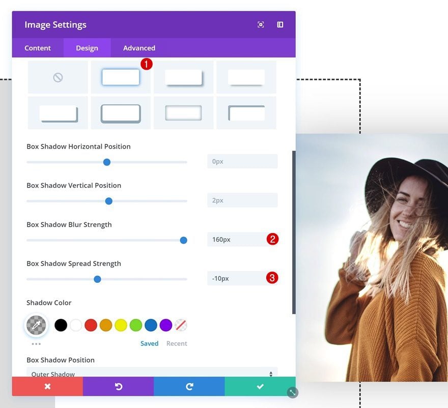
Box Shadow
Give the Image Module a box shadow as well.
- Box Shadow Blur Strength: 160px
- Box Shadow Spread Strength: -10px
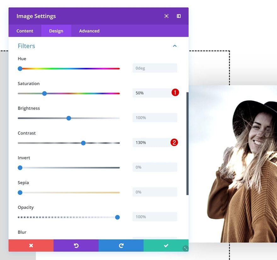
Filters
And to top it off, play around with the filters settings.
- Saturation: 50%
- Contrast: 130%
Preview
Now that we’ve gone through all the steps, let’s take a final look at the outcome on different screen sizes.
Desktop

Mobile

Final Thoughts
In this post, we’ve shown you 5 different ways to get creative with the Divi Person Module. You can use these examples for any website you’re building and create your own alternative versions by tweaking the settings of each design element. If you have any questions or suggestions, make sure you leave a comment in the comment section below!




I really like this module, but have come to a halt because when I try to put am image in column 4 and the person modules in column 3 (i.e. a mirror image to Example #1), I can’t find a way to make the Person Module #1 (containing the name and position) to overlap in front of the image.
Please help!
What size should the picture be for example #3? I am having spacing issues with the different screen sizes.
thanks! let me suggest that a demo page with the working examples will be very appreciated
+1 Download file or demo page would be awesome 😀
+1
Amazing. Thanks
Those exemples are just awesome, thank you
Any chance e can have a json download file please?
I second that.
This is some great designs of the person module in Divi. Will be using some of these defenatly.