
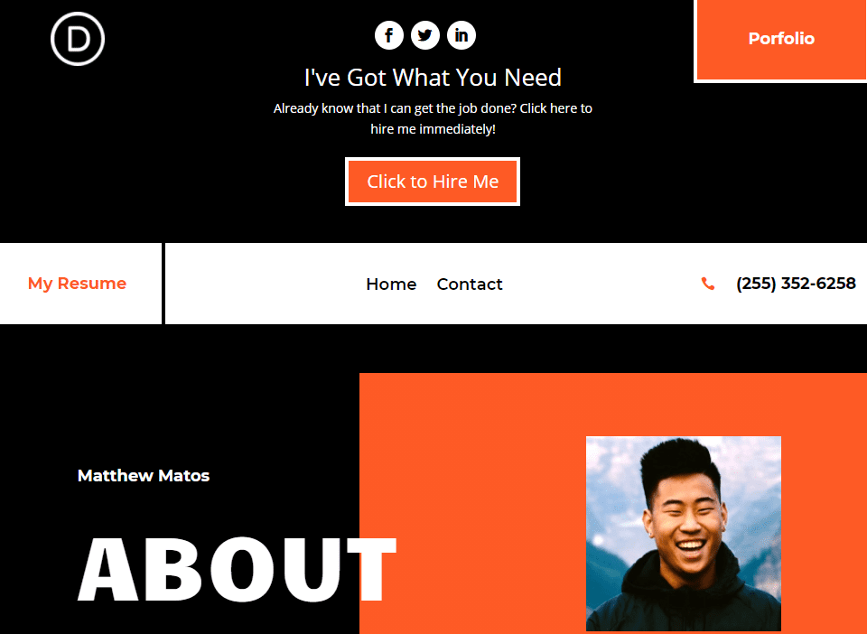
Divi’s secondary menu can be a lot more than a place where you list social networks and host a search bar. It is a fantastic place to engage your audience and call them to action in some way. Many of our free header/footer packs make great use of the secondary menu. In this tutorial, we’re going to go through the process of adding a Call to Action to the secondary menu bar of your Divi website.
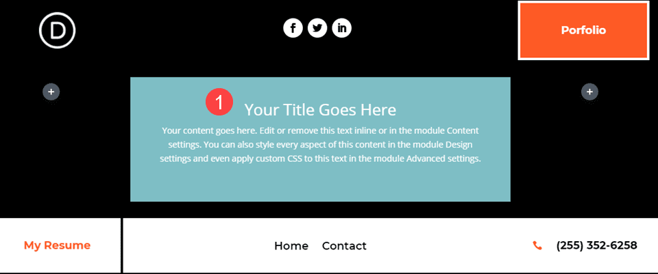
Preview the Call to Action Module
Desktop
Mobile

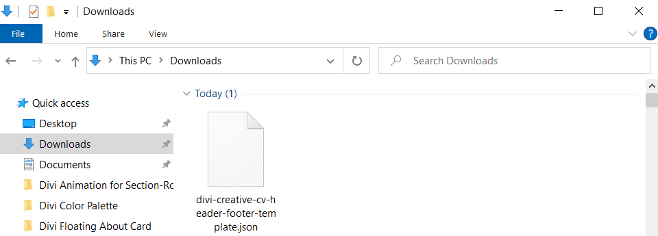
For this article, we are going to use the Creative CV layout pack and freebie header. Our first step is to go to the header post and download the .json file.
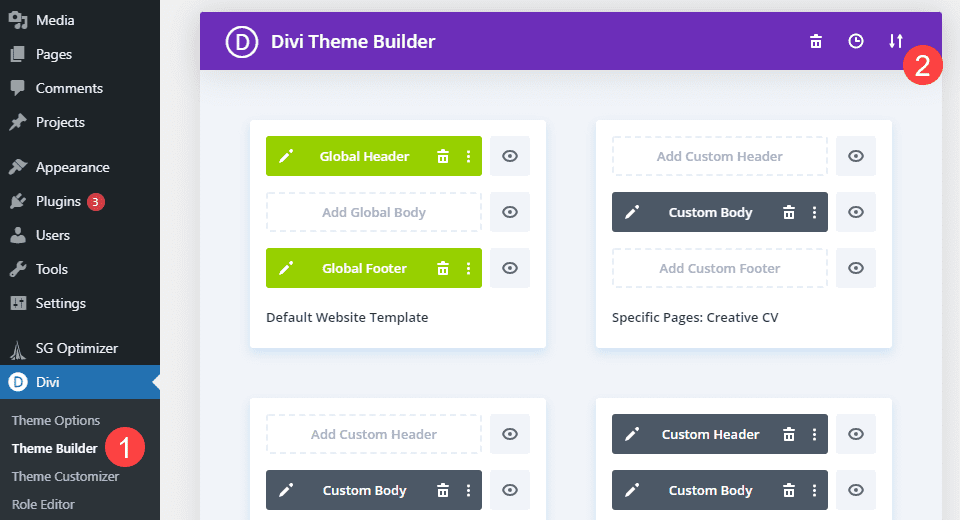
Next, head into your WordPress dashboard. Then navigate to Divi – Theme Builder and click on the up-and-down arrows icon to open the Divi portability options.
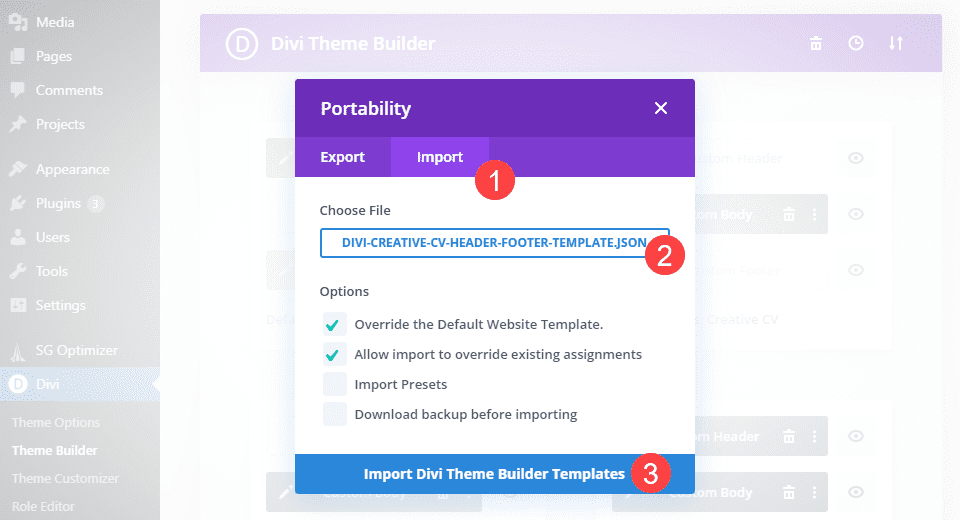
Inside the pop-up, click the Import tab, find the .json file for the header that you downloaded, and click Import Divi Theme Builder Templates.
With this done, you can click into the Global Header to enter the Divi Builder. If prompted, select Creative CV from the dropdown menu.
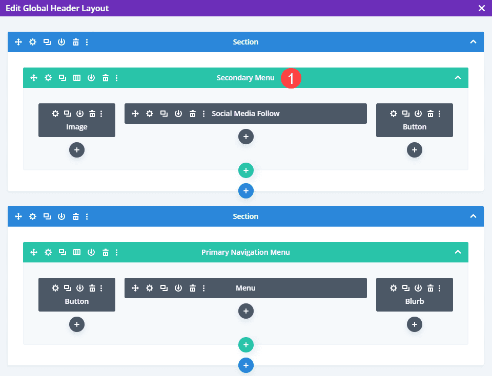
When you enter the Divi Builder for your header, be sure to identify which menu bar is the primary and which is secondary. We identify the primary as the menu bar with the main navigation bar. So we’re going to add our Call to Action in the top-most bar.
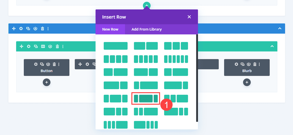
Add a New Row
Because of the header layout we’re using, we want the CTA to have as much space as we can without disrupting the design. We chose this layout pack’s header because it uses the large center column with smaller side columns. This will give it prominence on the site, no matter what device a user is on. You can see which one it is below, if you’re using a different header than we are.
Adjust Visibility for Existing Modules
If you use the same header layout as this tutorial, you will want to go into the Row options for all rows and make sure that each column is individually visible on all devices. This is under Row Settings – Column Settings – Advanced – Visibility.
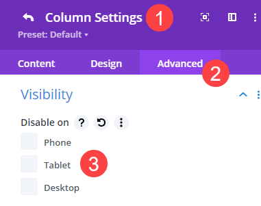
Be sure to uncheck any devices that you want to see the column’s content on.
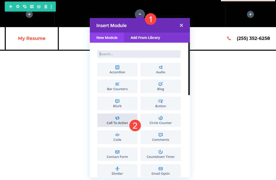
Add the Call to Action Module
Next, we will click on the black + icon to add a new module to the new row. We are using the Call to Action module in Divi, and you can find it near the top of the Insert Module dropdown.
Edit the Call to Action Module
If you notice in the screenshot below, the default Call to Action module size and styling is not quite suited for the header menu. Or most websites, straight out of the box. So we’re going to style it appropriately so it doesn’t seem out of place.
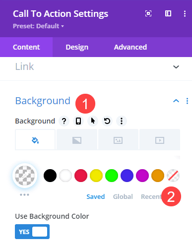
Change the Background Color
First thing, let’s adjust the background to be transparent so that no matter where the CTA sits, it matches the design around it. You find this option in the Background area under the Content tab of the Call to Action module. The option to turn the background transparent is the circle in the palette with a red slash over the checkered squares.
Adjust the CTA Content
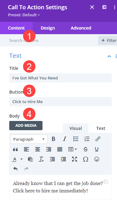
The Call to Action module is versatile in that you can use this single module to have a header, body text, and a button at the same time. Additionally, the real utility comes in that you can use the CTA module to link out to two different URLs depending on how you use it (one for the button and one for the body/title).
However, because so much information can be included, the module can get pretty large. So we’re going to keep things pretty succinct for our CTA, editing the headline, body, and button text to fit more easily in the header’s secondary menu bar. These editing options are in the Call to Action Settings under the Content tab. You can adjust all of them under the Text heading.
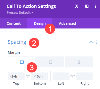
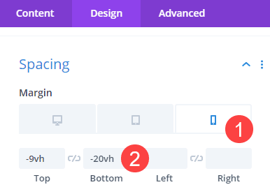
Adjust the Call to Action’s Size and Spacing
Making sure that the Call to Action module fits well into the header is very important. So go into the Design tab of the module settings and find the Spacing section. Set the Top Margin for the CTA module to -3vh and the Bottom Margin to -10vh. This should pull the menu bar into a more narrow position.
Next, go into the Responsiveness settings and set the margins for mobile to be -9vh on top and -20vh on bottom.
Customize CTA Colors
A CTA needs to be eye-catching. How else will it call any of your visitors to action? With that in mind, we want to go into the Design tab for the CTA module and find the Button heading. Under it, enable the toggle that reads Use Custom Styles for Button.
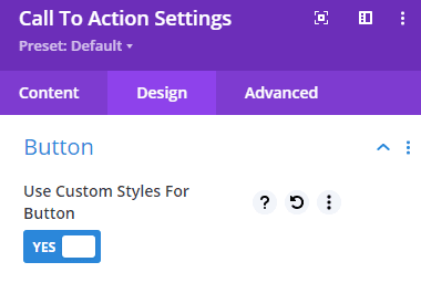
We are going to keep it simple and have the button in the CTA match the existing Portfolio button from the header layout. Set Button Text Color to white (#ffffff), Button Background to #fe5a25, Button Border Width to 4px, and Button Border Color to white (#ffffff).
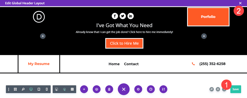
Once you’ve finished customizing the design to match your existing layout, save your work by clicking the green Save button in the lower-right corner and then click the X icon in the upper-right to return to the theme builder.
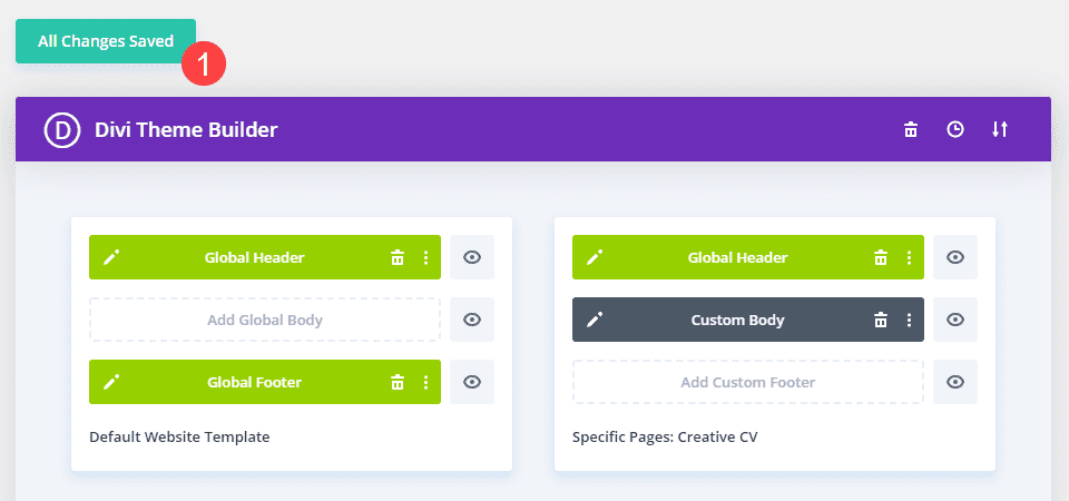
In the Theme Builder, make sure the green button above says All Changes Saved. If it says Save Changes, the updates you’ve made aren’t live yet.
Final Results for the Call to Action Module
When you’re finished with all the customizations, your site should appear similar to this:
Desktop
Mobile
Conclusion
Adding a Call to Action into your Divi site’s secondary menu bar is a pretty simple process. Having a CTA module appear at the very top of your pages can be an incredible way to engage your audience. Users can get desensitized to pop-ups and various modals, but a good, old-fashioned call to action never fails to get their attention.
How do you use Calls to Action on your websites? Let us know in the comments!


Great layout guys!
I’ve followed the tutorial but I’m not getting the CTA button showing fully on any display size. I’m not too sure what I am doing wrong on this one!