One of the easiest and most effective ways to add depth to a design is to add a box shadow. In today’s tutorial, we’re going to show you how to style a sleek slider box with a soft box shadow. The trick is to add a thick light border to draw attention to the edges. This design is subtle but elegant and can easily be tweaked to fit just about any kind of website.
Let’s dive in!
- 1 Sneak Peek
- 2 Download the Layout for FREE
- 3 Download For Free
- 4 You have successfully subscribed. Please check your email address to confirm your subscription and get access to free weekly Divi layout packs!
- 5 What You Need to Get Started
- 6 Creating a Unique Slider Design with a Soft Box Shadow in Divi
- 7 Final Result
- 8 Final Thoughts
Sneak Peek
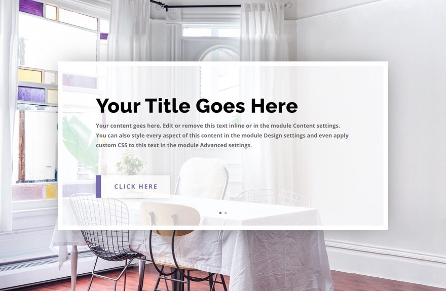
Here is a quick look at the design we’ll build in this tutorial.
Download the Layout for FREE
To lay your hands on the designs from this tutorial, you will first need to download it using the button below. To gain access to the download you will need to subscribe to our newsletter by using the form below. As a new subscriber, you will receive even more Divi goodness and a free Divi Layout pack every Monday! If you’re already on the list, simply enter your email address below and click download. You will not be “resubscribed” or receive extra emails.
To import the section layout to your Divi Library, navigate to the Divi Library.
Click the Import button.
In the portability popup, select the import tab and choose the download file from your computer.
Then click the import button.
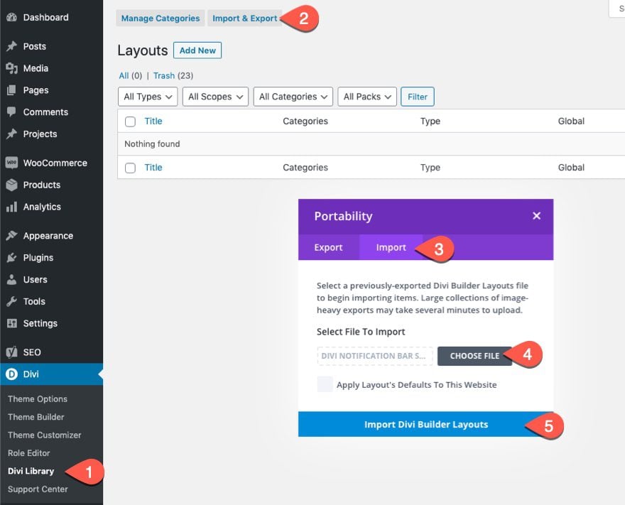
Once done, the section layout will be available in the Divi Builder.
Let’s get to the tutorial, shall we?
What You Need to Get Started
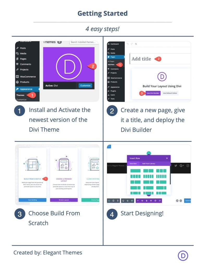
To get started, you will need to do the following:
- If you haven’t yet, install and activate the Divi Theme.
- Create a new page in WordPress and use the Divi Builder to edit the page on the front end (visual builder).
- Choose the option “Build From Scratch”.
After that, you will have a blank canvas to start designing in Divi.
Creating a Unique Slider Design with a Soft Box Shadow in Divi
Part 1: Designing the Section and Row for the Slider
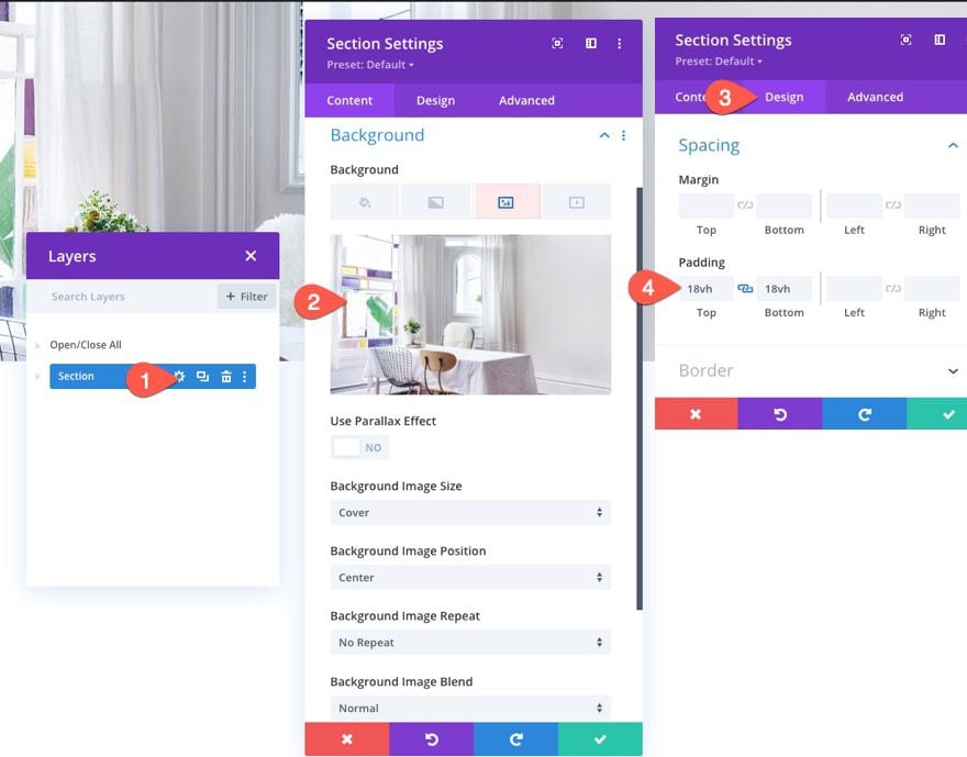
Designing the Section
- Add Background Image (about 1920px by 1080px)
- Padding: 18vh top, 18vh bottom
Designing the Row
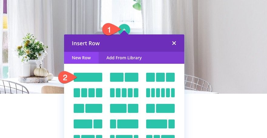
Once the section is done, add a one-column row to the section.
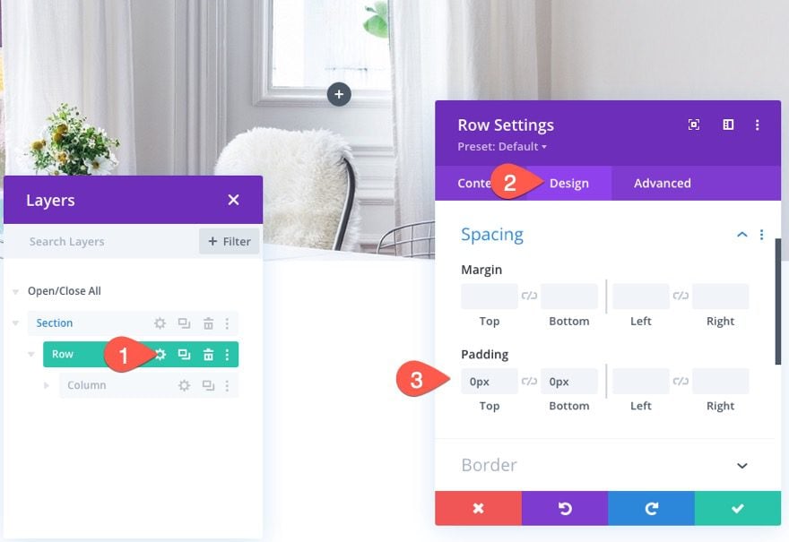
Then update the row padding as follows:
- Padding: 0px top, 0px bottom
Part 2: Designing the Slider with a Soft Box Shadow
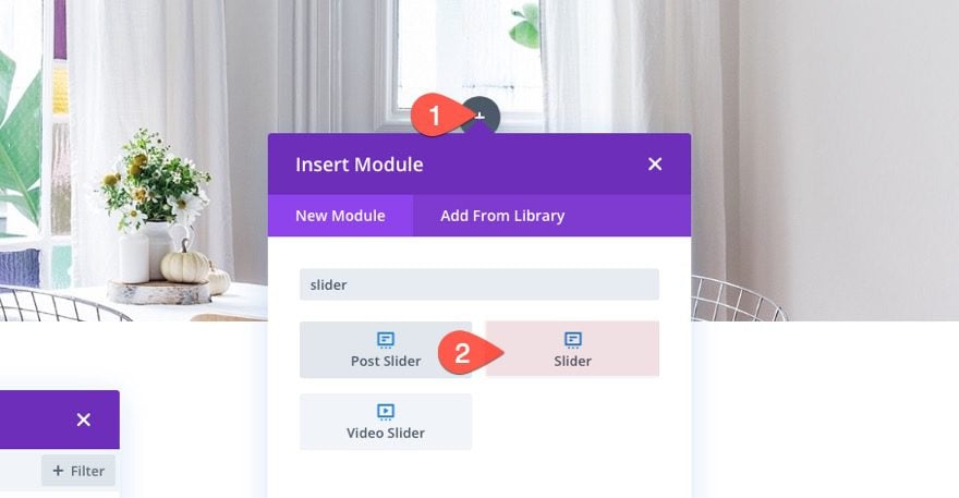
Now that our row is in place, we are ready to start designing the slider.
Add a new slider module to the row.
The Slider Background
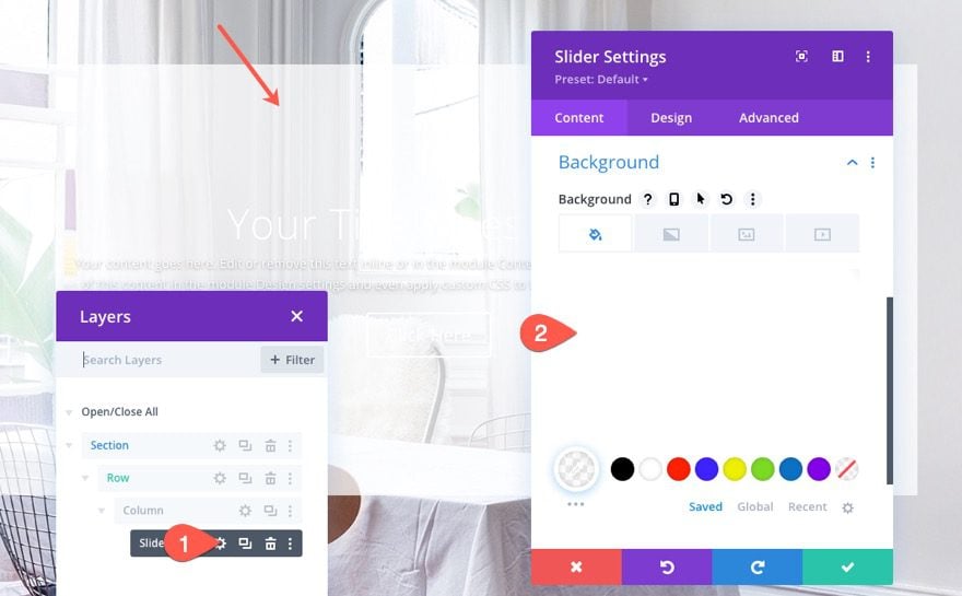
Then update the background with a semi-transparent white color.
- Background Color: rgba(255,255,255,0.75)
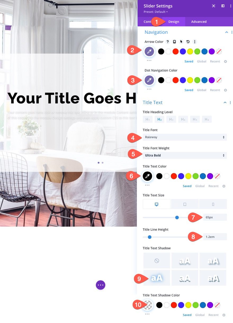
Navigation and Title Design Settings
Under the design tab, update the following:
- Arrow Color: #776cb1
- Dot Navigation Color: #776cb1
- Title Font: Raleway
- Title Font Weight: Ultra Bold
- Title Text Color: #000
- Title Text Size: 65px (desktop), 38px (tablet), 28px (phone)
- Title Line Height: 1.2em
- Title Text Shadow: see screenshot
- Title Text Shadow Color: transparent
Body Text Design
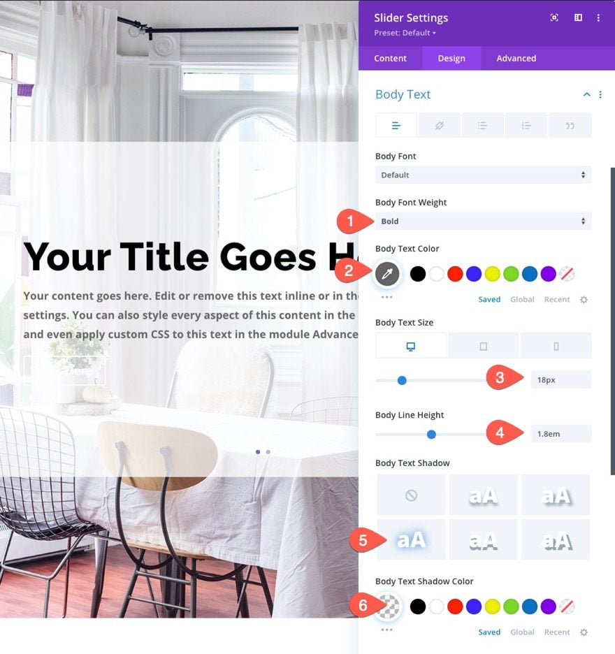
- Body Font Weight: Bold
- Body Text color: #666
- Body Text Size: 18px (desktop), 16px (tablet), 14px (phone)
- Body Line Height: 1.8em
- Body Shadow: See screenshot
- Body Text Shadow: transparent
Button Design
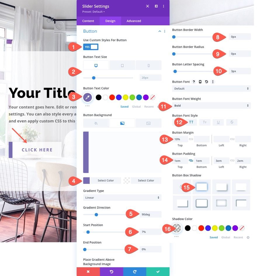
Next, update the button design as follows:
- Button Text Size: 20px (desktop), 18px (tablet), 16px (phone)
- Button Text Color: #776cb1
- Button Background Gradient Left Color: #776cb1
- Button Background Gradient Right Color: rgba(255,255,255,0.7)
- Gradient Direction: 90deg
- Start Position: 7%
- End Position: 0%
- Button Border width: 0px
- Button Border Radius: 0px
- Button Letter Spacing: 3px
- Button Font Weight: Bold
- Button Font Style: TT
- Button Margin: 10%
- Button Padding: 1em (top and bottom)
- Button Box Shadow: see screenshot
- Shadow Color: rgba(0,0,0,0.11)
Padding and Border
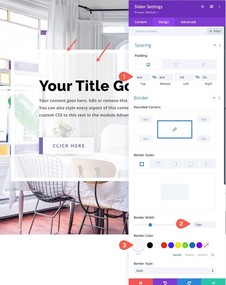
- Padding (desktop and tablet): 8vh top, 8vh bottom, 5% left, 5% right
- Padding (Phone): 8% top, 8% bottom, 5% left, 5% right
- Border Width: 15px
- Border Color: #fff
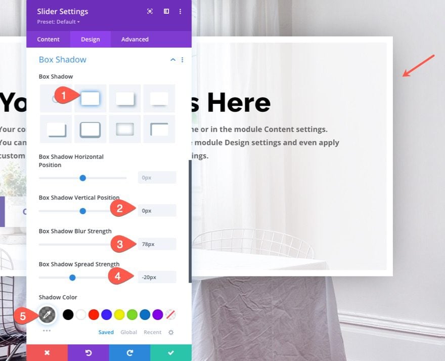
Box Shadow
Now it is time to add a soft box-shadow to our slider. This will give it a subtle depth to the design.
- Box Shadow: see screenshot
- Box Shadow Vertical Position: 0px
- Box Shadow Horizontal Position: 78px
- Box Shadow Spread Strength: -20px
- Shadow Color: rgba(0,0,0,0.5)
Final Result
Now let’s check out that final result.

Final Thoughts
Well, that’s it! Now you know how to create an elegant slider with a soft box-shadow. Hope you can make some great use of this tutorial, and feel free to post your uses of it in the comments!
I look forward to hearing from you in the comments.
Cheers!





I actually like how you designed the button with the line to the left of it more than the soft box-shadow, LOL. I will have to use this on one of my sites. Thanks for posting
Thanks, Ian. I can see how that would be the case haha. Here is a post on a few more button designs if you like… https://www.elegantthemes.com/blog/divi-resources/divi-button-module-designs
Outstanding Jason !
Thank you for giving me the tools and confidence to create a better user experience for my audience.
Cheers, Dujon
PS… I genuinely look forward to receiving these tutorials and fresh ideas in my inbox.
Thanks, dujon! Glad to hear this will help you.