Monospaced fonts are a delightful asset to web design. They are especially useful for creating designs that have beautiful symmetry and balance. A monospaced font is made up of letters and characters that each have the same width (or horizontal space). As such, they provide a consistent and elegant structure for displaying text. Monospaced fonts are widely used in coding for this reason.
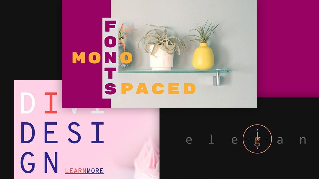
In this tutorial, we are going to create three stunning monospaced font designs in Divi. We will go over how to properly customize text modules to position and design monospaced fonts in some pretty unique ways, and much more.
Let’s get started.
- 1 Sneak Peek
- 2 Download the Monospaced Font Designs Layout for FREE
- 3 Download For Free
- 4 You have successfully subscribed. Please check your email address to confirm your subscription and get access to free weekly Divi layout packs!
- 5 What You Need to Get Started
- 6 Monospaced Font Design #1: Logo Style
- 7 Monospaced Font Design #2: Large Letter Blocks
- 8 Monospaced Font Design #3: CrossWord Puzzle
- 9 Mobile
- 10 Final Thoughts
Sneak Peek
Here is a quick look at the designs we will build in this tutorial.
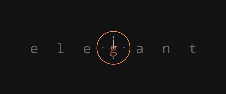
Monospaced Font Design #1: Logo Style

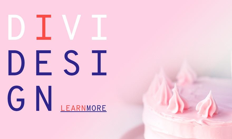
Monospaced Font Design #2: Large Letter Blocks
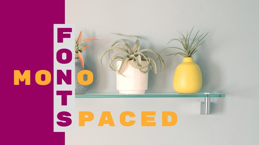
Monospaced Font Design #3: CrossWord Puzzle
Download the Monospaced Font Designs Layout for FREE
To lay your hands on the designs from this tutorial, you will first need to download it using the button below. To gain access to the download you will need to subscribe to our newsletter by using the form below. As a new subscriber, you will receive even more Divi goodness and a free Divi Layout pack every Monday! If you’re already on the list, simply enter your email address below and click download. You will not be “resubscribed” or receive extra emails.
Subscribe To Our Youtube Channel
To import the layout to your page, simply extract the zip file and drag the json file into the Divi Builder.
Let’s get to the tutorial, shall we?
What You Need to Get Started
To get started, you will need to do the following:
- If you haven’t yet, install and activate the Divi Theme installed (or the Divi Builder Plugin if not using the Divi Theme).
- Create a new page in WordPress and use the Divi Builder to edit the page on the front end (visual builder).
- Upload a few mock images to the media library to be used for the tutorial. We will be using a 200px by 200px image logo from the HVAC layout pack, and two background images (at least 1920px wide) taken from Cake Maker Layout Pack and the Home Improvement Layout Pack.
After that, you will have a blank canvas to start designing in Divi.
Monospaced Font Design #1: Logo Style

Let’s start with a simple monospaced font design that highlights the symmetrical balance of the letters. Because the letters are spaced evenly, monospaced fonts are great for graphics and logos. Here is a quick example of how you can incorporate the monospaced font with a simple image icon to create a nice graphic.
First, create a regular section with a one-column row.

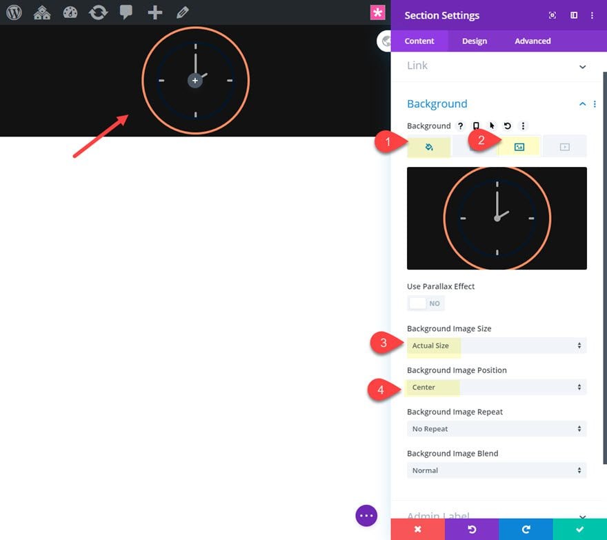
Before we add the text module, we are going to add a background to the section. The background will consist of a centered icon image with a dark gray background. The icon image we will use is taken from the HVAC Layout Pack. Make sure the image icon is about 200px by 200px since we will be using the actual size as the background image.
Open the section settings and update the following:
- Background Color: #121212
- Background Image: [insert 200px by 200px image icon]
- Background Image Size: Actual Size
- Background Image Position: Center
Add the Text Module
Once the section is done, add a text module to the one-column row.
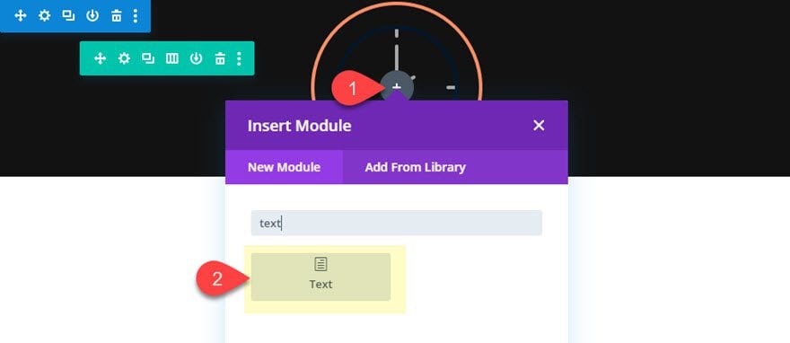
This is where we add the text with a monospaced font. The convenient aspect of monospaced letters is that, because each letter is the same width, you can easily center the middle letter of the text on the page. This will make it easy to line up with the background image icon we added to the section.
Open the text module settings and update the body content with the word “elegant”. Actually you can use just about any word that has an odd number of letters so that we have a center letter to overlap the background image icon nicely.
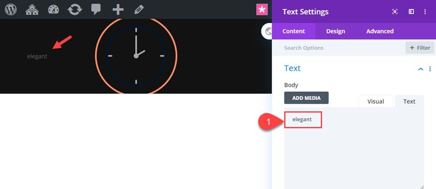
Adding the Monospaced Font Design
Divi has about 12 different monospaced fonts included in the Divi builder we can choose from. To see them, we can click to select a text font and enter “mono” in the search bar. This will show the list of available monospaced fonts.
Then update the design settings as follows:
- Text Font: Droid Sans Mono
- Text Text Size: 5vw
- Text Letter Spacing: 1.3em
- Text Line Height: 1em
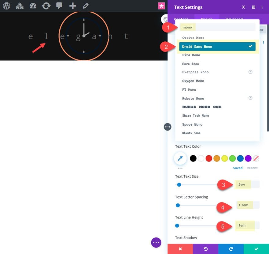
This combination of the vw length unit for the text size and the em length unit for the letter spacing and line height will make sure the text is perfectly responsive to all browser sizes.
Spacing
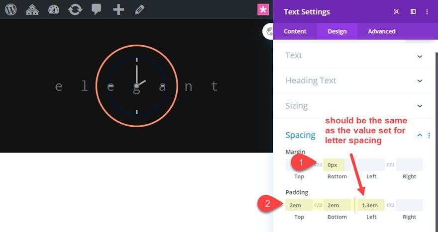
After the font is ready, add some spacing to the text module to make sure the text is perfectly centered. We can see the text is a bit off centered because of the letter spacing. We can easily fix this by adding a left padding equal to the value we added for the letter spacing.
Update the following:
- Margin: 0px bottom
- Padding: 2em top, 2em bottom, 1.3em left
Change the color of center letter
A simple way to change the color of a single letter in Divi is to use the inline style options when using the builder on the front end.
Simply highlight the letter you want to change and click the text color icon in the menu bar.
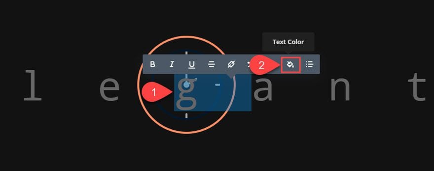
Then add the following color code: rgba(248, 142, 96, 0.54)
That’s it!
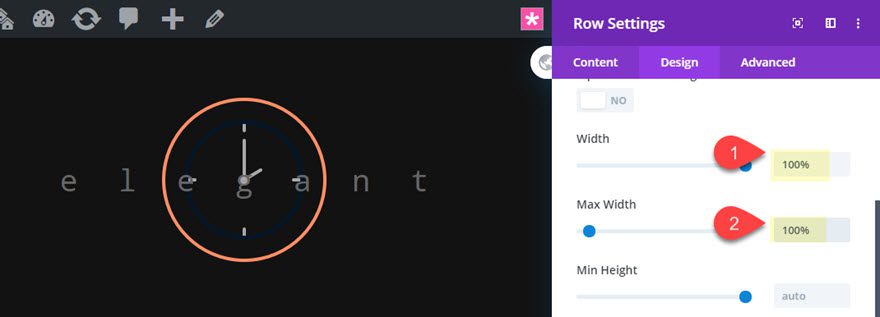
Make Row Full Width
We need to make some room for the text will will be adding so go ahead and make the row fullwidth by opening the row settings and updating the following:
- Width: 100%
- Max Width: 100%
Final Result
Here is the final result.

And if you want, you can add a space for the center character in the text to use the background image icon for the empty space. Here is what that would look like.

Monospaced Font Design #2: Large Letter Blocks

This next design showcases the block-like font structure that is possible with monospaced fonts. Unlike regular (variable-width) fonts, monospaced fonts stack on top of each other for a balanced design that is modern and pleasing to the eye.
Here’s how to do it.
Create a new regular section with a one-column row.

Before adding any module, update the section with a background design as follows:
- Background Gradient Left Color: #fcd1e5
- Background Gradient Right Color: rgba(255,255,255,0)
- Gradient Direction: 135deg
- Start Position: 50%
- End Position: 76%
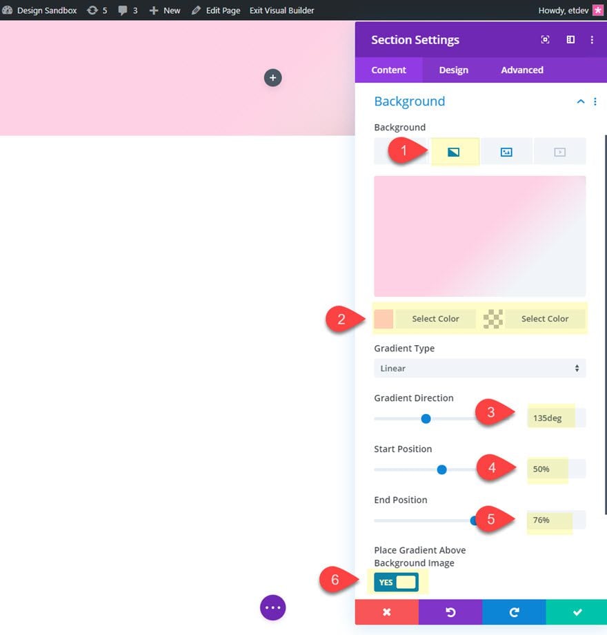
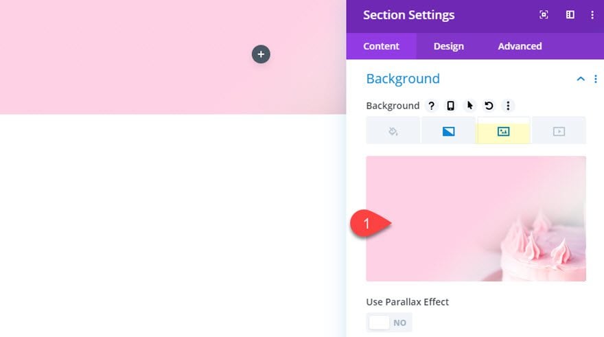
Then add a background image. I’m use one from the Cake Maker Layout Pack.
Add Row Width
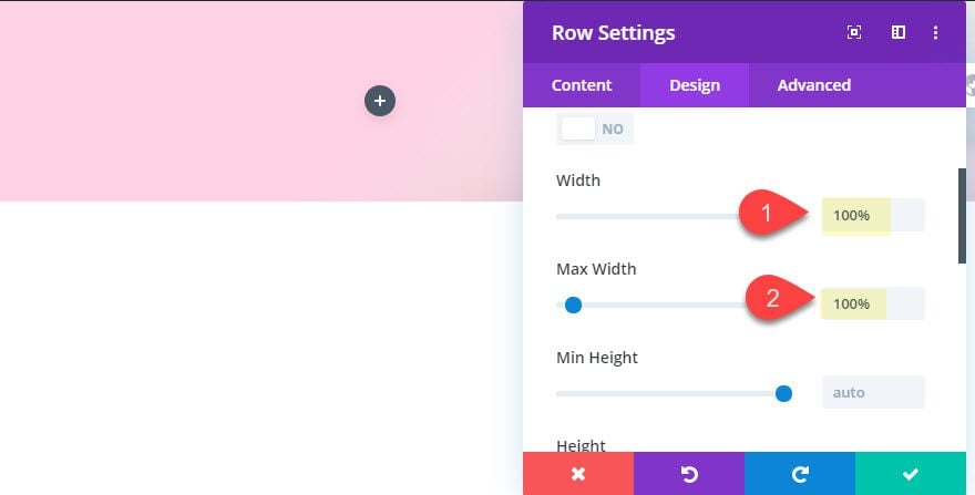
Next, update the row width as follows:
- Width: 100%
- Max Width: 100%
Add the Text Module
Once you have a fullwidth row, add a text module to the row.
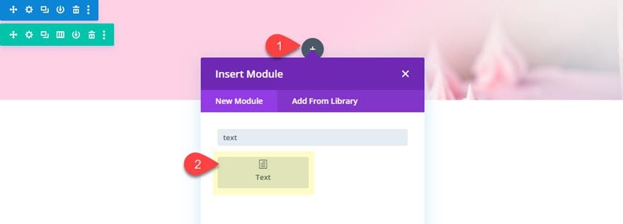
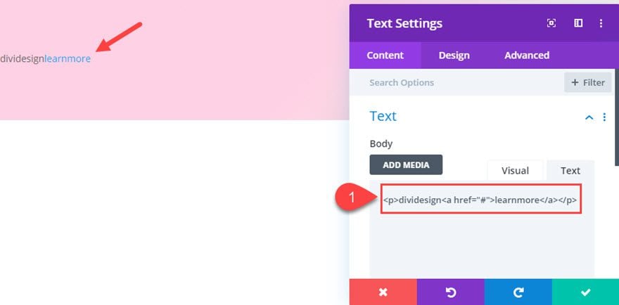
Then update the body content with the following:
<p>dividesign<a href="#">learnmore</a></p>
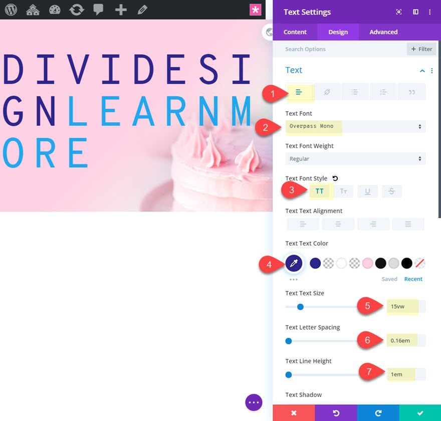
Then style the paragraph text as follows:
- Text Font: Overpass Mono
- Text Font Style: TT
- Text Text Color: #2e298f
- Text Text Size: 15vw
- Text Letter Spacing: 0.16em
- Text Line Height: 1em
We will add a different style to the link text as follows:
- Link Font Style: Underline
- Link Text Color: #2e298f
- Link Text Size: 3.5vw
- Link Letter Spacing: 0em
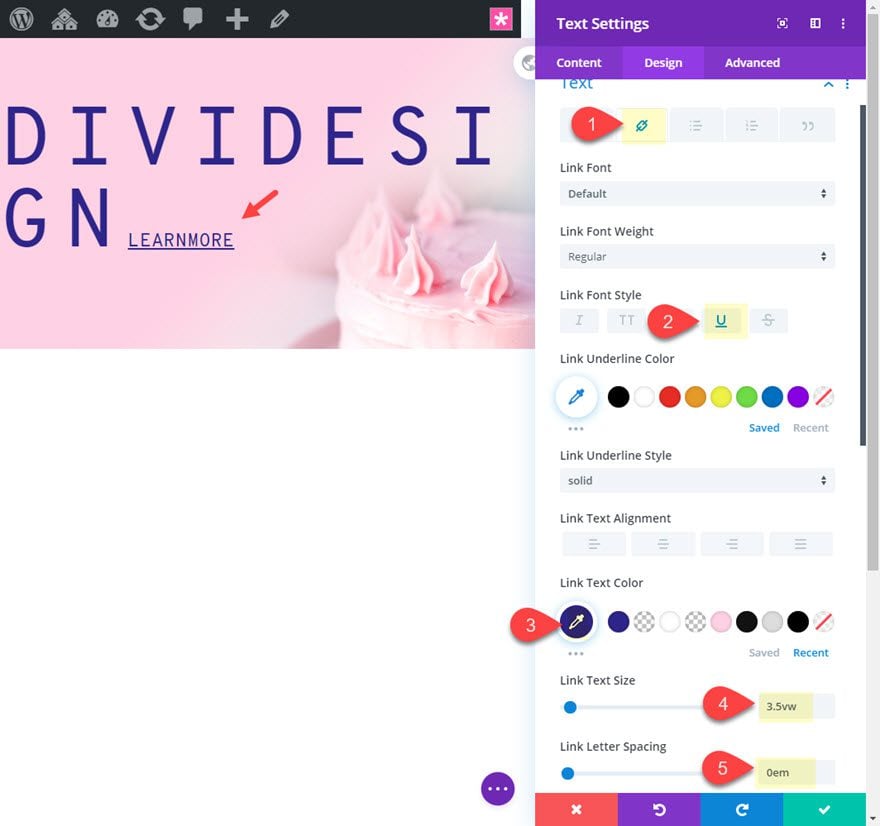
Spacing
After the text is styled, update the spacing as follows:
- Margin: 0px bottom
- Padding: 0.16em left, 3em right
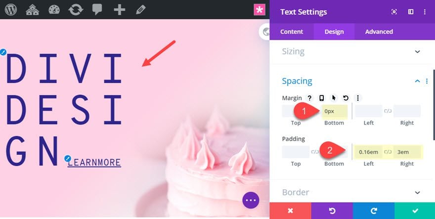
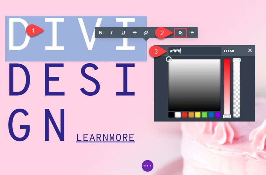
After that, save the settings. Then use the inline style options to change the color of the letters like we did in the first design example earlier in the post.
To do this, highlight the top four letters and changed the color to white.
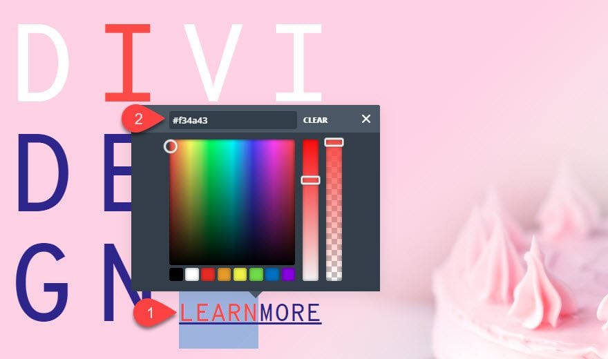
Change the second letter color to the following: #f34a43
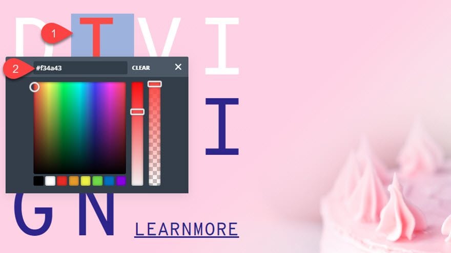
Lastly, highlight the first five letters in the link text (“learn”) and update the color to the following: #f34a43.
Final Design
Now let’s check out the final result on a live page.

Monospaced Font Design #3: CrossWord Puzzle

This last design takes advantage of monospaced fonts to create a crossword puzzle type layout for your text. Here’s how to do it.
First, create a new regular section with a one-column row.
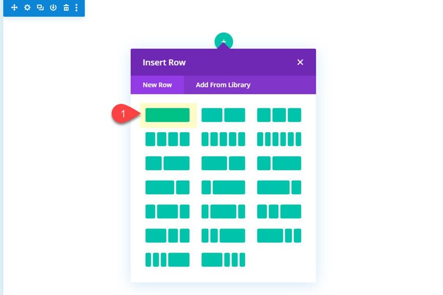
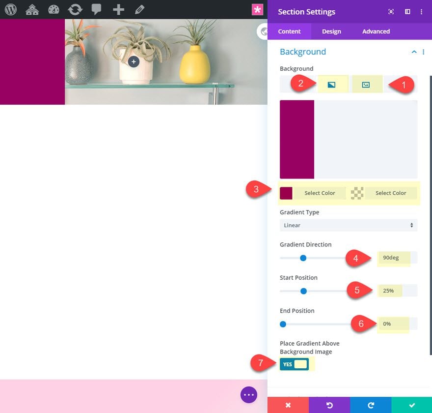
Before adding any modules, open the section settings and add a background image with a gradient as follows:
- Background Image: [insert image]
- Background Gradient Left Color:
- Background Gradient Right Color:
- Gradient Direction : 90deg
- Start Position: 25%
- End Position: 0%
- Place Gradient Above Background Image: YES
Row Settings
Once the section background is done, open the row settings with a new width and some spacing.
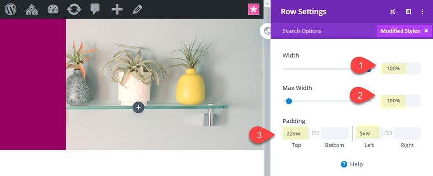
- Width: 100%
- Max Width: 100%
- Padding: 22vw top, 5vw left
Add text module
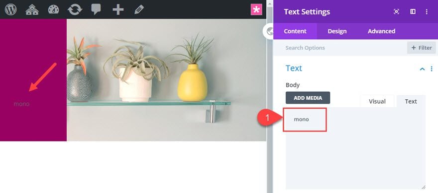
After the row is updated, add a new text module to the row with the word “mono” as the body content.
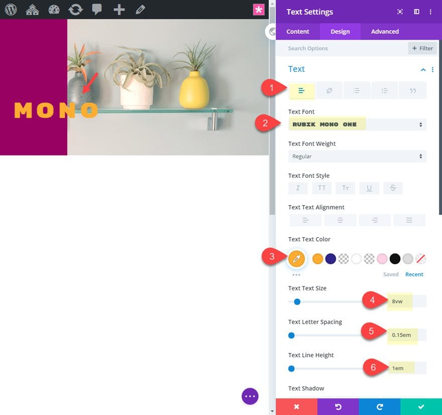
Then update the text module design as follows:
- Text Font: Rubik Mono One
- Text Text Color: #faac00
- Text Text Size: 8vw
- Text Letter Spacing: 0.15em
- Text Line Height: 1em
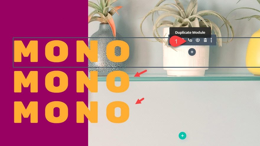
Duplicate the text module
To speed up the design of our next two blocks of text, let’s duplicate the text module we just designed two times so that you have a total of three text modules stacked on top of each other.
Update Text Module #2
After we’ve duplicated the text module, open the settings for the second (middle) text module and change the body text to the word “fonts”.
Then update the following:
- Body: “fonts”
- Background Color: #dddddd
- Text Text Color: #930565
- Width: 0.86em
- Margin: -3em top, 2em left
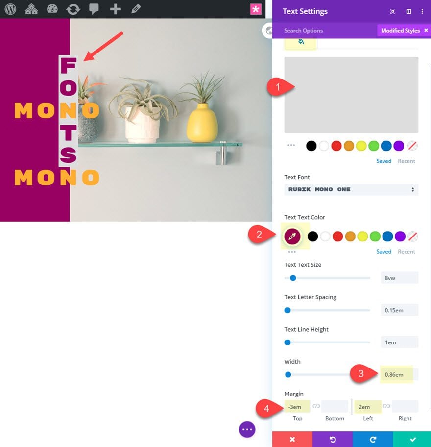
Notice how changing the width of the text module causes the text to display vertically. And because it is monospaced font, they stack up evenly. And with a width equal to the size of each letter block, we can move the text module around with increments of 1em. So -3em top margin will bring the text up exactly 3 letter blocks. And 2em left margin will move the text module over exactly 2 letter blocks to the right. This makes it easy to position the items in a crossword puzzle layout like this.
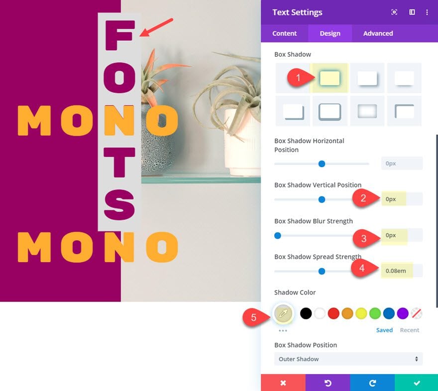
Box Shadow
Let’s add a box shadow to increase the background size behind the text module.
- Box Shadow: see screenshot
- Box Shadow Vertical Position: 0px
- Box Shadow Blur Strength: 0px
- Box Shadow Spread Strength: 0.08em
- Shadow Color: #dddddd (same as background color)
Z Index
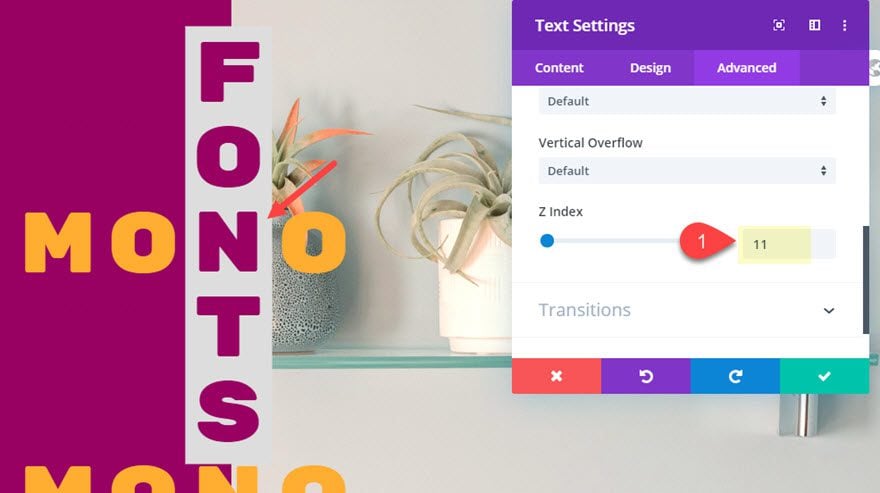
To make sure this block of text stays above the other text modules, update the z index as follows:
- Z Index: 11
Update Text Module #3
Once text module #2 is complete, open the settings for the third text module and change the body text to the word “spaced”.
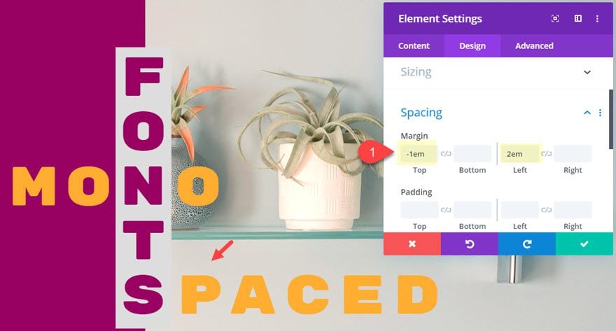
Then move the module in place using our magical em margin values:
- Margin: -1em top, 2em left
Final Design

Mobile
Because these designs are built using vw and em length units, the design will remain consistent on all browser sizes. Here is what the design looks like on tablet and phone display.
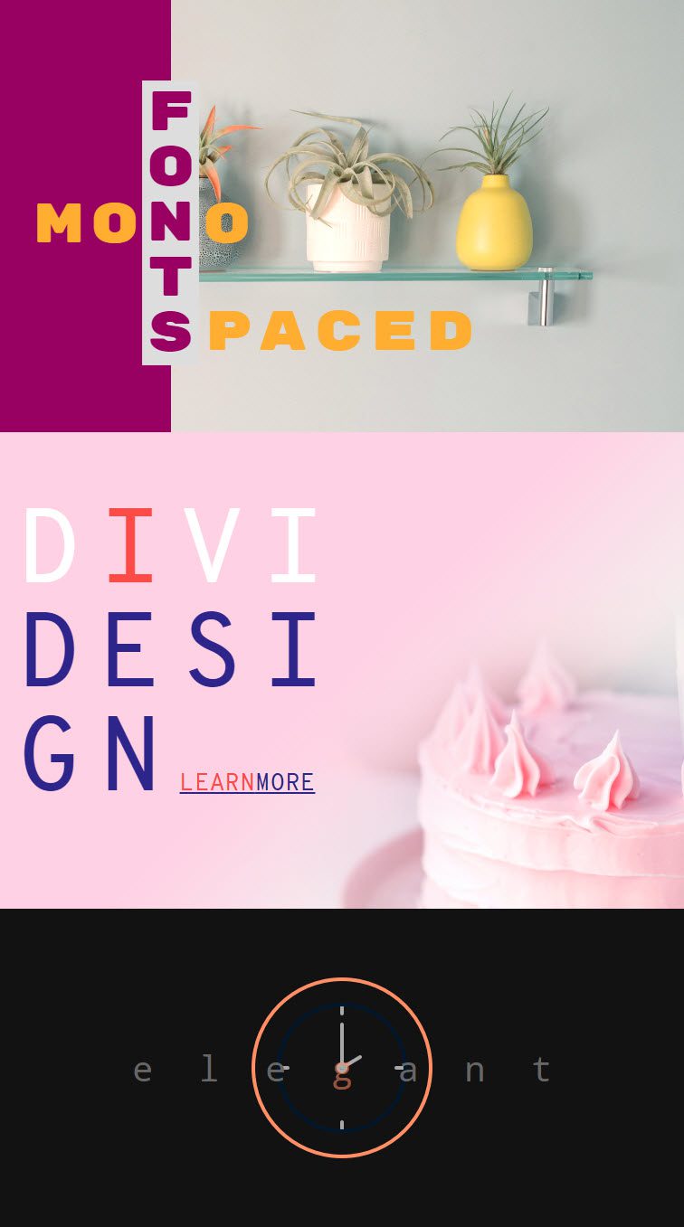
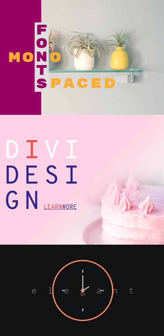
Note: The only element that isn’t responsive is the background image icon in the first design. However, you can easily add a smaller background image on tablet and phone to fix this.
Final Thoughts
Perhaps the best thing about creating monospaced font designs in Divi is the versatility of the font styles. Just a few minor touches can make a big difference. Plus the applications are quite practical to any website.
Which one of these three examples did you find most promising?
I look forward to hearing from you in the comments.
Cheers!



Not bad I just do not know if I would use these layouts