Styled content boxes for things like tips, warnings, and other important info are handy assets for any website or blog. They are an effective and convenient way to showcase important content with consistent design users will appreciate. For example, you may be a need a content box design for highlighting a key tip in a tutorial or for warning users about a potential problem.
In this tutorial, we are going to show you how to build 3 content box designs in Divi. These content box designs can easily be tweaked with new icons, color schemes, and/or content to fit any need. Once we show you how to design the boxes, we’ll show you how you can use Divi’s global presets to make it easier to deploy a new pre-designed content box with just a few clicks. No plugin is needed!
Let’s get started!
Sneak Peek
Today, we are going to build these 3 main content box designs in Divi.
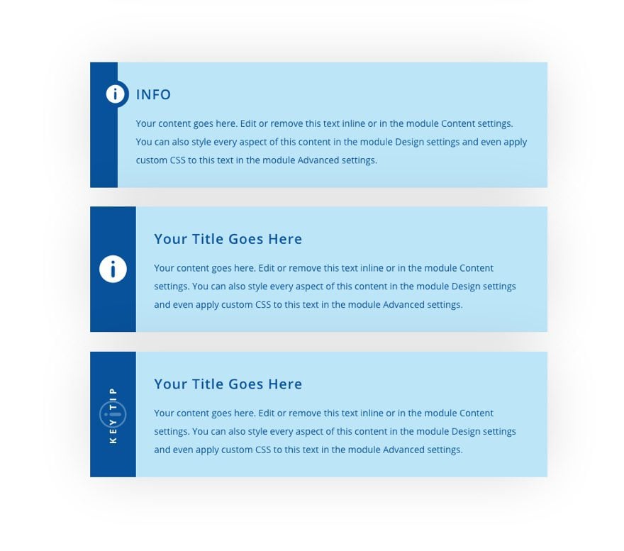
With these 3 main content box designs, you will be able to make easy customizations (like icon, color, and text) to make endless content-box designs for any occasion.
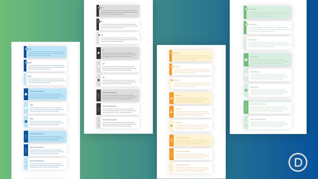
Here are 36 examples we are including in our FREE download below.

Download the Layout for FREE
To lay your hands on all 36 content box designs, you will first need to download the layout using the button below. To gain access to the download you will need to subscribe to our newsletter by using the form below. As a new subscriber, you will receive even more Divi goodness and a free Divi Layout pack every Monday! If you’re already on the list, simply enter your email address below and click download. You will not be “resubscribed” or receive extra emails.
https://youtu.be/j2k0KnBPOPg
Subscribe To Our Youtube Channel
To import the section layout to your Divi Library, navigate to the Divi Library.
Click the Import button.
In the portability popup, select the import tab and choose the download file from your computer.
Then click the import button.
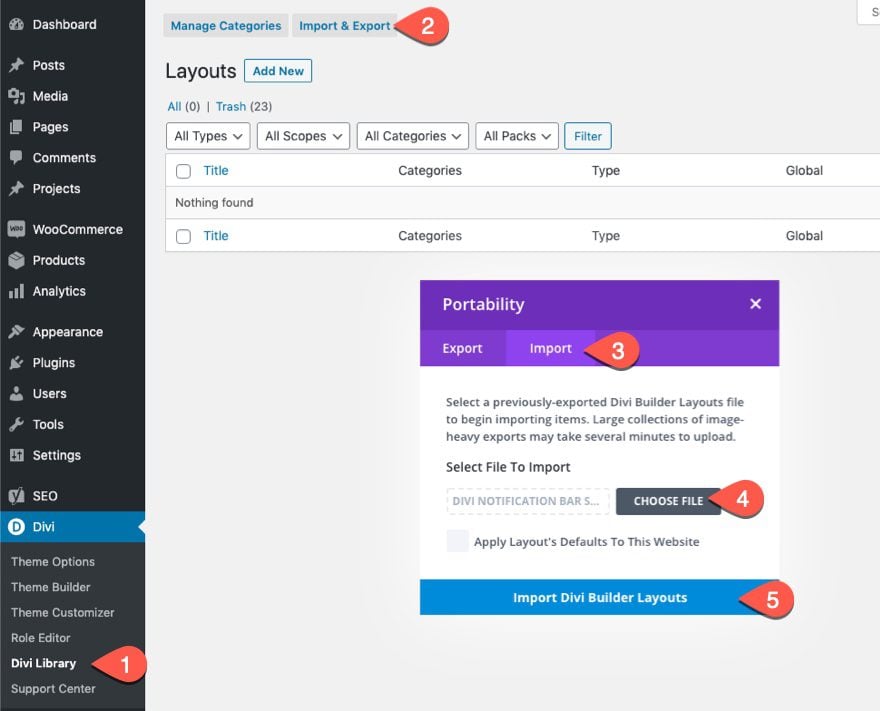
Once done, the section layout will be available in the Divi Builder.
Let’s get to the tutorial, shall we?
What You Need to Get Started

To get started, you will need to do the following:
- If you haven’t yet, install and activate the Divi Theme.
- Create a new page in WordPress and use the Divi Builder to edit the page on the front end (visual builder).
- Choose the option “Build From Scratch”.
After that, you will have a blank canvas to start designing in Divi.
Creating the Content Box Designs in Divi
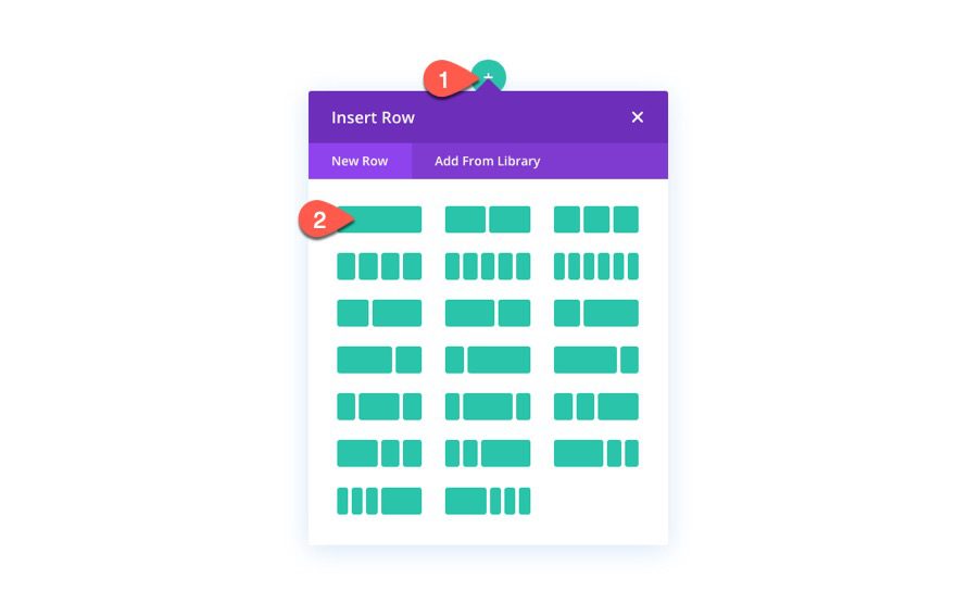
Before we start designing our content boxes, let’s add a new one-column row to the default section in the Divi Builder.
Content Box Design #1
To create the first content box, add a blurb module to the column.
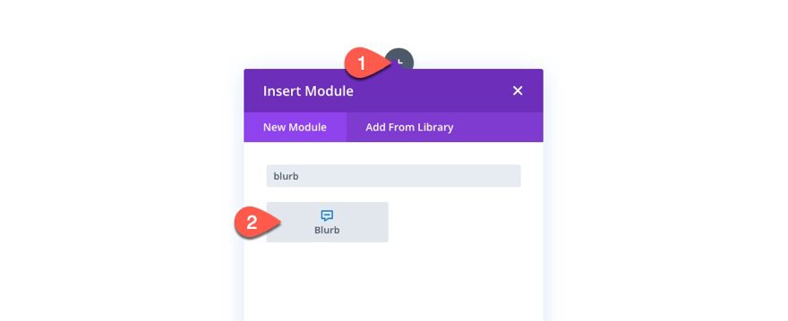
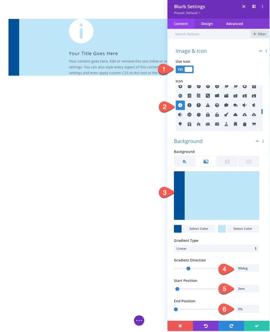
Under the content tab, update the following:
- Use Icon: YES
- Icon: see screenshot
- Background Color: #ffffff
- Background Gradient Left Color: #00529b
- Background Gradient Right Color: #bde5f8
- Gradient Direction: 90deg
- Start Position: 3em
- End Position: 0%
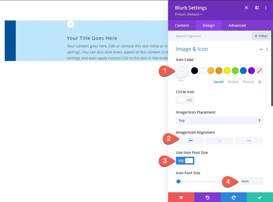
Under the design tab, update the icon style as follows:
- Icon Color: #ffffff
- Image/Icon Alignment: Left
- Use Icon Font Size: YES
- Icon Font Size: 2em
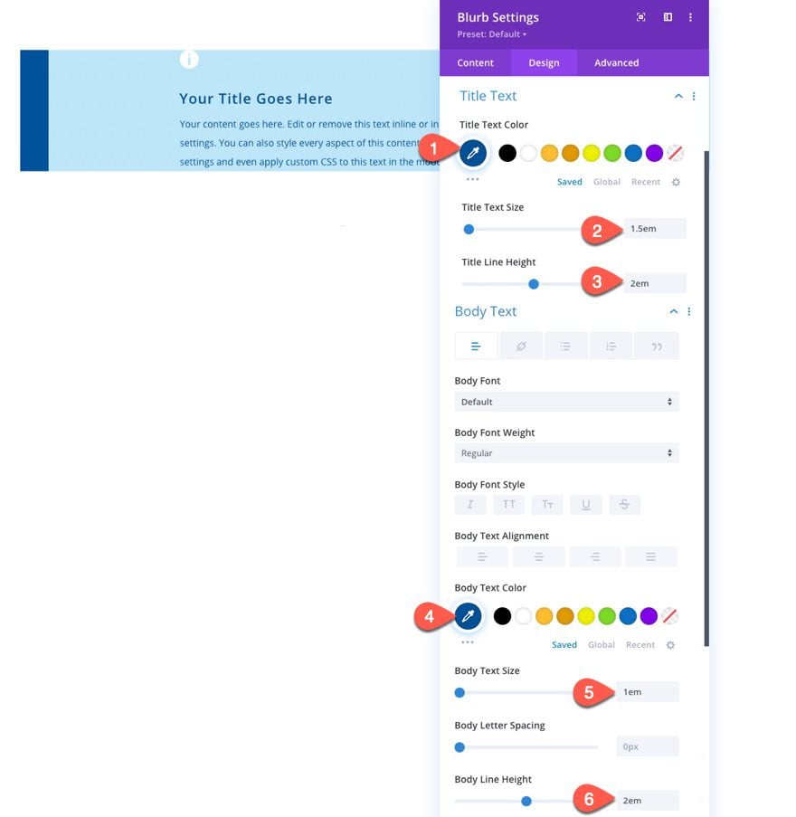
Next, update the text styles as follows:
- Title Text Color: #00529b
- Title Text Size: 1.5em
- Title Line Height: 2em
- Body Text Color: #bde5f8
- Body Text Size: 1em
- Body Line Height: 2em
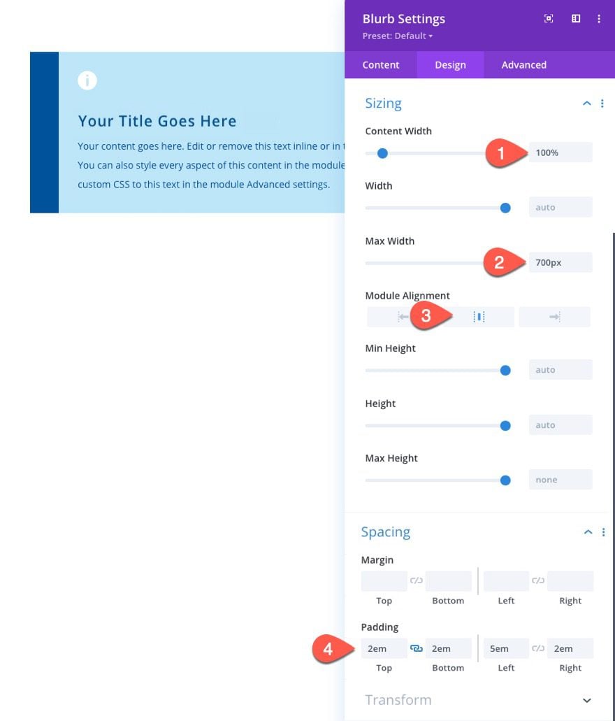
Once the text styles are in place, update the size and padding as follows:
- Content Width: 100%
- Max Width: 700px
- Module Alignment: Center
- Padding: 2em top, 2em bottom, 5em left, 2em right
Then add a subtle box-shadow to the blurb as follows:
- Box Shadow: see screenshot
- Box Shadow Vertical Position: 0px
- Box Shadow Blur Strength: 88px
- Box Shadow Spread Strength: -10px
- Shadow Color: rgba(0,0,0,0.17)
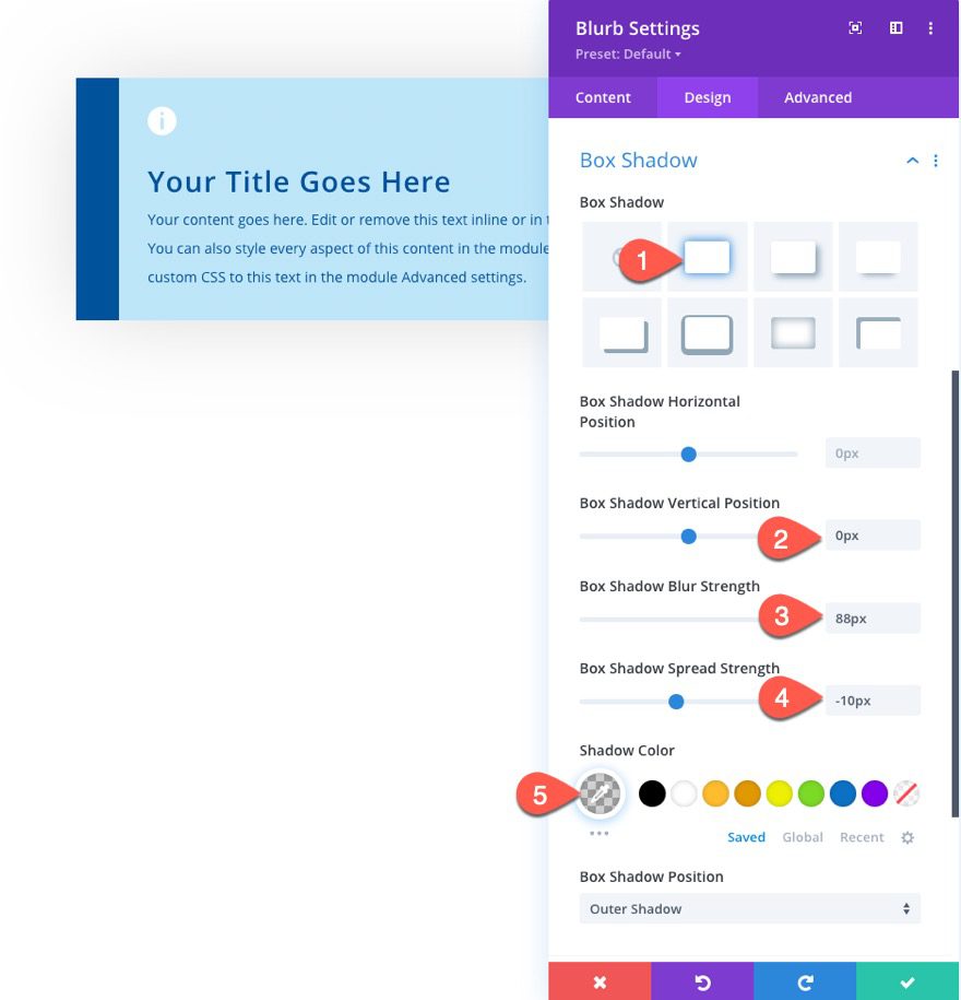
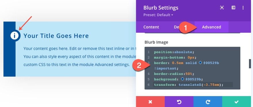
Under the advanced tab, we are going to give the blurb icon a custom style so that it has a circle shape with background and border colors that match the left background gradient color used earlier. We are also going to position the icon with an absolute position so that we can place it exactly where we want without taking up any actual space in the document.
To add the custom style, paste the following CSS code in the Blurb Image CSS box:
position:absolute;
margin-bottom: 0px;
border: 0.5em solid #00529b !important;
border-radius:50%;
background: #00529b;
transform: translateX(-3.75em);
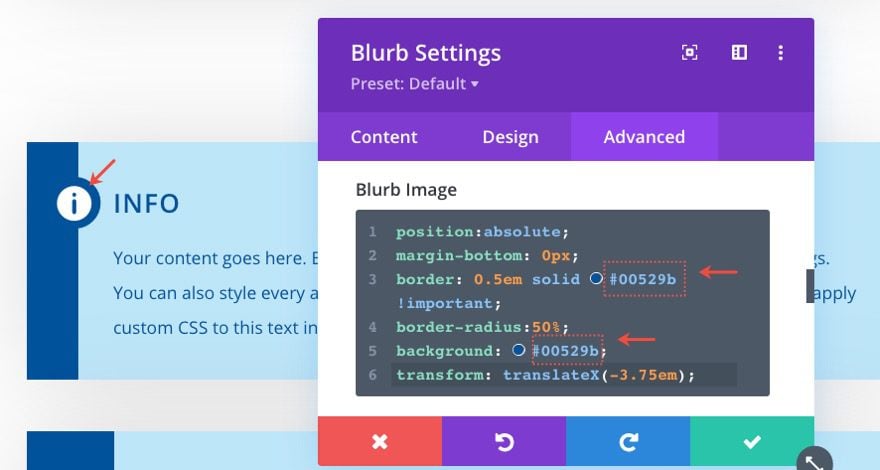
NOTE: When changing the color scheme of the content box (or blurb module), we will also need to update the colors that are being used in the Blurb Image CSS for the border and background of the icon.
Let’s check out the final result.
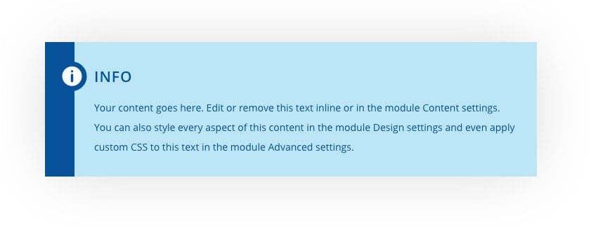
Content Box Design #2
To create our second content box design, duplicate the previous blurb module to jumpstart the design so that we can make a few modifications.
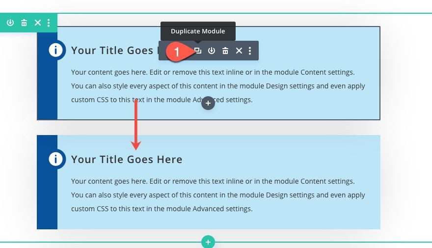
For this design, we are going to vertically center the icon on the left side of the blurb using the CSS grid property.
Under the design tab, replace the Blurb Image CSS with the following:
margin-bottom: 0px;
Then add the following CSS to the Blurb Content CSS box:
display: grid;
align-items: center;
justify-content: center;
grid-template-columns: 5em auto;
grid-gap: 2em;
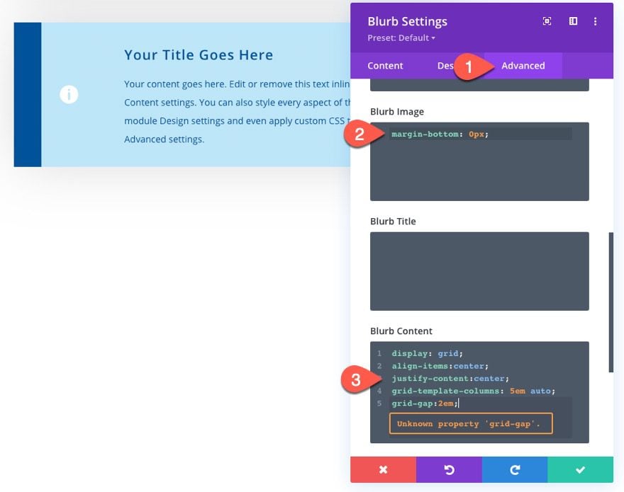
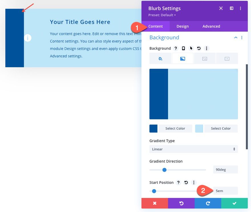
The width of the left column in the grid (the one holding the icon) is set to 5em, and the right column containing the title and body text is set to auto. We need to match the width of the left gradient color to the 5em width grid column holding the icon. To do that, update the following:
- Start Position: 5em
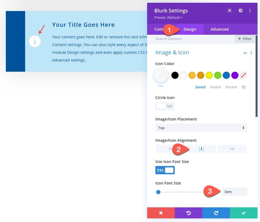
Under the design tab, update the icon alignment and size:
- Image/Icon Alignment: center
- Icon Font Size: 3em
Now we don’t need the left padding so take it out.
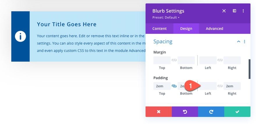
Now everything should be lined up nicely. Check out the final result.
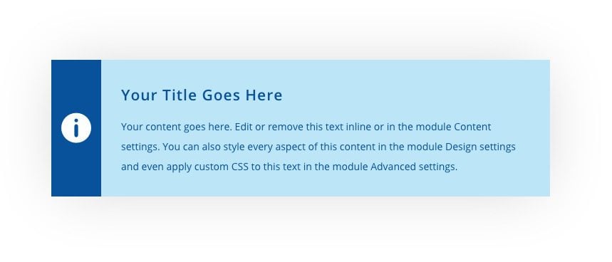
Content Box Design #3
To create the third content box design, duplicate the second blurb module (content box) we just finished.
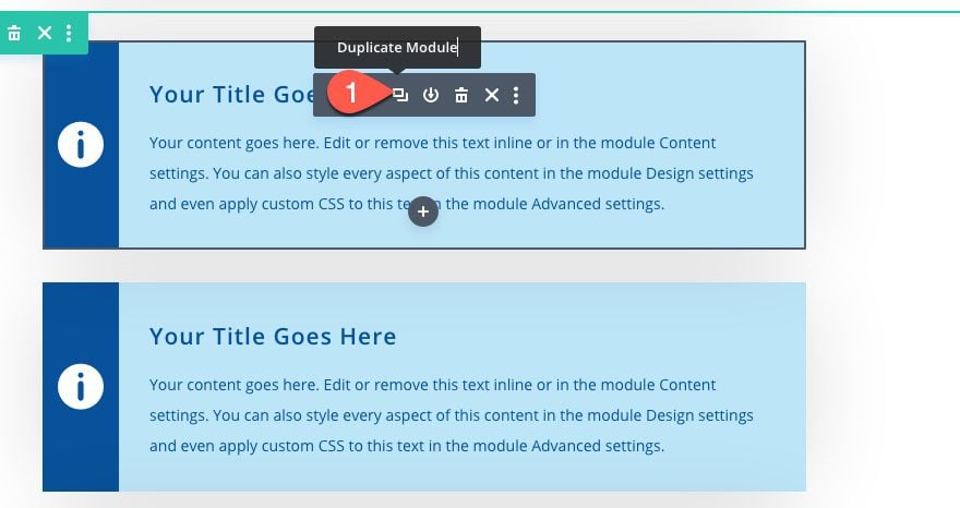
Once the second blurb is duplicated, open the duplicate blurb settings.
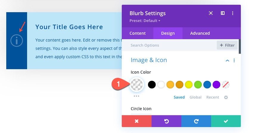
Under the Design tab, change the icon color:
- Icon Color: rgba(255,255,255,0.3)
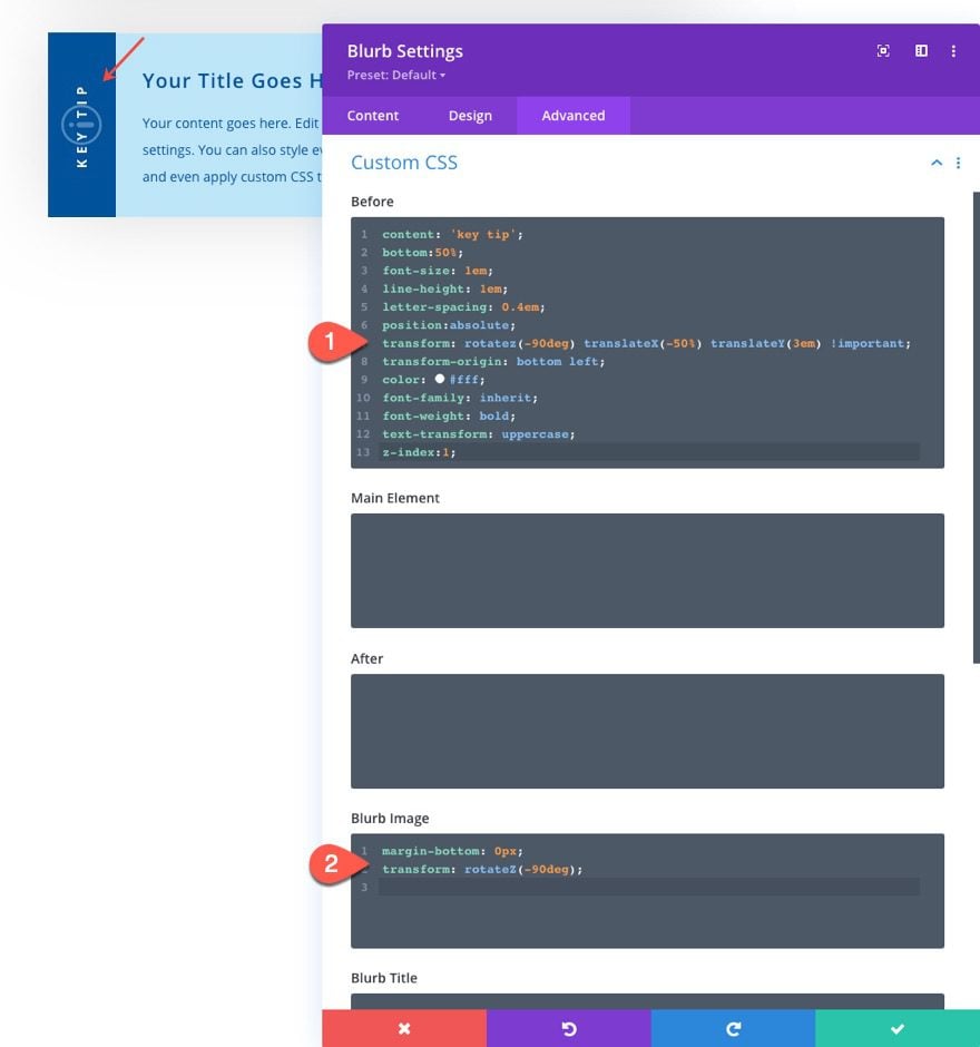
Next, we are going to add vertical label text over the icon by adding custom CSS to the before pseudo-element (which basically allows you to attach additional design and/or content before the blurb module element).
To add the label, paste the following CSS to the Before CSS box:
content: 'key tip';
bottom:50%;
font-size: 1em;
line-height: 1em;
letter-spacing: 0.4em;
position:absolute;
transform: rotatez(-90deg) translateX(-50%) translateY(3em) !important;
transform-origin: bottom left;
color: #fff;
font-family: inherit;
font-weight: bold;
text-transform: uppercase;
z-index:1;
We will also rotate the icon to match the rotated vertical text. To do this, add the following CSS to the Blurb Image CSS box:
margin-bottom: 0px;
transform: rotateZ(-90deg);
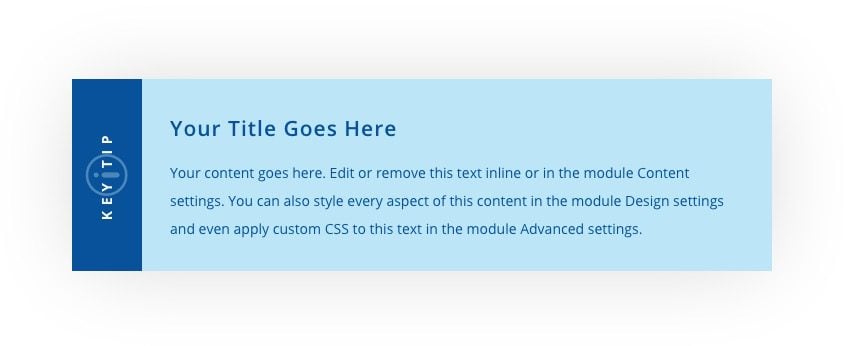
Here is the final result.
Updating the Design
Update the Size of Content Box Elements by Changing the Body Text Size
Each of the content boxes is built using mostly the em length unit (em is relative to the element’s root body font size). Because of this, the content boxes will scale in size seamlessly when adjusting the body text size in Divi’s built-in design settings.
Update Custom CSS Colors
For content box design #1, we added a custom background and border color to the icon with custom CSS. Make sure to update the colors used for the border and background property to match the color scheme of your own design.

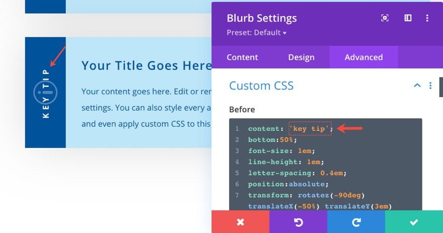
Updating the Label Text
For content box design #3, we added a label with custom CSS on the before pseudo element. To update the text, simply change the value of the content property in the Before CSS box.
Making the Content Boxes Reusable in Divi
Save the Module to the Divi Library
There two main ways to make modules reusable in Divi. The first way is to save the module (or any element) to the Divi Library.
Once the element is saved to the library, you can find it in the Divi library when adding a new element to a page.
Use Global Presets
The second main way to make a module reusable in Divi is to create a global preset for that module. Once you save the design of a module as a global preset, you can easily add that global preset to any other instance of that same module.
In this case, we can open the settings for each of our content boxes (or blurb modules) and create a new global preset for each one. To do that, open the Blurb Module settings and click on the preset option at the top. Then turn the module settings into a new preset from custom styles.
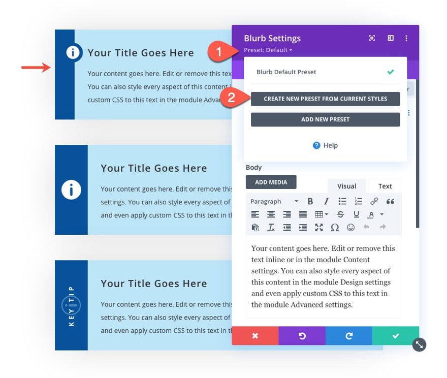
Name the new preset whatever you want and save it.
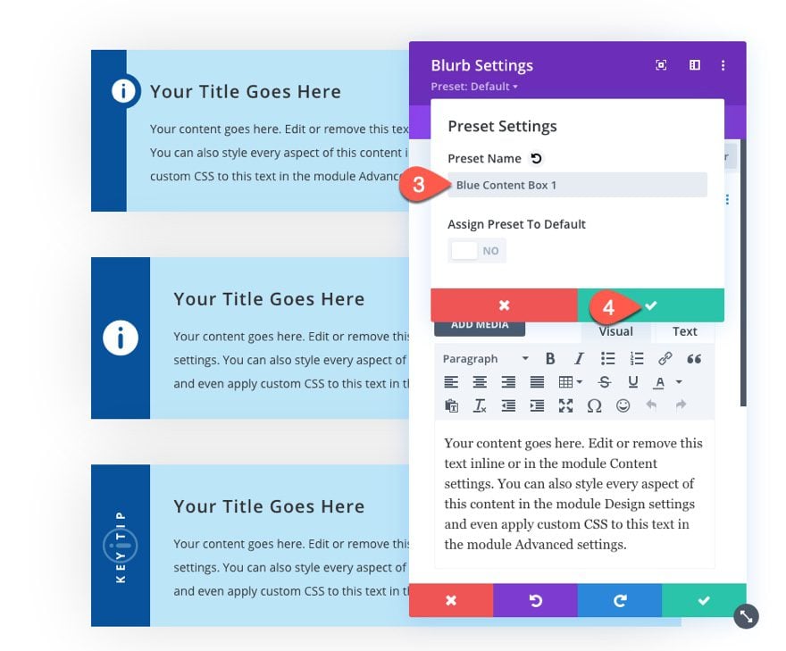
Repeat these steps for each blurb module preset you want to create.
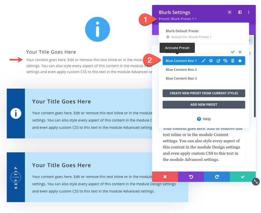
To create more content boxes in the future, simply add a new blurb module and select the icon you want to use. Then activate any of the uploaded presets by clicking on the preset dropdown at the top, and selecting a preset of your choice.
Final Results
Here is a final look at the 3 main content box designs we built.

And here are 36 designs you will be able to make with a few easy customizations we are including in our FREE download above.

Final Thoughts
The styled content boxes we created can be a useful design asset for any website or blog. You can take advantage of the powerful design options in Divi to tweak the content boxes to fit any design. Plus, with the ability to save and upload them to the Divi library and/or create global presets, you will be able to deploy these content boxes whenever you want with just a few clicks. Hopefully, these will come in handy.
I look forward to hearing from you in the comments.
Cheers!



These look great! But I think Divi has been updated, so the options above are not available. E.g., in the Blurb settings, background, instead of the options you have:
Use Icon: YES
Icon: see screenshot
Background Color: #ffffff
Background Gradient Left Color: #00529b
Background Gradient Right Color: #bde5f8
Gradient Direction: 90deg
Start Position: 3em
End Position: 0%
The options I have are:
Gradient stops (with a slider)
Gradient type – (this is the same)
Gradient unit – (percent is chosen by default)
So I can’t enter the options you have suggested. I pressed on anyway, tryig to subsititue options. There are other settings that don;t have the setting syou suggested. My box looks nothing like yours! 🙂
Is there an updates tutorial?
Jason,
these look great, but I’m having trouble changing the colours of the ones I downloaded, the colour change is locked in the gradient section. Then I tried to create my own using the guide but divi seems to have changed since it was written. I don’t have the option of start position and end position sliders in the third step when creating the solid bar on the left so mine dissolves into the colour of the main box with no solid block.
Beautiful!
how can i use them for small blog notices?
Thanks! To do that. I would save the styled content boxes to the divi library. Then I would use the Divi Layout block (when editing a blog post in the default editor) to create a new layout. Then I would add the styled content box to the layout block. Once it is added to the post. You can make it a reusable block for future use. See the following links for more…
https://www.elegantthemes.com/blog/theme-releases/introducing-improved-compatibility-with-the-gutenberg-editor
https://intercom.help/elegantthemes/en/articles/3624717-the-divi-layout-block
https://www.elegantthemes.com/blog/divi-resources/reusable-divi-layout-block-for-gutenburg