Blurb modules are some of the most versatile elements you can find in Divi. In this post, we will show you how to go a step further and get creative with the blurb icon background. We will be using a combination of blurb modules, text modules and call to action modules. These unique designs are perfect for services pages and product category pages. You’ll be able to download the JSON file for free as well!
Let’s get to it.
Preview
Before we dive into the tutorial, let’s take a quick look at the outcome of all three examples across different screen sizes.
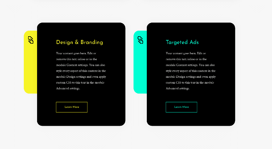
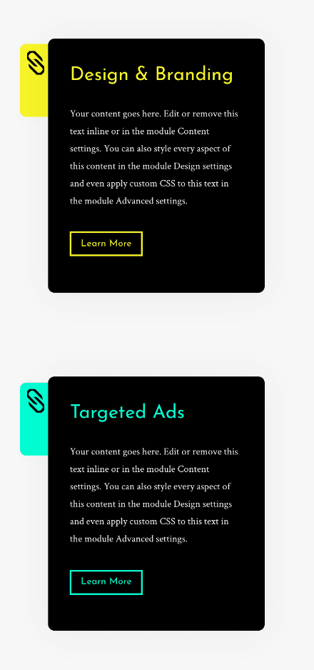
Example #1
Desktop
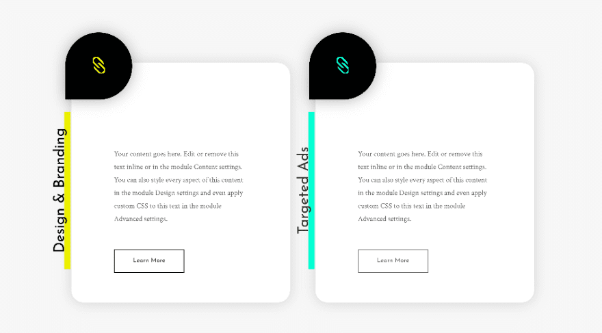
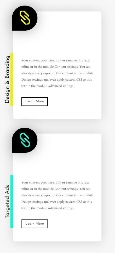
Mobile
Example #2
Desktop
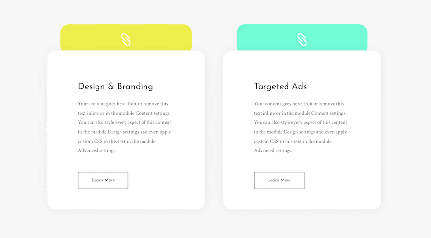
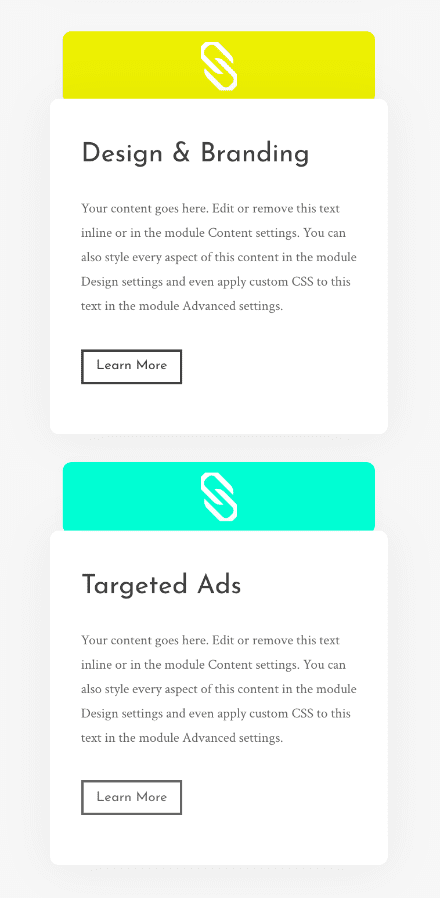
Mobile
Example #3
Desktop
Mobile
Download The Blurb Icon Background Examples for FREE
To lay your hands on the free blurb icon background examples, you will first need to download them using the button below. To gain access to the download you will need to subscribe to our newsletter by using the form below. As a new subscriber, you will receive even more Divi goodness and a free Divi Layout pack every Monday! If you’re already on the list, simply enter your email address below and click download. You will not be “resubscribed” or receive extra emails.

Subscribe To Our Youtube Channel
General Steps
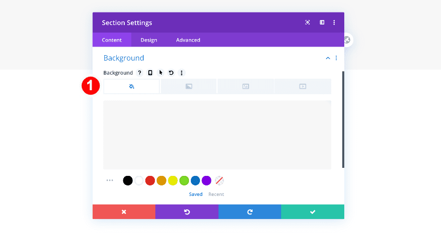
Add New Section
Background
To recreate these creative blurb background designs, open a new page or add a new section to an existing page. Before adding a row, add a background color to your section.
- Background Color: #f7f7f7
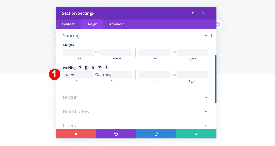
Spacing
Add some custom top and bottom padding to the section too.
- Top and Bottom Padding: 120px
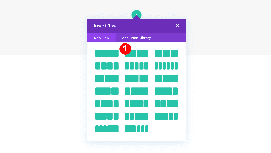
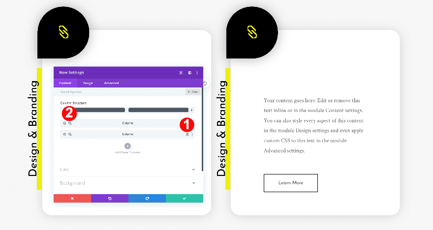
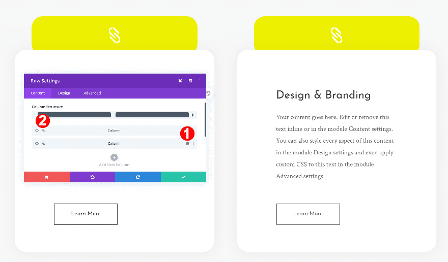
Add New Row
Column Structure
Continue by adding a new row using the following column structure:
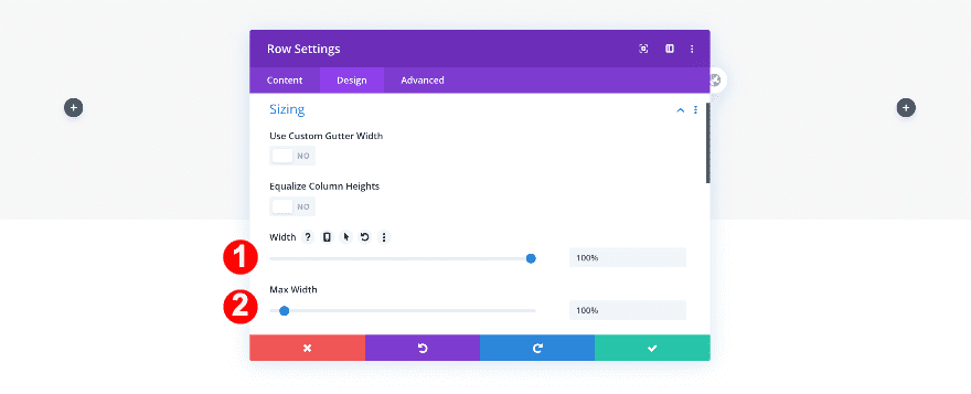
Sizing
Before adding any modules, adjust the sizing of the row.
- Width: 100%
- Max Width: 100%
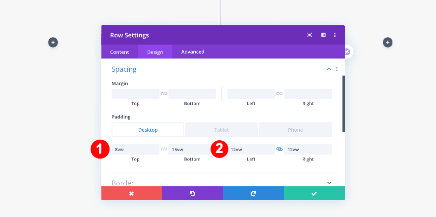
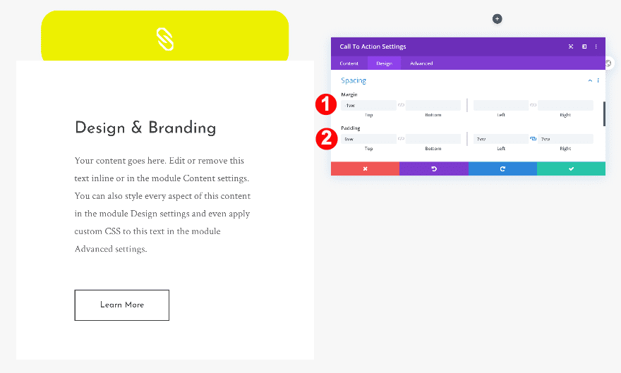
Spacing
Then, adjust the padding in the spacing settings.
- Top Padding: 8vw
- Bottom Padding: 15vw
- Left and Right Padding: 12vw
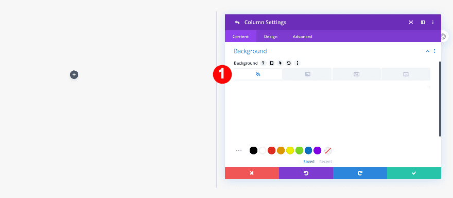
Column 1
Once you’re done modifying the row settings, make some changes to the first column.
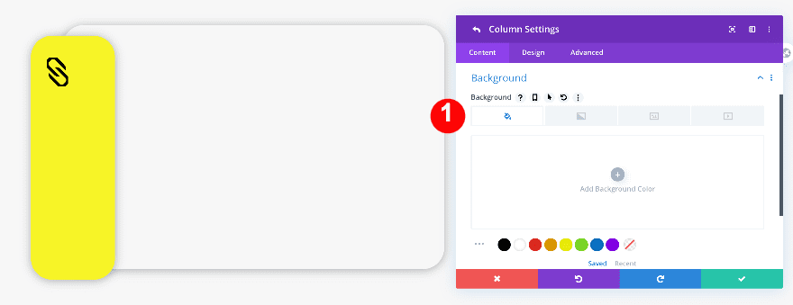
Background
First, add a white background.
- Background Color: White #ffffff
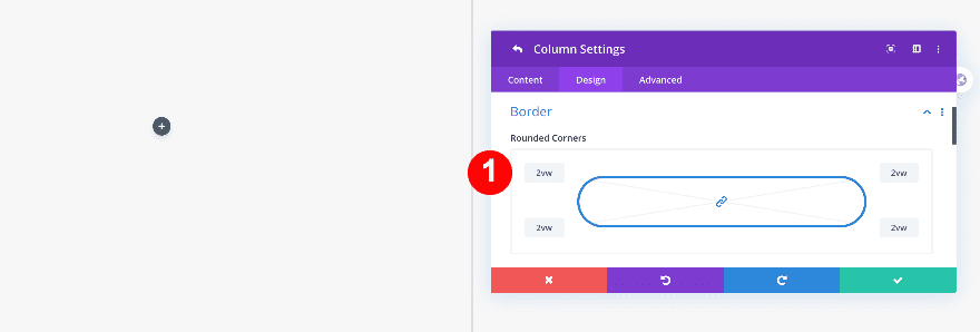
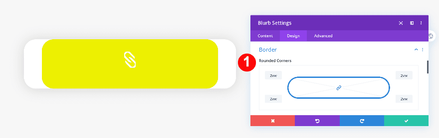
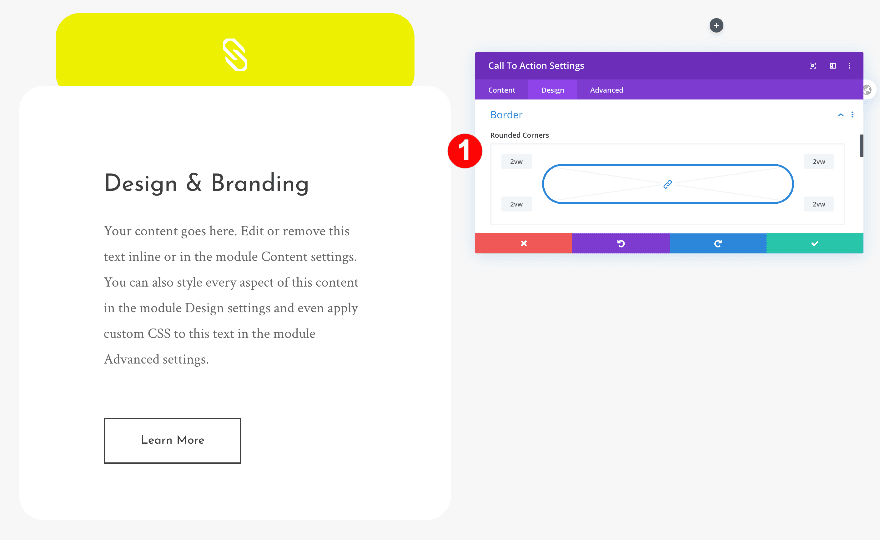
Border
Then, add some border radius.
- Rounded Corners: 2vw all four corners
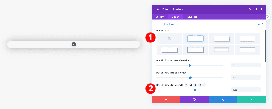
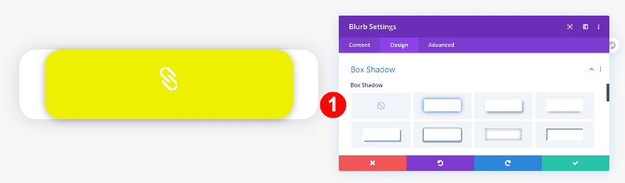
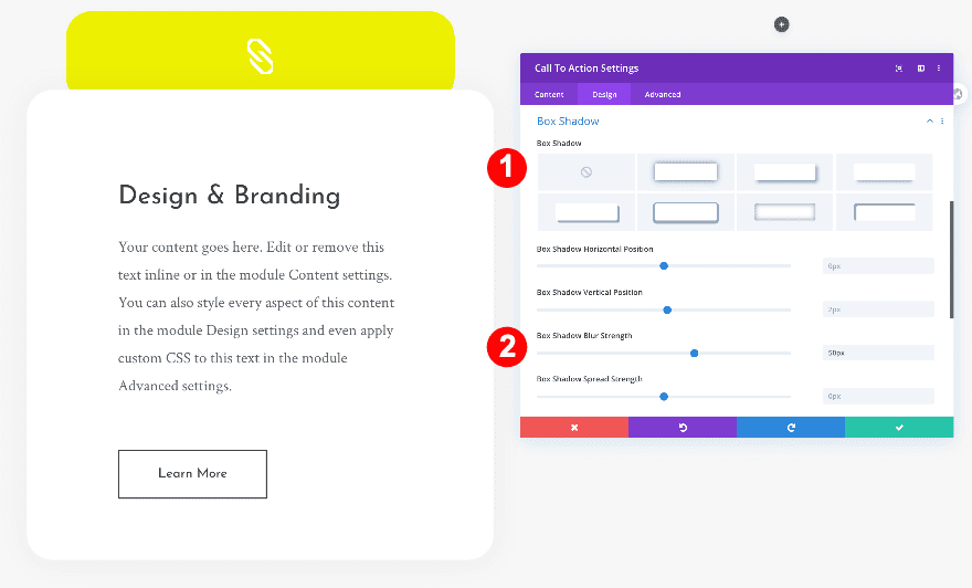
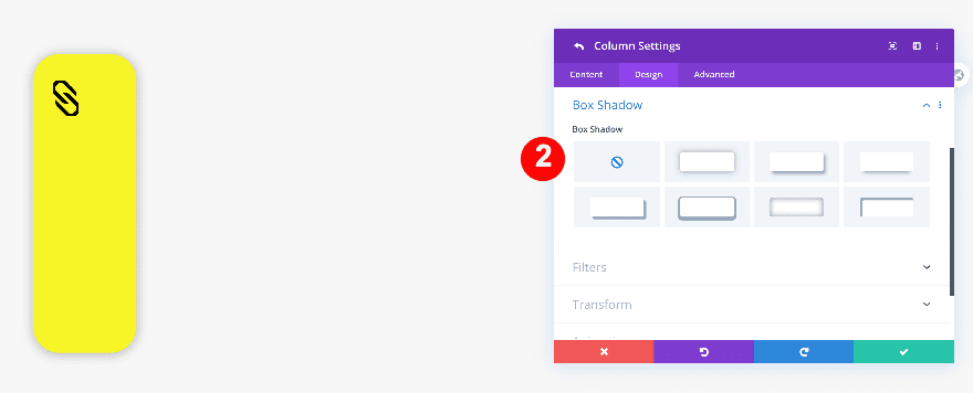
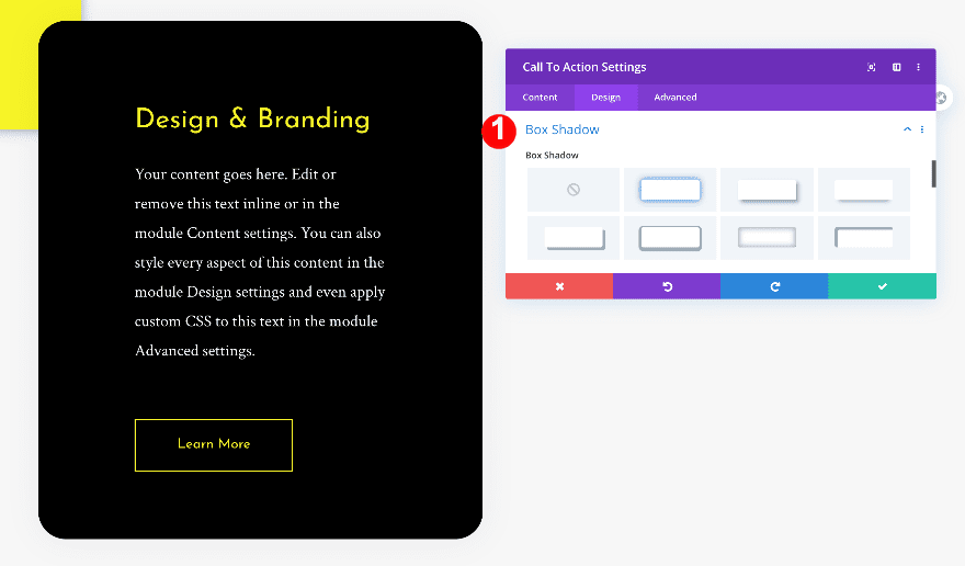
Box Shadow
Finally, add a box-shadow.
- Box-Shadow: First Option
- Box-Shadow Blur Strength: 47px
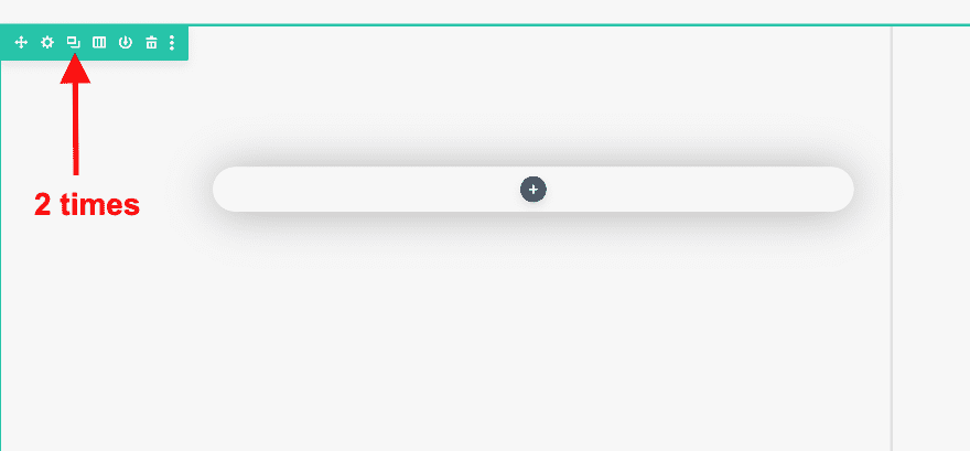
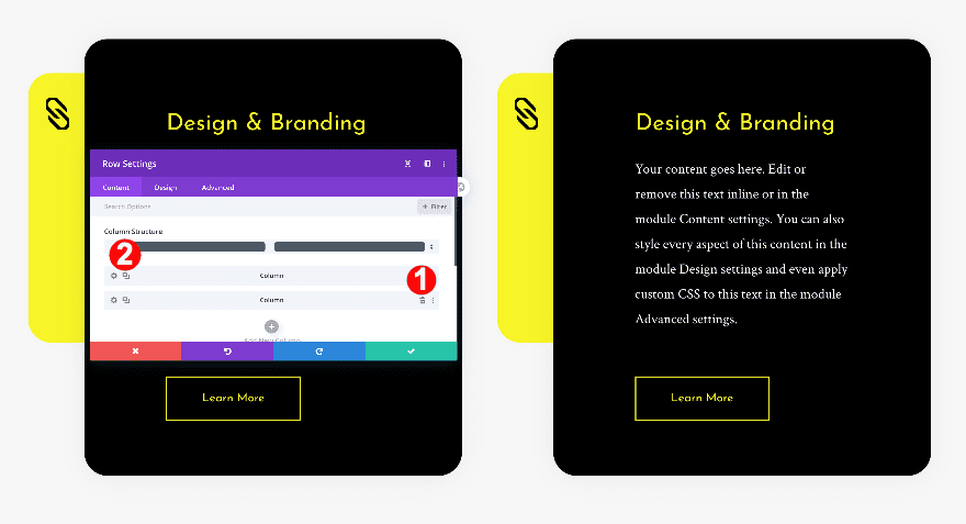
Clone Row Twice
There is one last step left before we start adding modules. Clone the row twice.
Recreate Example #1
Add Blurb Module to Column 1
Erase Default Content
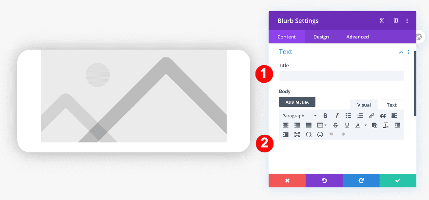
Now that we’ve set up our rows and columns, we can start adding modules to column 1 of the first row. First, add a blurb module and erase all the default title and body text.
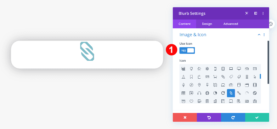
Choose Icon
Then, choose an icon instead of an image.
- Icon: Link
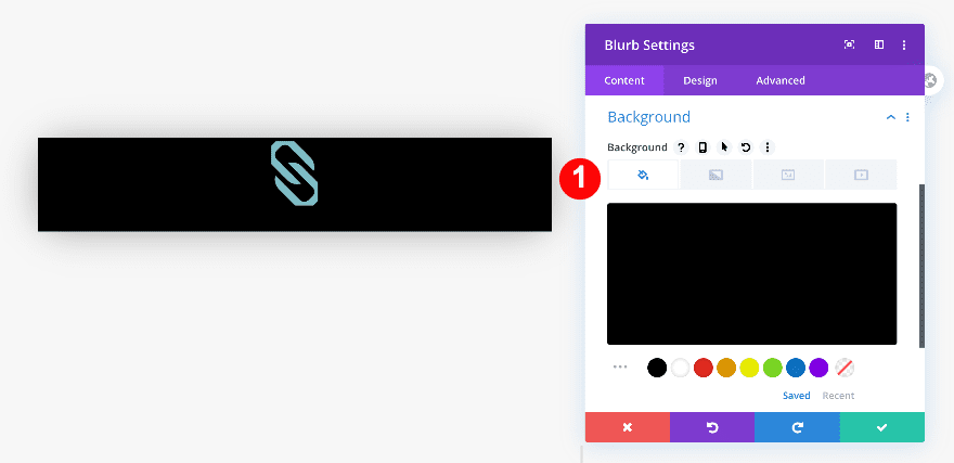
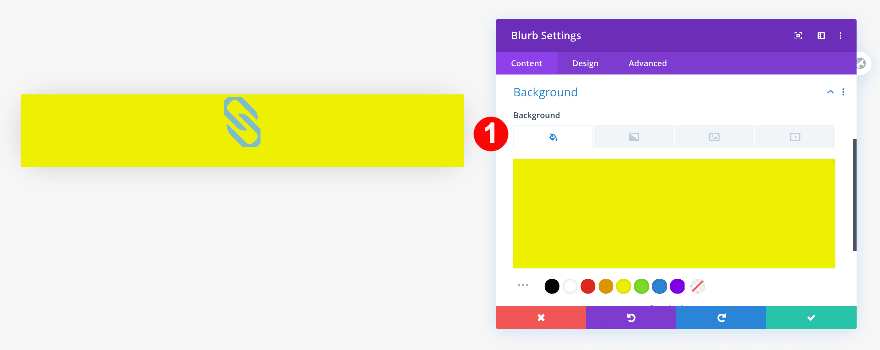
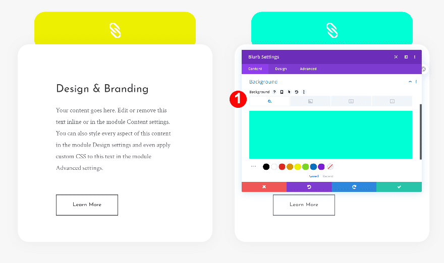
Background
Add a black background color to the blurb module.
- Background Color: Black #000000
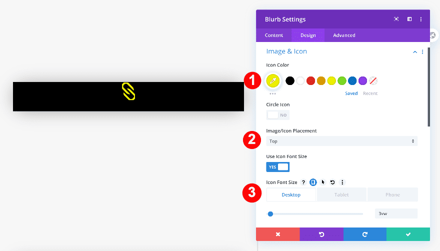
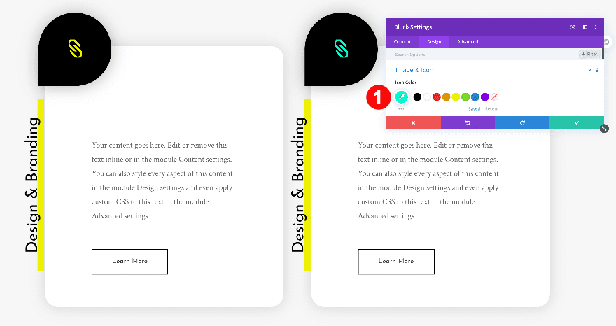
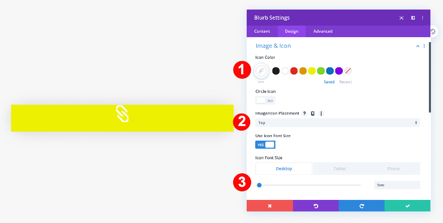
Icon Settings
Then, change the icon settings.
- Icon Color: Yellow #edf000
- Icon Placement: Top
- Icon Font Size:
- Desktop: 3vw
- Tablet: 11vw
- Phone: 13vw
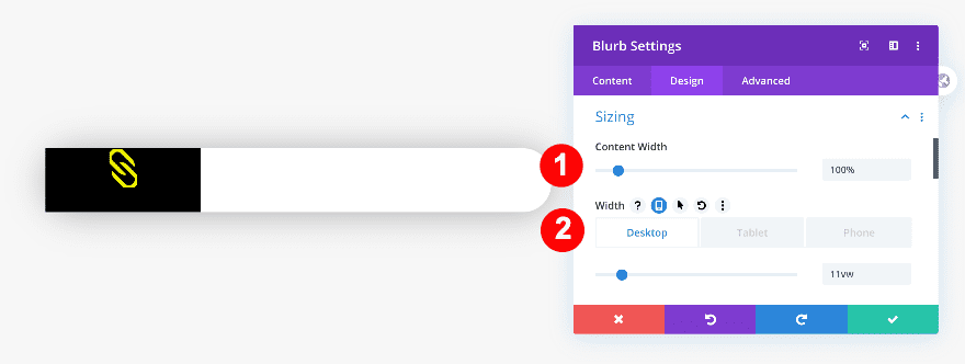
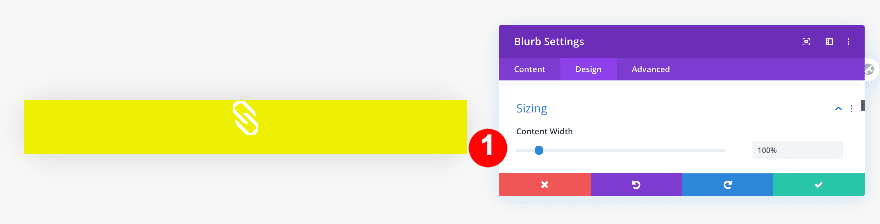
Sizing
Continue by adjusting the sizing of the module.
- Content Width: 100%
- Width:
- Desktop: 11vw
- Tablet: 19vw
- Phone: 22vw
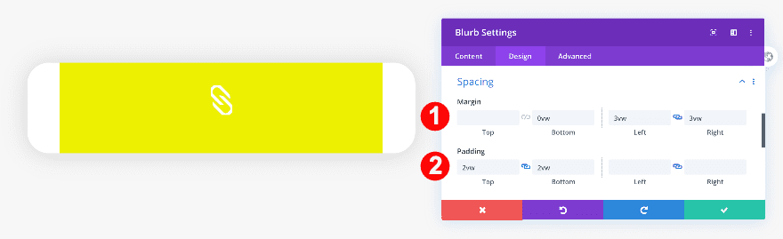
Spacing
Add some spacing values as well.
- Top Margin: -5vw
- Bottom Margin: 0vw
- Left Margin: -1vw
- Top Padding and Bottom Padding: 4vw
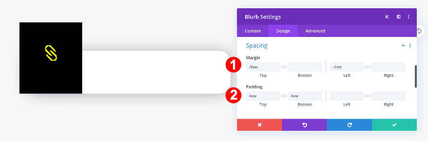
Border
To give the icon a unique shape, add some border radius to each one of the corners except for the bottom left one.
- Rounded Corners: 50vw, 0vw on the bottom left corner.
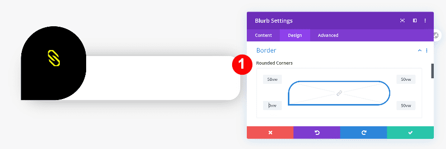
Box Shadow
Finally, add a box shadow.
- Box-Shadow: First Option
- Box-Shadow Blur Strength: 50px
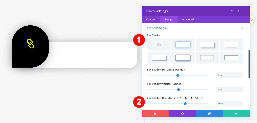
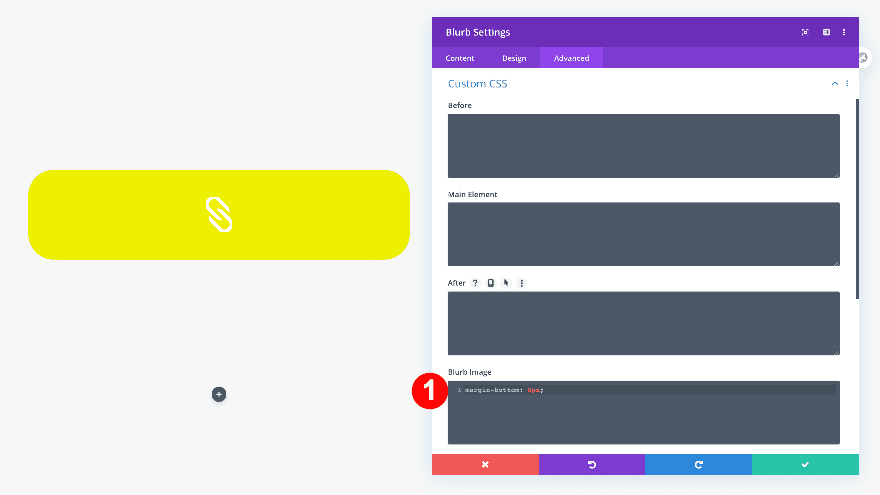
Custom CSS
The icon has, by default, some bottom margin attached to it. To get rid of that, we’ll add one single line of CSS code to the blurb image custom CSS box.
- Blurb Image: margin-bottom: 0px;
margin-bottom: 0px;
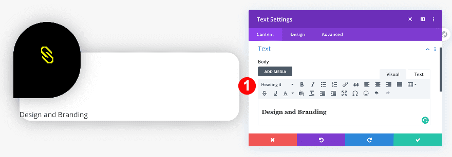
Add Text Module to Column 1
Add H3 Content
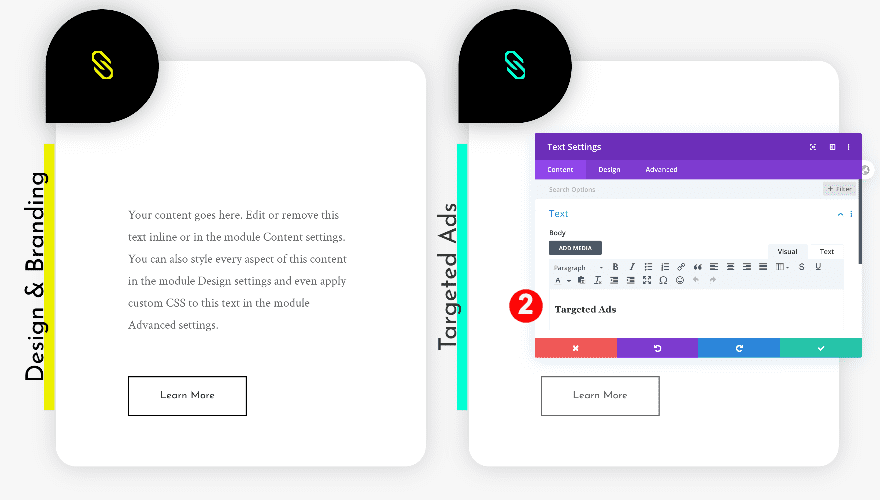
Below the icon, add a text module with some H3 content of your choice.
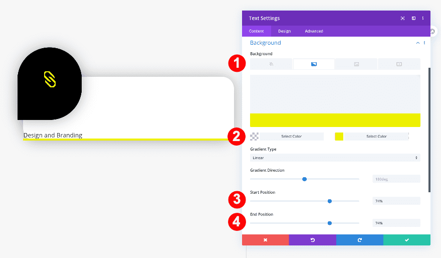
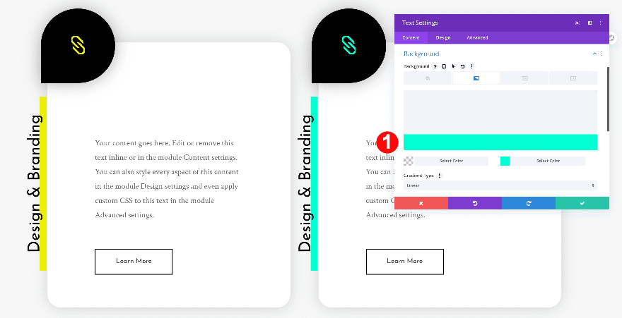
Background
Go to the background settings and add a gradient background.
- Background: Gradient
- Color One: Transparent
- Color Two: Yellow #edf000
- Gradient Direction: 180 deg
- Start and End Position: 74%
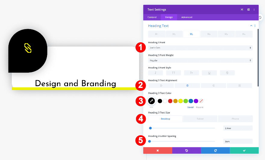
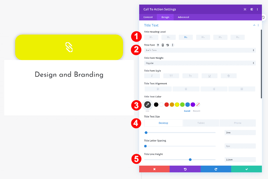
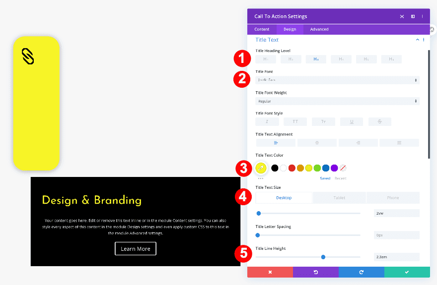
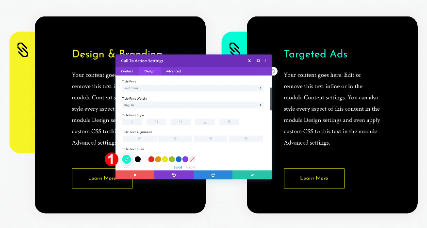
Title Text
Then, style the H3 text.
- Title Text Heading Level: H3
- H3 Font: Josefin Sans
- H3 Alignment: Center
- H3 Font Color: Black #oooooo
- H3 Text Size:
- Desktop: 2.4vw
- Tablet: 3.4vw
- Phone: 4.8vw
- H3 Letter Spacing: 0em
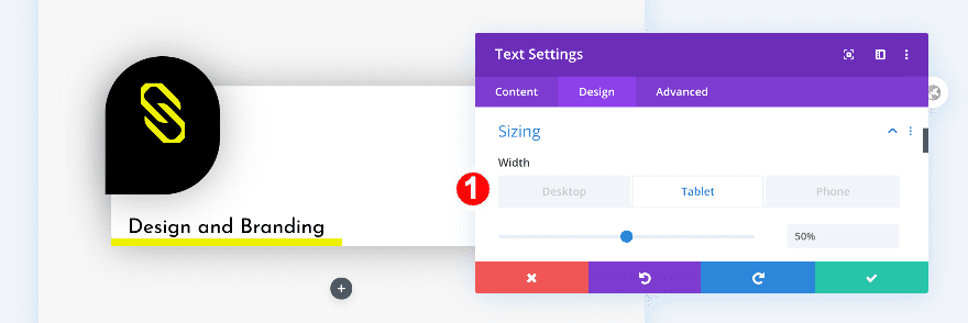
Sizing
In the sizing settings, adjust the width for tablet and phone.
- Width:
- Tablet: 50%
- Phone: 60%
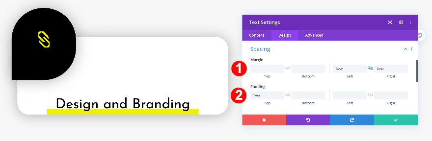
Spacing
Continue by going to the spacing settings and adjusting the margin values.
- Left and Right Margin: 5vw
- Top Padding: 1vw
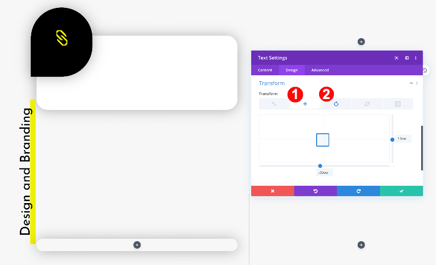
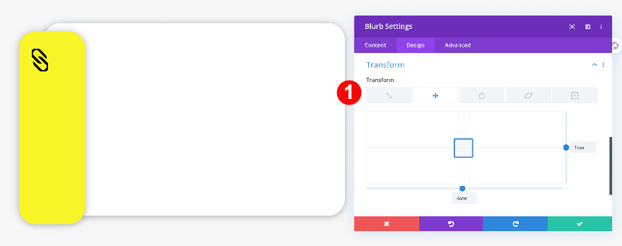
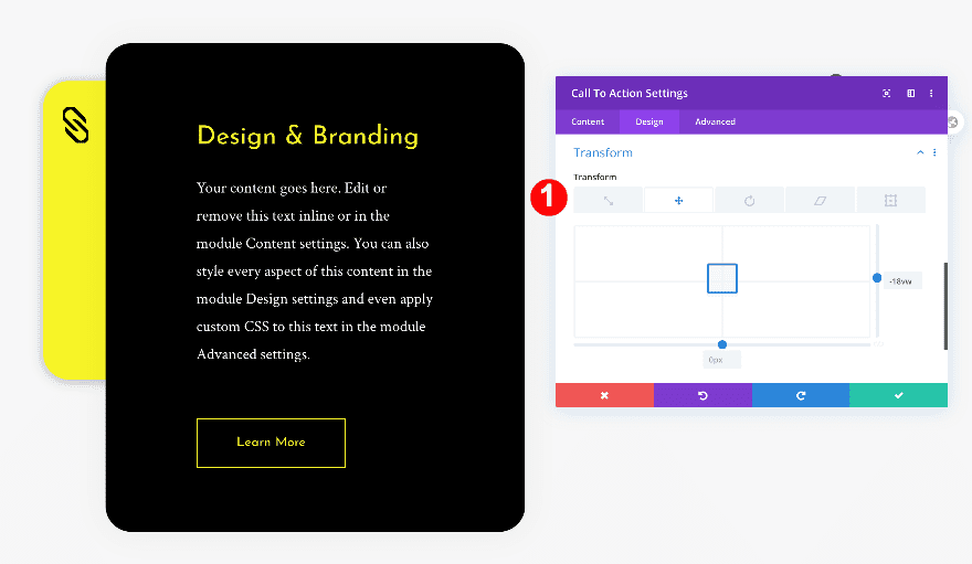
Transform
Finally, rotate the module with the transform options.
- Transform Translate:
- x-axis: -20vw
- y-axis: 13vw
- Transform Rotate: First Option, 280 deg
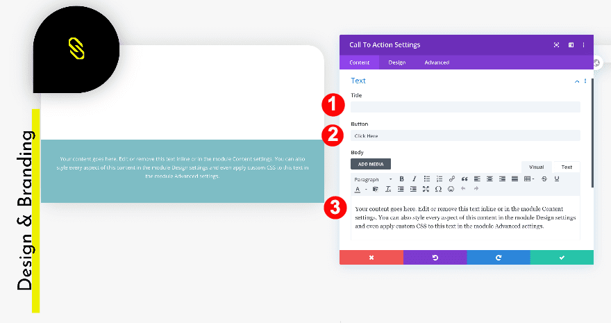
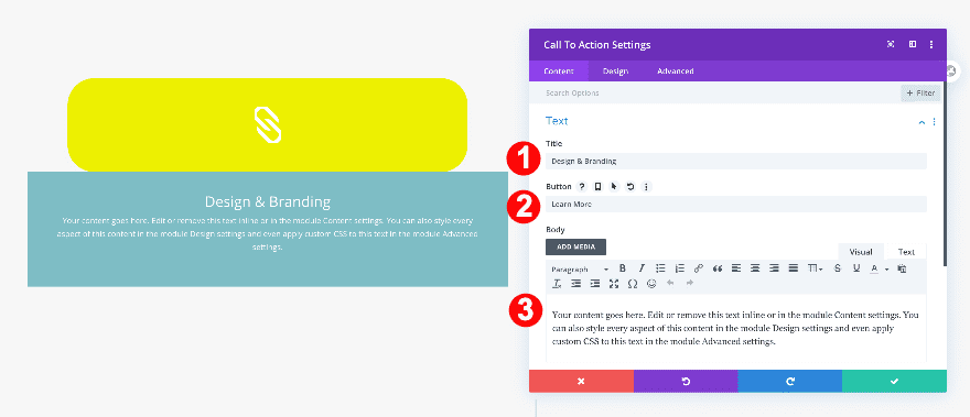
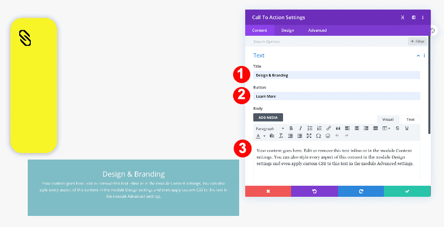
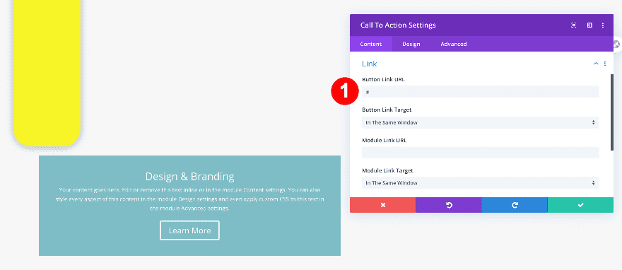
Add Call To Action Module to Column 1
Remove Default Title Content, Add Button and Text Content
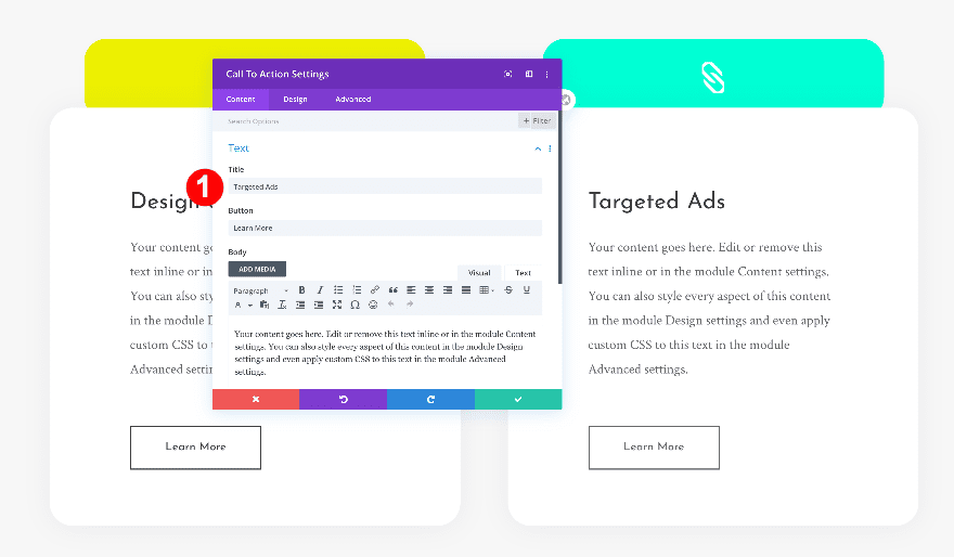
The next and last module we need in column 1 is a call to action module. Add some content of your choice and remove the title copy.
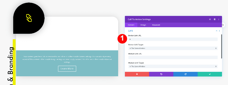
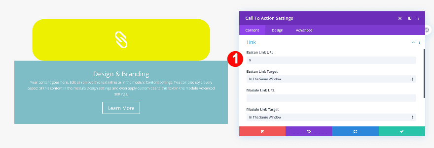
Add Link
Add a relevant link to the button.
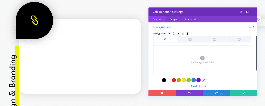
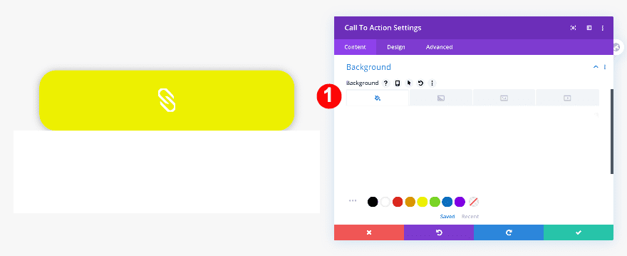
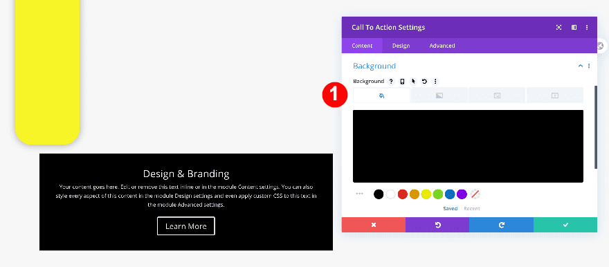
Background
Make sure the background has no color.
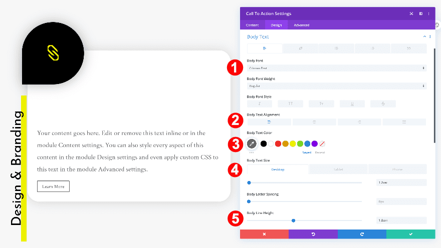
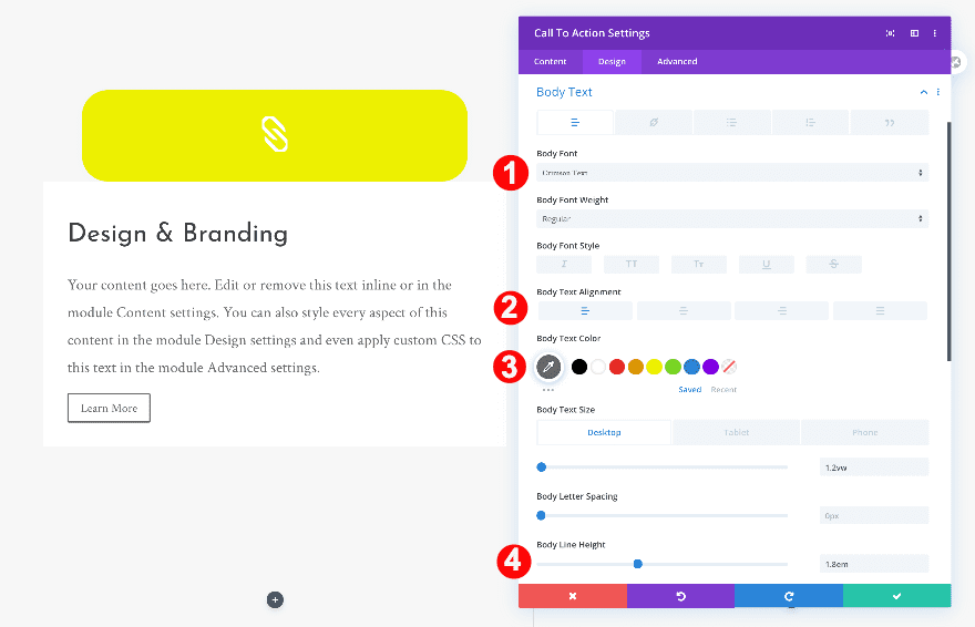
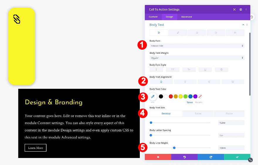
Body Text
Then, go to the design tab and change the body text settings.
- Body Font: Crimson Text
- Body Text Alignment: Left
- Body Text Color: Dark Grey #666666
- Body Text Size:
- Desktop: 1.2vw
- Tablet: 2.6vw
- Phone: 3.1vw
- Body Line Height: 1.8em
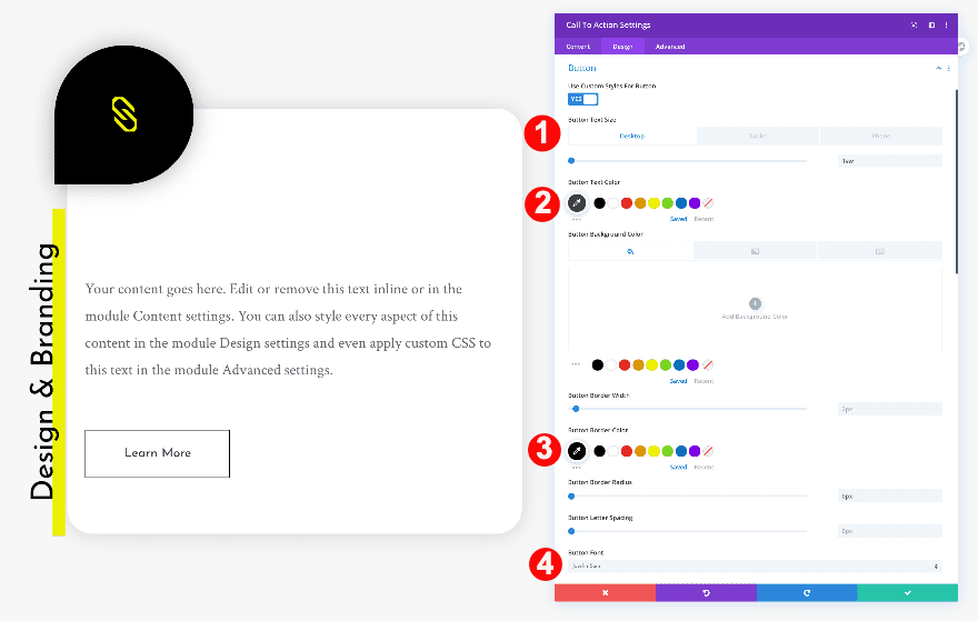
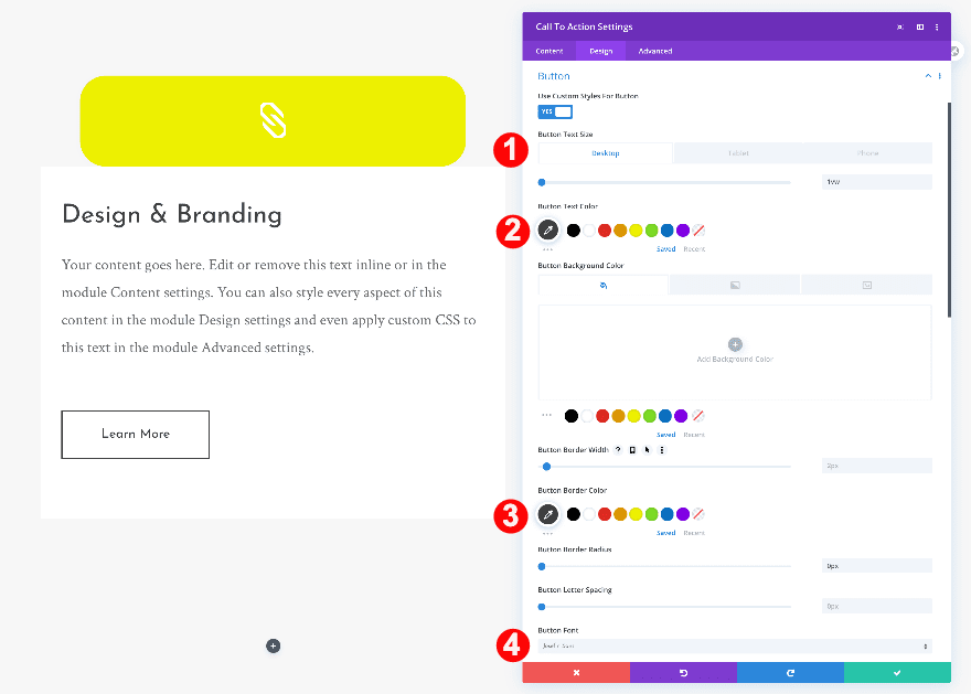
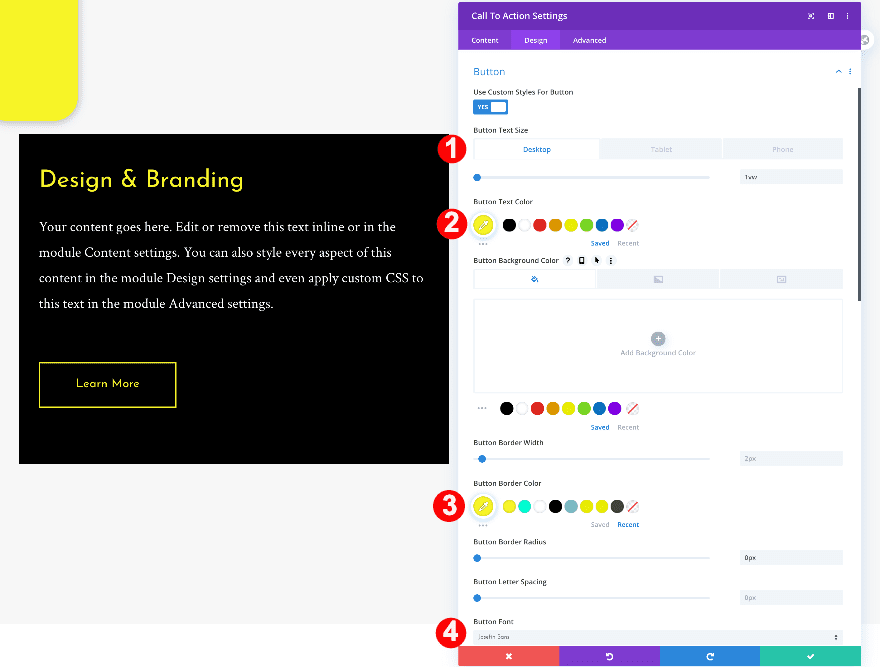
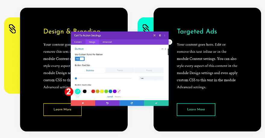
Button
Modify the button styles too.
- Button Text Size:
- Desktop: 1vw
- Tablet: 2vw
- Phone: 3vw
- Button Text Color: Very Dark Grey #3f3f3f
- Button Border Color: Very Dark Grey #3f3f3f
- Button Font: Josefin Sans
- Button Margin: 3vw
- Button Top and Bottom Padding: 1vw
- Button Left and Right Padding: 3vw
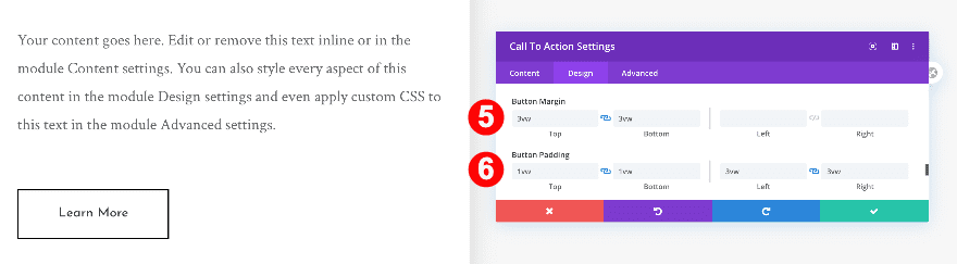
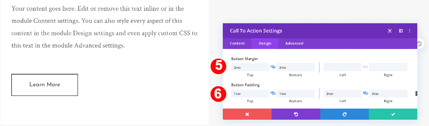
Spacing
Complete the module’s settings by adding some left and right padding.
- Left and Right Padding: 7vw
Delete Column Two and Clone Column 1
Adjust Settings in Column 2
Now, go back to the row settings and delete the second column. Instantly after, clone the first column. In the next steps, we’ll adjust a few settings in the duplicate column.
Blurb Module
Start by changing the icon color of the blurb module.
- Icon Color: Aqua #00ffd4
Text Module
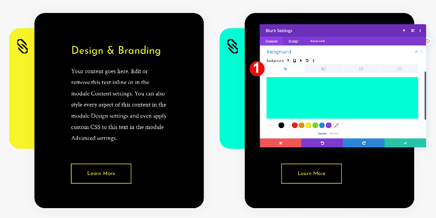
Change the gradient background and copy of the text module next.
- Background Color: Aqua #00ffd4
- Change Content
Recreate Example #2
Add Blurb Module to Column 1
Delete Default Content
On to the second example! Add a blurb module to column 1 and delete all default content.
Choose Icon
Then, choose an icon.
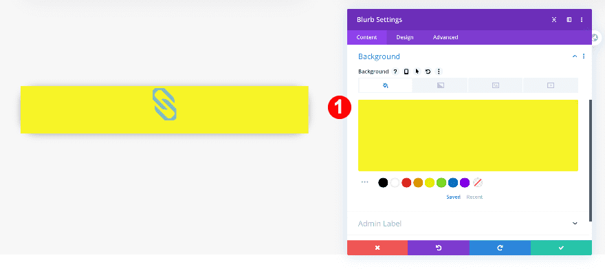
Background
Now, add a yellow background color.
- Background Color: Yellow #edf000
Icon
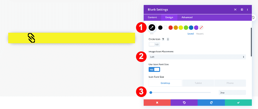
Continue by modifying the icon settings in the design tab.
- Icon Color: White #ffffff
- Icon Placement: Top
- Icon Font Size:
- Desktop: 3vw
- Tablet: 11vw
- Phone: 12vw
Sizing
Once the color and background are styled, adjust the sizing of the module.
- Content Width: 100%
Spacing
Modify the spacing settings too.
- Bottom Margin: 0vw
- Left and Right Margin: 3vw
- Top and Bottom Padding: 2vw
Border
Add some border radius to each corner next.
- Rounded Corners: 2vw all four corners
Box Shadow
Complete the module’s design by adding a subtle box shadow.
- Box-Shadow: First Option
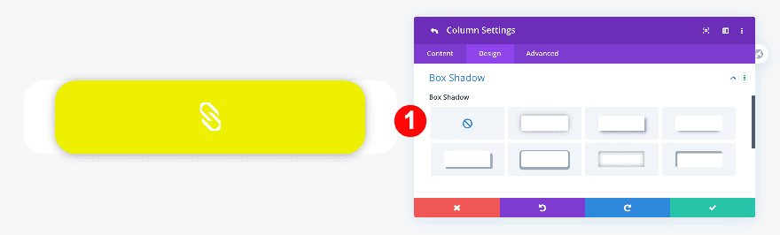
Remove Box Shadow and Background Color of Column 1
Open the column 1 settings next and remove the background color and box shadow.
Custom CSS
Remove the default bottom margin applied to the blurb icon by adding one single line of CSS code to the advanced tab.
- Blurb Image: margin-bottom: 0px;
margin-bottom: 0px;
Add Call to Action Module to Column 1
Add Title Content, Body Content, and Button Content
Below the blurb module, add a call to action module and insert some content of your choice.
Add Link
Add a link to the button next.
Background
Continue by adding a white background.
- Background Color: White #ffffff
Title Text
In the design tab, style the H3 title text.
- Title Heading Level: H3
- H3 Font: Josefin Sans
- H3 Font Color: Very Dark Grey #3f3f3f
- H3 Size:
- Desktop: 2vw
- Tablet: 4vw
- Phone: 6vw
- H3 Line Height: 2.3em
Body Text
Then, style the body text.
- Body Font: Crimson Text
- Body Text Alignment: Left
- Body Text Color: Dark Grey #666666
- Body Text Size:
- Desktop: 1.1vw
- Tablet: 2.2vw
- Phone: 3.1vw
- Body Line Height: 1.8em
Button
Move on to the button settings and style the button as follows:
- Button Text Size:
- Desktop: 1vw
- Tablet: 2vw
- Phone: 3vw
- Button Text Color: Very Dark Grey #3f3f3f
- Button Font: Josefin Sans
- Button Border Width: 2-x
- Button Border Color: Very Dark Grey #3f3f3f
- Button Top and BottomMargin: 3vw
- Button Top and Bottom Padding: 1vw
- Button Left and Right Padding: 3vw
Spacing
Now, adjust the spacing.
- Bottom Margin: -1vw
- Top Padding: 6vw
- Left and Right Padding: 7vw
Border
Then, round off the corners in the border settings.
- Rounded Corners: 2vw
Box Shadow
Finally, add a box shadow.
- Box-Shadow: First Option
- Box-Shadow Blur Strength: 50px
Delete Column Two and Clone Column 1
Adjust Settings in Column 2
Similar to the previous example, go to the row settings and delete the second column. Duplicate the first column and adjust a few settings.
Blurb Module
Change the background of the blurb module from yellow to aqua.
- Background Icon Color: Aqua #00ffd4
Call To Action Module
Change the call to action module’s content and link too.
- Change Title Content
- Change Link
Recreate Example #3
Add Blurb Module to Column 1
Delete Default Content
On to the next and last example! Add a blurb module to column 1 and erase the default content.
Choose Icon
Choose an icon.
Background
Add a bright yellow background to the module.
- Background Color: Yellow #f7f426
Icon
Make the icon black and adjust its placement
- Icon Color: Black #000000
- Icon Placement: Left
- Icon Font Size:
- Desktop: 3vw
- Tablet + Phone: 8vw
Sizing
Continue by modifying the module’s width and height.
- Content Width: 100%
- Height: 23vw
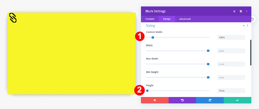
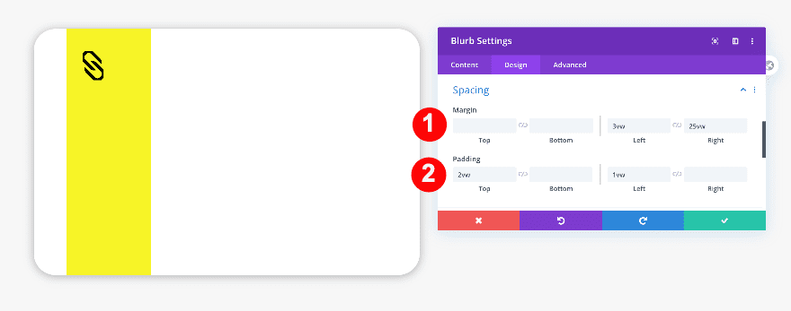
Spacing
Furthermore, adjust the spacing settings.
- Left Margin: 3vw
- Right Margin: 25vw
- Top Padding: 2vw
- Left Padding: 1vw
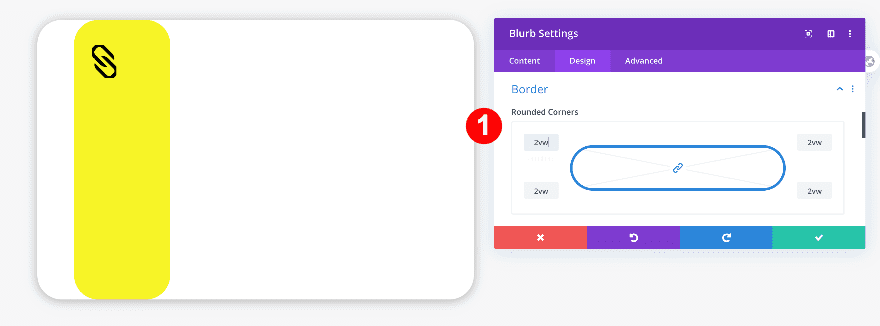
Border
Add some border radius too.
- Rounded Corners: 2vw on all corners
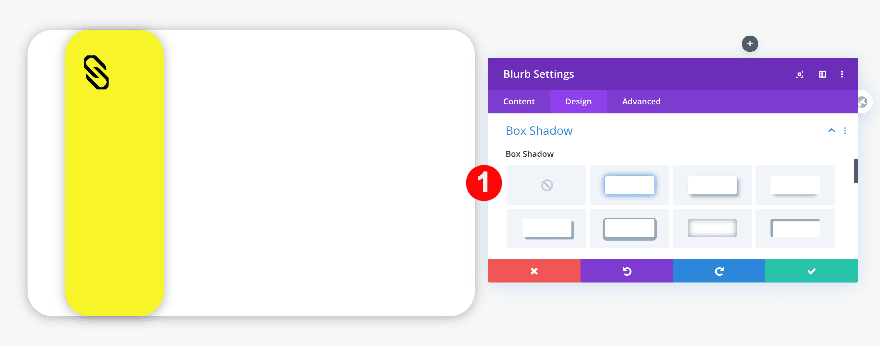
Box Shadow
Then, add a box shadow.
- Box-Shadow: First Option
Transform
Finally, reposition the module using custom transform translate values.
- x-axis: -6vw
- y-axis: 1vw
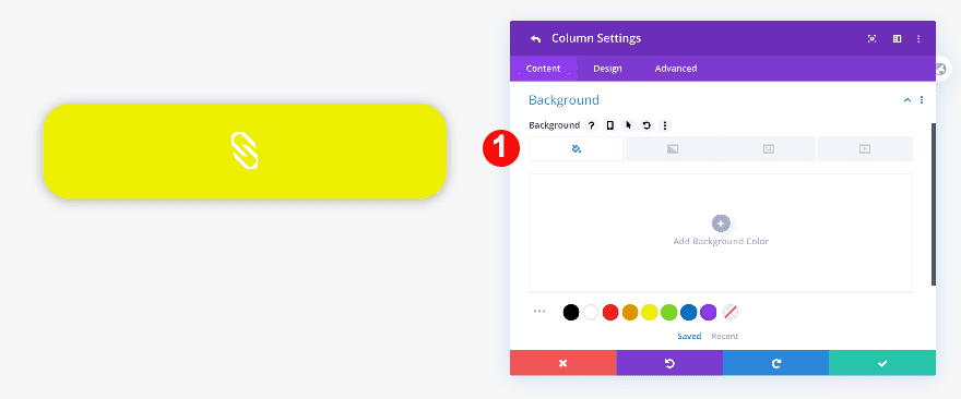
Remove background color and box shadow from column 1
Go to the column 1 settings and remove the background color and box shadow.
Add Call To Action Module to Column 1
Add Title, Body and Button Content
Below the blurb module, add a call to action module. Add some content of your choice.
Add Link
Then, add a link to the button.
Background
To style the call to action module, start by adding a black background color.
- Background Color: Black #oooooo
Title Text
Adjust the H3 text settings next.
- Title Heading Level: H3
- H3 Font: Josefin Sans
- H3 Font Color: Bright Yellow #f7f426
- H3 Font Size:
- Desktop: 2vw
- Tablet: 4vw
- Phone: 6vw
- H3 Line Height: 2.3em
Body Text
Change the body text settings too.
- Body Font: Crimson Text
- Body Text Alignment: Left
- Body Text Color: White #000000
- Body Text Size:
- Desktop: 1.2vw
- Tablet: 2.2vw
- Phone: 3.1vw
- Body Line Height: 1.8em
Button
Then, style the button as follows.
- Button Text Size:
- Desktop: 1vw
- Tablet: 2vw
- Phone: 3vw
- Button Text Color: Aqua #00ffd4
- Button Border Color: Aqua #00ffd4
- Button Font: Josefin Sans
- Button Top and Bottom Margin: 3vw
- Button Top and Bottom Padding: 1vw
- Button Left and Right Padding: 3vw
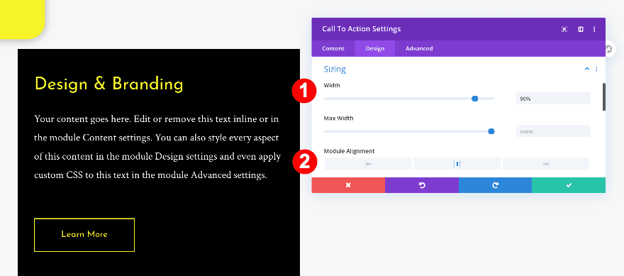
Sizing
Move on to the sizing settings and make some changes.
- Width: 90%
- Module Alignment: Center
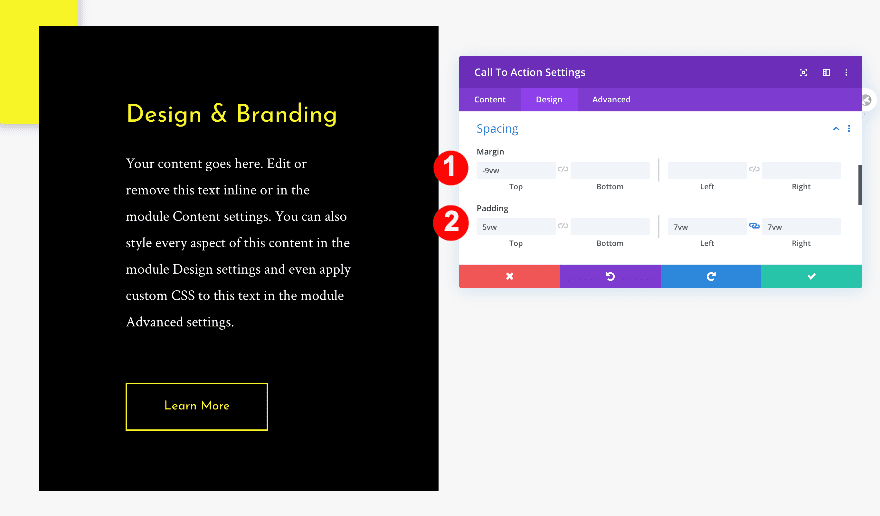
Spacing
Modify the spacing settings too.
- Top Margin: -9vw
- Top Padding: 5vw
- Left and Right Padding: 7vw
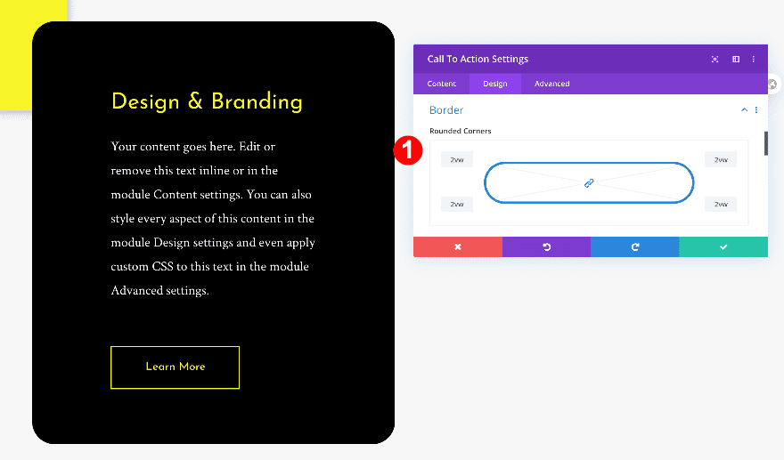
Border
Open the border settings next and add some border radius to each one of the corners.
- Rounded Corners: 2vw
Box Shadow
We’re using a subtle box shadow too.
- Box Shadow: First Option
Transform Translate
Finally, reposition the call to action module by modifying the transform translate settings.
- y-axis: -18vw
Delete Column Two and Clone Column 1
Adjust Settings in Column 2
Now that the first column is ready, we’ll delete the second one and duplicate the first. Afterward, we’ll adjust some of the content and color details.
Blurb Module
In the blurb module settings, change the background from yellow to aqua.
- Background Icon Color: Aqua #00ffd4
Call To Action Module
In the call to action module settings, change the title content, the title color, and the button color. Don’t forget to change the button link as well and you’re done!
- Title Text Color: Aqua #00ffd4
- Content
- Button Color: #00ffd4
Preview
Now that we’ve gone through all the steps, let’s take a final look at the outcome across different screen sizes.
Example #1
Desktop
Mobile
Example #2
Desktop
Mobile
Example #3
Desktop
Mobile
Conclusion
As you have seen in this post, blurb icon backgrounds can make your blurb designs much more interesting. By using blurb modules paired up with a call to action and text modules, there are many creative possibilities. These style of designs are perfect for services showcases or product sections. What do you think? Tell us in the comments.


Love this tutorial, very cool!
Question tho — because the CTA module has been moved up -18vw using the Transform option, it seems to leave a large white space beneath it before the start of my next Section that I am kind of unable to make smaller. I obviously can’t use the Transform option on all the rest of the DOM, so any good method of handling this? Thanks!
Hi Orana, I have tried #1 but the black icon is not overflowing, so it is alway cut . Where do I find the settings for overflow? I tried the ones from the advanced tab but without any success. What is my mistake?
Hi Kathrin, I had this same issue. Based on Jeff’s response from just above your comment, go into the advanced settings tab of column 1. Then click on the visibility dropdown. Then set horizontal and vertical overflow to “visible.” That way the overlap of the blurb will show up as designed. Hope that helps.
Hi Kathrin.
Did you follow the general steps first?
There is a step missing in the tutorial which might confuse some people. The Column Settings need to set Overflow to visible.
^^ Indeed, this. Setting the Horizontal and Vertical Overflow options to visible (on the Column Settings > Advanced tab) is a must in order for this to work. Also, it might just be me (because I used this to make a 3 column version), but I also needed to change the Transform options for the Blurb module on Tablet and Phone tabs so they’d stay positioned correctly on those sizes.
Hi, this is a very awesome tutorial. Thanks for sharing!
When I am creating #1, the blurb module is not about the actual row. What am I missing? I’ve followed step by step but still nothing changes.
Hi Cody, what do you mean that the blurb module is not about the actual row?
I love the number 1 and 3. Beautiful work, Orana. Thanks a lot!
Thanks Elisandro 🙂