The new Divi global defaults update helps you apply certain designs styles to elements throughout your entire website. It saves you time, helps you keep an overview of your website and style each global setting the way you’re used to it; inside the Divi Builder itself.
Now, when you’re using a layout pack for your website, chances are you want to turn the layout pack styles into global defaults, so you don’t have to go back and forth. But what’s the best way to go about it? We’ll show you in this week’s use case tutorial. We’ll use the Cyber Security Layout Pack to demonstrate it but rest assured, the technique applies to any layout pack you use.
Let’s get to it!
1. Create New Page for Each Layout in Layout Pack
If you’re planning on turning a layout pack’s style into global defaults, the first thing you will need to do is create a separate page for each layout that comes with the layout pack. Having a separate page for each one of the layouts will help you with the second step; scanning for design elements that are used throughout the layout pack and turning them into global defaults.
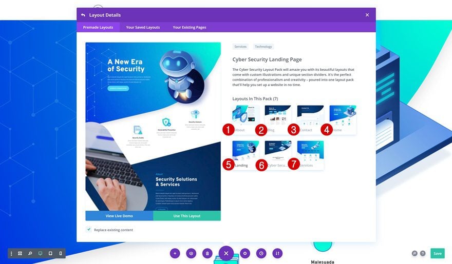
2. Detect the Modules Used Throughout Layouts & Make Them Global
Once you’ve created a separate page for each layout, you can start scanning the pages to find the different modules that are used. We’re deliberately skipping section, row and column settings because these depend on the type of section you’re creating. And for most sections and rows, the design team decides to go with the Divi’s default settings to make it easier for you to set up your own global defaults.
We’ve gone ahead and detected the most frequently used modules in the Cyber Security Layout Pack that contain custom styles. These modules are also some of Divi’s most popular modules and can be found in almost any layout pack:
- Text Module
- Primary Button Module
- Divider Module
- Email Optin Module
- Contact Form Module
Turn Text Module Body & Heading Settings Into Global Defaults
Time to start turning the module styles into global defaults! You’ll need to do this module by module. We’ll start with the Text Module. The only settings we recommend turning global are the heading and body text settings. These two option groups will most likely remain the same, no matter what design you’re creating. The other settings, such as spacing and sizing, usually depend on how your Text Module is influenced by the rest of the design and are tweaked along the way. We’ll go through the process of setting global defaults for this particular module. We’ll, then, continue by listing the settings we recommend turning into global defaults for the other modules.
Throughout the layouts, three Text Module headings are being used; H1, H2 and H3. We’ll turn these three headings and the paragraph text settings into global defaults. If you want to go further than H3, you can style them manually in the H3 global text settings.
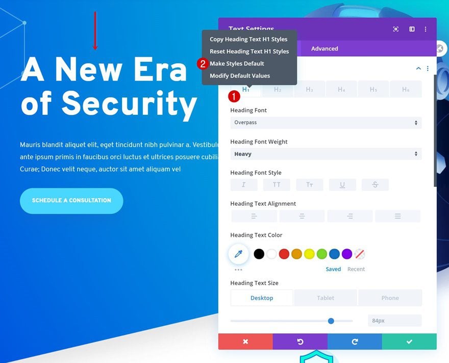
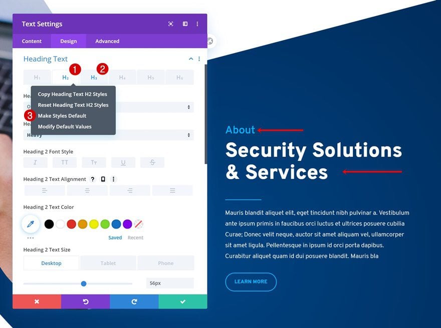
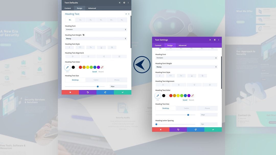
On the landing page, you’ll find all these settings spread across different Text Modules. The first Text Module in the hero section contains the H1 copy. Open the settings, go to the H1 text settings, right click on the H1 item and click on ‘Make Styles Default’.
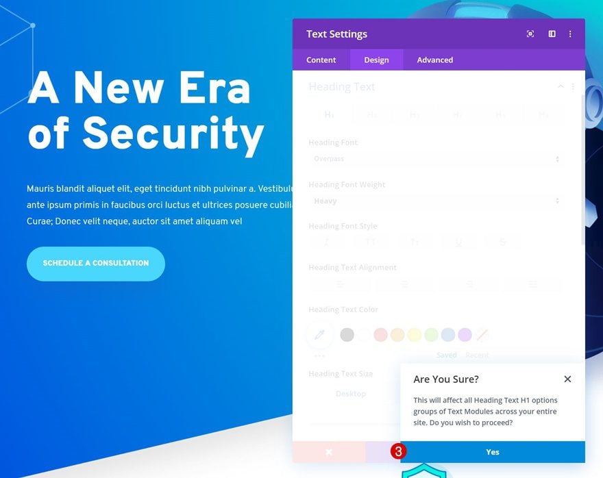
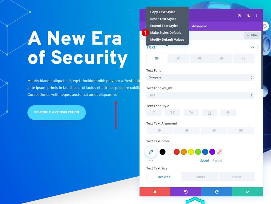
Locate a Text Module with some paragraph content next. Go to the text settings, right click and click on ‘Make Styles Default’.
The last Text Module we’ll open contains both the H2 and H3 text styles. Right click each one of the heading items individually and click on ‘Make Styles Default’. Once you’ve gone through these steps, your Text Modules are ready to go!
You’ll have to repeat these steps for each one of the recurring modules on your website. Let’s move on to the other ones.

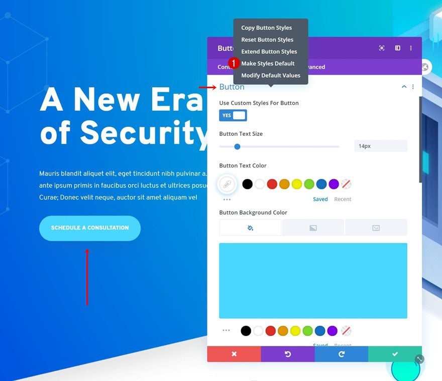
Button Settings
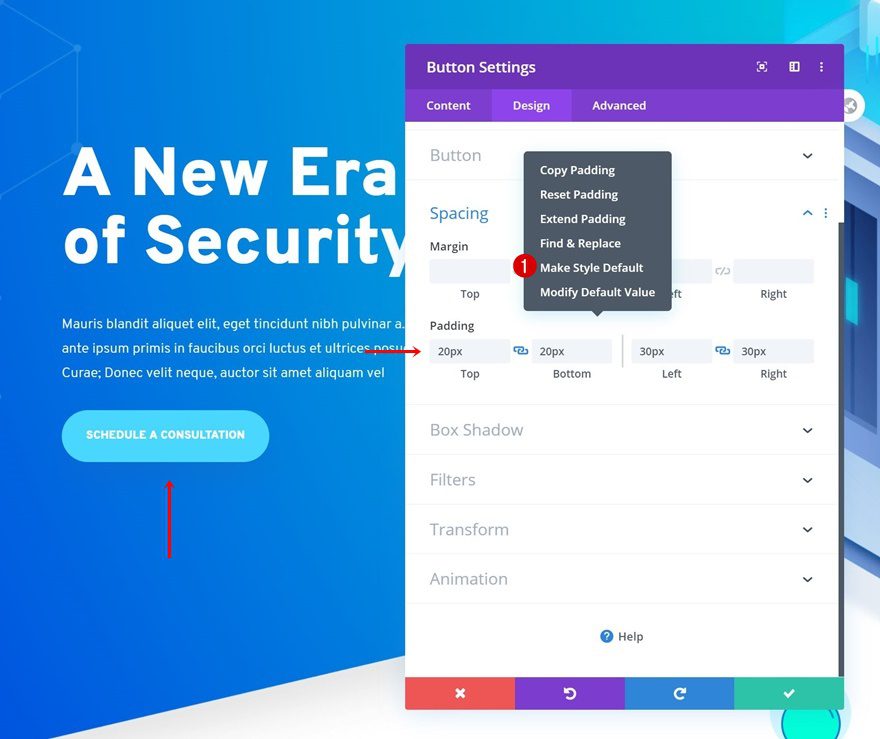
Padding
2. Blurb Module
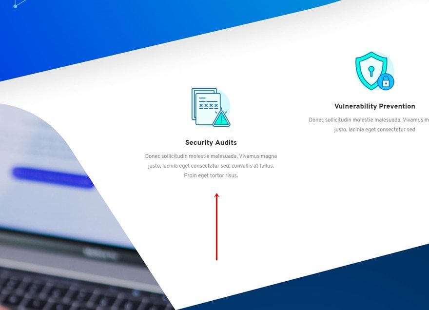
Icon Settings (When Needed)
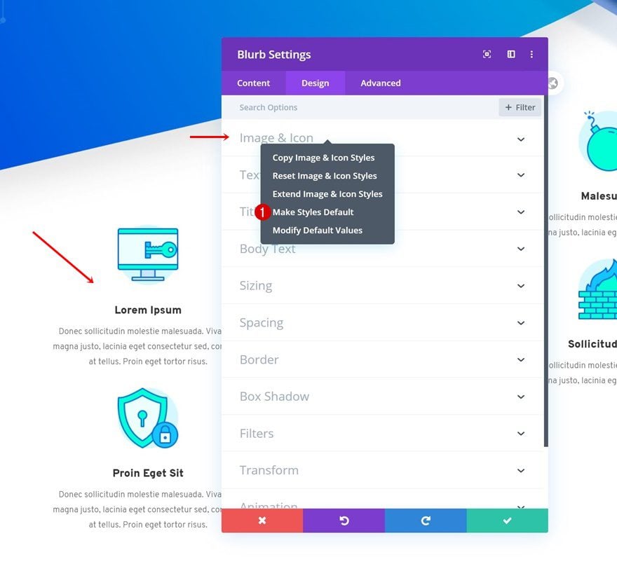
Text Settings
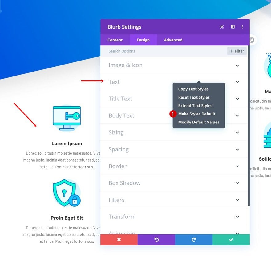
Title Text Settings
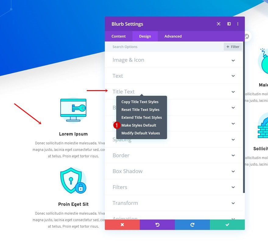
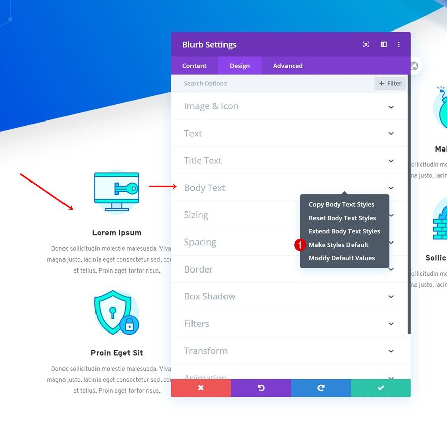
Body Text Settings
3. Divider Module
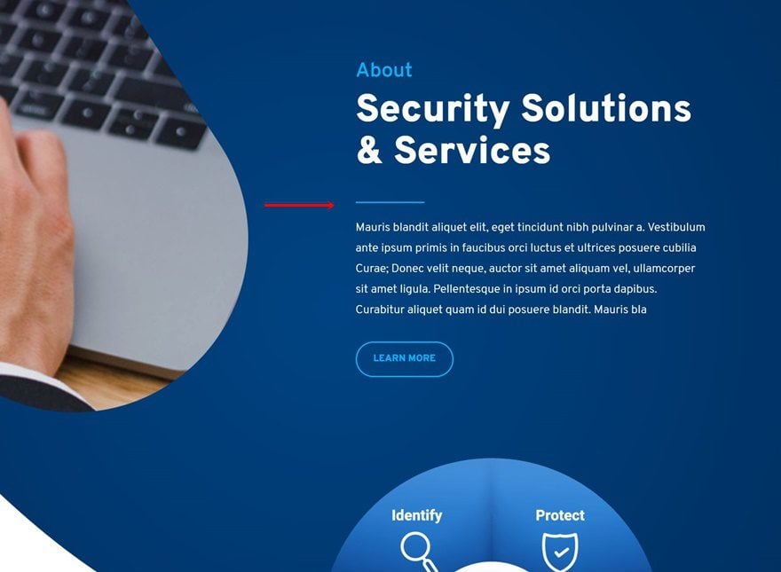
Line Settings
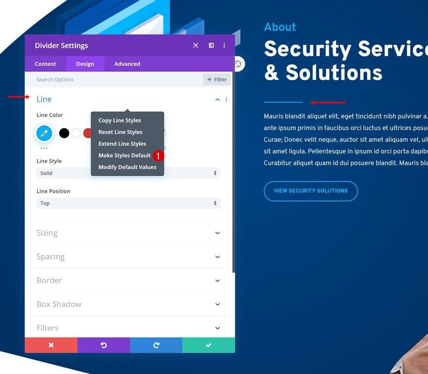
Sizing Settings
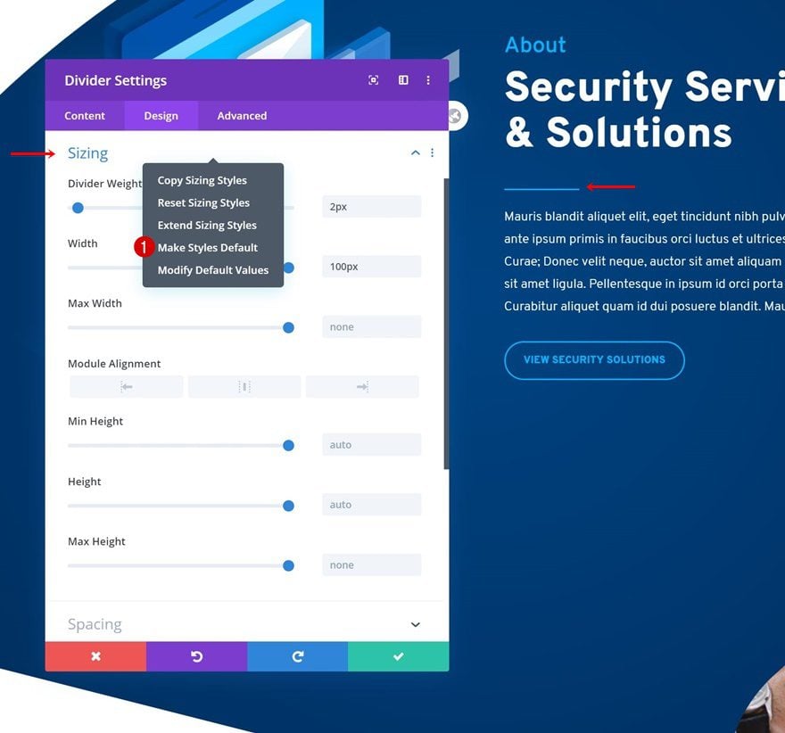
4. Email Optin Module
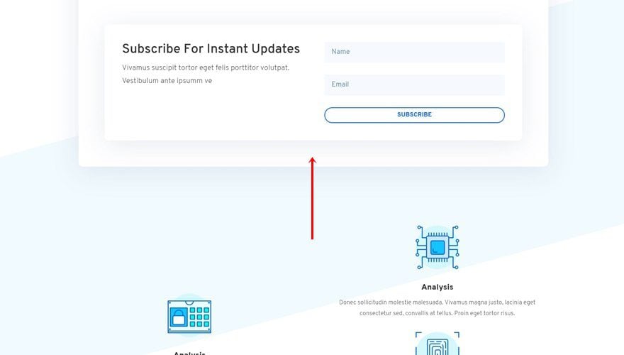
Entire Module Except: Margin + Sizing + Transforms Settings
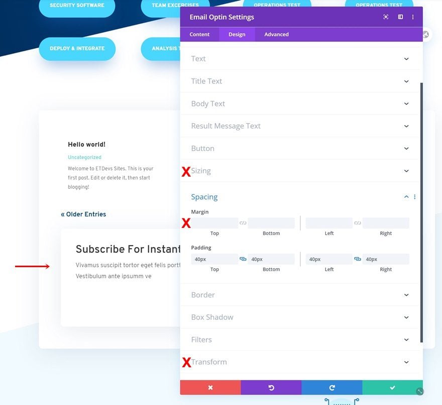
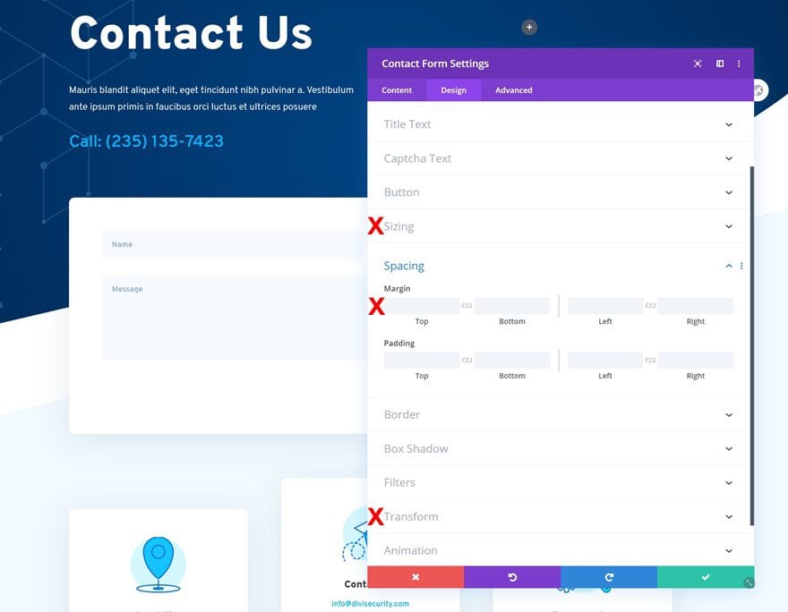
5. Contact Form Module
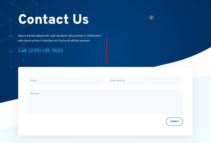
Entire Module Except: Margin + Sizing + Transforms Settings
3. Save Recurring Elements as (Global) Items for Reuse
Now, once you’ve set the global defaults for the mainly used modules, there are still some other elements that you might consider reusing. These elements are usually, but not limited to, the following:
- Secondary Button
- Tertiary Button
- CTA Sections
- Footer Sections
- Layout Pack Specifics: Image Modules with Section Dividers/Differently Styled Blurb Modules/…
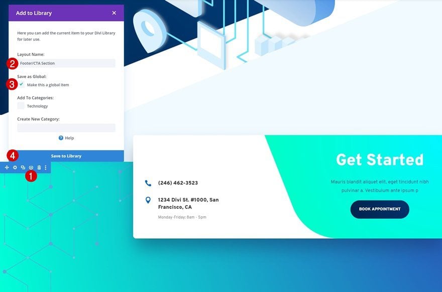
We recommend you save these elements to your Divi library and reuse them as you go. It helps to save some of them as global items instead of regular ones, such as footers and CTA sections. Elements like buttons or differently styled blurb modules are recommended to be saved without being global, so you can make specific changes to the copy and design wherever needed.
You can save an element to the Divi Library by hovering it, clicking on the save to library icon, giving your library item a name, choosing if you want to make it global and clicking on ‘Save to Library’.
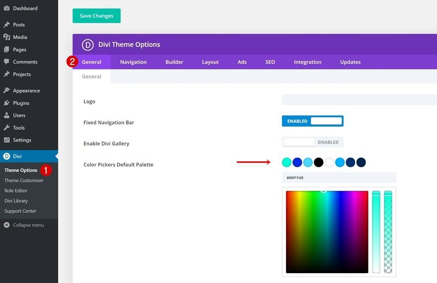
4. Create Default Color Palette in Divi Theme Options
Once you’ve set your global defaults and saved the recurring elements to your Divi Library, you’re almost ready to start building new pages from scratch using the global defaults and library items. Before you do so, we recommend you change the default color palette in your Divi Theme Options. These colors will appear on every design element you open and will help you change colors without constantly having to copy and paste color codes. This allows you to focus on what’s really important; creating a beautiful and functioning website. Go to your Divi Theme Options and make sure you include the following color types in your color palette:
- Text Colors
- Background Colors
- Accent Colors
5. Reset Module Styles on Existing Pages
Once you’ve set your global defaults, saved your library items and chosen your default color palette, you can start creating new pages from scratch and see the difference in approach right away. If you, however, have existing pages that have been modified before choosing the global defaults, you’ll have to go back and reset the module styles for the global defaults to apply. That’s how global defaults work. If you change something about a module manually, you’ll have to manually remove it as well so the global defaults can show through. Luckily, you can also use the extend styles feature Divi provides you with to extend the reset styles throughout the entire page!
Final Thoughts
In this post, we’ve shown you how to use the new Divi global defaults update to turn layout packs into global defaults. Although we’ve used the Cyber Security Layout Pack, you can make this technique work on any layout pack you choose to go with. This use case tutorial is part of our ongoing Divi design initiative, where we try to put something extra into your design toolbox each and every week. If you have any questions or suggestions, feel free to leave them in the comment section below!
If you’re eager to learn more about Divi and get more Divi freebies, make sure you subscribe to our email newsletter and YouTube channel so you’ll always be one of the first people to know and get benefits from this free content.





Great feature! I’m using the Animal Shelter layout pack and I don’t see that menu when I hover over H1. I only get “Extender Header styles” and that doesn’t expand to a global option?
Great way to work, it’s very logical when you think about it. I already used some of the options you describe, but Divi changes so fast. It’s good to get a reminder so you change you’re workflow and be more efficient.
Cool!
It’s a great way to design webpages. You clarified everything steps by step.
Will global defaults override a child theme stylesheet?
It depends if its important!; 😉
Its really good and very good way to designed website pages