Divi’s built-in section divider styles have always been a popular (and simple) way to add creative background designs to your pages. Not only does it provide a quick and beautiful way to break up page content, it can also add an abstract background texture to set your website apart. And with the release of Divi’s transform options, there are even more cool things you can do with those section dividers.
In this tutorial, I’m going to show you how to use transform options to design unique section divider backgrounds in Divi.
Let’s get started.
- 1 Sneak Peek
- 2 Download the Section Divider Background Examples Layout for FREE
- 3 Download For Free
- 4 You have successfully subscribed. Please check your email address to confirm your subscription and get access to free weekly Divi layout packs!
- 5 Getting Started
- 6 Creating Abstract Shape Backgrounds with Section Dividers
- 7 Creating Horizontal Section Dividers
- 8 Wrapping Up
Sneak Peek
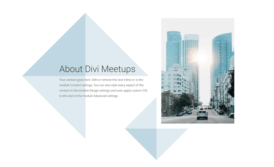
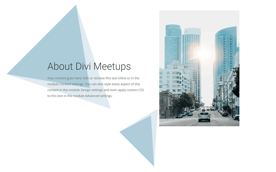
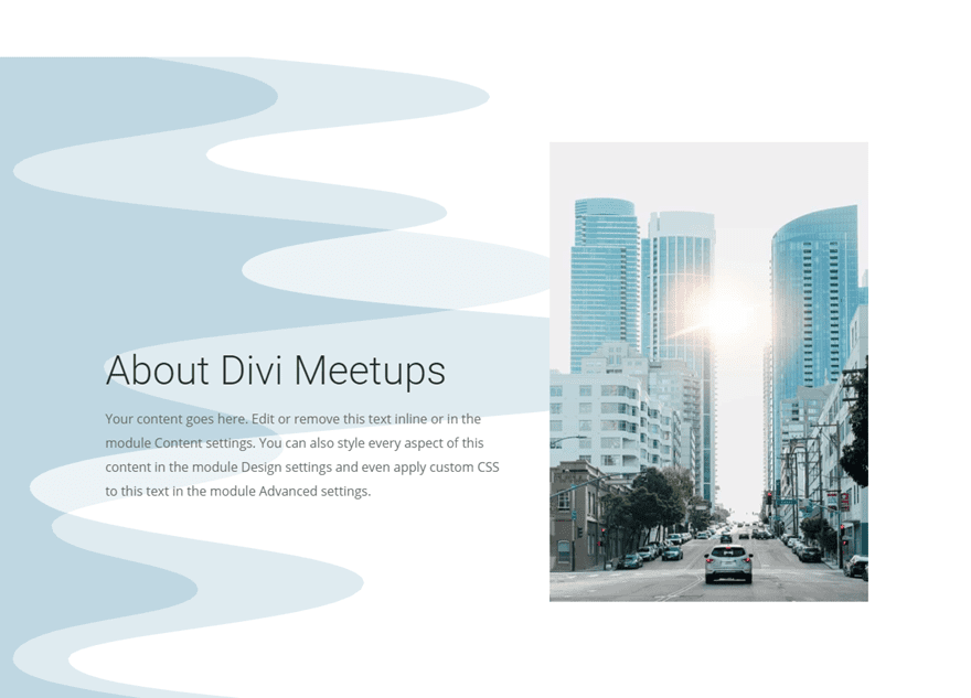
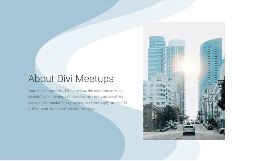
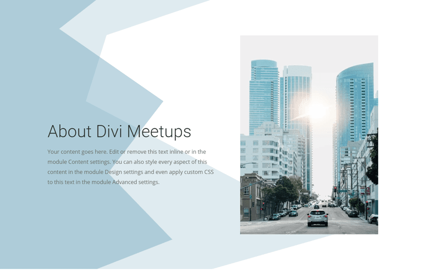
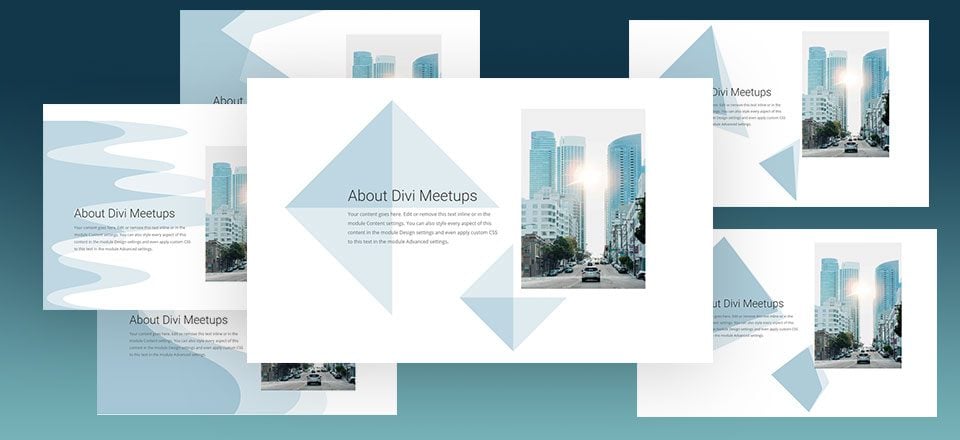
Here is a sneak peek of the designs that you will be able to build in this tutorial.

Download the Section Divider Background Examples Layout for FREE
To lay your hands on these example section divider backgrounds, you will first need to download it using the button below. To gain access to the download you will need to subscribe to our newsletter by using the form below. As a new subscriber, you will receive even more Divi goodness and a free Divi Layout pack every Monday! If you’re already on the list, simply enter your email address below and click download. You will not be “resubscribed” or receive extra emails.
To import the layout to your page, simply extract the zip file and drag the json file into the Divi Builder.
Now let’s get to the tutorial shall we?
Getting Started
To get started with this tutorial, all you need is the Divi Theme and an image to use for the example content. We will be building the design from scratch. All you need to do is create a new page and deploy the Divi builder on the front end. Then you are ready to go.
Creating Abstract Shape Backgrounds with Section Dividers

This first example is a really cool way to create some abstract shape backgrounds for your content. Basically, this involves customizing an empty section with a divider and positioning that section divider anywhere on the page behind other content.
Here’s how to do it.
Creating the Content Section
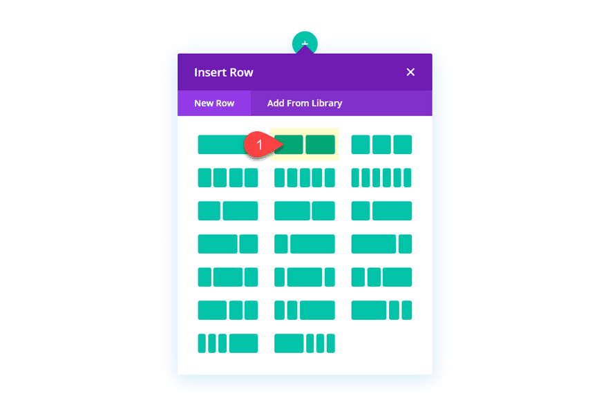
Before we start adding our section dividers to our page, let’s first add some example content. Create a new regular section with a two-column row.
Add the Text Module
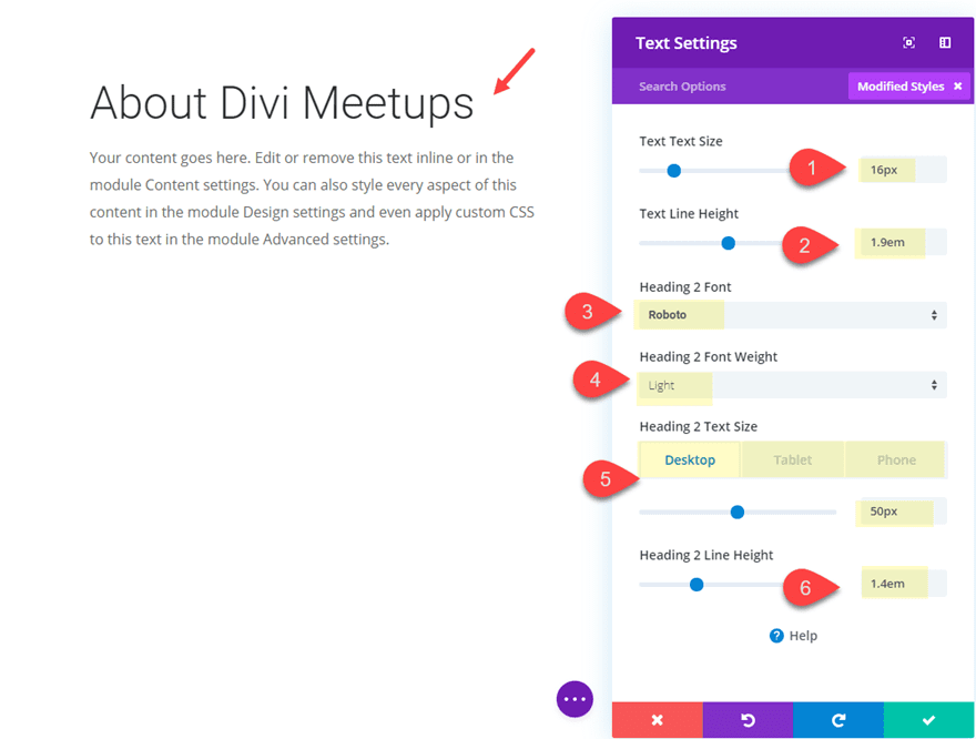
Then add a text module to column 1 with the following mock content:
<h2>About Divi Meetups</h2>
<p>Your content goes here. Edit or remove this text inline or in the module Content settings. You can also style every aspect of this content in the module Design settings and even apply custom CSS to this text in the module Advanced settings</p>
Then update the design as follows:
Text Text Size: 16px
Text Line Height: 1.9em
Heading 2 Font: Roboto
Heading 2 Font Weight: Light
Heading 2 Text Size: 50px (desktop), 40px (tablet), 32px (phone)
Heading 2 Line Height: 1.4em
Add the Image Module
Next add an image module to column 2 and upload the image you want to display. In this example I’m using an image from one of our layout packs that is 800px by 1156px.
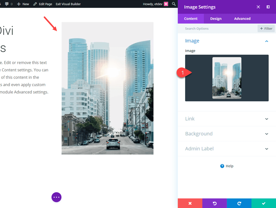
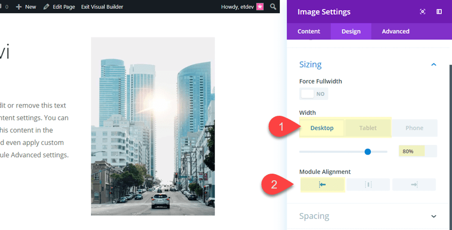
Then adjust the width and alignment of the image as follows:
Width: 80% (desktop), 70% (tablet)
Module Alignment: Left
Add Padding to Column 1
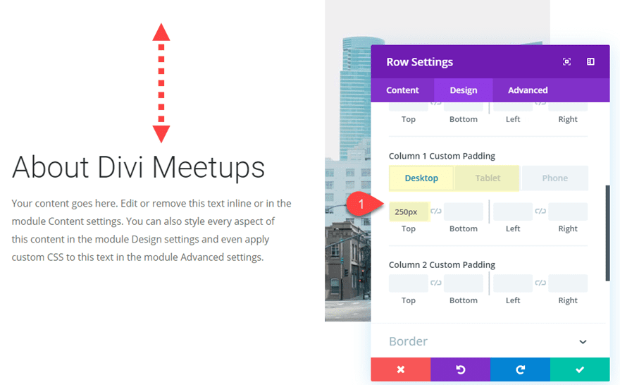
With our text and image in place, we need to add some top padding to column 1 to bring down our text module. Open the row settings and update the following:
Column 1 Custom Padding (desktop): 250px top
Column 1 Custom Padding (tablet): 50px top
Adding Top Section with Section Divider
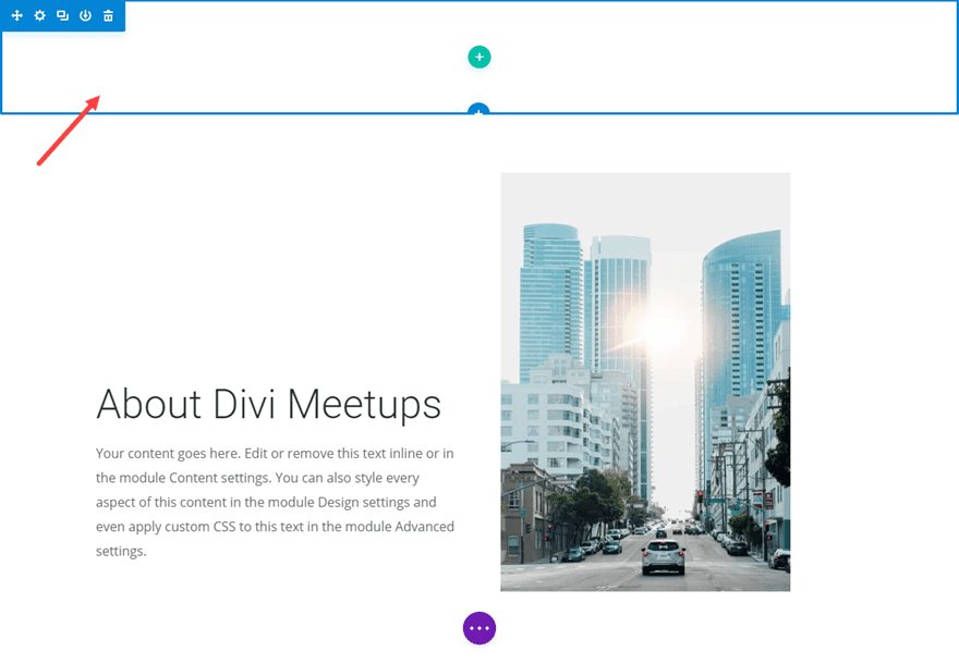
At this point, we are ready to add our first section divider design. To do this we need to create a new section. So go ahead and create a new regular section (don’t add a column to the section because we won’t need one) and drag it above the section containing our text and image.
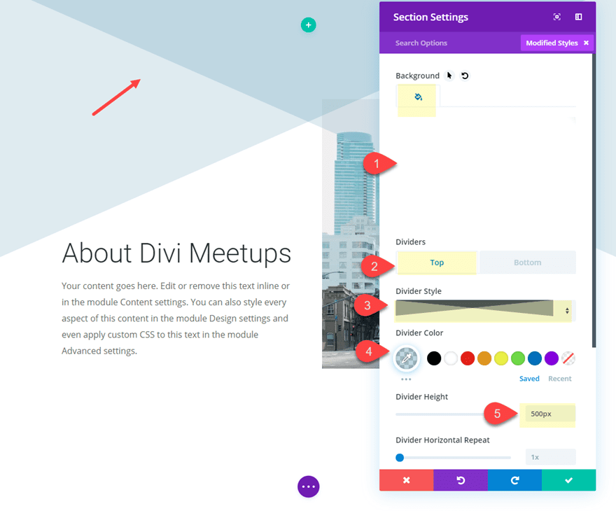
Then give the section and transparent background and a top divider by updating the following:
Background Color: rgba(0,0,0,0)
Top Divider Style: see screenshot
Divider Color: rgba(120,168,193,0.45)
Divider Height: 500px (desktop), 400px (tablet), 300px (phone)
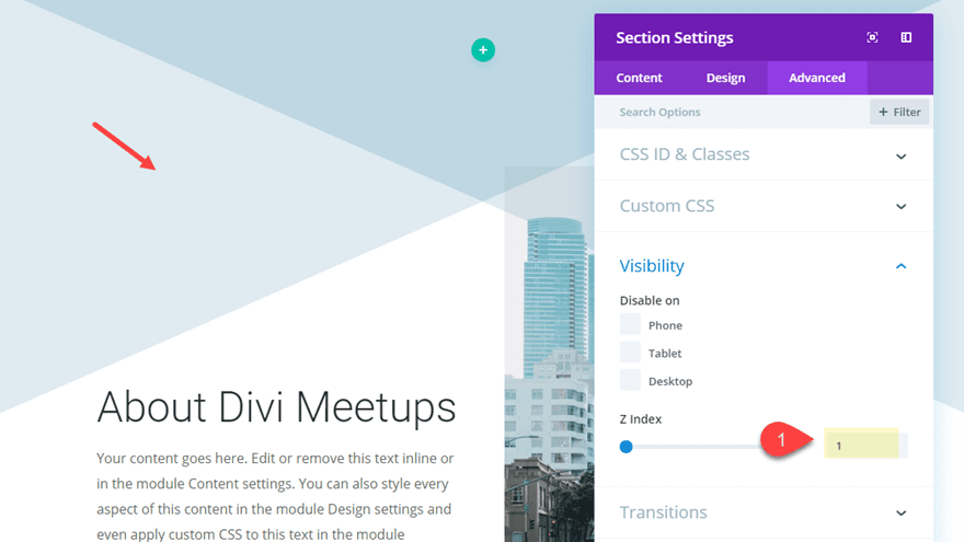
Next, go to the advanced tab and set the Z Index value to 1 so that it will stay above the section below it.
Then update the size and spacing of the section as follows:
Width: 500px (desktop), 400px (tablet), 320px (phone)
Section Alignment: Center
Custom Margin: -100px
Custom Padding: 100px top, 100px bottom
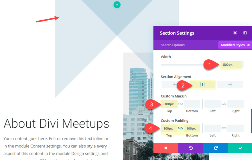
Note that the width equals the height of the divider we added earlier (500px for desktop, 400px for tablet, and 320px for phone). This will give us a perfectly square design for our section divider. It is also important to shrink the width and divider height to adjust for tablet and phone because if you don’t the section will skew and break the design or cause overflow on the browser viewport.
The custom padding is just to give the section some height so that we don’t have to adjust the transform translate values as much later on.
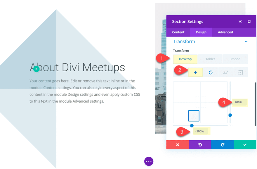
Now that we have our section design in place, we can use the transform options to position and rotate the section divider wherever we want it on the page.
Update the following:
Transform Translate X-axis (desktop): -100%
Transform Translate Y-axis (desktop): 200%
Transform Translate X-axis (tablet): -50%
Transform Translate Y-axis (desktop): 100%
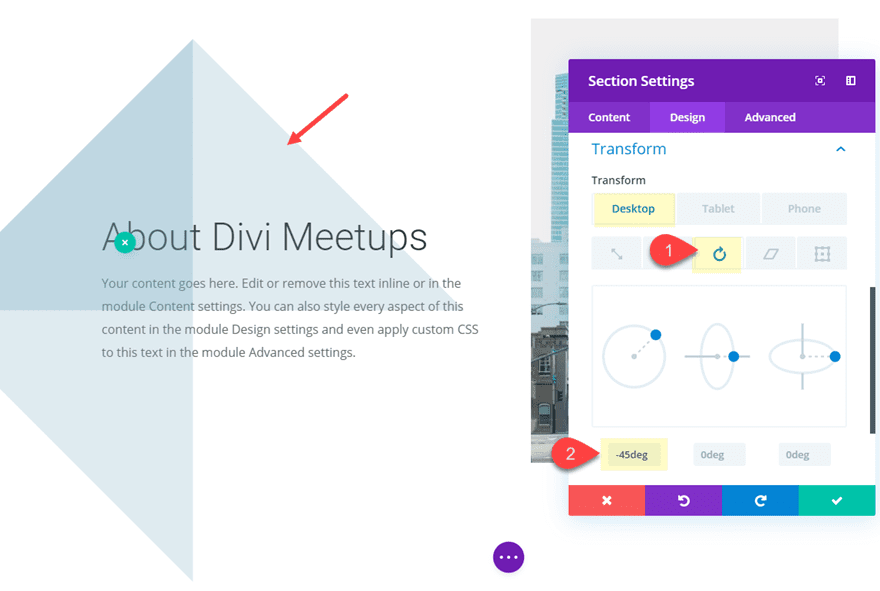
Transform Rotate Z-axis: -45deg
Copy and Paste Section
We are going to add one more section divider design to the page. But to get a head start on the design, deploy the wireframe view mode and copy the top section (with the section divider style) and paste it below the section containing the text and image.
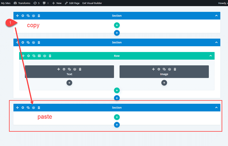
Update Section Settings
Then update the custom margin as follows:
Custom Margin: -100px bottom
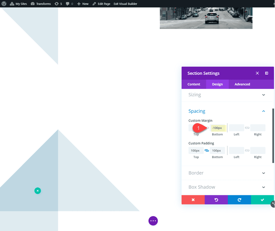
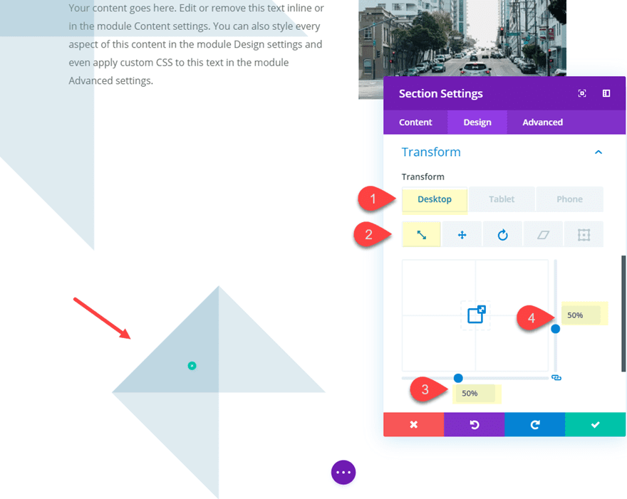
Next we can shrink the size of the section using the transform scale option as follows:
Transform Scale (X and Y axis): 50%
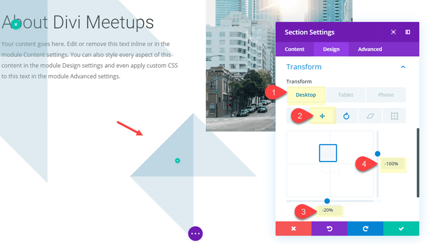
Using transform translate, we can move the section upward and to the right as follows:
Transform Translate X-axis (desktop): -20%
Transform Translate Y-axis (desktop): -100%
Transform Translate X-axis (tablet): 80%
Transform Translate X-axis (tablet): 30%
Now rotate the section as follows:
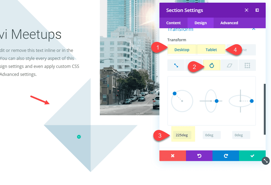
Transform Rotate Z-axis (desktop): 225deg
Transform Rotate Z-axis (tablet): -225deg
Final Result
Let’s check out the final result. Notice how the sections are repositioned on tablet and phone for a beautiful design.

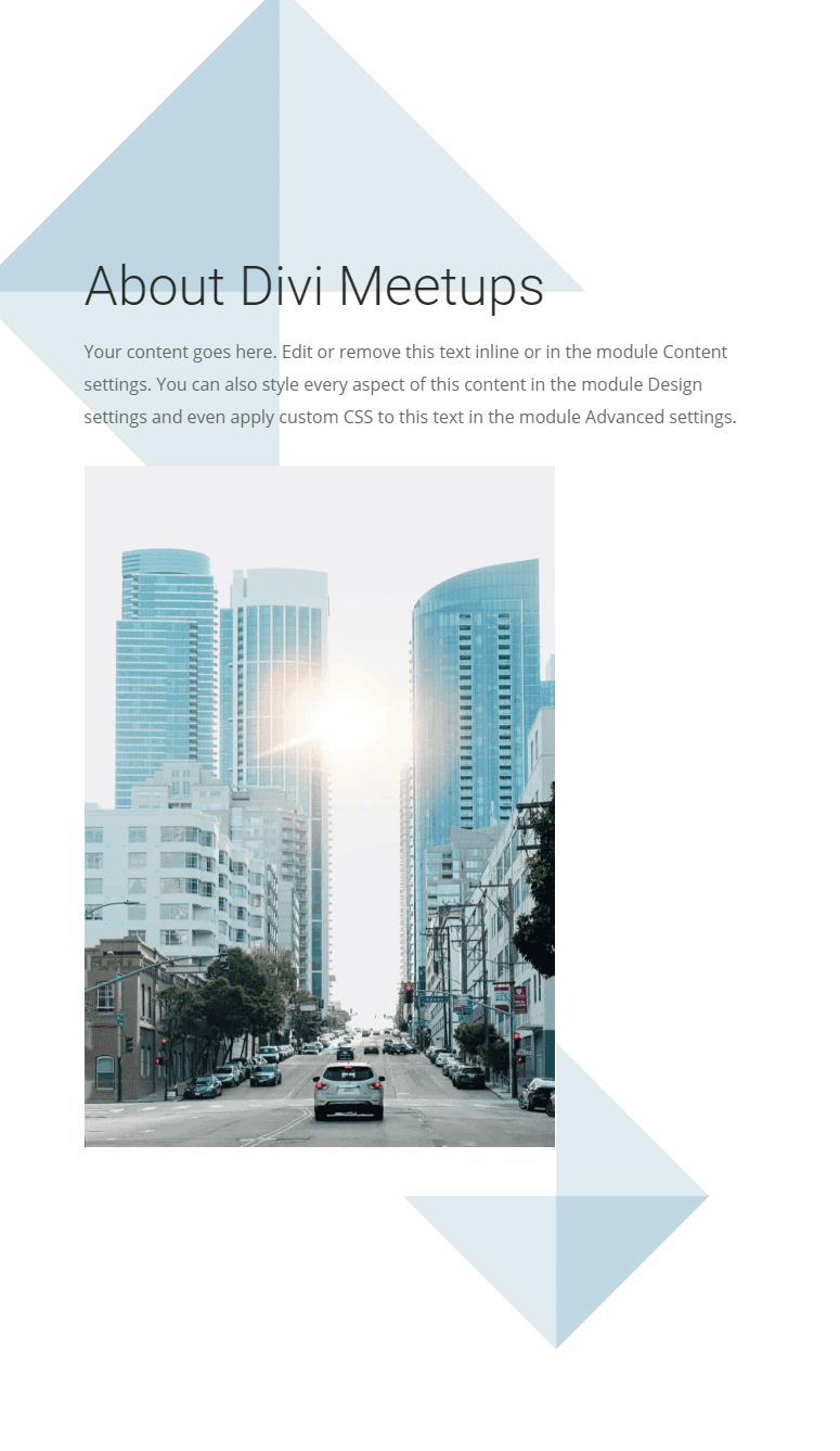
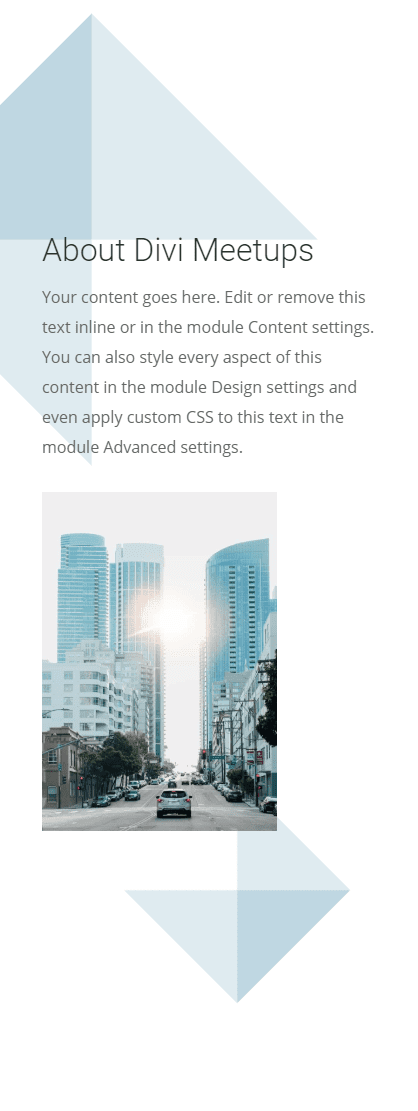
And here are a few examples of different Divider Styles using the same layout. Feel free to experiment with different styles and rotations of your own.


Creating Horizontal Section Dividers

Divi’s transform options also allow us to rotate section dividers to create horizontal section divider designs. This can provide a unique background for you page content.
Here’s how to do it.
Duplicate the Section with Mock Content
For this example, we can use the same section of content we created for the first example above. Go ahead and copy and paste the section at the bottom of the page.
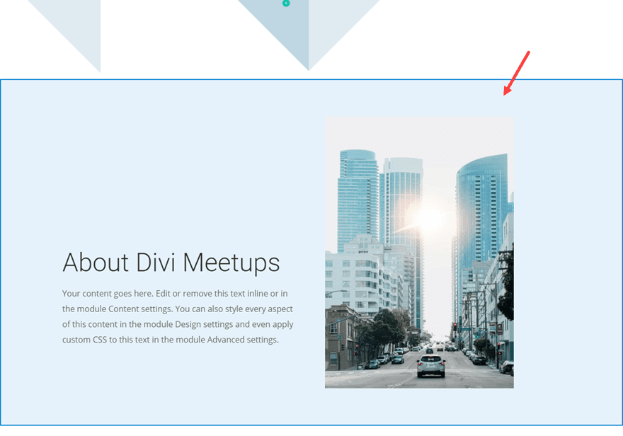
Update Content Section
Next, open the section settings for the duplicated section and update the following:
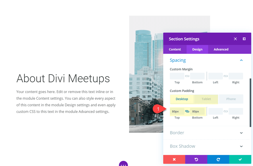
Custom Padding (desktop): 80px top, 80px bottom
Custom Padding (tablet): 0px top
Creating the Horizontal Section Divider
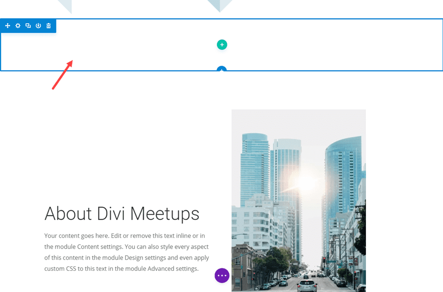
To create the horizontal section divider, first create a new regular section directly above the content section.
Then update the following:
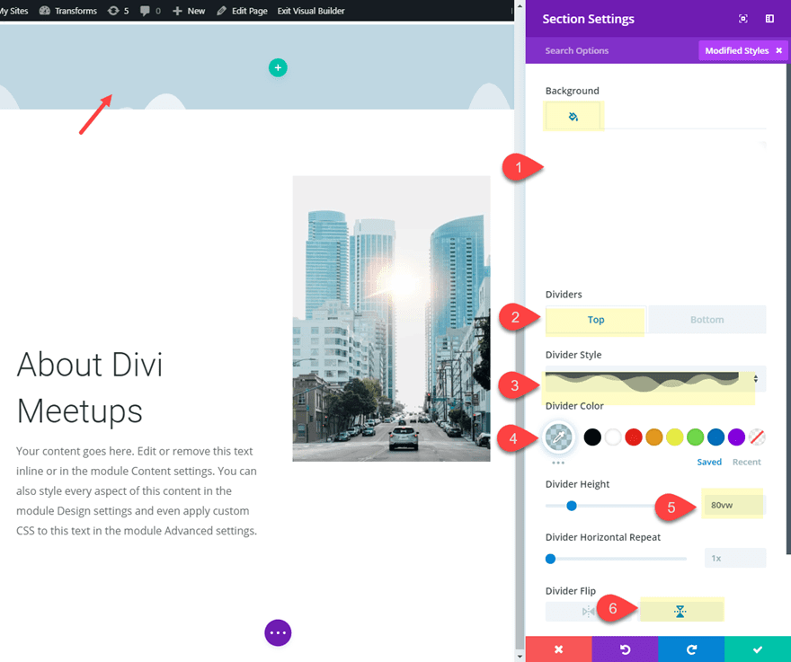
Background Color: rgba(0,0,0,0)
Top Divider Style: see screenshot
Top Divider Color: rgba(120,168,193,0.45)
Top Divider Height: 80vw
Top Divider Flip: vertical
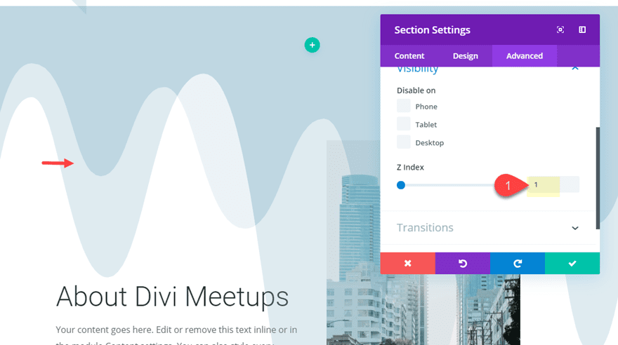
To make sure we can see the section divider on top of the section below it, we need to update the Z Index to 1.
Next we need to give our section a custom width and spacing as follows:
Width: 800px
Section Alignment: left
Custom Margin: -100px top
Custom Padding: 100px top, 100px bottom
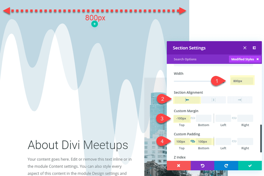
The width of the section (800px) will become the height of the section once it rotates to serve as a horizontal section divider. So you may need to adjust this height depending on the amount of content you have in the section below it.
Now we are ready to position and rotate the section using transform options as follows:
Transform Translate X-axis: -50%
Transform Translate Y-axis: 250%
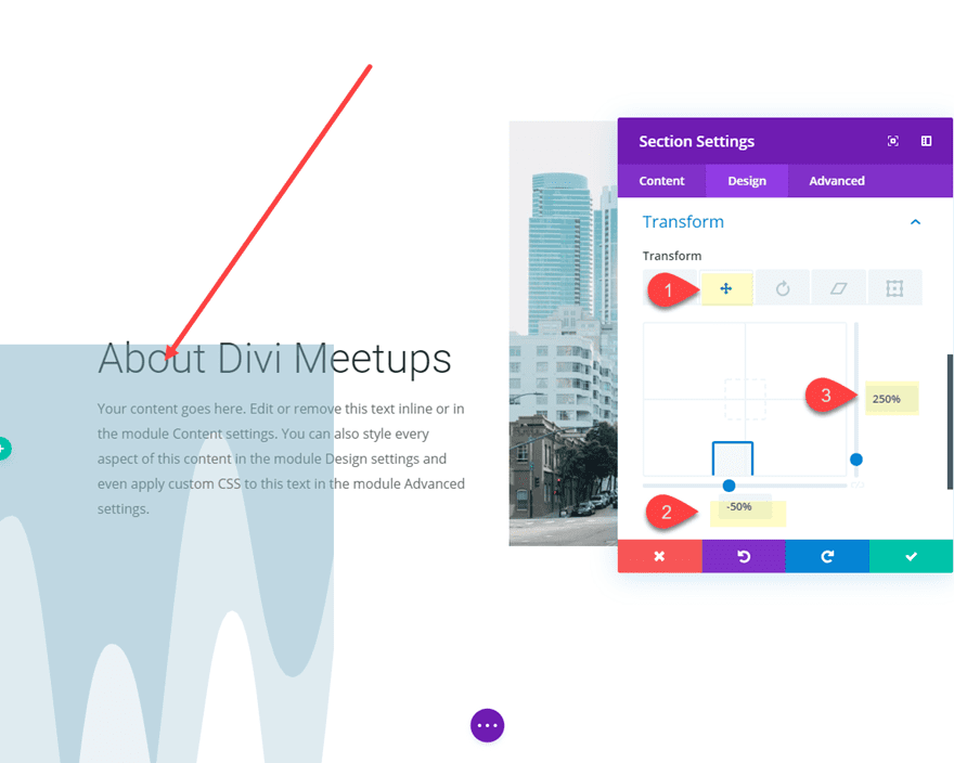
Transform Rotate Z-axis: -90deg
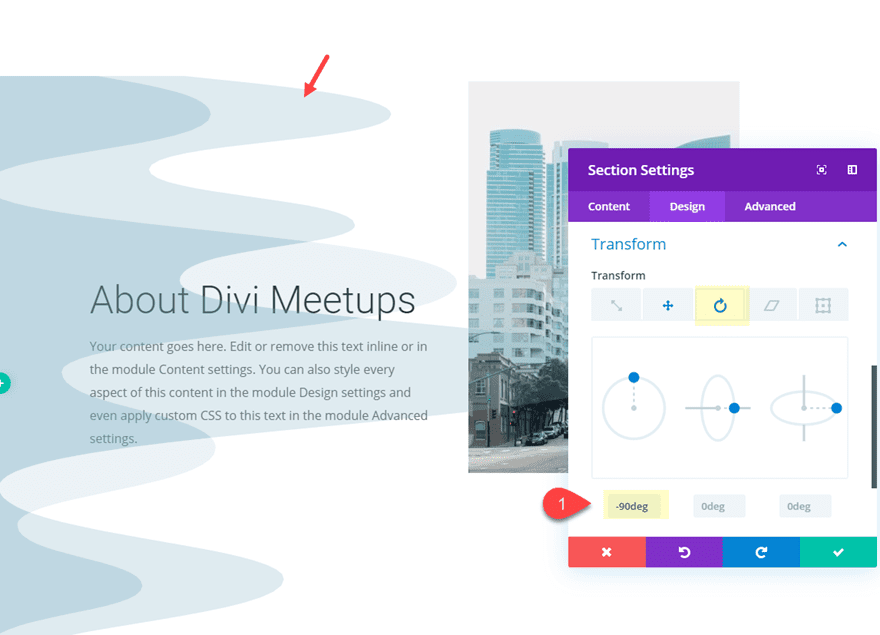
Final Result
Here is the final result of the design.

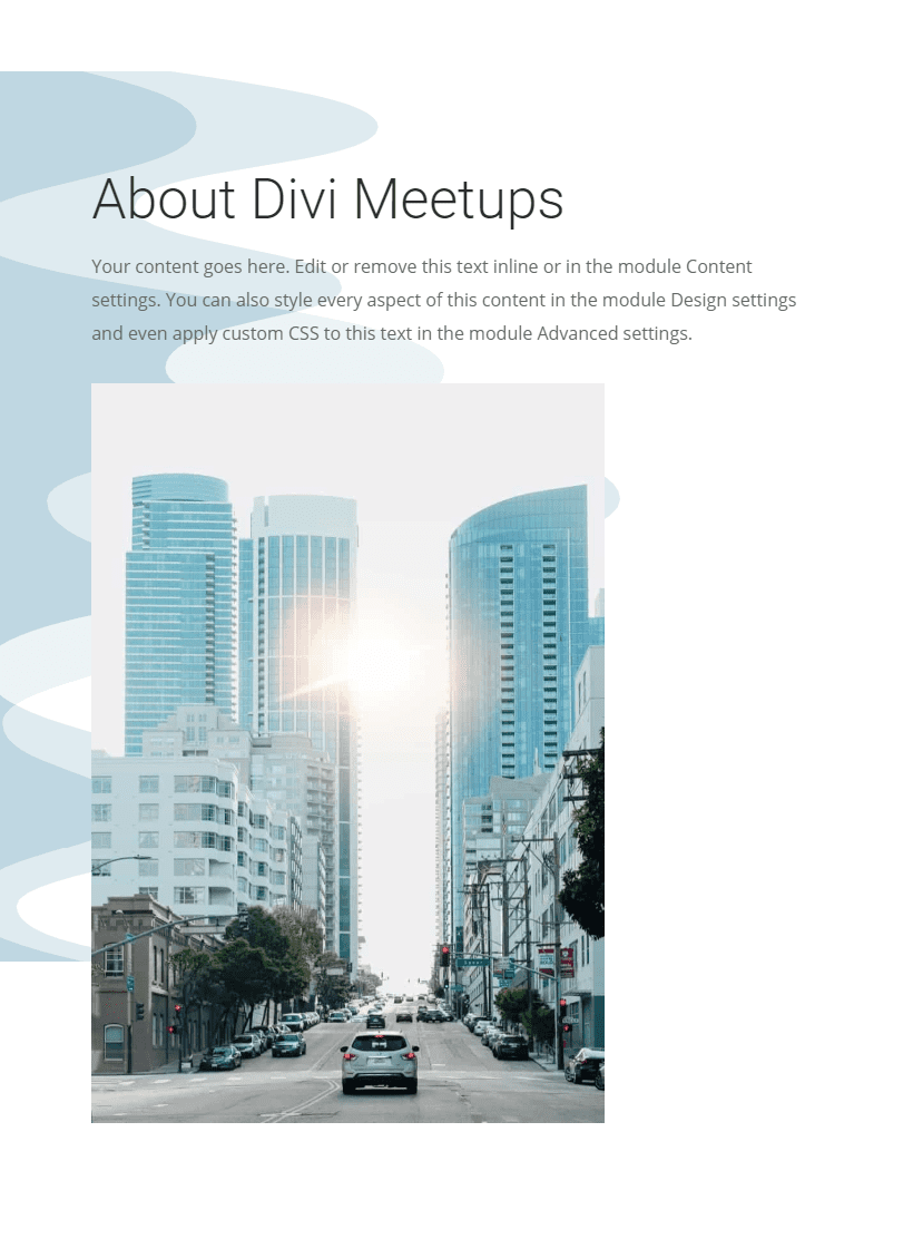
And here are a few more examples of different divider styles using the same layout.


Wrapping Up
There is always room for more ideas on how to add unique design to your website. With Divi’s transform options and easy to design section dividers, you can do some pretty creative things. Hopefully, the examples in this tutorial will inspire you to create some section divider backgrounds to bring a fresh new spin on your next project.
I look forward to hearing from you in the comments.
Cheers!





I used this to build my site, this transform controller is fantastic!
Awesome!
Well, I will try to use it. It is neat and elegant indeed
Thanks for the inspiration and detailed tutorial (as always!). You’re awesome!
Thanks, Lindy!
Absolutely stunning! Thanks for the well done tutorial, made my day!
That’s a pretty neat use of the section dividers, I never would have thought of trying that.