Picture this: you’re loading a website, and it looks ready to go. You click on a blog featured image to read the article, and suddenly the whole page shifts because something else just loaded. And you click on something entirely different and load a page you never intended. If you’ve experienced this problem yourself, you know how Cumulative Layout Shift (CLS) can negatively impact a site’s User Experience (UX).
Cumulative Layout Shift is the term for how much a page’s layout shifts while it loads, and in this article we’ll dig a bit more into what it means. We’ll show you how to measure CLS, and explain what a good score is. Then we’ll discuss how to optimize your website’s CLS score. Let’s get to work!
Subscribe To Our Youtube Channel
What Is Cumulative Layout Shift (CLS)?
There’s no better way to illustrate what a high CLS score (meaning anything over 0.10 from Google’s PageSpeed Insights) represents than with a visual example. Here’s a website with a layout that keeps shifting as the page loads. Note that we’re not scrolling at all when capturing this. Our viewport remains the same, but the page shifts drastically on its own:
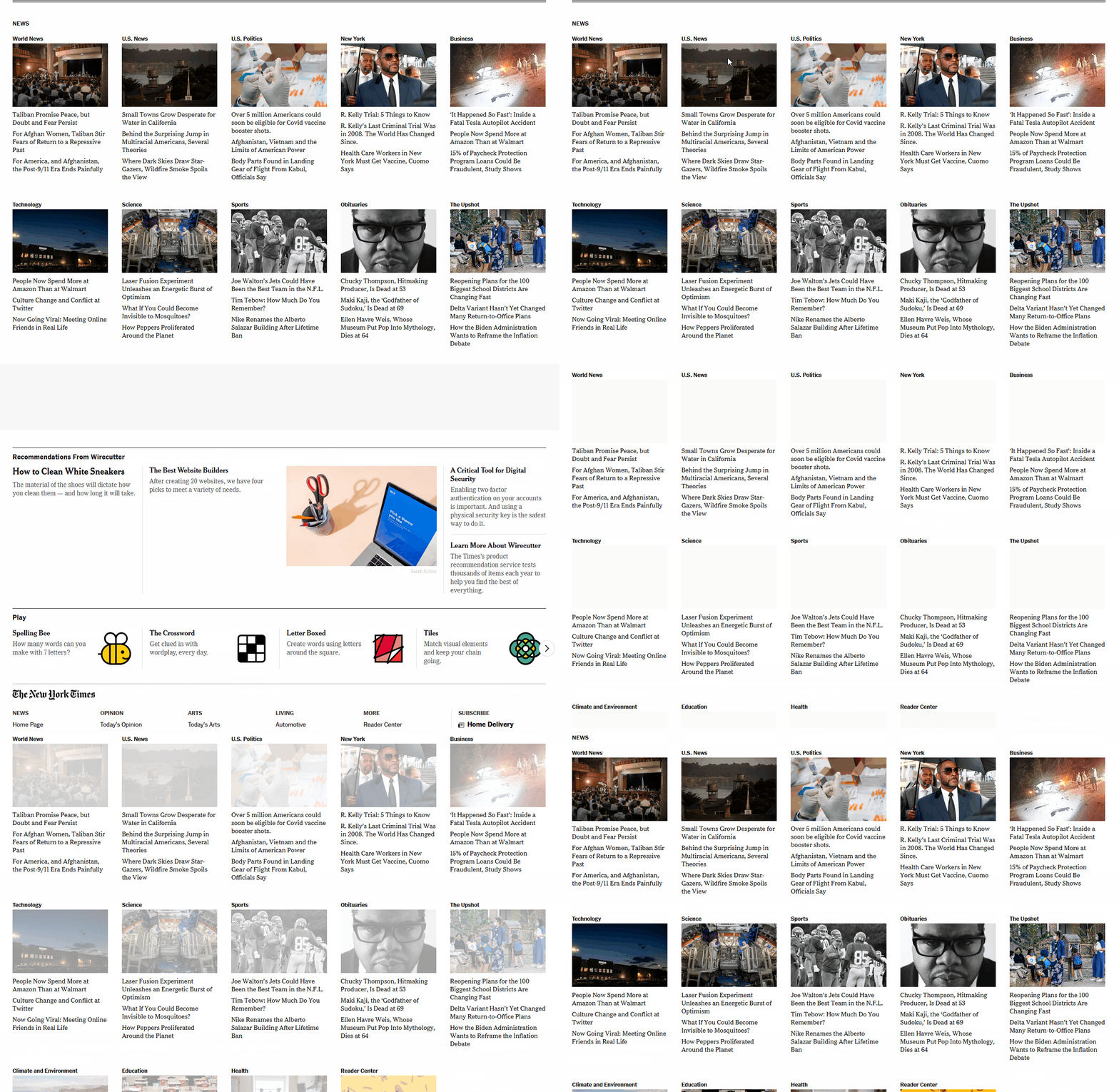
As a user visiting this website, you might not be sure when it’s actually done loading. You may try to click on a news story, only for the layout to shift drastically. As a result you end up on the wrong page, and you have to waste time going back. Depending on the page, this could happen multiple times. If it does, there is a good likelihood you’ll just leave.
And so will your users.
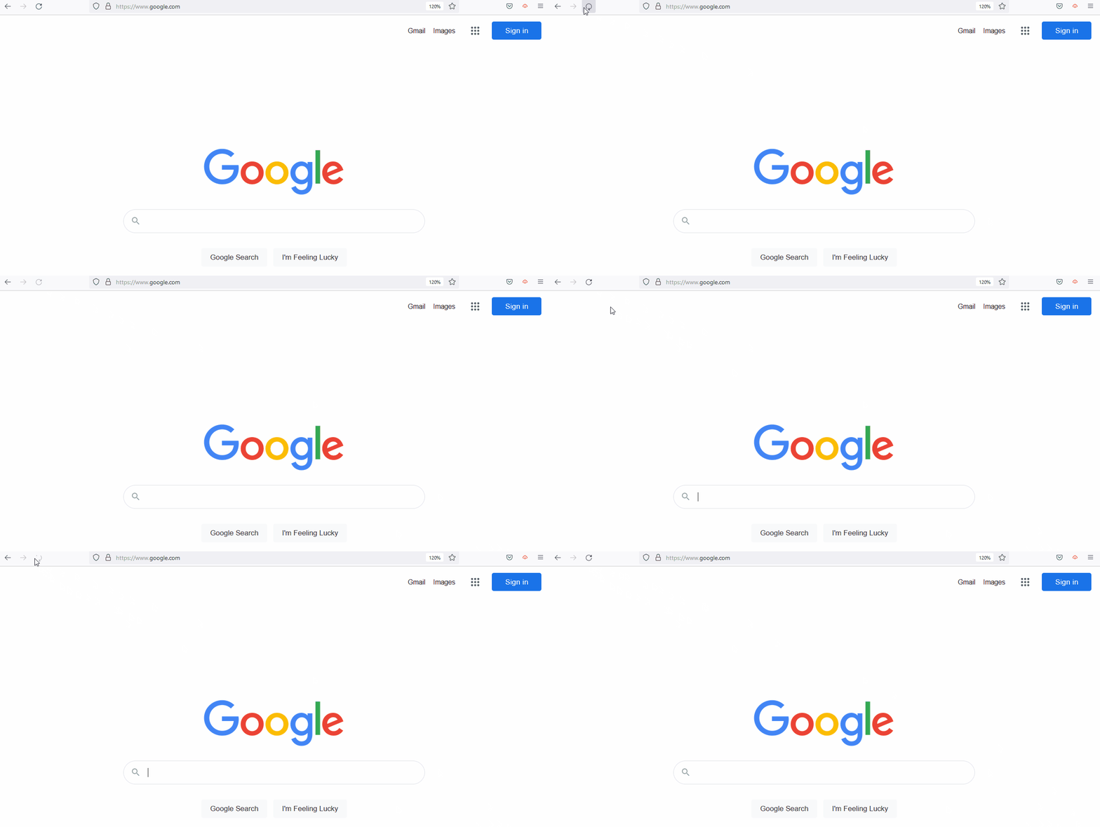
The more complex a website is, the more likely it is to have a high CLS score. With simple layouts such as the iconic Google home page, there’s no CLS because they include so few elements:
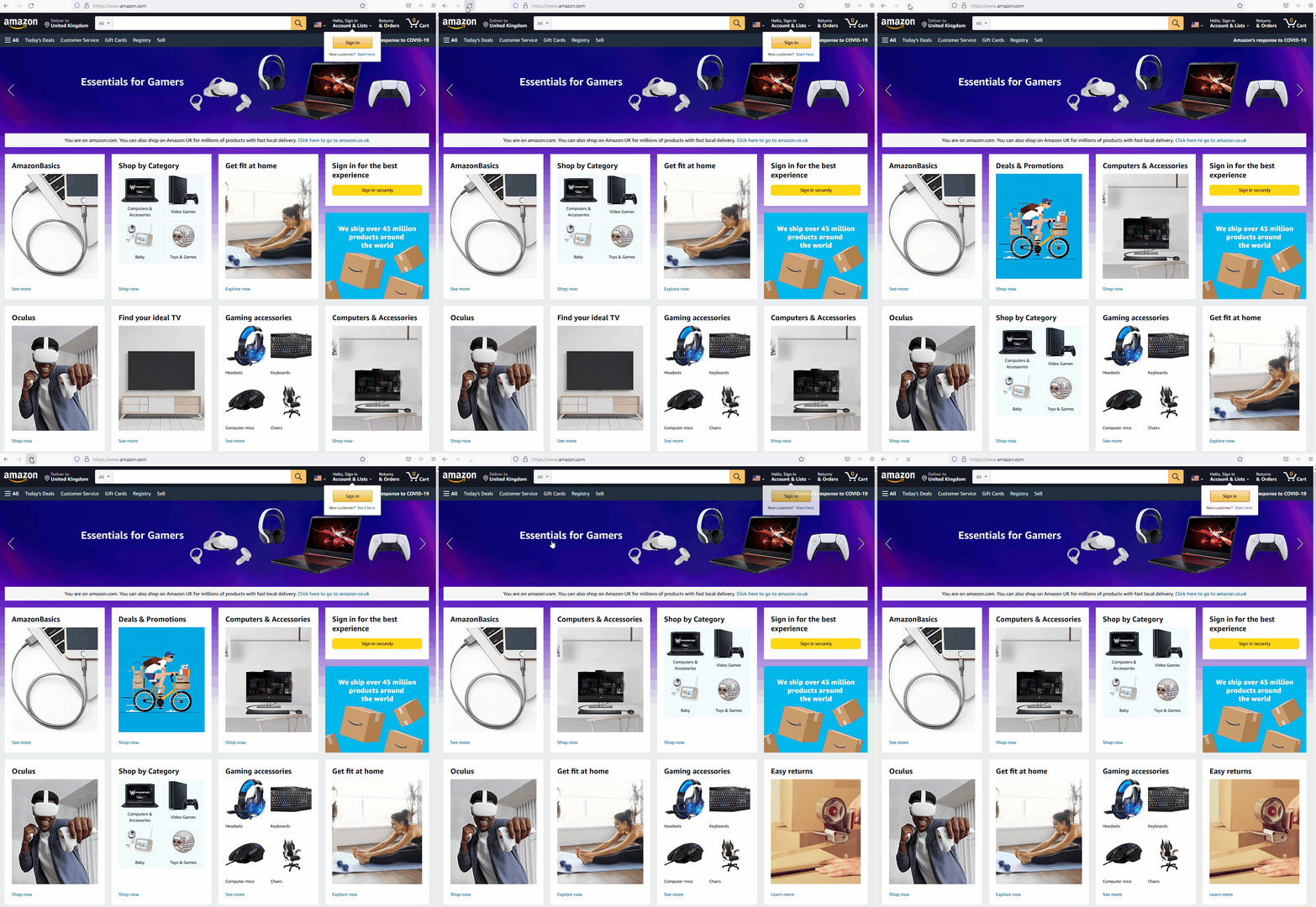
That’s not to say that all complex websites have high CLS scores. Consider Amazon, for example. No one would say that the e-commerce giant uses a straightforward web design. Yet there’s little to no layout shift to be seen while browsing its catalog.
Layout shifts happen because browsers tend to load page elements asynchronously. More importantly, there might be media elements on your page with initially unknown dimensions. This combination means the browser doesn’t know how much space the individual elements will take up until they’re done loading. Hence the drastic layout shift.
CLS interesting in that it can be objectively measured using various tools, but it is also user-centric in that each user’s device can affect how the layout of your site may shift. While you can’t control that aspect, you can certainly take precautions so it has the least impact possible.
CLS is one of the three Core Web Vitals that Google measures to help it determine if your website offers a strong user experience (UX). The other Core Web Vitals are First Input Delay (FID) and Largest Contentful Paint (LCP), which are also definitely worth any effort you spend optimizing.
How to Measure CLS
Figuring out if your website shows marked layout shifts is relatively simple. First, we recommend that you try accessing your website from a variety of devices and ask others to do the same. As you do, you can observe whether the layout remains consistent while pages load.
What you’ll likely find is that CLS experience can vary a lot. It depends not only how optimized your website is, but also on which device you’re using. With that in mind, the best tool for measuring your website’s CLS is PageSpeed Insights. This ties directly into Google’s Core Web Vitals so you can see directly how your CLS score affects how Google sees your site.
This service enables you to enter a URL and receive an overall performance score for it based on the past 28-days of data Google has collected. That score takes several metrics into consideration, including CLS, FCP, and LCP.
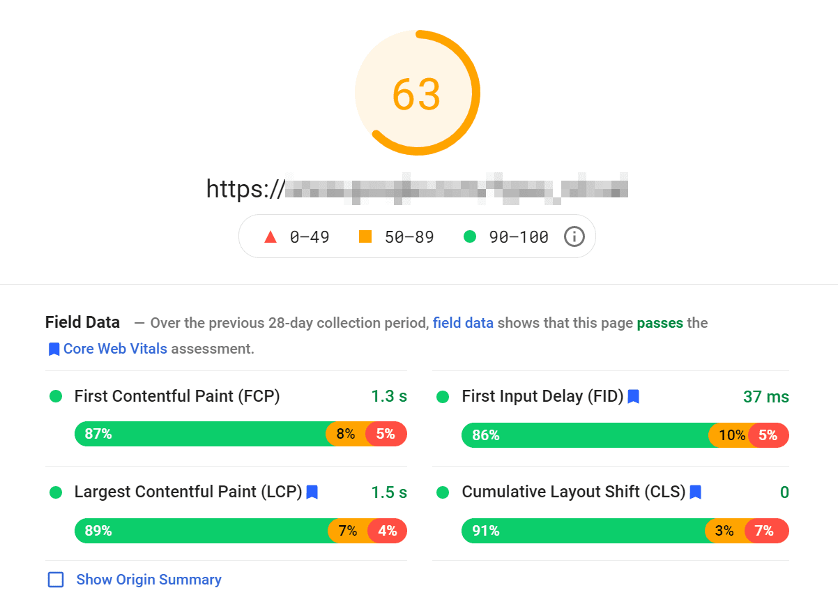
For this test, we chose a website with no discernible CLS. PageSpeed Insights confirmed our suspicions, as it returned overwhelmingly positive results with a strong CLS score.
Notice that PageSpeed Insights offers a percentage breakdown for each score. In this case, 91% of users experienced zero layout shift while loading the test website. However, the remaining visitors did experience some level of layout shift.
That’s to be expected when it comes to CLS and the rest of the Core Web Vitals. User experience will vary drastically depending on what device they’re visiting from, their internet connection, and many other factors. There is virtually no way to account for no user ever experiencing CLS, but you can definitely take precautions to optimize it so that percentage is as low as possible.
On top of field data, PageSpeed Insights also offers what it calls Lab data. Those are performance scores based on a single test, instead of data collected over a long period of time (which is considered Field data).
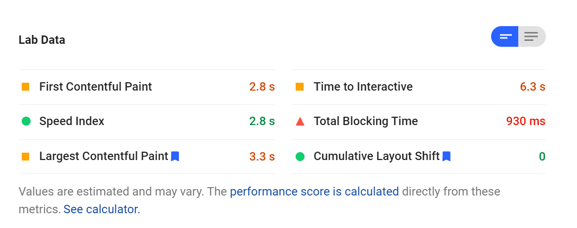
On our test we received a CLS score of zero, which means there was no layout shift. For this one particular test. Now let’s compare that with another website that didn’t get such a strong CLS score.

To meet Google’s standards, your CLS score should be below 0.10. Anything above that means there are significant, noticeable shifts in the layout, which leads to a poor user experience.
How to Identify What Causes Layout Shifts
If you want to identify what elements are causing layout shifts on your website, you can do so using the Chrome Dev Tools. If you open the tools (CTRL-SHIFT-I) and jump to the Performance tab, you’ll be able to record performance tests as you navigate the web.
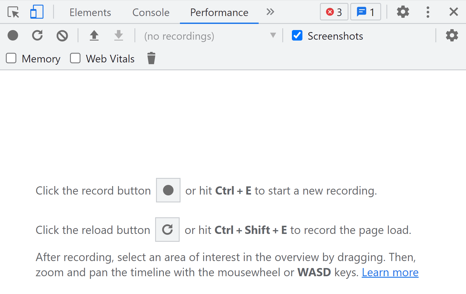
After you stop recording, Chrome Dev Tools will return a timeline that shows loading times, individual requests, and Core Web Vitals. From this timeline you can select individual Layout Shift events which are listed under Experience. That way, you can see what elements they correspond to.
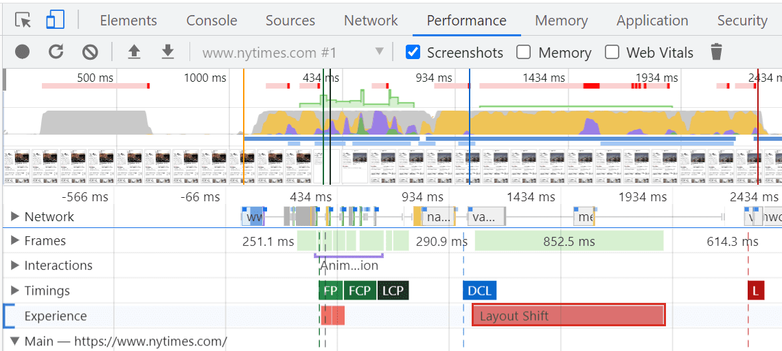
Once you know what elements are causing layout shifts, you can take steps to fix the problem. We’ll talk about that in the next section.
If you want to monitor your website’s Core Web Vitals, we recommend that you set up a Google Search Console account. You’ll be able to monitor performance metrics and Core Web Vitals from Search Console, which is a boon when it comes to Search Engine Optimization (SEO). We feel it’s in your best interest to regularly monitor the Search Console, regardless, but it never hurts to have a specific metric you’re tracking.
How to Optimize Your CLS Score
By and large, there are two big culprits when it comes to high CLS scores: media files and ads. For example, if you upload an image file with a massive resolution but don’t specify its height and width, it’s liable to break your page’s layout.
In terms of website performance, it’s best to use images that are already the precise dimensions you will display. That way, the browser doesn’t have to spend processing power (and time) on resizing them appropriately. However, that’s not always possible. When it’s not, you should set width and height attributes for every image that you display. That way, the user’s browser will know precisely where the image fits and won’t need to shift the layout at the last possible second.
Here’s how those attributes look in HTML:
<img src="http://imageurl.com" width="120" height="90" alt="Image Alt Text">
If you’re using WordPress, some image optimization plugins can automatically resize files as you upload them, which takes care of setting the necessary width and height attributes.
When it comes to responsive images, you can rely on CSS instead of manually declaring width and height. CSS enables you to use the max-width attribute to tell browsers which percentage of the viewport the image should take up:
img {
max-width: 90vw;
height: auto;
}
In this example, we’re telling the browser to scale the image so it takes up 90% of the user’s viewport. At the same time, we set the height attribute to auto, so that the browser calculates the ideal height based on the image’s new width and its aspect ratio.
The same fundamentals apply to ads as they do to images. Typically, you’ll be working with iframes, and sometimes ad networks will use dynamically sized elements. This can wreak havoc with your pages’ layout. Consider these ad plugins and see which ones mitigate this the most.
Instead of letting ad networks decide how big the ads should be on your website, you can reserve areas for them. That means declaring width and height attributes for ad areas and setting fallbacks in case they don’t load, so the empty space doesn’t cause a layout shift.
You can use the same kind of CSS and in-line styling for any ad container you want, keeping it locked in position regardless of what ads are served.
Cumulative Layout Shift (CLS) Frequently Asked Questions
CLS can be a bit more complicated to grasp than the LCP and FCP metrics. With that in mind, let’s go over some common questions that users have about CLS, to make sure you’re not missing any key information.
How Does CLS Affect My Website’s Performance?
In theory, you can have a very fast website that still gets a relatively poor CLS score. As with other Core Web Vitals, CLS scores might not directly correlate with overall site performance. Your site might be blazing fast, but as it loads, it unfolds like an accordion. Even then, big layout shifts definitely have a negative impact on the site’s UX. Google considers that incredibly important. Which is why Google weights this data point so heavily.
Is CLS Less Important Than FCP or LCP Scores?
A lot of users pay more attention to FCP and LCP scores than CLS. That’s because those two metrics are easier to correlate to website performance. Even though FCP is specifically a user-centric metric, too, CLS is harder to gauge consistently across large numbers of users.
All three metrics make up the Google Core Web Vitals. This means that if you ignore one of them, you run the risk of placing lower in relevant search results. Making sure that your site is is optimized for a low CLS generally has nothing but a positive impact on site performance like LCP and FCP. If the Largest Contentful Paint gets shoved down the screen as soon as the user sees it, how useful is that fast loading time?
What Is a Good CLS Score?
By the numbers, Google considers anything below 0.10 to be a good CLS score. However, if you take the proper steps, getting a CLS score of 0 isn’t out of the question, and it’s relatively ordinary among well-optimized websites. Keep in mind, however, even sites that regularly score 0 can have a slight percentage of users who experience shifts. That’s out of your control, and all you can do is account for most of your users having 0 CLS.
Conclusion
There are a lot of factors that go into offering a strong UX on your website. Ideally it should load fast. It should be easy to interact with. It shouldn’t shift the layout position as elements appear. Drastic layout shifts lead to frustration and misclicks. Those lead to a higher bounce rate. Which is not good for any website.
CLS is one of the Core Web Vitals that Google uses to measure your site’s overall UX. And the users are the entire reason you have a website in the first place. Their experience is priority 1. A low CLS score (under 0.10) means that your website should load fluidly, and every aspect of its layout will appear in the right place from the start.
Do you have any questions about CLS or how to reduce yours? Let’s talk about them in the comments section below!
Featured Image via Older Brother / shutterstock.com




The CLS caused by using the global header is terrible!! It demolished the CLS score on every page load.
Really hope I can get a reply on how to resolve this. The default header is not an option for most of my sites.
I cannot locate the Experience tap??
hello,
like people here that already mentionned the problem, i’ve got a CLS problem with the global header. you answer at some messages but nothing for this ones, So i hope you answer to mine, because i really need to understand what to do, or if it’s not possible to resolve that….
so : with global header CLS is very high. I check and do everything you talk. with default header CLS = 0! ! !
just want to understand please, can you help ?
I’m struggling with this on my site. I have a cumulative layout shift of 0.45 when i use my global header and 0.08 when i use the default header which has limited customisation.
Any tips guys as it seems when the custom header with custom top bar tries to load it is loading from centre of page and moving up. Looks like it is picking up the default header sizing from theme customiser which you would think would be removed when you activate the global header.
Thanks for this article. I am busy with CLS on my site. It is not that easy to handle the CLS so I have tested it with a blanco page and some standard divi elements in it. The CLS is then 0. But at the moment I for example change the padding of .et_pb_section (theme options – css) the CLS score goes way up…..
It is really a strange effect! Does this mean I have to keep only the default settings of divi ? I’m confused 🙂 What to do?
I would like to thank you all for the extraordinary effort improving the page speed scores without reducing the flexibility of Divi.
Regarding my site the only way to get a .0 CLS is to remove the global header, where I have only the menu, from the default website layout temple and add it to each single page.
Would you have some suggestions to follow to properly solve this issue?
I just realized that there was CLS problem recently when I use some of my favorite themes and they got bad CLS score on GTmetrix because of the way they display the featured image (smooth transition effect). One a one hand, the way the featured image displayed was what make those themes look nice and special. One the other hand, it makes the CLS scores bad.
Hi Iqbal,
Have you tried disabling the transition effect for that image? Since it’s above the fold, it may be best for it to simply load as fast as possible versus having an eye-catching effect.
Please tell me Elegant Themes is working on updating the Extra theme. I recently gave up using it for a magazine site because it has some awful CLS. It’s a gorgeous theme but with now with Core Web Vitals, Extra is going to be pretty much unusable without a major update.
Good post, thanks! I’d be really great if you could post a tutorial on how to get a better CLS using DIVI and the different impact on this web vital core metric by using templates instead of Custom CSS or inline CSS.
You’re welcome, Silvio. And thanks for the suggestion 🙂
Hi Will,
Thank you for writing this article as I have struggled to get good CLS scores, not knowing what to do about it.
I’ve one Divi website with an excellent CLS score and another with a poor one and it’s a headache to try to see why they are different.
On the poor one I can see a layout shift when the dynamic padding on the top section is loaded, as the whole content is bumped down, but this isn’t what Google identifies in its reports. Instead it picks up on main navigation menu items causing a layout shift, and when rows are loaded, which contain just text. Do you have any guidance to handle this, e.g. should we be specifying a section height in css so that it doesn’t jump when the content loads?
Thanks
Hi Cheryl,
I’d recommend using the Chrome Dev Tools so you can triple check which elements are causing layout shifts. With Divi, you should be able to “fix” those elements relatively quickly by specifying width and height measurements for the offending modules. You can find the options to modify those values in the Design tab within each module’s settings.
Let us know if that does the trick!