Using the Divi Gradient Builder
How to add and edit gradients throughout your Divi designs.
Gradients are a great way to add interest and depth to your webpages. They can be created with two or more colors, various levels of transparency, and combined with pattern effects to create stunning visuals for your website. Let’s take a look at how to use the Divi Gradient Builder and explore all of the options available with it.
Adding a Background Gradient
Divi’s Gradient Builder is part of Divi’s suite of background design options. Adding a gradient to any section, row, column, or module is easy. To demonstrate how to add gradients to a section, we’ll use one of Divi’s layout packs.
To add a gradient, click on any section in the visual builder to bring up the editing options. Scroll down to locate the background section. Click the Background gradient tab. Then, click the + Add Background Gradient button to add a gradient.
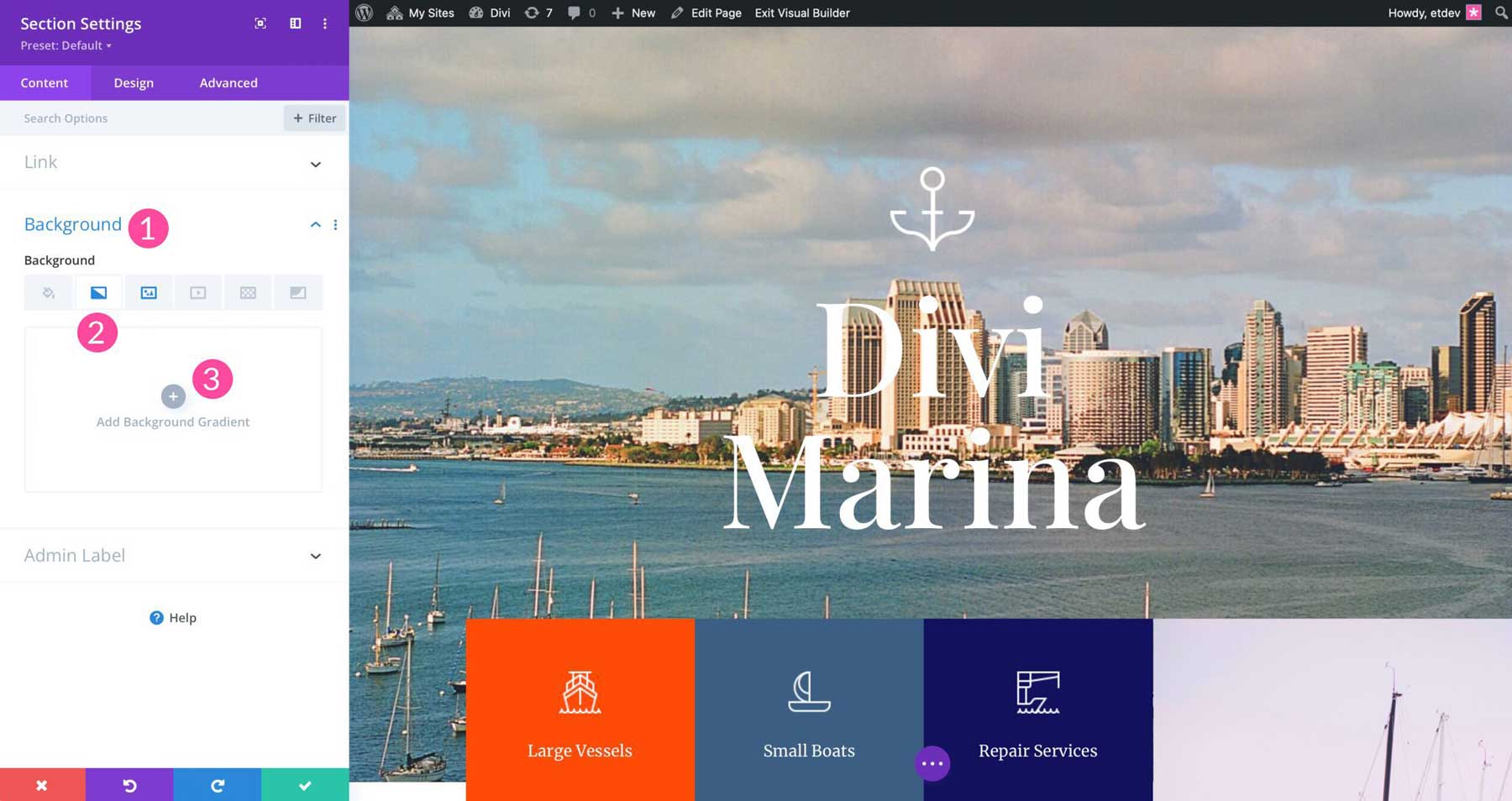
Once clicked, the default gradient will be applied.
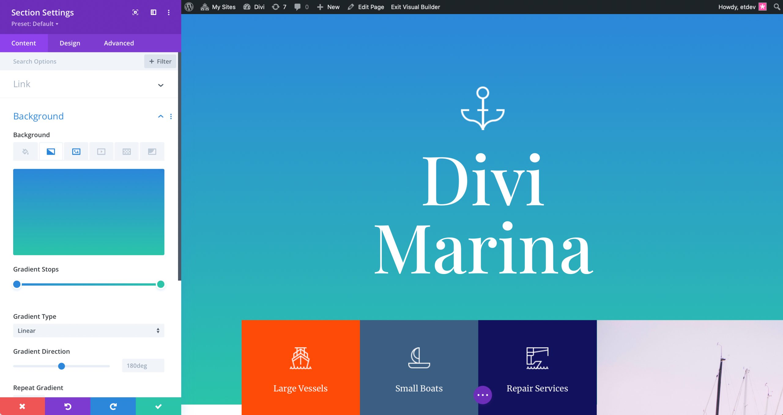
How to Set Divi Gradient Builder Colors
To set the colors for a gradient, you’ll need to use the color stops. Start by clicking on the first color stop to add your first color.
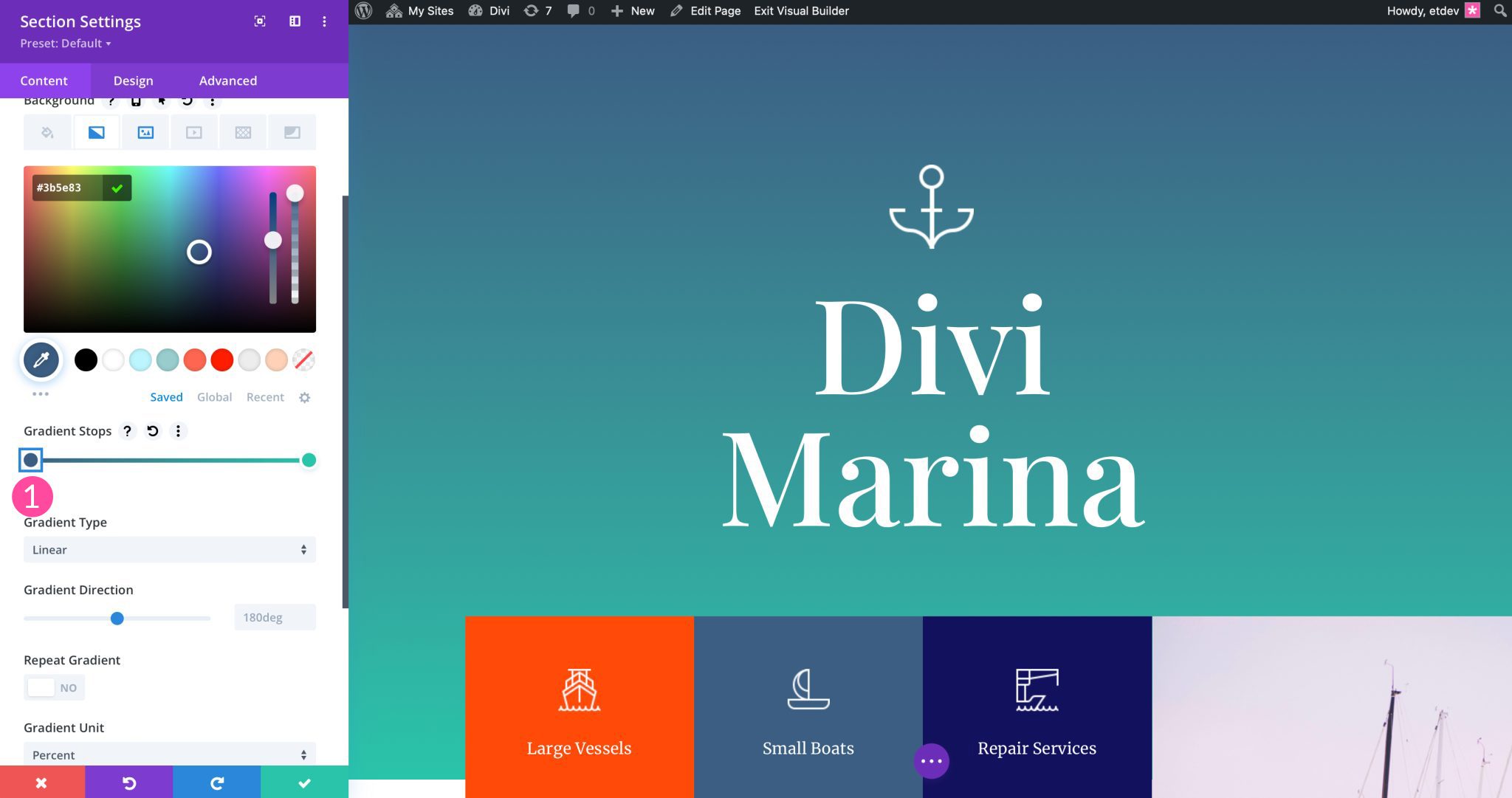
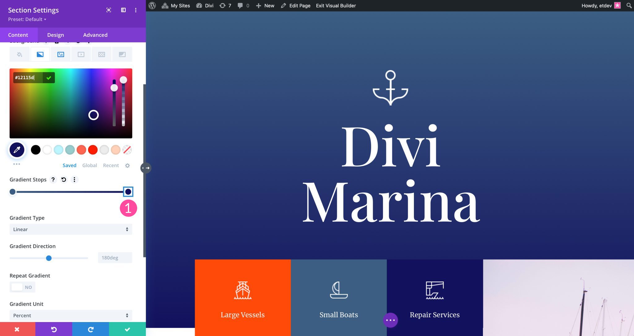
Colors can be added via the color picker. Then repeat the process to set the second color stop for your gradient.
How to Use More Than Two Colors
With the Divi Gradient Builder, you can add more than two color stops to any gradient. You can add as many colors as you would like. To add another color stop, simply click into the gradient slider to add a color.
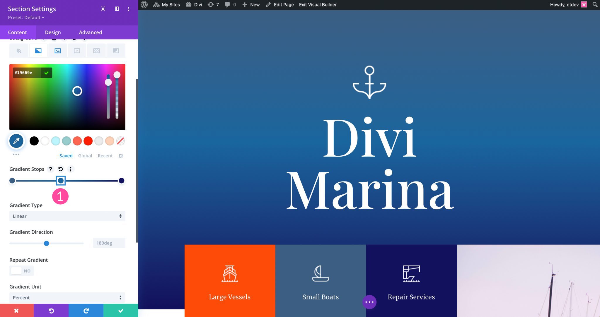
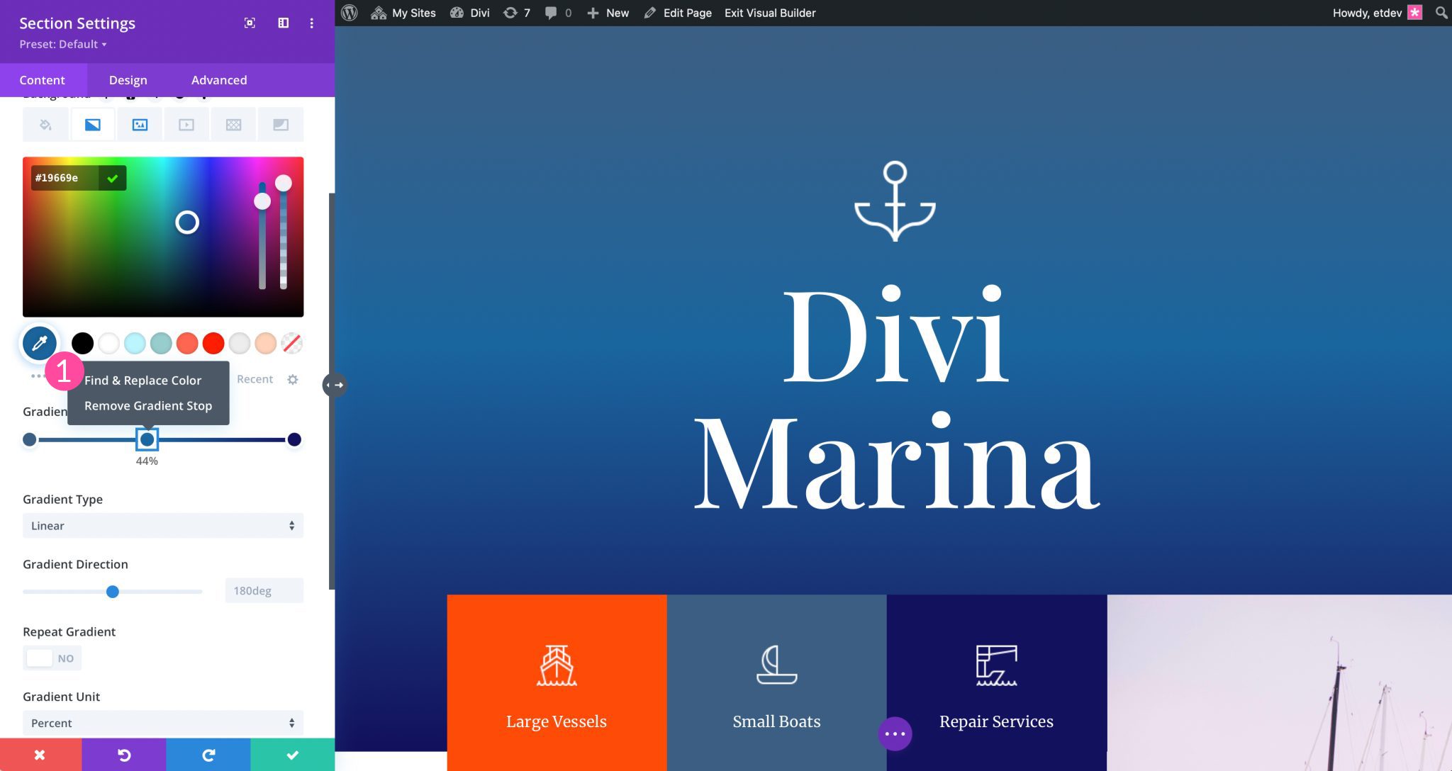
Once added, click and hold to slide the color stop anywhere you’d like within the gradient slider. When two or more color stops are used, colors can be adjusted to create more complex gradients. Additionally, you can right click on each color stop to do things like find & replace a color, or to remove it.
How to Overlap Gradient Stops
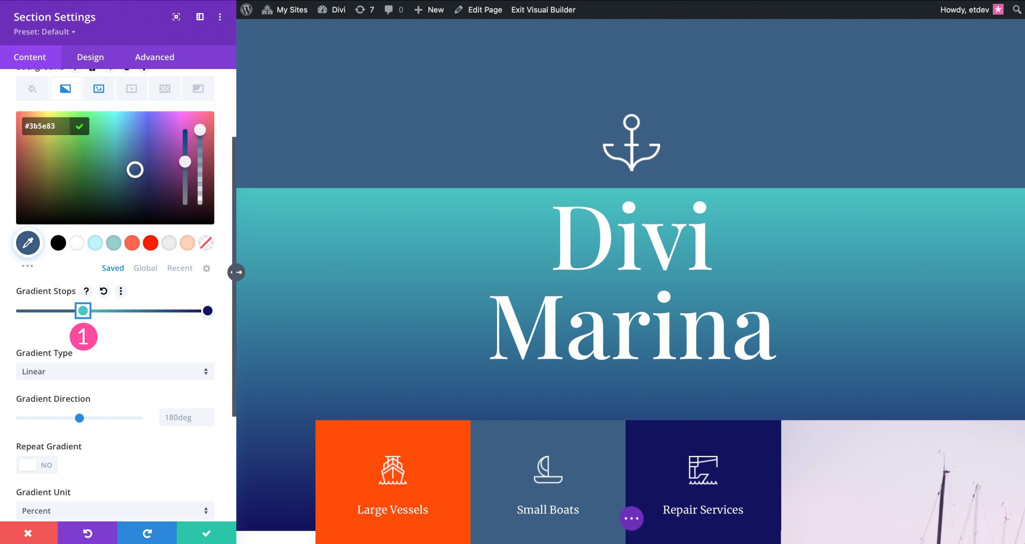
You can choose to overlap any of the color stops in the Divi gradient builder to create cool effects. For example, if you’d like to have a sharp line between your color stops, you can click into or right click on any color stop to slide it over another one. Doing so adds a sharp division of color into the gradient. This can be useful to create a striped background effect for your gradients.
In this example, three color stops are used. The left most color stop is placed directly over the middle one. This gives the gradient a solid color for the first 33% of the gradient, then uses the second and third color stops to create a smoothly blended gradient effect.
Placing a Gradient over a Background Image in the Divi Gradient Builder
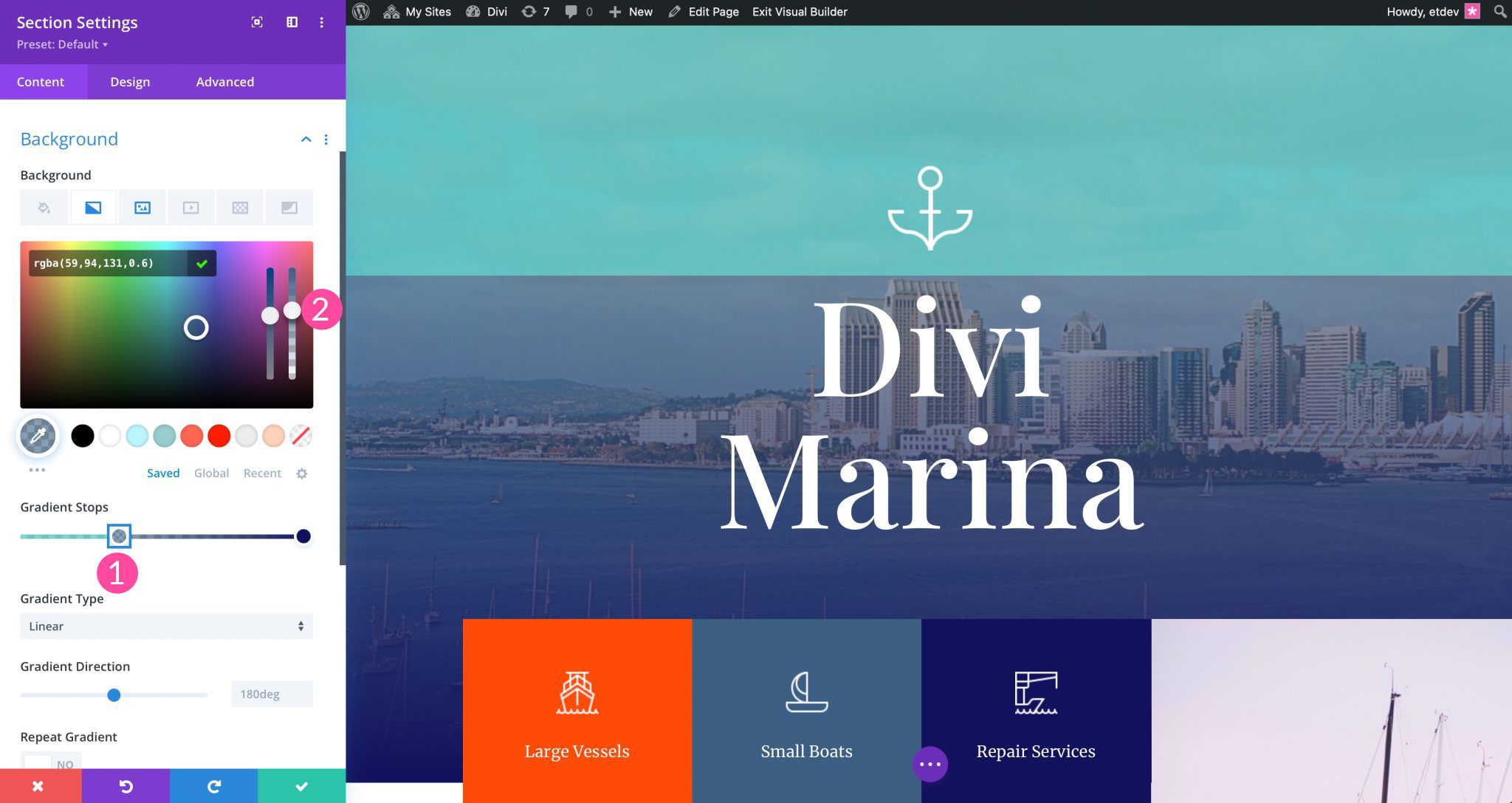
In some situations, you may want to place your gradient over a background image. This allows for the background image being used to display underneath the gradient. Simply toggle Place Gradient Above Background Image to yes.
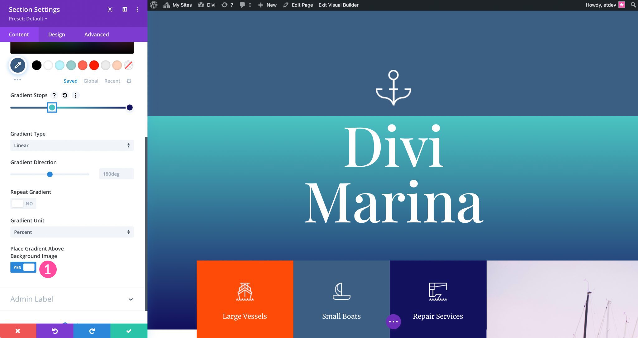
As seen in the screenshot above, even though the toggle is set to yes, the background image we have applied isn’t showing. This is because you’ll need to adjust the transparency of your color stops. You can choose to adjust the transparency of one or all of your color stops to change the effect. To adjust transparency of the color stop, click a color stop in the gradient slider. Next, adjust the transparency of the stop by adjusting the transparency slider options.
Divi Gradient Builder Types
There are four gradient types available within the Divi Gradient Builder. Linear, circular, elliptical, and conical. Let’s discuss each type and demonstrate how to configure each.
Linear Gradient
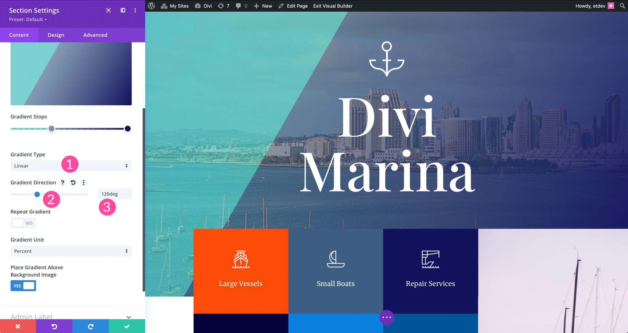
When first adding a background gradient, the linear gradient type is selected by default. For the linear option, you can choose the direction for your gradient. 180 degrees is the default position, but this can be adjusted however you wish. For exmample, switching the direction to 90 degrees will display the gradient horizontally. To adjust the direction, you may click and drag the gradient direction slider, or type a specific value into the field.
Circular Gradient
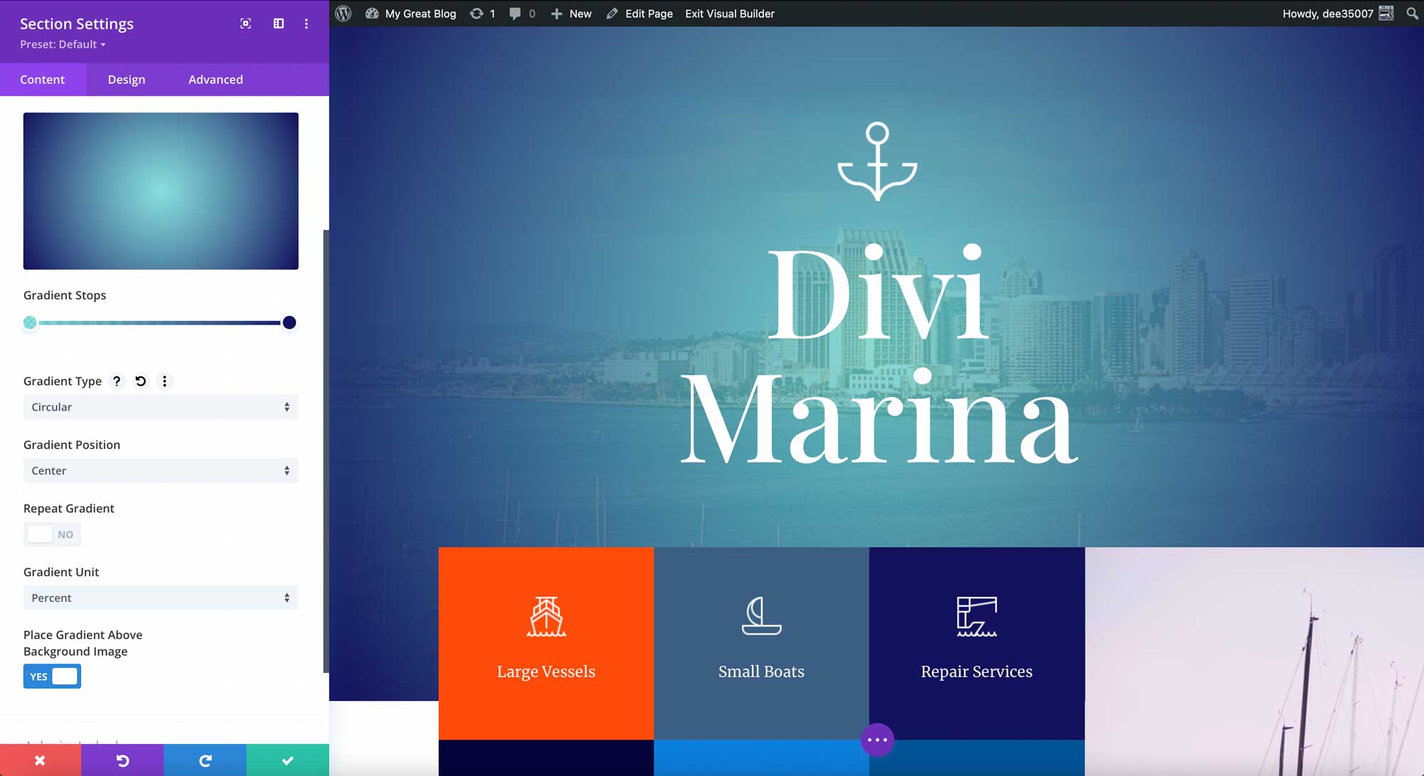
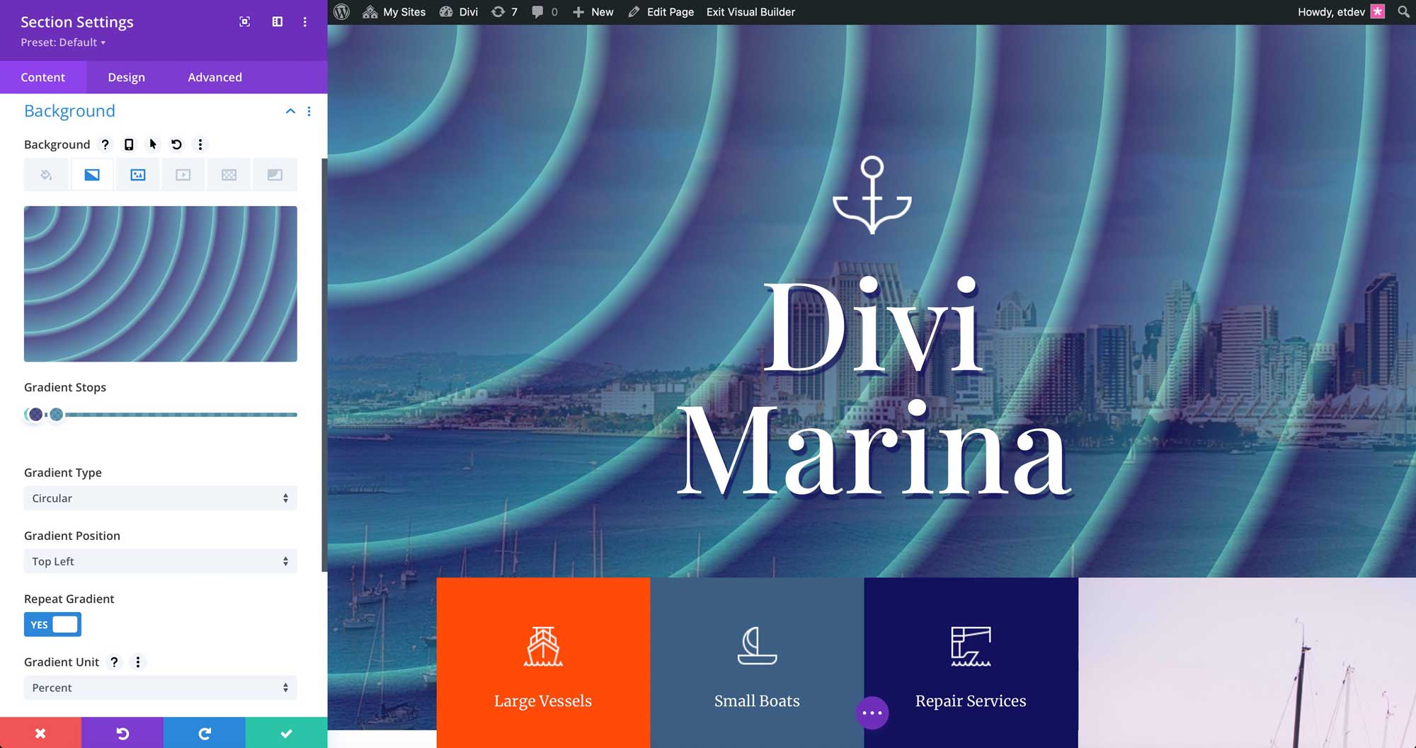
The circular gradient applies a round gradient effect to your background. You can define the position for your circular gradient using the dropdown menu associated with it. In the screenshot below, we have a top left position applied. However, you can choose from several options including center, top, top right, right, bottom right, bottom, bottom left, and left. Each setting has a unique look, so we encourage you to take time with each position to determine which one works best with your design.
Elliptical Gradient
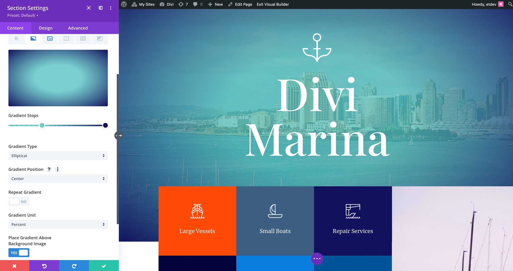
The elliptical gradient is similar to the circular one in that it provides the same position options. However, instead of applying a circle, it uses more of an egg-shaped gradient to the background.
Conical Gradient
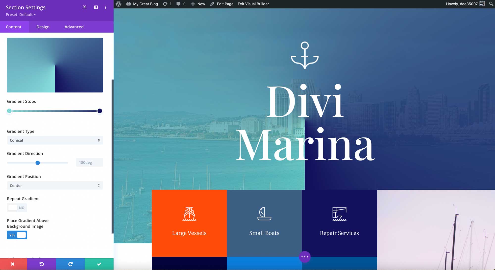
The final choice for gradient type in the Divi Gradient Builder is the conical gradient. Similar to the linear gradient type, the conical selection gives users the ability to define the gradient direction, as well as the gradient position.
Repeating Gradients With the Divi Gradient Builder
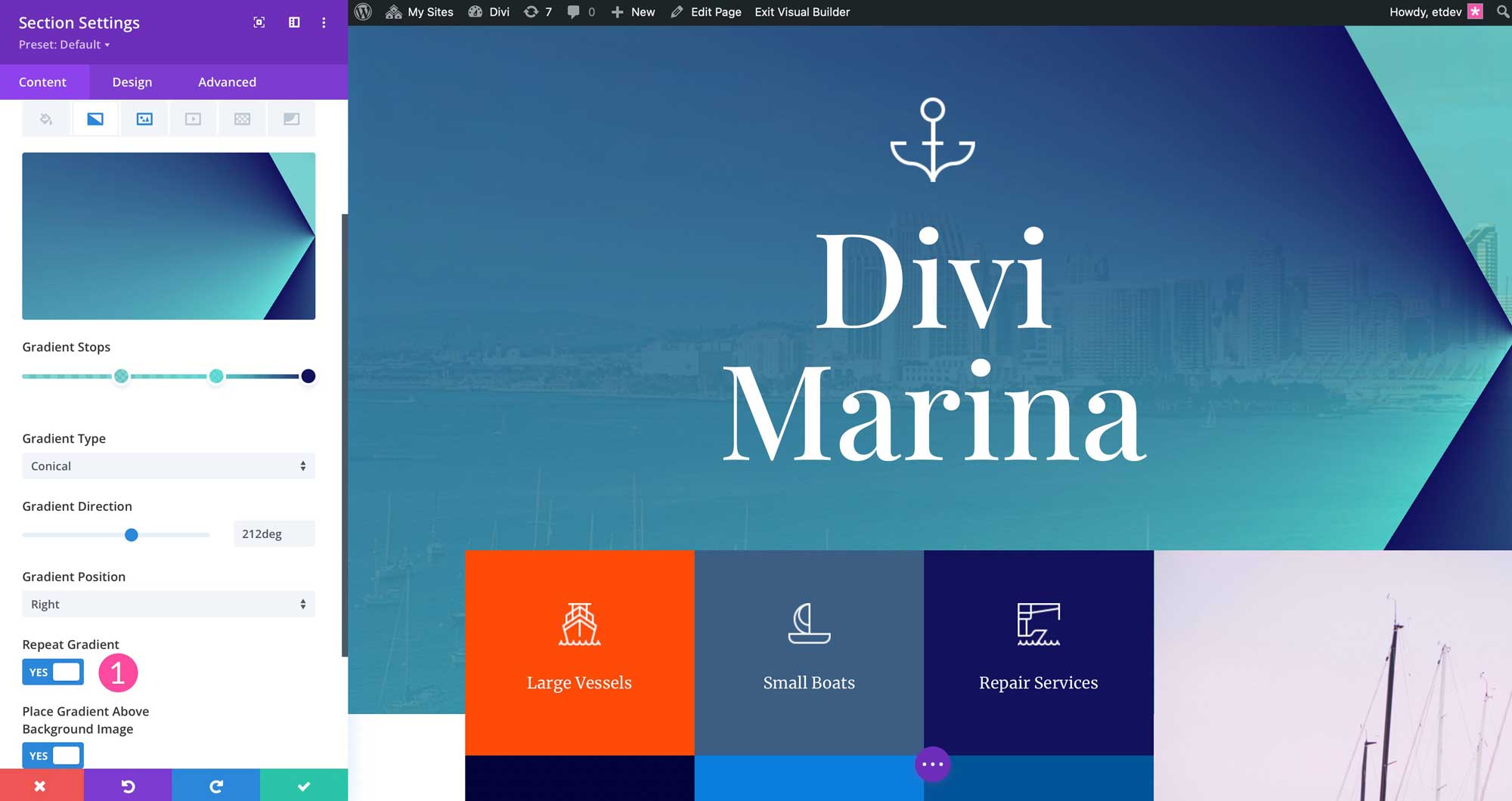
When repeating gradient is toggled to yes, the gradient that is currently applied will be duplicated. Looks will vary depending on the gradient type you choose. Repeating the gradient applies an interesting design element to your backgrounds. The more color stops you choose, the more drastic the change.
Repeating Patterns and Interesting Effects
Some cool design effects can be achieved by combining gradient type with the gradient repeat option along with gradient units. When certain gradient types are selected, an additional option for gradient unit is displayed. Linear, circular, and elliptical gradient types allow Divi users to create stunning background gradients to add dimension to their designs.
Divi Gradient Builder Units
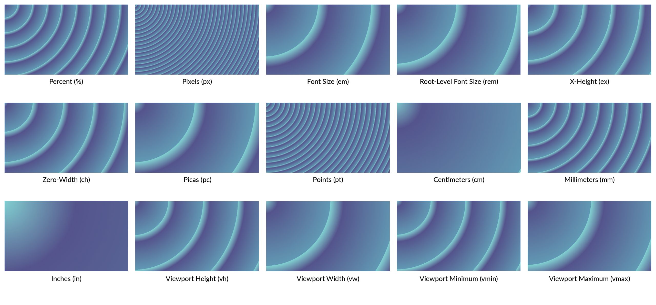
Gradient units are used to specify what the gradient stop numbers on the slide bar indicate. Additionally, they determine how the stops are measured. They affect the pattern created by the repeat options. When implementing gradient units, consider how your design will change based on the unit selected. In our example, we use the percent gradient unit. Our color stops are set to 0, 2, and 10. The opacity on all three stops is set to 70% or .7. We’ve chosen the circular gradient type, set the position to top left, and toggled repeat gradient to yes.
By applying the settings from the percent unit example, our design changes as we select different units.
Best Practices for Using the Divi Gradient Builder
Using gradients is an excellent way to add color, depth and eye-catching effects. When used properly, they can improve design and capture your site visitor’s attention. In order to get the most from Divi’s Gradient Builder, we will outline a few best practices to follow.
Focus on Color Families
Choosing the right colors for your gradients is an essential step. After all, you’re probably not creating a website for clowns. Choose hues of one color to create subtle gradients that are pleasing to the eye. Consider using Divi’s Color Management System to achieve visual balance in your designs.

A good example of how to use color families in your gradients can be found in Divi’s Private Investigator layout pack. As you can see, this design does a good job of utilizing colors within the same family to create an eye-catching design with similar colors.
Analogous Colors Are Your Friend
Analagous colors live next to one another on the color wheel. Using them is pleasing to the eye and a basic principle of color theory. In fact, brands such as BP, Red Bull, and MasterCard use analagous colors in their branding. As previously mentioned, using Divi’s dynamic magic color system is a great way to choose colors for your gradients. Additionally, Adobe Color is a great source. It can be used to generate color palettes based on analagous, monochromatic, complementary, and other color harmonies. In addition, there are pre-made color themes available. As an added bonus, Adobe Color is free to use.

Analagous colors doesn’t have to apply to just colors used in elements. You can expand on the use of them by choosing images for your design that incorporate those principles as well. For example, take a look at Divi’s Leather Goods layout pack. The images used in the layouts are a perfect example of picking images that fall within the alalogous color wheel.
Vary Gradient Types
To avoid being monotonous, use different gradient types on your webpages. For example, try not to use the same gradient background on every page. Subtle changes create a more dynamic design that keeps your site’s visitor engaged. If you’re using a linear gradient in your hero section, swap things up a bit by choosing a circular or conical background gradient in another section on the same page.

The same is true for using gradient backgrounds in elements such as buttons. Try using different gradient backgrounds for your call to actions (CTA) as well as section backgrounds. A great example of this is seen in Divi’s Digital Marketing layout pack.
Avoid Overuse of Colors
While color is essential in good design, it’s easy to overdo it. Limit colors to 3-4, and use hues to create balance. Too many colors can confuse or overwhelm visitors. On the other hand, try to incorporate more than two colors in your gradients. Limiting colors in a gradient can cause your gradient to appear muddy and unpleasant. Try using a third color of the same family. This will add depth and an interesting element to your gradient.
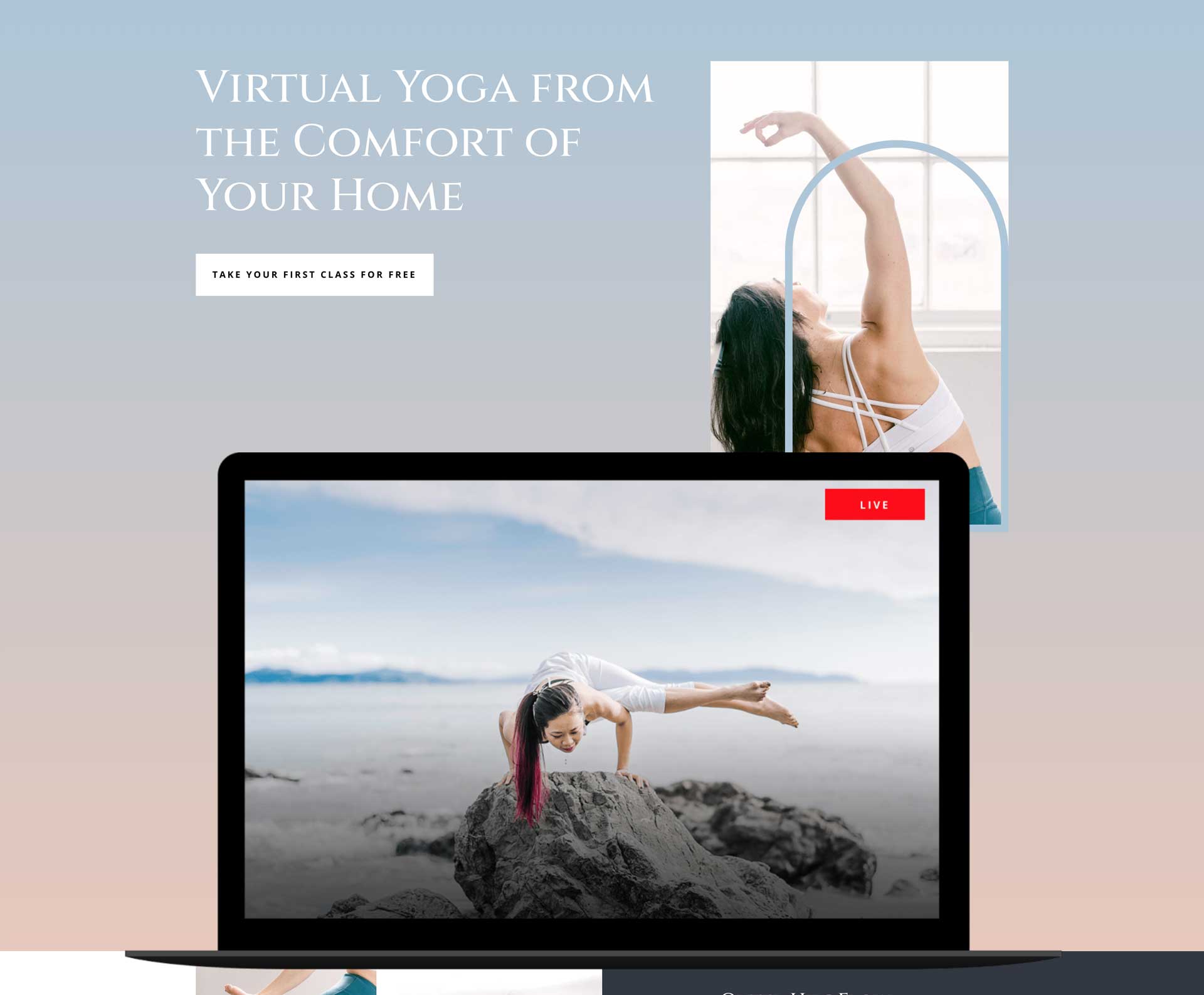
Let’s take a look at Divi’s Online Yoga layout pack as an example. While visually stunning, the layout limits color usage to 4 colors. The gradients used in the page contain two muted colors, allowing for the text to pop. There are two additionaly colors used throughout the page to provide pops of color without being overwhelming.
Stick to Good UX Principles
Legibility is key. Ensure that regardless of the type of gradient you choose, the content over it is easy to read. Consider stacking text and buttons to one side of the section where the gradient is being used. If using light text, place a darker color underneath.

The Divi Whiskey Distillery layout pack is a great example of balancing a background gradient with text overlay. Using a darker background gradient with a light text overlay results in a stunning design that’s both eye-catching and effective.
Make Your Gradients Unique
Combine gradient directions, types, units, and colors to create unique design options. Additionally, consider combining Divi’s background patterns and masks to add more visual appeal.
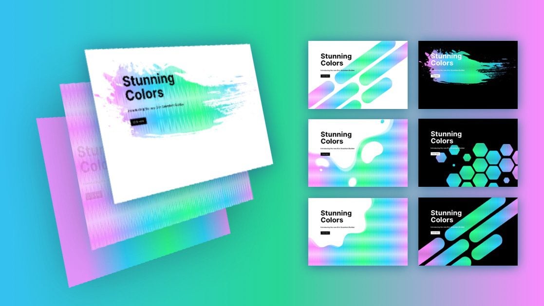
Check out our blog post on How To Combine Divi’s Background Gradient Builder, Masks and Patterns for a great example on how to combine these elements to create stunning designs.
Continue Learning
Check out our blog to learn more about the Divi Gradient Builder and how to incorporate gradients into your website. There are great posts including freebies as well as in-depth tutorials.
