Using Divi Position Options
Divi’s Position Options make it possible to move page elements independent of their parent container’s limits.
Divi Position Options give you granular control over the position of every element on your page. Position options allow you to move around elements unconstrained from their parent container’s limits. You can design fixed headers and banners, dynamic image collages, and interesting overlapping effects all with Divi’s Position options.
In this doc, we’ll cover:
- How To Access Divi Position Options
- How Position Options Works
- Use Draggable Anchors To Reposition Elements On The Page
- Tips & Best Practices for Using Divi Position Options
- Continue Learning
How To Access Divi Position Options
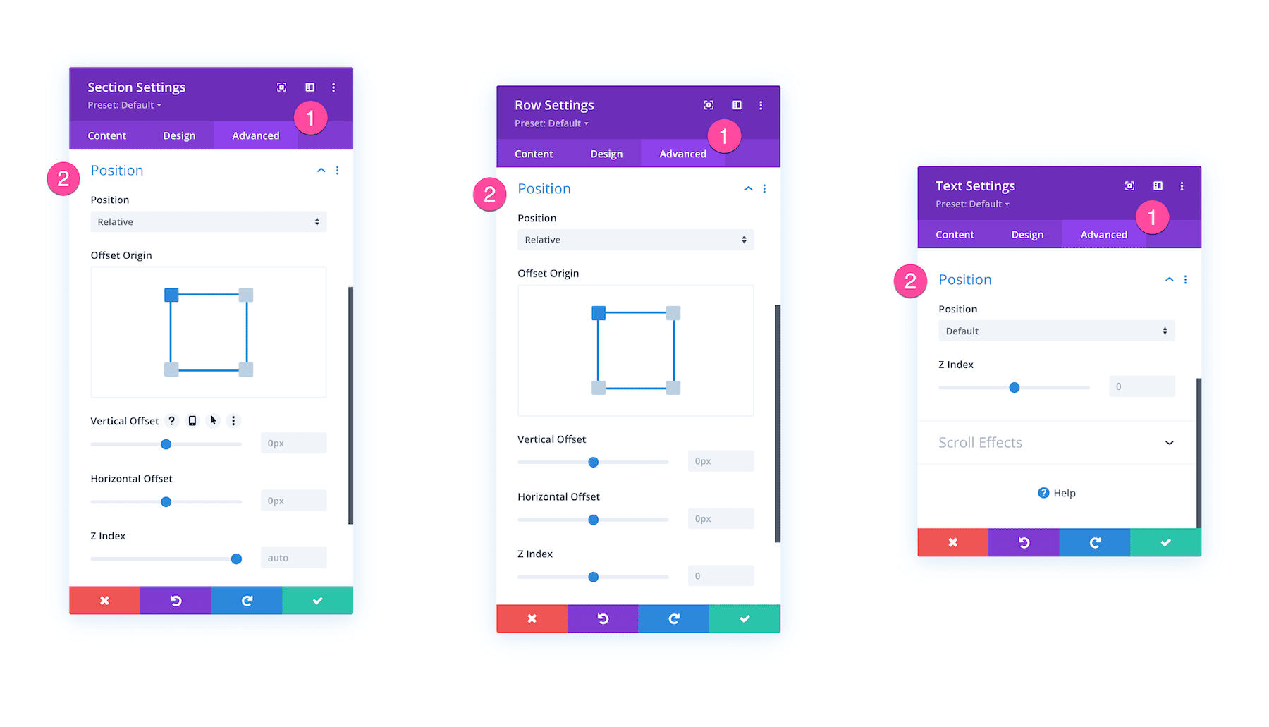
Every Divi section, row, and module has a Position settings group under Advanced > Position.
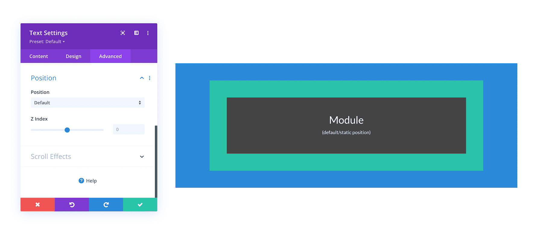
By default, modules have the default/static position and rows and sections have the relative position by default.
How Position Options Works
Within the Position settings group, you’re able to assign a position to the element, including Default, Relative, Absolute, and Fixed.
Default (Static)
The default position is the static position. Statically positioned elements stay within the normal flow or order of the elements on the page. They are not affected by the top, bottom, left, and right properties like other positioned elements which is why no offset values are available for elements in the default/static position.
z-Index
This controls the element position on the Z axis. Elements with a higher z-index number will sit atop elements with lower z-index values.
Relative
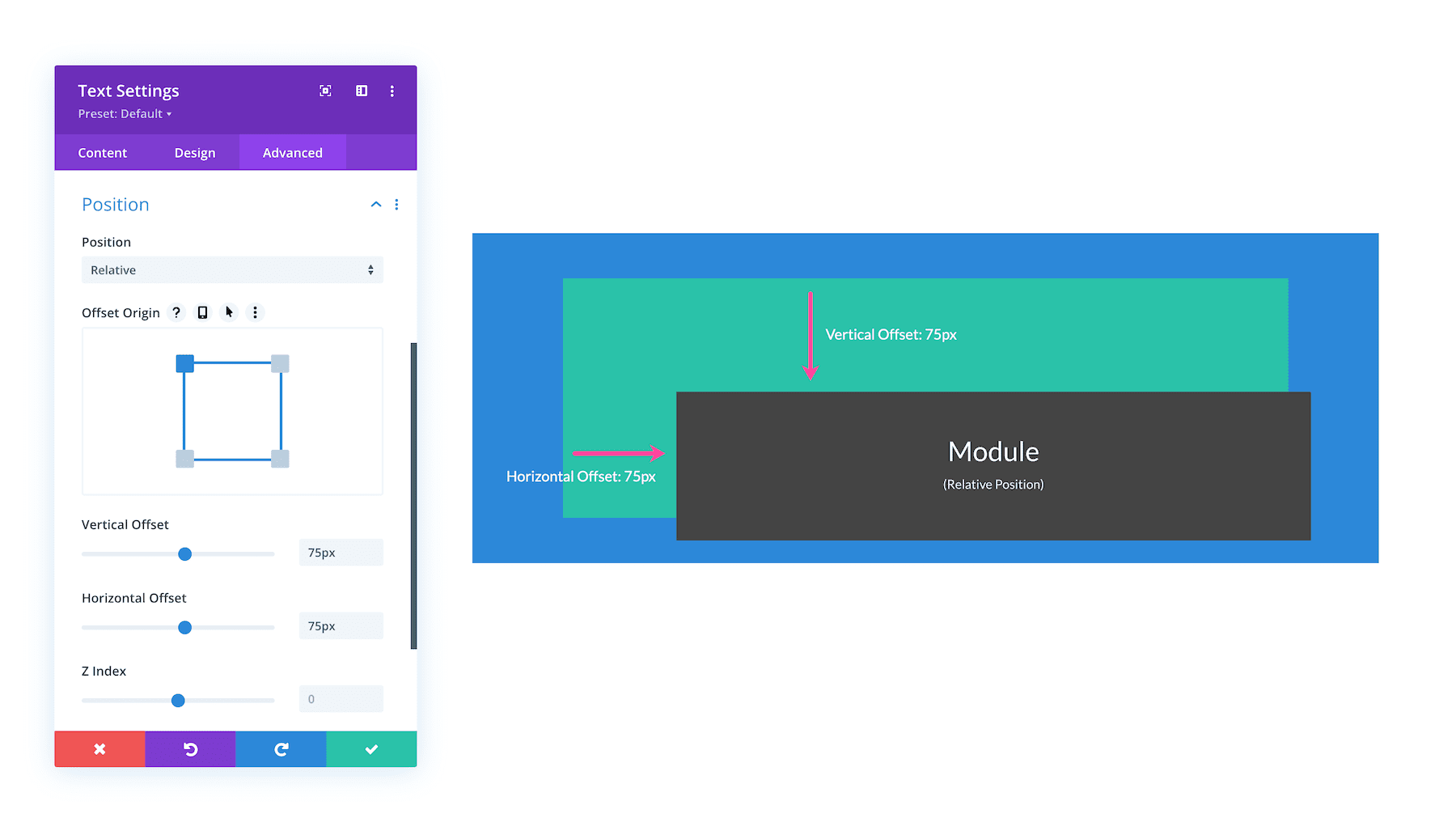
Relatively positioned elements can change position without affecting the element’s relationship to the elements around it. The element’s position is relative to itself. That means you can assign top, right, bottom, and left offset properties to move the element around without shifting the surrounding elements.
Offest Origin
This determines which corner this element is offset from. The vertical and horizontal offset adjustments will be affected based on the element’s offset origin.
Vertical Offset
Here you can adjust the element’s position upwards or downwards from its starting location, which may differ based on its offset origin.
Horizontal Offset
Here you can adjust the element’s position left or right from its starting location, which may differ based on its offset origin.
Z-Index
This controls the element position on the Z axis. Elements with a higher z-index number will sit atop elements with lower z-index values.
Absolute
The absolute position breaks the element free from its static position and instead allows the element to be moved around relative to its parent container. Absolutely positioned elements act like they are floating on the page. They are not restricted by their parent container limits and are positioned relative to the nearest positioned parent container. When an element has an absolute position it’s removed from its parent container and the parent container will “collapse” as if there is nothing inside it.
Location
Here you can adjust the element’s starting location within its parent container. You can further adjust the element’s position using the offset controls.
Vertical Offset
Here you can adjust the element’s position upwards or downwards from its starting location, which may differ based on its offset origin.
Horizontal Offset
Here you can adjust the element’s position left or right from its starting location, which may differ based on its offset origin.
Z-Index
This controls the element position on the Z axis. Elements with a higher z-index number will sit atop elements with lower z-index values.
Fixed
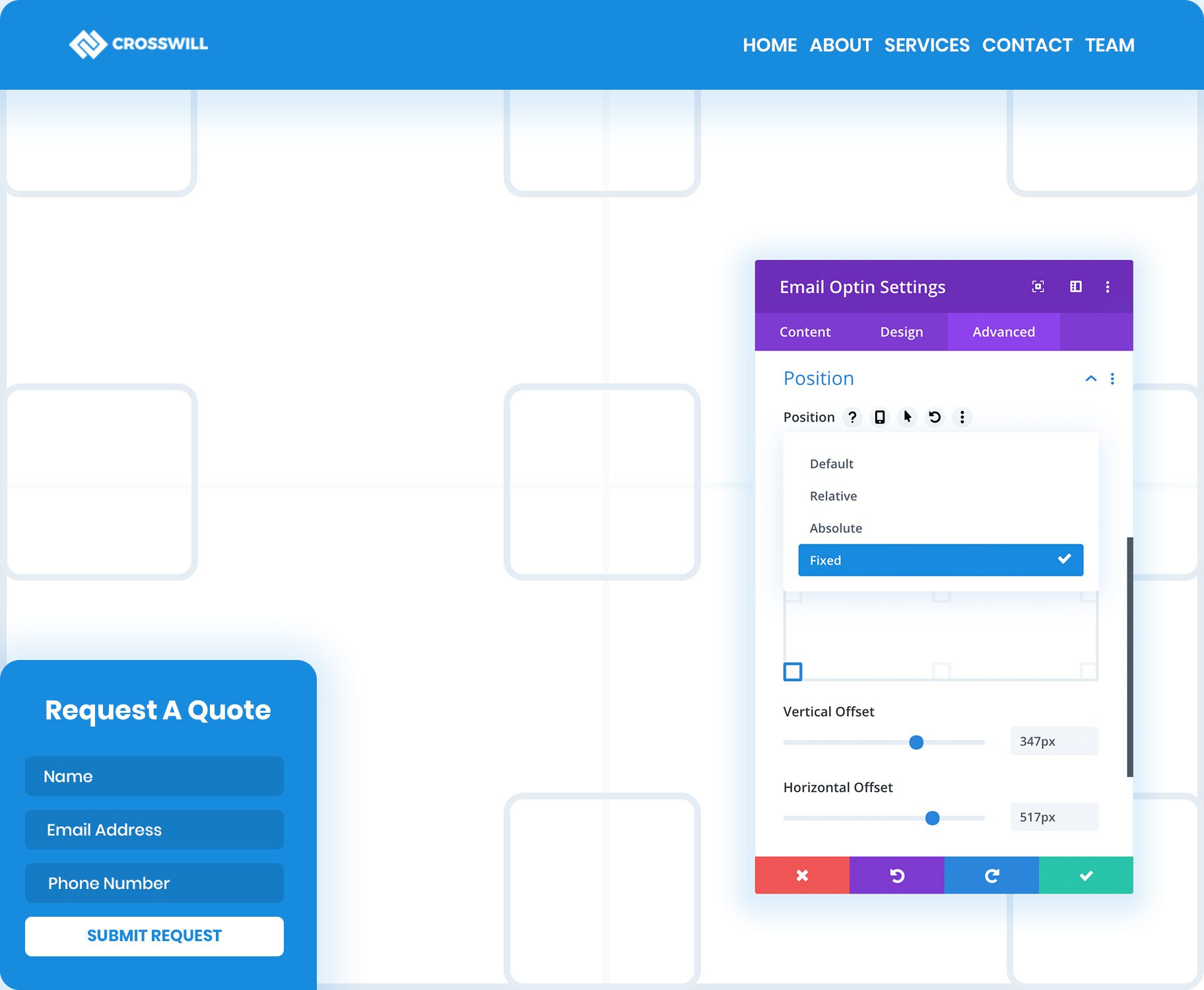
Elements with a fixed position stay in one position on the web page and are relative to the browser window or viewport, not to a parent container. This position can be used to create “sticky” elements such as fixed headers or a floating banner that stay visible as you scroll down the page. Fixed position elements break out of the normal flow of the page and have no actual space created within the page.
Location
Here you can adjust the element’s starting location within its parent container. You can further adjust the element’s position using the offset controls.
Vertical Offset
Here you can adjust the element’s position upwards or downwards from its starting location, which may differ based on its offset origin.
Horizontal Offset
Here you can adjust the element’s position left or right from its starting location, which may differ based on its offset origin.
Z-Index
This controls the element position on the Z axis. Elements with a higher z-index number will sit atop elements with lower z-index values. Because fixed elements will often hover behind or in front of other elements on the page, Z Index will help order fixed elements above others.
Use Draggable Anchors To Reposition Elements On The Page
When you change an element’s position to Relative, Absolute or Fixed, a new draggable anchor will appear when you hover over the element. This allows you to drag modules, rows and sections right on the page to change their position. As you reposition the element, its X and Y Offset is adjusted within the module settings. As with all Divi settings, the X and Y Offset controls can be adjusted on desktop, tablet and smartphone independently, allowing you to use position options to create responsive designs.
Tips & Best Practices For Using Divi Position Options
When using Divi Position options, keep these tips and best practices in mind.
Relative Length Units Respond Differently
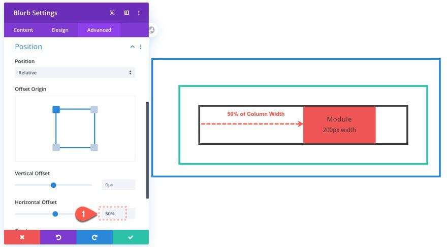
If we are using relative length units (like % or vw) for responsive design, these will work differently with relative position and transform translate.
A Divi module with a relative position and a horizontal offset of 50% will move the module horizontally the amount equal to 50% of the width of the parent container (or column).
Keep Important Elements Front And Center As You Scroll
Using fixed positions allows you to create floating elements, such as fixed headers or floating banners. Fixed elements can be positioned anywhere within the browser viewport and will remain fixed to that location as you scroll down the page. You can make any element fixed and some common uses include: Fixed headers, floating opt-in forms and lead generation forms, sticky buttons, important notices and more.
Create Custom Fixed Headers In The Theme Builder
One of the best uses of the new fixed position options is the creation of fixed headers in the Divi Theme Builder. You can create fixed menu modules or you can build an entirely custom header and make the whole section sticky.
Build Floating Banners, Buttons & Opt-In Forms
Anything can utilize the new fixed position options, not just headers. You can create fixed opt-in forms, lead generation forms or floating call-to-actions. If there is something important that you want to remaining accessible for your visitors, you can fix it to their browser viewport so that it’s always a click away.
Stack Elements To Create Fun Overlapping Effects
When you change an element’s position to Relative or Absolute, it allows that element to be moved around the page freely without disrupting the elements around it. You can even stack modules on top of each other to create overlapping effects and image collages.
Continue Learning
- Understanding & Using the Relative Position in Divi
- A Guide to Understanding & Using the Fixed Position in Divi
- A Guide to Understanding & Using Divi’s Absolute Position
- How to Use Divi’s Position Options to Create Image Bundles
- How to Create a Fixed Header with Divi’s Position Options
- How to Create an Interactive Image Collage Using Divi’s Position Options
- How to Build a Responsive Fixed Sidebar with Smooth Scrolling Anchor Links with Divi
- How to Create a Fixed Footer Bar for Your Divi Theme
- How to Create Mobile Sticky Footer Bars in Divi
