
We all know that websites need to be optimized for mobile. In fact, the strategy of web design has shifted to think “mobile first”. This makes sense considering there are over 4 billion people using mobile phones worldwide.
Divi’s visual builder is a useful design tool for building websites for mobile. It has a lot of structural features built in that adjust to tablet and smartphone without you having to do anything. On top of that, you can set custom responsive settings for desktop, tablet, and smartphone for all sections, rows, and modules. This gives you a lot of power over your mobile design.
This post is meant to help you understand the options available within Divi so that you can make those adjustments to mobile with confidence. And, having this knowledge will help you to think “mobile first” at the start of your projects, instead of patching up the mobile design after the fact.
The techniques shared in this post will help you do the following:
- Control the vertical spacing between sections and rows
- Make blurbs (or any module) span fullwidth on mobile, but not on desktop
- Adjust unwanted column spacing on mobile
- Optimizing buttons for mobile
Let’s get started.
- 1 What You Need to Get Started
- 2 Sneak Peek
- 3 Set Default Spacing Between Sections and Rows to 0
- 4 Add Custom Spacing Between Sections and Rows to Your Layout
- 5 Adjust Column Margin on Mobile
- 6 Creating Fullwidth Blurbs on Mobile
- 7 Customizing Divider Height for Mobile
- 8 Customizing Buttons on Mobile
- 9 Text Size, Line Length, and Line height
- 10 Final Thoughts
What You Need to Get Started
To get started, you will need the following:
- The Divi Theme (installed and active)
- A new page with the Locksmith About Page Layout loaded
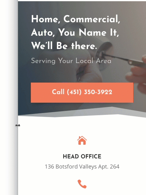
Sneak Peek
Here is a peek at the tablet and smartphone design we will be building.
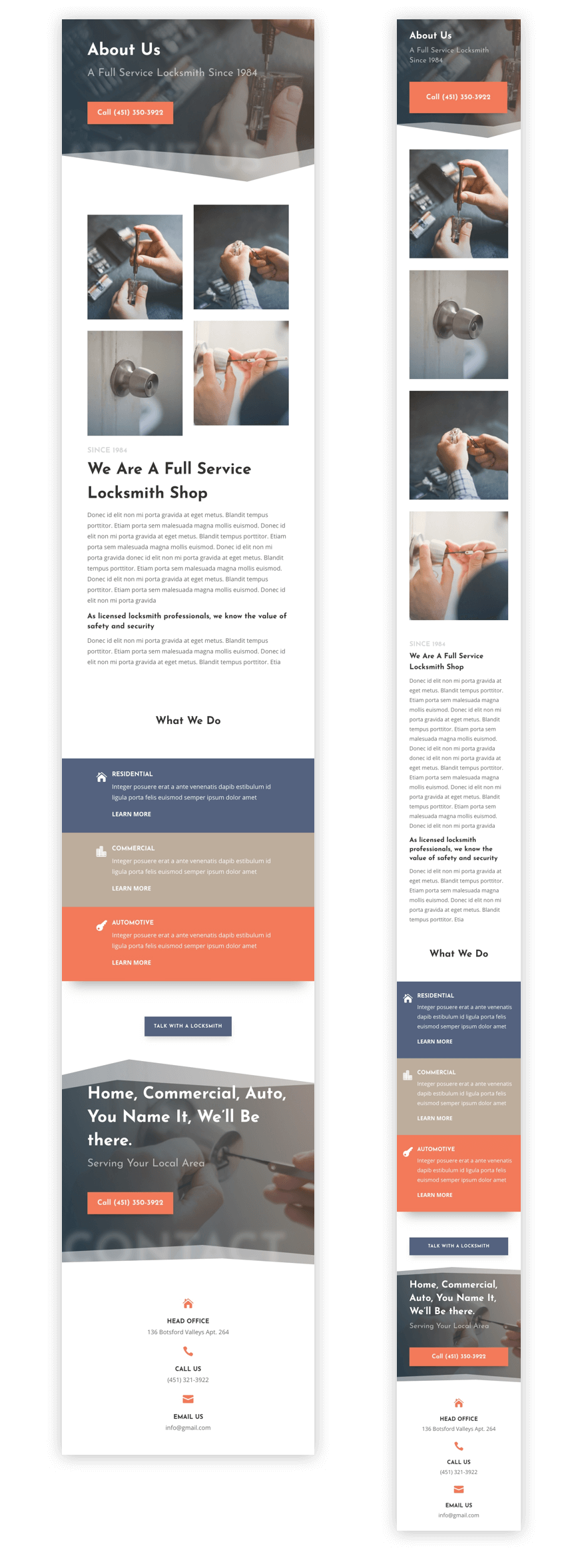
Keep in mind that the changes made are minimal but the techniques used will help you think properly about how to make more advanced changes to your own layouts.
Set Default Spacing Between Sections and Rows to 0
By Default, Divi will set your default spacing between rows and sections. If you navigate to theme customizer > General Settings > Layout Settings, you will see the default section height is set to 4 which equates to 50px of top and bottom padding per sections. The row height is set to 2 which equates to 30px of top and bottom padding per row. Instead of keeping these defaults and then having to change each one individually when customizing your layout, you can start fresh by assigning a value of 0 for both your section and row height. This will make your default top and bottom padding to 0px. That way when you go to edit your layout, you will have a better idea of what you are dealing with when adding custom spacing.
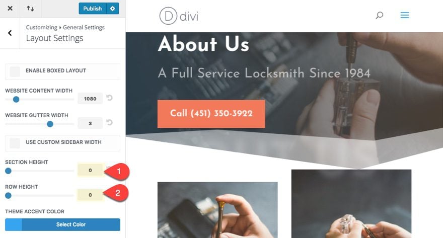
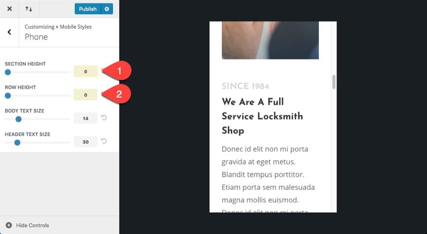
You can do the same for the Mobile displays as well. Navigate to Theme Customizer > Mobile Styles and set your section and row heights to 0 as well.
Add Custom Spacing Between Sections and Rows to Your Layout
For this use case tutorial, I’m going to use the Locksmith About Page Layout as an example. Once you import the layout to the page, you will see the new spacing defaults have made your sections and rows a lot closer so that the content stacks on top of each other without much spacing at all.
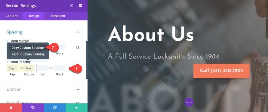
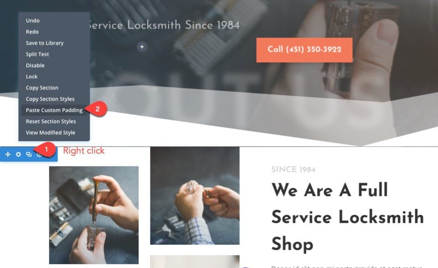
Now we can add our custom padding to each of our sections and rows. First, let’s check out the section settings for the top section of the layout.
Notice a custom padding has been set with a top padding of 6vw. This is a nice amount of space to serve as our default for all remaining sections on the page as well. So I suggest adding a complimentary bottom padding of 6vw as well. Then copy the custom padding to your clipboard so you can easily paste that style option to the rest of your sections on the page.
The 6vw length value ensures the padding will scale fluidly with the width of your browser window so you really don’t need to set a custom value for mobile devices. This is a great way to save time and get rid of unwanted space on mobile as well.
Now right click on the rest of your sections and paste the custom padding to each.
Now your sections will have a new custom spacing that scales with your browser sizes.
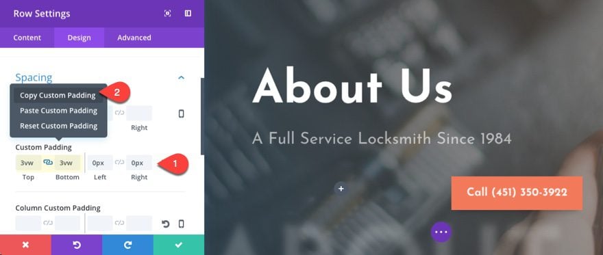
We can do the same for our rows as well. Click to open the top row in the first section that holds the main title of the page. Then add a top and bottom padding of 3vw (half the value of our section spacing). Then copy the custom padding.
Now paste the new custom padding to each of your rows throughout the layout. Depending on your layout design, some rows will need to keep their custom padding, so be aware of this when pasting your custom padding to each row. If you want get rid of some space, you could set all your rows to only have a bottom padding of 3vw.
With the vw length unit spacing your rows and sections, the length of your page will shrink as the spacing scales with your browser.
Adjust Column Margin on Mobile
The spacing between columns are controlled by gutter width. Depending on the gutter width you have selected, Divi will smartly and conveniently add a degree of spacing between columns. For the most part, you want to take advantage of this gutter width option. If you ever had to create a column structure from scratch using html/css then you know how much of a headache that can be.
By default the gutter width for your rows are set to a value of 3 (which represents a 5.5% right margin between columns).
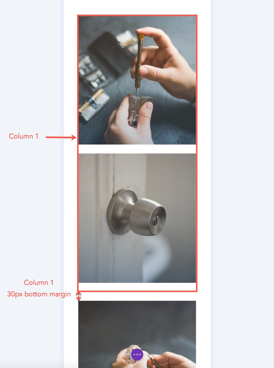
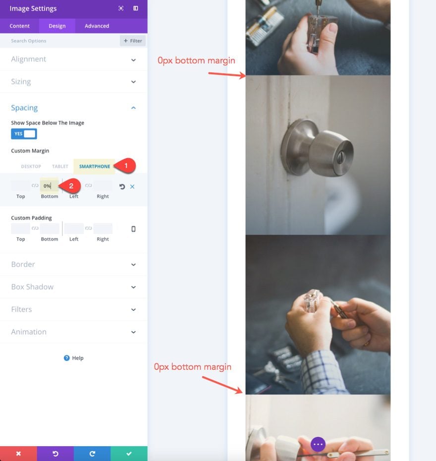
Take a look at the row in the second section of the Locksmith About Page Layout. Notice that it has a column structure of 1/4 1/4 1/2. The gutter with of the row is set to 2 (which represents a 3% right margin between columns).
On Tablet, the two 1/4 columns will still remain side by side to retain the grid layout for the images.
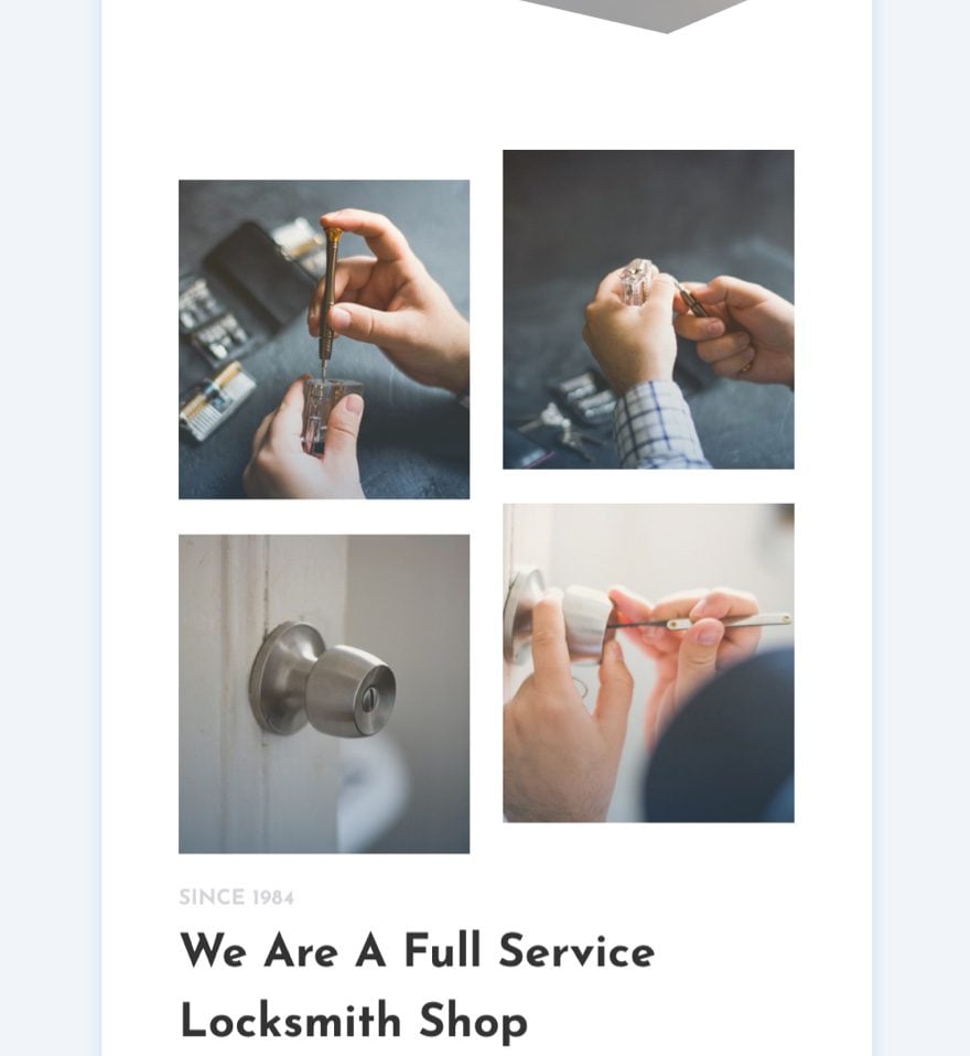
On smartphone, gutter width doesn’t really come into play since everything will need to be stacked on top of each other. There is no need for horizontal spacing anymore.
The images that make up the grid are in two columns that, when stacked on mobile, are divided by a 30px margin. This little extra space is actually a bottom margin of 30px that is applied to all columns that have a gutter width greater than 1.
This bottom margin comes in handy in most cases as a convenient way to break up content on mobile. But sometimes it may add a little spacing that you don’t need on smartphone.
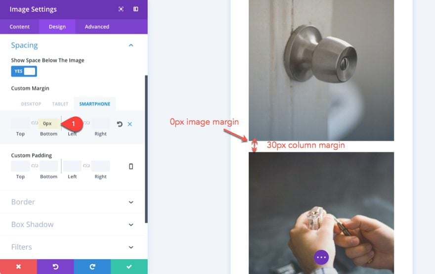
One way to fix this is to adjust the bottom margins of the images to account for the 30px bottom margin. Currently each image has a bottom margin of 12%. All you need to do is change the bottom margin to 30px on smartphone for all images except the second image in the first column.
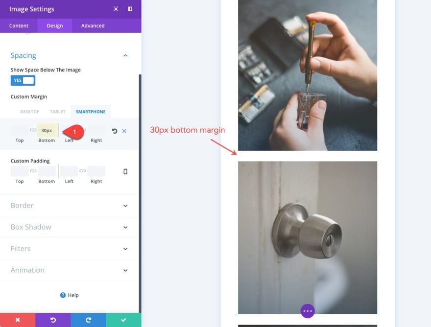
Since the first column will already have the 30px bottom margin on mobile, set the second image in the first column to have a bottom margin of 0px.
Or if you prefer to get rid of this margin altogether, you can just add the following snippet of CSS to Column 1 in your row settings.
margin-bottom: 0px !important;
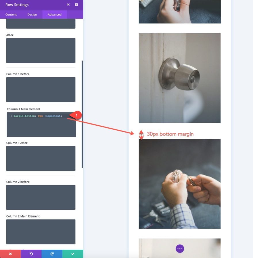
This will get rid of the bottom margin for that column.
To take it a step further, I could set the bottom margin value for each of my images to 0px (on smartphone display) so the images will stack without spacing, saving scroll time on smartphones.
Creating Fullwidth Blurbs on Mobile
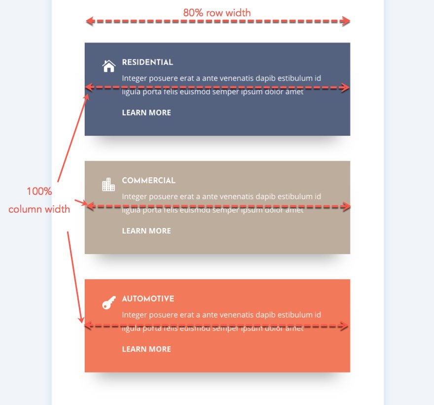
In the next section of our layout, there is a three column row with a blurb in each one. The row has a custom width of 1440px. Technically, this is a max-width value of 1440px so that the row won’t expand passed 1440px on large browser sizes. On smaller browsers, the row will take on a width of 80% and scale nicely. To say it another way, the width of the row will be 80% of the width of the section until it reaches 1440px wide.
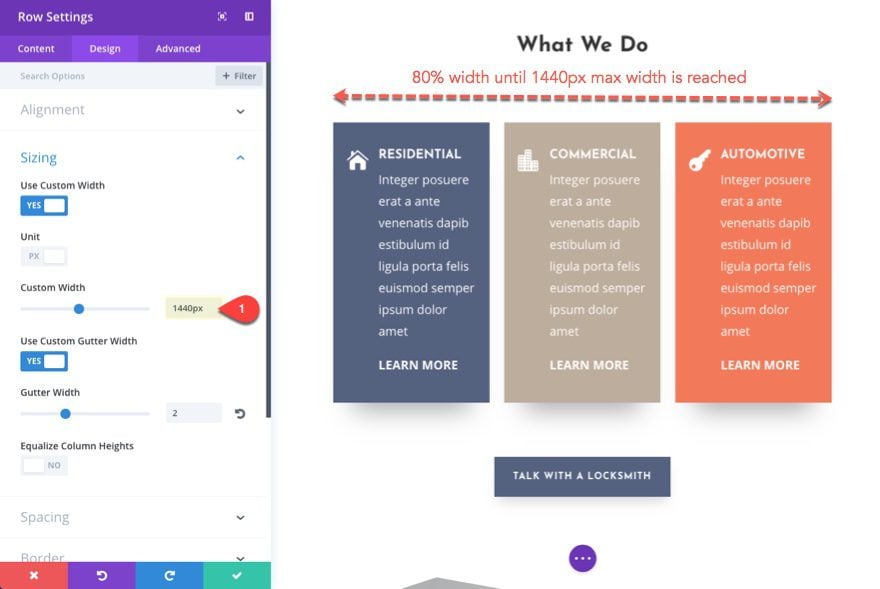
On tablet and smartphone, the three columns take on a width of 100% and stack on top of each other but they still are contained by the 80% row width.
To save some space on mobile, you may want to have these blurbs span the full width of your section so that no space exists on either side.
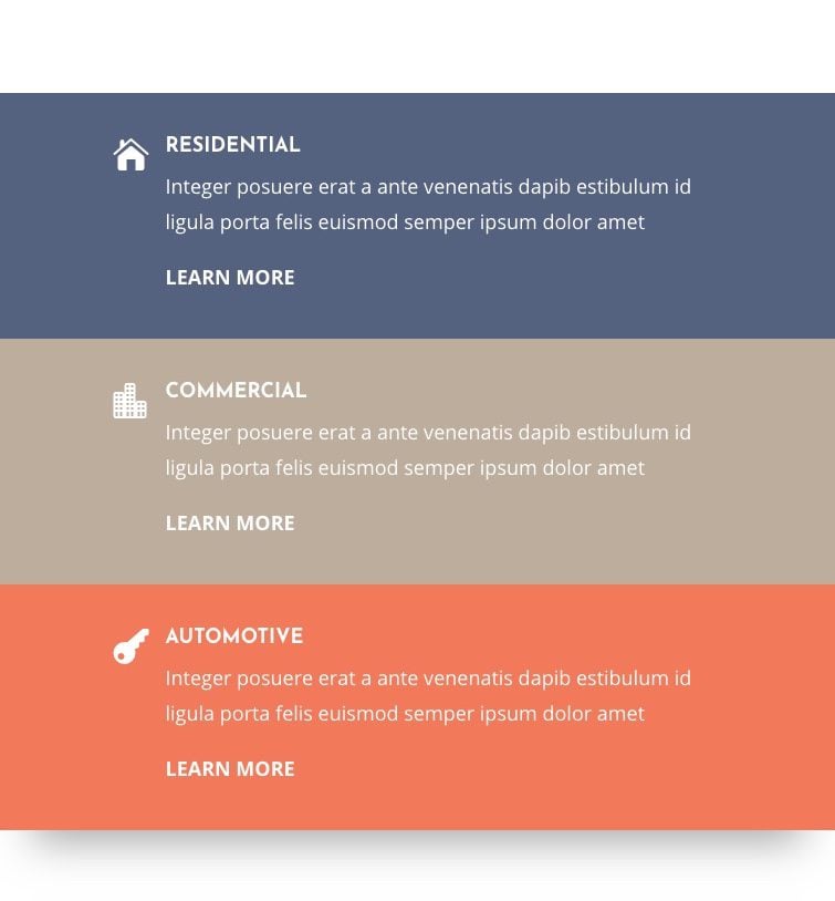
To do this, we need to rethink the way we set up our row. Instead of having a 1440px custom width, change the custom width to 100%. You could also choose the “make this row fullwidth” option but bear in mind that if you set the row to fullwidth (with a 2 gutter width), the width of your row will actually be 94%, leaving you 3% of margin on each side of the row. To simplify the math of it all, it would be best to use a custom width of 100%.
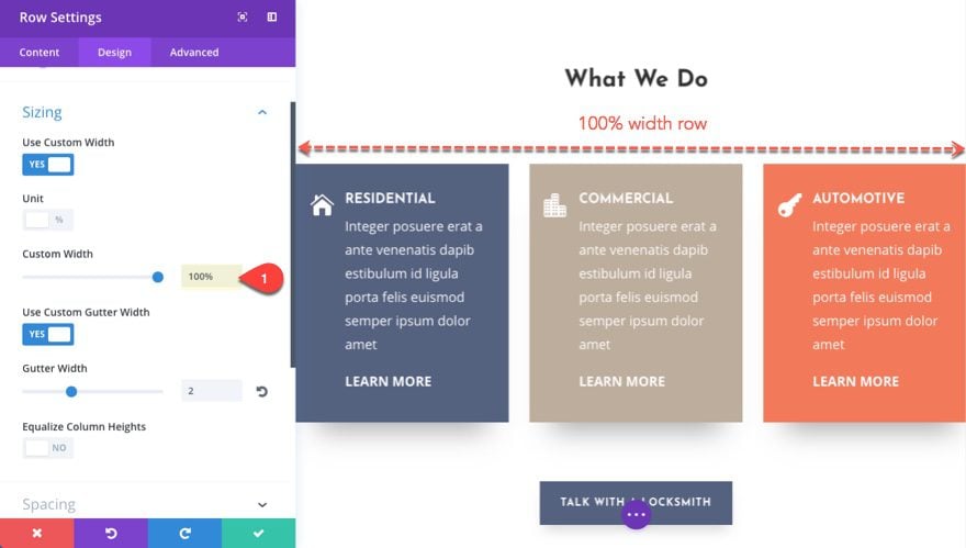
The main goal here is to think mobile first so that our content/blurbs span the full width of the page on tablet and smartphone. But since the current layout doesn’t really call for a fullwidth row in the design on desktop, you can gain some of that space back by adding padding to the row. If we want to gain back a row that spans 80% wide, we need to add 10% of padding on each side (10% + 10% = 20% and 100% – 20% = 80%). This will ensure your content will span 80% of the page.
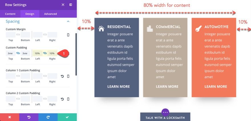
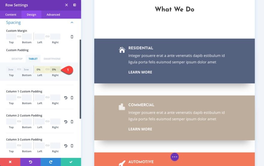
Now we can adjust the padding on tablet and smartphone to 0% so that the blurbs/content will span the full width of the page.
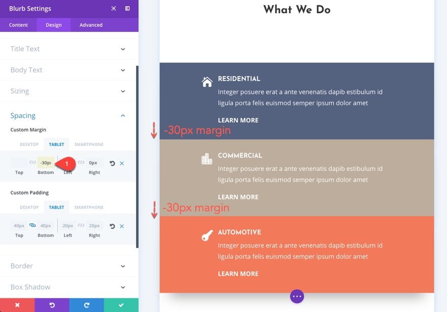
To make sure that they stack on top of each other, you can add a custom bottom margin of -30px for the first two blurbs. This will push them down over the bottom margin of 30px added by the column and hide the box shadow for a nice clean design on mobile.
Customizing Divider Height for Mobile
Divider heights play an important design role in many of our layouts. But it is important to keep a consistent design on mobile as well. There are a few techniques that will help you customize the divider height for mobile.
First, you should consider setting your height with a vw length unit. Look at the section of the Locksmith About Page layout right under the section with the three blurbs. If you look at the top divider height on this layout, you will notice it has been set to 18vw.
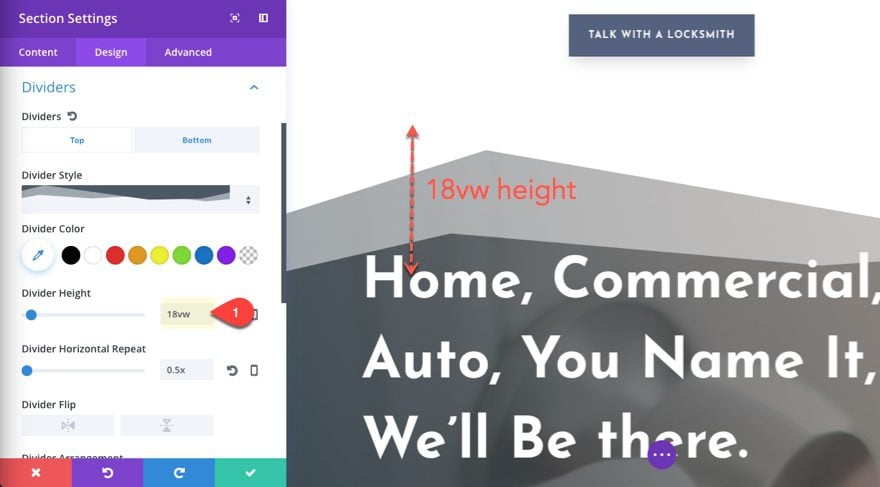
This will make sure the divider will scale perfectly with your browser window without having to set additional values for tablet and smartphone. Setting it to a pixel value will cause the divider to smush together or expand on different browser widths since the height will never change with the width of the divider. You could add additional px values for tablet and mobile, but the solution is a bit choppy since the design will jump to different heights as you adjust the browser. In short, using vw will ensure your design will stay exactly the same on all browser sizes while the px value will cause the design to move and jump around.
This doesn’t mean you can’t add additional settings to customize the design for mobile. In fact, you may prefer a much cleaner layout for mobile. All you would need to do is adjust the divider height to have less height and possibly less of a horizontal repeat.
For example, you could add a divider height of 10vw for smartphone with a horizontal repeat of .3 to get a flatter design and a smoother transition.

Or set your height to 0 on smartphone to get rid of the divider altogether.
On mobile, you want those buttons to be easily recognized and clickable. So instead of making buttons smaller on mobile, you may want to adjust the clickable area so that it spans a greater width of your mobile screen. For example, a small button left aligned will not be as easy to click for a right hander using one thumb to browse your site. The user would have to reach for it. One solution to this is to make sure your buttons are fullwidth on mobile.
You can adjust the size of your buttons on mobile a few different ways in Divi. The simplest way to do this is to add some custom padding to your button.
Using the Locksmith About Page layout, go to the top section and adjust the button settings to have the following custom padding on smartphone:
Custom Padding (Smartphone): 1em Top, 1em Bottom, 2em Left, 2em right
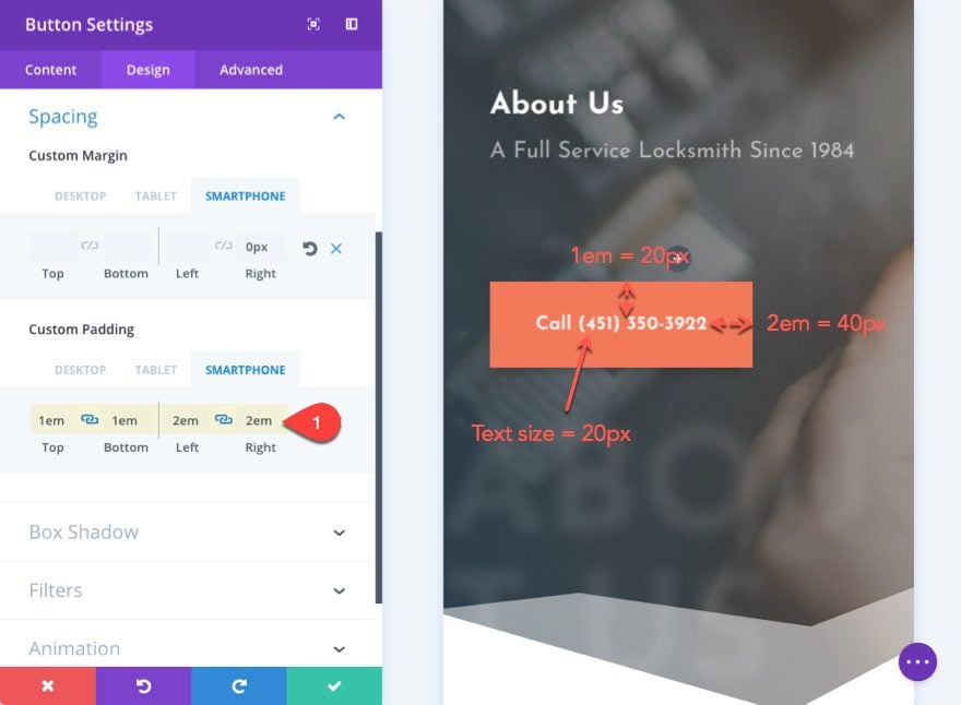
The em value is related to the size of the button text size which is currently set to 20px on smartphone. So 1em would be equal to 20px. So the top and bottom of the button would be 20px. 2em is equal to 40px (2 times 20px) so the button would have a padding of 40px on the right and left.
To make things run a little smoother and predictable on mobile, you could set your text size to a vw length unit. This will take a little trial and error to get the right size since it all depends on your font and the amount of button text you have.
Go ahead a set the button text size as follows:
Button Text Size (Smartphone): 5.6vw
Since the padding is already set with em (based on text size), both the text and the padding of the button would scale with the size of the browser. It will also ensure that the button text will never break to a different line.
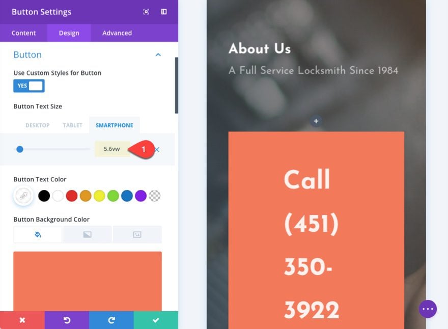
Don’t panic that the text seems really big in the visual builder preview. This is only because the text is using your browser to determine its size, not the width of the preview box. This goes for all vw length units so be careful to test this in a separate window on the live site to see the results.
Now your button takes up more room and appears to be almost centered even though it is left aligned for this design. But you can always change the module to centered to make sure.

Another quick solution to increasing the width of your button on mobile is to set your button as a block element only on mobile. The best way to do this is by adding a snippet of custom css. Go to Theme Customizer > Additional CSS and add the following:
@media (max-width: 479px) {
.block {
     display: block !important;
     text-align: center;
     }
}
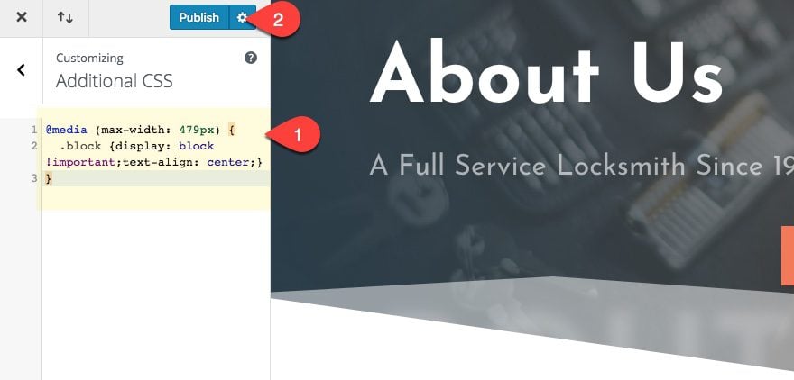
This creates a CSS Class (named “block”) that will add “display:block” and “text-align:center” to any element the class is added to. But this only takes place on screens with a max with of 479px which is a nice Divi breakpoint for mobile phones.
Now go back to your button module settings and add the CSS Class “block” under the advanced tab.
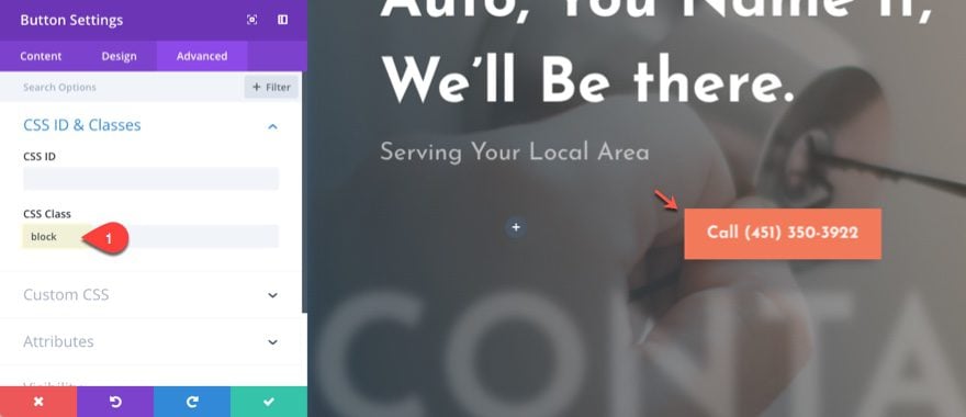
Now check the result on the live site. Notice the button change at the breakpoint.
You can also add that button class to the blue button on the layout as well to get the same effect.
Now let’s check out our final design for tablet and smartphone.
Text Size, Line Length, and Line height
There is a lot of research out there about what is the correct balance of text size, line length, and line height for optimal readability.
In general, it seems that 16px is about as small as you need to go for mobile devices. Line height should be somewhere between 1.4em (140% of font size) and 2em (200% of font size) which will depend on the size of your text. Larger text size should have a larger line height. So 16px will work well with a line height of 1.6em whereas a 18px font size may look better with a 1.8em. You get the point. As I write this article in the wordpress editor, I notice the font is 13px with a line height of 1.5em. And I have to say it is pushing the boundaries of my eye glasses prescription.
Line length is the amount of characters allowed on a given line of text. A comfortable line length for most is around 45-85 characters per line.
I’m not going to give you an exact best practice for determining these values, but I can give you a general idea of what to do.
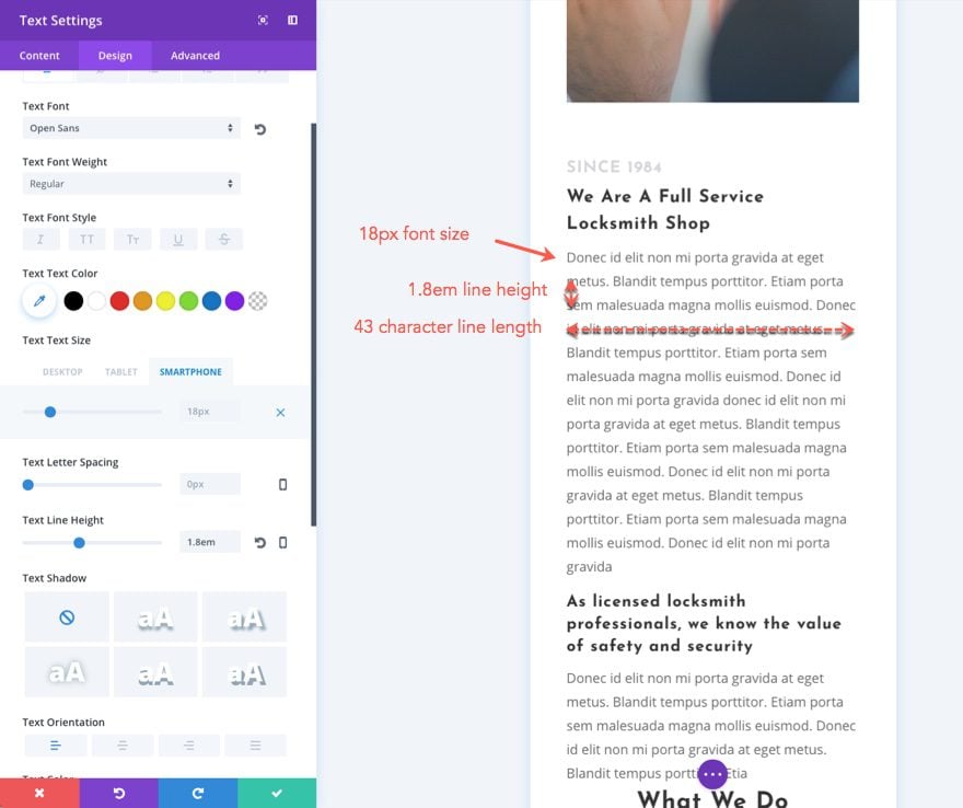
Let’s use our layout as an example. The body text size is set to 18px. This size can work well on most phones, but for some this may lead to a shorter line length than what is comfortable for most readers. The line length in the mobile preview is around 43 characters.
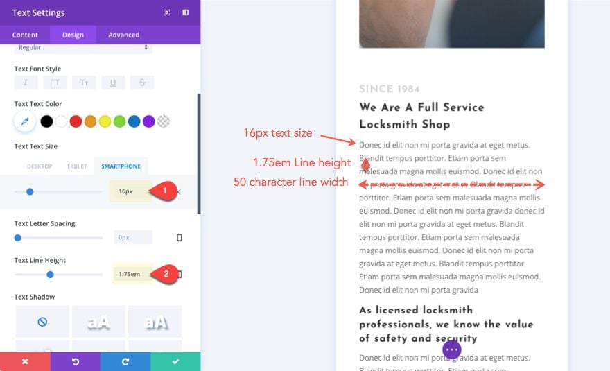
Let’s change the text size to 16px with the line height at 1.75em. This puts our line length at around 50 characters which seems to be a more comfortable length. But on smaller phones, this can shrink to around 37 characters which is probably too small.
So you may try a 14px or 15px text size to boost that line length up a bit. But us older folks may not be able to see 14px very well so it may not be worth the risk of a few characters of line length.
The line height is important not only for readability but also for cutting down on the length of the page. The spacing between lines can add up to significant wasted space on some pages and would result in too much scrolling to read the text.
Final Thoughts
In general, Divi layouts will render nicely on mobile devices with minimal effort. But sometimes it makes sense to optimize your site specifically for mobile. You may want to get rid of excessive vertical spacing and/or increase the width of rows and sections to cut down on the length of the page and minimize scrolling. You may also want to increase the size of buttons for better conversions.
Hopefully, these tips will help you understand Divi better and prepare you to make adjustments to any layout for optimal mobile design.
I look forward to hearing from you in the comments.
Cheers!


Getting your site to display exactly as you want on Mobile is very hard and requires hours of tinkering sometimes. Frequently, the mobile preview and that actual result om a phone are two very different things. I have exactly this problem on the website I’m working on right now. If you have columns side by side using CSS, the problem seems to get worse. I’ve found that using the sizing parameter compounds problems for mobile. I frequently find myself looking for workarounds to limitations where one would expect the software to just work. There is room for LOTS of improvement for DIVI in supporting mobile. Why do we need CSS just to have columns on mobile? It should be implemented into DIVI directly.
By default, Divi stacks columns at the top of each other on mobile, it is the responsive mechanism of Divi, to make sure there’s enough room for elements. I hope that an option to automatically adjust columns side by side will be implemented in future updates.
A quick way to display columns side by side is to use flexbox, it can be done by going to your Row Settings > Advanced > Custom CSS > Module Element > and adding this in the Main Element panel for mobile: https://prnt.sc/SbzhYScfD6QC
display: flex;
flex-direction: row;
All of the above should already be readily programmed into Divi’s default CSS.
Nobody wants to spend hours fixing these issues.
Please, Divi, fix this asap.
100% agree. Even the most archaic themes seem to be able to convert everything to mobile in a snap and the layout stay near identical to the desktop version. It is without a doubt the most frustrating part of this otherwise great theme.
Hi Jason!
There was no answer about the ipad and the landscape-questions. Do you know if there is something planned like change the tablet-view in the Visualbuilder to landscape?
Nice tutorial Jason!
Question: Is it best to make mobile tweaks to ONE section (ie. fullwidth header) or to just clone that section, set it up differently, and then use alternate visibilities for these 2 fullwidth header sections? It’s tempting to just clone sections and set their visibility to mobile only but I feel like I’m seeing them flash before being hidden when I load the site. Not sure if I’m hallucinating…seems like both get “loaded”. Please advise on best practice for this as I’ve not found a post addressing this on your blog.
Great question. It would be better to make mobile tweaks to one section to avoid the duplicate content you are referring to. Thanks.
Great tipps, we love divi builder and elegantthemes.
Excellent, Really creative. Actually me and my friends were looking some information about layouts and I found first thanks man.
Great job keep it up
Very useful tutorial. I like the idea of using the vw unit instead of px.
Great! Glad it was helpful.
Designing and optimizing for mobile is a whole new world. Apart from the technical issues involved in displaying the text and the images you have the whole psychological and UE side of things plus optimization. Thanks for the article, very informative.
This is interesting, though a little technical for me to grasp at one go…I will have read them a few times more.
A tutorial about how to customize an hamburger menu could be very helpful
I want blogger news theme. Please help me.
Extra. You want Extra.
Very useful post – thank you!
The real question is how do we optimize images for mobile, as in loading smaller images on mobile and larger images on desktop. And I don’t mean loading both and then just hiding or showing one or the other via CSS. We need the ability to specify different images for different devices/resolutions.
That’s a great idea. Thanks for the suggestion Peter.
Not sure if this would be helpful, but I did a quick search and found this plugin. I have never used it though:
https://wordpress.org/plugins/adaptive-images/
What about Divi using the image srcset?
We need some changes to the DIVI theme. One update to deal with images at different screen sizes.
Would appreciate more option while creating mobile sites.
1. Divi is not ready for portrait AND landscape mode
2. Divi is not ready for iPads. IPads are more than desktop PCs concerning the resolution. There is unfortunately not even an option for creating mobile iPad compatible websites. The options for tablets are not enough.
I don’t understand why Divi’s only tablet breakpoint adjustment is for portrait. Can you please add for landscape. Not sure what the research says, but personally, I only use my tablet in a landscape orientation.
James I’m with you on this one brother.
Thanks for the suggestion James.
so sorry James, that big reply i made is supposed to be in the main thread, not replying to you.
it has 3 doesnt it?
My #1 complaint about Divi mobile views is there is those left and right margins that we can never get rid of. I like sites that let text go to almost the edge. With Divi, those margins are too wide for most text views.
#2 complaint is lack of control over ordering. Some other themes let you assign a mobile view “priority” to each block of content, so for example, if in desktop view your columns/modules were ordered like this:
123
456
Maybe in mobile view you want the order to be more like this:
1
4
2
5
3
6
Make sense?
Thanks Arby. If you plan ahead you can set those rows to 100% width so that you can take away those margins on mobile.
As for the ordering dilemma, maybe this will help… https://www.elegantthemes.com/blog/divi-resources/how-to-change-divis-column-stacking-order-on-mobile-devices
Wouldn’t make much sense to make ordering a custom feature. Plus, there’s the flex-box property if you know a little CSS so you can change ordering of elements yourself.
I’ve only just discovered that after changing form Thrive themes to Divi my wordpress sites are now not mobile responsive..
The text is do small it is impossible to read. I was creating websites using WP in my business from 2006 and the themes were mobile responsive. How come I’ve gone a step backwards with Divi???
It could be due to the conflict with the styles applied to the site. Divi has a responsive option that allows to add different styles for desktop, tablet, and mobile. This way you can configure how the layout should appear on different screen sizes. You can refer to these articles as a guide:
https://help.elegantthemes.com/en/articles/2249798-how-to-use-divi-s-responsive-settings
https://help.elegantthemes.com/en/articles/2254621-how-to-optimize-divi-layouts-for-mobile-devices
https://www.elegantthemes.com/documentation/divi/customizer-mobile/
Maybe I’m reading what you wrote wrong but I’ve been able to change the margins using Divi the settings are under design in the mobile tab.
Only sizing problems I normally have are the iPads getting it to fit nicely is a pain, sometimes I have to block content and remake it for tablet only.
If you set your content margins to 0, you still get margins on the left and right side, no matter what, when viewed in Mobile view. To reduce that, you have to hack it by using negative values, which rarely works out nicely (it almost always causes some side-effect).
I’m not sure about research either, but I can tell you with having run heat mapping software on many of my sites and client sites that I have encountered nearly everyone on a tablet using landscape, not portrait. For this very reason, I have always forced Divi to operate tablet view starting at 1024px and now with the advent of the iPad Pro, I have to watch for it clear up to 1333px wide which royally sucks because that is still a regular laptop size as well. So then I have to do browser sniffing for the tablets and desktops. Divi couldn’t even begin to fix some of these issues.
Very helpful. Thank you.
I think there ia a difference, between optimisation and customization. It seems, that DIVI is one of the hardest themes to optimise regarding Page speed, both for desktop and phones.
Another excellent tutorial many thanks Jason. I do make sure that any site I build is optimized for mobile viewing but this has shown me some ‘better practices’ that I can use on my next site. (For example I usually create a separate button for Mobile to make sure it is centered if I have a Left or Right aligned button for Desktop view).
Just one question… do I take it that ‘vw’ is interchangeable with ‘vh’ as I noticed you have used vw to affect height spacing?
Thanks Alan. To your question, vw is not interchangeable with vh since vw is related to the width of the browser and vh is related to the height of the browser window. Even so, this doesn’t mean that you are limited to using vh for vertical spacing and vw for horizontal spacing. I used vw for vertical spacing between sections and rows because I wanted that space to scale (increase or decrease) depending on the width of the browser. That way the vertical space would be larger on desktop and smaller on mobile. Make sense?
Yes it does, thank you Jason 🙂
Nice one!! Wish there was a video, though.
Pablo. Sorry for the delay on the video. It will be add soon. Thanks.