“With great power comes great responsibility.” That’s what Spider Man would tell you if he was teaching you about color theory. When using our themes, the Theme Customizer gives you full control over the colors in your design; but how do you make sure that you don’t ruin a great design by choosing disharmonious color combinations?
1. Step One: Learn Basic Color Terminology

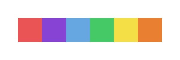
Hue – The hue refers to the position of a color on the color-wheel, each of which represents a certain spectrum of light. It’s what differentiates the primary colors of Red, Yellow and Blue, as well as all combination in-between. When you see the color blue, the term “blue” refers the hue. There are many forms of blue (light, dark, vibrant, and pale) each of which share the same hue despite being distinguishable in color.
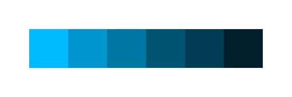
Value – This refers to the relative lightness and darkness of a color. The value of a color is distinguished by its relationship to a scale of white to black. A light blue and a dark blue is an example of a single hue with two different values.
Saturation – This term refers to the relative “strength” and “weakness” of a hue. Colors with a higher saturation will appear more vibrant. Saturation should not be confused with lightness and darkness, which as stated above, relates to a color’s Value. For example, you can have a bright color that lacks purity due to the addition of light gray. The result is a light color with low saturation. On the same vein, you can have fully saturated colors that have drastically different Values. Colors are considered de-saturated as they near gray-scale and they hue itself becomes less dominant.

2. Use Complimentary Colors To Begin A Beautiful Color-Scheme
Starting off with complimentary colors is a great way to begin exploring ideas for your website’s color-scheme. Complimentary colors appear opposite each other on the color wheel. Simply picking two complimentary colors on the wheel and calling it a day, however, will likely result in a lurid, headache-inducing discord that will send your visitor screaming. The real trick to beautiful color combinations isn’t just the hue, but also the relative Value and Saturation of the hue in relation to the colors around it. Let’s go through a simple method I use to create color harmony:
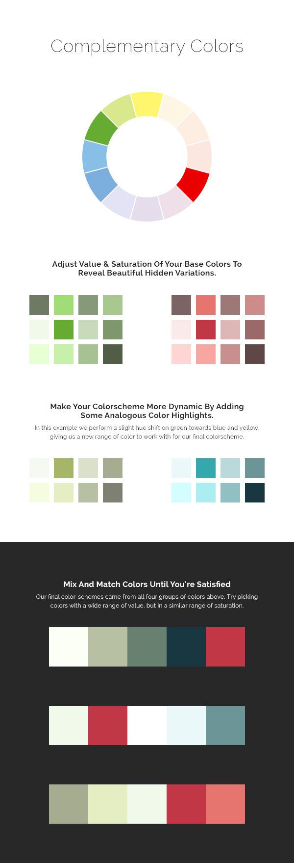
In the above example, I begin with the complimentary colors Green and Red. Next I create a palette of green/red variations by taking my original two colors and adjusting their value and saturation. Next I add a second dynamic by experimenting with analogous colors (colors next to each other on the color wheel). By performing a slight hue shift of green, we are given an additional array of green-blue and green-yellow.
Finally I picked one color from each variation set using the following principle that I have found to be, for the most part, true: Colors generally look good together when their Values are varied, but their Saturations are similar. The end result is a color scheme based on classic complimentary color harmony with varied value and a similar range of saturation.
3. Using Analogous Color Can Also Result In Simple & Yet Beautiful Combinations
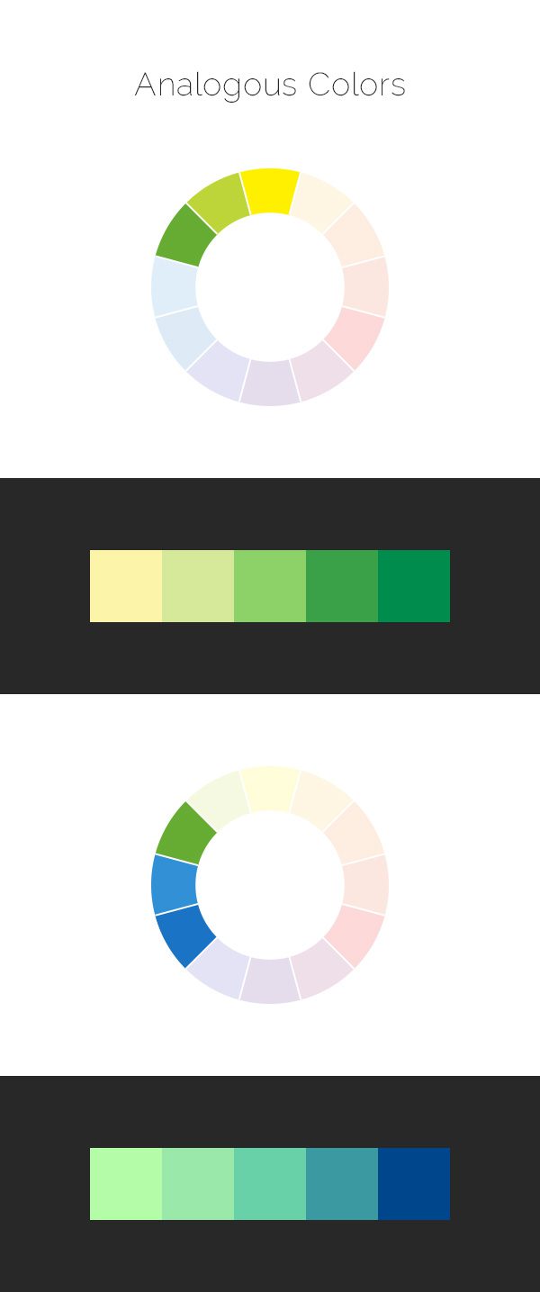
Using colors that are next to each other on the color wheel is also a great way to ensure that your colors don’t clash. These are called analogous colors. I often like using analogous colors in combination with monochromatic colors (grayscale colors). Basing a design solely on analogous colors can often feel a slightly stale.
Above I have created two different analogous color-schemes. One that uses Green and Yellow, and another that uses Green and Blue. By creating a simple gradation between the two colors, and use varying values as we did in our first example, we are left with a color combination that is simple yet stunning.
4. Avoid The Dreaded Color Discord

A discord is a color combination that clashes. The result is a terrible, unreadable and vibrating mess of muddy color! The most common cause of color clashing is combining colors that are too similar in value. Above is an example of the exact same three hues paired together with differing values & saturations. Even though the hues are the same in both examples, the version on the left is in glaring disharmony while the version on the right feels balanced. The colors on the left vibrate as your eyes struggle to find the defining line between each hue. Avoiding this simple mistake will solve 90% of your color problems 🙂
The Moral Of The Story?

The next time you are inside the theme customizer adjusting your website’s colors, don’t just make your text and background orange because that’s the color of your logo. Think about the type of orange you are using and how it will relate to the rest of your design. Better yet, try thinking about creating harmony with your orange logo by pairing it with something different based off the principles above! How about a dark, de-saturated blue?
I hope you found this post useful. Don’t forget to color responsibly 🙂






Hi
some images are can’t see in this page. please fix it and also
V good article
This is a good articles and it contains similar concepts to what I’d learn at fashion school. This would be good as a infographic.
This page taught me more about colors than 5 lessons in my school. Thank you very much.
Thank Nick, really insightful:)
One thing that leaves me confused though is point 4 – example of discord. You say that to reach the harmony I should use similar saturation and different value. But in the exemplary circles on the right you d e s a t u r a t e the green (besides tuning the value) and it is saturation that the two mostly differ in. Do I overlook sth?
It’s desaturated, but the values are also drastically different. It’s the difference in value that solves the visual vibration problem.
Nick I know I may be meticulous but I checked with colour picker – red and green differ in saturation, their value is almost equal;) What you say works for the inner par – green and blue;) I guess it’s due to the fact that when you desaturated the green it became much brighter than the red; tricky stuff but probably the rule is we should avoid the jarring vibrance by tuning both saturation and value until reaching pleasant result
I found great tips about improving the color…
thanks,
Thanks, this is the simplest explanation of color theory I’ve read. Hope it helps me design better.
This was a very easy to understand color tutorial. Thank you!
Wow, I just love this tutorial!!! Will help me in my future color selections!!!
Perfect guide for customization. Thanks for sharing it.
Thanks for the tips Nick
thank you for sharing this tutorial, great information.
Fantastic article. HSV has been a mystery for me until now. You’ve explained these simple things so clearly. Thanks!
Try Adobe Kuler for colour combos – I use it all the time – you can create your own or look for inspiration in the explore section! Have fun everyone!!!
https://kuler.adobe.com/create/color-wheel/
Thanks for the article.
One thing that has annoyed me in recent years, is when designers make the text a slightly dark gray & the background a light gray in their themes. (http://cl.ly/image/0Z0T0E1L1O34) The contrast is bad and often times I have to make sure the text is high contrast by making it black a dark color.
In regards to that… Elegant Themes’s shortcodes are similar. The buttons – the background is a particular color and the text for it is a slightly darker color of the rest of the button. Bad contrast & hard to read. I liked the buttons before the latest short code redesign (yes, it was quite awhile ago). I realize the buttons have a gradient to them, but, for instance, the big teal button is #5ce4e6 near the text & the text is #3da7a9 (values are approximate). – http://cl.ly/image/160o1V2m1r1M
But in my opinion the text would be better to be black or in some cases white making them easier to read, this has been my experience when working with clients. Really, the only “perfect” button, is the black & white button in my opinion.
Does a color have to be “web safe” now or does this not matter any more?
Nope, luckily that rule is a relic of the past 🙂 Computers today can render millions of colors.
Thanks for sharing this tutorial, great information.
Excellent guide to color choices. What are your favorite tools for choosing colors, in rgb and hex?
Thought I’d chime in and say, I like using ColorSchemer Studio 2. It’s PC & Mac compatible. It’s $50, but if you have a Mac, it often goes on sale in the Mac App Store (I got it for $0.99). Also the same people have an iPhone app that works well too & it’s free – ColorSchemer touch.
Simple colour theory, easy to grasp, effective concepts to apply. You better bookmark this to keep as a reference. Thanks!
Great useful information. Thanks for taking the trouble !
Great theory . I used it on my own blog to create perfect graphics . But practice is something different . But have to try.
Thank you for good manual.
Thanks for the mini course in “colorogrpahy.” It’s filled with valuable facts and insights
Love it!
Fabulous color combination and great article…
Great tips, such an valuable information regarding color combination for designs. Thanks for sharing this helpful tips !!!
Cool!
Excellent information!
Thank you for the helpful advice on picking a color scheme. I believe it will come in handy for me.
Amazing article, caring about hue is very important. It is the only way if you wanna to get colors that makes your web a live
Are these tips come from ET new designer Kenny Sing? 😀
You all are rockzz! Keep up the good working!!
This one is all Nick Roach 🙂
This is great! Thanks for the great info.
What’s the chance of getting this as a downloadable PDF document?
I think I’ve not much problem in choosing the right color scheme, but I’m having problem on how to apply them. For most of the cases, I ended using 1 or 2 color out of 4 or 5 colors from the color scheme.
ps: It’d great if you can link to some color-scheme generators. I know few good tools, but you readers might want to know them.
I agree with you Rudd,
The is a great and wonderful tool to have and use for this.
Thanks 🙂
Perfect guide for customization. Thanks for sharing it.
thanks so good, this is what l was searching for yesterday 😉