I’ve noticed in the comments of other posts recently that some readers would like more “tips and tricks” articles, particularly about CSS. So in today’s post, I’ll be providing what I hope is a useful introduction to a bit of CSS “trickery” that can be used to create compelling microinteractions across your website. Specifically, we’ll be learning how to create CSS3 transitions and animations. We’ll also be talking about when and where you might want to use them.
What Are CSS Transitions & Animations?
The evolution of CSS over the years has lead to some really amazing innovations within the language. In the case of transitions and animations, what previously required a program like Adobe Flash or another coding language altogether (such as Javascript) is now possible with nothing but HTML and CSS.
This kind of language maturity, enabled by better browsers and higher web standards (among other things), has been a huge boon to web designers who double as front end developers. They can now do more with less and the whole process of web design/development has become a bit easier.
Nevertheless, CSS transitions and animations are still considered advanced uses of CSS. A spectrum of coding I try to stay away from in most of my articles since I do not consider myself an “advanced developer”–even in language as accessible as HTML or CSS.
That said though, after reading up on W3Schools and elsewhere I think a sufficiently simple introduction to these concepts is within the grasp of not only myself but a good deal of the Elegant Themes readership as well.
To begin, I think we need to have a really good idea of what, exactly, CSS transitions and animations are before jumping into examples and code.
CSS Transitions
A CSS transition allows you to change the property values of an element over a given duration that you set. To create a transition you must first identify which CSS property you want to add an effect to and then specify the duration of the effect. If no duration is set, the transition will not occur.
There are four transition properties:
transition-delay – specifies the delay, in seconds (s), you would like to assign your transition effect.
transition-duration – specifies the duration, in seconds (s) or milliseconds (ms), you would like to assign your transition effect.
transition-property – specifies the name of the CSS property your transition effect is meant for.
transition-timing-function – Specifies the speed curve of the transition effect. Meaning, the type of speed variation you want to select for your transition effect. There is no “fast” or “slow” options. Instead there are speed curve options that go from one speed to another. Such as “ease” which tells your effect to start slow, then go fast, then end slowly.
To create a transition you only need to change one of these properties over the duration you choose. However, it is possible to change more than one property at the same time; resulting in more dramatic transitions.
CSS Animations
Where CSS transitions are all about altering element properties as they move from state to state, CSS animations are dependent on keyframes and animation properties.
keyframes – keyframes are used to define the styles an element will have at various times.
animation properties – animation properties are used to assign @keyframes to a specific element and determine how it is animated.
There are eight animation properties:
animation-delay – specifies a delay for the start of an animation.
animation-direction – specifies whether an animation should play in reverse direction or alternate cycles.
animation-duration – specifies how many seconds or milliseconds an animation takes to complete one cycle.
animation-fill-mode – specifies a style for the element when the animation is not playing. Such as when it is finished or when it has a delay.
animation-iteration-count – specifies the number of times an animation should be played.
animation-name – specifies the name of the @keyframes animation.
animation-play-state – specifies whether the animation is running or paused.
animation-timing-function – specifies the speed curve of the animation.
The examples below will show you how these things are used together in various ways. Once you understand the relationships between them you’ll be able to figure out all kinds of interesting ways to use them.
A Quick Note on Vendor Prefixes
In your personal usage of CSS transitions and animations you will most likely need to use vendor prefixes. In some of the code below you will no doubt notice some vendor prefixes. Many of the source examples do not contain vendor prefixes, so if you want to see what the code looks like without them you can check there; I thought it might be helpful to provide a fuller picture.
For the uninitiated, when I say “vendor prefix” I’m referring to a prefix that needs to be added to your CSS based on the range of browsers you want to support your transitions and animations.
A good resource for identifying the necessary prefixes for each browser is caniuse.com. You can also check out the respective pages for transitions and animations on W3Schools. Or, if you’d like to avoid the mess of prefixes altogether, you can use a tool like Bourbon.io.
CSS Transition Examples
The CSS transition examples below are all transitions I’ve found from various sources that show what’s possible with these relatively new CSS capabilities. I’ve chosen to recreate the examples I found using CodePen so you can easily take a peak at the HTML and CSS required for each example while also seeing it in action
1. Linear
See the Pen MwJaQr by nathan (@nathanbweller) on CodePen.
Example via.
2. Spin
See the Pen doNYmE by nathan (@nathanbweller) on CodePen.
Example via.
3. Color
See the Pen OVWyZN by nathan (@nathanbweller) on CodePen.
Example via.
4. Square to Circle
See the Pen WvRQJp by nathan (@nathanbweller) on CodePen.
Example via.
5. Card
See the Pen zGNvjL by nathan (@nathanbweller) on CodePen.
Example via.
CSS Animation Examples
Again, the CSS animation examples below are from various sources around the web. Just as above, the CodePen allows you to see the animation and the required code in one place. You can also follow my source links to get more information (in some cases) on each example.
1. Pulse
See the Pen pJRyEz by nathan (@nathanbweller) on CodePen.
Example via.
2. Shake
See the Pen QbdNER by nathan (@nathanbweller) on CodePen.
Example via.
3. Bouncing
See the Pen wagGWR by nathan (@nathanbweller) on CodePen.
Example via.
4. Bounce In
See the Pen GJrZqG by nathan (@nathanbweller) on CodePen.
Example via.
5. Linear Bar
See the Pen qdRZNm by nathan (@nathanbweller) on CodePen.
Example via.
Potential Use Cases for CSS Transitions & Animations
As I mentioned above, CSS transitions and animations are ideal for creating compelling and delightful microinteractions across your website. A lot of great WordPress themes and plugins come with some of these behaviors in place. A good example being the Divi Builder, which allows you to control transitions and animations within its module controls.
You may however wish to take the basics above and apply them other areas of your site in which a theme or plugin author has not given you easy control over. The following ideas might help you get started.
- An email opt-in form that makes a delightful entrance and exist; such as bouncing in and folding closed to disappear.
- A form that shakes when the essential information is not and someone attempt to submit it as finished.
- Buttons that fold open, bounce, shake, or in some other way respond to hovering and clicking.
- Preview images that turn over to reveal more information.
- Subtle background graphics that move, creating depth.
- Beautiful charts that spring into action as they load.
- Google Doodle style experiments, logos, and more.
- Games (for the really ambitious).
- Ads that you can interact with or that subtly change shape to draw attention.
- Beautiful product displays that rotate and respond to the mouse.
- Beautiful stat counters.
- And whatever else your imagination can think up.
Inspiring Showcases of CSS Transitions & Animations
If you need more visual stimulus than a list of ideas, I’ve take the liberty of compiling a small but impressive showcase of inspiring CSS transitions and animations that I hope will show off the potential illustrated in the rather basic examples I created above.
Logos in Pure CSS
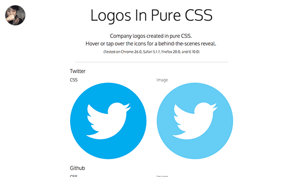
Logos in Pure CSS is a great showcase of world famous logos re-created with nothing but CSS. In their current form they use animations and transitions to show how they are made and how they stack up against their traditional counterparts. However, I think it’s important to note that just creating your logo in HTML/CSS opens up a lot of interesting possibilities.
CSS A/Z
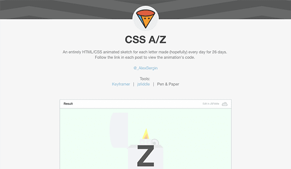
CSS A/Z is a showcase of HTML/CSS animated sketches; one for each letter of the alphabet. Great stuff and a lot of ideas for sprucing up seemingly insignificant elements on your website.
Double Ring

I think Double Ring is a great example of something you could do with a logo to make it more eye catching and interesting.
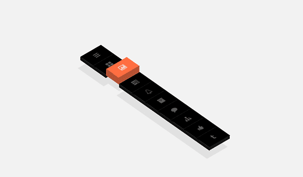
Navigation Bar is an example of just how dynamic and beautiful something as standard as navigation can become when given some advanced CSS love.
In Pieces
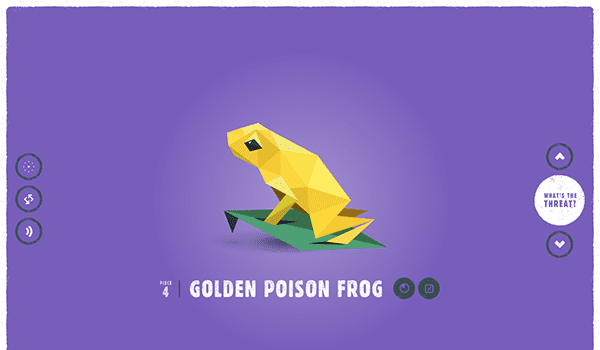
In Pieces is a magnificent (and highly complex) use case of CSS animation. It’s an interactive exhibition of the evolution of 30 species of animals. Truly breathtaking and a great indicator of just how powerful a tool CSS can be.
Additional Resources & Tutorials
In your quest to master CSS transitions and animations, there is a good chance that you’ll need or want more detail than I am able to provide in this post. Additionally, someone else’s writing style may be a bette fit for the way you think. That’s why I’ve compiled a short list of other useful resources and tutorials below for you to take advantage of.
- W3Schools Transitions
- W3Schools Animations
- Shay Howe’s Learn to Code Advanced HTML & CSS
- CSS Shapes 101
- CSS Animation for Beginners
- Simple CSS3 Transitions, Transforms, & Animations Compilation
- Hover.css – a collection of CSS3 powered hover effects
- Animate.css
- Buttons
- Hint.css
- Color.css
- 30 Cool CSS Animations You Have to See
In Conclusion
CSS transitions and animations are an extremely useful and versatile set of capabilities. You can do small subtle things or big in-your-face impressive things. But either way, it all starts with mastering the basics and moving on from there.
I hope this post is a welcome change of pace for those who have been requesting more CSS related content. If you have any more thoughts or requests on this post or future posts then please feel free to drop us a line in the comments section below.
Article Thumbnail via TCmakephoto // shutterstock.com


how can I incorporate code pen css themes in my project?
You should read this post if you are wondering why you need to hire a SEO professional. The writer of the post successfully elucidates every advantage that a SEO specialist brings.
Please get rid of those terrible overlays when you first visit your site. Or at least add the ability to hit escape to close them.
I’m a lifetime member of Elegant Themes and I enjoy this blog I find interesting and informative.
I liked this post and commented on it. However I used a different email address the one that is connected to my gravatar, I was not spamming I would love it if you approve my post. TY
The Via Source is hyperlinked with Elegantthemes ! Check it !
I really wonder to know the capability of CSS.its a great post dude.just love the article.
I keep thinking in looking at all this movement how early on in web site design it was frowned upon to use any animation since it was annoying and a sign of an amateur. Has all of that changed? I loved the little animated mail boxes for email or some of the animated buttons but removed the use of all that because of the trend to be non-pro sites. Thoughts?
I think if you look at the examples in the showcase you will see that we’re not talking about geocities animations here. We’re talking about tasteful transitions and animations that create pleasant experiences for visitors.
Thanks for this post. Never imagined CSS could do so much. Love all the resources at the end.
Nice tutorial. I love using CSS3 animation, especially in my own personal projects. I generally create classes for various animations / parts of animations to re-use throughout the site. Thanks for sharing.
Super little blog! Really enjoyed the examples 🙂
Awesome! Love this kind of posts!
Many thanks!
I thought transitions and animations are dealt only with Javascript , thank you for making me aware that it’s so easy to do using CSS.
Thank you for the nice tutorial, Great article
I second Deb’s comment. I subscribed and use Divi. How do we implement the above CSS examples in Divi (step by step would be nice)?
I’ll see if I can put something together with a few examples of CSS transitions and animations used with Divi elements.
You mention DIVI being already set up for this in the module controls. I imagine its a little more complex than pasting the code into the css area of the module. Can you give us an example of how this can be done using one of the examples above?
A good example is that some of the modules, such as the image modules, give you animation options for how an image loads. All you have to do is select how you want the image to animate in from a list of options and it does.
Hi Nathan,
Thanks for this great post. Now I knew that css can do lots of things.
I am one of ET readers that suggest css tutorial to be one of articles that ET should focus.
Great article, thank you
Thanks for shearing some great tips.
Never Played with CSS except playing with the numbers.
Now you gave me some tips, It’s time to get my hands dirty on this one 😀
Thanks for this great post 🙂
Great post. Thank you!
Great post! Thank you!
Thanks for this great post! I would like to have my cartoon character, who’s a little dog, chase a ball across the pages of my site. I wasn’t sure how to do that, but maybe I can figure it out now. Or, if someone else knows how to code that please let me know. Again, thanks so much for this info and the links!
I’m not an “advanced developer” either, so I really appreciate this kind of post. You laid it all out clearly enough for me to at least play around with some of these ideas. Great work.
This post gives some very good tools to take every website to the next level. Thanks!
Great post, I’m sure a lot of people will be bookmarking this one.
Thanks for the primer. I’m glad to see that you listed hover.css here. I’ve been trying to figure out how to incorporate hover.css transitions into Divi. I think it would be great to see a follow up tutt on how to affect Divi’s standard button with updated transitions such as hover.css.
This would make a good follow-up. I’ve got hover-min.css added via my child themes functions.php but would like to know a future-proof version of adding classes to buttons, etc. in Divi.
I’ll take a look at this and see if I can put something together.
Did this ever happen? If so could we have a link?
Posted sonner than expected, no ?
Anyway, thanks for this post.
Just discovered species in pieces yesterday. Impressive use of CSS and the unknown “clip-path”.