Last week we posted Origin Theme CSS Tricks and got a few comments about applying the effects within Divi. Below are a number of CSS tricks to help customize your Divi Theme project and product thumbnails. Each example has an animated preview and a block of custom CSS required to achieve the effect. As always, we recommend that you add all custom CSS via a Child Theme or the Custom CSS Box in ePanel.
Overlay Zoom In
By default, project and product overlays simply fade in. The CSS below will modify the overlay to zoom and fade in, with a reverse animation when the cursor hovers off.

.et_overlay {
	-webkit-transform: scale(.9);
	-moz-transform: scale(.9);
	-o-transform: scale(.9);
	-ms-transform: scale(.9);
	transform: scale(.9);
}

.et_shop_image:hover .et_overlay, .et_portfolio_image:hover .et_overlay{
	-webkit-transform: scale(1);
	-moz-transform: scale(1);
	-o-transform: scale(1);
	-ms-transform: scale(1);
	transform: scale(1);
}
Overlay Slide Up
The CSS below will modify the overlay to fade in and up from the bottom of the thumbnail, with a reverse animation when the cursor hovers off.

.et_overlay {
	top:30px;
}

.et_shop_image:hover .et_overlay, .et_portfolio_image:hover .et_overlay{
	top:0;
}
Overlay Spin
The CSS below will modify the overlay to spin and zoom in, with a reverse animation when the cursor hovers off.

.et_overlay {
	-webkit-transform:  scale(.6) rotate(-30deg);
	-moz-transform:     scale(.6) rotate(-30deg);
	-o-transform:       scale(.6) rotate(-30deg);
	-ms-transform:      scale(.6) rotate(-30deg);
	transform:          scale(.6) rotate(-30deg);
}

.et_shop_image:hover .et_overlay, .et_portfolio_image:hover .et_overlay{
	-webkit-transform:  scale(1) rotate(0deg);
	-moz-transform:     scale(1) rotate(0deg);
	-o-transform:       scale(1) rotate(0deg);
	-ms-transform:      scale(1) rotate(0deg);
	transform:          scale(1) rotate(0deg);
}
Thumbnail Hover Rise
The CSS below will cause the whole thumbnail to slightly rise off the page upon hover. The overlay has been removed for this effect, but you can leave it if you wish.
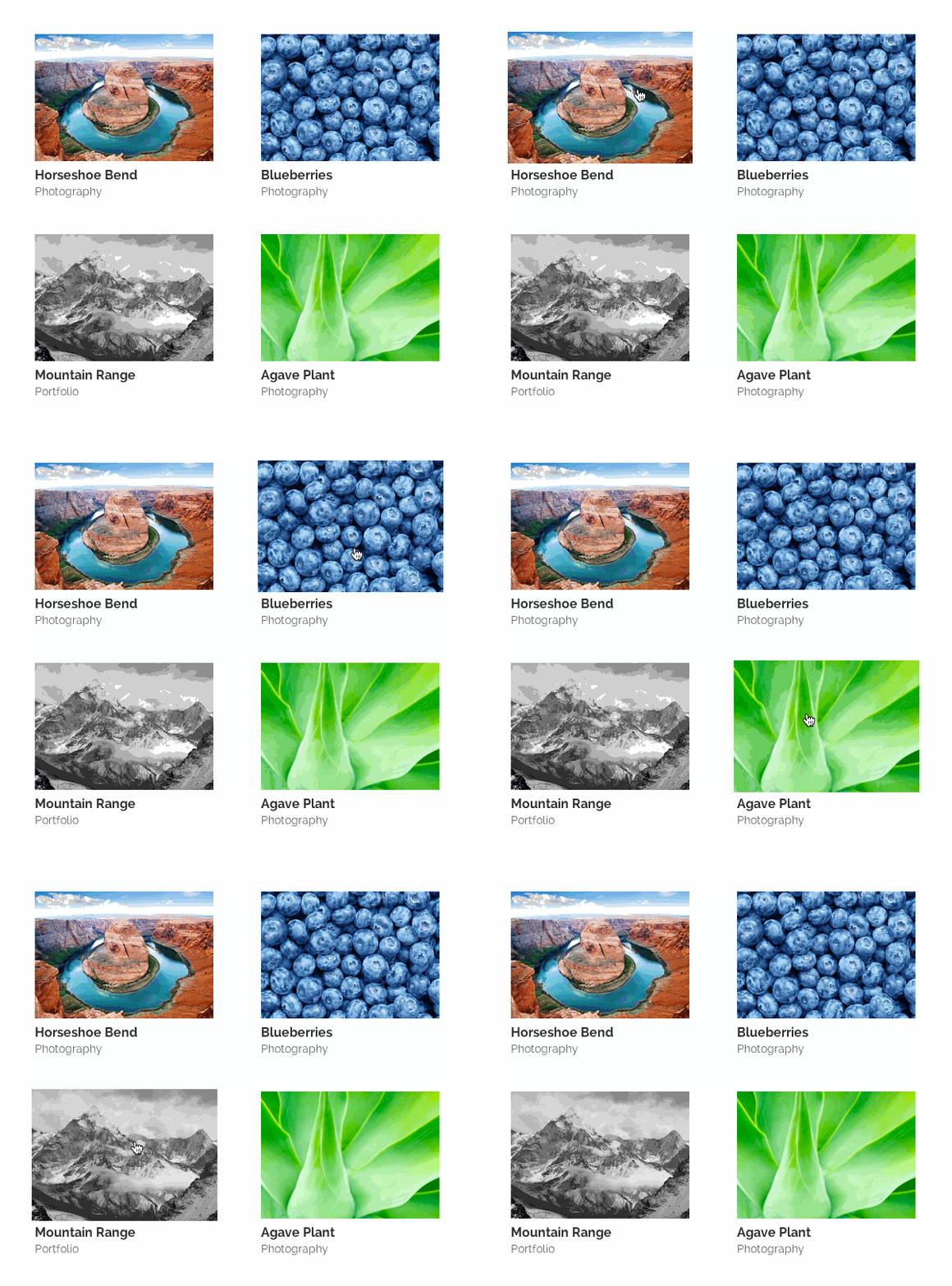
.et_overlay {
	display:none;
}

.et_portfolio_image, .et_shop_image  {
	-moz-transition: all 0.3s;
	-webkit-transition: all 0.3s;
	transition: all 0.3s;
}

.et_portfolio_image:hover, .et_shop_image:hover {
	-webkit-transform: scale(1.04);
	-moz-transform: scale(1.04);
	-o-transform: scale(1.04);
	-ms-transform: scale(1.04);
	transform: scale(1.04);
}
Project Thumbnail Border
The CSS below will add a border to your project thumbnails. The example below is combined with the “Slide Up” example above, but can be combined with any or no addition modifications.
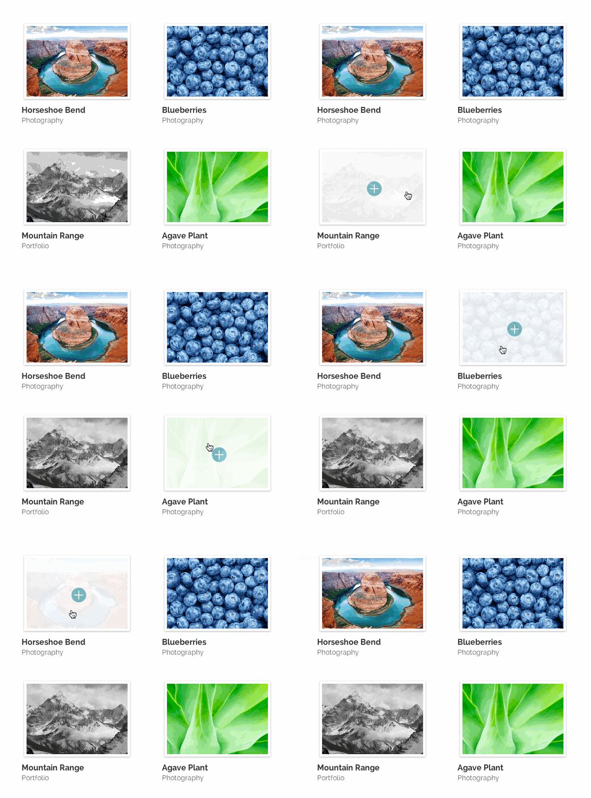
.et_portfolio_image{
	border: 5px solid #fff;
	-moz-box-shadow: 0 1px 4px rgba(0,0,0,.3);
	-webkit-box-shadow: 0 1px 4px rgba(0,0,0,.3);
	box-shadow: 0 1px 4px rgba(0,0,0,.3);
}
Overlay Custom Colors
You can simply modify the existing colors and styles with the CSS below. These modifications will allow you to define the overlay background color, the border style, icon color, and overlay opacity.

.et_overlay {
	background: rgba(50, 200, 235, 0.6); /* overlay background color */
	border: none; /* border style */
}

.et_shop_image .et_overlay:before, .et_portfolio_image .et_overlay:before{
	color: #FFF !important; /* + icon color */
}

.et_shop_image:hover .et_overlay, .et_portfolio_image:hover .et_overlay { opacity: 1; } /* overlay opacity */
If you liked this theme tip, take a stroll around the blog for more of our free resources and please let us know what our next theme tip should be!





Nice little code snippets to build awesome looking website.
Thanks and Bookmarked.
Some great CSS takes you a long way! Thanks for posting this. Is it IE compatible? If so, which versions?
Thanks!
Great little customization to take the theme to the next level…I love that you guys are always focusing on improving what is already great!
Thank you! This is awesome 🙂
Wtf is CCS? Did I miss something or are you guys sloppy as hell when it comes to proofreading? 😛
HA! Nice catch, totally missed that!
I am continually amazed at what some creative CSS can do, especially with a well-designed theme such as Divi. Thanks for the code.
The grammar nazi in me wants your to correct CCS to CSS in the post title 🙂
You’re not alone. Easy done though.
Kane, You might want to work on your own english grammer. Try making sense:
“The grammar nazi in me wants your to correct CCS to CSS in the post title”
That was funny 😉
You just have nothing better to do than to correct someone else’s typo by using your own bad grammar?
I guess the world needs more self righteous hypocrites.
Thanks a lot for that nice post! I was looking for a possibility to show the thumbnails in a square format. any idea anyone?
thank you for the tip, the Overlay Custom Colors is the one i like it 😀
Great job Kenny… Keep up the great work.
AND please keep em’ coming!
cheers
I’m wondering how we can keep the slide images from disappearing from the slide show when viewing it on mobile.
Please help.
Hi Jocelyn,
I was wondering the same thing. Came across this site. Might be helpful to you.
http://www.divithemeexamples.com/slide-image-missing-divi-full-width-slider-mobile/
🙂
Hi Kenny Sing,
Thanks for the post. I was wondering if there is a way to make blurb’s act the same way? I would like to show the image and title of the blurb. Then when someone mouseover it will show the text / description.
Also with the product / project is there a way to have a brief description appear over the image on mouseover?
Thanks for the help,
Jay
I completely agree with Jay, I’m looking for code for blurb images too. Is this possible?
Totally agree – that would be an awesome addition!
Another vote for product info on hover.. I’m so desperate for being able to making my product page visual-focused and have product name, brand, color options and price appear as overlay on hover.
+1
+1 for this idea. I would love to display some products info on roll over in my Shop, but how?
thanks
+1 too. this would really make Divi an essential theme for me.
+1 for this too, I would love to have almost the ‘blurb’ functionality on mine. If someone figures this out, we’ll have a hero on our hands.
yes I just spent far too long trying to figure this out 🙁 … it would be such a great feature
Me too. Just went mad trying to adapt it to a blurb without success!
Awesome! Thank you!!
Awesome Job
Thanks for the great css!
Is it possible to create links across the top of the divi portfolio page above the thumbnails that link to the different portfolio categories like many portfolio themes have example:
http://designtecky.ca/wp-content/uploads/2014/03/category-links.jpg
Rosy
Thank’s again!
Is it possible to add “Thumbnail Hover Rise” effect to blog thumbs?
Thanks 🙂 these tips and tricks really help. Can I ask – most of the css mods are via the epannel – can you give me some examples of css in the modules? thanks – loving Divi – now building whole sites in a day thanks to you guys 🙂
WOW! What can I say? These posts just keep getting better and better. My website and several client websites have been built using divi and these snippets will be a nice way to add some new flavor to those sites. Thanks again, and keep em’ coming!
Is it possible to have a title in the center of the overlay instead of a symbol ?
Great tip !
How about custom content in the overlay? Rather than just an icon how about letting us add our own custom HTML?
Thanks, great tips.
Whoa, Elijah! How did you get your navigation menu to be clear/transparent? Love all the customization you’ve added. Awesome site, btw!
These posts save us so much time.
No matter how good your coding skills are, it takes time to work out what css you need to effect the changes you want and these quick css tips really help.
Keep them coming please ET!
Nice nifty tips Kenny. Divi is malleable and I’d love to see more ways to style the menu area and the inner tweaking of the fullwidth module like if I want to embed icon or an image on it.
Thanks.
Klemm
Another interesting post. Learn lot of new coding from you. Thanks for the share.
Love it, we want more!! Please!!
Why are these not embedded into future versions of the Divi Theme?
Thanks for the tips Kenny
but… where I can put this trick in my web? I Know..in CSS but in which part??
Thanks
Hi, I use Divi whenever i can when creating websites for clients – you asked us to suggest a new blog topic and first i’d like to say that these CSS tips are great (you could do that ALL DAY LONG and never run out of good tips and things that will help all of us).
Also, I’d really like to see a blog post that shows some different ways we can layout the home page of Divi because it’s hard for me to sell the same site (structure) to different clients. I don’t want them to think i’m selling them the same exact site!!! So if you can show us some different ways that you or others have used Divi that would be GREAT too.
Thank you, Emily (pd my latest Divi site is here: drten20.com check it out!!!
Awesome! It’s great having CSS tips like this! DIVI is fun to play with but CSS tweaks are not the fun part for me. Please keep it up!
Is there any CSS magic to make a sidebar scroll as a page is scrolled?
I particularly like the thumbnail border and custom colours. Nice work, Elegant Themes!
Where can I find code for a Divi social media bar on the side of my pages? Excellent work you guys!
Great tips, started to work with Divi and really liking it.
I recently just installed Divi on my site and love it so far. I am going to experiment with the custom color overlays this week. Thanks for the tips!
Hey, with referenze to the above chapter ‘Project Thumbnail Border’ what CSS code for blog image (page build with blog module – divi template). Thanks
thanks for css cods
These were great. Could you give us some css box shadow options for the slider? That would be great!
Great tricks! By the way, how do we remove the from source? It’s a security concern for us. Thank you!
I meant to say: meta content=”Divi v.1.9.1″ name=”generator”
do these snipets still work with divi 2?
madrynweb,
Yes, it is possible to have these snippets work with Divi 2.0. I used the Thumbnail Hover Rise. Here is the coding I wrote up:
.et_overlay { background: none repeat scroll 0% 0% rgba(0, 0, 0, 0.3); !important; }
.et_overlay:before { display: none !important; }
.et_pb_portfolio_image { -moz-transition: all 0.3s !important; -webkit-transition: all 0.3s !important; transition: all 0.3s !important; }
.et_pb_portfolio_image h3 { color: #FFFFFF !important; text-transform: uppercase; !important; font-size: 14px !important; font-weight: 800 !important; }
.et_pb_portfolio_image:hover { -webkit-transform: scale(1.05) !important; -moz-transform: scale(1.05) !important; -o-transform: scale(1.05) !important; -ms-transform: scale(1.05) !important; transform: scale(1.05) !important; }
You simply have to swap out anything that says “.et_portfolio_image” for “.et_pb_portfolio_image” etc. Hope this helps.
Is there a code for divi 2.0 to change the overlay to black and white?
Thanks
Hi,
Can you please give CSS code for image slider? I want boxed image (1170 X 500) slider not full width slider(1920 x 1080)
Thank you,
Bhargav
Bhargav, with Divi, you can create any type of slider layout you want. You can have the full width, boxed with and many sizes in-between.
Dear Bhargav,
Can you please tell me that how can i add a css for any particular PIC in our divi theme with the page layout.
Is it possible to change the animation color and add text in it ?
I think everyone wants to know how to get the effect displayed on the demo: http://elegantthemes.com/preview/Divi/
With the title and category appearing on mouse over.
I couldn’t find it.
Or is this another plugin?
I just found out, the effect is available only on the Fullwidth Portfolio module.
thanks me!
haha
I agree: being able to display the image title and description on hover would be incredible. I’ve searched for an entire day and there doesn’t seem to be a mod or plugin to do this (without a ridiculous unfeasible workflow for each image).
SO many people here also want to know HOW to implement the above, but no-one’s answering. I join them in being new to Divi and would greatly appreciate some basic instructions. It’s a shame that ET’s posts so often seem to assume their audience to be advanced users.
Here’s a newbie question; is there any way to make the images square shaped rather than the slightly rectangular?
I agree, a tutorial on this would be fab.
For this, I modified the lines in themes/Divi/js/custom.js in function set_fullwidth_portfolio_columns
if ( portfolio_items_width >= 1600 ) {
columns=5; // => columns=10 because for me it’s small thumbs.
…
portfolio_item_height = portfolio_item_width * .75;
=> portfolio_item_height = portfolio_item_width * 1; // square ratio
I changed also in my css :
.et_pb_fullwidth_portfolio .et_pb_portfolio_image h3 {
padding:20px 5px !important;
}
Hope it would help someone 🙂
Thanks a lot!
I’ve one question though.
I’m trying to get an overlay on my fullwidth portfolio carousel. But I can’t figure out how to change the ‘overlay background color’.
This is what I tried:
.et_overlay {
background: rgba(124, 215, 198, 0.6); /* overlay background color */
border: none; /* border style */
}
.et_shop_image .et_overlay:before, .et_pb_fullwidth_portfolio .et_overlay:before{
color: #FFFFFF !important; /* + icon color */
}
.et_shop_image:hover .et_overlay, .et_pb_fullwidth_portfolio:hover .et_overlay { opacity: 1; } /* overlay opacity */
Thanks in advance!
Dear All,
I’m new here and making some improvements with Divi Theme.
But I still have a couple questions:
1) How can I access the CSS Box on epannel?
2) How can I modify the CSS code to insert the Overlay Slide Up?
3) And how can I ajust my company logotype (for a bigger size)?
Thank you very much.
Regards
Ricardo
Loving the tutorials 🙂 I hope there is more to come.
Can someone help me please, I have spent hours trying to make my gallery images do the “Thumbnail Hover Rise” from above, but when I enter the code into the Divi theme options Custom CSS box, it ends up turning the images into static images with no animation or overlay at all, as if they are just regular images.
The other options above don’t function correctly for me either, the “Overlay Spin” ends up with my overlay being stuck at an angle, but not moving. It changes for each on mouse over, but doesn’t carry out the animation.
The only one I can get to work is the “Overlay Custom Colors” one. What am I doing wrong? I’m editing a main Divi theme, and putting the above css code into the custom css box within the “divi theme options under Appearance.
I’m lost 🙁 Hope someone can help me!
Hi. Is there a way to create a full boxed layout that there is margin on top and background color/pic visible and also margin below footer and all the corners rounded? So that it would look a bit like this http://kaisakarvo.fi/ ? This could be also a new template feature in future updates…? And Divi is the best theme I´ve seen so far! Keep up the good work!
Loving this theme!! So very customizable. I was wondering if it were possible to add different transitions to the full width slider, by giving it an CSS tag and writing some code, thereby also allowing to randomize it? Or does one have to create a full child theme for it?
How can I add an image in ‘png’ instead of an icon, that is as “content: ‘\ 123′”?
Example: I want to add an image with the writing “buy” and when the user hovers the mouse over the image appears an overlay with the image and not the icon with the “+” in a blue circle. You can do this?
hey,
Great tricks,
i was just wondering Ive applied your Thumbnail Hover Rise css but i still seem to be getting the white background with the “+” sign on it is there any way to get rid of the white background and just have the clear photo enlarge??
also Ive seem to have only applied this code to my products,
is there a way to apply the same trick to my photos in my home page,
as seen on the link Ive added.
Please Help.
Thanks for reading
I am new to WordPress and Divi so bear with me.
In the portfolio module, what is the best image size to use as featured image for each project? I find that when the image is too small (129×200), it looks fuzzy but when it is larger (258×400), important aspects of it get cropped out. This is important because the images are of book covers, so it is best to be able to see the title and cover shots.
Is there a rule of thumb for portfolio image sizes?
Thanks!
I’d also like to know this. Would be nice if someone could answer.
How can I have just square images rather than rectangular?
This is awesome! It is a helpful trick for the CSS overlay. Btw, is there a way that to overlay and image instead of the “+” icon? Thanks!
I’m completely new and really don’t understand how to implement this coding for the pictures on my homepage where do I implement the image name or class in the coding?
Can you please tell me how to add the background colour change on hover for the blurb image? I’ve re-used the code but replaced the example with .et_pb_main_blurb_main_image for the blurb image but nothing happens when i add it to the custom css box.
.et_overlay {
background: rgba(50, 200, 235, 0.6); /* overlay background color */
border: none; /* border style */
}
.et_pb_main_blurb_main_image .et_overlay:before{
color: #FFF !important; /* + icon color */
}
.et_pb_main_blurb_main_image:hover .et_overlay{ opacity: 1; } /* overlay opacity */
Any idea how to modify the divi gallery to sort / search images by tag when? I can’t seem to find out how to do this.
You will have to excuse me because I am a rookie when it comes to coding.
I have modified my overlays to show up the way you describe here in the post and they look great. But I have a different question.
Is there a way to make it so that the overlay loads when the page loads in the “on / up” position and then actually goes away when you hover over it? Essentially I want it to do the opposite of what it does by default.
Thanks if anyone can help
—Tuesday September 22nd @8.02am—
None of these worked for me. Using the newest divi 2.5
Hey John, sorry you’re having difficulties with these. If you check the forums and/or create a ticket there should be able to show you why those are not working for you.
Hi there,
How can i change the “+” icon that on the image? I want to change it or remove it.
To change the hover icon, go into the advanced design settings tab and choose a new icon from the hover icon picker.
To remove it altogether, add the following css code in your style sheet (and hopefully you are using a child theme. Or you can add it to the epanel but risk the chances of losing it during an upgrade.
.et_overlay:before {
display: none;
}
hello,, how to change boxed layout width divi theme? example : change default width to smaller. can you make post about that. thanks
How to make that thumbnail image in shop pahe would be seen whole image? Now the thumbnail is like cropped.. i need that it would be seen all image…
Helpful tips, as always! Used several today, worked perfectly.
Is it possible to get an overlay ( not hover ) on the gallery images ¿?
Is it possible to get a transparent overlay for the gallery images and another color for the hover one?
Is it possible to get a transparent color over the gallery images and another one for the hover one?
Hi, I need some help. I want to change thumbnail size so it can be a square instead of a rectangle. Can you help me please?
How to add post excerpt on image overlay?
is there any way to repeat section img ?
Hello
How can I center the portfolio?
Thanks
I’m trying to UNDO the fade on hover effect in Divi so that my plugin that flips to a different picture can be seen. Before, I removed
/* Portfolio + Shop Overlay */
.et_overlay {
display: block;
position: absolute;
z-index: 3;
top: 0;
left: 0;
-webkit-box-sizing: border-box;
-moz-box-sizing: border-box;
box-sizing: border-box;
width: 100%;
height: 100%;
border: 1px solid #e5e5e5;
opacity: 0;
background: rgba(255, 255, 255, 0.9);
-webkit-transition: all 0.3s;
-moz-transition: all 0.3s;
transition: all 0.3s;
-webkit-transform: translate3d(0, 0, 0);
-webkit-backface-visibility: hidden;
-moz-backface-visibility: hidden;
backface-visibility: hidden;
-o-backface-visibility: hidden;
}
.et_overlay:before {
position: absolute;
top: 55%;
left: 50%;
margin: -14px 0 0 -14px;
font-size: 32px;
content: “\e050”;
-webkit-transition: all 0.4s;
-moz-transition: all 0.4s;
transition: all 0.4s;
}
.et_overlay:hover:before {
top: 50%;
}
.et_shop_image:hover .et_overlay,
.et_portfolio_image:hover .et_overlay,
.et_pb_fullwidth_portfolio .et_pb_portfolio_image:hover .et_overlay,
.et_pb_fullwidth_portfolio .et_pb_portfolio_image:hover .meta,
.et_pb_gallery_image:hover .et_overlay {
opacity: 1;
}
.et_pb_slider.et_pb_gallery_fullwidth span.et_overlay {
display: none;
}
#ie7 .et_overlay,
#ie8 .et_overlay {
display: none;
}
from style.css However, that no longer works. Any ideas?
Is there a way to use CSS to change the coloring of thumbnails on the portfolio to black and white, and turn to color on hover? I have found some articles on this, but am hoping to find some instruction for Divi specifically as I am mostly HTML illiterate 😀
Hi Kelli, I don’t write code myself much, but I found this moments ago.
http://quiroz.co/styling-text-images-in-divi/
There is code you can use to specify the initial effects on something and then the hover effect.
When you want to update a specific module, give it a CSS ID and then you can edit it within the Divi ePanel
For example, I wanted to change the position of text in a blurb to instead be on top of the text.
To do this, I first found the CSS ID for the blurb. The generic CSS ID for all blurbs is .et_pb_blurb. The image is .et_pb_blurb_image and the text is .et_pb_blurb_container.
In the Custom CSS section of ePanel, I wrote this
.et_pb_blurb_container {
position: absolute;
z-index: 100;
Top: 10%; }
To break this down so you undestand it
{ = start the code
: = end of parameter or variable
; = end of value
} = end of code
So my code says set the variable of position to absolute. This specific instruction needs more information since absolute could mean anything!
z -index relates to the layer of the coded element. If I want this element to be at the top, the z-index value must be bigger than everything else. If it is just 1, then it will likely be behind everything and won’t be seen
Top means I’m putting the item at the top, but I want it to be 10% from the very top. Using percentage rather than pixels means that as the website changes for different devices, the position will stay the same.
If I was able to explain this to make sense to you, you should be able to make sense of code you start seeing in tutorials.
Hi!
How I can center the title below every item of the porfolio?? By default is on the left…
Thank you!!
Hi,
I was having the same problem with the plus sign and also didn’t like the high opacity. So I came up with my own hack as follows:
.et_overlay::before {
content: “Details”;
background: rgba(255, 255, 255, 0.6) none repeat scroll 0 0;
font-size: 32px;
font-family: “Open Sans”, sans-serif !important;
text-align: center;
position: absolute;
margin-left:-50px;
display: block;
top: 55%;
transition: all 0.4s ease 0s;
}
.et_overlay {
backface-visibility: hidden;
background: rgba(255, 255, 255, 0.1) none repeat scroll 0 0;
border: 1px solid #e5e5e5;
box-sizing: border-box;
display: block;
height: 100%;
left: 0;
opacity: 0;
position: absolute;
top: 0;
transition: all 0.3s ease 0s;
width: 100%;
z-index: 3;
}
What I changed to et_overlay::before:
-changed the content to some other text (here was the plus thing);
-added background so the text will sit nicely, not directly on the picture (currently with the opacity set to 0.6), you can change the color to another rgb;
-added a font family, remember to use !important;
-centered text;
– display as block so you can tweak position, atm set to border-left -50px (you will have to change this to something else depending on the length of your text, so it will look centered);
-removed all other margins.
What I changed to et_overlay:
-set background opacity to 0.1 as I didn’t like the white-ish background.
That’s it 🙂 You can see it in action at http://elegantpanda.com
PS: Still work in progress, tweaking takes forever.