No matter what type of blog you run, I think all website and blog owners can agree that they all want the same thing: conversion.
Now, you can do all the on-site/off-site SEO that you’d like to do – and don’t get me wrong, that’s an important part of any marketing strategy – but if the design of your site isn’t properly set up for conversion, then all that effort is essentially wasted.
Designing for conversion can be… tricky, to say the least. You have to be able to balance user experience and overall design with content that has clear calls to action. If that were easy, then no one would be struggling with this “Conversion Crisis”, as I like to call it.
As a Web Designer who focuses on Conversion Centered Design (CCD), I was thrilled after I got my hands on Divi and saw the power that could be harnessed with the theme.
There is so much that goes into designing a site that gently nudges people toward the action that you want them to take. However, the first half that struggle is in the design – especially the landing page(s).
Divi makes creating a conversion powered website easier than ever before. All you need to do is learn some of the tricks that goes into designing with that goal in mind.
The Keys To Designing For Conversion On Your Homepage
I’m sure you’ve heard the phrase, “One Site Fits All”.
Well, unfortunately, that idea doesn’t really work with Conversion Centered Design. Every site has a different goal, and only time and testing can tell what design will work best for each website.
However, there are some fundamental keys to designing for conversion that give can at least give you a starting point:
- A contrasting, but pleasant color scheme (2-4 colors are generally enough)
- A leading question or thought
- Calls to action that stand out
When designing your homepage (especially the top section), these 3 steps are crucial. Thankfully, Divi makes all three rather simple.
Using Divi To Build A Conversion Based Homepage

Though not as effective as a landing page, your homepage should still be optimized for conversion.
The top section of your homepage is the first thing that your visitors will see, and that will be the area that I’ll be focusing on for this part of the post on.
The design of your homepage is important. If you can grab a viewers attention with your message, then you’re one step closer to converting their page view into your end goal.
The thing that amazed me most about Divi is how the pre-designed layouts seemed to already have this in mind. Take the Homepage Company design layout for example.
The default look and layout come out looking a bit like this.
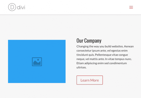
This layout looks a bit bland, but that’s the point. It’s just a layout that you can tweak to look like whatever you want. Just as a demonstration, I decided to quickly edit the modules and change the look while keeping in mind the 3 fundamental design keys that I mentioned earlier.
In the Homepage Company layout that I’ll be using, this top section uses the Fullwidth Slider module. I won’t change the module, however, I will be adding some design tweaks to make this section really pop.

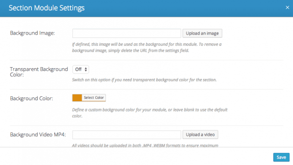
After selecting the Section Module, I uploaded a new background that is specific to that area of my homepage.
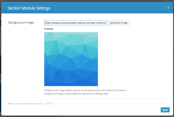
Next, I edited the Fullwidth Slider.
Instead of having multiple slides that could distract from my conversion goals, I only used one slider. Within the Slider Settings for the one that I want to display, I edited the information and look of that particular slide.
The options I have there are easy to navigate but have a pretty powerful output.
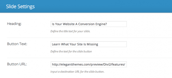
The areas in the backend I changed and edited were the Heading, the Button Text, the Link, as well as the slider picture.
Here is the end result.
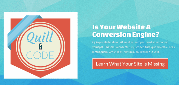
Pretty different, right? (Hail the power of Divi!)
I would still consider this design a rough draft, but this encompasses everything that I would want to start with. Bold but pleasing colors, a leading question, and a call to action about fixing their issue that is highlighted in the most striking color in the color palette that I’ve selected.
Here is another example of someone who used Divi to build a conversion based homepage.
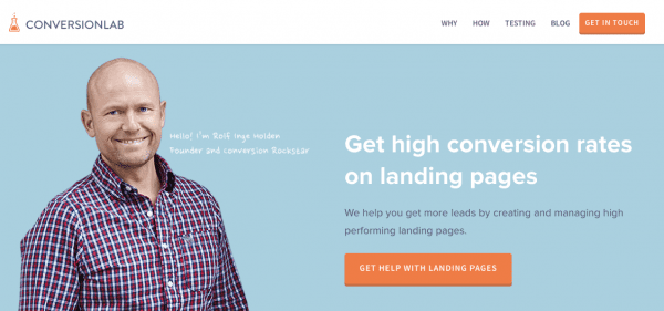
The layout that ConversionLab uses for the top section of their homepage is the same one that I’ve used, only they’ve designed it a bit differently. However, their design sticks to those 3 fundamental design keys that I mentioned before.
They have a cohesive color scheme (white, blue, orange, and grey towards the bottom of their site), a leading thought (“Get High Conversion Rates On Landing Pages”), and a call to action (“Get Help With Landing Pages”) that is highlighted in the brightest color.
These guys definitely knew what they were doing when they built the page. (Two thumbs up!)
Now don’t start thinking that Conversion Center Design is only for websites that promote conversion based products; anyone can use these tips on their website.
To show you what I mean, I’ll change the design of the top section of my homepage to reflect something that a maintenance company may like to use in order to drive leads to their contact form.

As you can see, I changed everything in the design of the page.
I chose a black and white background, posed a slightly fear inducing question, and then highlighted my call to action in a color that draws automatic attention. I also changed the former slide picture into a video that will automatically start playing when someone comes to the site.
This layout is the same one that I’ve been using from the start; it’s only the look of things that has changed.
While looking at this picture, my assumption is that your eyes are being drawn to that bright blue button and the word FREE inside of it.
If someone came to this site looking for this service, this is what they would notice first too. Now, what do you think they would click on? Most likely, the button.
And where would that button lead? My guess would be that it would connect to a type of lead generation landing page that further wows the visitor into filling out a contact form for the service. This translates into a lead that can become a sale for that site and business owner.
That is the power of optimizing your site for conversion, and it’s the kind of conversion you can be harnessing. The real power, though, in any conversion optimized site is in the landing page. Before you design a landing page though, it’s important to know what it is.
What Is A Landing Page?
In case you’re new to the idea of a landing page, let me give you a basic rundown of what it is and what it’s used for. A landing page is a separate page on your site designed with conversion as its objective.
It is a very focused and condensed page that can be designed into 2 ways:
- As a Lead Generation page, or
- A Click-Through page
As the name would suggest, a Lead Generation landing page is designed to captured leads in return for something else. For example, a person may fill out the contact form on a lead capturing landing page in return for some kind service or product (i.e. a free e-book, or a professional service like graphic design). The site owner gains a lead and will deliver the promised product or service to the person who filled out the form. It’s a win-win situation.
A Click-Through page is slightly different, but the end goal is similar: prompting a specific action, or in this case, prompting a click to another specific page to help along you sales funnel. These are used to help control and further push your traffic to a very specific page on your site.
Both types of landing pages are powerful components in pushing conversion on a site, but designing a landing page is different from designing a homepage.
Before you jump into just creating one and crossing your fingers with hopes that it will work, be sure you follow these next few design tips.
Keys To Designing For Conversion On Your Landing Page
Image by Bloom Design | shutterstock.com
Landing pages tend to take the Less Is More approach, and it works wonders. When designing either a Lead Generation page, or a Click-Through page, there are some elements that you should be sure to focus on.
The 3 design keys I mentioned before are important:
- Great color scheme (2-4 colors are generally enough)
- A leading question or thought (best for a Click-through page)
- Calls to action in a bright color
Below are a few more worth considering in your design:
- Bold Heading and Subheading that relate to your product or service
- Pictures or video since they convert better then just words on the page
- A Contact Form (best for Lead Generation pages)
- Directional cues to promote a specific action
There is quite a lot that goes into designing a landing page that actually converts. If you’d like to take the time to get your hands dirty and learn the psychological aspects that go into designing landing pages, or even if you just need some inspiration, then be sure to take a look that the resources below.
- The Anatomy Of A Perfect Landing Page Infographics
- Free E-Book On Hubspot: Conversion Centered Design (take note that this link is another great example of a Lead Generation landing page *wink*)
- Landing Page Example For Your Inspiration
Now on to the fun part.
Using Divi To Build A Conversion Based Landing Page
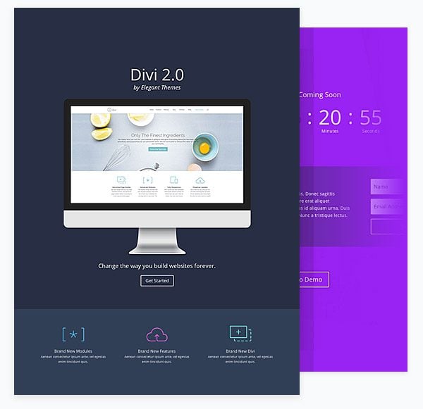
Even though Divi comes with some great landing and splash page layouts, I decided to design my landing page from scratch while keeping in mind all elements that I mentioned above.
I’m going to create a lead generating landing page that plays off the idea of the homepage that I designed earlier (a property maintenance type of company) to give you an idea of how a click-through design from your homepage can link to a page like this.

I first started out with a Fullwidth Section and added a single Text Module. Using this, I added a bold looking title to the top of the page and set the color of the background to a dark blue.
Next, I decided to use one of the Specialty Section columns that are now available with Divi and added the needed Columns and Modules into those sections. I added a couple Text Modules (one for written content and one to embed an iFrame video), a Divider and a few Blurb Modules along with some CSS to get the look I wanted.
Now for the bottom half of my landing page.

I used another Fullwidth Section with a Text Module and a made sure to set it with a bright background since I plan to use this for my call to action.
Lastly, I created another Fullwidth Section with a Contact Form and a directional cue in the form of an arrow so that I could capture leads.

Ready for a look at the end result?
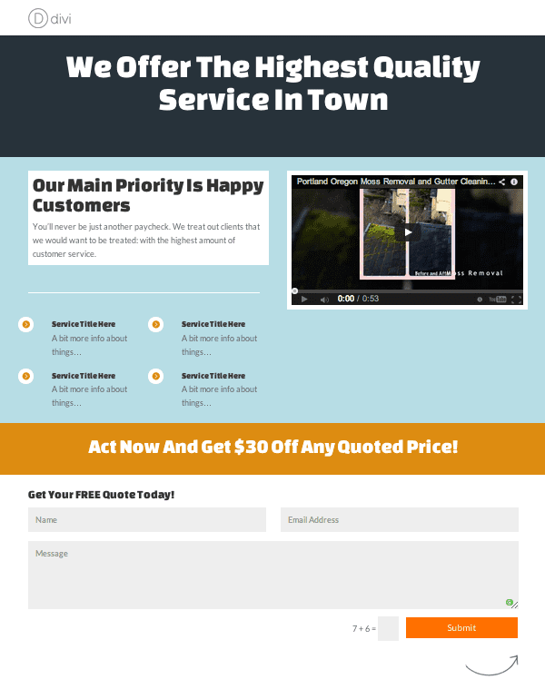
Tah-dah!
As you can see, I incorporated every single element that I mentioned above (bold headings, nice color scheme, bright colored call to action, ECT.) and the end result is pretty great. Outside of the Modules that I used for the design I did a couple CSS tweaks, but other than that, this was all Divi.
Now the question is, will this the design be the best for capturing leads? If you’d like to know the answer, then be sure to read the last section of this post.
Final Thoughts On Designing For Conversion
As I mentioned earlier, designing for conversion is tricky to nail down. Divi makes building pages and websites rather easy, however, it’s up to you to be able to really utilize its power for conversion. When it comes to CCD, there are things that work and things that don’t. But, how do you know if your design is working or not? Is there an easy way to figure that out?
Thankfully, you don’t have to stumble around blind in this endeavor. Use these 3 steps to figure out what’s working on your site, and what needs to change:
- Google Analytics. This tool will help you to analyze the bounce rate on your page; a high bounce rate signals a red flag and it’s time to change things up.
- Use A Heatmap. A heatmap allows you to track your viewers mouse-clicks and will help you get an idea of what is grabbing their attention. You can use this to help your understand where your design is lacking, and then you can optimize your landing page or homepage even further by using that data to tweak your site. A popular heatmap software that many love is CrazyEgg.
- A/B Test. The idea behind A/B testing your landing pages is rather simple: create more than one landing page with slight differences in the design and study the conversion rates between the two. Most times it is the smallest thing that can make the biggest difference in your conversion rate, but you’d never know without testing things out and studying the data.
Without testing, studying data, and then tweaking things accordingly, your chances of better conversion are slim. Whether you use Divi or not, be sure that you’re really making the most your design by following these steps and expanding your knowledge on Conversion Centered Design.
It can take a bit of time to get right, but it’s well worth the effort.
Thumbnail Image by Bloom Design via Shutterstock.com


Is there a way of having the divi contact form redirect to a separate thank you page after they click the form?
I need this for Facebook conversion pixel tracking.
Thanks
Overall, I feel like Divi offers awesome flexibility to create landing pages. A few items I wish you could manage out of the box:
-Have multiple CTA buttons on sliders. I like a “do this or do that” CTA vs. “do this or do nothing”.
-Change the color/styling of individual CTA buttons.
Both can be managed with some stylesheet editing, but it’d be nice if the options were there right in the module.
Nonetheless, to date it’s my favorite theme to work with!
Is there a way you can have the modules save to draft so that I can have some modules not active and do no need to keep recreating content. Then I can make the module active when I want it to show.
Would love to see more on squeezing people (that are already on your site) towards a free download…
Dear elegantthemes!!
I thank you very much for the development of the Divi Theme and the included page builder! For me it’s the theme of choice for all future web properties and web projects. I think, the customization possibilities and conversion optimization features of the theme and the divi page builder are the best wordpress themes with the best conversion optimized features available! Thank you very much and I am happy, to also participate of this great development team’s updates!
Best wishes and regards,
Matthias
Great article!
I would LOVE and have been asking for a CSS tutorial in regard to Divi 2’s CSS Class and CSS ID in each module. I have been Googling, reading the ET forums, and figuring it out on my own, but a tutorial would still be greatly appreciated.
Also, @Finge’s link to the PageSlide effect is broken 🙁
Thanks,
Deb
PS any way to get notification for follow-up comments when I comment on ET blog posts like this?
Great info Ariel, Your CSS video would be a big help with Divi 2.0.
Does Divi 2.0 have 2 menu capability in the header area?
Divi 2.0 have a big issue in image gallery. In 15 inch screen gallery iz perfect and when i saw it at 16 inch screen or above then gallery show in two cloumn not three. And a big space show between gallery or sidebar. Plz resolve this issue.
Fantastic post Ariel!
Just one question: how could we personalised Divi’s Contact Form?
I need to include more info than just email + message…
Thank you very much!
It would be easier to skip the Divi Contact Form and opt-in to using a plugin like Contact Form 7 (free). It has plenty of options and it’s easier to customize 🙂
Hi Ariel,
Great article! Thank you!
I need a little help please, how do you change the color of the call to action button itself. I can’t seem to figure that out (and have no CSS or HTML experience).
Any help you can offer is greatly appreciated.
Thanks,
Mark
It’s a little complicated to explain (I’m hoping to do some tutorial posts about this soon).
Assuming you use Google Chrome, if you hover over the button and left click, you will see an option called “Inspect Element”. You can use that to see the code of the button. You would then generally add the code:
background: #FFFFFF; (or whatever color you desire)
And then you copy and paste the code that you edited into your CSS stylesheet in the backend. I know… that’s a bit overwhelming. Perhaps I a sort of CSS tutorial would be good for this theme. Anyone else think that they need could use one?
How exactly does one “paste into your CSS stylesheet in the backend?” And where in the CSS stylesheet? Do you mean find the code in the CSS stylesheet (first finding the stylesheet somehow) that you see using the inspect element function? And then stick in the background spec at that point?
These outlined buttons are really not useful. Is there a plugin or something that provides colored background buttons? Or a more detailed explanation of exactly how to get colored background buttons?
Yes please make a tutorial on CSS training!! Im sure there a lot of people waiting for this type of training. That would be very helpful!
Thank you !! 🙂
Thanks Ariel!
It’s a little over my head right now. Yes, I would love a tutorial on that since the button color is crucial to the look and impact of every page and its conversion rate. I love the Divi theme which is making it very easy to create my website but if I have one beef with it, the button color is it.
Hi Ariel,
Hope you can do that. Make some tutorials about css training
This post was wonderfully timed for me – and very helpful. All of your examples seem to omit the slider function on Divi. Do you think using the slider with no more than 2-3 images hurts conversions?
It does tend to have an underwhelming effect :/. Each slider image generally has its own call to action. Too many of those have the tendency to overwhelm a viewer and they don’t follow through with what you wanted. Best thing to do would be to try one for a couple weeks, and then try another and see which one does better for your conversion rate. It’s all about the testing – mostly anyway 😉
Thanks Ariel!
Great post Ariel,
Would love to see more of these kinds of posts in the future if possible ET.
Mark
I’ll do my best 😉
Great post. I am designing mine and this is useful and Correct time to know about this for me.
Fantastic article and thanks for the info!
1 questions though – have you tested this on a mobile device? Sliders seem to ‘drop’ all their content but the headlines when viewed on a mobile browser.
If yours didn’t, Id sure love to know how you did it!
And thanks.
Hey guys,
nice post. Divi works awesome for that kind of website, what about making it look something like this?
http://www.twpiperbrook.com/
Is it possible? Could you possibly make a tutorial for that type of website making?
Cheers,
Adrijus
mmm super interesting !!!!
Thanks Ariel for a very helpful post. We’ve been able to land new clients by showing them how they lose leads coming from PPC ads when there is no landing page, just a generic website. We showed them a mock-up of a landing page built on Divi and we picked up a check that day. Opt-ins and calls are increasing in just the first 4 weeks. Hardest challenge was convincing them that their bio and other info was not needed on the landing page (It’s not about them.) Video definitely helps with our landing pages showing better results with video than a download or special deal without a video. 🙂 Cheers!
Thank you. What fantastic content. This is very useable information. I am going to be exploring the power of Divi in the immediate future.
Fabulous post Ariel
Great content backed by Divi theme specific examples.
I’ve got a couple of posts to write and this week and then… I’ll be setting up a landing page using your great advice.
Thanks Keith. I hope your designs go well!
Thank you for the informative post! I’m having a little trouble understanding when to use a landing page. I understand using one for a product or service that you want someone to purchase, but what about if your CTA is just to get them to opt-in to your list? Say that my Call to Action for the top area of my homepage is simply to get the reader to sign up to my email newsletter and in turn I will give them a free product, or access to a free membership site. Would it be better to go ahead and collect the email address right there, or should I still get them to click through to a landing page that tells them all about what they get with the newsletter and the free product and then ask for the email address? I worry that I might lose them if I ask them to go through too many steps, but I can also see how giving them this extra info could be a good lead-in for getting them to buy later. What do you think?
Hi Crystal. External landing pages (where your page is separated from your website or navigation is hidden like you can achieve with Divi) are best suited for traffic coming from paid traffic sources. That way you have complete control over who is coming to the page, or more importantly – better controll over what message/offer they clicked in order to get there. Your website is created with a more general purpose in mind. A landing page is designed with a single purpose in mind.
To illustrate using a real life example (apologies for any self-promoting): I run advertising on Facebook and elsewhere where my only goal is to get people to sign up for my 7 free tips to increase conversion rates. For those ads I drive the traffic to an extarnal landing page. This ensure message match with the ad and lets me create an uncluttered experience free from distraction like navigation and my service offering.
You can see the landing page here
http://hello.conversionlab.no/7-tips?source=ET
You might ask “Am I not loosing the opportunity to show my service offering?”. I would argue not. FIRST I gain trust by giving my free tips – and when the right time comes during the series of emails I drive readers to my website. My ultimate goal by offering the 7 tips is obviously to generate leads – it’s just a different way of doing it – and it seems to work pretty good so far 🙂
Hope this makes sense, Crystal.
Thank you, Finge, for taking the time to answer. I think I was looking at landing pages backwards – that people would be coming to them through my site, rather than from an external source. Makes more sense now! Thank you.
Very nice post. I was waiting on this because this is what im offering my clients. I really looking forward to build a conversionpage. but i like to have the form above the fold next to the slider.
Great post Ariel! And thank you for featuring our website (http://conversionlab.no).
Glad you mentioned the A/B testing at the end. A well designed conversion centered landing page will get you far, but A/B testing will really nail it and help you find a high performing landing page.
Keep up the fantastic work with Divi!
Hi Finge,
You guys deserved the mention! Great looking site ;). A/B testing is probably what I would call the pulse of conversion design. So important!
Hi Finge. I was just asking how you were able to create the CTA button in your header. Your guidance would be appreciated.
Hi Douglas. I see that Arial has helped you along. I have written about this previously as a comment on guest post here on ET http://www.elegantthemes.com/blog/customer-spotlight/generating-more-leads-with-divi
The short version: Style one of the meny items and use the PageSlide jquery found here http://srobbin.com/jquery-plugins/pageslide/
I hope that helps 🙂
Thanks for the reply Finge. It’d be great if you could give a sample CSS to create the header CTA button with steps to implement the effect.
Thanks Finge! I really like your site. Clean and optimized!
Hey guys, perfect timing! I was just working on this.
How do I create the ConversionLab’s example “Get In Touch” CTA header button on the Divi Theme?
Hi Douglas,
Looks like Finge used some CSS to do the job. You can use the Inspect Element option in Google to see how the code was written.
Thanks Ariel.
Great post Ariel! Lately I’ve tried to implement landing pages on my site with good results. Following your advices, like choosing a color scheme of no more than 4 colors (Adobe Kuler app helps me a lot) and an attractive call to action on the home page give us more conversions. Any suggestions for my site?
Hi Paolo,
Thank you for taking the time to comment on the post! Your design is great :). My only two suggestions would be to use the brightest color in your color scheme for your Calls To Action (like a red or orange), and try implementing a nice pop-up to help drive either newsletter sign-ups or social media posts. I hope that helps :).