It’s Friday and here on the Elegant Themes blog that means a new episode of Divi Nation. It’s a Divi Nation Short this week and as promised in previous episodes I’ve bundled three Divi Quick Tips into one. This time around we’re making some simple, subtle modifications to Divi’s header and navigation using a few snippets of code.
You’ll find everything you need to follow along in the sections below. Enjoy!
- 1 Divi Nation Short: 3 Super Simple Divi Header Modifications
- 2 How to Display Your Divi Site Title Text Instead of a Logo Image
- 3 How to Add a “Slide-Over” Effect to the Divi Slide-In Menu Option
- 4 How to Add a 360 Degree Animation Effect to Divi’s Dropdown Menu Arrows
- 5 What Divi Quick Tip Would You Like to See Next?
Divi Nation Short: 3 Super Simple Divi Header Modifications
[powerpress]
In this episode of Divi Nation, the official Divi podcast, I show you three Divi header modifications that are quick and easy to execute. You’ll find everything you need in the sections below to follow along with each Divi Quick Tip. If you have any questions about the tips themselves or requests for new Divi Quick Tips, please leave me a comment in the comments section below.
Subscribe To Our Youtube Channel
All Subscription Options:
How to Display Your Divi Site Title Text Instead of a Logo Image
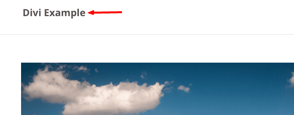
First up, displaying your site title text instead of the Divi logo image. There are two steps to this quick tip.
Step 1: Make sure that your Header.php file is in your child theme.
If you’re not sure if your child theme has that file, you can check by going to Appearance > Editor and looking for the Header.php file.
If it’s there, you’r ready for step two.
If it is not there, here’s what you do:
Access your site’s file tree via FTP. As you can see, I’m using an app called Transmit, but you can also just use your hosts web ftp. There should be a link in your epanel there.
Go to wp-content > themes > Divi. Duplicate the header.php file. Drag the duplicate down into your Divi Child theme. Make sure the file name within your child theme reads simply “header.php”.
Save that and head back to your WP Admin.
Now, when you go to Appearance > Editor you should find the header.php file there.
Step 2: Swap out a single line of code in your child theme’s header.php file.
What you can do to make this part really easy is simply copy the “logo” line of code from the blog post, then use command+f to find that line in the editor.
img src="<?php echo esc_attr( $logo ); ?>" alt="<?php echo esc_attr( get_bloginfo( 'name' ) ); ?>" id="logo" data-height-percentage="<?php echo esc_attr( et_get_option( 'logo_height', '54' ) ); ?>" />
Once you’ve found it, replace it with the “name” line of code.
<span style="font-family: 'Open Sans', Arial, sans-serif !important; color: #505050; font-size: 20px; font-weight: bold;"><?php echo esc_html( get_bloginfo( 'name' ) ); ?></span>
This line of code replaces the logo image with your site name and gives you a few styling options too. You can adjust the font family, color, font size, and font weight by adjusting the styles within the .
If you want a few more font options I’ve included a link in the blog post to w3schools that shows you how to list a few other web safe fonts in the same way I’ve used Open Sans. Font options: http://www.w3schools.com/cssref/css_websafe_fonts.asp
When you’re done, save the edit you’ve just made to your child theme’s header.php file and check out the result on the front end of your site.
As you can see, you are now displaying your site title instead of a logo image.
Pretty awesome, right?! This is a great little trick for anyone who doesn’t have or want a logo.
Let’s move on to our second Divi header modification.
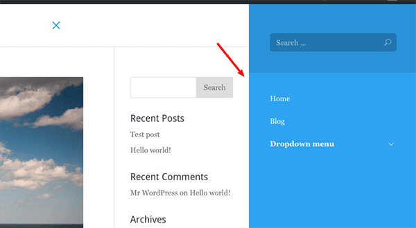
Next up, we’ve got what I’m calling the “slide-over” menu effect. This one is subtle so before we make any changes let me show you want the new slide-in menu option is supposed to look like in action.
As you can see, when I click on the menu’s hamburger icon, the menu slides in from the right and the entire page container is pushed to the side.
The change we’re going to make will result in the menu sliding over the page container, instead of pushing it aside.
Let me show you the “slide-in” again.
Ok, now let’s make our change and see what happens.
Copy the CSS snippet for this from the accompanying blog post and then head over to Divi > Theme Options. Scroll down to your custom css panel, and paste it there.
.et_pb_slide_menu_active #page-container, .et_pb_slide_menu_active #main-header {
left: 0!important;
}
.et_pb_slide_menu_active #et-top-navigation {
margin-right: 320px;
}
Now click save changes and go back to the front end to refresh and view the difference.
As you can see now, instead of pushing the page container aside, the menu slides in over top of the page container, overlapping instead of pushing.
It’s subtle, but a cool variation nevertheless.
Ok, moving on!
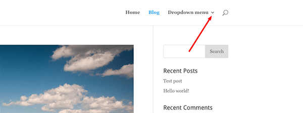
For our final modification we’re going to add a fun little 360 degree rotation animation effect to your dropdown menu arrows. This effect will work on the three classic Divi menu styles: default, centered, and centered inline.
Again, you’re going to want to copy and paste the appropriate CSS snippet from this episode’s accompanying blog post.
#top-menu li > a:after {
-webkit-transition: all 0.4s ease-in-out;
-moz-transition: all 0.4s ease-in-out;
transition: all 0.4s ease-in-out;
}
#top-menu li:hover > a:after {
-ms-transform: rotate(360deg);
-webkit-transform: rotate(360deg);
transform: rotate(360deg);
}
Once you’ve copied it, head back to Divi > Theme Options and scroll down to the custom css panel. Paste it in there and click save changes.
Now, when you go back to the front-end of your site and refresh, you’ll notice that when you hover over your scroll down menu the arrow does a 360 degree spin.
Again, this is a subtle little effect to a small part of your site, but pleasant little micro-interactions like this are a great way to improve the user experience.
What Divi Quick Tip Would You Like to See Next?
That’s all for this round of Divi Quick Tips. Do you have anything in particular that you’d like me to cover in a future episode? If so, leave it in the comments below and I’ll add it to the queue!




Hello.
Nobody knows how to disable header menu in Divi mobile version.
I might transparent background. But no result for mobile version.
Regards.
Some nice snippets here. I see two of them I’m going to try right now! Thanks, Nathan.
Thanks, Nathan for these great tips.
I appreciate your friday’s divi-quick tips!
Hello Nathan, Is it possible to fix on top a fullscreen menu when you scroll on a page or post ?
Thanks
Have a good day !
droupy
Hey Droupy,
Thanks for tuning in to Divi Nation! I’ll do my best to answer your question but fair warning, I’m not sure I understand it.
Here’s why: Basically, when you select the fullscreen header it will stretch to fullscreen on all devices. This means that if it were fixed to the top you would scroll but nothing would change. You’d always see the fullscreen header.
Sorry if that is not the answer to your question. I may be misunderstanding you. Feel free to re-phrase your question and I’ll take another crack at answering 🙂
Best,
Nathan
This Divi plugin allows you to create really perfect ideas. But, my opinion maybe request from you to share more videos about using of Divi plugin while preparing website post. Divi is really awesome but on the other hand a little bit makes you confused.
Thanks
I’d be happy to do a video on how to create blog posts with the Divi Builder!
Hello Nathan,
I wish I could add some adjustable transparency to header / main / footer blocks background, to make a full background photo visible.
Some CSS like : background : transparent with adjustble percentage.
Can I achieve this with Divi ?
thanks
Hi Claude, yes that is absolutely possible. And it does not require CSS with Divi. You can simply adjust a sliding scale of transparency.
Nathan,
I found my way through the options to adjust transparency for the main-content block, but didn’t found options for main-header nor main-footer ids.
Can you please indicate where these settings can be found ?
Rgds,
To adjust the background transparency for your primary navigation go to Appearance > Customize > Header & Navigation > Primary Navigation. Scroll down to your background color and adjust the transparency bar there.
The footer section does not have a background transparency setting. However, what you can do is create a footer as a section in the Divi Builder, save that section to your Divi Library, and then add that footer to each page.
This will give you all of the freedom you have with background transparencies (and other design settings) in standard Divi page or post sections–but in the form of a footer.
I’m looking for info about how to customize category page. Is it possible to use builder for this?
It’s definitely possible in Extra where you can use the category builder. Here is a video I made showing how this works: https://www.youtube.com/watch?v=30SVxnjdnxc&list=PLF17V-5878mWNSsgcX73_W_Adp9MfrbTK&index=9
Thanks Nathan
This works well.
As I have also a secundary menu, I made some tweeks based on your code.
#et-secondary-menu li > a:after {
-webkit-transition: all 0.4s ease-in-out;
-moz-transition: all 0.4s ease-in-out;
transition: all 0.4s ease-in-out;
}
#et-secondary-menu li:hover > a:after {
-ms-transform: rotate(360deg);
-webkit-transform: rotate(360deg);
transform: rotate(360deg);
}
Now it works on both menu !!
Hi,
When I added your code for the 360 spin it didn’t work. I tried it on two Divi sites. Any idea what I did wrong?
I pasted this in custom CSS:
/* Make Dropdown Arrows Spin */
#top-menu li > a:after {
-webkit-transition: all 0.4s ease-in-out;
-moz-transition: all 0.4s ease-in-out;
transition: all 0.4s ease-in-out;
}
#top-menu li:hover > a:after {
-ms-transform: rotate(360deg);
-webkit-transform: rotate(360deg);
transform: rotate(360deg);
}
Thanks for your help!
Thanks, Nathan for these great tips.
I appreciate your friday’s divi-quick tips!
This is awesome! Is there any way to replace the “hamburger” with say a company logo?
Thanks for the quick tips man!
I’m having one little issue. I’m trying to change the font style on the site title text. The line of code seems to remain the same font regardless to my changing it. The other aspects will change such as color etc., just not the font style. Any suggestions will be greatly appreciated. Thank you kindly 🙂
I would really like to be able to set menu’s at breakpoints. The slidein menu is really nice on smaller screens but on larger screens not having the menu visible is not good imho. The ability to select the type of hamburger menu separately from the ‘normal’ menu would be great. Also some more menu styles. Just having dropdowns is a bit limiting.
Also a great video would be “Creating your own modules”
Small concerns in a fantastic product overall.
Love these Divi shorts. Thank you for creating this awesome content! Keep up the awesome work!
Great group of tips and a perfect presentation. Thx
Hi Nathan. Great Divi tip on replacing the logo. I was recently looking for that exact tip, but… any chance you can provide the same tip for the Extra theme ( I know, I know, this is the Divi podcast, but was hoping you’d make an exception… maybe even start a “Div-Ex” podast)? 🙂
Thanks in advance!
sorry, code was filtered out.
replace with:
Excellent as always Nathan! I have one suggestion; If you are like me and like to keep all styles in the style sheet for consistent access, I’d recommend applying a class to the header instead of in-line styles:
and then adding the styles to the styles.css in the child theme:
.blog-title {
font-family: ‘Open Sans’, Arial, sans-serif !important;
color: #505050;
font-size: 20px;
font-weight: bold;
}
I just like to keep all my styles together so I don’t lose track of where I set them 🙂
-JD
The “slide over” effect is awesome! Big differentiator!!
Since we’re on the subject of ‘dropdowns’ it would nice to be able to EASILY reduce the size of the dropdown boxes and text size, as well as (maybe) filling in the boxes with a color. I think this should be a part of Divi and not need CSS.
Hi
I am running the Extra theme on my website and was wondering how to achieve the swing down menu as shown in the demo. Thanks.
Go to Extra > Customizer > Header & Nav > Primary Menu > scroll all the way to the bottom and select your dropdown menu animation style.
Thx!
Nice littel rotation!
Jan
nice effects Nathan. it’s the subtle attention to detail that make a site stand out 🙂
Thanks Nathan,
The 360 degree rotation dropdown animation is a classy feature. Divi is a time-saver and your code for Divi site title text keeps the site looking clean.
Thanks for tuning in Kim, appreciate it. If you every have a request feel free to drop me a line 🙂
Nice episode Nathan … like your tips.
It’ll be great to be able to change logo when scrolling down the website. For Example, your original logo when loading the website, but when scrolling down, instead of shrinking the logo, to change it for something similar to a favicon (simpler logo).
I have seen many websites have that capability and it is great. So, to sum up … normal logo on Primary Menu but changing to some kind of favicon-like logo on Fixed Nav Menu!
Keep posting great tips !
Best,
Pablo from London
Interesting. So, like a second place to upload a different logo on the fixed navigation?
+1 thanks Nathan !
Love these little but powerful tidbits. Thanks!
Thanks for tuning in!
I would love for you to do one like this but on editing the footer, maybe some tech savvy ones w/ child themes and editing php files and some info on how to do this for people not as tech savvy (like me) using pluggins or something like that 🙂 Love this series! Keep up the great work!
You’re in luck. We did this one already. Here is the link to the YouTube video.
https://www.youtube.com/watch?v=P12YRWIR1mk&index=2&list=PLF17V-5878mWVOcXf16DqIwStUtMS53ef
About the “Divi Site Title Text Instead of a Logo Image”; I am not impressed, honestly. I did not buy DIVI to reinvent the wheel.
I want to be able to switch between Title Text header and Logo Image with a simple click. This functionality is needed and I don’t understand why it’s not a basic option in DIVI theme.
lol… some people….
Why be so rude? The whole Elegant Theme deal is great value. Keep up the great work Nathan!
Thanks for the feedback Christian. I think that’s something we should consider.
Love the tips Nathan, keep them coming!
Hi Nathan,
Thanks much. What were you using as your FTP client in the video? It looked like a native Mac window.
I use Transmit.
Thanks so much Nathan! You must have read my mind on the slide in menu.
Hi Nathan, Thank you for that slide over menu, it’s perfect for what I have to do next!
I wonder if there is a way to add the logo on that slide in menu
Just so I can make sure I’m understanding, you want the logo to appear within the slide out part?
yes please
+1
Cool tips, Nathan! I added the spinning icon for menu dropdowns to my sites.
Thanks Phil!