This post is part of our Customer Spotlight series. If you have an interesting story to tell and would like to share your experience with WordPress and Elegant Themes on our blog, please contact us!
Introductions
My name is Anthony Louis Kelly. I’m a graphic designer and web developer based in Rochester, NY. At the relatively young age of 29, I have been involved with design and web for some time. By middle school I was teaching myself how to use Photoshop and designing primitive web sites on Yahoo GeoCities (if anyone remembers that.)
I was taking on freelance design work semi-regularly before I was out of high school. I went to a trade school for Commercial Art and majored in graphic design and printing in college. I’ve been interested in art and graphic design before I knew it was possible to make a living at it.
Welcome To The Machine
Straight out of college I got a gig as an in-house graphic designer for a local printing and business form company. I was a real designer…I was living the dream…right?
It became apparent very quickly that this was far from the design position I’d aspired to have. It was the most boring and monotonous work you could imagine with little to no room for any creativity, like watching MS Paint dry. I spent most of my days setting up 1 color forms, the kind you fill out at your doctors office. After a long 9 months of enduring this torture, I reached a mutual agreement with my employer [got fired] and struck out on my own.
Back In My Day
I started in the olden days of the web when we used to have to design a web site in Photoshop, slice it all up and bring it into Macromedia Dreamweaver (now Adobe) to build the site. I taught myself enough HTML to get by, but it was archaic and very time consuming to make any major changes after the fact. After doing a few web sites like this in the mid 2000’s, I came into the world of WordPress and eventually to ET.
I was drawn to WordPress originally by its ease of use and web-based interface. Being able to purchase pre-made themes was a huge time saver and it offered a wide variety of design and layout options. As a graphic designer first, and web designer second, WordPress and ET allows me to focus on making the site beautiful and functional without having to dive too deeply into the matrix of code, if at all.
I still administer a couple older web sites I built on other platforms, but I’m using WordPress and ET themes exclusively for new projects. Between the low price point, variety of themes, top-notch support forum as well as great designs, it’s really a no-brainer. With so much web traffic being mobile these days, its important that my sites look good on a phone or a tablet, and ET themes really do an excellent job of that as well.
My Work
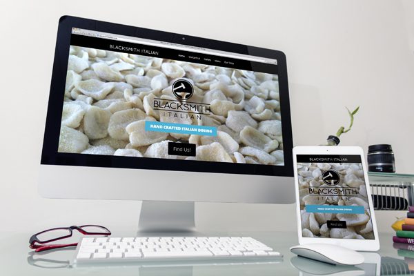
My most recent project has been the Blacksmith Italian Restaurant’s web site. I designed their logo and signage as well as their web site. I used the Vertex theme for the site for its bold design elements and ability to keep pretty much everything on the home page. This allows for ease of use to visitors that are [for the most part] looking for contact info, hours and the menu. The menu that exists on the home page took some customization, which is where the support forum sets ET apart from other theme providers. A question posted on the forums and some back and forth from the support admins (Zain & Slavia) and I got exactly what I was looking for.
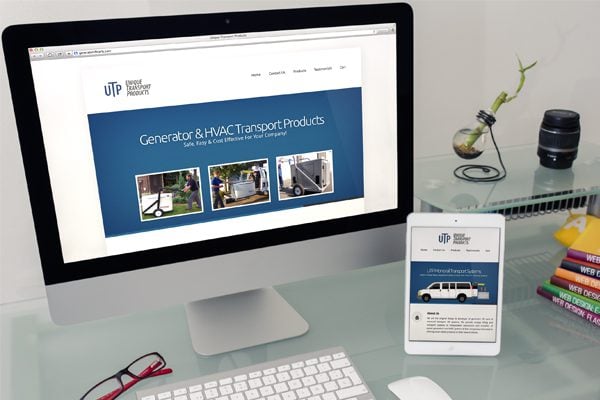
Another recent web project was the Unique Transport Products web site. UTP had an aging web site and was looking for a new design to bring them into the modern age. For this site I used the Foxy theme and integrated the WooCommerce shopping cart. I really dig the Foxy theme. It’s attractive, yet versatile enough to use on multiple web sites without even knowing it’s the same theme with a little customization.
Looking Forward
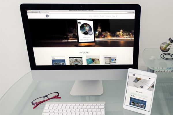
I am always excited to meet new clients and work on new projects. As a graphic designer, I have a preference for visual layout rather than code, which is why I’m really enjoying the new page builder introduced with Divi. Unlike a lot of designers, I redesign my personal site quite often, some [my wife] would say too often. I recently redesigned my site with Divi and I foresee a lot of the Divi theme in my future web projects. Between its potential for customization, and its versatility, I feel its potential is only beginning to be realized.




Great article. I liked the logos and websites, I wish I could know how to customize themes like that. Thankfully Divi is a great tool.
With Divi Cesar we are all WordPress developers.
Sat here waiting for Divi 2.0.
power user…you can say that again, lol!
Thanks Cesar, there is actually very little customization to divi on my site. I did not modify any of the theme files, only a few lines in the custom CSS area.
Great beginning.
Watched few works of you, logo design is great and web design I’m sure will rise eventually.
Can I suggest you to fix galleries on Blacksmith Italian Restaurant’s web site?
I think for people would be usable to watch less sized pictures with lightbox maximize. It’s too far to scroll to see all that great dishes…
Good luck!
I want spaghetti now… ))
Hey Anthony,
Just saw this post on the Elegant Theme’s Facebook page and clicked when I saw Rochester, NY. I’m located in Buffalo and attended SUNY Oswego for 2 years and I’ve been an Elegant Theme’s user for about 2 years now. Checked out your personal site, great work – I love Divi too! In the process of redesigning my site using it.
Keep it up!
Cheers,
Melissa
Everyone on the ET forum has a story of creativity. I have a good “eye”, but without the tools and templates that Elegant Themes has provided, I wouldn’t have sites that I (and others) can look at and say, “that’s a beautifully designed website.” ET provides artistic skills, maybe not to the level that Anthony has, but
it’s satisfying in any case.
By the way bamagazine.com has many great free tutorials for graphic artists
at all skill levels.
I just ran across a site with beautiful pictures for free. pixabay.com. Great to use or experiment with while building a site.
David, I enjoyed reading about your journey. I remember those slice & dice out of Photoshop days. I also remember when MS Frontpage was all the rage! Thank goodness WordPress came along. I’m very inspired by your new Divi design — it’s beautiful.
Sorry, ANTHONY! Don’t know why I wrote David, except that it’s my husband’s name.
The Blacksmith Italian Restaurant and Unique Transport Products websites are missing favicons 😉
Thanks four the heads-up R3, I have added them.
I would suggest that in your portfolio on the pages where you display your work that you have text on the left to describe the work and possibly make all the images fit above the fold. For example: http://anthonylouiskelly.com/project/cornerstone-eye/
Hi, I enjoyed reading your blog, However I would check the website you built
http://generatorliftcarts.com/ .
If you view it from a mobile ( all the sites I build now have to be totally mobile friendly) and you view a product.
When reading the description all looks well , until you click on additional information.
It flies off the screen!
I am having a similar problem using woo-commerce and foxy theme.
If you go to categories the products do not align well on the page. Funny though they work perfectly on a mobile!!!
I will sort it hopefully..
customization is the key
Gotta smile at some of the unsolicited advice being offered in the comments. Especially when one clicks through to their own offerings 🙂
Nice article Anthony. Thanks for sharing.
Thanks Pat.
Lovely post Cesear! Can you tip me how you struck the font-icon on your site? I’ve been trying but seems I’m missing some points. I’ve used Divi for a couple of site and I would love to integrate the font-icon animation. Thanks in anticipation.
We have built two sites with ET and are working on migrating Lowcountry Africana to ET as well. Enjoyed reading about your experience and viewing your work. Love the Woof Town logo!
I’m here in Rochester and a Divi fan. We’re looking at a second website, for blogs. I’d love a thinking partner and maybe the help of someone who gets graphics at a deeper level than I do. Would you be willing to stop by (we’re at East and Oxford) for a cup of coffee and talk?
Terry
Sure Terry, shoot me an email and we can set something up.
Anthony, your site looks great!
I really like your logo. Would you be willing to share the name of the font that you used?
Great article.
-Kraymer
Thanks Kraymer, the ALK in the circle is not a font, it’s a custom vector I created.
My name below is in Quicksand which is a free font you can find here:
http://www.fontsquirrel.com/fonts/quicksand
I too was designing on the web since Geocities. I got into WordPress because I was doing freelance projects for friends and Flash was the thing but I wanted to be different. Now I have no clue why any site would be built without WordPress and Elegant Themes. Great story.
You sure did go far, Anthony.