It’s a common belief that flexibility is the same as being unrestrained, that to be creative you also have to be unbridled. To complete a project, though, especially one that’s as intricate as web design, creating structure can actually give you more flexibility. You need a framework – it’s non-negotiable. Flexing your artistic, creative muscles where you truly have the freedom to will result in designs that are as inspired as they are functional and realistic. Atomic design is a sensical, methodical approach to web design that still gives you the chance to experiment within the framework.
Design Systems
Designers don’t simply create web pages anymore; they create design systems. Design systems include:
- Color
- Grids
- Texture
- Typography
- Etc.
I love how Jack Strachan over at UX Planet describes design systems: “In short, a design system is a collection of reusable components, guided by clear standards, that can be assembled together to build any number of applications. Design systems are a method to translate a consistent experience and visual language across a product when working on different touch-points.”
Elements of design can be subjective, and they can quickly become overwhelming and chaotic. In order to categorize them, design has to be looked at in a more methodical way. That’s what web designer Brad Frost did.
The Birth of Atomic Design
Here’s how Brad came up with atomic design: “In searching for inspiration and parallels, I kept coming back to chemistry. The thought is that all matter (whether solid, liquid, gas, simple, complex, etc.) is comprised of atoms. Those atomic units bond together to form molecules, which in turn combine into more complex organisms to ultimately create all matter in our universe.”
He goes on to explain that interfaces are made up of components that can be categorized into building blocks. Here’s the order from smallest to largest:
- Atoms
- Molecules
- Organisms
- Templates
- Pages
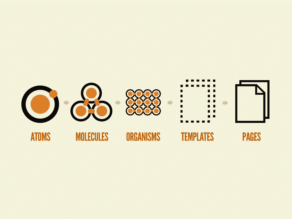
Source: BradFrost.com
The Building Blocks of Atomic Design
The main draw of atomic design is that it promotes consistency. Many of the elements you create can be easily replicated, reused or scaled. And to keep track of them all, designers can build themselves a library where they can see all of their elements and styles in one place. There’s some room for customization, too, but only as the building blocks get more complex and grander in scope. Let’s get into the five building blocks:
1. Atoms
As atoms are to matter in the natural world, HTML tags are to web interfaces. Meaning: all web interfaces begin with HTML tags or fundamental elements (animations, buttons, color palettes, fonts, form labels, etc.). While these atoms aren’t beneficial to web design on their own, they are required to build the web interface.

2. Molecules
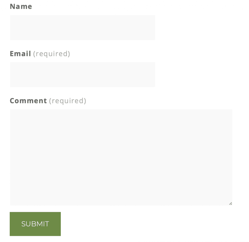
Molecules are more complex than atoms, but they’re not complex overall. When you group not-so-useful atoms together, you have more-useful molecules: Search Form Label + Input + Button (atoms) = Completed Search Form (molecule)
3. Organisms
When you group molecules together, you get organisms, which are more complex than their predecessors: Logo + Navigation + Search Form + Social Media Icons (molecules) = Completed Masthead (organism)

Ideally, you’ll be able to reuse organisms on the website or across different websites, keeping the general layout and customizing it with different text and images. For example, you may use the same type of masthead on all the websites you design, or you may create a product-specific organism (image + title + price) that you repeat on the product page.
This is when the web interface truly starts to shape up in a unique, customized way. Before now, your interface is just a collection of plain elements. During the organisms stage, the website becomes more visual.

If you were to share your process with a client, this is the part where they’d go, “Oh, I get it.” This is the time to start wireframing or put together mockups so the client can give you feedback before you get further along.
4. Templates
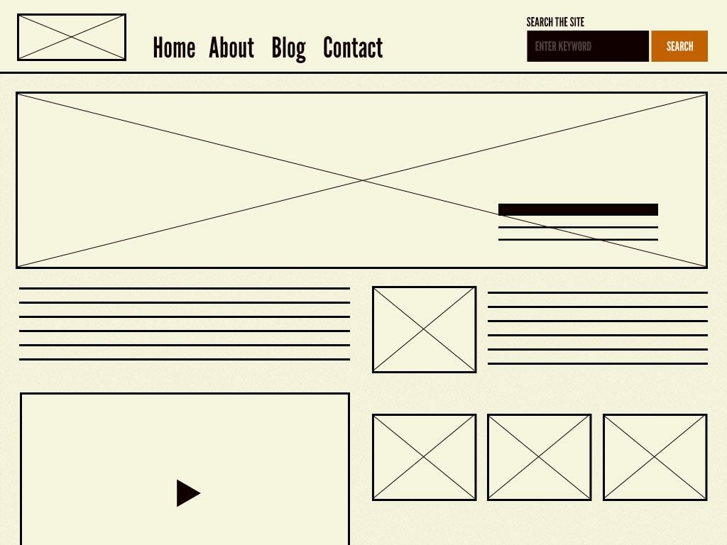
When you group organisms together, you have templates. This is when the actual page layout comes together. While molecules and organisms have their own, internal layouts, the templates stage is when you start seeing how they complement and interact with one another; where they’re placed in regard to one another; and how they flow as a whole. The template gives the molecules and organisms context. Note that templates have placeholder content, not custom or original content.
Source: BradFrost.com
5. Pages
Pages take templates to the next level by replacing the placeholder content with actual content. It probably won’t be the final content, but it will be more representative of the final design and content. Adding high-quality, permanent content at this point could be a waste because the website still has to be tested, reviewed and tweaked. That said, it’s possible that you will plug in the finalized content – it depends on where you are in that process.
This is the stage where the website will be under the most scrutiny. Depending on the reviews and feedback you get, molecules, organisms and templates may have to be changed. This is also a good time to test design variations.
Final Thoughts
The thing about atomic design is that it’s not new – the verbiage is, but the theory isn’t. This is how websites have been designed for a long time now. Speaking in atomic design terms won’t automatically make you a great designer or developer; it’s not a replacement for solid work.
One benefit of speaking about it this way, in using this sort of terminology to clarify the methodology, is that’s is easier for non-developers to understand – you can explain your process to clients. And for the organized developer, it’s a way to compartmentalize designs. You’ll be able to drill down into one component or a small grouping of elements that aren’t working. It can help you view the forest for the trees instead of saying, “This whole thing is flawed.”
Atomic design allows you to embrace creativity without getting lost in it. It wrangles basic elements and design systems in a way that gets you started on a project faster so that time can be spent where your artistry and skills are needed most – making intricate adaptions, solving problems, meeting client needs and ultimately creating a website that goes beyond the norm.
Keep up that web design momentum and check out 10 Rules of Good UI Design to Follow On Every Web Design Project.
Featured Image via ShadeDesign / shutterstock.com


Very good concept and the idea of the design system ties in nicely with the most recent update to Divi where you can globally design all the modules you will need for a site in one place, on a private page for example. The upcoming theme builder where you can built templates that can be applied to the dynamic content of custom post types is where this will really shine.
Thanks so much for your comment, Stephen! I’m glad you found this article useful – and I love how you’ve tied it to Divi, too.
An interesting interpretation of web design. Lets take a look at the new design!
It’d be great to see ET build out a section in Divi options (as they did for the color setting options) where a style guide can be curated and shared with clients; and clients can download that style guide to share with others. Adherence to a style guide is one of biggest pain points web designers have with clients – especially when they come back and ask why their branding has become so haywire. I’m sure many of you have seen the before and after images of brand new websites. Before: the clean beautiful website at time of launch, before a client logs in to add to it. After: the client has manhandled the logo, design and color scheme to a point where it looks like a toddler with crayons build it – no offense to toddlers because they don’t know better.
There is something relating to sharing a style guide. I notice that there is now an option for globally setting modules based on an imported layout. The check box for this I believe is new. Perhaps not the best way to do it but something all the same.
I agree with Shane below, to a degree. Clients have the potential to screw up sites. Gauging the competence of client from the developers/designers point of view is tricky. There is always the option to set up user roles and limit access to content input with custom designed backend for regular posts and CPTs,
So true, Peter! Thanks for your comment.
“One benefit of speaking about it this way, in using this sort of terminology to clarify the methodology, is that’s is easier for non-developers to understand – you can explain your process to clients. “
I guess I am working with a different group of clients because explaining any of this using “atoms, molecules and organisms” will put a bewildered look on their face if it didn’t put them to sleep first.
In my experience clients don’t care about the process they care about the end result.
Did I use a framework, JavaScript, css, Photoshop etc.? The client only cares about what their site looks like.
Did I use h1 tags, descriptions, seo etc.? They only care can people find their site in Google.
Using design lingo and terminology may impress the inside design circle but is lost for the most parts on clients but I could be wrong.
I totally agree Shane!
@shane +1 on that.
I’m pretty sure this post is for us, and not for our clients.
Yes. Usually, clients trust only themselves or their friend, wife, secretary, etc. But not to the designer. Unfortunately…
Hey Shane – Very good point, and I believe it really depends on the client. In general, this breaks down the process in an easier-to-understand way than using too much jargon. In my experience, some clients do care about the process (even if they don’t actually understand it), so while I wouldn’t lead with how the sausage is made, it’s a way to explain it in case the client asks.
It is necessary for designers to read this post!
Ever excellent, elegant themes…
Thank you.
Thanks so much!