

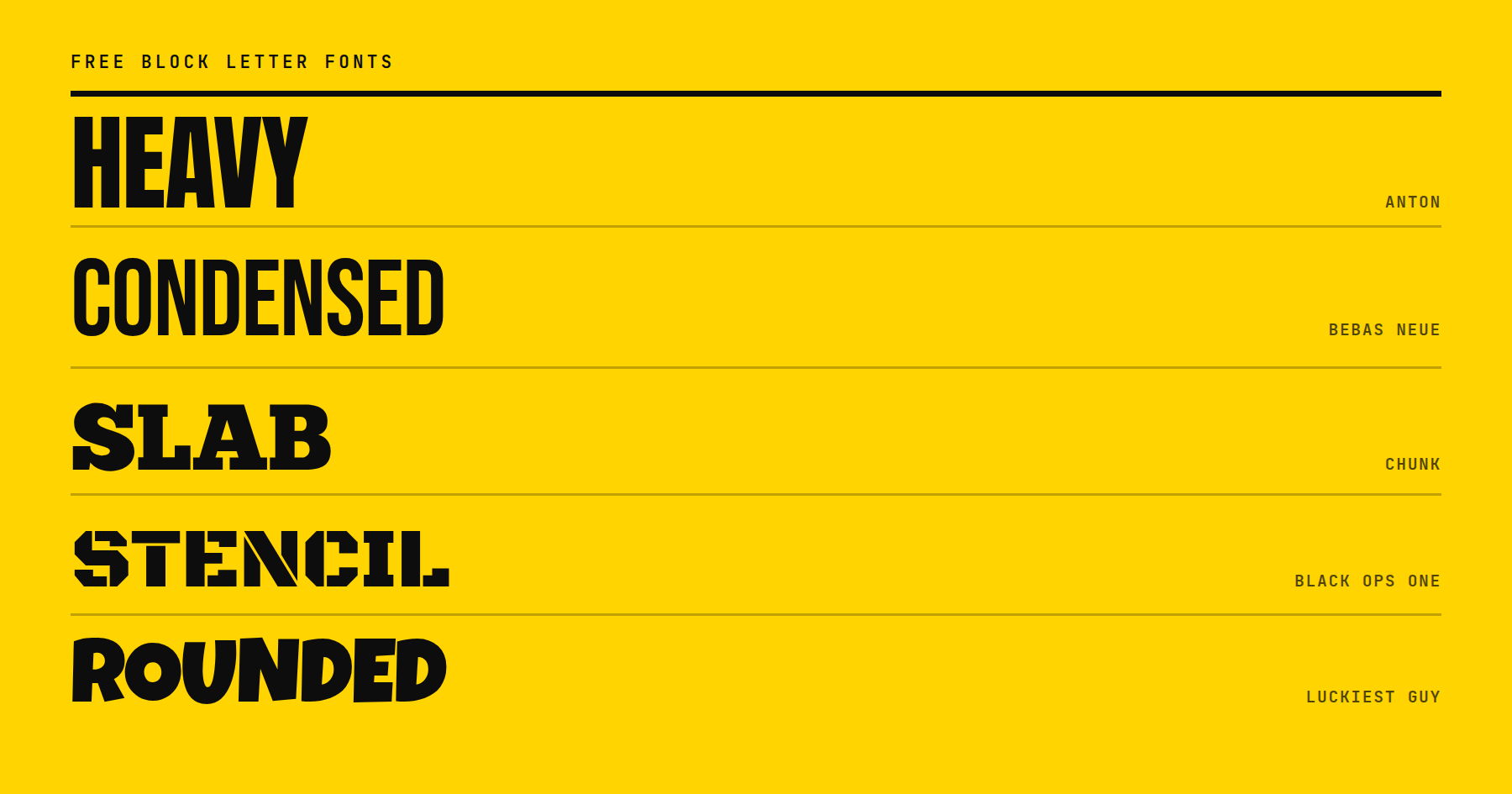
Below are 20 free block letter fonts in six groups: heavy grotesque, condensed poster, slab, stencil, signage, and rounded. Each entry identifies what sets that font apart and links directly to the download. Each one is free for commercial use, and each entry names its license type.
Here’s a sample:
- 1 What Is A Block Letter Font?
- 2 Heavy Grotesque Block Fonts
- 3 Condensed Poster Block Fonts
- 4 Slab Block Fonts
- 5 Stencil And Outline Block Fonts
- 6 Signage And Display Block Fonts
- 7 Rounded Block Fonts
- 8 Variable Block Fonts Cover The Whole Weight Range
- 9 Three Tips For Choosing A Block Font
- 10 Pick One And Test It On The Actual Headline
What Is A Block Letter Font?
A block letter font is a typeface built from thick, even strokes with squared corners and flat terminals, designed to be read at large sizes in short bursts of text rather than in paragraphs.
The defining traits are stroke weight and corner shape. A block letter holds roughly the same thickness from one end of a stroke to the other, with almost no taper, and the ends of the strokes are cut flat instead of rounded or pointed. That combination is what gives a headline or a sign its weight and its presence at a glance.
Some of the fonts below also carry serifs, stencils, or outlines, so “block” here describes the stroke and the corner, not the absence of decoration. A slab block font still counts, because the slab serif is as thick and as square as the stem it sits on.
The phrase also has an everyday meaning unrelated to typefaces. Writing in block letters means printing separate capital letters by hand instead of joining them in cursive. That is what a form means when it asks for block capitals. The fonts below imitate that look on screen.
Heavy Grotesque Block Fonts
Thick, upright, and serif-free, built to fill a headline with as much weight as the page can carry.
1. Anton
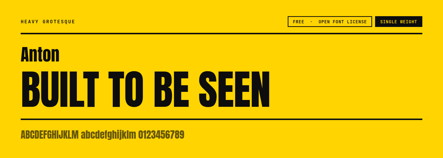
Anton’s counters are noticeably tighter than the other fonts in this group. The letterforms read almost condensed even though the family carries no separate condensed width. That makes it a strong pick for a short headline that needs to fill a wide space without a second font to stretch it. It is single weight, so pairing it with a lighter body font does the contrast work instead of a weight change.
Price: FREE ǀ Go to Anton
2. Archivo Black
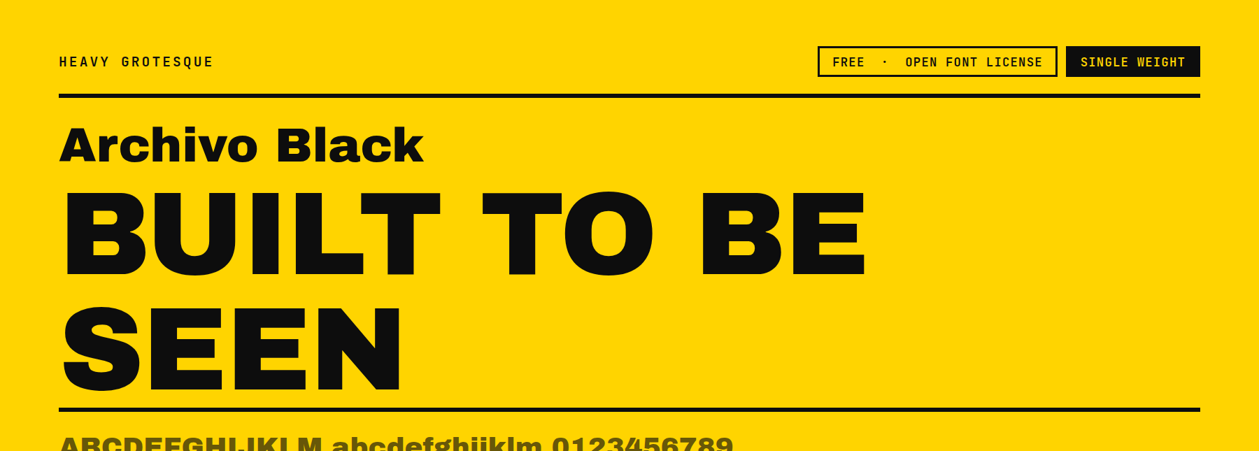
Archivo Black opens its counters wider than Anton does, and its x-height sits taller. It holds up better at medium sizes, not only at poster scale. The letterforms sit closer to geometric than to condensed, so they come across as neutral and workmanlike rather than aggressive. Single weight, one consistent black cut.
Price: FREE ǀ Go to Archivo Black
3. Blackout
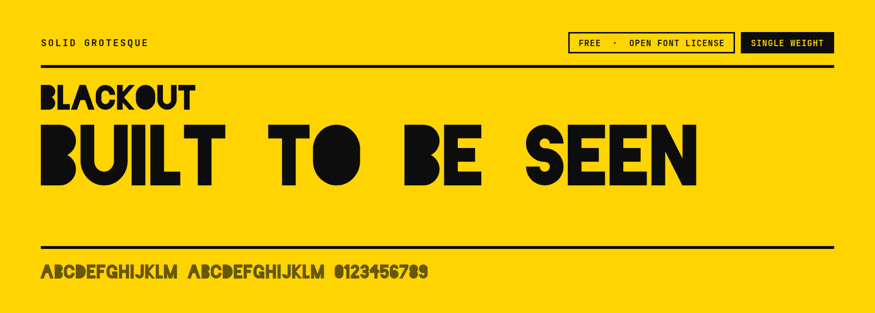
Blackout ships as three separate cuts named Midnight, Two AM, and Sunrise, each filling in a different amount of the counter so the letters look progressively more worn or more solid. That is a different mechanism from a weight axis: you pick one of three fixed files rather than dialing a slider, and each file carries its own texture rather than just a heavier stroke. Single weight per cut.
Price: FREE ǀ Go to Blackout
4. Archivo
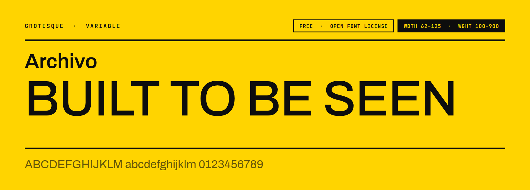
Archivo is the variable sibling of Archivo Black, and it offers two axes in a single file: width from 62 to 125 and weight from 100 to 900. That means the same headline can be squeezed narrow to fit a tight column or stretched wide for a banner, without swapping in a second font file to do it. No other entry in this group carries a width axis.
Price: FREE ǀ Go to Archivo
5. League Spartan
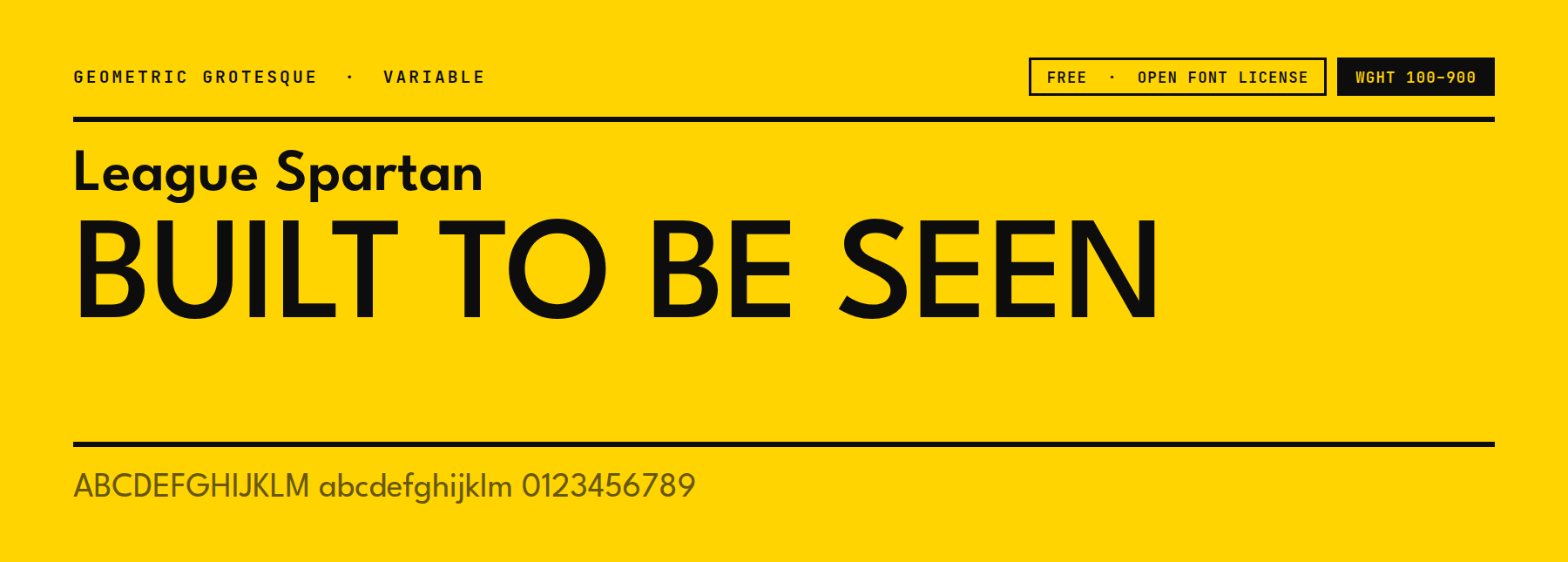
League Spartan’s counters are true circles rather than the slightly squared ovals in Anton or Archivo Black. This gives it a geometric, Futura-adjacent feel instead of a purely industrial one. Its weight axis ranges from 100 to 900 in a single variable file, so a site can load a single font and still cover both a thin caption and a heavy headline.
Price: FREE ǀ Go to League Spartan
Condensed Poster Block Fonts
Narrowed letterforms, so a long word still fits a fixed width. Posters and tight sidebar headlines are the usual use.
6. Bebas Neue
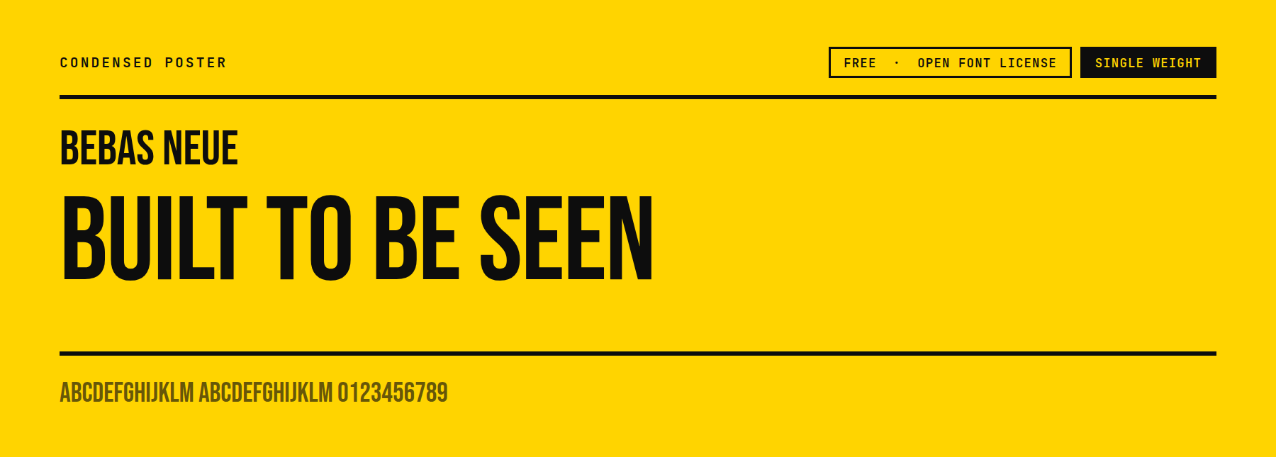
Bebas Neue has no lowercase at all. Typing a lowercase letter renders the same capital shape, so there is no accidental mixed-case headline to catch in review. It is a single-weight, tall, narrow font, and it sets tighter by default than the other condensed fonts on this list.
Price: FREE ǀ Go to Bebas Neue
7. Oswald
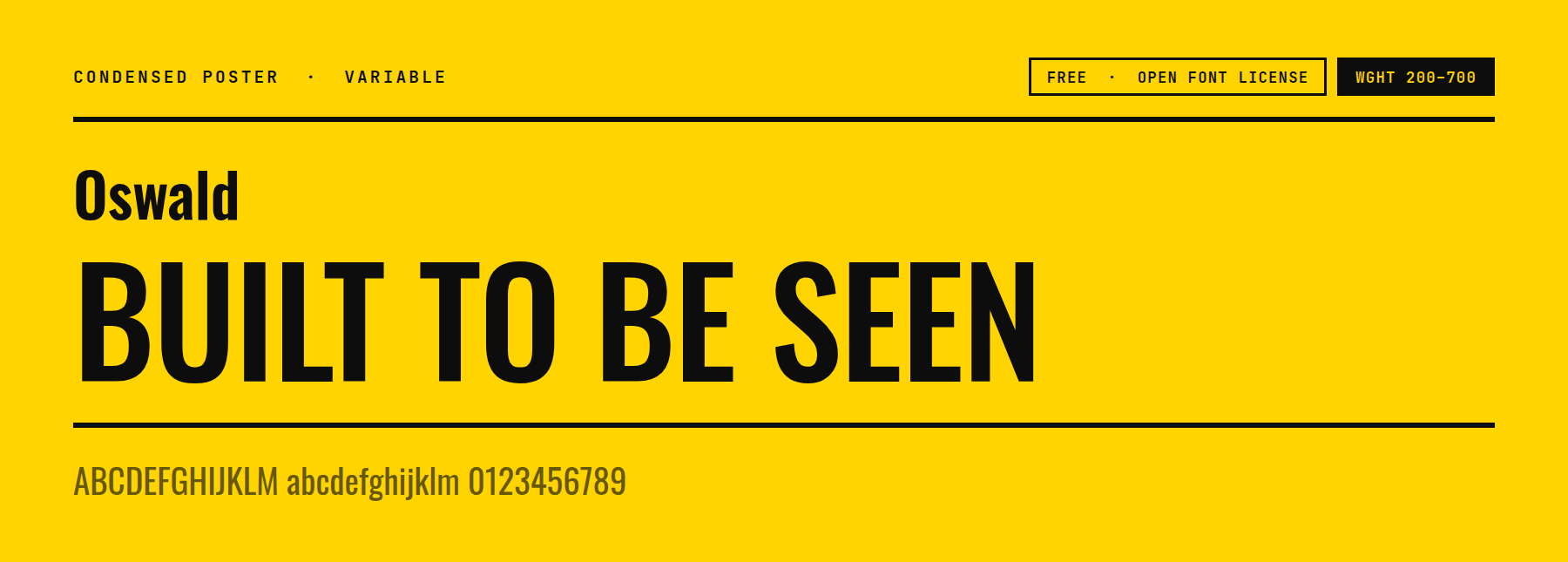
Unlike Bebas Neue, Oswald keeps a full lowercase alphabet, so it works in a condensed subheading or a nav bar as well as a poster headline. Its variable-weight axis runs from 200 to 700, a narrower range than the heavy grotesques above, which keeps it usable at body-adjacent sizes rather than only at poster scale.
Price: FREE ǀ Go to Oswald
8. Big Shoulders
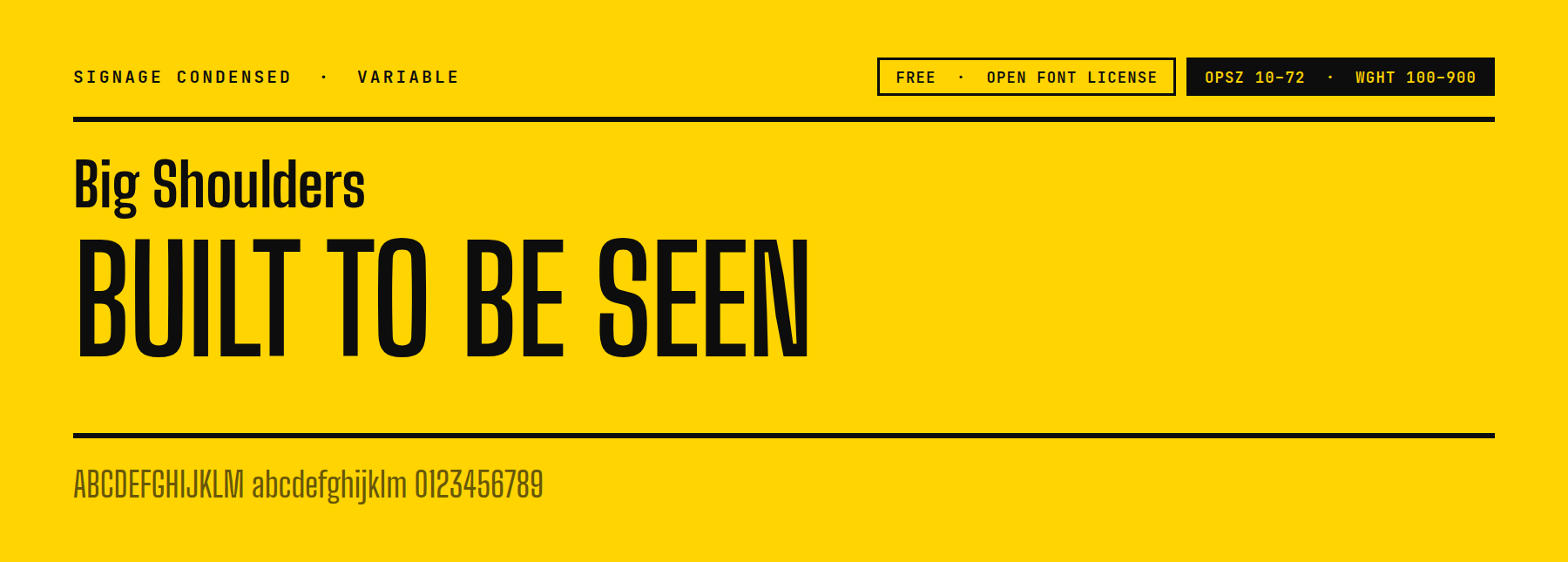
Big Shoulders carries two variable axes at once: optical size from 10 to 72 and weight from 100 to 900. The optical size axis adjusts stroke contrast and spacing to match the set size, so the same file looks right in a small caption and a large headline instead of only scaling up. No other font here carries that second axis.
Price: FREE ǀ Go to Big Shoulders
9. Ostrich Sans
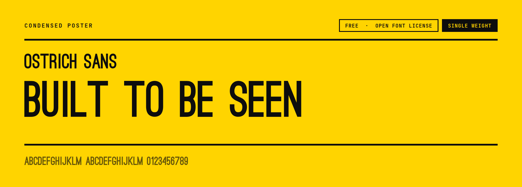
Ostrich Sans ships several separate cuts from Light to Black rather than one variable file. Choosing a weight means downloading the specific cut rather than dialing a slider. That makes it a heavier install for a project that wants the whole range, but each individual file stays small.
Price: FREE ǀ Go to Ostrich Sans
Slab Block Fonts
These pair block-weight stems with heavy square serifs instead of leaving the strokes bare.
10. Chunk
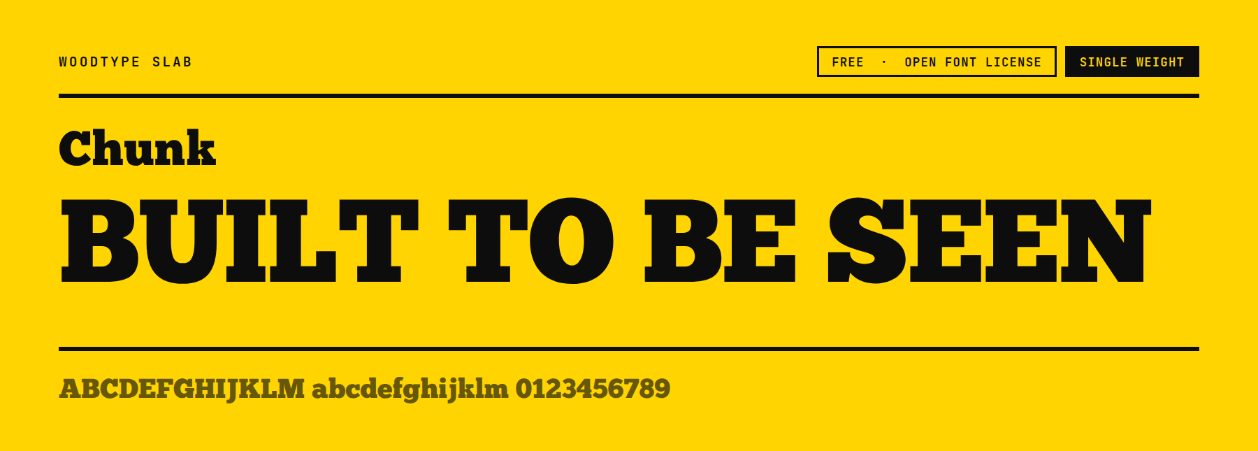
Chunk pairs a thick block stem with an equally thick square serif. It adds a second Print cut with a textured, slightly worn edge for a screen-printed look. The plain cut alone is a classic bold slab; the Print cut adds the texture without changing the letterforms underneath.
Price: FREE ǀ Go to Chunk
11. Alfa Slab One
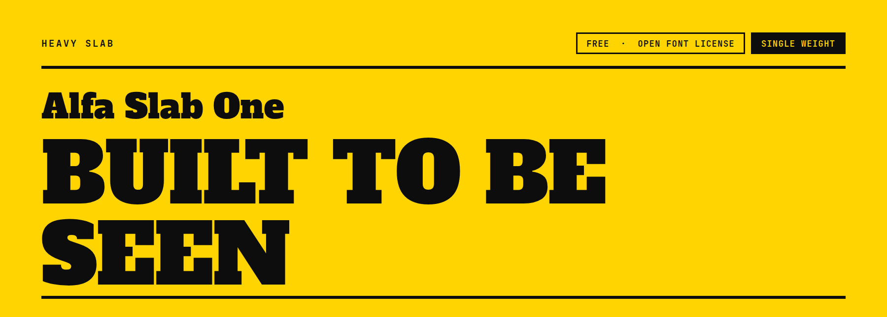
Alfa Slab One carries the heaviest overall stroke weight of the three slab fonts here, with serifs almost as thick as the stems they attach to. That makes the counters noticeably smaller than Chunk’s or Ultra’s, so they appear darkest at a glance and read best at very large sizes.
Price: FREE ǀ Go to Alfa Slab One
12. Ultra
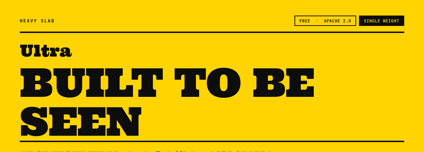
Ultra is licensed under Apache 2.0 rather than the Open Font License, worth checking if a project’s license audit specifically screens for OFL. Its serifs are thinner relative to the stem than Alfa Slab One’s, so the overall color on the page is lighter even though both are single-weight slabs.
Price: FREE ǀ Go to Ultra
Stencil And Outline Block Fonts
These break the block shape with gaps or hollow it out entirely, instead of filling it solid.
13. Big Shoulders Stencil Display
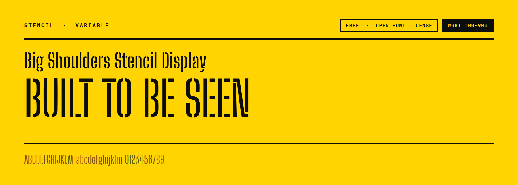
This is the stencil variant of the Big Shoulders family. It uses the same variable-weight axis, 100 to 900, rather than the fixed single weight most stencil fonts ship with. That means the gap width and stroke weight can both be dialed in for a specific headline, instead of choosing among a few preset cuts.
Price: FREE ǀ Go to Big Shoulders Stencil Display
14. Bungee Outline
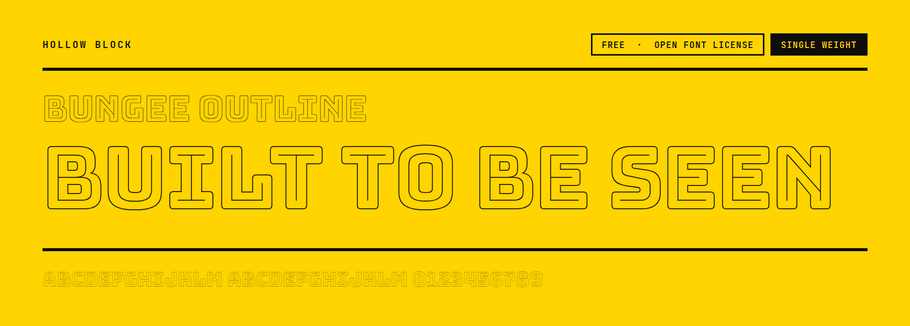
Bungee Outline draws only the outline of each letter, with no fill at all. The interior is transparent and ready to carry a background color, a texture, or a second layer of type underneath it. It is single weight, and the outline stays a consistent width across every letterform.
Price: FREE ǀ Go to Bungee Outline
15. Black Ops One
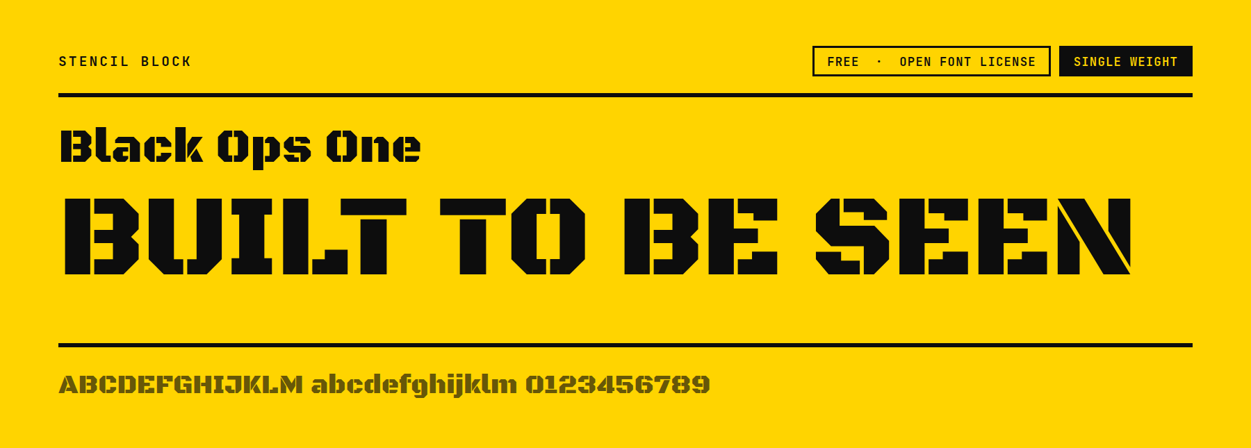
Black Ops One keeps the connecting ties inside its stencil breaks thin and deliberate, rather than leaving open gaps. The letters look stenciled at a glance but stay legible at smaller sizes than a wide-gapped stencil would. Single weight, capitals-forward design.
Price: FREE ǀ Go to Black Ops One
Signage And Display Block Fonts
These are drawn for signs, badges, and lockups rather than for running headlines.
16. Orbitron
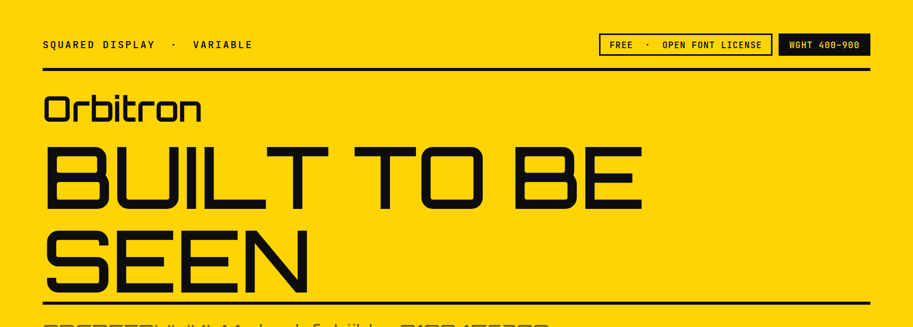
Orbitron’s letterforms feature distinct angled cuts at the terminals rather than flat ones, giving it a technical, geometric look that the other signage fonts here don’t share. Its variable weight axis runs from 400 to 900, a narrower, heavier-starting range than most of the other variable fonts on this list.
Price: FREE ǀ Go to Orbitron
17. Bungee
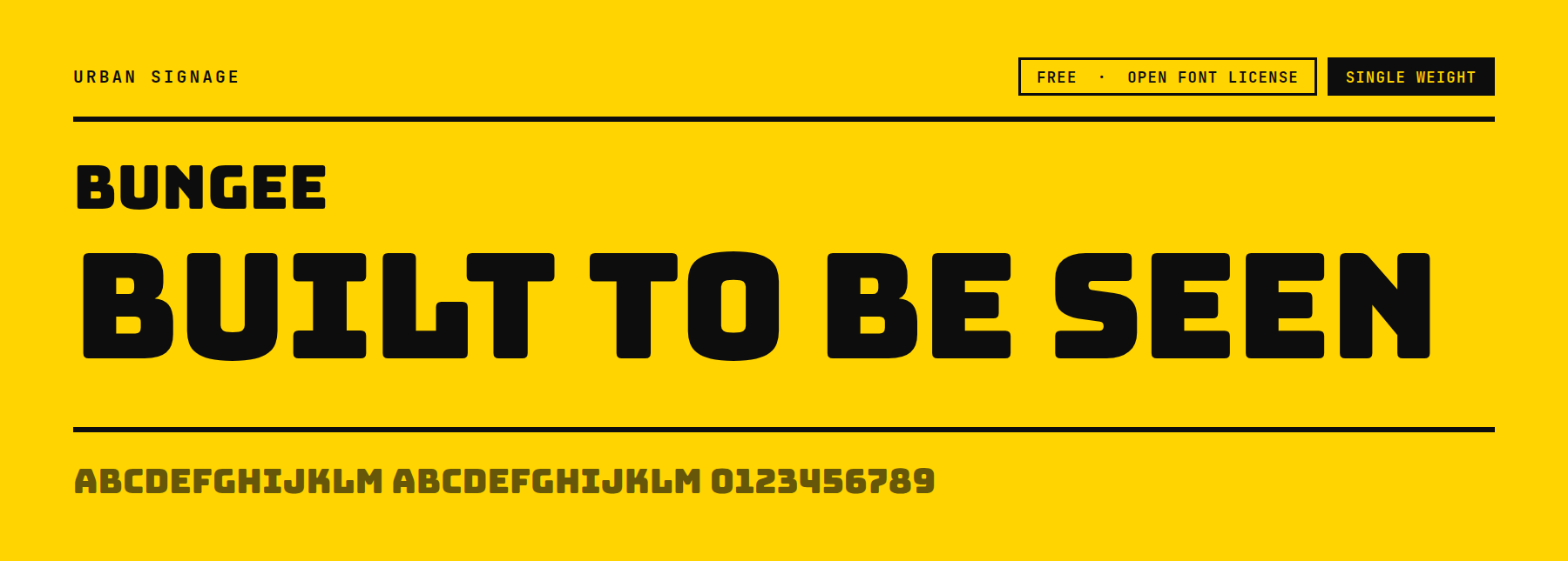
Bungee includes vertical-setting support built into the family. Letters can stack top to bottom for a marquee or a stacked sign layout without faking it with line breaks. The horizontal cut is single weight, bold and rounded.
Price: FREE ǀ Go to Bungee
18. GreatLakes
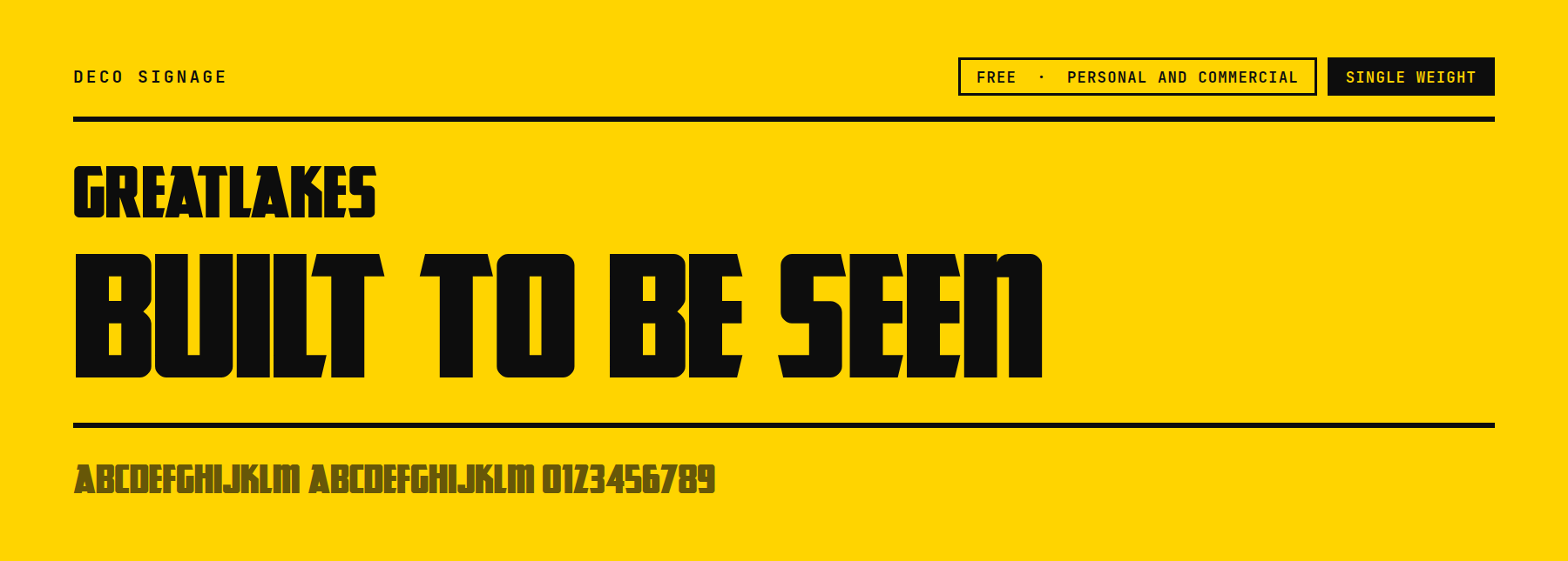
GreatLakes is licensed for free personal and commercial use directly from Font Squirrel, rather than under the Open Font License. It is worth reading the license file before a client project. Its corners are cut at a diagonal angle rather than squared off, giving it a sharper, more angular silhouette than the other signage fonts here.
Price: FREE ǀ Go to GreatLakes
Rounded Block Fonts
These keep the block weight but soften every corner instead of squaring it off.
19. Luckiest Guy
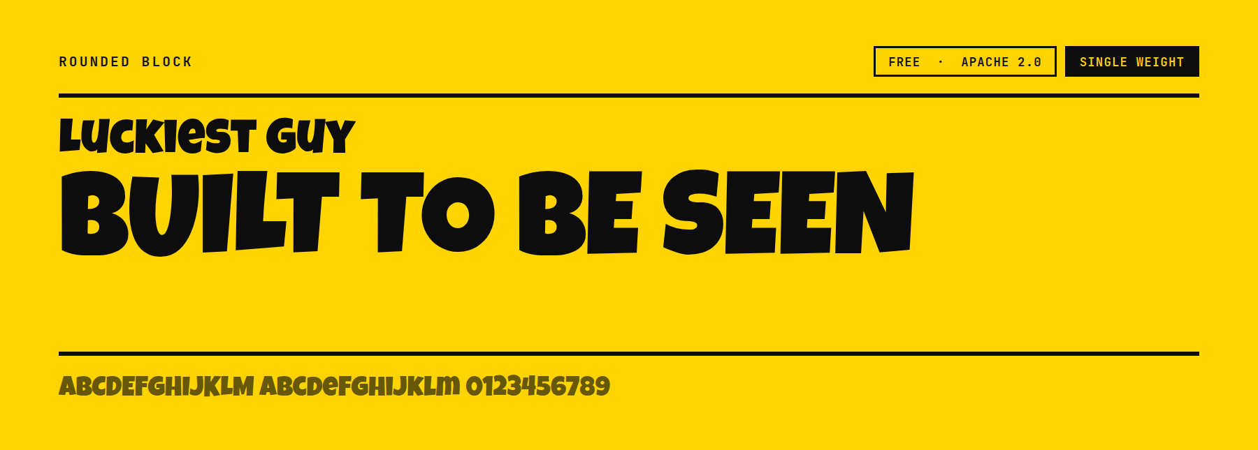
Luckiest Guy sets its baseline with a slight bounce from letter to letter rather than a perfectly flat line. This gives it a cartoon energy that the other rounded fonts here don’t have. It is licensed under Apache 2.0, and it is a single weight.
Price: FREE ǀ Go to Luckiest Guy
20. Knewave
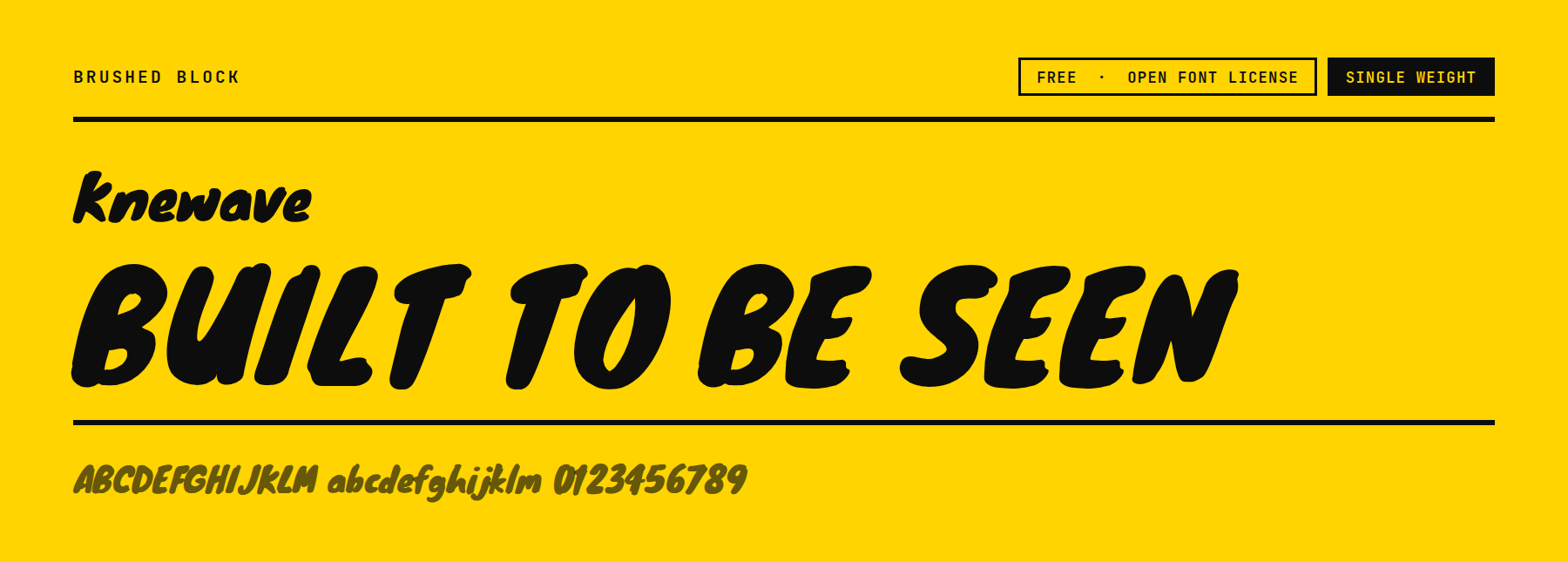
Knewave’s strokes carry a brush-like texture right at the ends, thicker and slightly uneven compared with the clean, uniform rounding on Luckiest Guy. That texture makes it look hand-drawn rather than manufactured, which suits a casual or youth-facing brand. Single weight.
Price: FREE ǀ Go to Knewave
Variable Block Fonts Cover The Whole Weight Range
Six of the fonts above are variable rather than fixed weight: Archivo, League Spartan, Oswald, Big Shoulders, Big Shoulders Stencil Display, and Orbitron. A variable font holds its entire weight range, and in Archivo’s case, its entire width range too, inside one file. Otherwise, a site ships separate files for each weight it uses.
On a real site, that means one font file loads instead of four or five, and the CSS just dials a weight or width value rather than swapping fonts between a caption and a headline. Archivo’s width axis squeezes the same headline to fit tighter spaces or stretches it to fit a banner. No second condensed font needed. See 7 Variable Font Combinations for setting-level pairings that use this range on a real page.
Three Tips For Choosing A Block Font
Keep block faces to headings and short lines. The even stroke weight and squared terminals that make a block font readable at large size become fatiguing across a full paragraph. Pair it with a plain text font for the body copy.
Check the letter-spacing before committing, especially at heavy weights. Tight spacing needs more attention on a bold block font than on a regular-weight text font. Thick strokes sitting too close together can fuse into each other at a glance instead of staying separate.
Read the license before a client project. A large share of free display fonts are personal-use-only, or they specifically exclude web embedding. A font restricted that way is not free on a site somebody paid a business to build. Every font on this page is Open Font License, Apache 2.0, or explicitly free for commercial use, and each entry says which.
Pick One And Test It On The Actual Headline
The fastest way to choose from this list is to drop the actual headline text into two or three candidates at the size it will really run, then check the letter-spacing and the weight against the body font sitting underneath it. A font that looks right in a specimen image can still crowd or gap oddly once it carries a client’s own words.




Leave A Reply