When creating a website, font choice is an important aspect of the overall look and feel of your site. Fonts need to be easy to read, but also aesthetically pleasing. If you choose the wrong font, it can disrupt the user’s experience, and actually make your content hard to read. Thanks to Google, there are plenty of font choices available to you. Since its launch in 2010, Google fonts have come a long way from its 19 font offerings. There are now over 1450 choices currently available, so picking the right fonts can be daunting. In this post, we’ll make your life a little easier by providing our list of the best Google fonts to use on your website.
What Are Google Fonts?
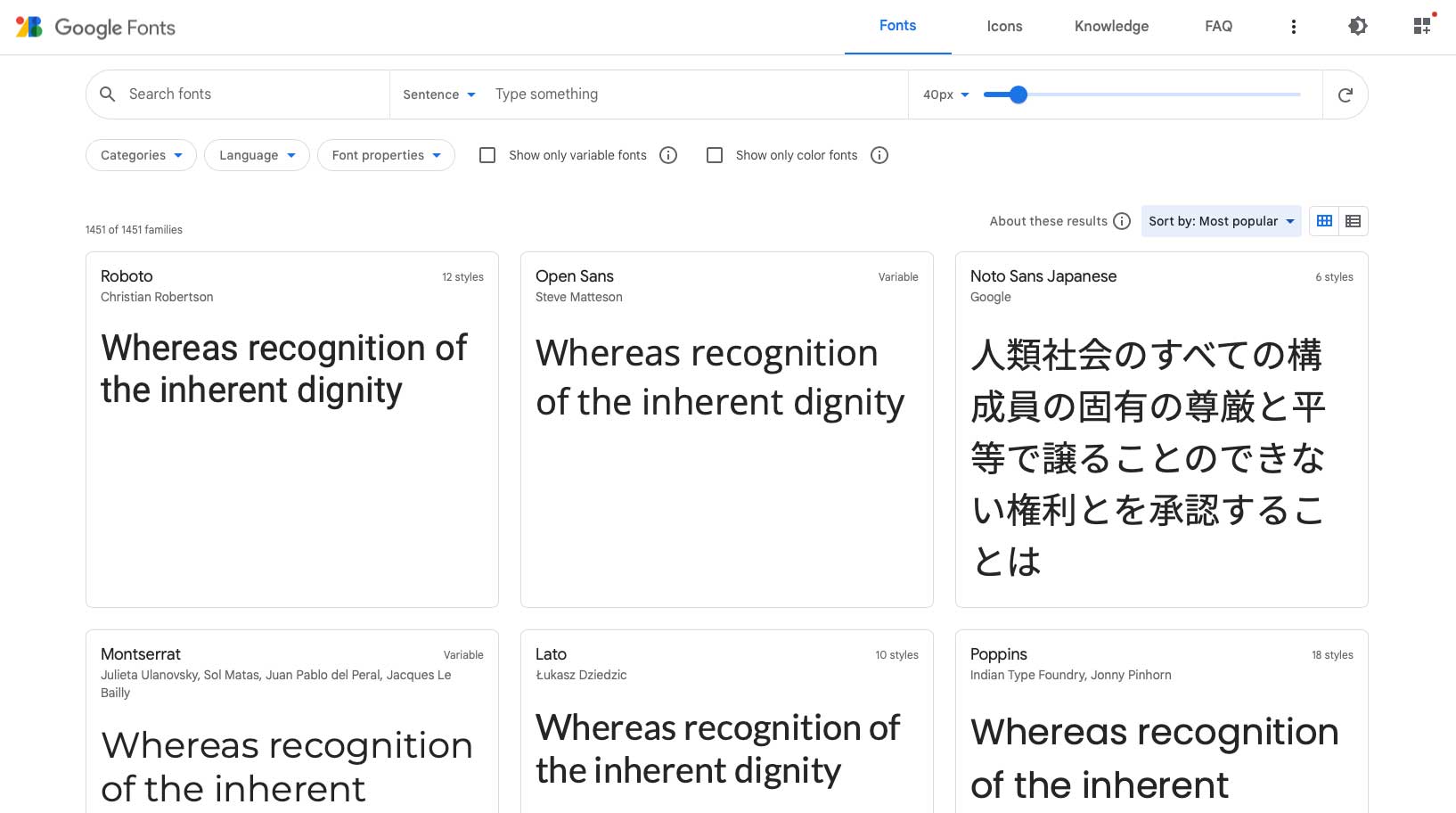
Google Fonts are a collection of high-quality web fonts for use on web projects. Additionally, all fonts can be downloaded for installation on local systems. Fonts are pulled into your website through Google’s content delivery network (CDN) and will load automatically once installed.
Why Should You Use Google Fonts?
All of the fonts are free for commercial use, so they can be used in both web and print projects. Additionally, all of the fonts are updated automatically, so there’s no need to worry about keeping things updated manually. Once installed on your site, there’s nothing more to do. As previously mentioned, there are tons of options with over 1450 font families. Lastly, Google fonts offers multi-language support, so if your site has more than one language installed, you’re good to go.
12 Best Google Fonts Available (And They’re Free!)
With so many options available, it can be a bit overwhelming to know which fonts to choose for your website. Thankfully, we’re going to help you determine the most popular and trending font families for you to use on your website. Let’s get started.
1. Roboto
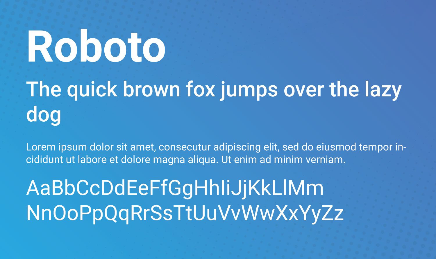
Roboto is considered a dual-purpose font, and is the most popular Google font available. Geometric in shape, it also has nice curves and is generally considered very easy to read. It has been used as the typeface for Google’s Android operating system since 2014.
2. Open Sans
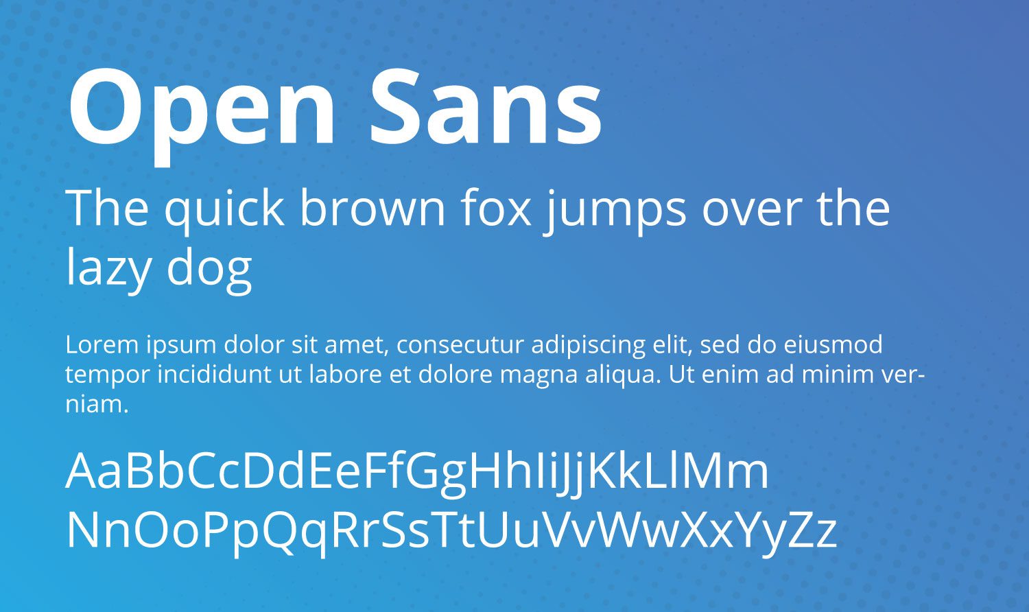
Open Sans boasts a user-friendly, ultra-readable appearance. It’s great for both headline and body texts. Because of its ease of readability, it is used as the default font in the Divi theme.
3. Montserrat
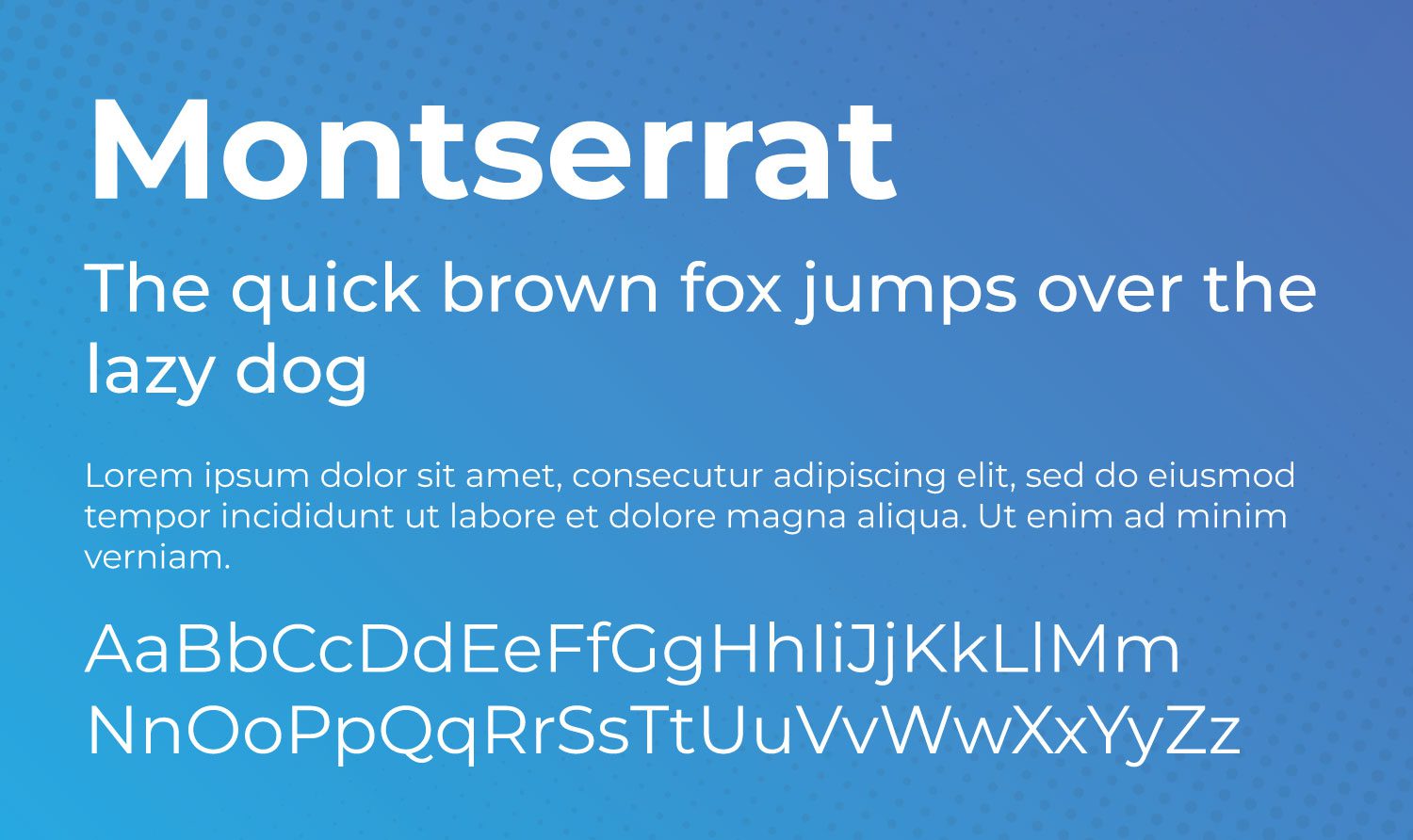
With over 30 styles, Monsterrat is quite versatile. It was inspired by artwork seen in the historic Montserrat neighborhood of Buenos Aires during the first half of the 20th century.
4. Lato
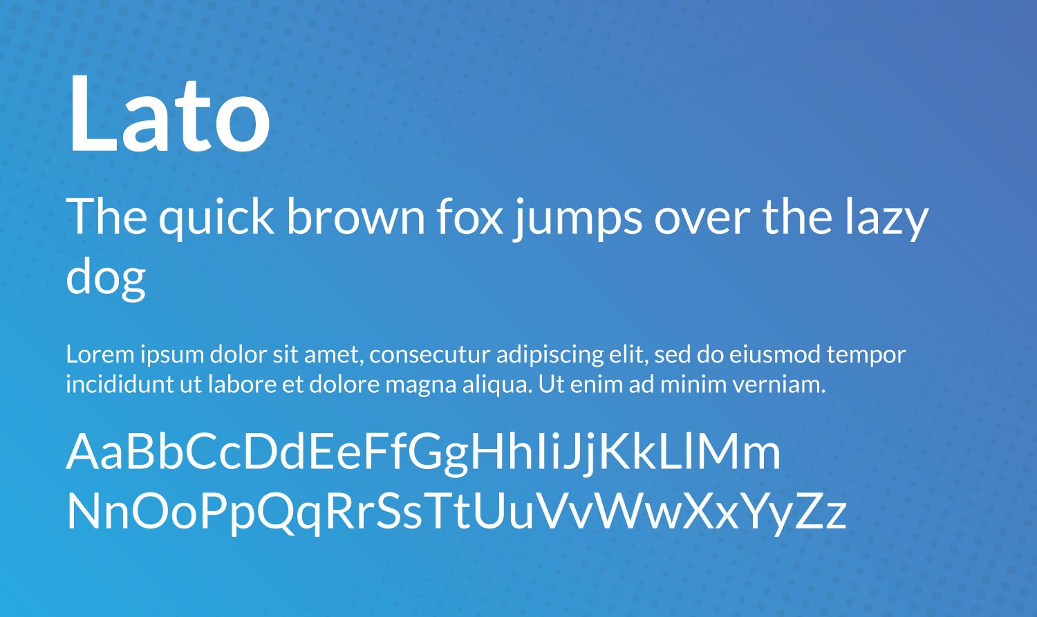
Google describes Lato as a “serious but friendly” font. Polish for summer, Lato is a multi-purpose font that is generally easy to read and invokes feelings of summertime playfulness.
Oh, and by the way, we use it on our blog.
5. Poppins
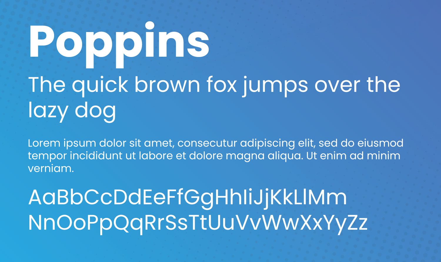
Poppins is a rounded, widely popular font that is suitable for both heading and body text. Developed in 2014 as an open-source font, Poppins is based on the Devanagari and Latin writing systems.
6. Source Sans Pro
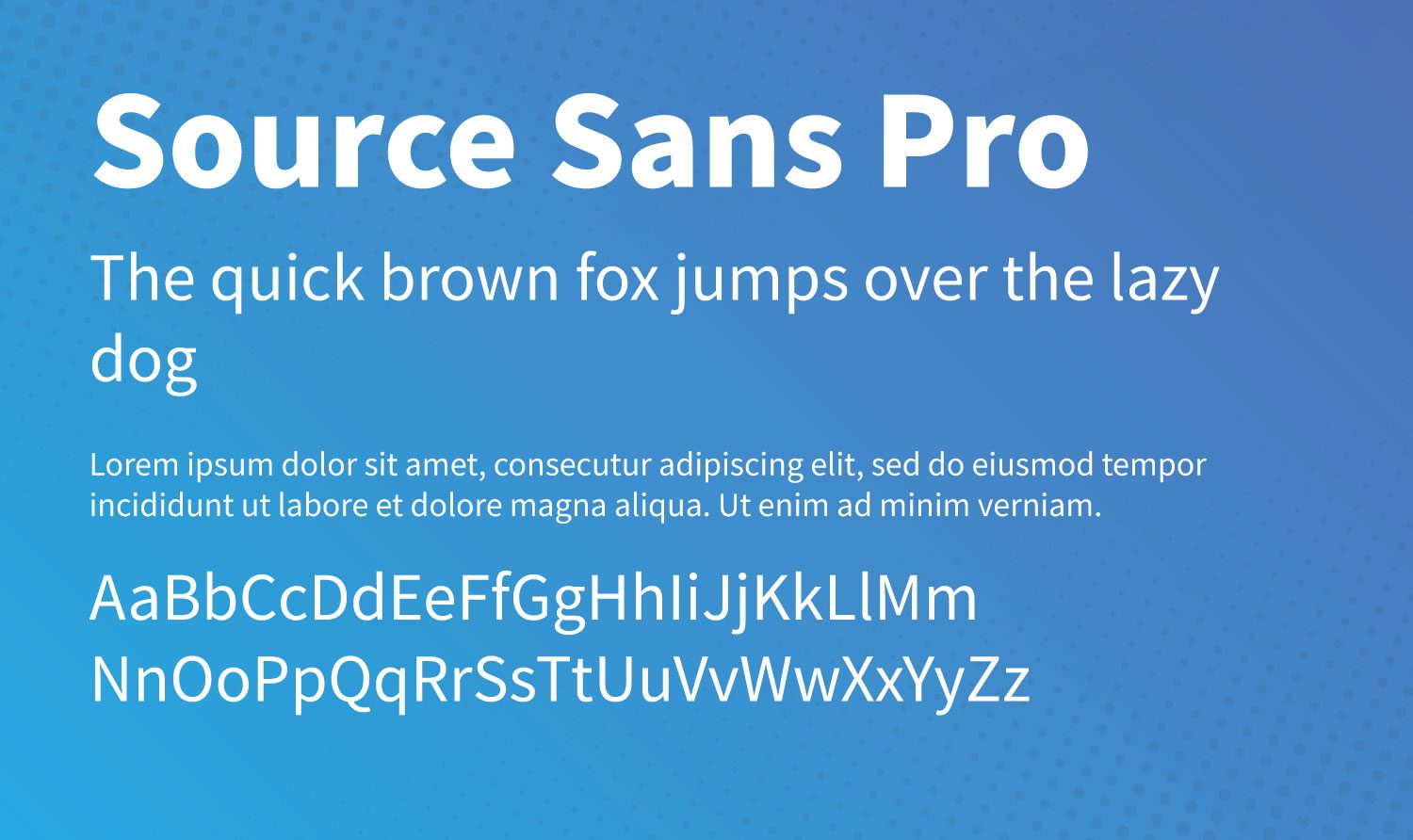
Released as Adobe’s first open-source font, Source Sans Pro is suitable for all user interface designs. It is quite versatile and pairs well with other fonts on our list such as Montserrat, Open Sans, and Work Sans.
7. Raleway
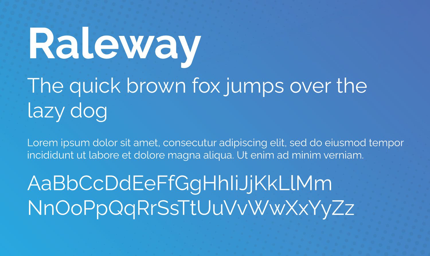
Thin and elegant, Raleway is a display font typeface well-suited for headings and subheadings. Initially developed in 2012 as a single thin font, it has expanded to include 9 variances.
8. Noto Sans
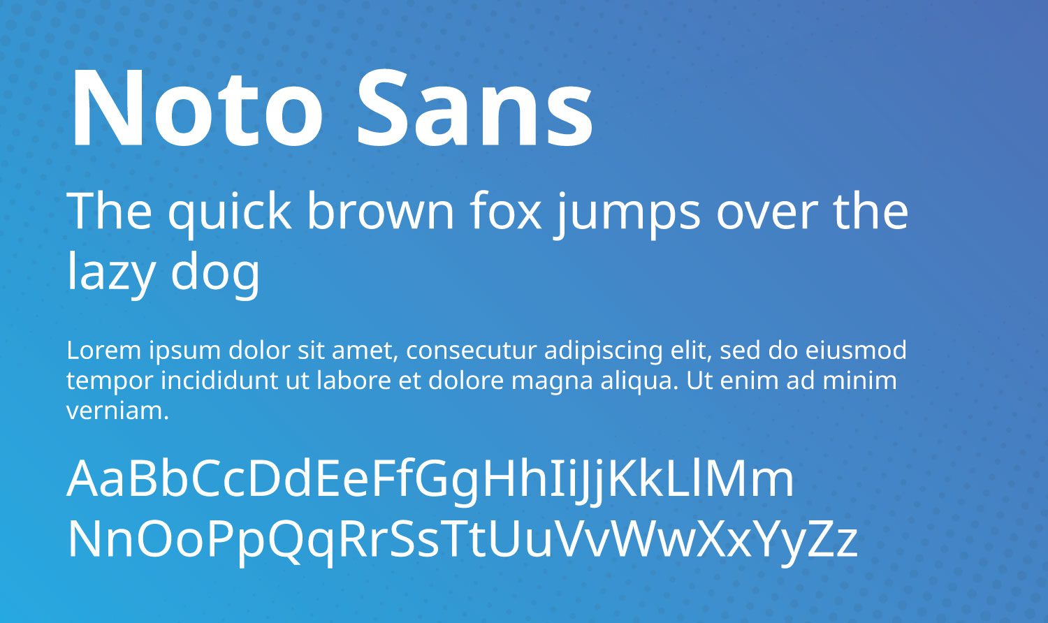
Noto Sans is quite robust with its 18 font variances. In addition, there are more than 3,700 glyphs available with this incredible typeface. With over 18 variances including multiple weights, widths, and italics, Noto Sans is suitable for just about any design.
9. Inter
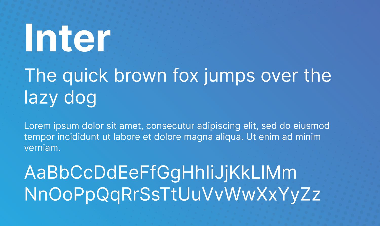
Designed specifically for computer screens, Inter is the newest font on our list. Initially released under the name Interface, Inter hit the scene in 2017. It is frequently referred to as a cross between Helvetica and San Fransisco Pro.
10. Roboto Slab
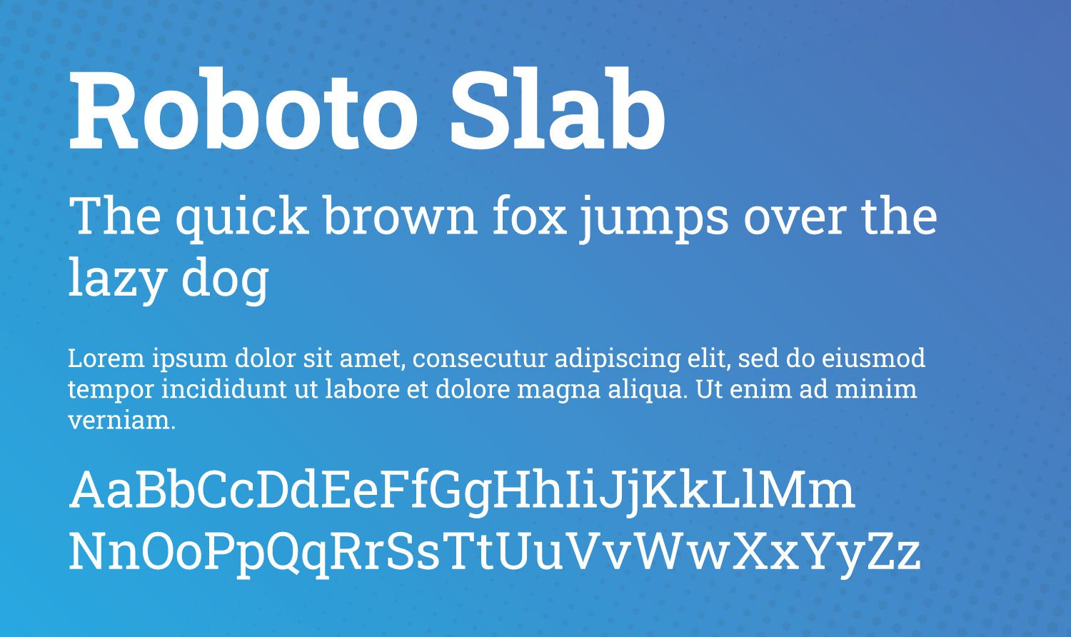
Based on the widely popular Roboto, the Slab variation is available in four weights – thin, light, regular, and bold.
11. Merriweather
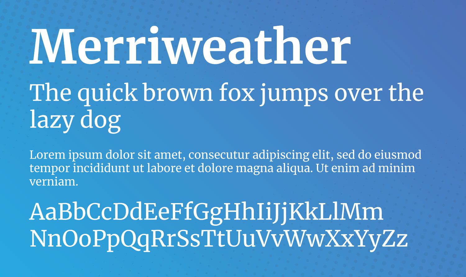
As one of the only serif typefaces on our list, Merriweather is playful, yet serious. It features tall letters that are condensed, yet easy to read on all screen sizes. There is also a Merriweather Sans font available that pairs well with its serif cousin.
12. Playfair Display
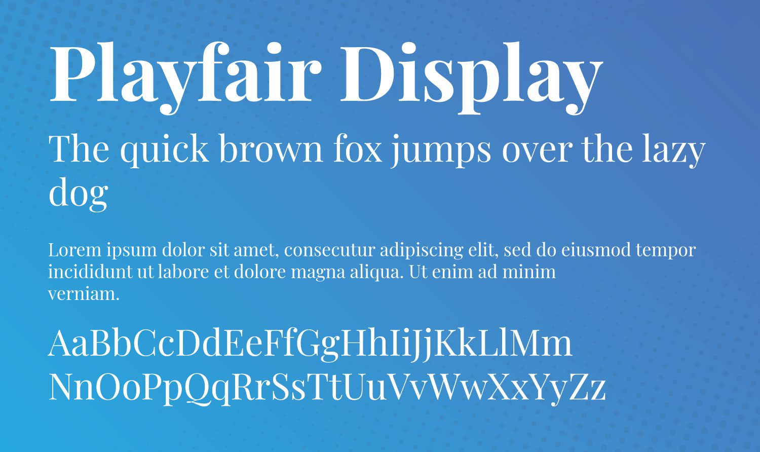
Playfair Display exudes old-world style, yet exhibits a modern flair. It’s best suited for headings due to its commanding appearance. When using Playfair Display, consider pairing it with an easily readable sans serif font such as Roboto, Open Sans, Work Sans, or Lato.
Best Practices For Using Google Fonts in WordPress
Using Google fonts is fast and easy, but some things should be considered to keep your site running smoothly and fast. To make the most of using these fonts, site optimization is key.
Only Use the Fonts You Need
When considering site speed, you should generally only use two or three font families on your site. Font families consist of all iterations of a font. For example, if you install the Montserrat family on your site, you’re installing 8 fonts. Font families contain all instances of a font type, which may include different weights (regular, medium, semi-bold, bold) and transformations including italics.
Use a Typography Plugin

It’s a good idea to use a typography plugin to manage the fonts installed on your website. Some themes such as Divi have typography management built into their framework. Typography plugins can help you manage not only your fonts, but typefaces, icons, drop caps, and more.
Choose Good Font Pairings
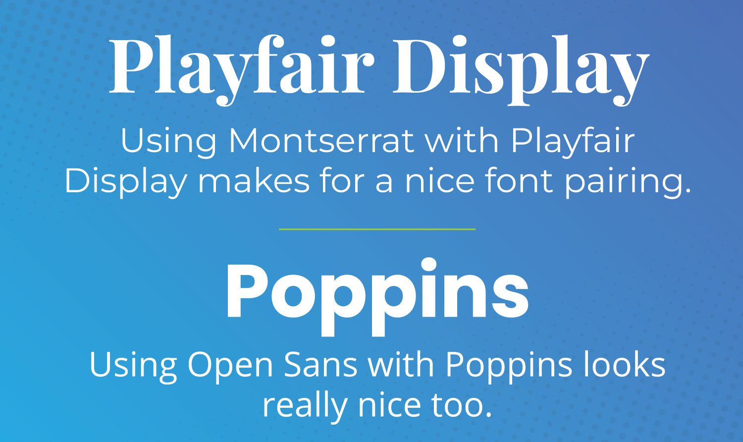
When choosing fonts, try to choose fonts that work well together. Additionally, you should pair serif headings with sans-serif body text. This is because using two serif fonts together makes your text hard to read. Alternatively, it’s acceptable to use two san serif fonts together, or even different weights in the same family. If you’re not sure what font pairings to use, you can use a handy browser extension like Fontpair to make it easier to find what fonts a website is using.
Use Self-Hosted Google Fonts
If you choose not to use a typography plugin on your WordPress site, you can host the fonts on your own server. The process is fairly simple to achieve in a few steps.
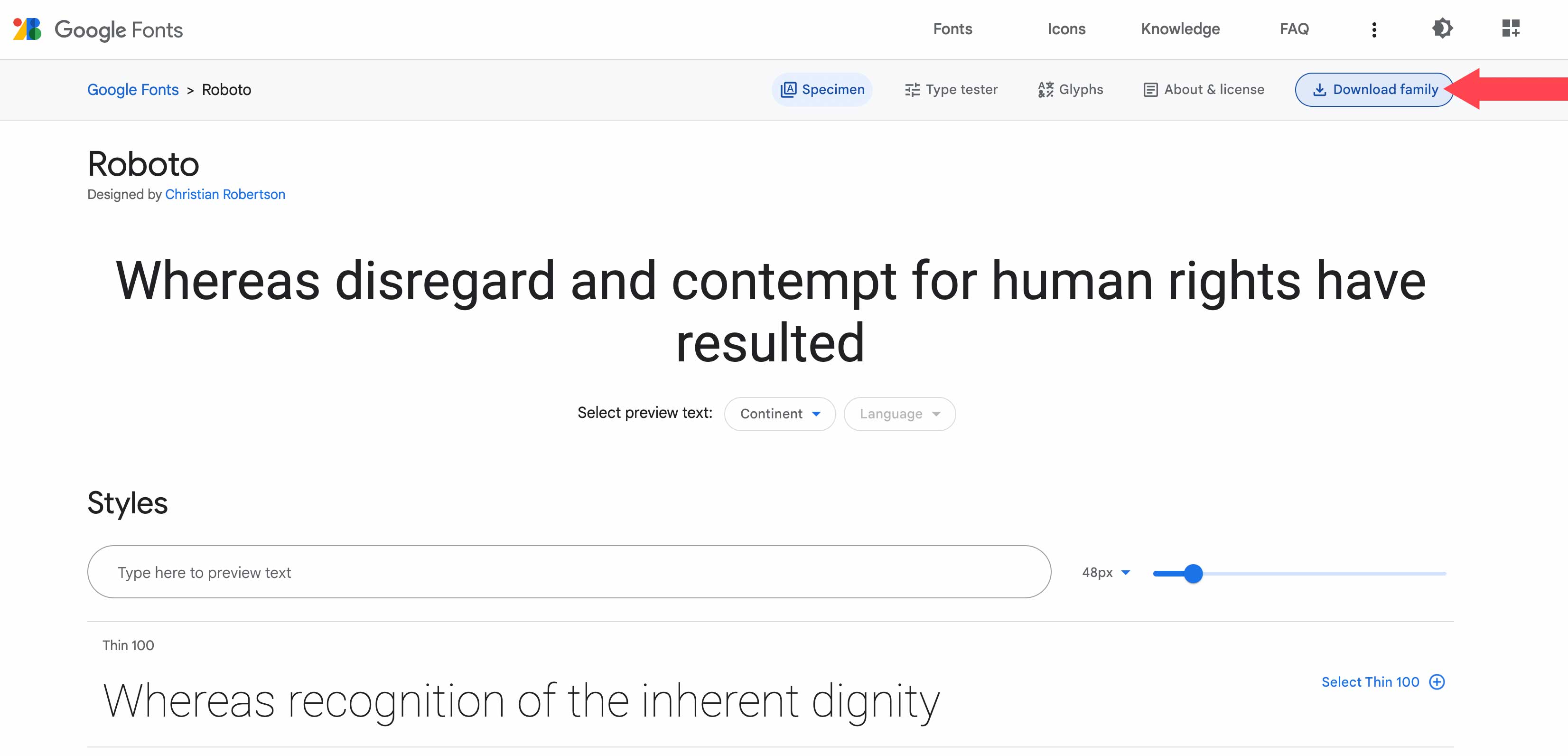
The first step is to download the font. Choose the font you’d like to download, then click the Download Family button in the top right-hand corner of your screen. Keep in mind that when you download the font from Google, you are automatically agreeing to their terms of service.
Once the fonts are downloaded, you’ll need to move them to your project. For this example, we’ll use Mamp to upload them to the Twenty Twenty theme.
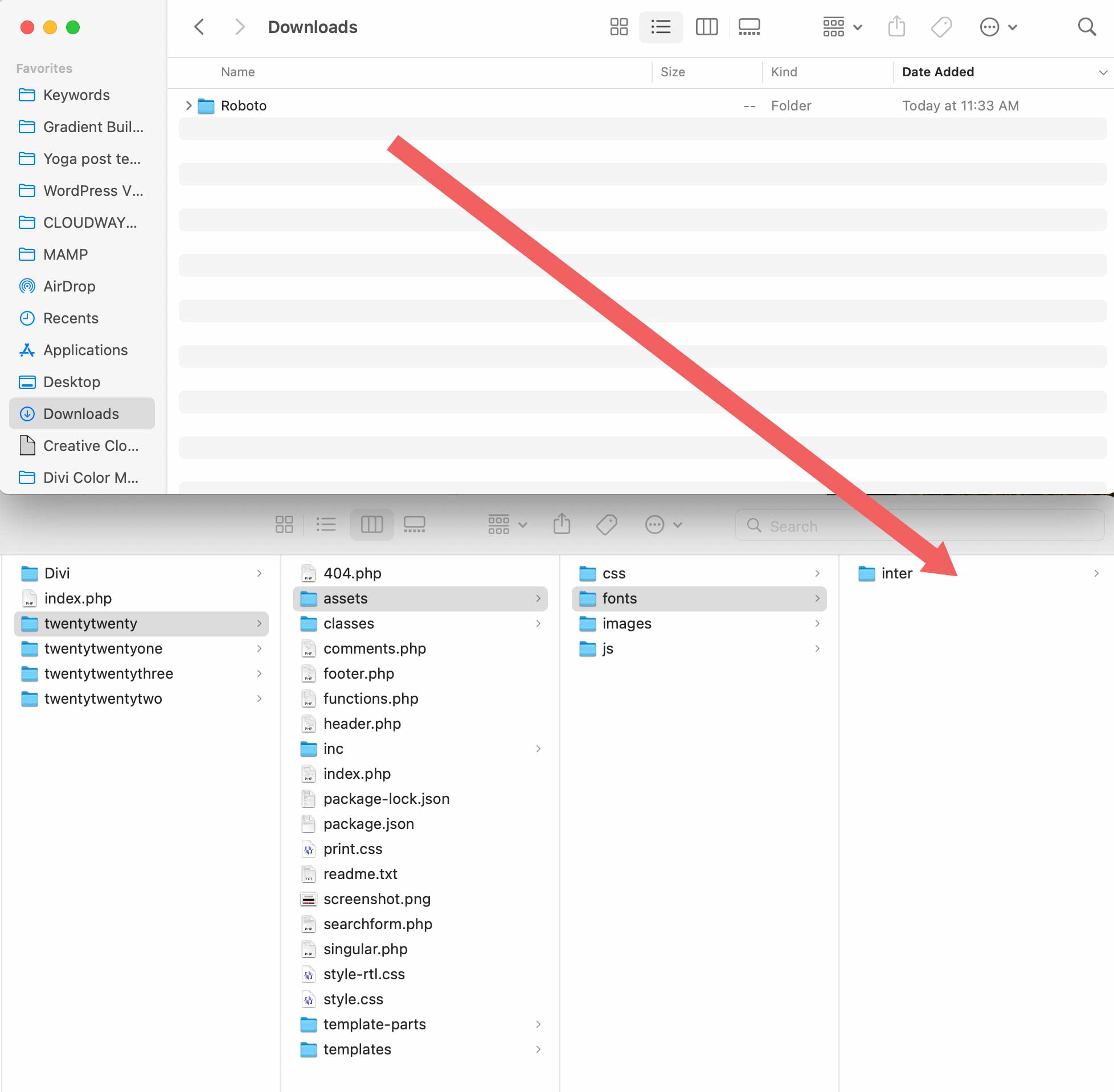
When placing the font files into your project, be sure to take note of the file location. You’ll need to add it via CSS in the next few steps. To access the fonts for your theme, navigate to /wp-content/themes/twentytwenty/assets/fonts/. If you are using a different theme, replace twentytwenty with your theme’s name. Drag your downloaded font files (including the folder) into the fonts folder on your WordPress sites.
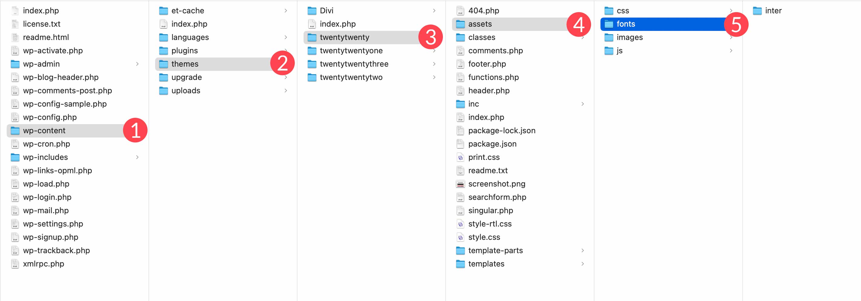
Next, locate the downloaded font and drag it into the assets/font folder of your theme.
Adding the CSS
Next, we’ll need to add a bit of CSS to the theme’s customizer for our font to be recognized. Navigate to Appearance > Customize.
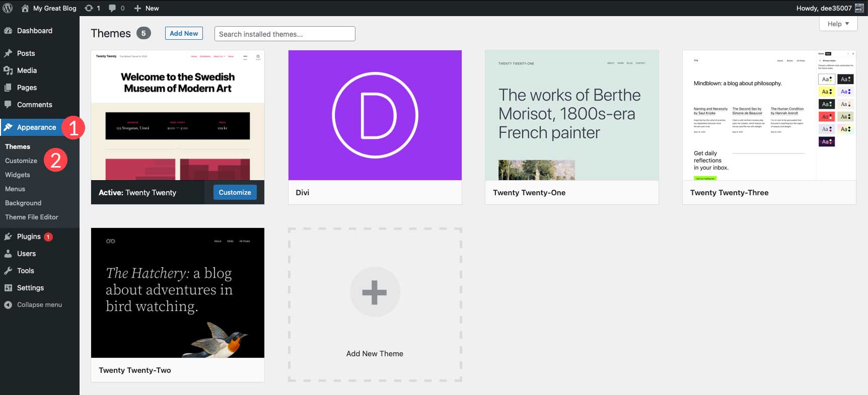
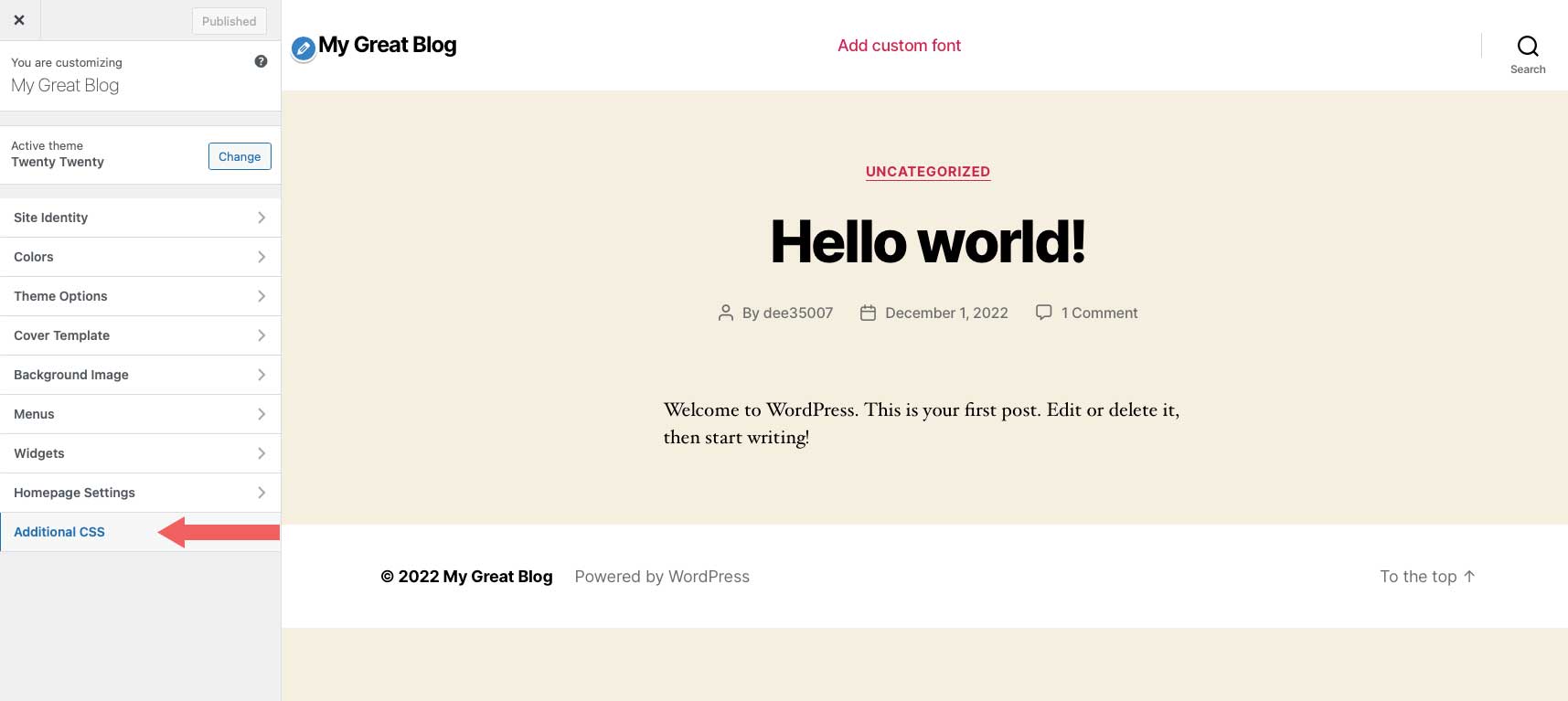
Click Additional CSS in the customizer to open the CSS input area.
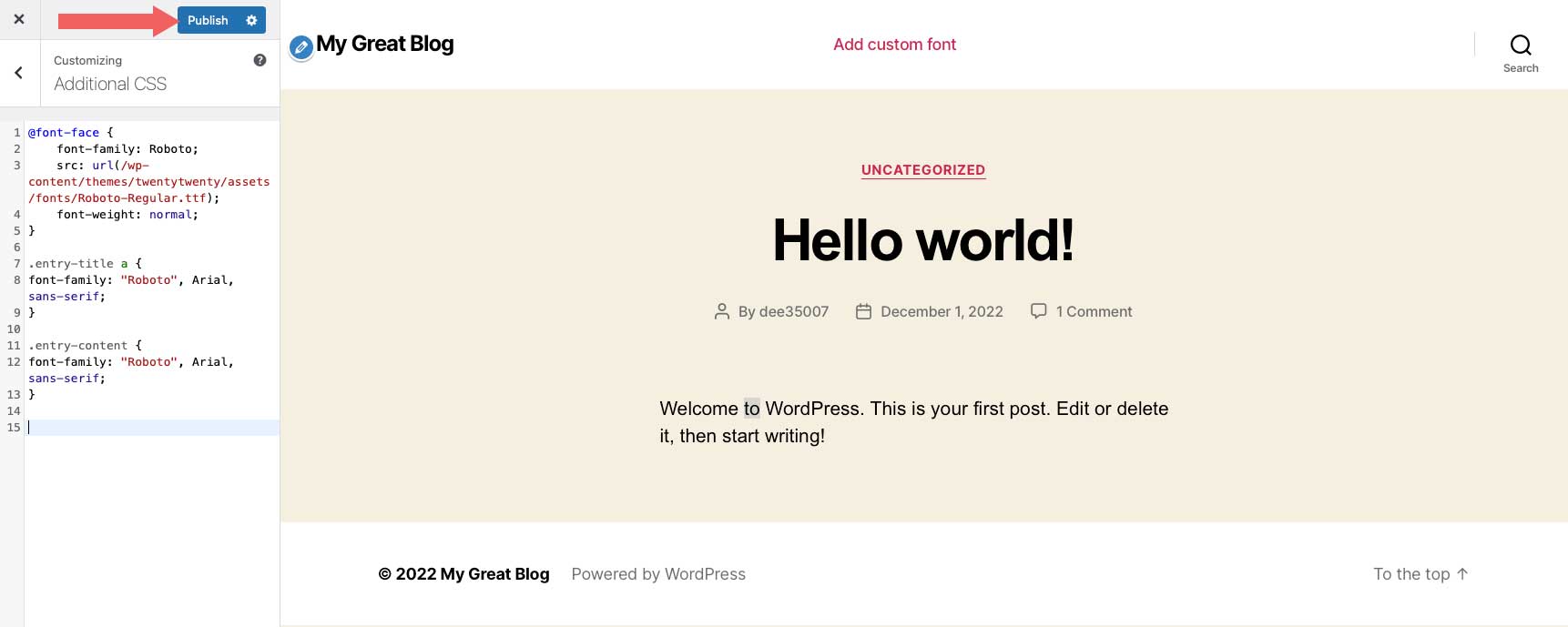
Next, add the following code into the Additional CSS area:
@font-face {
    font-family: Roboto;
    src: url(/wp-content/themes/twentytwenty/assets/fonts/Roboto-Regular.ttf);
    font-weight: normal;
}
To use your new font, simply reference the font using CSS. You can use the browser inspector tool to apply the font to whichever CSS class you like. In this example, we want the site title, as well as the page content to use our new font. For this example, input the following CSS:
.entry-title a {
font-family: "Roboto", Arial, sans-serif;
}

.entry-content {
font-family: "Roboto", Arial, sans-serif;
}
Click Publish to save your changes.
For more, check out how to use downloaded fonts in WordPress without a plugin.
Limit Font Weights
Similarly to keeping your font families down to a minimum, you should limit the number of font weights you use on your website. If you only plan on using regular, medium, and bold, there’s no good reason to include 18 variations of a font. Calling on Google to deliver extra font weights that aren’t being utilized will only increase the time it takes to load the fonts from Google’s servers.
Using Google Fonts in Divi
Divi makes Google fonts available by default. Fonts are available in any module that has text. You can choose from hundreds of web fonts from the Google font library.
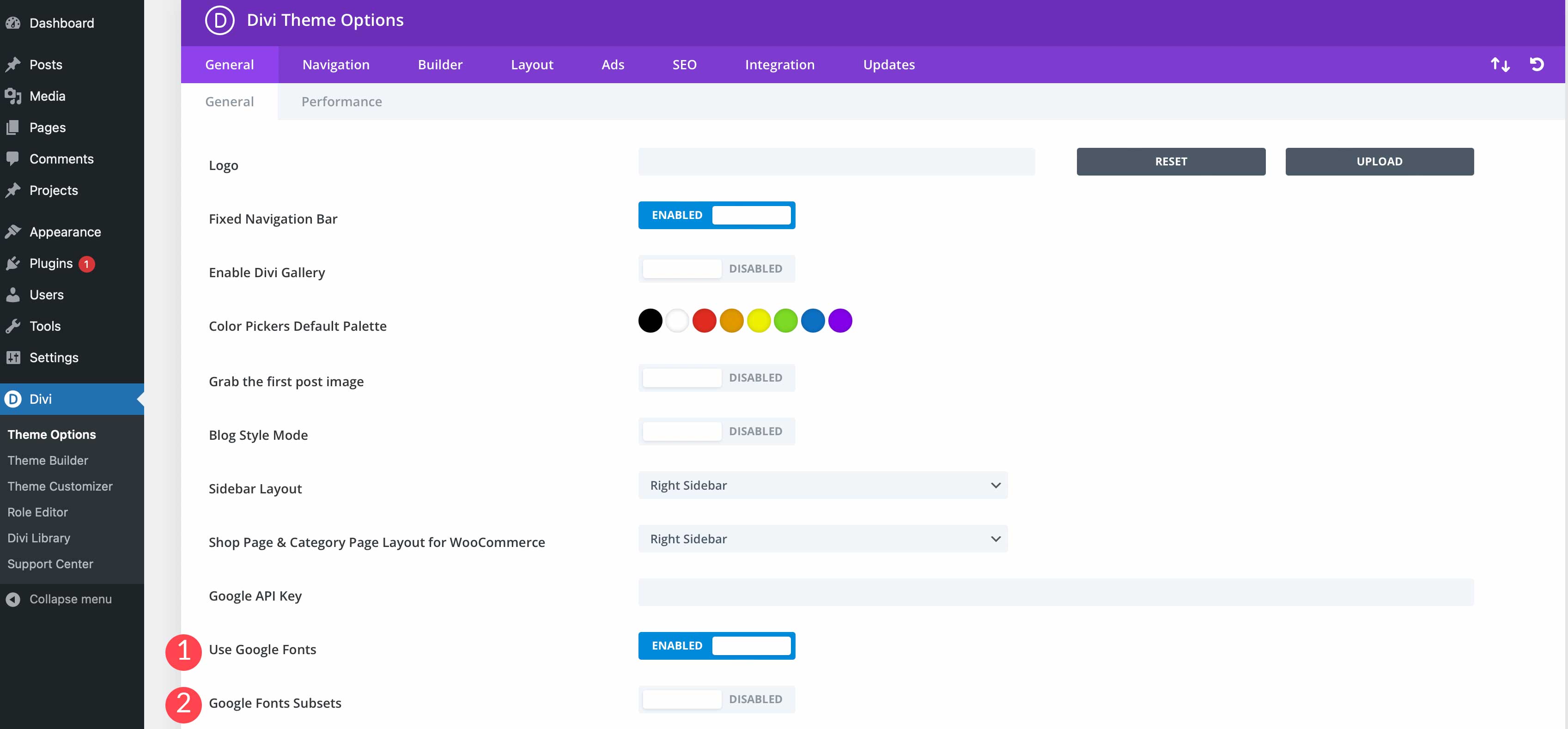
In the Divi theme options, you can choose to enable Google Fonts, along with font subsets.
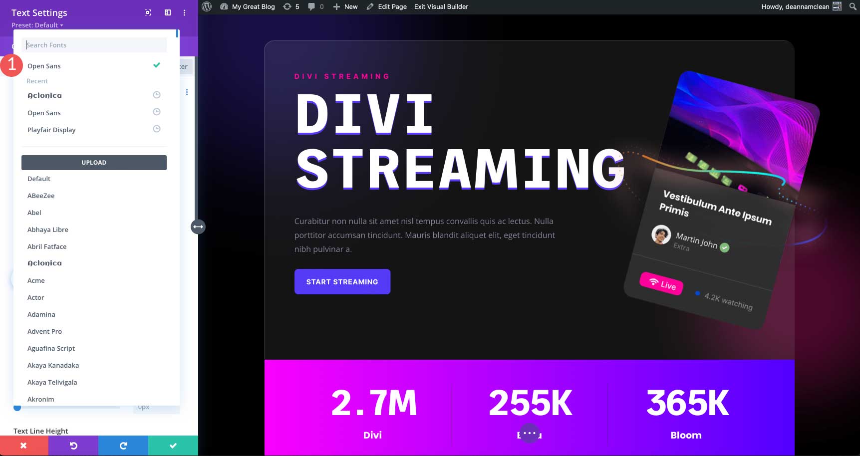
Thanks to Divi’s font search feature, it’s easy to search for and find any Google font that you wish. Another great feature of Divi is the ability to view recently used fonts at the top for easy access.
You can also enter the Google API key so that Divi stays up to date with the latest versions of fonts, as well as any new ones that are added in the Google font repository.
Final Thoughts
Picking the right font for your website can be an overwhelming process due to the many hundreds of options available to you. Just remember to pick a font that is easy to read, and looks good with the mood of your design. Pair fonts that complement each other, and try not to use too many fonts.
What are some of your favorite Google fonts? Let us know in the comments section below.



I think what else needs to be addressed here is that the local fonts downloaded/installed and fonts directly linked to a CDN (i.e., Google), the output of the fonts are different visually in weight and style (this comment is in support of both Oliver’s and Mel’s comments above). It amazes me still that Divi has a heavy reliance on the Google CDN for fonts. If compliance and pagespeed are of any factor, I would rather download the fonts locally instead of having to connect to Google’s CDN for every pageload.
What’s more, even though Divi sells the idea that you can use Presets for global settings for their modules, it’s time consuming. It was easier to use WordPress’ old Customizer to set a font and size for headings and body text: done. Then you just used Divi to fine tune certain areas. I find myself spending an hour going through all of the modules just to set “defaults” using the Presets.
It just would be nice if the mentioned fonts would work properly with Divi, because they don’t. Lets take Roboto for example. If you set the font weight to regular or medium – nothing changes in divi – they both have the same font weight (500). But it should be 400 for regular and 500 for medium. And that happens to a lot of the fonts named here. Sad to see this problem hasn’t been updated, even if it is a known bug since over 4 years.
Second of all the divi “built in” use of Google Fonts doesn’t downlad the fonts. Which means there is a connection to Google. This is highly against GDPR Compliance, if there is no active user consent. It’s crazy to not mention it in this article.
Still not fixed in December 2024. Montserrat regular and medium both show up as 500 font-weight. What is Elegant Themes doing about this ??
+1
This!!!
This post should address that Divi’s settings allow you to upload a Google font for a text module and then make it the default for all text modules, but you still need to do the same for blurbs, sliders and every other module under the sun.
Divi is in desperate need of a CENTRALIZED font management system where you upload and set the font ONCE and then you’re done. Ideally with auto-scaling depening on viewport width (very easy to do with the clamp function) and a way to handle exceptions (like changing the font size if the font is used in a 1/3rd module (make it smaller), etc.)
Divi is rather behind when it comes to this topic when comparing it to other themes out there. 🙁