

You’re on your phone, ready to purchase that product you’ve been eyeing, and the website just….loads. Suddenly, you’re tapping impatiently, wondering if your internet is broken or the site is cursed. And let’s be honest, you probably just bounce. You’re not alone.
Did you know that 53% of mobile users will abandon a page if it takes longer than 3 seconds to load? Now think of that concerning your website. That’s a huge chunk of potential customers vanishing, never to return. Slow loading times aren’t just frustrating for visitors; they hurt your bottom line. They impact your search engine rankings (SERPs) and make it harder for people to find you in the first place. In this post, we’ll show you how to control those image-heavy pages and ensure the best image size for mobile phone website speed. We’ll also introduce you to some good tools, like Divi, which help you showcase your images responsively.
Why Is Mobile Speed Important?
The impact of a slow website is more than just about being annoying. It can affect user experience (UX), search engine optimization (SEO), and your bottom line.
Imagine you’re browsing for a new summer dress or the hottest new earbuds. You tap on a website, and it feels like you’re watching paint dry. Frustration sets in, and you’ll likely bail to find another retailer with a faster site. This is called a bounce, and it’s bad news for online businesses. According to Databox, the average bounce rate is around 44%. Anything higher than that can lead to lost revenue and a lack of engagement, killing an online business.
Let’s not forget about mobile SEO. Google is all about providing the best possible user experience, including prioritizing fast-loading mobile sites. They use mobile-first indexing, which means they primarily look at the mobile version of your site when determining your search rankings.
However, the impact of poor mobile speed goes beyond frustrated users and lower rankings. It can and will hit your bottom line. Imagine a slow-loading e-commerce website built with WordPress. Those extra seconds (over 1-2 is too long) can cost you sales. Keeping your site running fast on mobile devices is imperative for revenue, so ensuring you don’t lose customers because your website is taking too long to load is crucial.
There are many ways to speed up your site, but the low-hanging fruit is determining the best image size for mobile phone website speed.
Image Optimization Basics For WordPress
Images are crucial for making your website look good and keeping users engaged. Images that are too big can really slow your website down. As we’ve learned, studies show that most people aren’t going to wait forever. So, how can you keep images looking great without sacrificing speed? Let’s explore some basics for keeping your site running fast and smoothly.
1. Choose The Right Image Format
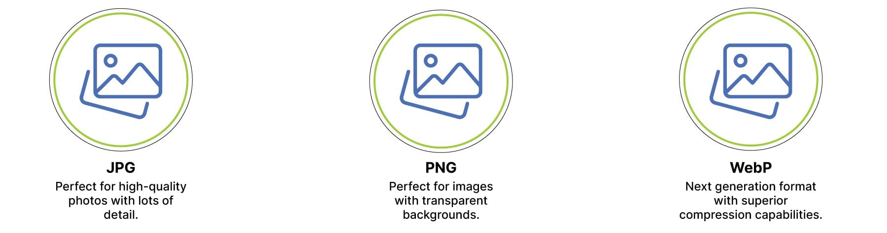
You can use several image types on your WordPress website, including JPG, PNG, and WebP. Which one is the best to use? Let’s dig deeper into each image type and which situations are best to use them.
- JPG: These are like your everyday photos. They are great for images with wide color variation and smooth transitions, like landscapes or portraits. They are good for most situations, like hero backgrounds, team photos, blog post featured images, etc. That said, JPGs can be sized inappropriately, making them larger in file size.
- PNG: PNGs are perfect for images with sharp edges, like logos or graphics with text. They’re also great for images with large images of solid color because they keep colors crisp and clean. However, PNGs tend to have a larger file size, so use PNG files for smaller areas of your design to reduce their size.
- WebP: Google’s brainchild, WebP, often offers the best compressions, resulting in a much smaller file size, even when using large images (example: 1920px x 1080px). The image quality isn’t as good as JPG, but the difference in size between the two is significant.
2. Resize Images
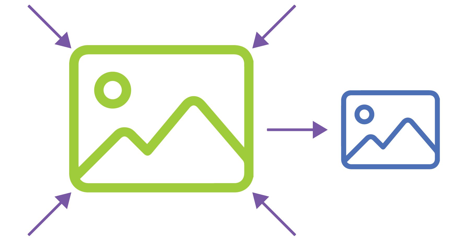
Image size matters. To keep the size down, upload images that are only as big as needed on your website. There’s no need to upload a giant image and then shrink it. It creates extra work for you and will slow your website down.
It’s important to remember that one size doesn’t fit all regarding images. Does a visitor on a smartphone need a huge image designed for a larger desktop screen? They don’t. Use responsive images when possible to deliver a perfectly sized image for every screen size. We’ll go over this more later, but one of the best ways to ensure your images are responsive for WordPress is by using a WordPress theme, like Divi, that allows you to upload images for every browser breakpoint, keeping file size down.
3. Squeeze Out The Unnecessary
When it comes to image size, smaller is better. When using images in WordPress, we want to make images as small as possible without sacrificing quality. You can use compression tools like image optimization plugins to do the heavy lifting for you. Tools like EWWW Image Optimizer are good, but we’ll dive deeper into tools later in this post.
Many WordPress plugins and online image resizing tools use lossy or lossless compression to reduce images’ size. Lossless compression is like carefully folding a piece of paper — you can unfold it perfectly and get the original back if needed. It’s great for images with sharp edges but might not always result in the biggest file size reduction.
On the other hand, lossless compression is a bit more aggressive. It’s like crumpling up that same piece of paper. You might lose a bit of detail, but you’ll get a much smaller file size.
4. Load Images When They’re Ready To Be Seen
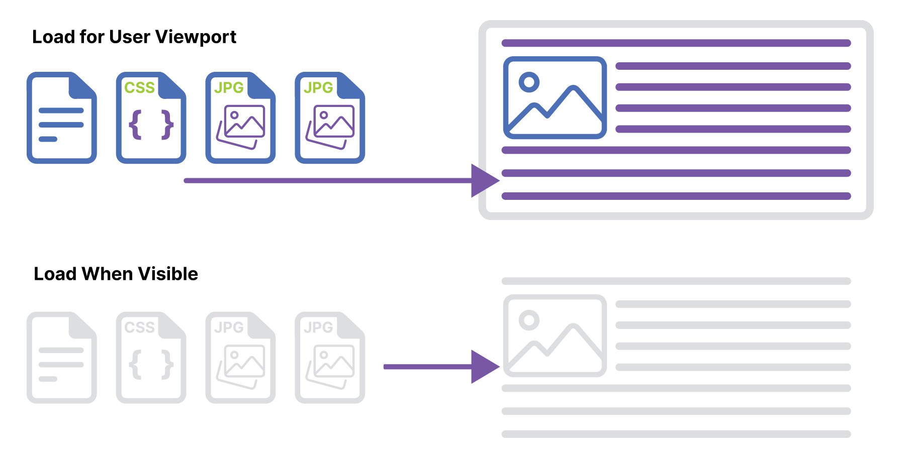
Another step you can take is to lazy load images on WordPress. Imagine scrolling down a long page. Do you really need to load all the photos at once? Probably not. Lazy loading only loads images you need to view the page, putting the ones farther down the page waiting to load once you get to them. Plugins, like WP Rocket, can easily add lazy loading to your WordPress website. It will speed up initial page load times, which is imperative for keeping your visitors happy and your page size down.
Image Dimension Best Practices
When it comes to image dimensions, there are a few key practices to keep in mind to ensure your website loads quickly and looks great on all devices:
Use Responsive Image Sizes
Different devices have different screen sizes and resolutions, so a one-size-fits-all approach won’t work. For example, a desktop might need an image sized at 1920px wide, while a mobile device only requires 600px wide. You can serve the right size for each device by using responsive images. Tools like the secret attribute in HTML or a responsive WordPress theme can keep pictures contained within the div to deliver the appropriate image size based on the user’s device.
Aspect Ratio Matters
Maintaining a consistent aspect traitor across your images can help avoid distortion or weird cropping. For example, if your desktop image has a 16:9 aspect ratio, the mobile version should maintain the same ratio, even if it’s a smaller image. This ensures that your images look proportionate and professional across all screen sizes.
Avoid Over-Sizing
Uploading larger than necessary images is a common mistake that can slow down your website. For example, if your website’s content area is only 1080px wide, uploading a 2000px wide image is unnecessary. Oversized images consume bandwidth and storage, leading to slower page load times. Always resize images to match the maximum dimensions displayed on your site.
Test Across Devices
Even with the right dimensions, images can behave differently on various devices and browsers. Always test your images on multiple devices — desktops, tablets, and smartphones — to ensure they look sharp and load quickly. Tools like Google’s Mobile-Friendly Test or your browser’s developer tools can help you find and fix image issues for all screen sizes.
Consider Image Compression
Even with the correct dimensions, images can still be too big. Compression tools can reduce file sizes without sacrificing quality. For example, a high-quality JPG or WebP image can be compressed to load faster while still looking great. Combining proper dimensions with compression ensures your images look good and keep your page size minimal.
What Are The Best Tools For Sizing Images In WordPress?
There are a few ways to easily resize images for WordPress: with a plugin, built-in features of a premium theme like Divi, or with Divi AI. Let’s explore these more so you’ll better understand what they do.
1. WordPress Plugins
Using an image optimization plugin is one of the best ways to resize images. They typically allow you to perform actions like bulk-optimization of images or resizing images as they are uploaded to the WordPress media gallery. Many also offer advanced features like WebP conversion, lazy loading, and various levels of image compression.
- EWWW Image Optimizer: A robust option with features like bulk optimization, background optimization, and conversion to WebP format. EWWW Image Optimizer offers a free plan with limited usage and paid plans starting at $8 per month.
- ShortPixel: Known for its excellent compression algorithms and ability to significantly reduce image file sizes while maintaining quality. ShortPixel offers a free plan with limited usage and monthly plans starting at $9.99 monthly.
- Optimole: Emphasizes speed and performance. Uses a cloud-based system for image optimization and delivery. Optimole offers a free plan with limited usage and paid plans starting at $22.99 monthly.
- WP Smush: A popular and highly-rated option. Smush offers free and paid plans (starting at $3 per month) with features like automatic optimization, lossy/lossless compression, lazy loading, and WebP conversion.
- Imagify: An AI-powered plugin that focuses on high-quality compression with minimal loss. Imagify provides a free plan with limited usage and paid plans starting at $11.99 per month.
2. Divi (WordPress Theme & Page Builder)
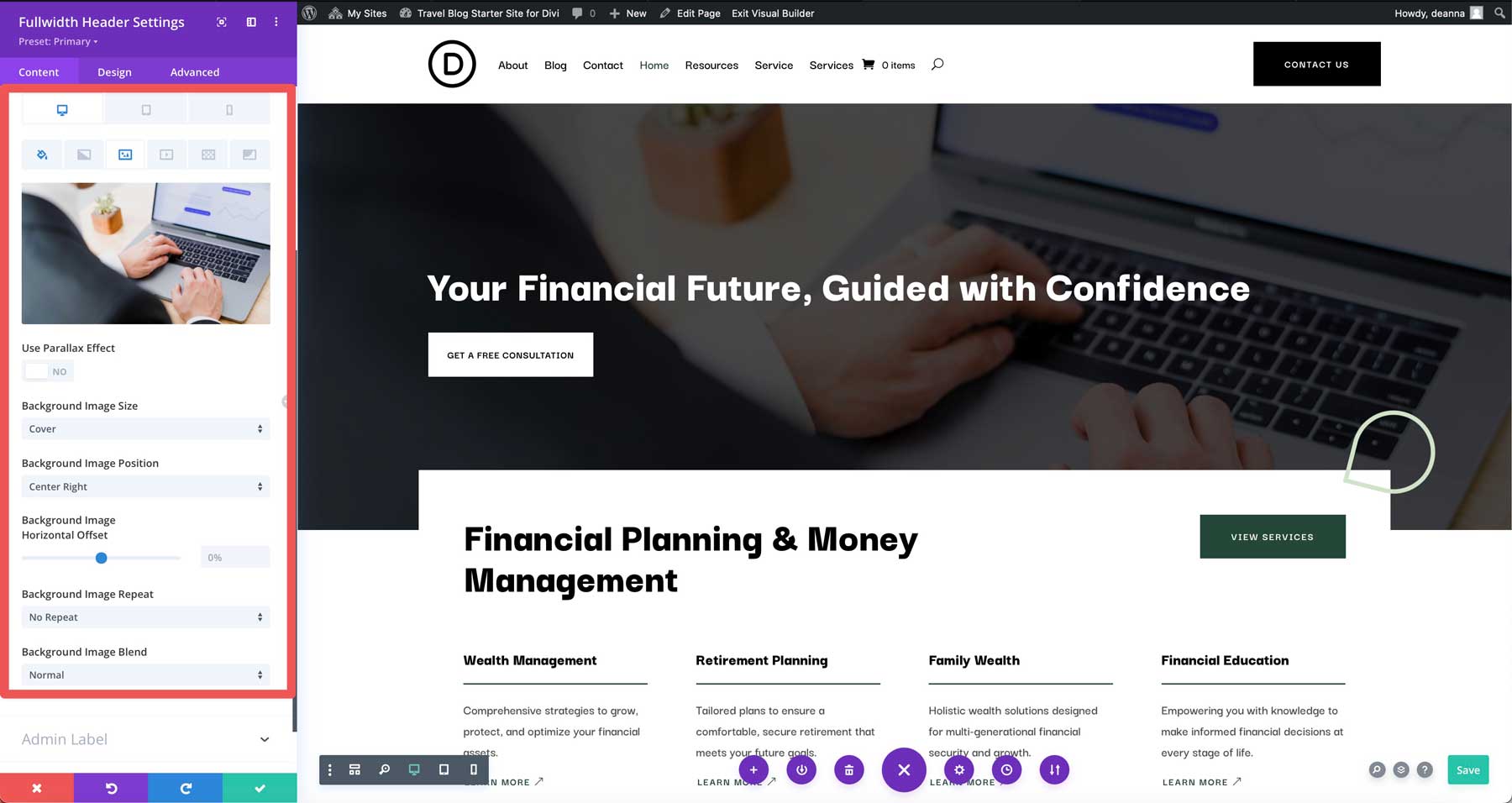
Divi is more than just a WordPress theme — it’s a complete framework for building responsive websites. It provides a robust front-end Visual Builder with responsive controls that allow you to use the best image size for mobile phone website speed.
Divi handles mobile image sizes through its responsive editing system and design settings. When you add images in Divi, you can set different images for desktop, tablet, and mobile views. This is part of Divi’s responsive design features, allowing you to optimize images for each device type. You can adjust settings such as size, position, horizontal offset, and more, specifically for mobile devices, ensuring your images look perfect across all screen sizes.
Changing Images For Smaller Screens
Within any design module that contains an image, Divi’s responsive controls allow you to display one background image for a desktop while a different one is shown for tablets and mobile devices. For example, while editing a hero section on a Divi website, you can add a background image measuring 1920px x 1080px, which is the perfect size for large screens. Viewing the same image on a mobile device may not look as good, depending on the image used. Therefore, Divi includes settings allowing you to add a smaller background image (or a different image entirely) for smaller screens.
Background Positioning
Divi also lets you control how background images are positioned on different screen sizes. Every module, column, row, and section has these controls, making it easy to ensure an image looks great no matter what device visitors are using.
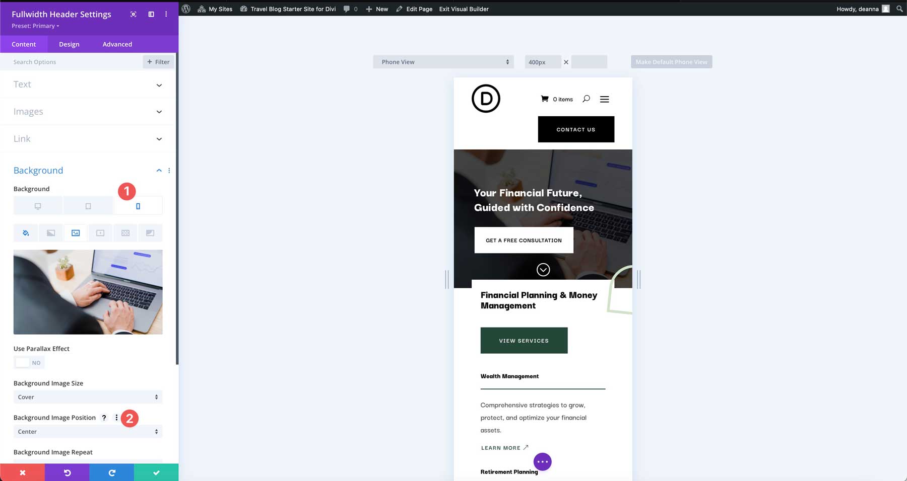
For example, you can set a background image centered on a desktop but reposition it to the top or bottom on mobile devices. This ensures that the most important part of the image is always visible, no matter the screen size. This is a great way to utilize one image and keep page size at a minimum.
Divi Has Built-In Lazy Loading
When you add images or backgrounds using Divi, the theme takes care of the heavy lifting by automatically applying lazy loading. Images won’t load until the user scrolls to that section, keeping your page snappy and responsive. Divi leverages HTML attributes supported by modern browsers, ensuring images are deferred with minimal processing overhead. The result is faster page speeds and a smoother user experience. By reducing the number of images loaded upfront, Divi helps improve key metrics like Largest Contentful Paint (LCP) and boosts your Core Web Vitals performance.
To learn more about using images within Divi, check out our Ultimate Guide to Using Images Within Divi.
3. Divi AI
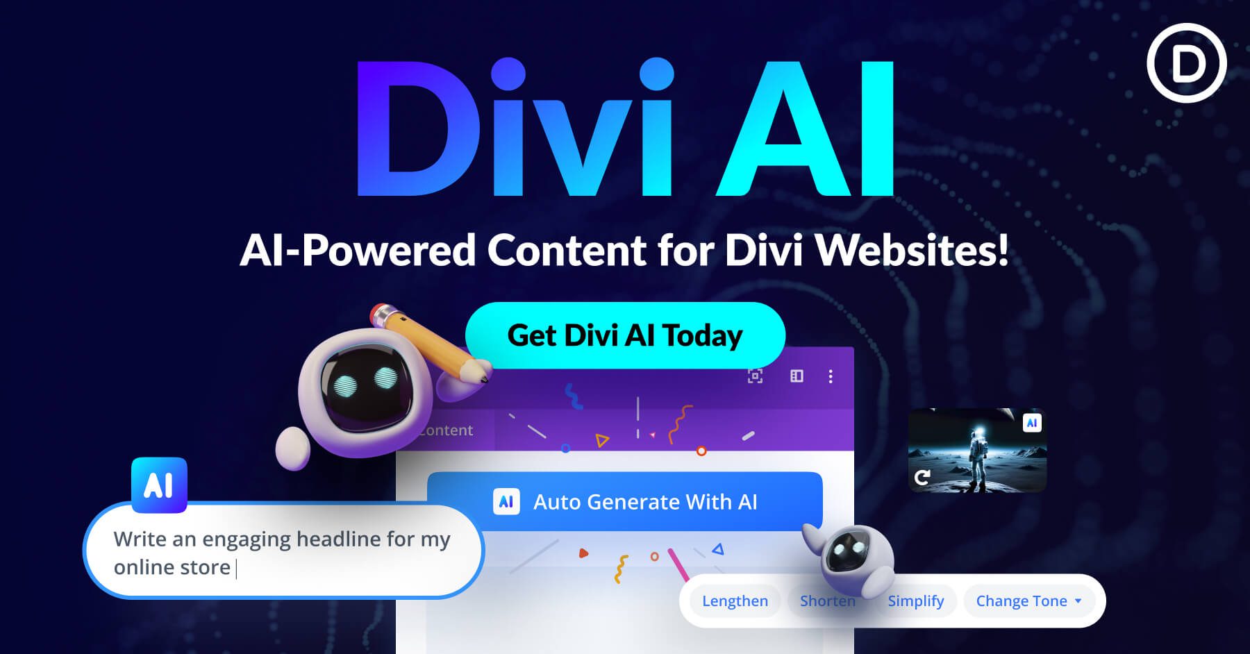
Another way you can use Divi to ensure the best image size for mobile phone website speed is by using Divi AI to generate perfectly sized images. Divi AI is like a personal design assistant for your websites. A text prompt can generate text, code, web pages, full websites, and pixel-perfect photos.
For example, you need an image for a majestic snow-covered mountain range for a snowboard rental business. You’ve scoured royalty-free stock image sites but can’t find what you want. Divi AI can generate that image for you with the size you specify.
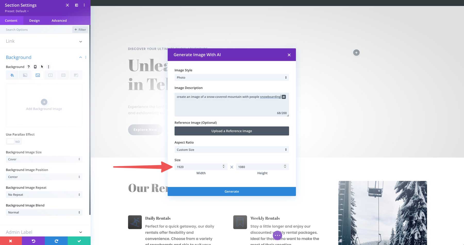
And thanks to Divi’s responsive controls, you can also use Divi AI to generate images for smaller screens.
Divi AI doesn’t just create beautiful images. It creates smart images. You can tell Divi AI exactly what size you need, and it delivers.
Divi Makes Resizing Images For Mobile Websites A Breeze
| Tool | Starting Price | Purpose | ||
|---|---|---|---|---|
| 1 | Divi | $7.42/month | A powerful WordPress theme that allows you to create web pages with ease. | Visit |
| 2 | Divi AI | $16.08/month | Generate text, images, code, web pages, and full websites with Divi's AI-powered assistant. | Visit |
| 3 | EWWW Image Optimizer | $8/month | Image optimization plugin for WordPress. | Visit |
| 4 | ShortPixel | $9.99/month | Image optimization plugin for WordPress. | Visit |
| 5 | Optimole | $22.99/month | Image optimization plugin for WordPress. | Visit |
| 6 | WP Smush | Free | Image optimization plugin for WordPress. | Visit |
| 7 | Imagify | Free | Image optimization plugin for WordPress. | Visit |
Finding the best image size for mobile phone website speed doesn’t have to be a challenge. If you choose to build websites with Divi, you’ll be well-equipped to tackle slow-loading images. Divi’s built-in image optimization features, including responsive resizing and lazy loading, work behind the scenes to ensure images display perfectly for any screen size. But the benefits of Divi don’t stop there. With Divi AI, you can generate high-quality images in the exact dimensions you need, eliminating bulky, slow-loading web pages.
For even more control, leverage the power of plugins like EWWW Image Optimizer to further compress images and fine-tune your website’s speed. Combining Divi’s strengths with powerful tools allows you to create a website that looks amazing and loads fast, keeping your visitors happy and your business thriving.
Do you want to learn more about speeding up your website? Check out these posts from our blog:


Leave A Reply