Scrolling through the web feels like walking through a crowded city these days. You pass dozens of storefronts, but only a few make you stop and peek inside. That’s the magic of creative web design — turning casual scrollers into engaged visitors who want to explore.
Behind those engaging designs are intelligent, creative choices, not just trendy effects or flashy animations. Let’s unpack what makes the difference between just another website and one people remember. Websites like these are easy to build with tools like Divi.
The Psychology Of Creative Web Design
The most memorable websites don’t just look good — they trigger emotional responses. Not just “oh, that’s nice,” but shift your mood or make you want to take action. That’s not random. It’s psychology at work, and understanding it changes how we approach design. Here are some essentials of design psychology.
Subscribe To Our Youtube Channel
What Makes Designs Stick
Think about the last website that wouldn’t leave your head. Maybe it was that portfolio with the smooth scroll effects that felt like butter or the landing page where images revealed themselves like a perfectly choreographed dance. These aren’t just happy accidents — they’re carefully crafted moments that plug into how our brains work.
When Netflix slides show previews as you hover or Airbnb’s photos transition seamlessly as you browse listings, they’re not just showing off. They’re tapping into our brain’s reward system, creating those “that’s satisfying” moments that make us want to keep exploring.
Our brains love patterns, but they light up when they break in interesting ways, like how a dash of orange in an otherwise monochrome design suddenly makes everything pop. That’s why some sites feel magnetic while others just feel… meh.
Color, Space, And The Brain
Dark interfaces and light ones trigger completely different psychological responses. Deep, moody color schemes create immersive experiences perfect for entertainment and creative portfolios, while lighter palettes build trust and professionalism. This isn’t just designer intuition — it’s backed by years of psychological research.
Beyond pure aesthetics, color and space shape how we feel and act. Warm colors can create urgency without aggression, while cool tones foster calm and confidence. Strategic white space isn’t just empty real estate — it’s breathing room that lets essential elements command attention, much like a painting on a gallery wall.
Understanding these psychological triggers transforms good design into great design. When we pair colors with appropriate spacing, we’re not just decorating but crafting emotional experiences. A well-balanced color palette combined with thoughtful spatial design guides users through content naturally while maintaining emotional engagement.
Design That Sparks Joy
Creative web design can create the same flutter of excitement as unwrapping a beautifully presented gift, not through flashy animations or endless bouncing elements but through thoughtful touches that make browsing feel special.
While some designers might throw in every effect they know, the real magic happens in subtle moments. Think of those micro-interactions that make browsing feel like play — the subtle hover effect that reveals more information, the satisfying swoosh when completing a task, or the playful loading animation that makes waiting less boring.
Finding this balance takes practice, as too many websites fall into the trap of adding effects just because they can. Instead of showing off, focus on those “just right” moments where hovering over a button or scrolling through a gallery feels as natural as flipping through a favorite book. Users don’t just visit your site when everything clicks — they experience it.
Essential Elements Of Creative Web Design
Skip past the basic “every site needs a header” stuff. These are the design elements that separate forgettable from fascinating:
Playing With White Space
Most designers treat white space like empty calories, but it’s your secret weapon. While rookies rush to fill every pixel, innovative designers use space to guide attention and create rhythm in their layouts.
Think of white space as the pauses in a conversation — without them, you’d have noise. By varying the breathing room between elements, you’re not just organizing content but creating visual stories with purpose and flow.
Different densities create natural focal points that draw users through your content. When you nail this balance, even complex information feels digestible, and key messages pop without shouting. The trick? White space is not a space but an active design element that shapes how users experience your site.
Grid Magic That Works
Behind every stunning layout lurks a carefully crafted grid system, though you might never notice it. Breaking away from rigid columns doesn’t mean abandoning structure — it’s about knowing exactly which rules to bend and which to keep.
Like jazz musicians who understand music theory before improvising, the best designers master grid fundamentals before breaking them meaningfully.
Innovative grid systems flex and flow, creating organic layouts while maintaining perfect alignment where it counts. By mixing grid scales and occasionally breaking free from their confines, you can craft creative web designs that surprise and delight without losing their coherence.
Think about how magazines use grids — sometimes strict and orderly, other times deliberately breaking patterns to create impact. The key is understanding when that break serves the content and when it’s rebellious for rebellion’s sake.
The real magic happens when your grid becomes invisible to users but guides them exactly where you want them to go. It’s like choreographing a dance — each element knows its place, yet the overall movement feels natural and unforced. Users shouldn’t see the grid but feel its effects through intuitive content flow and visual hierarchy.
The best layouts create rhythm and movement while maintaining the structural integrity that keeps everything from falling into chaos; when done right, even the most complex arrangements feel inevitable, as if the elements couldn’t sit any other way.
Colors That Tell Stories
Your color palette isn’t just about looking pretty — it’s about speaking to your users without words. Each shade should do its job, whether directing attention, triggering emotions, or strengthening your brand’s voice.
But here’s what many miss: colors need to work as a team. That means creating relationships between different elements that feel natural, not forced. Primary colors lead the show, while supporting colors know when to step back.
The best color systems adapt across your site while maintaining their core personality. They create depth and hierarchy without overwhelming users, making complex information easier to digest and essential actions impossible to miss.
Typography With Personality
Typography is like your site’s voice. It needs to hit the right tone while being crystal clear. But great type design isn’t just about picking pretty fonts. It’s about creating systems that make content scannable and engaging.
Just like a well-modulated voice can make or break a presentation, your typography choices can pull users in or push them away before they’ve read a single word.
Size, weight, and spacing work together to guide users through your content. Headlines grab attention, body text keeps it, and accent text adds personality without stealing the show. The trick is finding fonts that complement each other while maintaining their distinct roles.
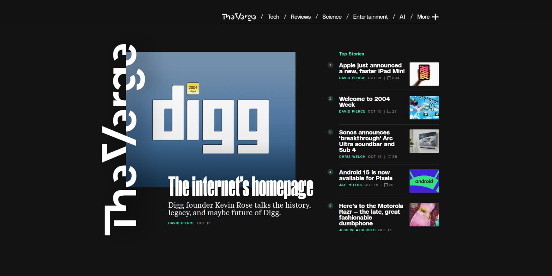
An example of great typography from The Verge
Think of it as casting actors for a play — each typeface needs to perform its part perfectly while working harmoniously with the ensemble. That display font might look stunning in your header, but you’ve lost the plot if it’s fighting with your body text.
Good typography feels invisible to users — they’re too busy engaging with your content to notice. But get it wrong, and suddenly reading becomes work instead of pleasure. Watch for common pitfalls: line lengths that tire the eye, contrast that strains readability, or spacing that crowds words together.
The best typographic systems create natural rhythm and flow, letting users focus on your message rather than struggle to decode it. When typography works, it’s like a perfectly tuned instrument; it doesn’t draw attention to itself but makes everything around it sound better.
Creative Web Design Decisions That Cost You
Beautiful disasters — we’ve all built them. Those stunning designs that tank conversions or load slower than… well, you know. Let’s talk about the creative web design choices that secretly sabotage your site’s success.
Pretty But Poor Performance
We’ve all built those pixel-perfect designs loaded with stunning animations and high-res images, only to watch them crawl to load. Those beautiful full-screen videos and parallax effects might showcase your skills, but they kill your site’s performance.
Here’s the harsh truth: 53% of mobile users abandon sites that take over 3 seconds to load. Half your audience might never see those carefully crafted animations you spent hours perfecting. Each bounce isn’t just a lost visitor — it’s a potential customer walking away.
The answer isn’t abandoning creative elements but wisely implementing them. Use lazy loading, optimize images, and trigger animations strategically. Great designs balance visual impact with performance, working flawlessly across all devices.
Responsiveness Gone Wrong
Your desktop design might look museum-worthy, but open it on mobile and watch the horror unfold. Elements overlap, text blurs, and those clever hover effects become useless on touch screens. What should impress users now frustrates them instead.
The issue isn’t responsive design — it’s treating mobile as an afterthought. We’ve all encountered those five-tap mobile menus and broken image galleries. These aren’t just annoying; they cost you engagement and credibility.
Clever, responsive design means rethinking how elements work at different breakpoints. Consider how people hold their phones, where thumbs naturally rest, and what information they need. Great responsive designs feel native to each device, adapting to match user expectations.
When Effects Kill Sales
Fancy animations and transitions can make your site feel premium, but they can also stand between users and their goals. Those creative scroll-triggered animations might disrupt the reading flow, and that sleek hover effect on product images could make it harder for users to compare items quickly.
Watch real users interact with your site; you’ll spot when they start fighting your design instead of enjoying it.
The most dangerous effects are the ones that look great in demos but frustrate real users. Every creative decision should serve a purpose beyond aesthetics. Those fade-in effects on product descriptions? They force users to wait before reading crucial information.
Multi-step hover animations on navigation often make menu items harder to access, especially for users who need more time to read or click.
Interaction design isn’t about showing off but enhancing usability while delighting users. When effects prioritize style over substance, they’re not just annoying; they’re actively harming conversion rates.
The best interactive elements feel natural. They guide users through content, highlight important information, and create memorable moments without getting in the way. Remember: if an animation doesn’t make your site easier to use, it probably shouldn’t be there.
Technical Debt Nobody Talks About
That custom JavaScript animation that seemed brilliant six months ago now haunts your site updates with compatibility issues and code that nobody dares to touch. Designers need developers for simple changes, and developers dread modifying these “simple” effects.
This is technical debt — when complex solutions become tomorrow’s problems. Like a high-interest loan, custom code that initially saved time demands endless maintenance hours. Browser updates trigger crises, and adding features feels like playing digital Jenga.
As your site grows, these custom solutions become limitations rather than assets. What worked for five pages becomes unmanageable across fifty. Smart designers choose solutions that balance creativity with maintainability, allowing sites to evolve without constant rebuilds.
Divi: Creative Web Design Made Easy
Creative web design used to be pretty black and white — either you learned to code or settled for basic templates.
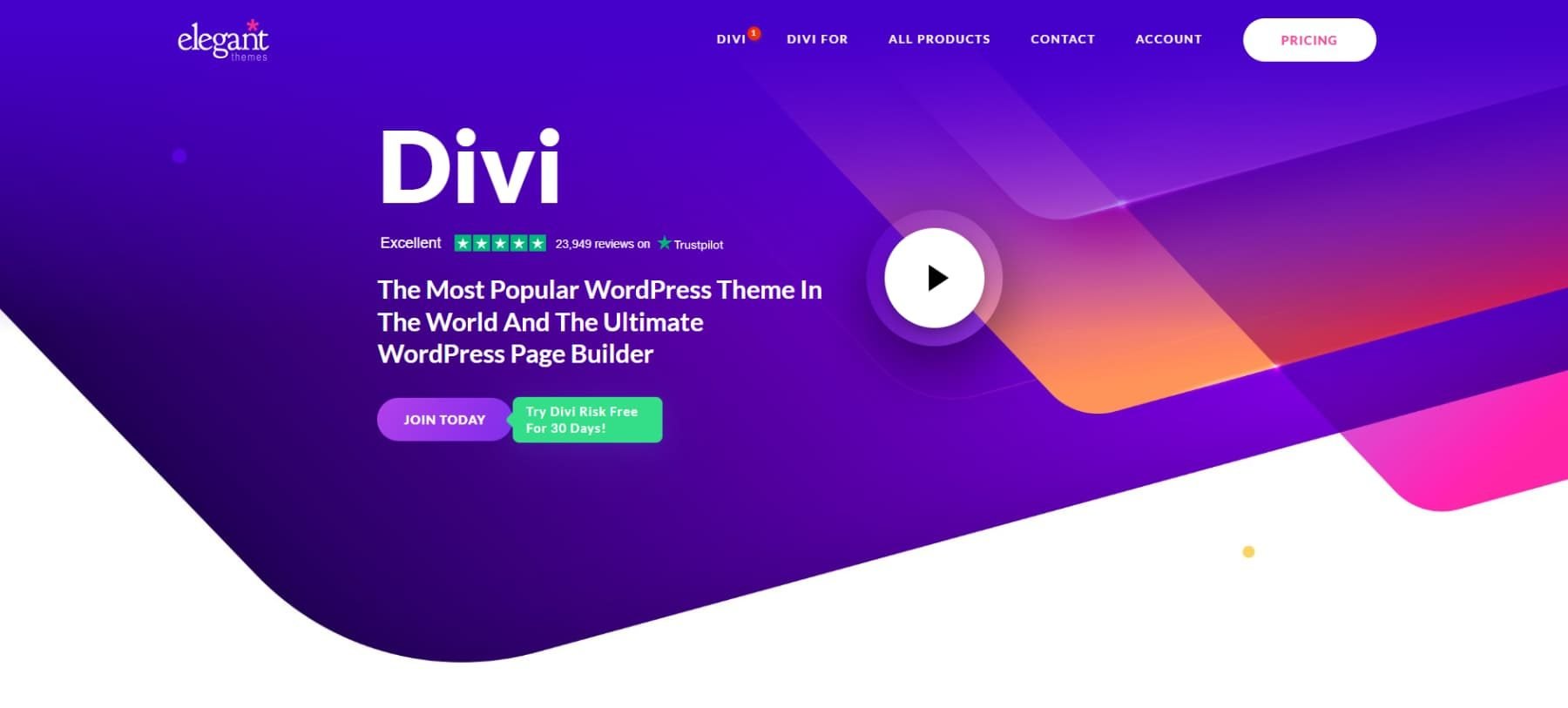
Your creative options are endless, especially when working with powerful themes like Divi.
Want to move something? Adjusting spacing is as simple as clicking and dragging. Every piece of your design is on the screen, ready to be shaped exactly how you picture it.
Most design tools hand you a few options and call it done. Divi takes a different route. You get 200+ specialized modules alongside core design features, meaning you can build almost anything you dream up. And when you want to get fancy? You can still add code.
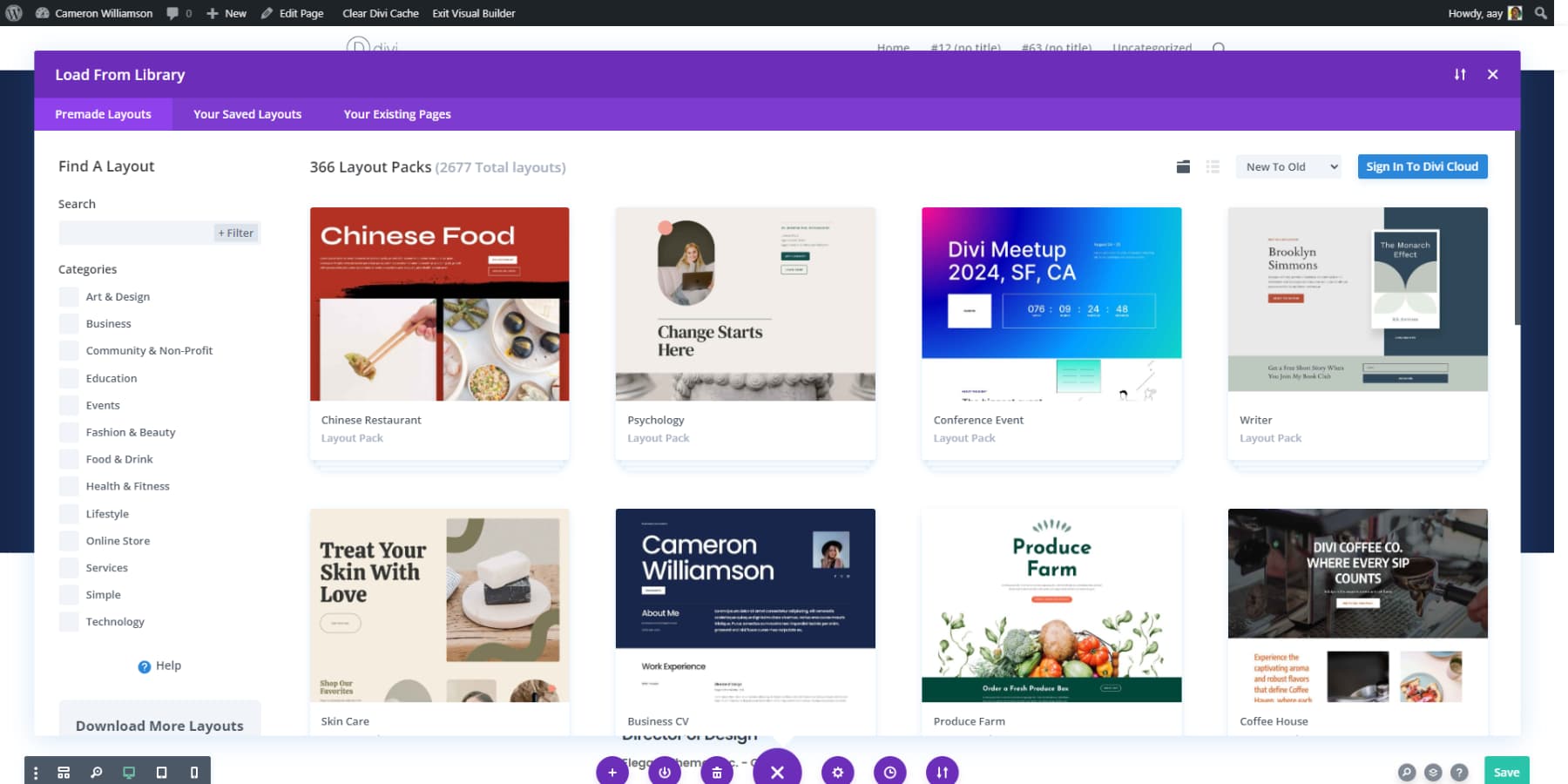
When you start with a blank canvas, creativity often stalls rather than inspires. That’s why having access to Divi’s massive library of 2000+ pre-built designs makes sense — you’re not copying, you’re kickstarting.
You can customize any layout by changing colors, swapping modules, or adjusting spacing — whatever gets you to your vision faster.
Here’s where things get interesting: the Theme Builder. You know those parts of your site that usually look… well, boring? Blog templates, archive pages, search results? You can design them visually, turning standard website elements into creative opportunities. Want your category pages to look as polished as your homepage? Done. Need a unique layout for your blog posts? No problem.
Build While You Blink With Divi Quick Sites
Nobody wants to spend weeks designing their website. That’s where Divi Quick Sites (with AI) steps in. It turns your business details into a complete website faster than you can order lunch.
But we are not talking about those generic AI outputs you’ve probably seen floating around. Just tell Divi Quick Sites some info about your business and needs, and watch it work like an entire creative team — designing layouts, writing content that makes sense, and pulling together images that fit your brand.
You choose from Unsplash or fully AI-generated — no more settling for cookie-cutter templates that look like everyone else’s site.
The cool part? While you grab a coffee, Divi Quick Sites handles all those tedious setup tasks that usually interrupt your day. Your navigation menu? Done. Those tricky Theme Builder templates? Sorted. Even your brand colors get picked and applied across the site. Running an online store? It’ll also set up your WooCommerce pages, from product displays to category archives.
If you don’t prefer AI-generated design, grab one of the professionally designed starter sites instead. These aren’t your average templates — each comes with custom photography and original illustrations.
Pick a design that matches your style, drop in your basic info, and Divi Quick Sites does the heavy lifting. Before you know it, you’ll have a fully functional website.
The best part about either approach? Everything works together. Your design system, color schemes, and fonts are all set up and playing nice. Once everything’s running, you can hop into the builder and make changes like regular sites.
All Your AI Assistance In One Place
Think of all the tabs you usually have open when designing — content tools, stock photos, layout inspiration. Now close them. Divi AI handles those creative tasks through simple text prompts, letting you focus on the big picture instead of bouncing between services.
With Divi AI, headlines that stand out and product descriptions that sell come naturally. Tell it what you’re after, and it learns your brand’s personality, crafting content that sounds like you — not some generic corporate robot.
That photo of your service team looking a bit… off? Drop it into Divi AI. A quick prompt, and suddenly, you’ve got a polished, professional image that fits your brand — no external photo editor needed.
Adding new sections to your site becomes seamless. Instead of hunting through templates or starting from scratch, describe your vision to Divi AI. “Create a contact section with a contact form” — done. The layout, content, and visuals match your existing design; no pixel-pushing is required.
Work Smarter, Not Harder With Divi AI
The Everything-Friendly Builder
Some tools fight each other when you stack features. Not WordPress and Divi — they’re the perfect team players. Divi handles your creative vision, while WordPress opens up thousands of plugins. Add SEO plugins to climb search rankings, bolt-on membership systems to drive revenue, or extend your site any way you imagine.
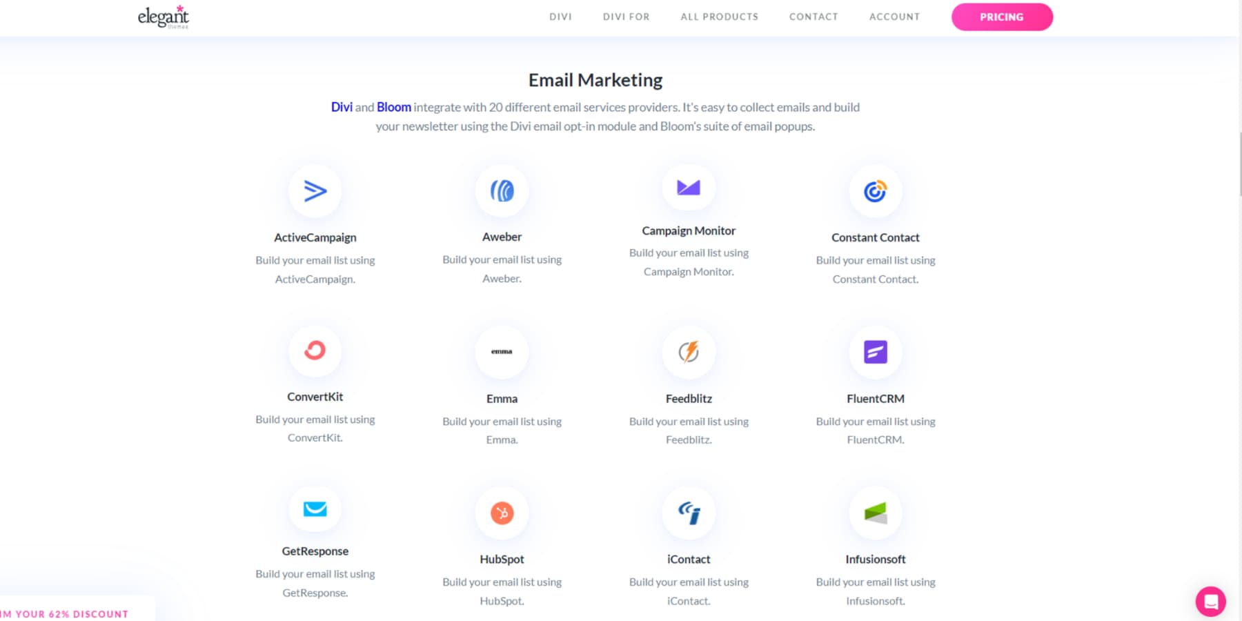
The magic happens when everything works smoothly together. While other builders might glitch out when you add new features, Divi keeps your site running like clockwork with over 75 built-in integrations — no matter how many plugins you stack on.
Most designers encounter roadblocks at some point. That’s where Divi‘s massive support system kicks in. A 76,000+ strong Facebook community shares its best tricks and creative web design inspiration daily.
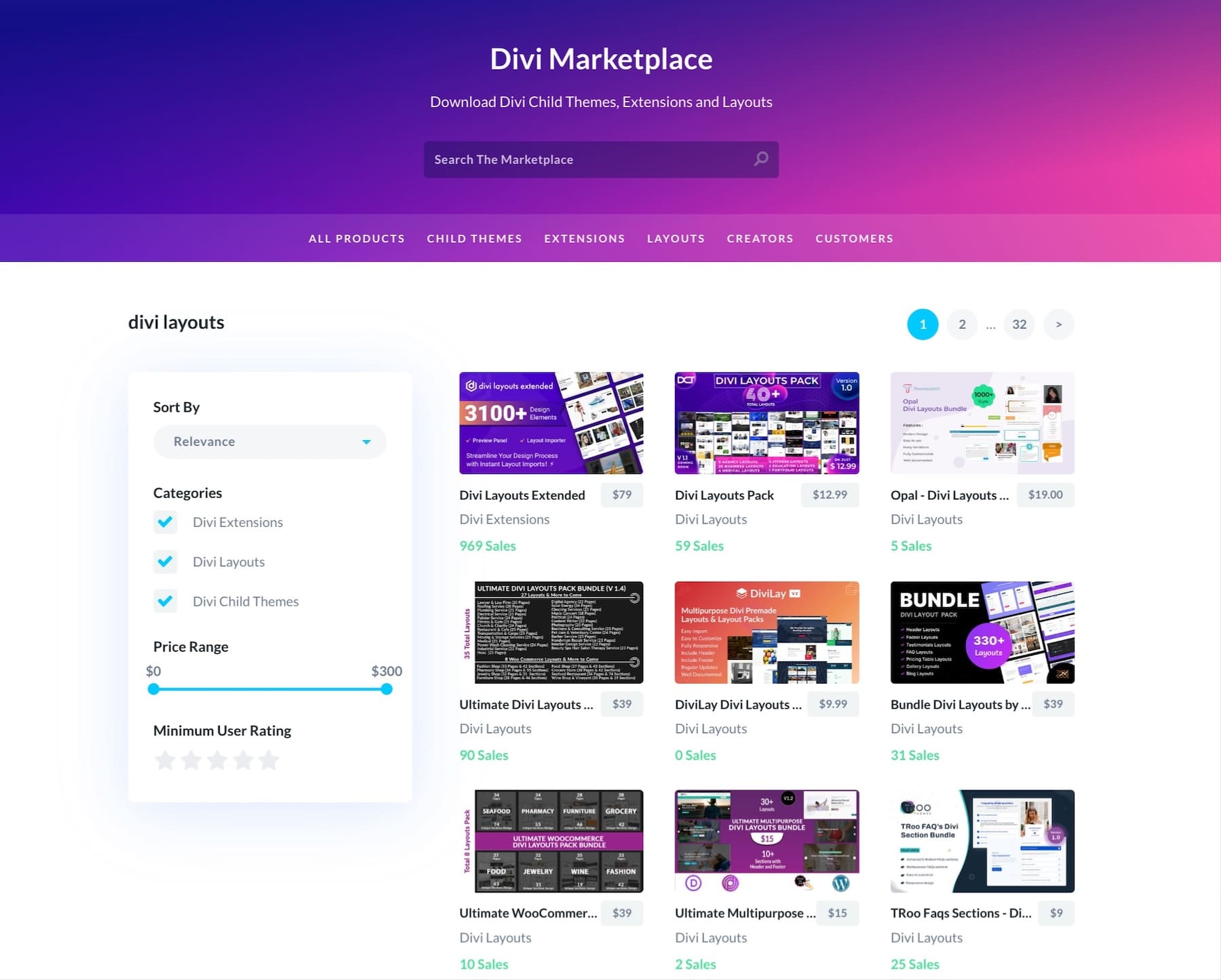
The Divi Marketplace takes your site even further with premium goodies — from specialized child themes to powerful extensions. These aren’t generic add-ons either: they’re built specifically for creative web design by developers who live and breathe Divi.
Common Challenges In Creative Web Design
Nobody shows their design process on Instagram. If they did, you’d see plenty of frustrated faces trying to make creative visions work in the real world. Here’s what happens behind those perfect websites:
When Ideas Fight Tech
Creative design ideas often collide with technical reality. Beautiful parallax effects might stutter browsers, while smooth transitions drain mobile batteries. What looks perfect in mockups can create real performance headaches.
The key is balancing creativity with technical constraints. Start by prototyping complex interactions early and leverage modern CSS features like container queries instead of heavy scripts. Setting performance budgets early prevents unnecessary effects from slowing things down.
Divi‘s visual builder helps bridge this gap, offering pre-optimized animations and effects tested across devices. You can experiment with parallax backgrounds and scroll animations without worrying about cross-browser issues or complex code, turning technical limitations into creative opportunities.
Mobile Ruins Everything
Mobile devices have a way of exposing design flaws—perfectly spaced elements start stacking awkwardly, hover effects become useless, and typography breaks across smaller screens. Even navigation can turn into a maze when interactive elements land in thumb-unfriendly spots.
Smart, responsive design starts with mobile priorities, considering thumb zones for essential buttons and keeping text readable without zooming. Breaking complex layouts into more straightforward arrangements helps maintain the visual hierarchy. But don’t trust emulators — accurate device testing tells the true story.
Divi‘s responsive editing controls make this process more intuitive. You can adjust layouts, spacing, and text sizes specifically for mobile views while maintaining desktop aesthetics.
Divi lets you create device-specific sections that only appear on specific screen sizes. This ensures content flows naturally instead of forcing desktop layouts to squeeze into mobile views. This means you can build perfectly optimized experiences for each device without compromise.
Whether using Divi or your preferred tools, successful mobile design requires thinking beyond screen sizes to consider how people use their devices.
Speed vs Style
Beautiful websites often come with a performance cost. High-resolution images, animations, and complex layouts can significantly slow loading times. Yet stripping away these elements for speed leaves sites feeling flat and uninspired.
The key is intelligent optimization. Start with a solid hosting foundation — providers like SiteGround offer specialized WordPress hosting with built-in performance features. Then, layer in caching solutions like WP Rocket to reduce server load and speed up repeat visits.
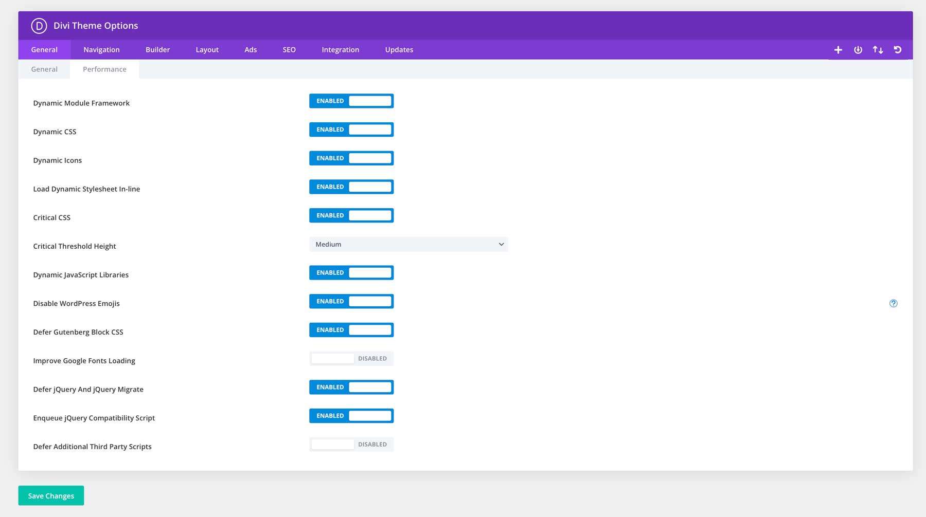
Divi approaches this challenge systematically. Its performance features minimize file sizes and reduce server requests without compromising visual quality.
With Divi’s efficient codebase, you can keep engaging animations and dynamic layouts while maintaining quick load times. This means your site stays fast and responsive even with advanced design features enabled.
The goal isn’t choosing between speed and style — it’s optimizing your design choices to deliver both.
Beyond The Basics: Power Moves
Forget the usual “make it pop” advice. These advanced techniques turn good designs into great ones without sacrificing performance or usability.
Make Mobile Shine First
Here’s an unpopular opinion: start with mobile designs and expand to desktop later. While most designers perfect their desktop layouts first, this backward approach leads to compromised mobile experiences that feel like afterthoughts.
Think about it — mobile users make up most web traffic, yet we still treat their experience as a scaled-down desktop version. Instead, build single-column layouts that nail content hierarchy and touch-friendly navigation first. Divi‘s responsive controls make this easier by letting you build mobile views independently and thoughtfully expand layouts for larger screens.
This might feel counterintuitive, but it leads to faster, more focused designs that work better across all devices. Your site stays lean because you add complexity, which is only where it truly enhances the experience.
Break Grids, Not Sites
Traditional grid layouts keep content organized, but they can make websites feel predictable and boring. The trick is knowing where to break grid patterns without losing structural integrity.
Strategic grid breaks create visual interest and guide attention to key elements. Try offsetting sections slightly, overlapping elements, or using asymmetrical layouts in hero areas.
But keep navigation, footers, and crucial content sections within clear grid structures — users still need familiar patterns to navigate comfortably.
Divi‘s advanced spacing controls and position options make these creative breaks simple to execute. You can drag elements outside their containers, adjust margins visually, or create overlapping effects while maintaining responsive behavior.
The visual builder shows how these breaks affect your layout across different screen sizes, helping you find the sweet spot between creativity and usability.
Smart Color Systems
Random color choices make websites feel amateurish, no matter how good the design is. Professional sites use systematic color approaches that create a visual hierarchy and maintain brand consistency across every page.
Smart color systems start by defining clear roles — primary colors for key actions, secondary colors for supporting elements, and neutral shades for content areas. Each color should serve a specific purpose, whether it’s drawing attention to calls to action or creating readable text.
Divi‘s Global Colors feature turns this theory into practice. Instead of manually updating colors across hundreds of elements, you can create a dynamic color palette that updates automatically site-wide.
For example, changing your brand’s blue instantly updates every button, heading, and accent element using that color—maintaining perfect consistency while making design updates effortless.
The key is considering colors as a system rather than individual choices, regardless of your platform.
Layout Tricks That Pop
Most designers stick to standard layouts — header, content, and footer. However, the websites that stand out play with unexpected arrangements that guide users through content naturally.
Try layering content sections over each other, using negative space creatively, or breaking content into diagonal sections.
The secret is strategic placement — create visual paths that lead users through your story while keeping navigation intuitive.
Divi’s transform controls and position options make these advanced layouts achievable without complex code. You can layer sections, adjust angles, and create depth through overlapping elements while maintaining responsive behavior. Just remember: unique layouts should enhance your content, not overshadow it.
Design Like You Mean It
Your website shouldn’t play it safe anymore. Creative web design lives where scroll-triggered animations feel like butter, layouts break grids without breaking sites, and every interaction makes visitors pause mid-scroll.
It’s those perfect moments where form meets function — crafting experiences that stick long after visitors click away. Divi with Divi Quick Sites and Divi AI puts that power in your hands – turning your “what if” moments into working features faster than you can sketch them. Whether pushing pixels or breaking design rules, you have the creative firepower to back up your boldest ideas.
The web has enough ordinary sites. Build extraordinary.




Excellent well written and informative for those that design with Divi. Looking forward to more articles from this author.