
")
Imagine walking into your favorite store — you know exactly where to find the shopping cart, how to locate items, and where each department is situated. Similarly, your online shop’s header should provide that same easy navigation. It quietly guides you, ensuring you don’t miss a thing while exploring the store.
But here’s the thing: creating that natural, effortless experience takes careful planning. Whether refreshing your current design or starting fresh, crafting the right header balance is simpler than you might think, especially with flexible tools like Divi in your corner.
Why Make A Great Ecommerce Header?
Picture walking into a store where you can’t find the checkout counter or shopping carts — frustrating, right? Your ecommerce header design functions like the front desk, key signage, and assistance booth of a physical store combined. When customers land on your site, they’ll look up top for everything they need.
A solid header does more than look good — it keeps shoppers around. Most visitors decide whether to stay or leave in just a few seconds. Your header can make that difference.
You’re making shopping easier by showing them exactly where to search, how to browse categories, and what’s in their cart. And easier shopping means happy customers who stick around to buy. The best part? They might not even notice how smooth their shopping trip was — and that’s exactly what you want.
Why Your Store Header Might Be Cause You To Lose Sales
Ever notice how some online stores make you work extra hard to find what you’re looking for? It’s like walking into a maze where every turn leads to frustration. Your header might send customers running if they’re clicking more than they’re shopping. Let’s uncover the common header mistakes that could cost you valuable sales.
Your store’s header navigation should work like a helpful store assistant, pointing customers exactly where they want to go. But when you stack too many menu items on top of each other or tuck important sections behind endless dropdowns, you’re putting up roadblocks.
Picture your customer trying to find a specific product category, only to face a wall of options that makes their head spin. The more clicks it takes to reach their destination, the more likely they’ll bounce away to shop elsewhere. Keep it clean and simple, and watch your customers browse easily instead of being confused.
Your menu labels should be as clear as the signs in your local grocery store. When you label a category “Shop Our Curated Aesthetic” instead of “Women’s Clothes,” you’re making your customers work too hard. Skip the fancy marketing speak — your shoppers want to find products, not decode puzzles.
A good rule? If you have to explain what a menu item means, it probably needs a simpler name. Just ask yourself: “Would an 8-year-old understand this label?” If not, it’s time to rethink those words.
Missing Search Functionality
You wouldn’t hide the cash register in your physical store, so why hide your search bar on your online shop? Your customers come to your site knowing what they want — help them find it fast. A missing or hidden search bar is like removing all the aisle signs from a supermarket and telling shoppers to figure it out themselves.
Put your search bar where everyone expects it: front and center in your header. And make sure it works well. A search bar showing “no results found” for “blue shirt” when you have dozens in stock is worse than having no search.
Slow Loading Elements
Those flashy header animations might look cool in your design preview but probably drive your customers crazy. Each extra second of load time feels like an eternity when you’re shopping online.
Watch what happens when your header elements load slowly — menu items jump around, buttons shift position, and your customers click the wrong things. It’s like trying to grab items off a moving shelf. Keep your header light and snappy. A simple header that loads instantly beats a fancy one that takes forever to show up.
Getting a high-performing ecommerce website can be tricky. A solid foundation is key. Consider SiteGround’s WooCommerce hosting, specifically optimized for ecommerce sites, in conjunction with WP Rocket’s caching and performance optimization, coupled with the EWWW Image Optimizer‘s image compression. This combination can make your feature-rich ecommerce site float like a feather.
Poor Mobile Adaptation
Pull out your phone and look at your store’s header. Can you easily tap each menu item without zooming in? Your mobile customers shouldn’t have to perform finger gymnastics just to navigate your store.
A header that works perfectly on the desktop can become a nightmare on phones — menu text gets squeezed together, buttons become too tiny to tap, and dropdowns cover the whole screen. Your mobile header needs to do its job while staying out of the way. Think of it as a compact version of your desktop header that keeps all the important stuff within easy thumb reach.
Building Your Perfect Header: Must-Have Elements
Creating the perfect header is like setting up a well-organized shop window — every element needs to serve a purpose while looking great. Your customers shouldn’t have to think twice about where to find what they need. Here’s your essential checklist of header elements that work together to create a seamless shopping experience.
Your navigation menu works like a roadmap for your store — it needs to point customers in the right direction without sending them in circles. Start with your most popular categories right in the main menu. Put related items together in clean, logical groups that make sense to your shoppers.
If you sell clothes, group them by type or occasion rather than your internal product codes. And remember those dropdown menus? Keep them short and sweet. Nobody wants to hover through a five-level menu just to find a t-shirt. The best navigation menus feel natural, like having a conversation with a helpful store clerk.
Brand Identity Elements
Your logo and brand colors do more than just look pretty — they help customers know they’re in the right place. Think about how quickly you spot the golden arches of McDonald’s while driving. Your store’s header should work the same way.
Place your logo where people expect to see it (usually the top left), and make sure it’s crisp and readable, even on small screens.
Your brand colors should pop without overwhelming the navigation or search features. And here’s a pro tip: link your logo back to your homepage. Your customers expect this shortcut, and they’ll use it more often than you’d think.
Smart Search Features
Think of your search bar as your store’s superpower. Place it where shoppers can spot it immediately — usually in the center or top right of your header. But just having a search box isn’t enough. Add product images in the results, show prices right away, and let shoppers filter by category without leaving the search.
When someone types “blue tee,” show them options before they finish typing. Better yet, help them find products even when they make typing mistakes. Your search should be smart enough to know that “jackt” means “jacket” and “womens” means “women’s.”
A search plugin if you’re using WordPress to create your ecommerce website could be very helpful. SearchWP is a very popular option. you can enhance your WordPress site by using multiple search engines and searching through custom fields, taxonomies, and post types. Easily exclude specific posts, customize search forms, and integrate with WooCommerce. You can also access search analytics, view related content, handle redirects, and order results as you prefer.
Real-Time Cart Updates
Nothing bugs shoppers more than wondering if their stuff made it to their cart. Make your cart icon work harder by showing live updates. Pop up a small number when they add something new. Let them peek at their picks with a quick hover — just like glancing into a real shopping basket. Want to help your customers out? Show them the total price right in the header. It saves them from that awkward surprise at checkout when they’ve spent more than planned.
Contact Information Placement
Got questions? Your customers sure do. Put your phone number or chat button where they can spot it fast — nobody likes hunting around when they need help. The top right corner usually works best. Skip the fancy “connect with us” language and stick to the basics: phone, chat, or email. And please, no hiding contact info behind vague icons. If you’re open now, say so. If you’ve got live chat ready to go, show it. Nothing builds trust like knowing help is just a click away.
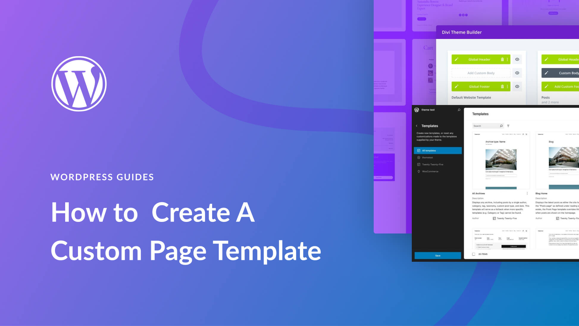
The Header Blueprint: Building Better With Divi
Designing an online store used to mean compromise — either settle for rigid templates or invest thousands in custom development. WordPress cracked open possibilities, but Divi turns those possibilities into powerful realities for ecommerce entrepreneurs.
Divi is a complete website design toolkit that reforms how you construct every aspect of your online store — headers included. With a drag-and-drop interface that feels more like sketching than coding, you can craft headers that don’t just look good but guide customers through your shopping experience.
Divi’s Theme Builder and 200+ design modules give you a complete design ecosystem.
With Theme Builder, you can style all aspects of your website, from headers to footers and product pages to 404 pages. Want a cart icon that updates in real time in your header? Responsive menus that adapt perfectly to mobile?
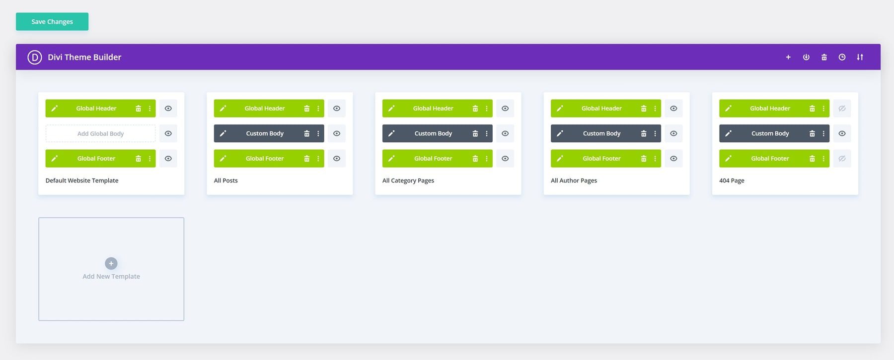
These won’t be complex coding projects — they’d be simple clicks in Divi’s visual builder. This means you’re never boxed into someone else’s vision. You have the power to make your header a strategic tool, not just a decorative element.
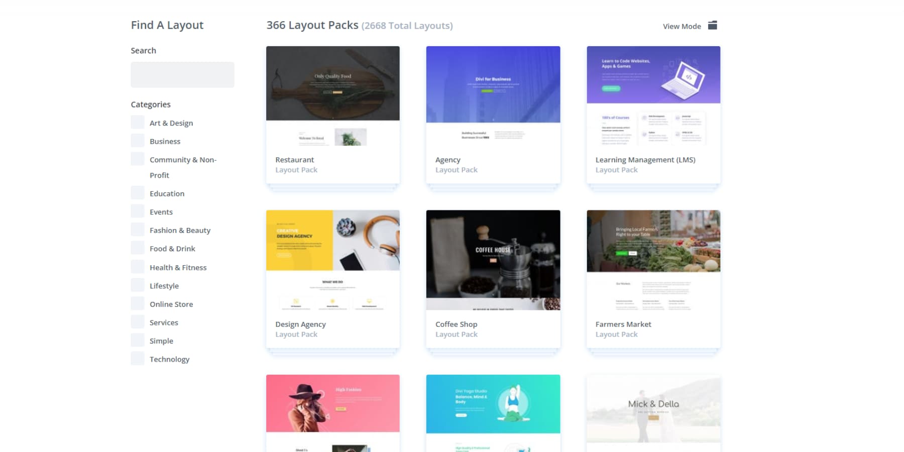
Your website needs more than just tools—it needs a killer design. Divi gives you 2000+ ready-to-use layouts that aren’t just templates but full design systems that look sharp across every page of your site.
Imagine having a design buddy who gets exactly what you want. With Divi, you can drag, drop, and tweak until your website looks precisely how you pictured it. No more settling for less.
Divi AI: Your Design Superpower
Divi’s visual builder makes website design feel like sketching on paper — natural and fluid. Now, Divi AI adds even more creative freedom to your design process. You’ll find your own copywriter, assistant, image editor, and developer. Divi AI understands your brand and communicates in your language right where you already work in Divi.
Want a fresh product image that captures your store’s personality? Just tell Divi AI what you’re looking for, and it’ll create custom visuals that fit right in with your design. Say goodbye to endless stock photo searches or pricey photoshoots.
Do you already have product photos but need them to look more professional? Divi AI helps you enhance them right in the builder.
Want to add a new section to your page? Just tell Divi AI what you’re looking for, and it’ll put it together quickly.
It even helps when you need custom code — no complex programming is required.
Set Up An Online Store In No Time Using Divi Quick Sites
Want your online store up and running fast? Divi Quick Sites uses Divi AI to build custom storefronts based on your business. Tell it about your products and brand, and you’ll get unique layouts — complete with headers, product pages, and navigation — filled with relevant content and images matching your style.
Setting up shop? It’ll even set up WooCommerce for you. This goes way beyond picking templates — you get a store that feels custom-made for your business from top to bottom.
Beyond Divi’s AI-powered designs, you’ll find our carefully curated collection of starter sites. Our design team crafts each one with custom photography and illustrations. Pick a design that fits your store, add your products and brand elements, and launch in minutes.
Every store you build with Divi Quick Sites — whether through AI or our pre-built collection — has a complete design system. Your header, navigation, colors, and fonts work in harmony right from the start. Adding a seasonal banner or new promotion? Global presets ensure everything matches your brand perfectly. Your theme settings maintain consistency and every element automatically uses your brand colors and typography.
We’ve handled the design details so you can focus on what matters — your products, content, and brand identity. That’s what makes a true design system work.
WordPress & Divi: Design Without Limits
WordPress and Divi work together to make your online store shine. While Divi handles the design magic, WordPress’s plugin collection lets you add any feature your store needs — from SEO tools that boost your visibility to WooCommerce add-ons that pump up sales. Your header stays sharp and functional, no matter which plugins you add.
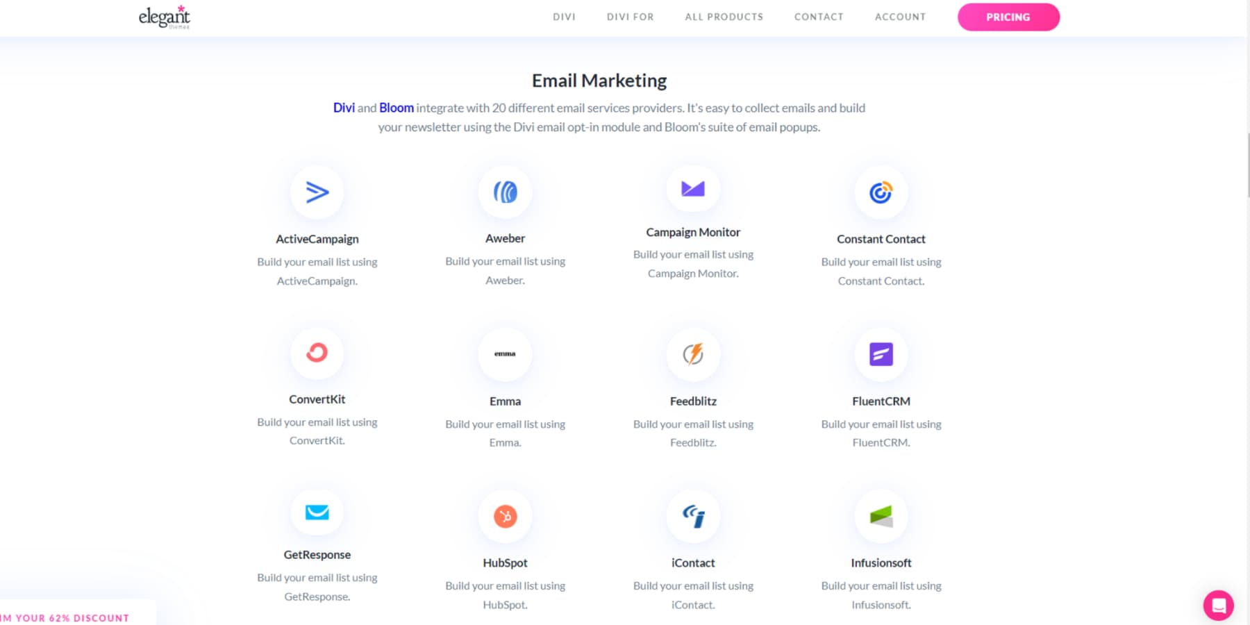
Divi integrates with 75+ plugins, tools, and services out of the box.
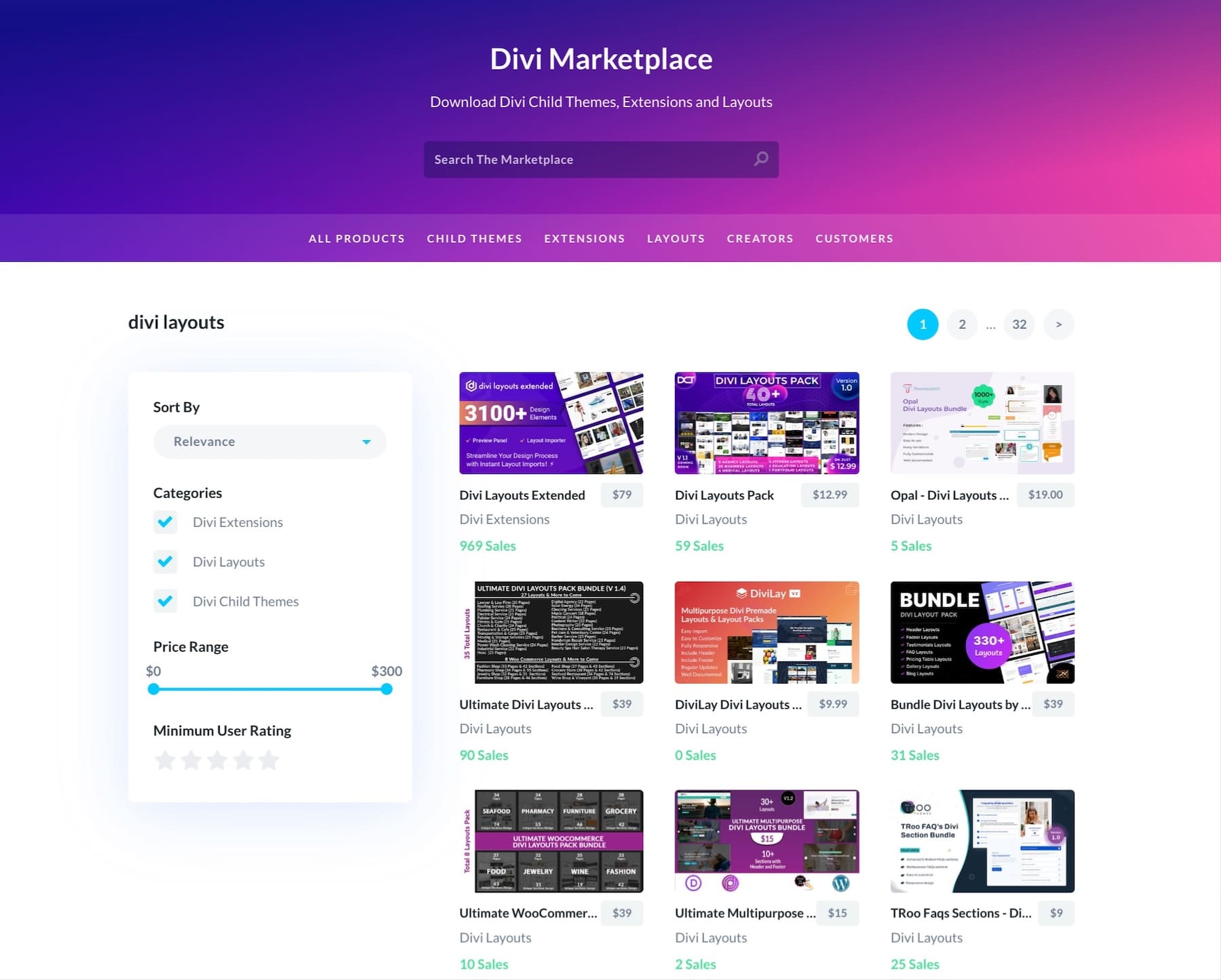
Need help? You’re never alone. Join our 76,000-member Facebook community, follow easy tutorials, or check out our detailed guides. Ready to take your store further? Browse our Marketplace for premium child themes, extensions, and design packs built by Divi experts. Each addition maintains Divi’s easy visual editing while adding extra features you’ll love.
The Divi Pro Advantage
Running an online store means every detail counts — including your budget. Divi’s Pro tools give you premium design capabilities without the premium price tag. Here’s what you get bundled in Divi Pro apart from Divi AI (starts at $16.08/month when purchased separately):
- Divi Teams ($1.50/person monthly when purchased individually) lets your design and marketing staff work together in one space, with full access to Divi’s tools, support, and AI features. You control who can edit your store’s header and other elements. Add up to 4 members (additional can be added at the mentioned costs)
- Divi Cloud ($6 monthly when purchased individually) stores your header designs, layouts, and brand elements in one spot. Swap seasonal headers or promotional banners across your store with a single click.
- Divi VIP ($6 monthly when purchased individually) keeps your store running smoothly with 30-minute support response times, round-the-clock help, and 10% off Marketplace purchases. Because a broken website shouldn’t cost you sales.
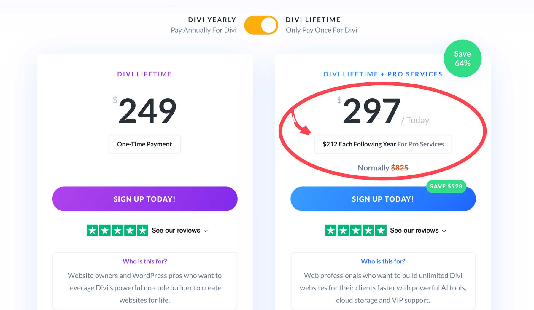
Save big with a Divi Pro membership at $277/year — $388 less than buying features separately. You’ll get Divi AI, Cloud, VIP, and Team access for up to four members.
Want lifetime access? The Lifetime + Pro bundle gives you permanent Divi access plus yearly Pro services at $297 the first year, then $212 annually — saving you $528.
Upgrade Your Workflow With Divi Pro
Beyond The Basics: Advanced Customization Tips
Once you’ve mastered the basics, it’s time to add those special touches that make your store stand out. Think of these advanced features as your secret sauce — the little details that turn casual browsers into loyal customers. These smart customizations can transform your header from functional to fantastic.
Personalized User Greetings
Ever walked into your local coffee shop and heard the barista call out your name? That same friendly recognition works wonders for your online store too. Your header can do more than just show your logo — it can welcome back familiar faces. Some studies suggest personalized experiences can boost sales by up to 40%.
Divi’s Condition Options lets you add these thoughtful touches to your store’s header. Switch up what they see based on their membership level. Regular customers might spot their reward points up top, while new visitors get a friendly “welcome” message.
Season-Ready Headers
Your store’s header sets the mood for shopping — like decorating your storefront for different seasons and sales. Keeping your header fresh shows customers your store is active and gives them a reason to check back often.
Divi lets you schedule header changes without staying glued to your computer. Schedule these headers for specific dates, and they’ll appear right on time. For example, your winter collection menu could pop up every November without you lifting a finger.
Keep your seasonal changes practical, though. Don’t bury important navigation under festive designs, and make sure sale banners don’t push your search bar out of sight. Your regular customers should still find everything in its usual spot with some seasonal flair added. Think of subtle touches, like changing your header’s color scheme for winter, rather than a complete navigation overhaul.
Micro-Interactions
Small movements in your header can make your store feel more alive and responsive. When elements smoothly fade in, or menu items respond to hover, customers get subtle cues that guide them through your store. These tiny animations create a more engaging shopping experience without getting in the way.
Divi’s hover effects let you add thoughtful touches to your header. Menu items can be highlighted softly when customers hover over them, and your logo can smoothly slide into view when they scroll back to the top. These small details make your store feel polished and professional.
But don’t go overboard. Skip the flashy animations that slow down your site or distract you from shopping. Your header shouldn’t look like a light show — each movement should serve a purpose. If customers notice the animation more than its supporting action, dial it back. Remember, these touches should help, not hinder.
Special Offer Highlights
Drawing attention to your best deals helps customers spot value right away. A well-placed offer in your header can turn casual browsers into buyers — but only if it’s clear and timely.
Divi lets you showcase these deals without cluttering your header. Add a subtle banner above your main navigation to highlight free shipping thresholds or display current promotions. You can even schedule different offers to rotate throughout the day or week, keeping your header fresh and relevant. Likewise, use Divi AI to create great copy that engages your visitors and piques their interest in checking out current offers.
But keep your offers focused. Don’t stuff multiple promotions into your header or use aggressive flashing banners that annoy visitors. Pick your best offer and present it clearly. And always leave room for essential navigation elements — a good deal means nothing if customers can’t find their way around your store.
Split Testing Your Header Design
Are you guessing what works best for your header design? Stop guessing and start testing. Small changes in your header — like button placement or menu wording — can significantly affect how customers shop your store.
Divi Leads makes testing different header versions simple. Show half your visitors a header with the search bar centered and half with it on the right. Or test different wordings for your promotion banner. Divi tracks which version gets more clicks or sales, taking the guesswork out of design decisions.
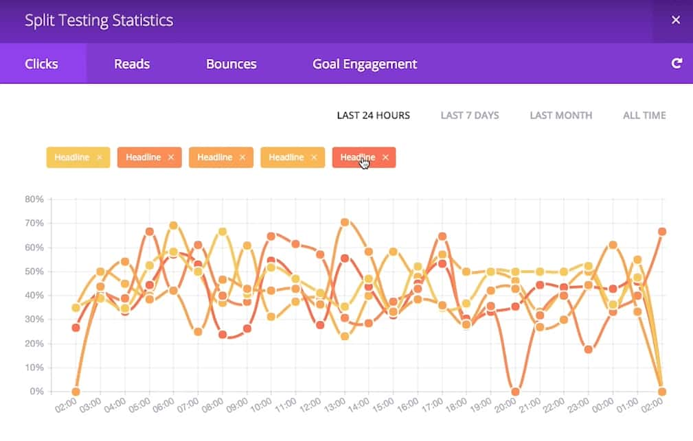
Tools like Hotjar can show you heat maps of where visitors click in each header version, while MonsterInsights helps track how different designs affect your overall conversion rates and time on site.
Just remember to test one change at a time. Comparing too many versions at once makes it hard to know what worked. Give each test enough time to gather solid data—rushing changes based on a few days of traffic won’t tell the whole story.
Give Your Header A Makeover Today
Your store’s header isn’t just another design checkbox — it’s your online storefront’s superpower. While other store owners fret over fancy animations or stuff their headers with every imaginable feature, you know better. Keep it simple, make it work, and watch your customers enjoy shopping with you by using these tools to enhance the experience:
| Tool | Purpose | |
|---|---|---|
| Divi | Ultimate WordPress Website Builder | Get |
| Divi AI | Design assistance and content generation | Get |
| Divi Cloud | Design and layout storage | Get |
| Divi Teams | Team Collaboration | Get |
| Divi VIP | Quick support response times + discounts on Marketplace purchases | Get |
| Divi Pro | All of the above bundled (save up to $300) | Get |
| SiteGround | WooCommerce hosting | Get |
| WP Rocket | Caching and performance optimization | Get |
| EWWW Image Optimizer | Image compression | Get |
| SearchWP | Advanced search functionality | Get |
| Hotjar | Website heat mapping | Get |
| MonsterInsights | Website analytics | Get |
You don’t need to overhaul everything at once. Start with what bugs your customers most — maybe it’s that tricky search bar on mobile or those confusing menu labels. Pick one thing and make it better today.
Want to skip the headaches and build a header that just works? Grab Divi, and let’s make some magic happen.


Leave A Reply