Ever wonder why Amazon’s design has stayed almost the same since 2009? Because it works. They have cracked the formula and stuck to it. The reason behind Amazon’s success is that they focus on removing every possible barrier between their products and their customers’ wallets and less on the ugly design. But does that mean your store should look like it’s from twenty years ago? No.
That’s precisely what we’ll cover today. We’ll show you actionable steps you can take right now and exactly how to use tools like Divi to master ecommerce web design that balances beauty with business.
- 1 Does Design Even Matter In Ecommerce Web Design?
- 2 Ecommerce Web Design: What Makes Shoppers Buy?
- 3 The Real Cost Of Poor Ecommerce Web Design
- 4 The Essentials Of Building An Ecommerce Website
- 5 More Sales, Less Stress With Divi
- 6 From Design To Dollars: Implementation Guide
- 7 Design A Store That Sells — Right Now
Does Design Even Matter In Ecommerce Web Design?
Look at Nike’s online store, then hop over to eBay. One’s sleek and polished, while the other looks like it’s fighting to shake off its 90s design roots.
Then there’s Walmart — they completely overhauled their clunky website in 2018, and their online sales have been rising 22% almost every year since then. All three have different design languages, but they still pull in serious revenue because they’ve cracked what matters in ecommerce design.
Subscribe To Our Youtube Channel
Don’t get me wrong — design matters, but for reasons beyond aesthetics. Your customers come to your store with a mission: find what they want and buy it without hassle. They’re not here to admire your fancy hover effects or that perfect radius for the buttons you spent hours choosing.
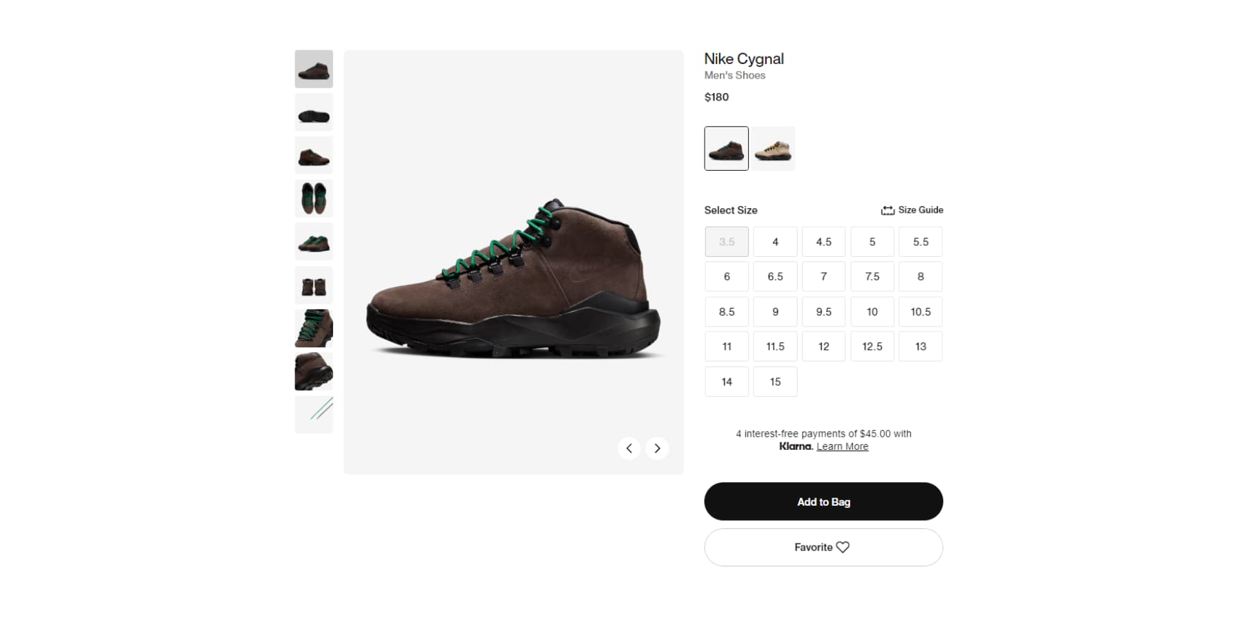
The most successful ecommerce sites nail this balance. Look at how Nike’s product pages guide you naturally through size and style options.
These aren’t random design choices — they’re calculated decisions based on years of testing what makes people click “buy.”
By focusing on guiding shoppers smoothly from browsing to buying, these stores remove friction at every step. Think clear product categories, prominent search bars, obvious price displays, and checkout buttons that you can’t miss. While their competitors chase design trends, they’re busy perfecting the paths that turn visitors into customers.
Ecommerce Web Design: What Makes Shoppers Buy?
While designers debate the perfect shade of blue for buy buttons, actual shoppers care about something entirely different. Drawing from years of ecommerce web design data and real customer behavior, this is our understanding of what truly drives purchase decisions online.
Trust Indicators
Trust badges and security indicators serve as visual shortcuts for customer confidence. They are the cornerstone of modern ecommerce web design. The most effective approach combines SSL certificates, recognized payment logos, and security badges at crucial decision points — especially near pricing and checkout areas.
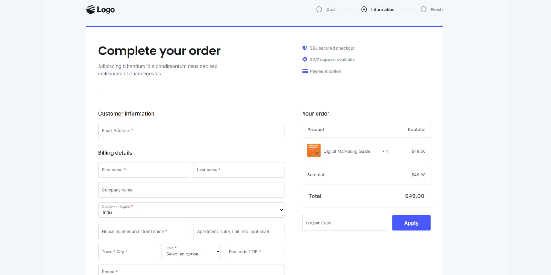
Example of good trust signals design from Cartflows
But effective trust-building goes beyond these symbols. Clear contact information, detailed shipping policies, and transparent return processes and guarantees form the foundation of customer trust. The key is strategic placement: position trust elements where customers naturally hesitate or question their purchase decision.
This creates a seamless path to purchase while maintaining a clean, uncluttered design that doesn’t overwhelm visitors with trust symbols.
Core UX Principles
Successful ecommerce web design focus hinges on removing friction from the buying process. This means implementing clear navigation structures, consistent layout patterns, and apparent paths to purchase.
The most effective product pages follow a logical hierarchy: prominent product images, transparent pricing, and easily accessible buy buttons. Supporting elements like product descriptions, specifications, and additional photos should enhance rather than interrupt this core flow.
Mobile responsiveness isn’t optional — it’s crucial for maintaining a seamless experience across all devices where purchasing decisions happen.
Social proof works best when combining multiple formats: star ratings, written reviews, customer photos, and expert endorsements. Position these elements strategically: above the fold on product pages and near call-to-action buttons where they naturally support purchasing decisions.
The type of social proof should align with your product. Visual products benefit from customer photos, while complex offerings need detailed reviews. Keep it authentic — real customer experiences consistently outperform polished testimonials.
Don’t hide negative reviews. Showing only perfect scores can trigger skepticism. Instead, respond professionally to criticism and provide contact information, demonstrating transparency and commitment to improvement.
Loading Speed
Loading speed directly impacts your bottom line – each extra second of load time cuts conversions by 7%. Fast-loading product images, quick checkout processes, and snappy page transitions aren’t just technical requirements – they’re sales drivers.
The key is optimizing without compromising quality. This means adequately sized images, efficient code, and strategic caching. Mobile performance deserves special attention since most shoppers browse on phones.
Focus on critical content first: ensure product images, prices, and buy buttons load immediately while less crucial elements can load progressively. A well-optimized store should load its main content within 2-3 seconds, with interactive elements ready within 5 seconds maximum.
What Doesn’t Work In Ecommerce Web Design?
Now that we know what will work, let’s clarify what doesn’t. You might be surprised to learn that some of the “tricks” influencers swear by online could hurt your conversion rates. Here are the common misconceptions that keep store owners investing in the wrong places.
Cluttered Product Pages
Product pages fail when they try to show everything at once. Dense walls of text, multiple competing calls to action, and endless feature lists overwhelm shoppers and tank conversion rates. The most common mistake is cramming every product detail above the fold.
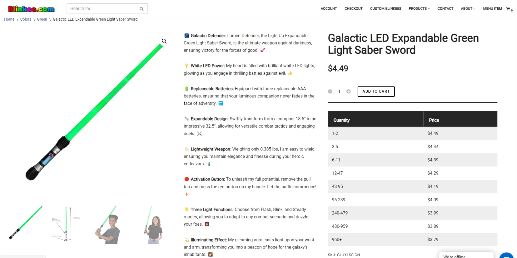
Blinkee is world-“infamous” for its terrible ecommerce Web Design
Instead, product pages need a clear visual hierarchy that guides customers through the essential information — the primary image, price, key features, and buy button.
Secondary details should live further down the page where interested customers can find them. Think of your product page as a conversation, not a data dump. Each element should serve a clear purpose in moving customers toward a purchase decision.
Copy That Is Trying Too Hard
Skip the ALL-CAPS hype and excessive exclamation points in product descriptions. “AMAZING!!” and “BEST PRODUCT EVER!!!” push customers away rather than convert them. Avoid content filled with empty buzzwords like “revolutionary” or “game-changing.” Your customers want clear, specific details about what your product does and why it matters to them.
Focus on practical benefits — explain how your camping tent handles rainfall rather than making vague claims about “transforming outdoor experiences.” Direct, honest descriptions convert better than manufactured enthusiasm.
Aggressive Popups
The 2000s called. They want their popups back. You know what we mean: “GET 10% OFF!!!” before seeing what you sell, “DON’T LEAVE!” when moving your mouse up, and “JOIN OUR VIP LIST!” while trying to read product details. Imagine someone jumping in front of you as soon as you enter your store and shouting at the top of their lungs, “INTERACT WITH ME!!!!”
These desperate attempts at capturing emails do more harm than good. If you must use pop-ups, timing is everything. Let shoppers browse your store first. One well-timed, relevant offer beats five aggressive interruptions every time. Your conversion rates will thank you.
Poor Images
Poor product photos — blurry, poorly lit, or inconsistently sized — instantly hurt your credibility. Your product images are your storefront, doing the work that physical displays would do.
Show scale, detail, and context in every shot. Skip those tiny thumbnails that make customers squint and avoid using the same manufacturer photos as everyone else.
Include multiple angles, lifestyle shots, and zoom features – these aren’t optional when customers can’t touch your products. Current AI tools make getting professional-quality product shots both accessible and affordable.
The Real Cost Of Poor Ecommerce Web Design
Bad design isn’t just about looking unprofessional — it’s costing you real money. Every frustrated and confused visitor represents dollars flying right out of your cash register. Let’s break down the impact of poor design choices on your bottom line.
Abandoned Shopping Carts
Here’s a painful stat: 7/10 shoppers ditch their cart before buying. Poor design is often the culprit. Confusing checkout flows, surprise shipping costs, and clunky mobile experiences push customers away right when they’re ready to buy.
Each abandoned cart isn’t just a lost sale — it’s wasted marketing spend that got them there in the first place.
The math hurts: if you spend $50 to get each potential customer to your store, those abandonment rates are burning through your marketing budget. Fix the common friction points in your checkout process, and you’ll see immediate results in your completion rates.
Customer Service Overload
The lousy design confuses customers, flooding your support channels. When shoppers can’t find sizing guides, shipping info, or return policies, they hit the contact button.
Every support ticket from a question that your design should have answered is money down the drain. Your support team gets bogged down answering basic questions instead of handling real issues.
Plus, many shoppers won’t even bother asking — they’ll leave and buy from a competitor whose site makes sense. Good design is your best customer service agent.
Lost Repeat Business
First impressions stick. When shoppers struggle with a clunky website, they rarely return for seconds. Think about it — even if they push through a frustrating experience to make one purchase, they’ll remember that hassle the next time they need your product.
Losing repeat customers hits harder than you think. Returning customers spend more than new ones and cost virtually nothing to acquire. A poorly designed store isn’t just losing sales today — it’s killing your long-term customer value. Those lifetime value calculations look pretty grim when customers only buy once.
Rising Development Costs
Band-aid fixes add up fast. Poor foundational design turns every new feature or update into a complex project. Simple tweaks morph into significant overhauls. Quick price updates need custom code. New product categories require navigation rebuilds.
These constant fixes eat into margins and slow down market adaptability. The clever initial design pays for itself by making future changes smooth and affordable. The actual cost isn’t just the fixes — the opportunities lost while dealing with technical debt.
Each patch job compounds the problem, creating a snowball effect of increasing development expenses and decreasing site flexibility. A solid design foundation eliminates these costly maintenance spirals.
The Essentials Of Building An Ecommerce Website
Strip away the fancy features and trending designs, and you’ll find that successful ecommerce sites share fundamental elements. These aren’t optional extras — they’re the backbone of any store that consistently converts. Here’s what you absolutely must get right.
1. A Proper Content Management System
Your store’s management system can make or break your business. While flashy templates and trendy designs catch the eye, the backend determines whether you’ll thrive or struggle.
Running an online store involves more than displaying products and prices. You need zoom features for product images, color variants that update in real-time, size charts that pop up right when needed, and shipping calculations that make sense. Your system needs to handle all this without breaking a sweat.
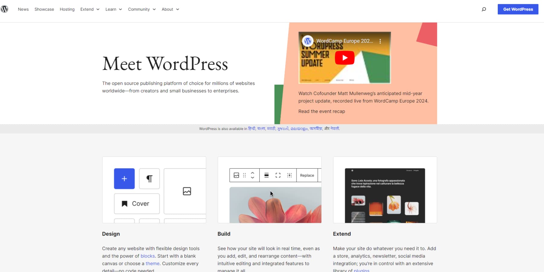
Most platforms promise simplicity but deliver limitations. They work fine until you need custom features or want to scale up. That’s where WordPress stands out. It powers nearly half the web by handling basic and complex needs without forcing you into a box.
The difference shows up in daily operations. Want to add a size chart? Done. Need to show fabric swatches? Easy. Time to add product videos? No problem. WordPress lets you build exactly what your customers need, not what some platform decides you should have.
2. Integrations & Extensibility
Growing stores face a common challenge — system integration. When payment processing, shipping, inventory, and marketing tools don’t sync properly, you’re stuck with manual updates instead of focusing on growth.
Well-connected systems create efficiency. Stock updates automatically with orders, shipping rates are calculated instantly, and customer data flows directly to marketing tools. Reviews appear on products as soon as they’re approved.
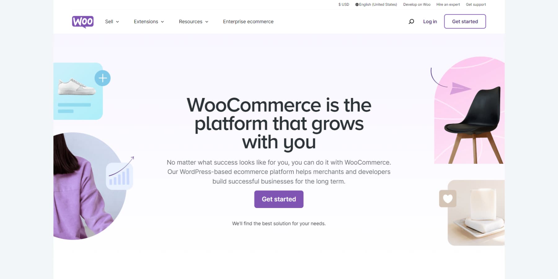
WordPress and WooCommerce handle these connections simply. You can quickly add payment options or shipping methods, sync inventory with a plugin, or integrate email marketing in minutes. As markets shift and customer needs change, you can adapt quickly by adding, removing, or tweaking features. And the best part is that the basic features of WooCommerce are free of cost.
3. Scalability & Agility
Growth can become the biggest hurdle in ecommerce web design. More sales strain servers, more products complicate management, and more customers mean heavier data loads. Planning for expansion isn’t optional.
While most platforms struggle beyond basic loads – working fine with 100 products but failing at 1,000 — WordPress handles scale differently. Major sites like TechCrunch and CNN use it to serve millions daily, proving its reliability whether you sell ten items or thousands.
Scalability means more than handling traffic. Adding wholesale pricing, member-only products, or loyalty programs happens without rebuilding your store. WordPress’s efficient database structure ensures quick searches and smooth operations as you grow, making expanding into new markets or currencies simple.
4. A Capable Backend To Handle It All
Think of your store’s backend like an iceberg — customers see the surface, but the foundation handles the heavy lifting: inventory, orders, accounts, payments, taxes, and security.
WordPress gives you complete control as a self-hosted platform — like owning rather than renting. You can modify anything, but you’re responsible for maintenance. This means your data stays yours, and you can customize functionality freely. However, it also means managing servers, backups, and security updates.
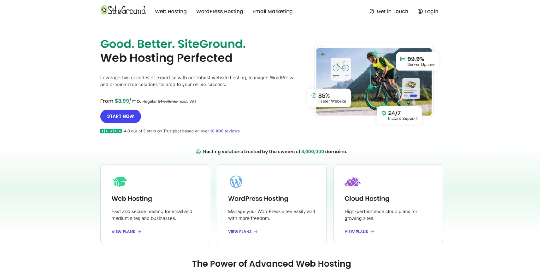
Most stores balance this by using hosts like SiteGround that understand commerce needs. You keep control while getting expert support to maintain performance. This lets you focus on growth while keeping your backend solid and secure.
Launch A WordPress Website With Siteground
More Sales, Less Stress With Divi
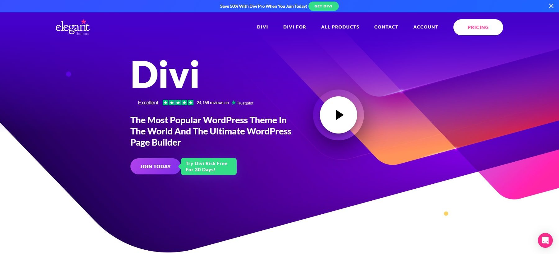
Building websites used to mean wrestling with code or settling for cookie-cutter templates. Those days are gone. WordPress gave us the foundation for great ecommerce web design, but now you need tools that match how you actually work, which is, hands down, Divi.
Divi builds on WordPress by adding visual design tools that make sense. Click any element on your page and edit it right there — no more bouncing between preview screens. The visual builder packs over 200 design modules, so you’re never stuck figuring out complex code.
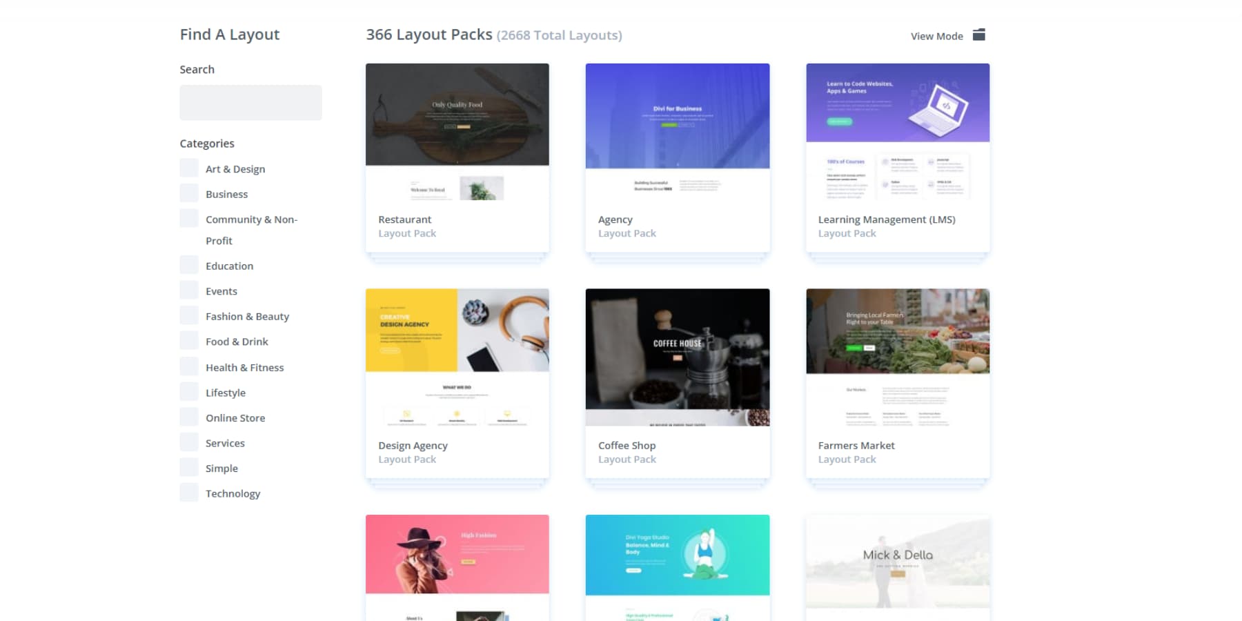
Good tools mean nothing without good design, though. Divi comes loaded with 2000+ professional layouts — not basic templates, but complete design packages that maintain consistency from your homepage to your product pages.
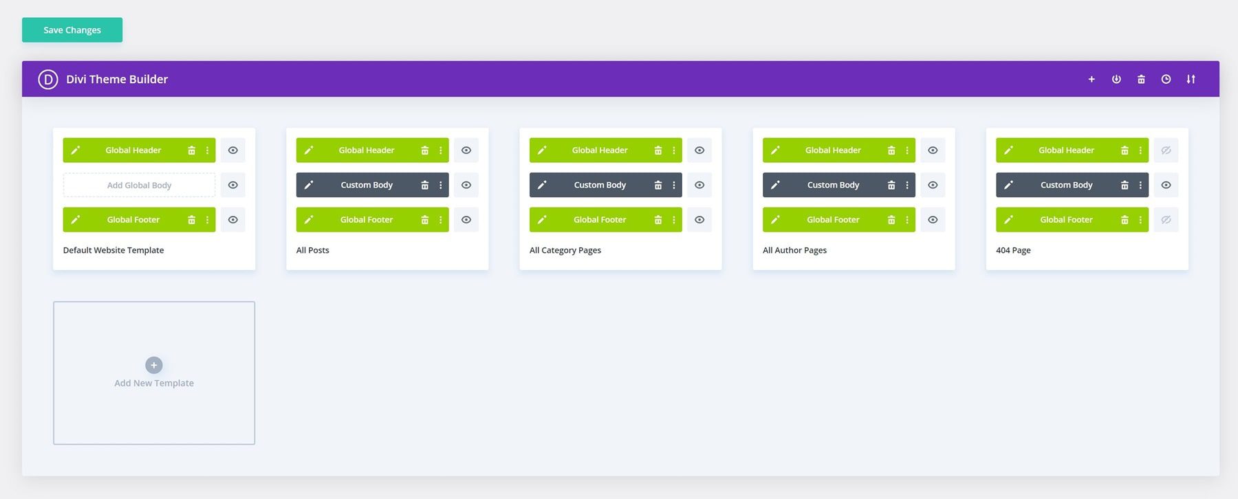
The Theme Builder takes this further by letting you design headers, footers, and dynamic templates visually, giving you control over every part of your site.
Think of it as your design partner that delivers — no more compromising between what you want and what you can build. Just drag, drop, and customize until your site matches your vision.
Divi AI: Faster Than The Speed of Thought
Divi‘s visual tools changed how you build websites, and now Divi AI will change how you complete them. Right in your familiar Divi workspace, you’ll find your personal copywriter, personal assistant, image editor, and developers who understand your brand and speak your language.
The AI handles everything from headlines to body text, keeping your brand voice consistent across every page.
Do you need to improve product photos or hero images? Type what you want and get custom visuals that match your style perfectly. No more endless stock photo searches or expensive photoshoots.
Do you already have a product photo but need to improve it and make it professional? Get that done, too.
Do you need to add a new section to your page? Just describe what you need and see Divi AI assemble it quickly.
Even when you need custom code.
From Idea To Website In Minutes
When combined with Divi AI, Divi Quick Sites flips the script when building a website. Tell it about your business, and it builds your entire site — pages, navigation, and all. For shops, it even sets up WooCommerce automatically.
The system builds a proper design hierarchy from the start. Your color schemes, typography, and spacing stay consistent across every page. Navigation works right away. Contact forms connect correctly. Even your blog templates and archive pages match perfectly.
Beyond AI designs, Divi packs a collection of hand-crafted starter sites from our design team. Each comes with custom photography and illustrations you won’t find anywhere else.
Pick a site, add your details — that’s it. You’ll get working menus, proper spacing between pages, and consistent styling across every page.
The best part? Everything stays flexible. Using the same visual builder, you can add pages, swap content, or adjust designs anytime. Your Quick Site isn’t just a template — it’s a complete website foundation that grows with your business.
Everything You Need, All In One Place
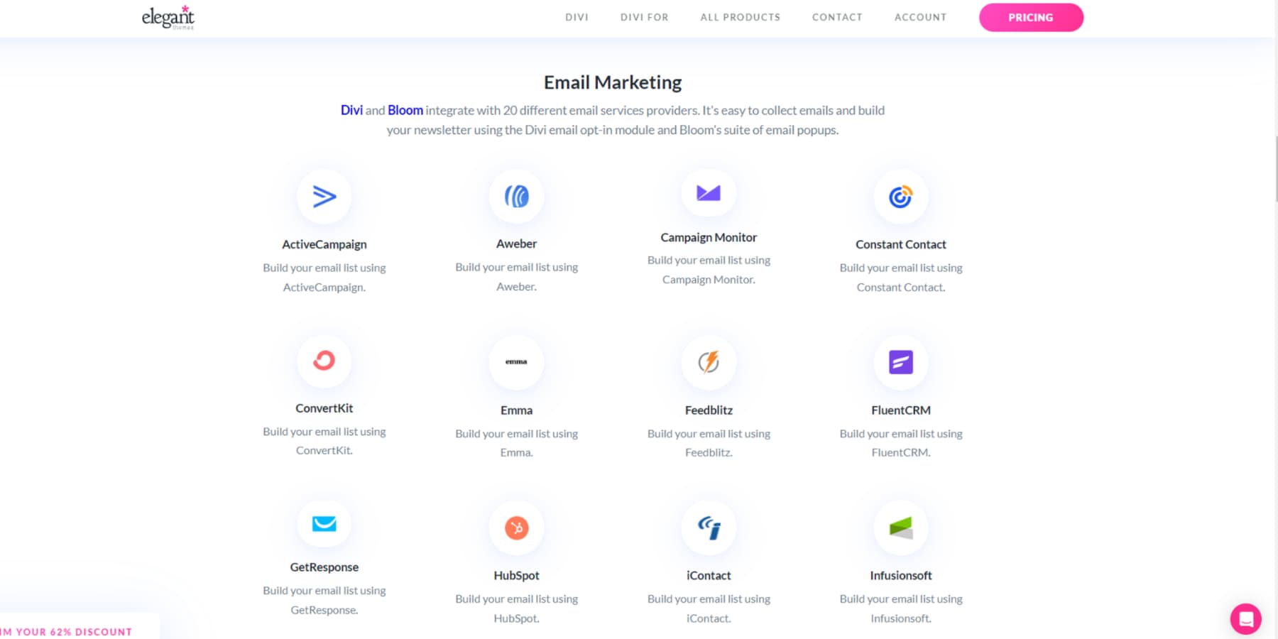
Divi plays nice with your favorite tools — from Mailchimp to WooCommerce. Over 75 popular services plug right into your workflow.
SEO plugins like Rank Math integrate directly into the visual builder, so you optimize content while you create it. Plus, with WordPress under the hood, you’re never limited by what you can add. The Divi ecosystem goes beyond just tools. Our 76,000-member Facebook community shares design tips, solutions, and inspiration daily. Experienced sellers share tips and tricks, while seasoned users help newcomers master the platform. When you’re stuck, our top-rated support team jumps in fast.
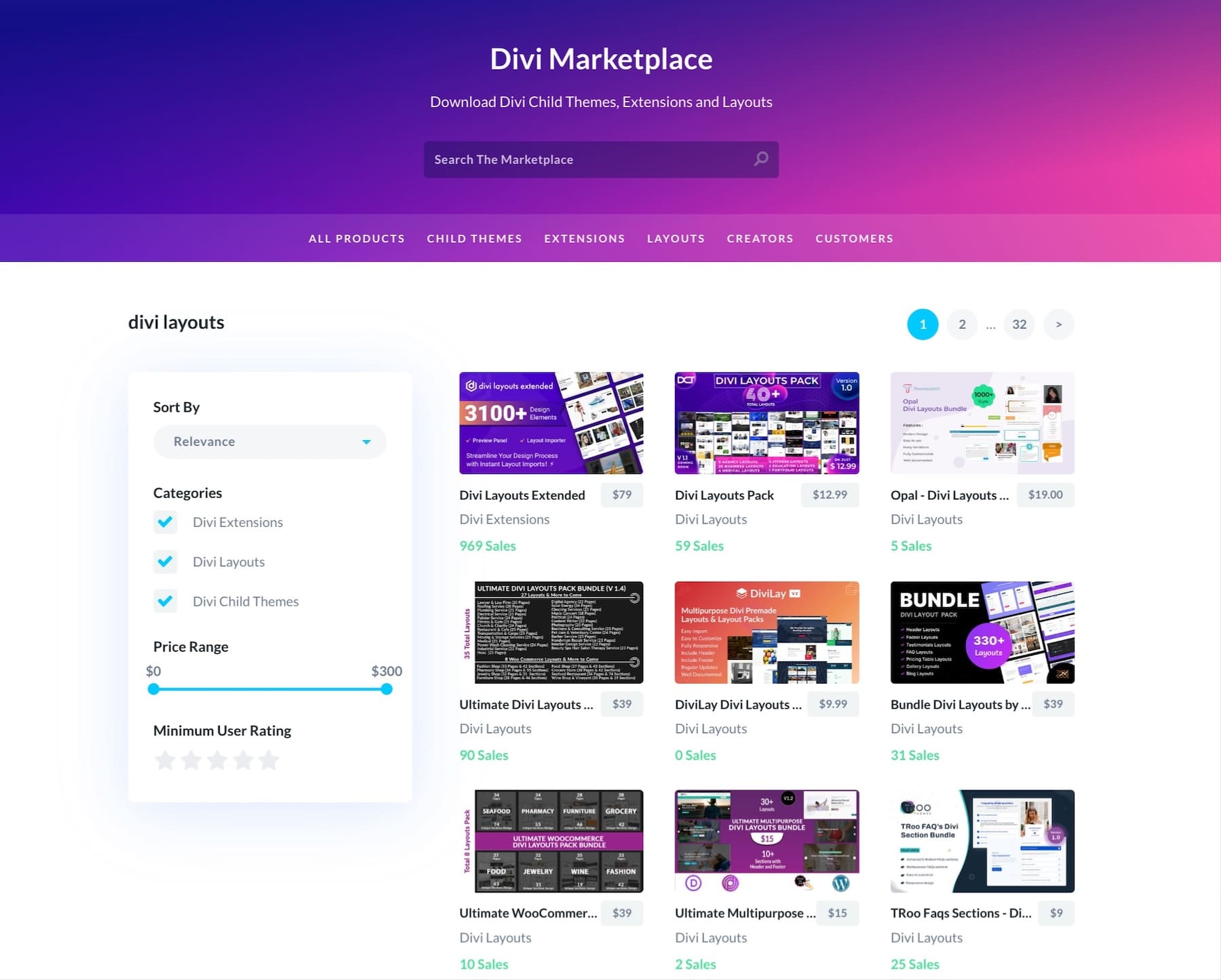
Want to expand your site? The Divi Marketplace offers professional child themes, layout packs, and extensions from trusted developers.
Each addition maintains Divi‘s visual editing features while adding specialized functionality. From shop designs to portfolio layouts, you’ll find pre-built solutions that save work hours.
From Design To Dollars: Implementation Guide
The theory session was great, but let’s get practical. This step-by-step guide will walk you through turning these principles into a working store that converts and looks great. There is no fluff, just actionable steps you can implement today.
Planning The Pages You Need
Effective ecommerce web design starts with proper planning. Your store is only as strong as its structure. Before diving into design details, you need to nail down exactly which pages you need and how they’ll work together. Here’s your essential page blueprint.
Homepage & Landing Pages
Your homepage must immediately show what makes your store different from competitors. Focus on featuring best sellers, new arrivals, and clear navigation paths to product categories.
Place your most robust value proposition at the top, then guide visitors through a logical flow of featured collections and promotions. Divi‘s Theme Builder lets you create templates that can automatically pull in your latest products and sales with some setup.
Landing pages work best when they focus on one clear goal – promoting a product line or building an email list.
Add proven conversion elements like customer testimonials, benefit-focused copy, and clear calls to action. Divi‘s specialized modules help create urgency through countdown timers and email capture forms that integrate with major marketing platforms.
Product Pages & Collection Archives
Product pages convert when they present all crucial information upfront. Include multiple product angles, clear size guides, detailed specifications, and prominent purchase buttons in your image gallery. Display genuine customer reviews and photos to reinforce buying decisions.
Furthermore, each category page, a collection archive, should feature curated products, relevant filters, and targeted promotions.
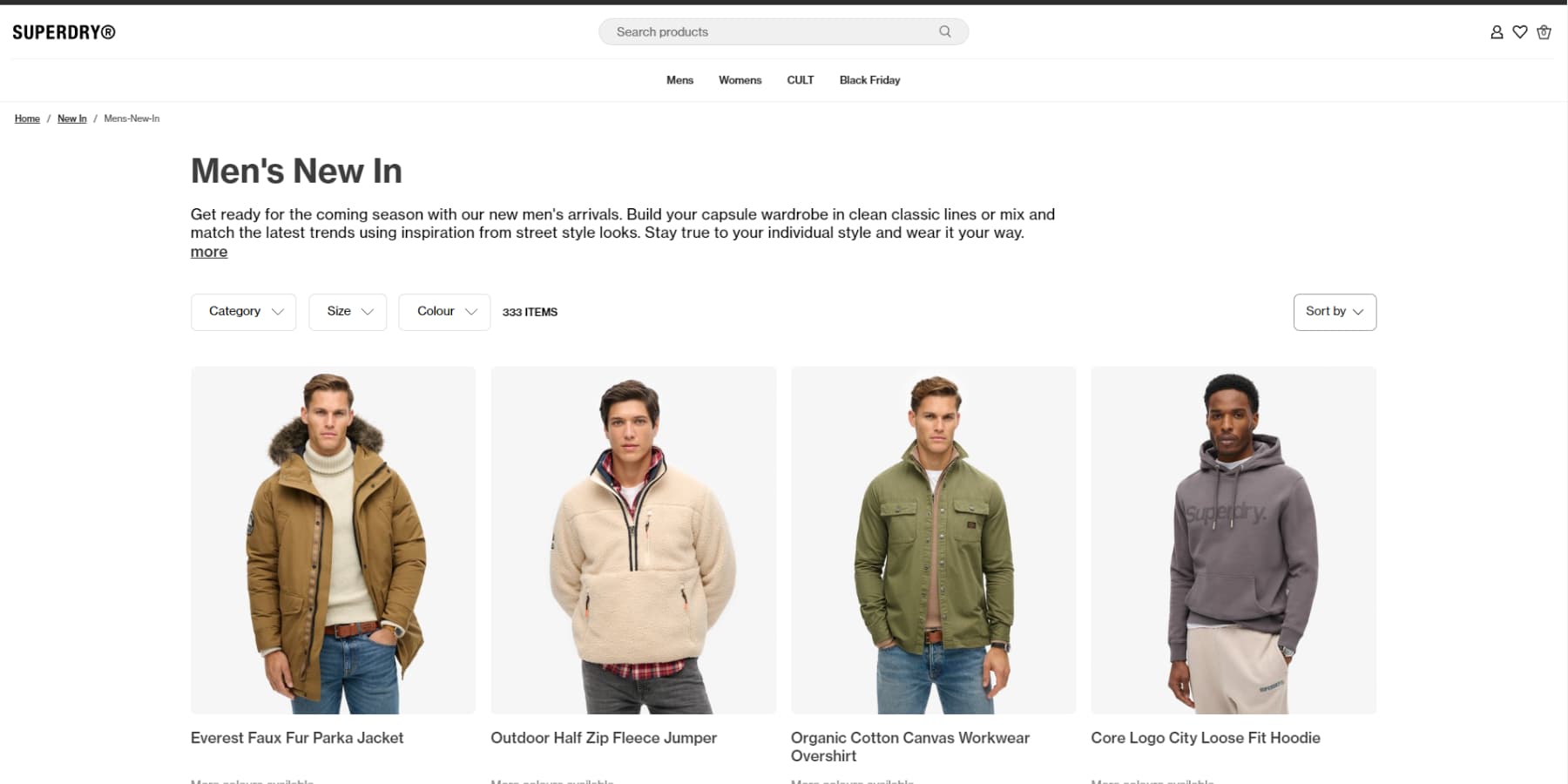
For example, a clothing store’s “Men’s Shirts” category page needs seasonal collections up top, followed by subcategories like dress shirts and t-shirts, with bestsellers prominently featured. These category pages are focused entry points for direct traffic and search results.
Divi‘s Theme Builder can help you create distinct templates for different product types. Streamlined layouts work best for simple items, while detailed layouts suit complex products that require more explanation.
Cart & Checkout Pages
Cart pages seal the deal or lose the sale. Start with clear product images, easy quantity adjustments, and prominent pricing. Add shipping estimates early so customers know the total costs upfront. Place intelligent product recommendations below the cart summary where they’ll catch eyes without disrupting the purchase flow. Divi‘s Woo Modules, such as Cart Products, Totals, and Cross-Sells, make this layout simple, whereas, in most other page builders, you have to struggle with custom PHP.
Move customers smoothly into checkout with a streamlined process. Structure the page clearly through billing, shipping, and payment using Divi‘s specialized checkout modules. Keep forms short, place trust badges near payment options, and remove unnecessary distractions. Set this up once in the Theme Builder and watch it work flawlessly for every sale.
If you’d like to design something more customized and advanced, Divi works flawlessly with WooCommerce funnel plugins such as CartFlows, FunnelKit, and more.
Account Pages (Login, Register, Dashboard)
Most stores treat account pages as an afterthought. But these pages handle everything from first-time logins to repeat purchases – they deserve proper attention. The login page comes first. Divi‘s Login module helps you build something that fits your store’s style, not some generic form that screams “template.”
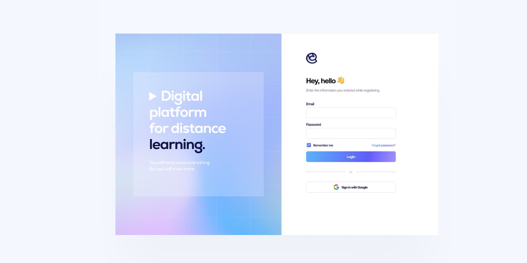
An example of a login page by Ali Sencan on Dribbble
Need more styling options for your registration page? The Divi Marketplace has solid extensions that plug right in.
The dashboard is where your regular customers will spend their time. Take WooCommerce’s solid account features with its shortcode, drop it on a page using Divi‘s text module, and make the page shine with Divi’s visual builder. Show order history clearly, keep shipping addresses easy to update, and put the most-used features within easy reach. A little time spent here can make a big difference in how customers interact with your store.
Policy Pages (Shipping, Returns, Terms)
Policy pages build trust and prevent support headaches. Place your shipping costs, delivery times, and return windows front and center — customers abandon carts when these details hide behind clicks. Break complex policies into scannable sections with clear headings. List shipping rates by region, expected delivery windows, and any free shipping thresholds. Your returns policy should outline the return window, condition requirements, and refund processing times without legal jargon.
Divi‘s toggle modules work perfectly for organizing lengthy policies into expandable sections. Using the Theme Builder, create a policy hub template and link to specific sections from your product pages and checkout flow.
Include a prominent FAQ section addressing concerns about common international or return shipping costs. Remember to update seasonal shipping cutoffs during holiday periods and display them prominently across your store using Divi’s global elements – update once, change everywhere.
Designing Product Cards That Convert
Product cards are your store’s handshake with shoppers – they must make a solid first impression. While Divi works smoothly with WooCommerce’s default product cards, grab a solid marketplace extension to push your designs further.
The right extension lets you add smart hover effects, stock counters, or quick-add buttons that make browsing feel natural.
Keep your card designs focused on what matters. Clear product titles, visible pricing, and well-spaced elements help shoppers scan quickly. Test different layouts with your actual products — what works for one store might not work for yours.
Determining A Product Display Strategy
After nailing your product cards, think about how they’ll work together on the page. Grid layouts work well for visual products like clothing or art, while list views might suit detailed items better. Divi marketplace extensions help you mix these layouts or add filtering options that help shoppers find exactly what they want.
Consider how your products flow on different devices – what looks perfect on a desktop needs to work just as well on mobile. Show three or four products per row on larger screens, letting the layout adjust naturally for smaller devices. The goal is to help customers browse efficiently, whether they’re shopping from their phone or desktop.
Implementing Post-Purchase Experiences
The sale isn’t the end—it’s just the beginning. How you handle the post-purchase experience can mean the difference between one-time buyers and loyal customers. Most people forget to optimize this part, thinking it doesn’t really matter in ecommerce web design. Let’s build a system that turns first-time shoppers into repeat buyers.
A Proper Thank You Page
Most stores waste their thank you page on basic order details. Smart merchants know better – this is prime real estate for deepening customer relationships. While WooCommerce handles the basics of a “thank you page,” tools like CartFlows or WPFunnels let you craft something more meaningful by leveraging Divi‘s visual builder.
Add a quick video welcome from your team, showcase your loyalty program, or drop in personalized product picks based on their purchase. Some shops even offer instant rewards or exclusive content here. The key is making customers feel good about buying from you, not just processing their orders. Keep it clean, keep it focused, but make it count.
Customer Feedback Collection
Fresh feedback helps you spot issues before they become problems. On your thank you page, drop a simple, nonintrusive popup or pushup asking how the shopping experience was — keep it to one or two questions max. Nobody wants a survey right after buying.
Connect your email platform to WooCommerce for deeper insights and trigger a feedback request a few days after delivery. Tools like MailPoet make this automatic. Ask about the product quality, shipping speed, or overall satisfaction. Just time it right — too early feels pushy, too late, and they might forget the details.
Consistent Transactional & Welcome Emails
Standard WooCommerce emails work, but they rarely excite because they all look identical. You may get your hands dirty with custom code or use tools like FunnelKit or WPFunnels to let you design emails that match your brand and drive engagement with a drag-and-drop builder. Customize order confirmations, shipping updates, and welcome sequences that feel personal, not robotic.
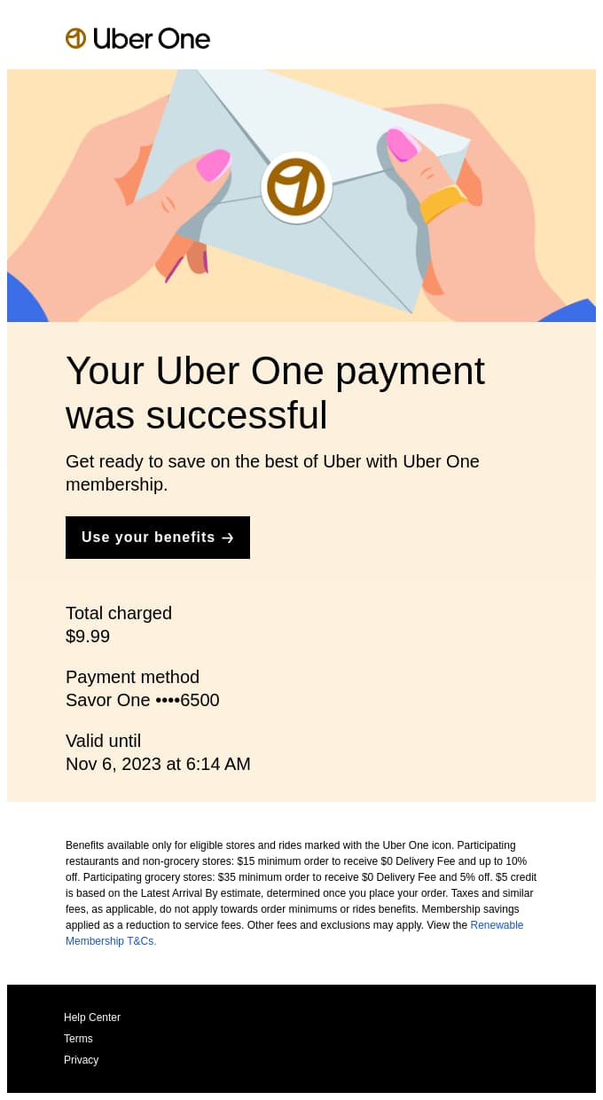
An example of an excellent transactional email design by Uber (image from Really Good Emails)
Build a welcome series that guides new customers through your brand story, showcases top products, or shares care tips for their purchase. Time these touches thoughtfully — space them out to stay helpful, not annoying. The goal is building relationships, not flooding inboxes.
Design A Store That Sells — Right Now
Now you know, Amazon’s consistent design has driven sales for over a decade because they understand what we’ve covered today: superior ecommerce web design principles come from removing barriers between products and purchases. Every element, from your product cards to checkout flow, should combine to convert browsers into buyers.
| Tool | Purpose | |
|---|---|---|
| Divi | WordPress Theme/Page Builder | Get |
| Divi AI | AI-Powered Design and Content Creation | Get |
| Divi Quick Sites | Instant Website Creation | Get |
| WooCommerce | E-commerce Platform | Get |
| SiteGround | Web Hosting | Get |
| Mailchimp | Email Marketing | Get |
| Rank Math | SEO Plugin | Get |
| CartFlows | Sales Funnel Builder | Get |
| FunnelKit | Sales Funnel Tool | Get |
| WPFunnels | Sales Funnel Plugin | Get |
| MailPoet | Email Newsletter Plugin | Get |
| EWWW Image Optimizer | Image Compression | Get |
| UpdraftPlus | Website Backup | Get |
| Solid Security | WordPress Security | Get |
| CleanTalk | Anti-Spam Protection | Get |
Stop bleeding money through abandoned carts, overwhelmed support teams, and lost opportunities. With Divi‘s powerful visual builder, seamless WooCommerce integration, and AI-powered tools like Divi AI and Quick Sites, you can transform your eCommerce website into a conversion-killing machine.
And the best part? When you pair Divi with rock-solid hosting from SiteGround and optimization tools like WP Rocket and Rank Math for SEO, you’re not just building a website — you’re building a revenue-generating powerhouse. Whether you’re a solo entrepreneur or a growing brand, we’ve engineered every tool you need to turn browsers into buyers without the headache of complex coding or design struggles. Don’t wait, don’t compromise — launch your winning eCommerce strategy today with Divi and our ecosystem of game-changing tools.




Leave A Reply