

Your logo is probably your brand’s single design asset that people see the most. It’s on your website, letterhead, promo materials, emails, icons, shirts, social media pages, and nearly everything else that you work with on a daily basis. So making sure that you choose the best fonts for logos is imperative. Whether it’s fair or not, first impressions matter. So do lasting impressions. And if you’re going be judged and remembered by something, you ought to make it as amazing as possible.
What This Article Is Not
When we talk about choosing the best fonts in this article, we aren’t talking about what you should be using for headers or body text on your website. Or whether you should be using serif or sans serif fonts in your email blasts. While some of the same criteria apply to those as well, we are going to be specifically focusing on what you have in a singular space that gets repeated over and over again.
The difference specifically is that your logo (and its respective font) will be plastered everywhere. So it will be used as a kind of springboard and cornerstone for the rest of your design aesthetic. You will choose complimentary fonts and typefaces for your website and promo materials, but they may not be the exact same. So while you may get some great ideas and starting points for overall designs in this piece, you’ll want to see some of our other font and design articles to flesh out the rest of your page-wide and brand kit decisions.
With that in mind, let’s get started choosing your brand’s new face. Typeface, that is!
How to Choose the Best Fonts for Logos
Subscribe To Our Youtube Channel
1. Consider Your Brand’s Identity and Personality
When we say this, all we mean is to think about what your brand stands for and how people see it. Typefaces and fonts can very much drive the perception of a product or service, and you want one that invites people to think about your brand in a specific way.
For instance, if you’re designing a logo for a new doctor in town. They want their logo to simply be the letters Doc. How would you choose the correct typeface for them?
Well, first of all, you’d remember they’re a doctor. So using a font like Creepster is probably out. And so is this palette, but that’s a different article altogether.
![]()
However, if they’re a pediatrician, you might actually choose something playful and like Comic Sans. (Yes, Comic Sans is fine to use on occasion.)
![]()
And if they’re, say, a cardiologist or oncologist where the most professional (type)face has to be put forward at all times? You would want to choose something with a personality to match: an elegant script or serif font that’s easy to read and discern, like Corbel or Gabriola.
![]()
Regardless, the font you choose absolutely puts off a different feeling, and you’re going to need to look at whom you’re designing for and make sure that your choice lines up with theirs. That said, can you think of one particular element that all of these examples have in common? They’re readable by the largest swath of people who will see it.
2. Keep Things Legible
When choosing a font, making sure people know what it says is paramount. Take the Disney logo. We’ve all seen it thousands of times.
![]()
We know that it spells D I S N E Y. Right?
Wrong. Well, kind of. A number of people out there see that caligraphic D as a funky, backward G. They just can’t see the D.
Now, for Disney, modeling their logo after the founder’s signature is worth more than a subset of the population misinterpreting their logotype. Unfortunately for all of us, we are not Disney. So we have to be much more careful about the legibility of our fonts.
Using even a single ambiguous letter can make your logo go from memorable to forgettable. Or even worse to what in the world is it?
Honestly, this isn’t that hard to do. Just keep a few things in mind as you search around for the best fonts for logos:
- If the font has serifs, don’t let them overlap and obscure other characters
- Consider the readability at multiple sizes. Make sure you can read it at 5px, 12px, 500px, etc. Some get blown out of proportion when scaled.
- Like above, make sure the kerning and tracking is on point (though leading may be less of an issue). This is a very important issue for some sans-serif fonts as the letters can bleed together more easily.
- Check to make sure each character in the typeface is unique (such as the capital I, the lowercase l, and the numeral 1. If any of them use the same character, they fail the il1 test, and you should choose a typeface with better readability for your logo
If you find a font that makes it past those 4 criteria, you’ve got a definite contender on your hands.
3. Don’t Get Flashy
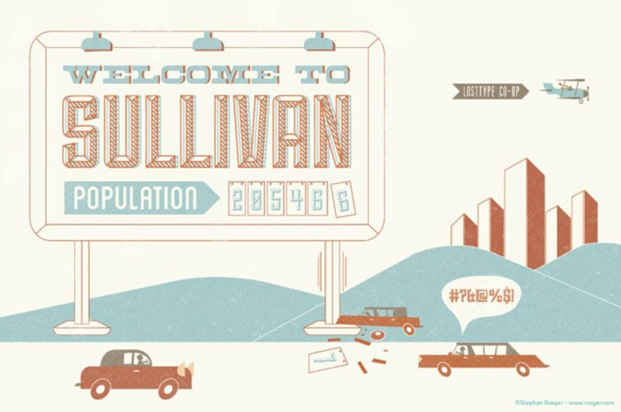
Flashy fonts are great for individual promos. They can add life and pizzazz to whatever you design with them. But if you’re looking for the best fonts for logos, you don’t want flashy. Because flashy and trendy fonts go out of style. And in 2 years, your on-the-edge logo looks dated and like you aren’t a company that keeps up with the latest changes in your industry. Like we said above, people absolutely judge you based on that first impression with your logo. If you use a font like Sullivan, it may be cute and wonderful this year, but it might force a rebranding in 5.
Sticking with simpler, less-trendy fonts for logos basically future-proofs you. And if you really love the more out-there fonts, use them in images and promo materials (as long as they still compliment your brand kit or particular promo). Use them to draw people’s attention for something specific, and then let them judge your brand on a separate playing field.
4. Numbers, Symbols, Case, and Weight
And finally, you need to make sure that your chosen typeface can actually be used as a font. A typeface is the way that the characters look, the design itself. A font is how you use the typeface. You may bold it, use it in 96pt italics, or add font-variant:small-caps to your stylesheet. Because of the varying nature of fonts, you want to make sure that you choose something that can actually be used as a font.
Not every typeface you look at will have numeral characters, for instance. So if you’re brand name is ExpressDev 5000, you’re gonna be ExpressDev [square square square square]. The same applies for bold and italics. Not everything can transform weight. Sometimes you will be stuck with t00-thin or too-thick lines. You might also not have upper- or lower-case letters. And as you can see in Example 1 up above, the changing of case can drastically affect the way the logotype turns out.
This issue tends to be more prevalent in the use of free fonts, so be aware of that’s the main pool you’re drawing from. If you’re paying for a typeface, the designer tends to include everything you could need to justify the expense and the time they put in.
Wrapping Up
As you can see, a lot more goes into choosing the best font for a logo than oh, this one’s pretty! Taking the time to make an informed choice about what the world sees first about your brand will return dividends over time. Just think, a few extra minutes staring at serif length could be the difference in landing that big client.
What do you look for when choosing the best font for logos?
Article featured image by CandyDuck / shutterstock.com


Theme based fonts on logos are the best. But the most difficult part it to satisfy a client
Really very good post.I loved it and enjoyed.
Hey B.J, Thanks for the post. Designing Logo is really a Daunting Task and I too agreed with choosing best fonts for the Brand or Company Logo matters a lot when it comes to Branding a Product or Services.
Appreciate your work!
Comic sans, gabriola and corbel? Was this article actually written by a designer?
I go for simple text while making a logo for my website. Comic Sans i usually use.
Disney example was great to make us understand the use of the font.
Good information with great content. Disney example was great.
I usually choose the free/paid commercial fonts available on “DaFont”.
As long as it’s not papyrus or birth of a hero!
YES!!! For Comic Sans!!