Even though the old saying is that you should never judge a book by its cover, people do. The same thing happens to podcasts. Potential listeners judge the quality and colors and composition that make up your podcast cover art before they ever hear a second of your show. That means that as a creator, you should be sure to adhere to a few basic principles for your podcast art that will make people want to dig deeper into your content.
What Makes Engaging Podcast Cover Art?
There is no set template for podcast cover art, but if you take a scroll through the Apple Podcasts most popular podcasts, you will see a lot of similarities.
1. They Look Good as a Thumbnail
Each and every one of the top podcasts in the world has art that looks good as a thumbnail. Because people are scrolling through them on their phones, the art doesn’t need to be too busy. Simple is best because you don’t want your podcast art to look like a collage made by a 2nd grader for a homework assignment.
This can be done by keeping the number of words to under 5, using only a couple of colors, and a single object. This is a case where less really is more.
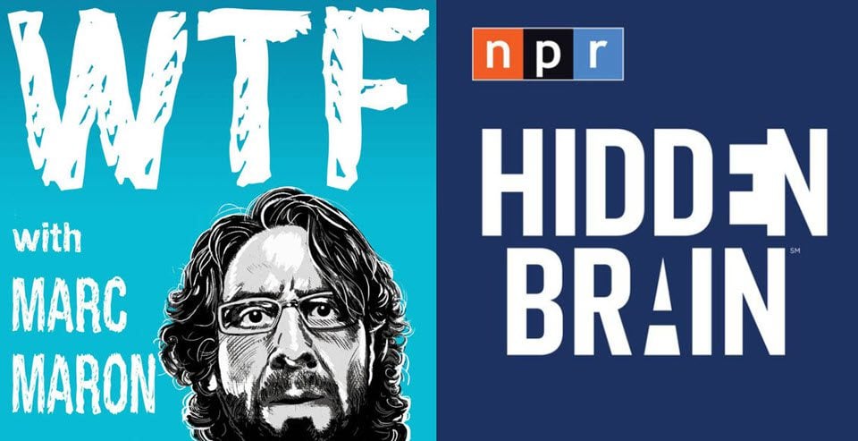
The images here are striking and recognizable, despite being simple. They also translate well into smaller sizes because they don’t have too much going on.
2. The Colors Tell Something About the Show
In general, colors will let readers know what a show is about. Bright tones indicate a show that’s energetic, subdued or darker tones might indicate a more serious subject. If you do a finance podcast, you’re probably going to want to have green in your podcast art. Because, you know, money is green. True crime podcasts tend to go for the darker colors, black and red especially.
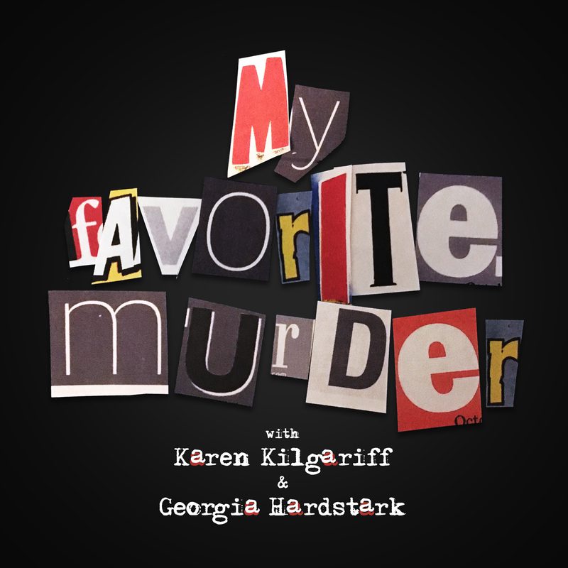
Comedy podcasts (like Mark Maron’s WTF above) use bright colors to call attention to themselves. Sports podcasts about certain teams use those teams’ colors. You get the idea.
3. Use Original Art and Design
We understand the desire (necessity?) to cut corners sometimes. We especially understand working on a podcast with little-to-no budget. But that doesn’t mean that you should just grab any image or picture out there and use it for your podcast just because it has a related theme. Stock photos are a fantastic resource, but when you’re making the rounds of totally free stock images, you’re going to see a lot of repetition in terms of what images are out there.
Images on sites like Unsplash, Pexels, and Pixabay are used a lot for podcast cover art. Which means that lots of podcasts will have similar, if not the exact same, pictures representing them. That means that if you’re not willing or able to spend for stock imagery, it may be best to forego it altogether. When you’re vying for people’s attention in a fraction of a second, you absolutely do not want to look just like a podcast they passed over moments before.
How to Create Eye-Catching Podcast Art
We actually like using tools like Canva for podcast cover art. While PhotoShop and Illustrator are fantastic tools, not everyone has access to them. Canva is a free image design tool that has free and paid plans, and you can buy images and templates directly from within the app itself. We’re going to show you how to start out with Canva to make a quick-but-professional piece of podcast cover art.
But First: The Requirements
Before you get started, you need to know there are a few requirements for your podcast art. And these are set by Apple Podcasts because they are the main podcast directory out there. You want to abide by Apple’s because they’re by and large the podcast directory almost everyone pulls from. Being within their guidelines means that you will be within everyone else’s too.
Cover art for your podcast must meet these technical specifications:
- Size: square; minimum 1400 x 1400 pixels and maximum 3000 x 3000 pixels (preferred)
- Resolution: 72 dpi
- File type: JPEG or PNG
- Colorspace: RGB
Additionally, artwork must be original and can’t contain any of the following:
- Blurry, misaligned, mismatched, or pixelated images
- Explicit language
- Placeholder images
- Apple Inc., Apple Podcasts, or iTunes Store logos
- The terms Apple Inc., Apple Podcasts, Apple Music, iTunes Store, or iTunes
- Visual representation of Apple hardware
- References to illegal drugs, profanity, or violence
All media associated with your podcast must be independently hosted and linked under the appropriate tags in its RSS feed.
Creating Podcast Cover Art with Canva
Using Canva for this kind of content creation is easy. When you log in, you can select a size for a new image. Because of the Apple Podcasts requirement of 3000×3000, just go ahead and start with that. You can also start with another square image template like an Instagram Post to then have easier access to their templates, but just make sure to resize it to the podcast art requirements.

Once inside, you will see to the left a series of templates that you can scroll through. Additionally, you can search inside the templates for keywords. Even the search for just “podcast” brings up podcast art templates.
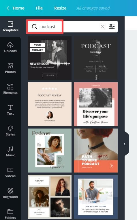
Again, let us note that you should not use one of these templates and not adjust it at all. You want to make it yours and edit it to where it’s unrecognizable that you used a template. Or else you might be in the same spot as you would be with duplicate stock imagery. Keywords for whatever your subject is will also bring up lots of templates for that, too. These are great places to draw inspiration.
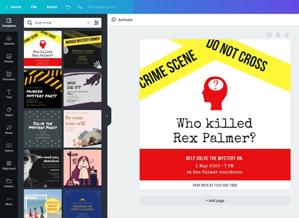
And with just a few adjustments, you can see the evolution of an RSVP template for Instagram into a unique piece of podcast art.
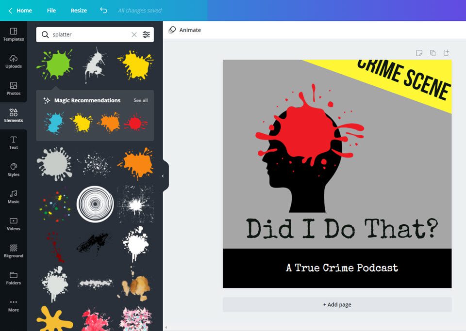
Note that we used the same rules that we mentioned above, too. The colors are often used within the “true crime” genre. It has a simple design that both indicates the subject at a glance. It doesn’t have too much going on, and it’s readable at smaller sizes. Plus, even though we used a stock design, we adjusted it to less recognizable by adding a splatter graphic to it.
You can do even more by adjusting fonts, uploading your own images, and even using the photo editing effects within the software. This was a very simple example of how you can create effective podcast cover art without breaking your budget (of both money or time!).
Just by doing those few things, we now have a piece of podcast cover art that fits the requirements so that we can upload it to our podcast host immediately.
Wrapping Up
No matter what genre of podcast you host, having eye-catching and engaging cover art can be a make-it-or-break-it element of your show. Hopefully, we’ve shown you that you don’t have to spend hundreds or thousands of dollars on original art with lots going on to be effective. You just need to know about your niche and what your listeners are looking for when they’re scrolling through all the different shows. You want to stand out from the crowd enough to be noticed but fit in with them well enough that people still know you’re a part of the team.
Looking for a way to showcase your podcast using WordPress? Try one of these top-rated podcasting plugins!
What inspired your podcast cover art?
Article featured image by Dmytro Novitskyi / shutterstock.com



Do people really go to Apple store first to search for a podcast and not to Google first and search for a name or type or title?
It should not be true because most Dutch and EU organisations, who take internet security serious, don’t allow Apple gears or products like software connected to their network and stronger, you face to be sacked if you continue to use an Apple product in your private.
If you are a sales organisation and you send messages made on an Apple, your mail is not accepted, so I have the idea that this article is not mend for Europe.
They absolutely do. It’s a major search engine for podcast discovery, though with services like Spotify and now Google showing podcast episodes individually, it will diminish a little. But they still have a major lock on searches because of the Podcasts app being default on iOS devices, and people just click it and search. It’s not the best search, mind you, but it does tend to be keyword-centric and show up both episodes on the topic and overall shows.
What is wrong by using a flat ebook like cover?
What do you mean, exactly?
Thanks Keeton, Actually my friend recently started podcast. This would help him.