
")
Your website’s footer is more than just a place for copyright information; it can be a valuable tool for boosting brand credibility, improving user experience, and even driving conversions. In this post, we’ll explain why you need a well-designed footer on your site, showcase some best practices, and show you how to design a footer using the Divi WordPress theme.
Let’s dive in.
For those who don’t know, a website footer is the section that appears at the very bottom of every page on your site. It’s an important area that often goes overlooked but serves several important functions. Footers typically include essential information, like contact details, copyright and legal information, and social media links. While seemingly small, the footer plays a significant role in boosting user experience, improving your brand’s credibility, and even boosting your search engine optimization (SEO).
Footers play a vital role in the success of any website. They serve as a hub for important info and contribute to the user experience. There are several reasons why you should have an effective footer, including:
- Brand Reinforcement: Footers consistently display your logo, colors, and fonts, reinforcing brand identity across all pages.
- Contact Information: The footer’s easily accessible contact details allow visitors to contact you quickly and easily.
- Legal & Privacy Information: Footers provide a central location for crucial legal and privacy information, ensuring transparency and compliance.
- Improved User Experience: Well-organized footers enhance user navigation by providing easy access to important pages and site maps, improving overall usability.
- SEO Benefits: Well-designed footers can include valuable links to other websites (backlinks) and social media profiles, improving placement in search engine ranking pages (SERPs) and SEO.
A well-designed footer is more than just a footnote. It’s a valuable space that provides essential information, enhances user experience, and boosts your brand’s credibility.
1. Contact Information
Your footer should be a convenient hub for visitors to connect with you. Include your phone number to encourage visitors to call, your email address or a form for inquiries, and your physical address if you have one. Don’t forget to add links to your social media profiles using attractive and visible icons. This encourages visitors to connect with you in various ways.
2. Copyright & Legal Information
Transparency is key, so your footer should clearly outline your legal and privacy information. Include a copyright notice to protect your original content. Provide easy-to-find links to your privacy policy and terms of service pages. This builds trust with your visitors and ensures they understand how you handle their data. If applicable, include a disclaimer or cookie policy to address specific concerns or limitations.
Another crucial component when designing a footer for your website is including a menu. Navigation makes it easy for users to navigate your website and helps visitors quickly find the information they want. Don’t forget to include links to important pages on your site, including your blog (if you plan to have one). This ensures easy access to key areas of your website.
4. Call To Action (CTA)
Finally, consider adding a CTA to your footer. Encourage them to subscribe to your newsletter to receive exclusive updates and offers. You can also use this space to promote a specific product or service. Alternatively, consider offering a valuable free resource like an ebook or webinar to entice visitors to take the next step.
When you set out to design a footer for your website, you have to think beyond simply listing information. You need to have a greater purpose in mind and incorporate some key design principles to make it effective.
- Keep It Concise: Avoid dropping a large amount of text into your footer, as doing so can overwhelm your visitors. Prioritize clarity and avoid clutter.
- Focus on Readability: Choose clear, easy-to-read fonts. Use sufficient spacing between elements and ensure font sizes are appropriate for easy reading.
- Maintain Brand Consistency: Your footer should have the same look and feel as the rest of your website. Use colors, typography, and logos consistently to reinforce your brand identity.
- Make It Responsive: Web design principles dictate that websites should be sized appropriately for all screen sizes – including your site’s footer.
- Accessibility Matters: Ensure your footer is designed for all users, including those with disabilities. Use appropriate heading structures, alt tags for images, and sufficient color contrast.
There are plenty of ways to design a footer for your website. Web design tools like Figma, Framer, or Sketch are great for ironing out a prototype for your designs, or you can dive in with a tool like Divi and design your footer in real-time. For this tutorial, we’ll use Divi to show you how easy it is to design a footer with a logo, social media icons, an email opt-in, and some important links – all in just a few minutes.
What Is Divi?

Divi is one of the most powerful WordPress themes on the market. With a front-end, no-code page builder, and the ability to design every aspect of your website, Divi has the flexibility and design chops to do it all. With its intuitive Visual Builder, you can easily create stunning and unique websites, including footers, without needing to write any code.
Divi also includes a large library of premade layouts, including a wide variety of footer designs. These premade layouts can serve as a starting point for your design, offering inspiration and saving you valuable time. In addition to layouts, Divi also offers Quick Sites, which gives you a fast and easy way to generate a complete website from a collection of starter sites. The process involves choosing a starter site and providing Divi with information about your business, including your logo, brand colors, and fonts.
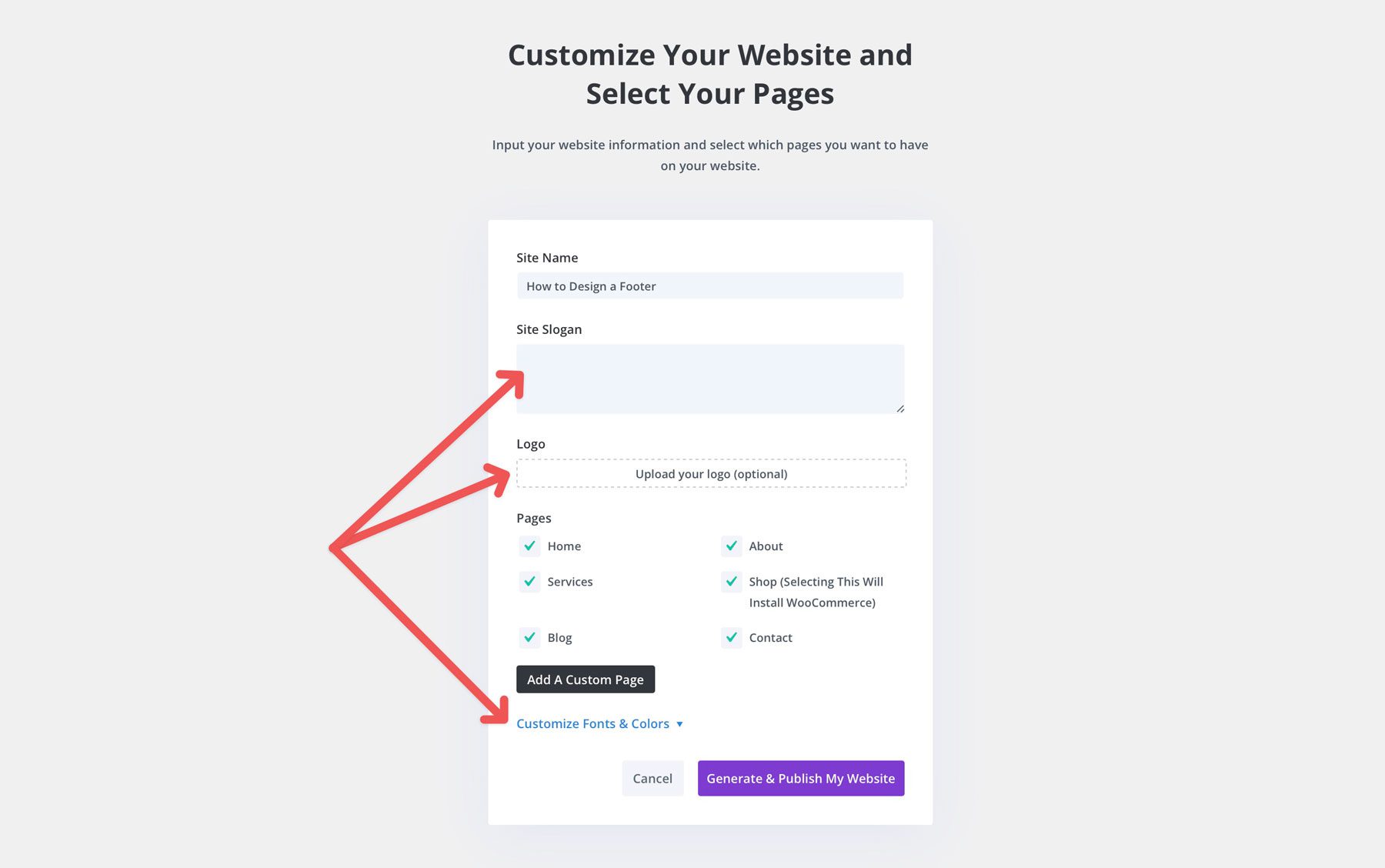
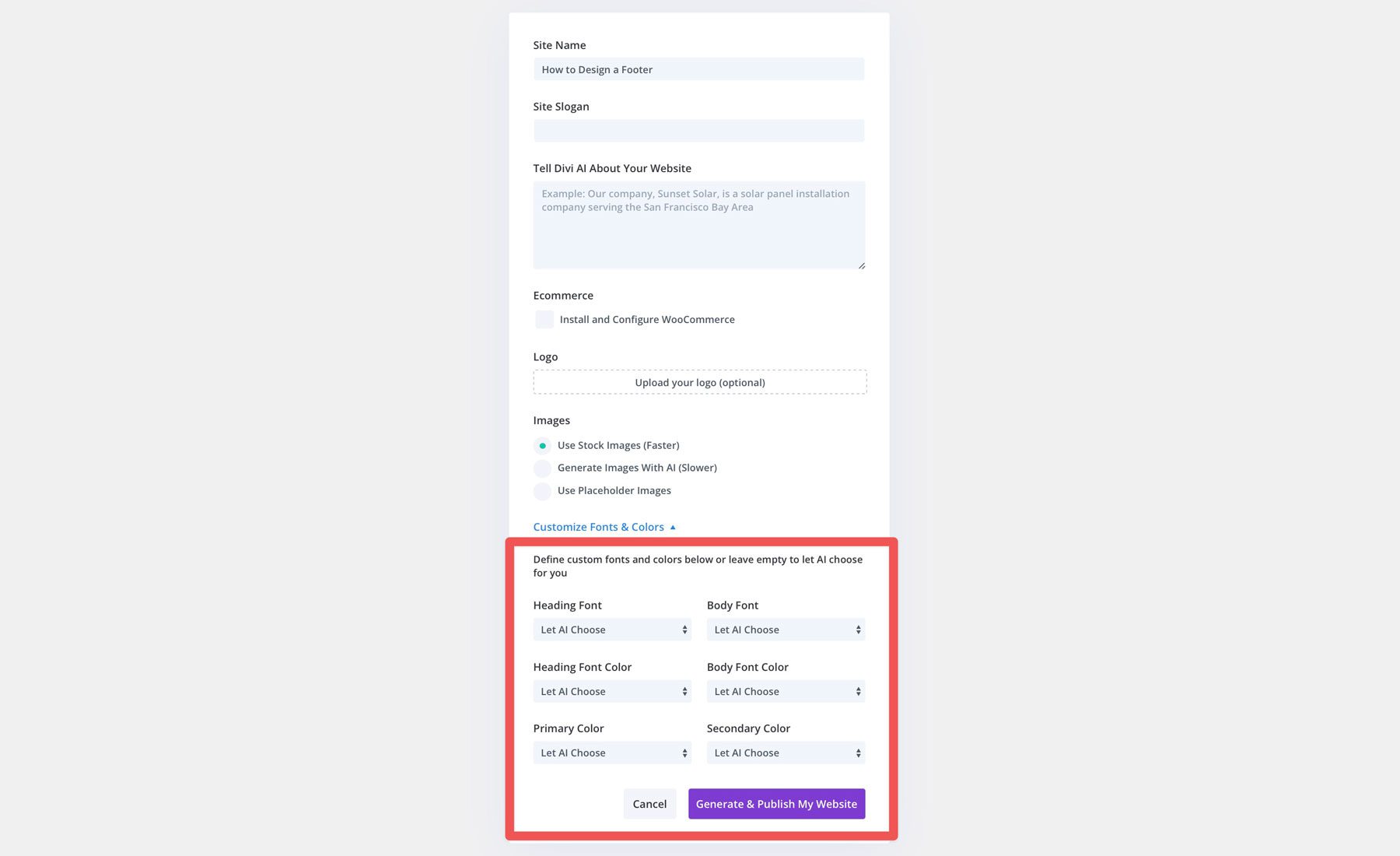
Every website Quick Sites generates comes with all core web pages, Theme Builder templates, design module presets, and global styles, keeping the design consistent across the entire website. In addition to starter sites, you can opt for an AI-generated website courtesy of Divi AI. With Divi AI, your site comes with everything the starter site does but allows you to use a text prompt to write a description of the site you’d like to create. You can also choose your branding or allow Divi AI to generate it.
Although you can use Divi AI or Quick Sites to generate an effective footer, you can design one from scratch from the Visual and Theme Builders.
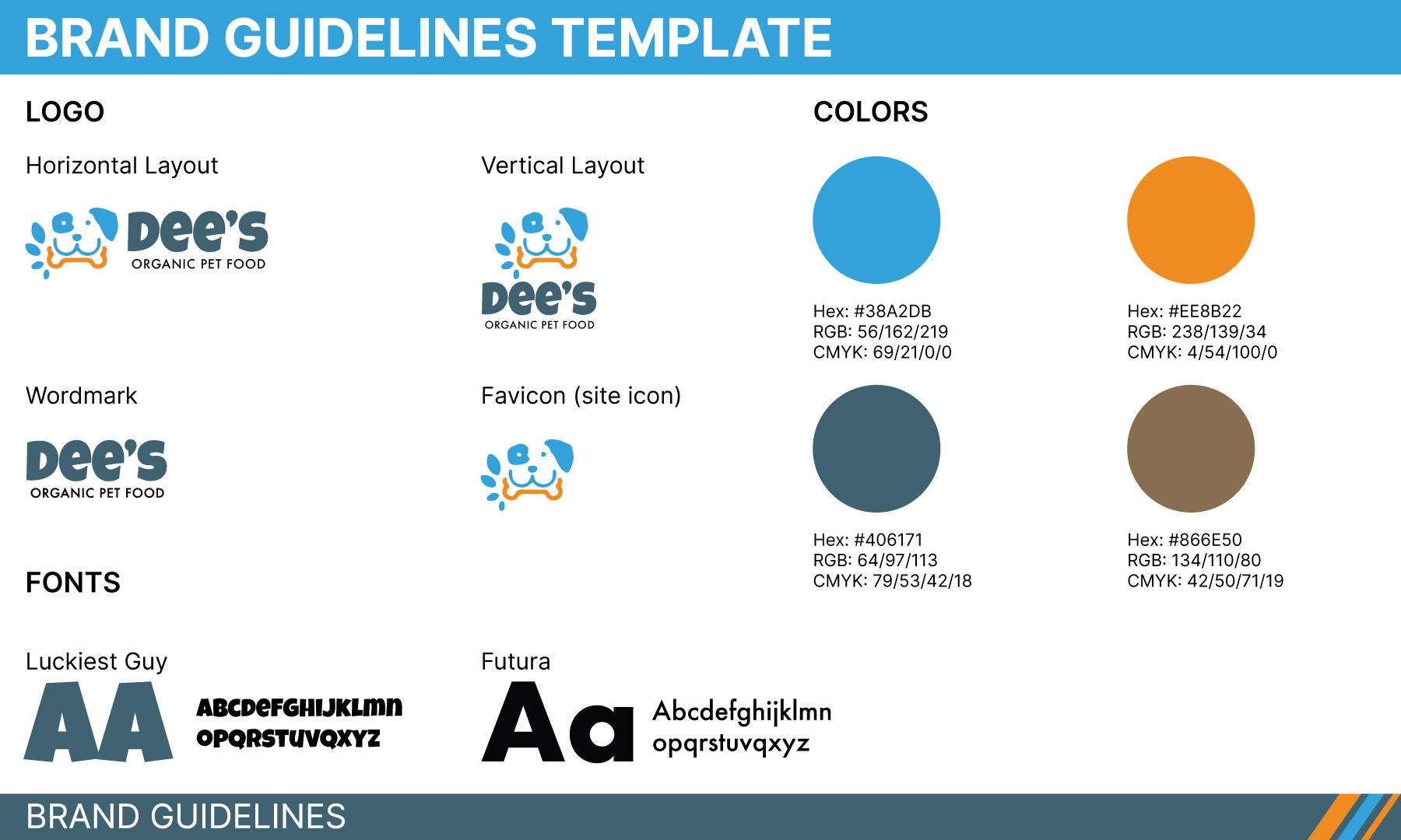
Before we begin designing a footer, it’s a good idea to have a brand guidelines template like the one pictured below. This template allows you to start with logo guidelines, brand colors, and fonts to assist you when you design a footer. Moving forward, we’ll use this template as a guide.
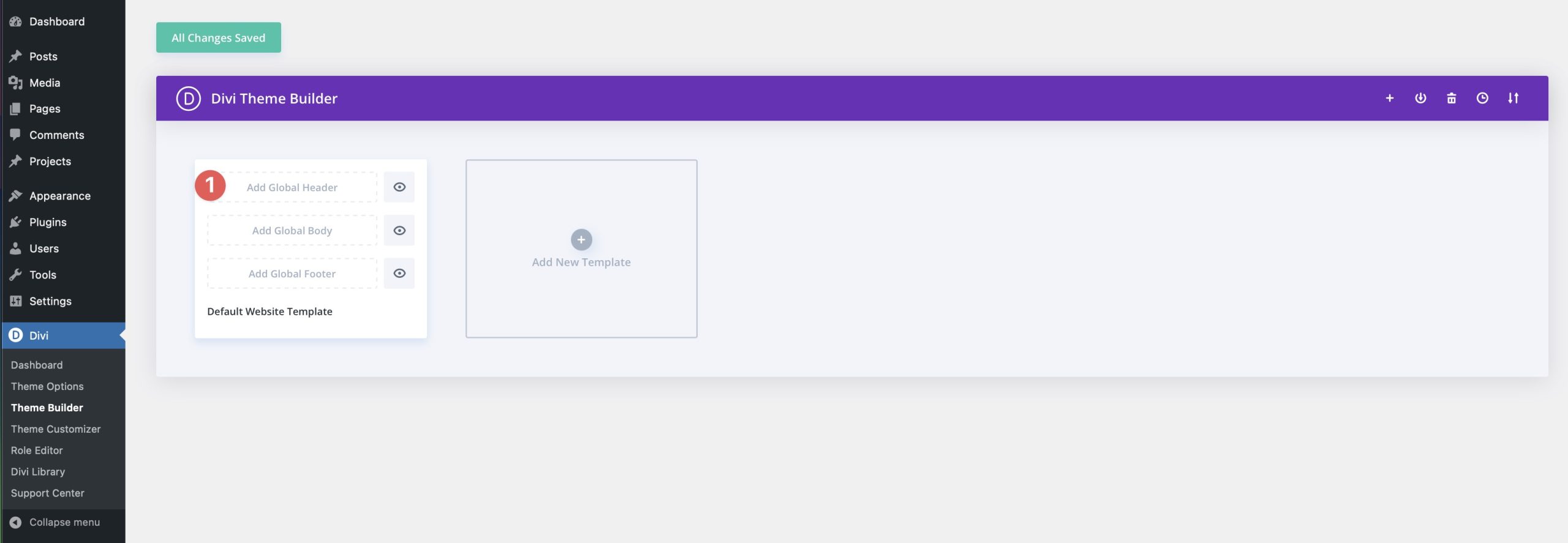
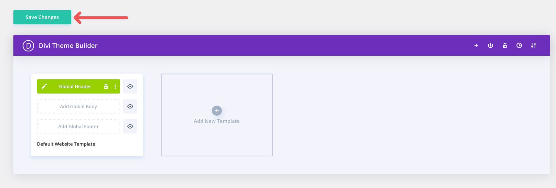
Log into your WordPress website and navigate to Divi > Theme Builder.
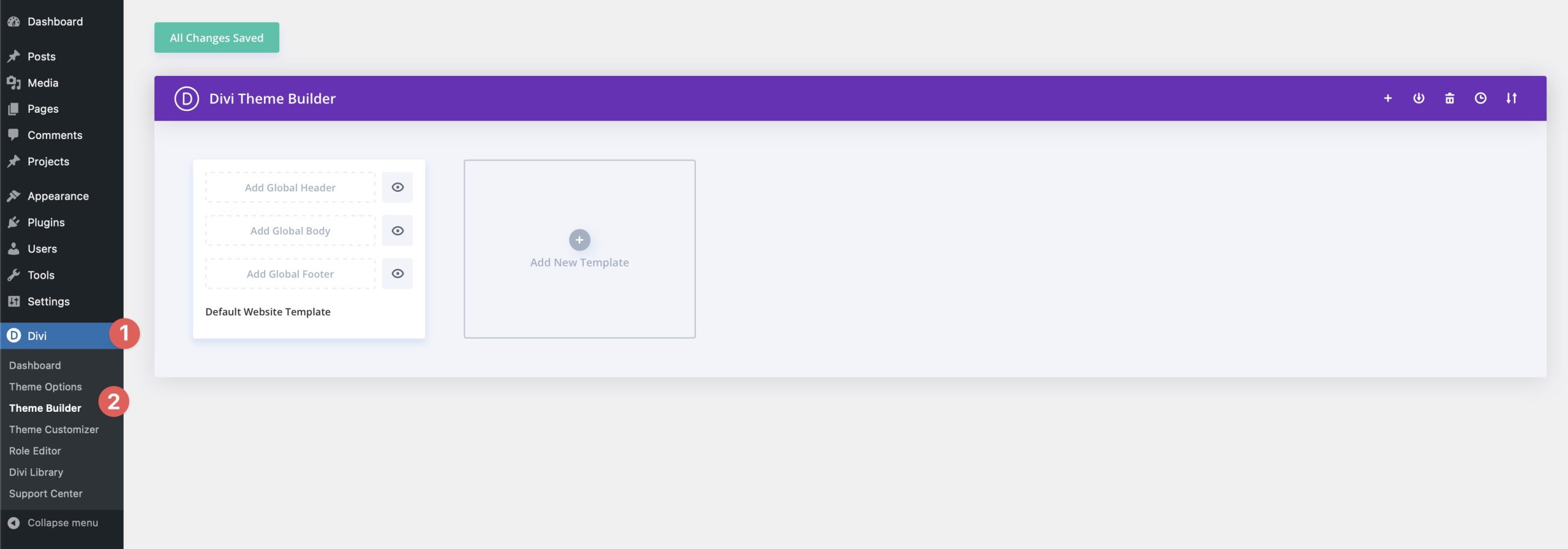
Next, click Add Global Footer, then Build Global Footer to launch the Theme Builder.
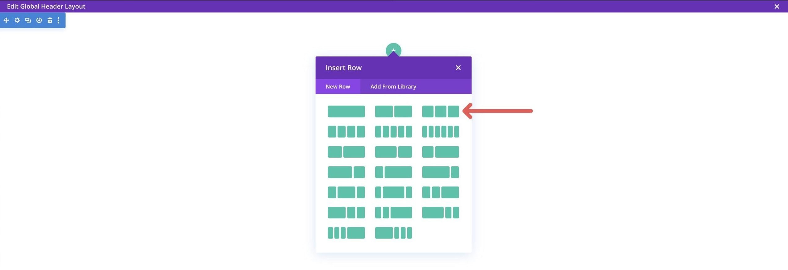
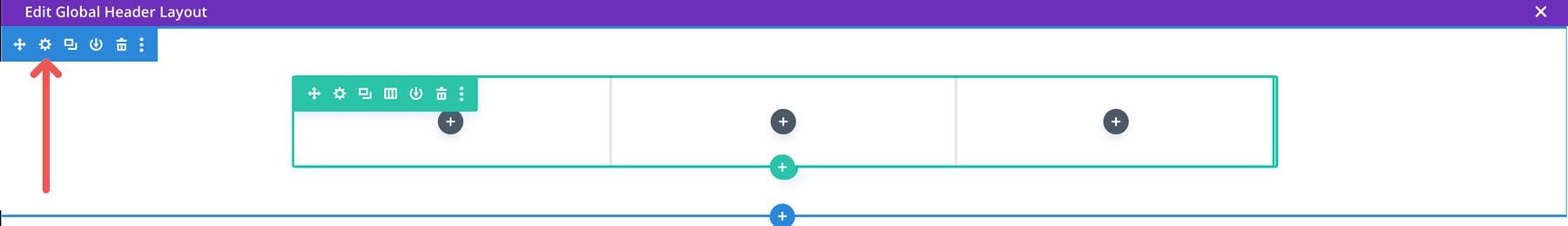
When the Theme Builder launches, you’ll be met with a blank slate. Start by clicking the green icon to add a row to the footer.

Next, select the three-column layout from the available options.
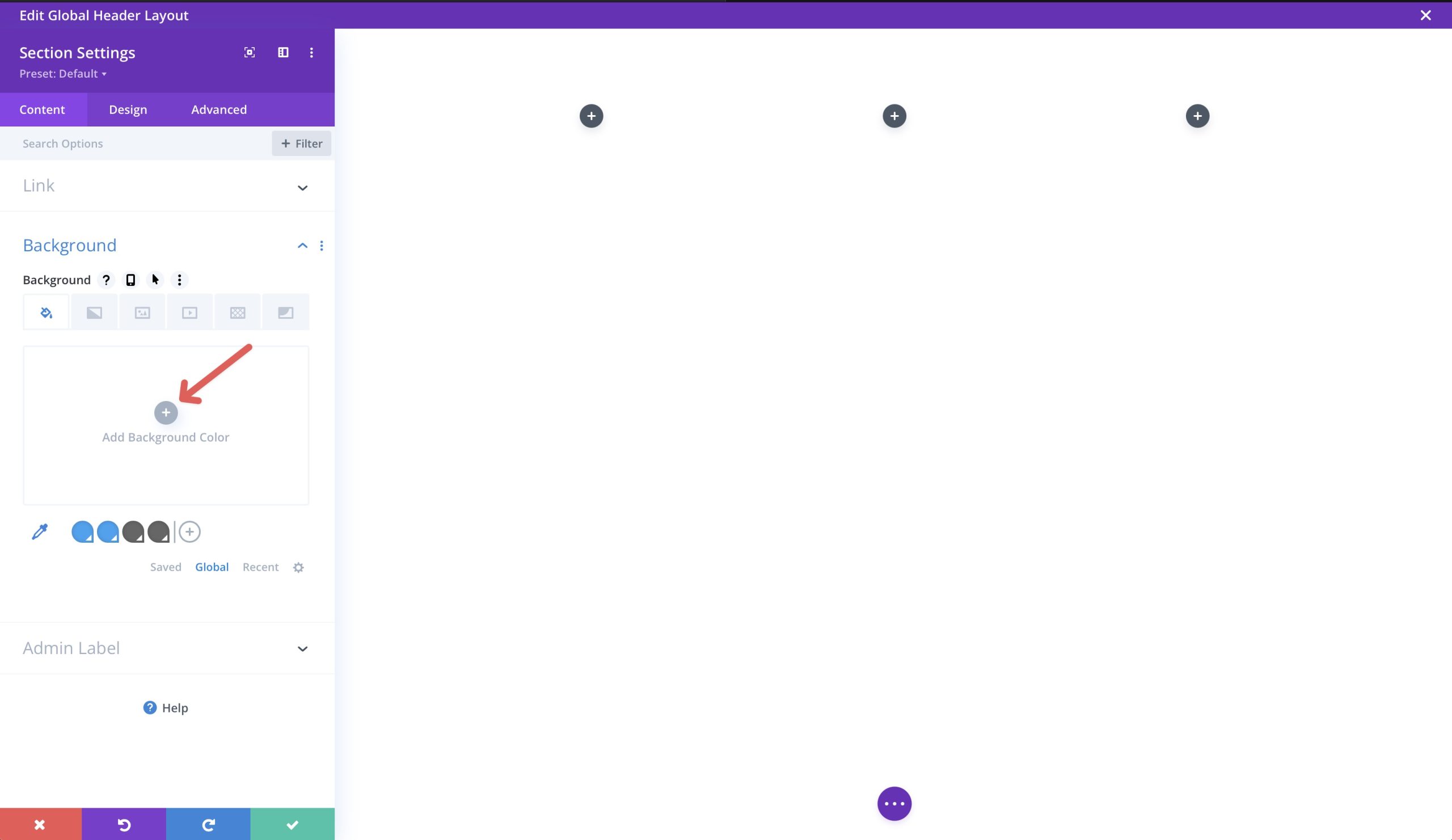
Before we add content, we will need to add a background color to our section. To do so, click on the gear icon (settings) at the top left of the section.
Click + Add Background Color to select a background color for our section.
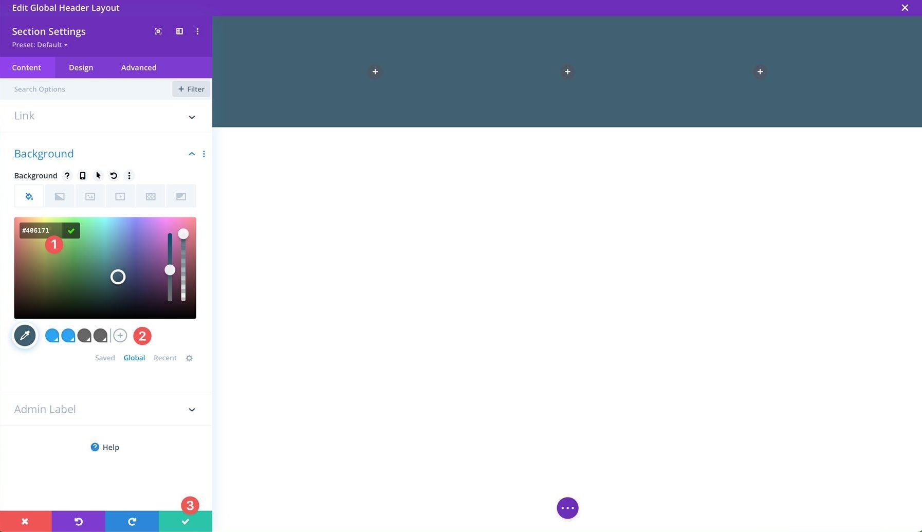
Use #406171 as the color. To save the color as a global one, click the + icon to add it. Once you’ve added a background color, click the green button to save it.
Add A Logo
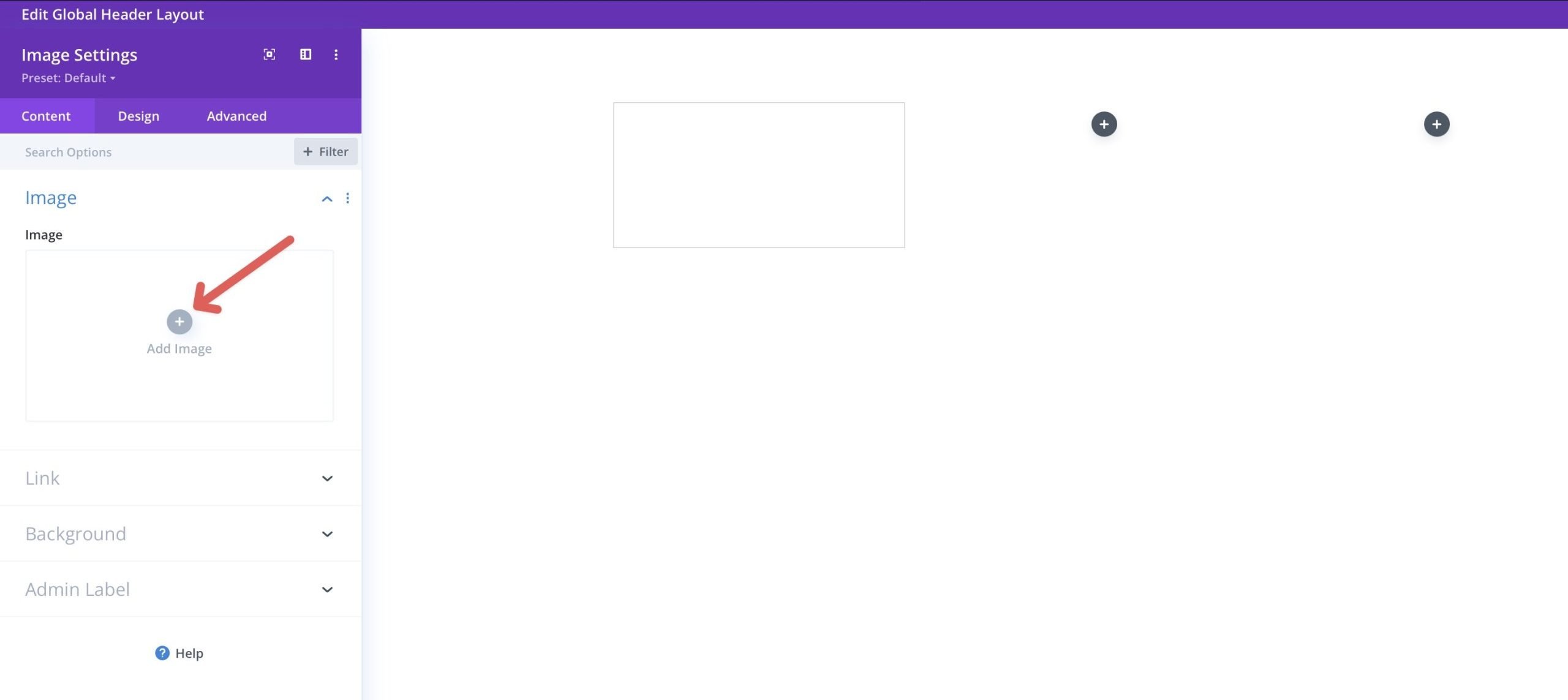
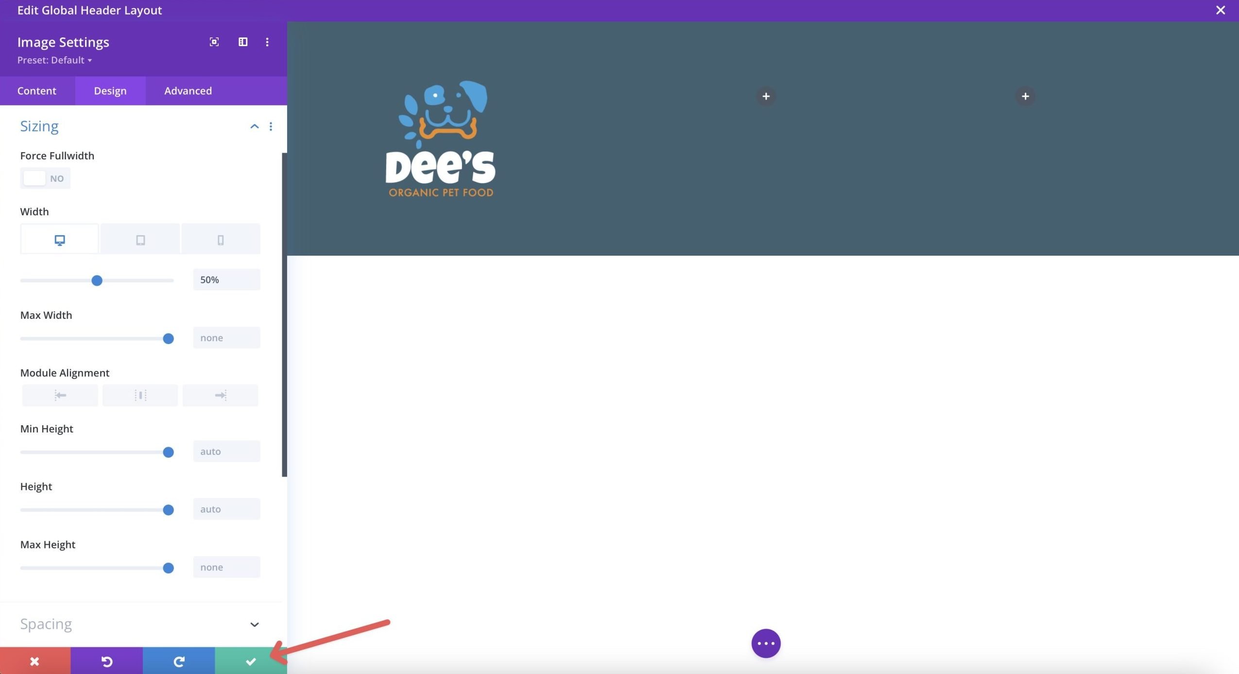
With our row structure in place, it’s time to add some content. Start by adding the image module to the first column of the row.
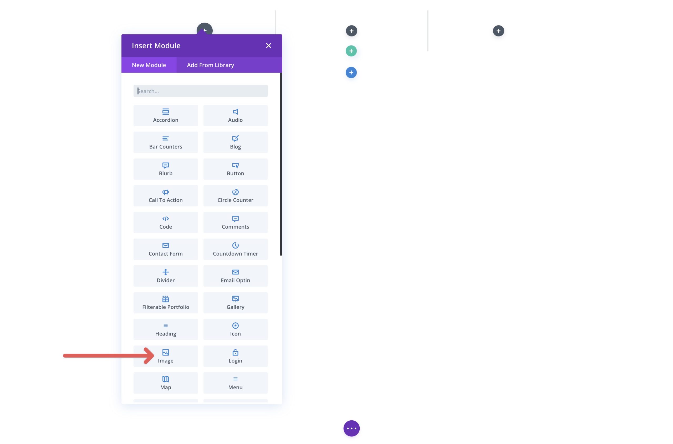
Select + Add Image to upload your logo with the image module’s settings active.
Once your logo is uploaded, we’ll need to make some changes, so click the design tab to begin.
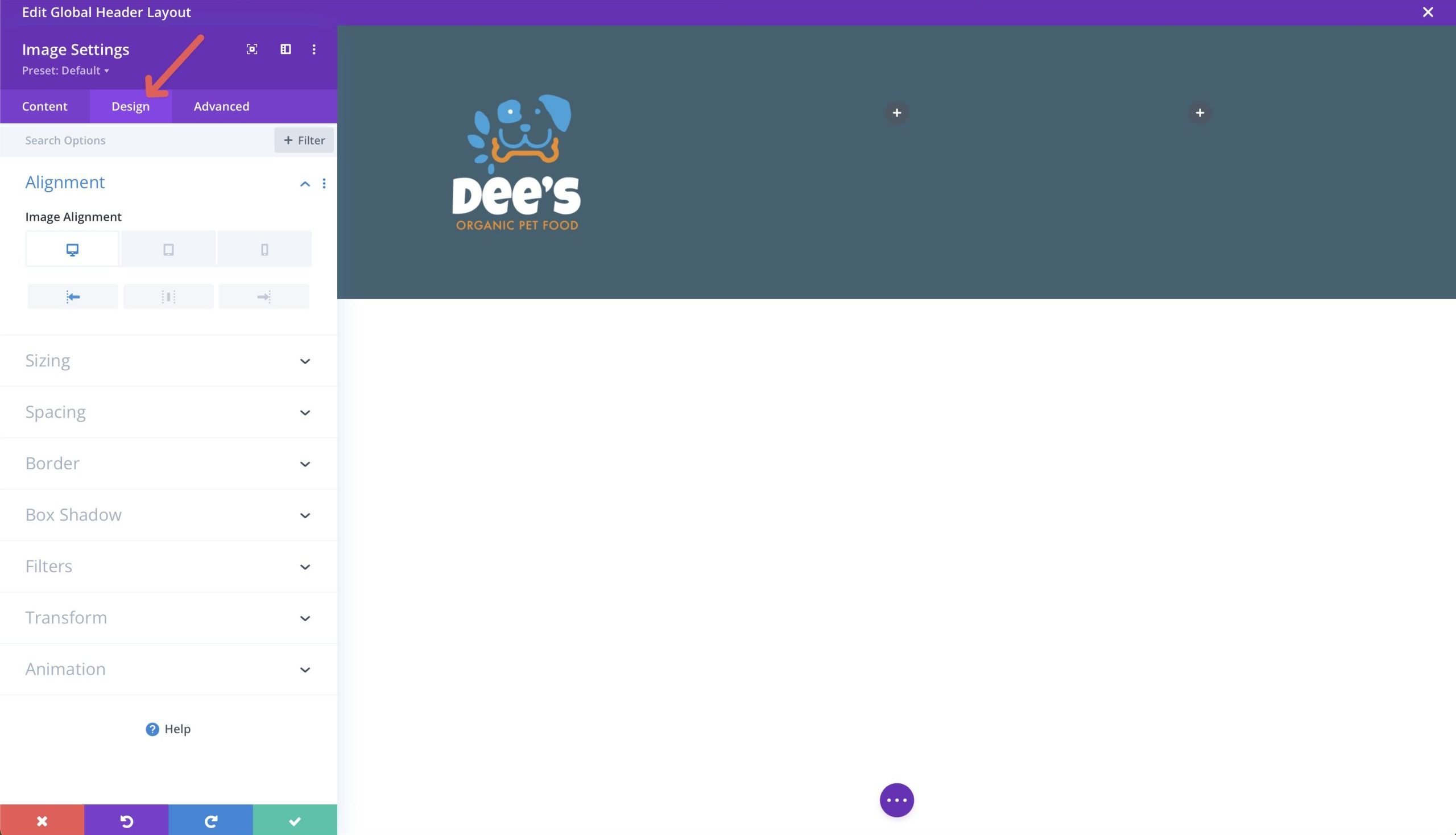
Under the alignment dropdown menu, set the image alignment to the left on the desktop and center on tablet and mobile. Next, click the sizing tab and set the width to 50% for desktop and tablet and 40% for mobile.
When finished, click the green button to save the module.
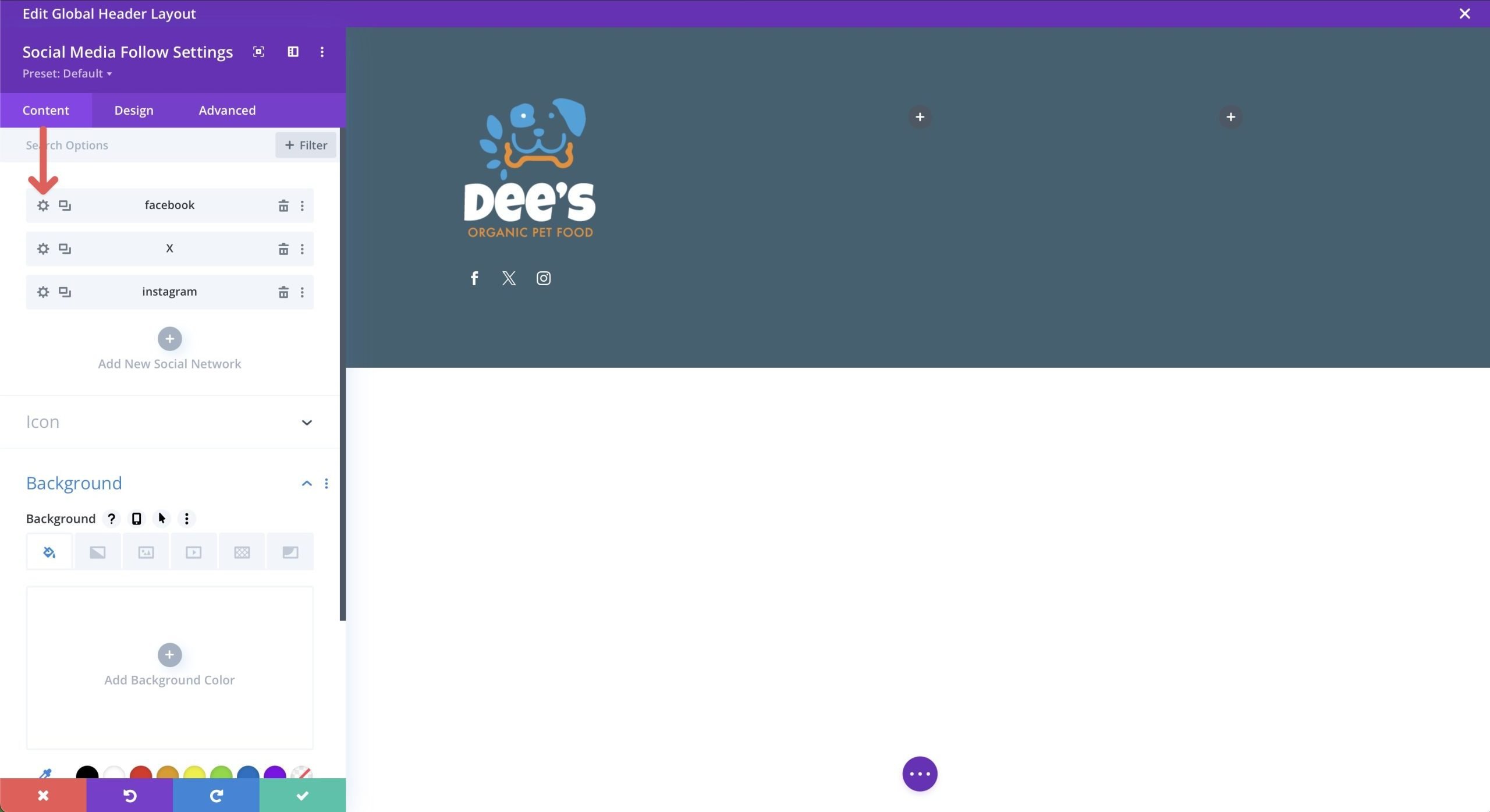
Add Social Media Icons
Click the grey + icon underneath the logo to add a new module and select the social media follow module.
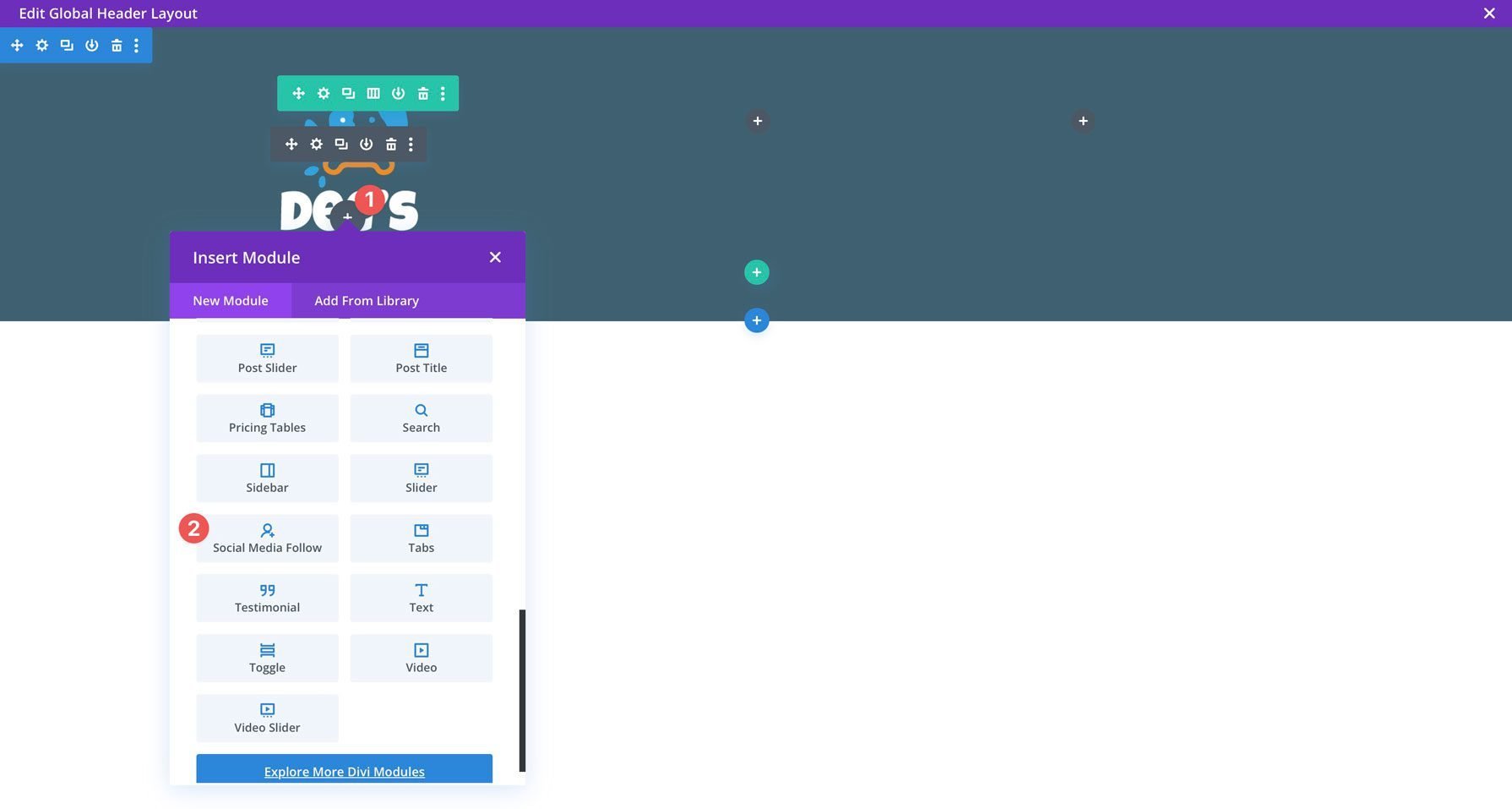
With the module settings active, click the +Add New Social Network button to add your chosen social media platforms. For this tutorial, we’ll add Facebook, X, and Instagram.
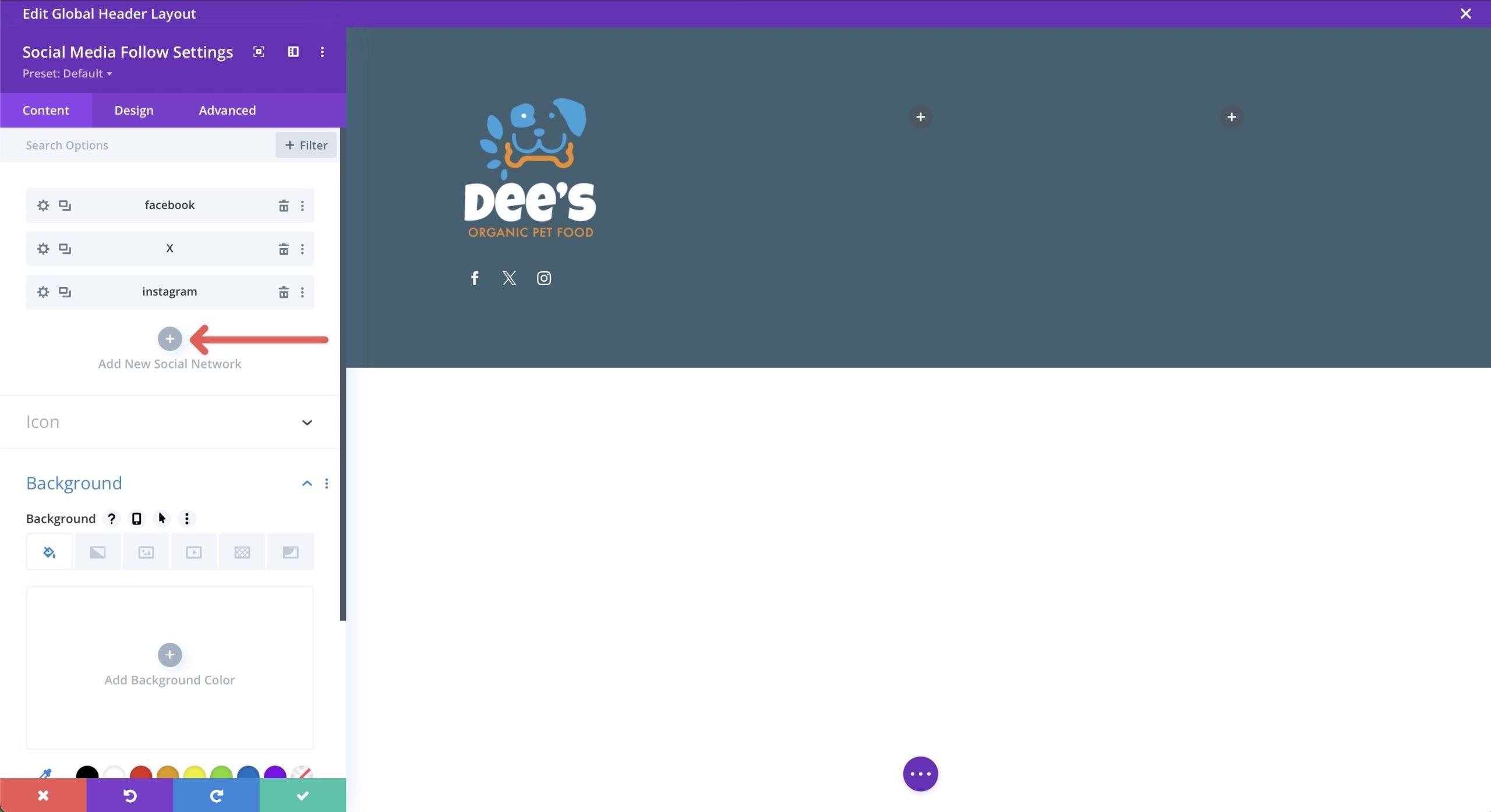
To add a background to each social media platform, click the gear icon to edit it.
Use #ee8b22 for the background color. Repeat these steps to edit the icons for X and Instagram.
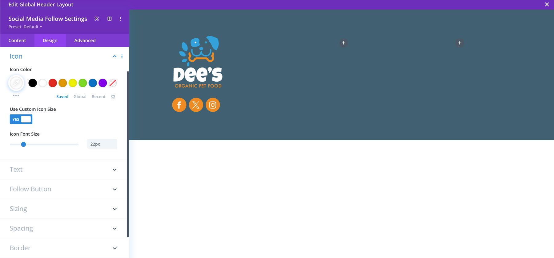
Next, swap to the design tab and add the following settings:
- Module Alignment: left (desktop), center (tables & mobile)
- Icon Color: #ffffff
- Use Custom Icon Size: Yes
- Custom Icon Size: 20px
- Border Rounded Corners: 100px
Once complete, your icons should look like the image below.
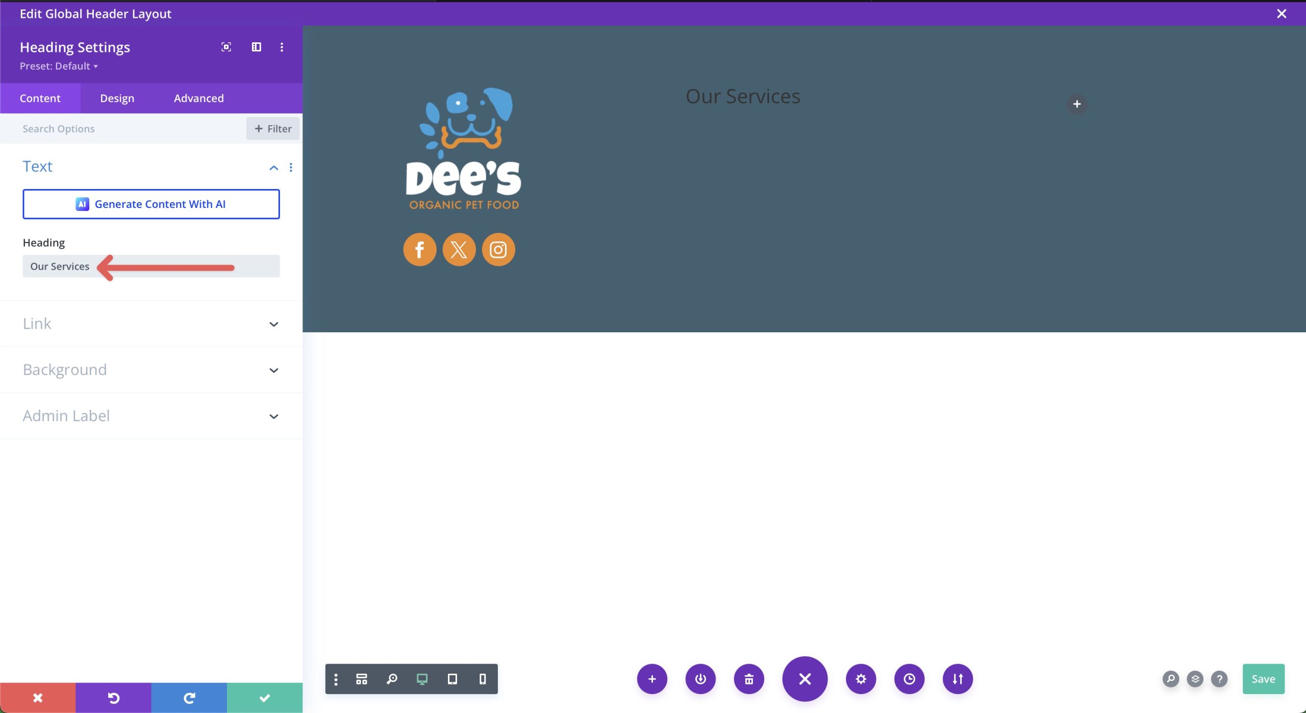
Add A Heading Module
Next, we’ll add a heading module to our second column. Click the grey +icon and select the heading module to add it. Write Our Services in the heading field when the dialog box appears.
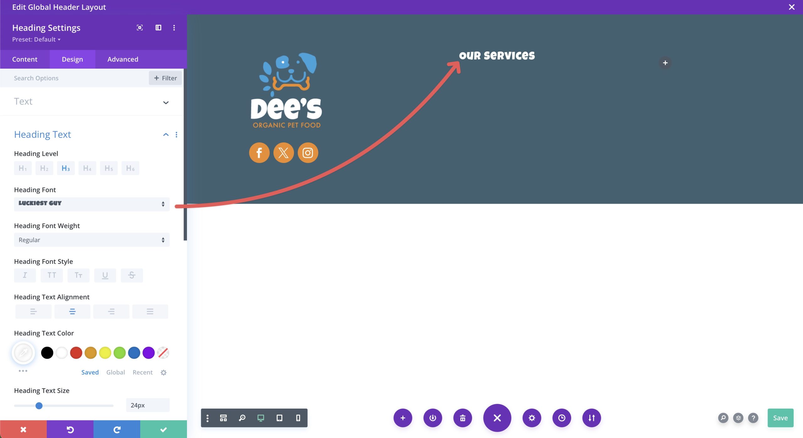
Click the design tab and add the following settings:
- Heading Level: H3
- Heading Font: Luckiest Guy
- Heading Text Alignment: Center
- Heading Text Color: #ffffff
- Heading Text Size: 24px
- Heading Letter Spacing: 1px
Once all settings are in place, your heading should look like the image below.
Add A Text Module
Next, we’ll add a text module underneath the heading module to showcase important links in our second column. Divi adds placeholder text into the module by default, so we must delete that before adding new text.
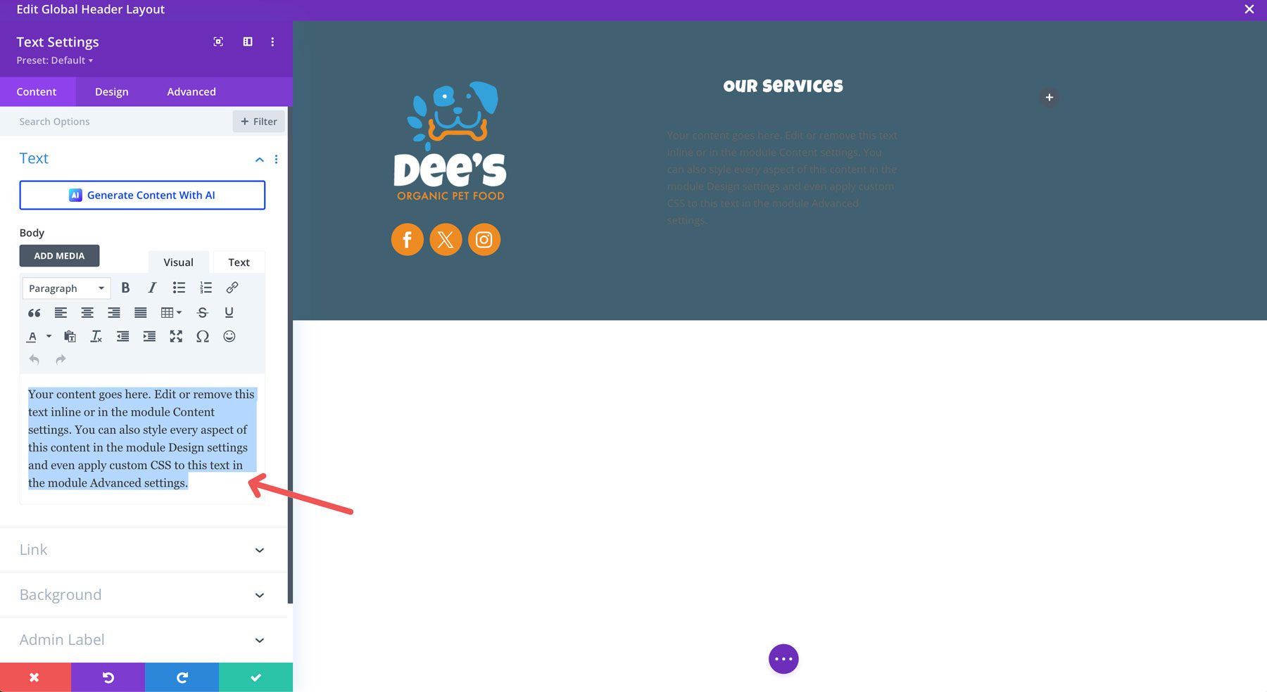
Although we could use a menu module here, it makes more sense to use a text module and add links to each line of text. Since we’re creating a footer for a pet food site, we’ll want to include important links to interior pages that are most beneficial to the user, like pet food & treats, wellness, toys, leashes, etc. Add a # to each link.
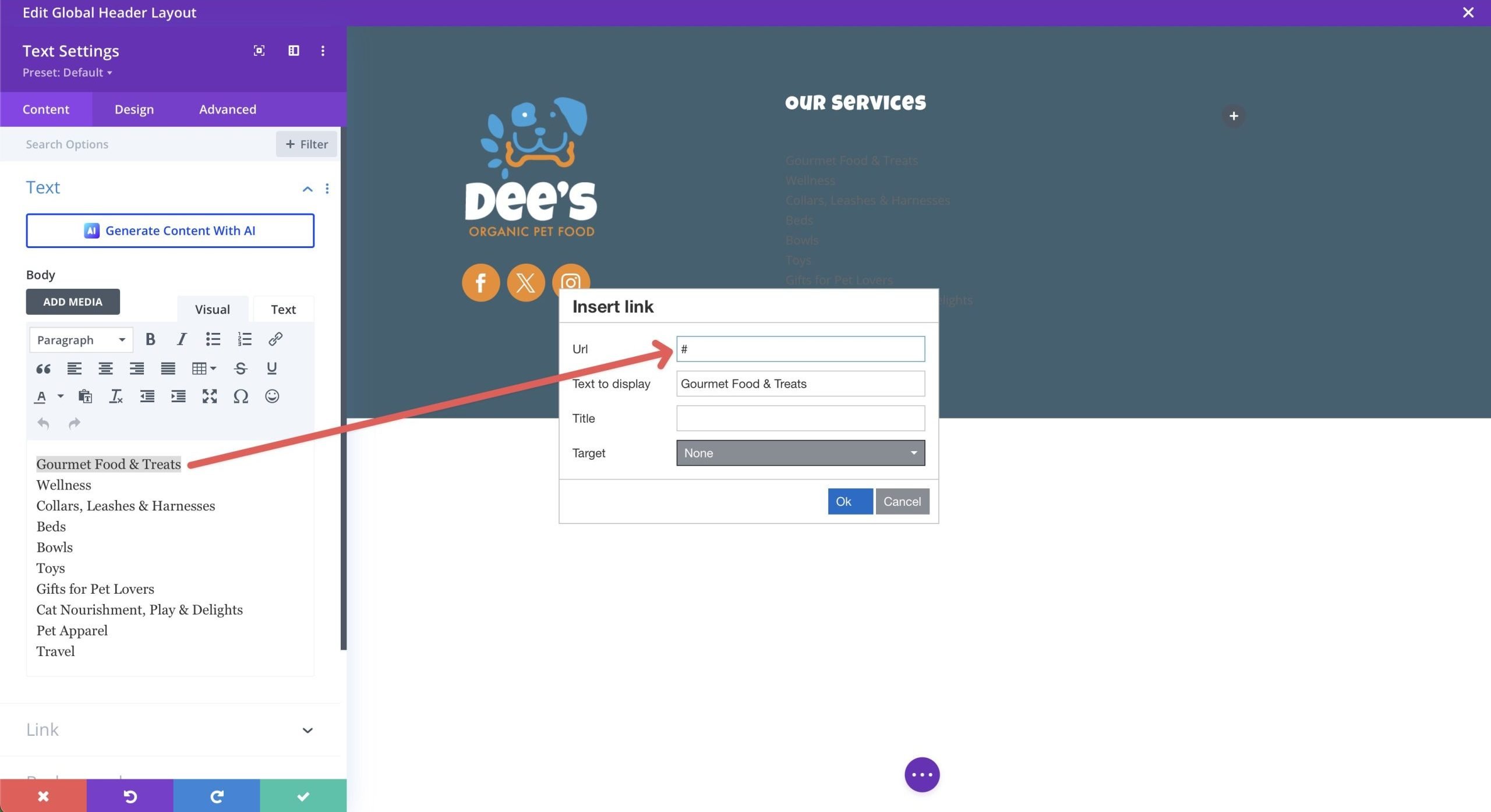
With your links in place, click the design tab and add the following settings under the text link menu:
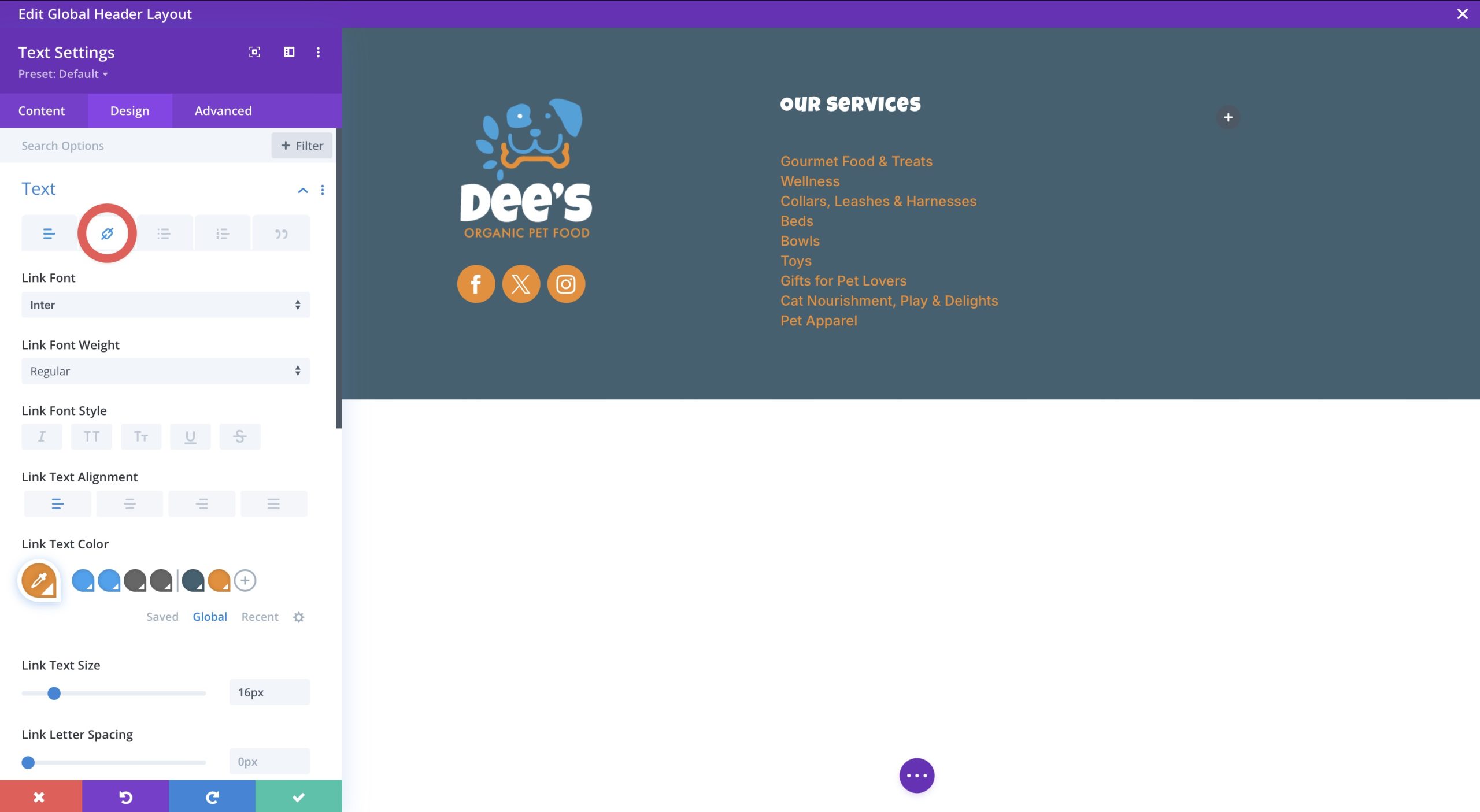
- Text Font: Inter
- Link Text Alignment: Left (desktop), center (tablet and mobile)
- Link Text Color: #ee8b22
- Link Text Size: 16px
- Link Line Height: 1.3em
Add An Email Opt-in Module
In our third column, we’ll add an email opt-in module for capturing user data. The idea is to get potential customers to sign up for a newsletter to receive updates about new products and services.
In the content tab, add the following settings:
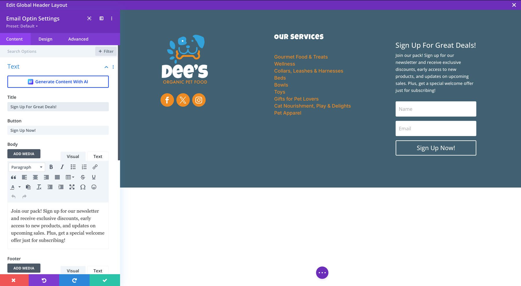
- Title: Sign Up For Great Deals!
- Button: Sign Up Now!
- Body: Join our pack! Sign up for our newsletter and receive exclusive discounts, early access to new products, and updates on upcoming sales. Plus, get a special welcome offer just for subscribing!
- Email Account: Choose from one of 20+ email providers, including Mailchimp, ActiveCampaign, HubSpot, and more. If you need help configuring your opt-in, check out this post.
- Fields: Toggle Use Single Name Field to yes
- Success Action: Choose to display a message or redirect to another URL.
- Background: Transparent
In the design tab, add the following layout settings:
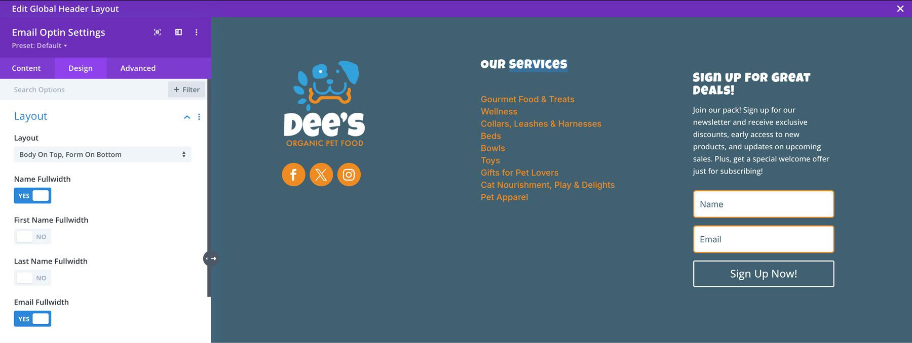
- Layout: Body on top, form on bottom
- Name Fullwidth: toggle to yes
- Email Fullwidth: toggle to yes
Field Settings:
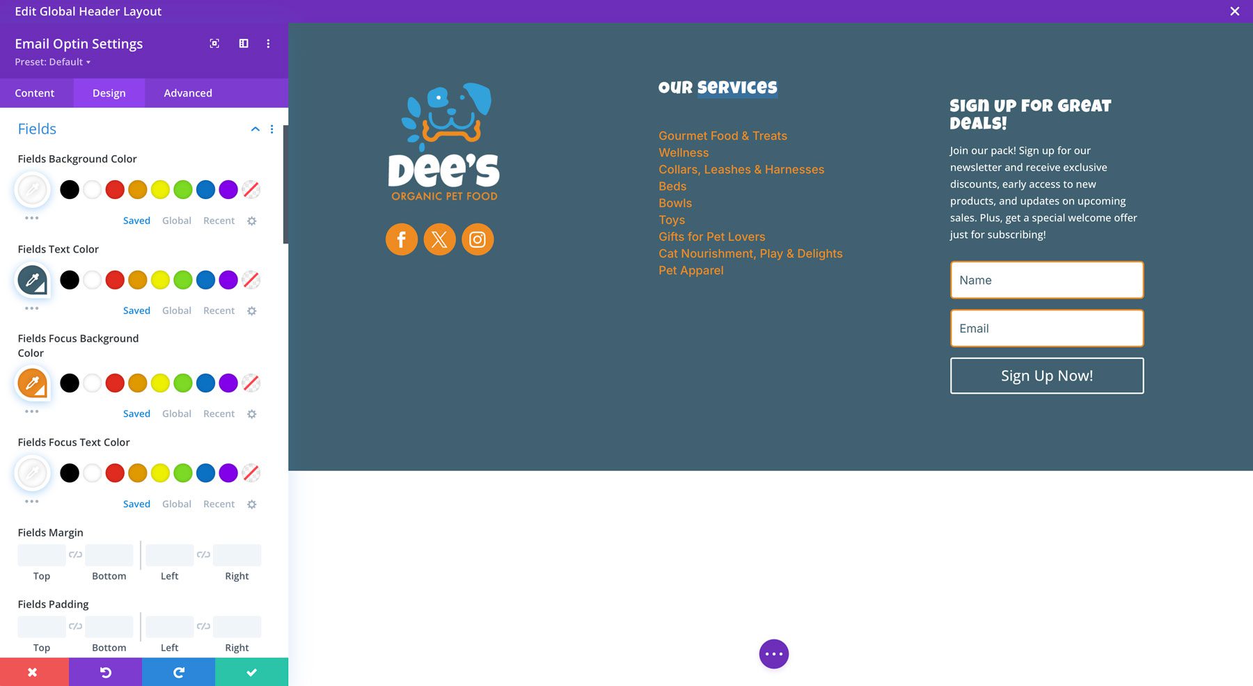
- Fields Background Color: #ffffff
- Field Text Color: #406171
- Field Focus Background Color: #ee8b22
- Field Focus Text Color: #ffffff
- Fields Font: Inter
- Fields Rounded Corners: 5px
- Fields Border Width: 2px
- Fields Border Color: #ee8b22
Title Text Settings:
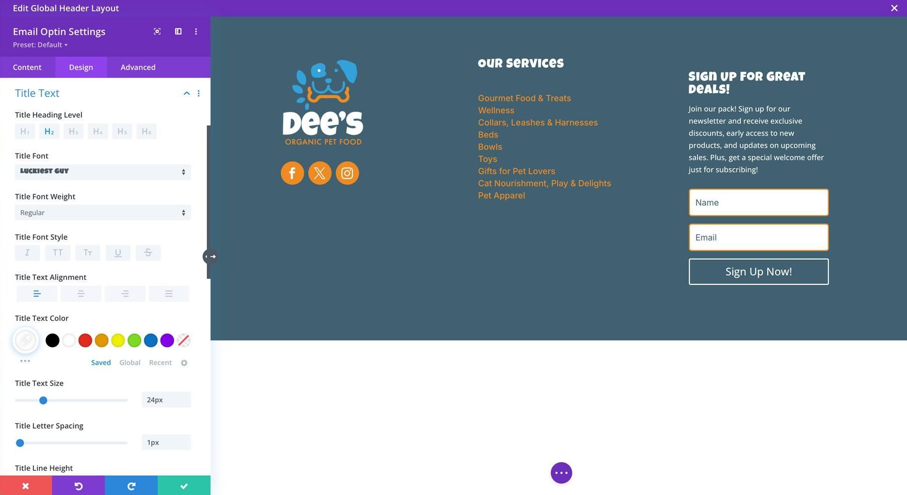
- Title Font: Luckiest Guy
- Title Text Alignment: Left
- Title Text Color: #ffffff
- Title Text Size: 24px
- Title Letter Spacing: 1px
Body Text Settings:
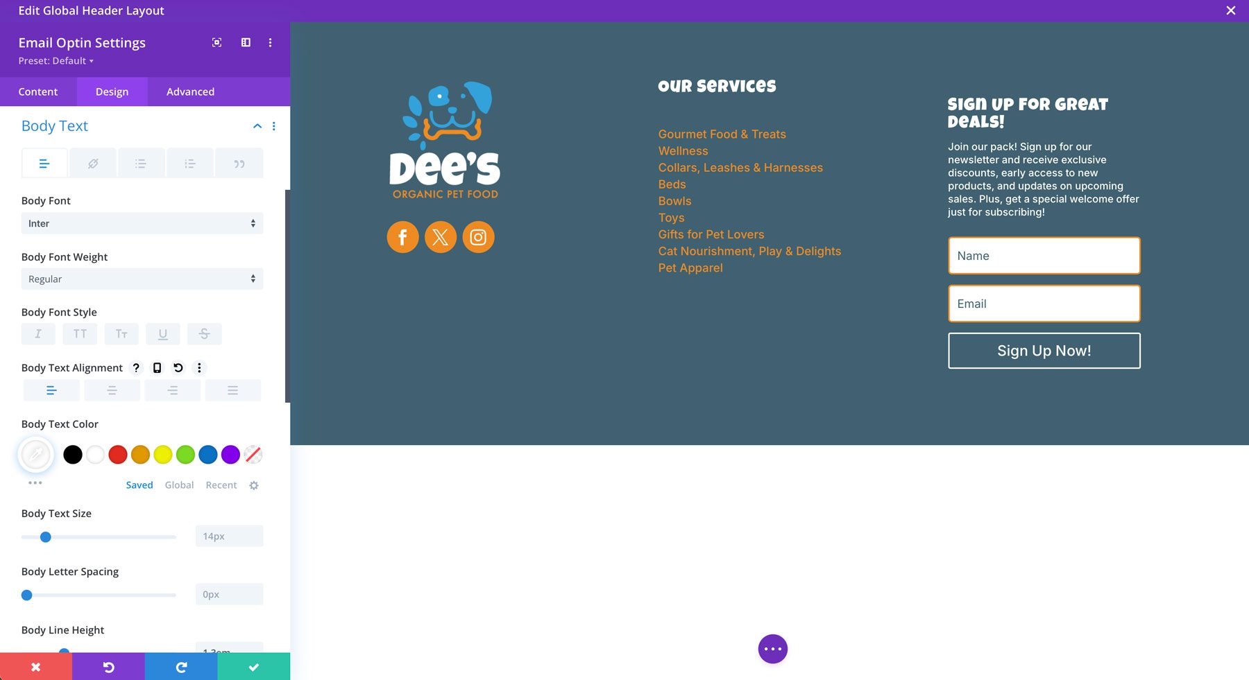
- Body Font: Inter
- Body Text Alignment: Left
- Body Text Color: #ffffff
- Body Line Height: 1.3em
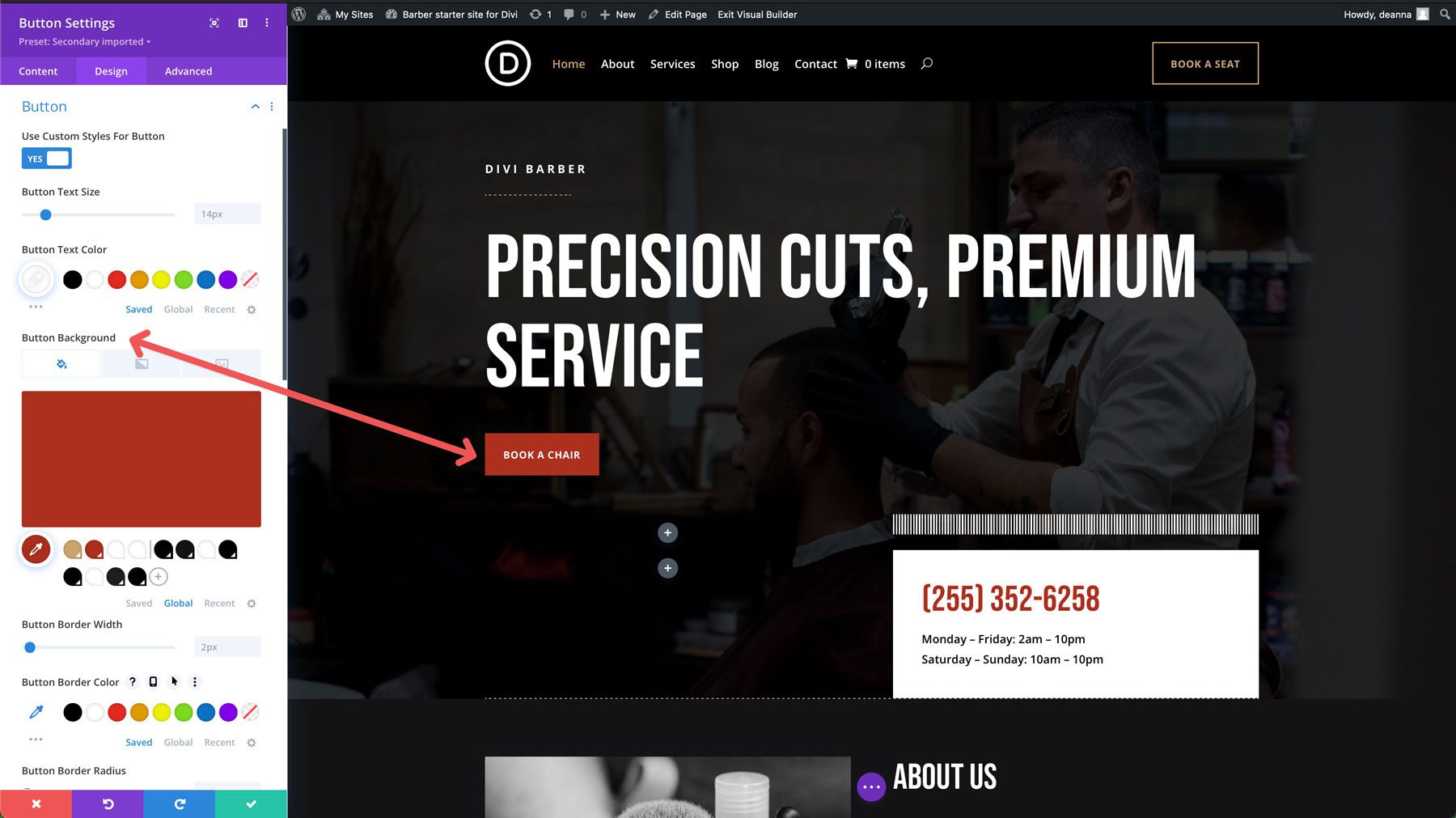
Button Settings:
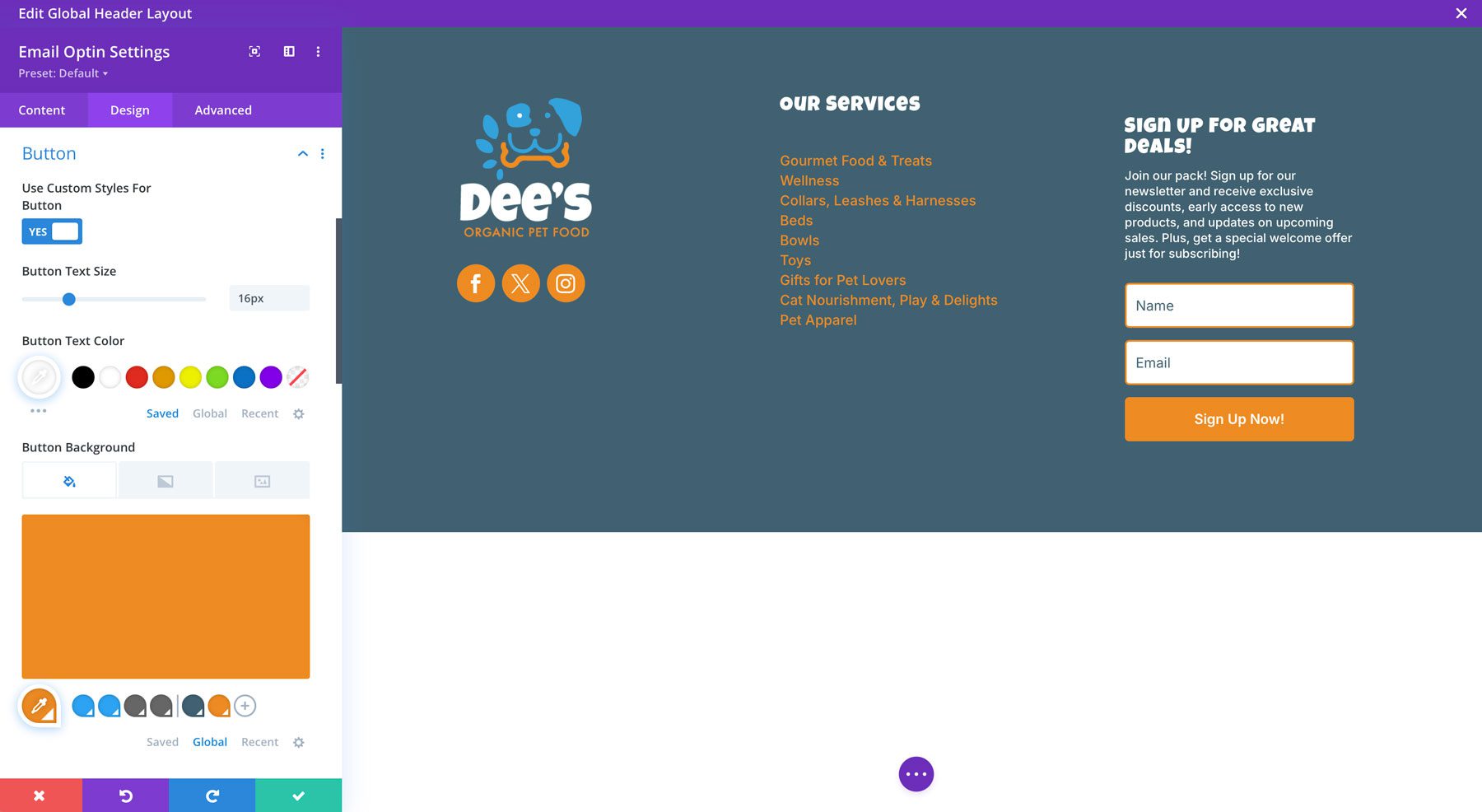
- Use Custom Styles For Button: Toggle to yes
- Button Text Size: 16px
- Button Text Color: #ffffff
- Button Background: #ee8b22
- Button Border Width: 0px
- Button Border Radius: 5px
- Button Font: Inter
- Button Font Weight: Semibold
- Show Button Icon: No
- Button Padding: 12px (top & bottom)
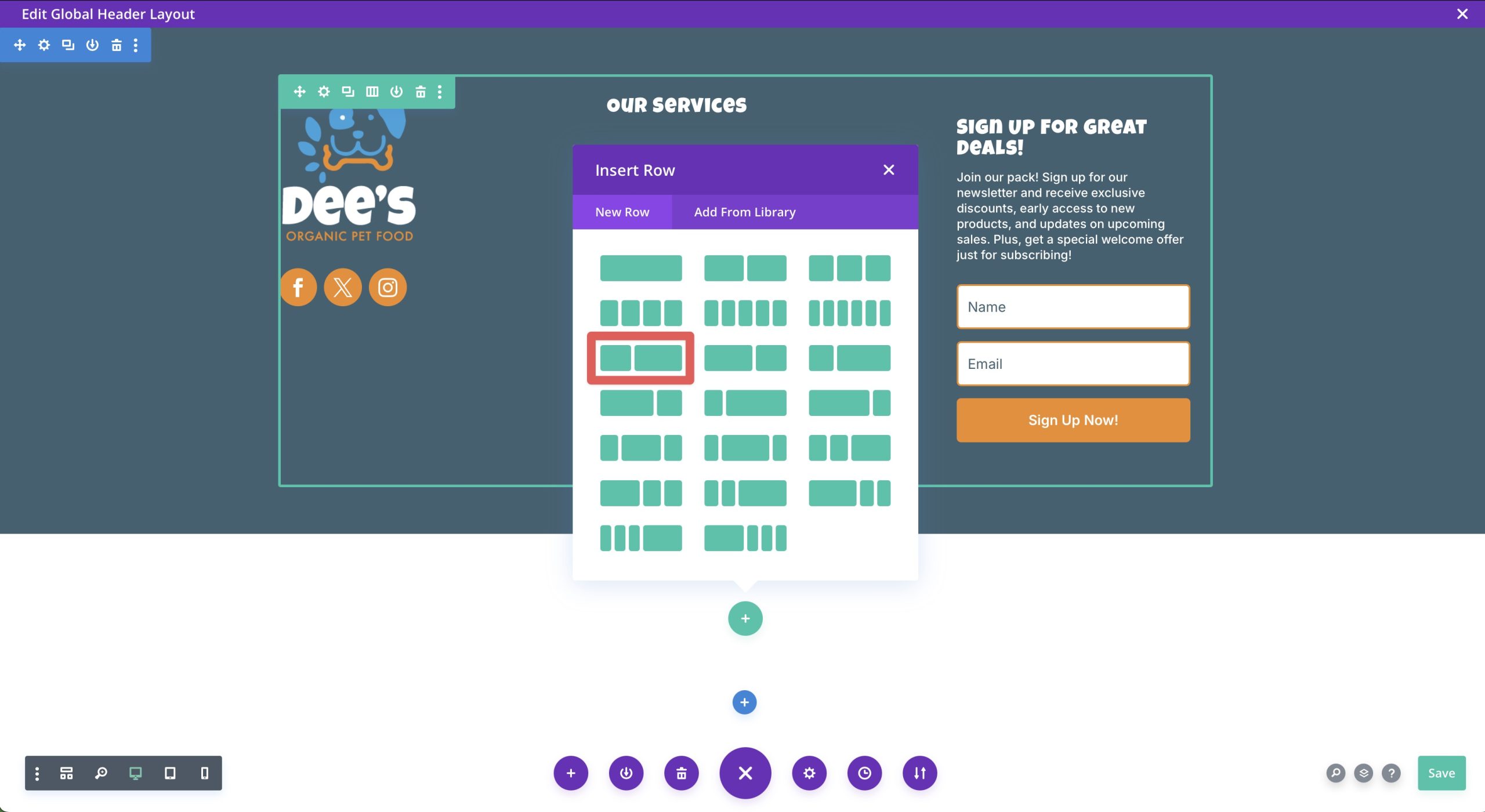
Add A New Section
Lastly, we’ll need to add a new section for copyright information and our terms of service menu to our footer. Click the blue icon under the existing section and choose a regular section.
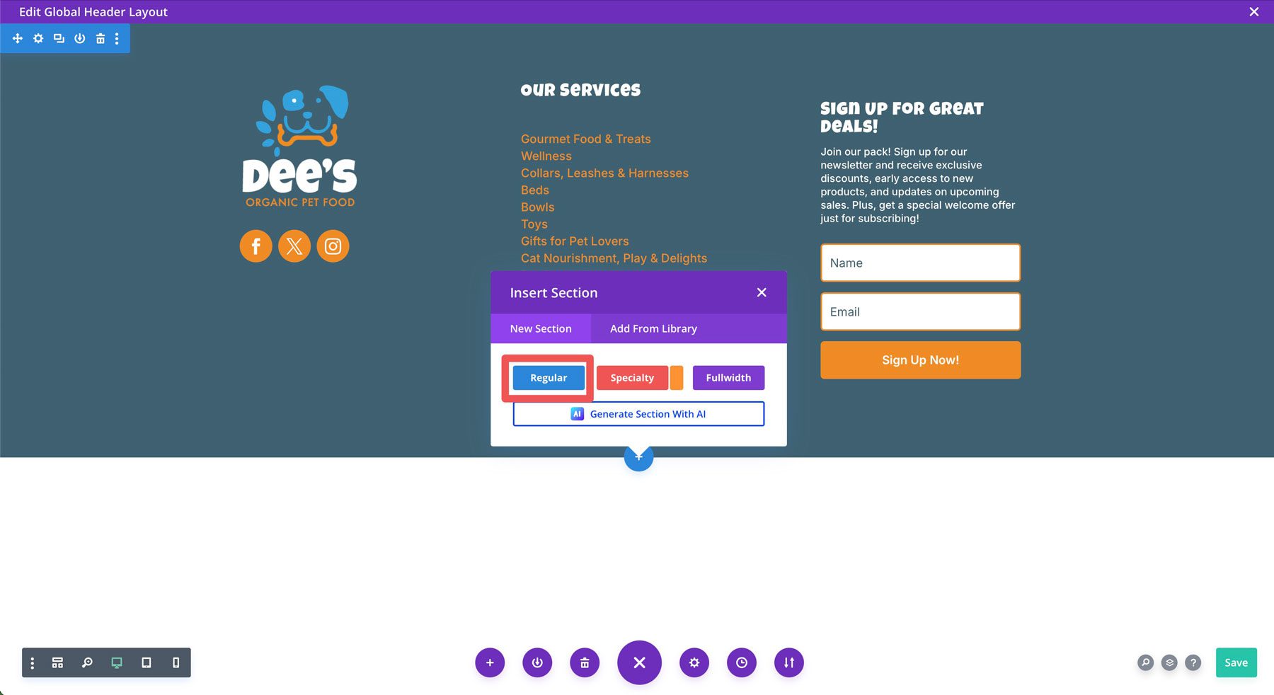
Choose a 1/3 + / 2/3 column row.
Set the section’s background color to #38a2db and the spacing (in the design tab) to 10px top and bottom, and then save the changes.

Add a text module to the left column. Instead of adding text in the body, click the dynamic content icon. We’ll add our copyright information here so that it updates every year without you manually changing it.
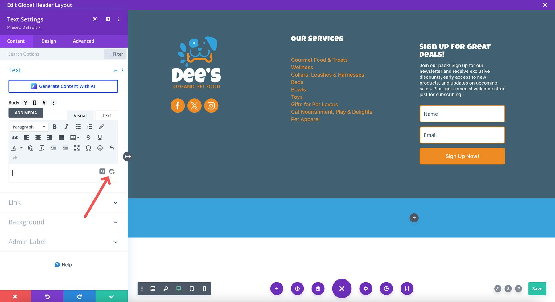
When the dialog box appears, select current date from the list of options.
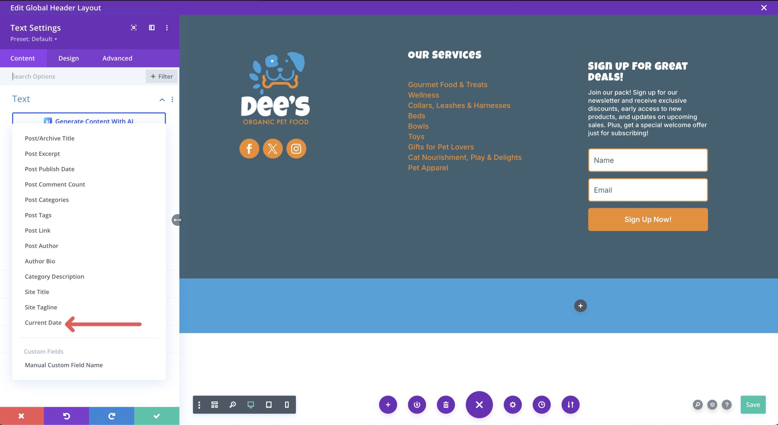
When the text dialog box appears, enter the following settings:
- Before: Copyright symbol (option + G on your keyboard)
- After: Your business name. Be sure to leave a space before entering text!
- Date Format: Custom
- Custom Date Format: Y
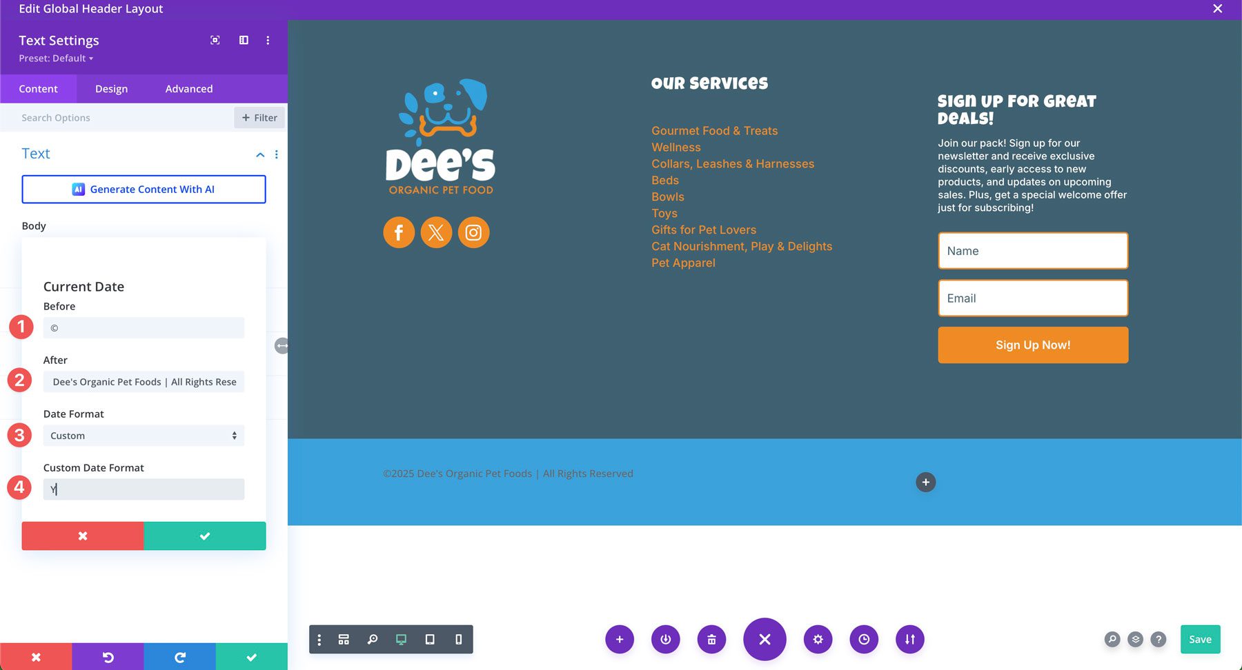
Save the changes before heading to the design tab to style your text. On the design tab, leave all settings at their default settings, except for making the text #ffffff and changing the font family to Inter.
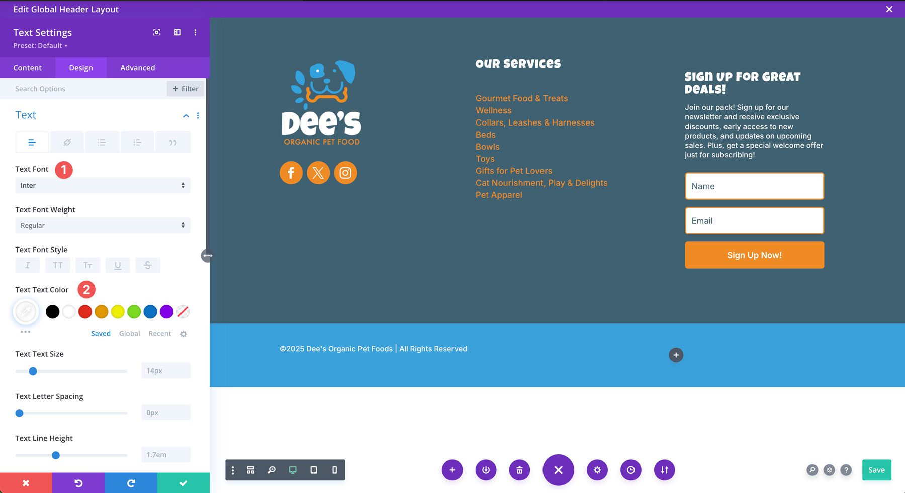
Add a Menu Module
The last module to add to our footer is a menu module. We’ll add it to the right column of our new section. You must create a menu beforehand by navigating to Appearance > Menus. This footer menu should contain any legal information on your site, such as a privacy policy or terms and conditions page.
With the menu module’s settings active, select the following options:
- Menu: Select your legal information menu
- Background: Transparent
In the design settings, choose the following settings:
Layout:

- Style: Left Aligned
Menu Text:
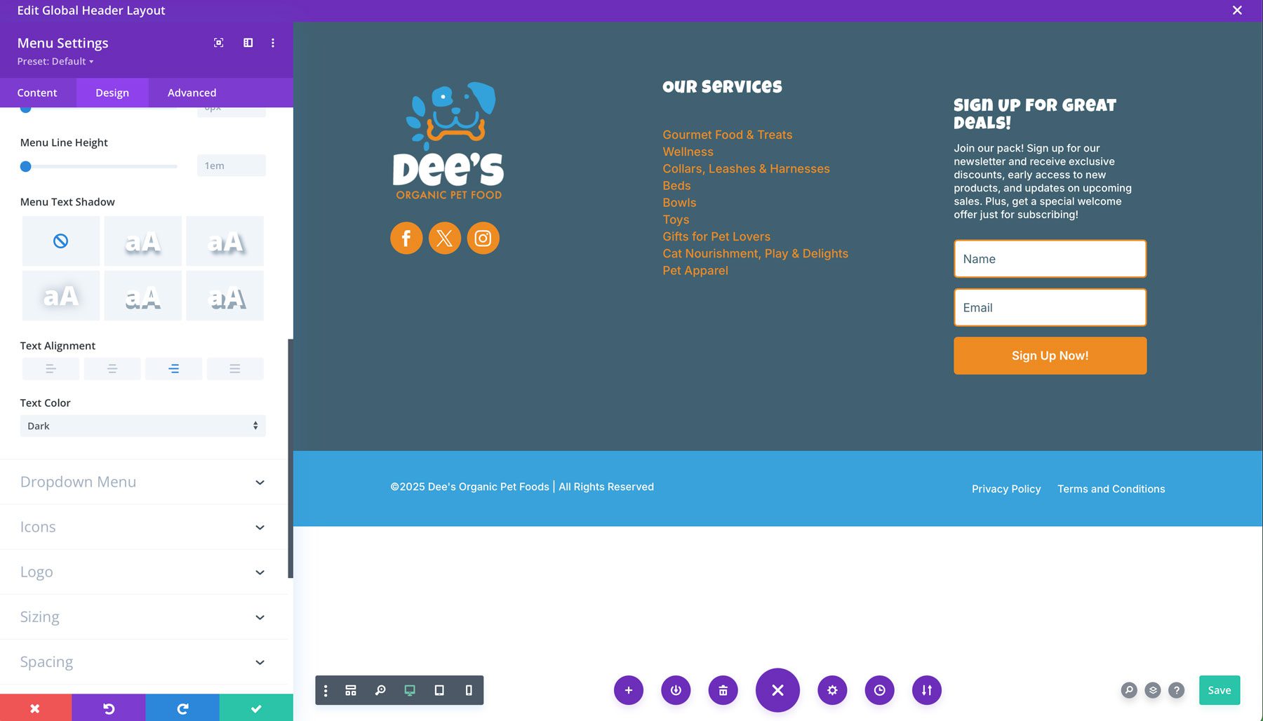
- Active Link Color: #ffffff
- Menu Font: Inter
- Menu Text Color: #ffffff
- Text Alignment: Right
Dropdown Menu Settings:
There are only a few things to change here since your menu doesn’t have submenu links. These settings will apply to just the mobile version of your menu when people view your site from a smartphone or tablet:
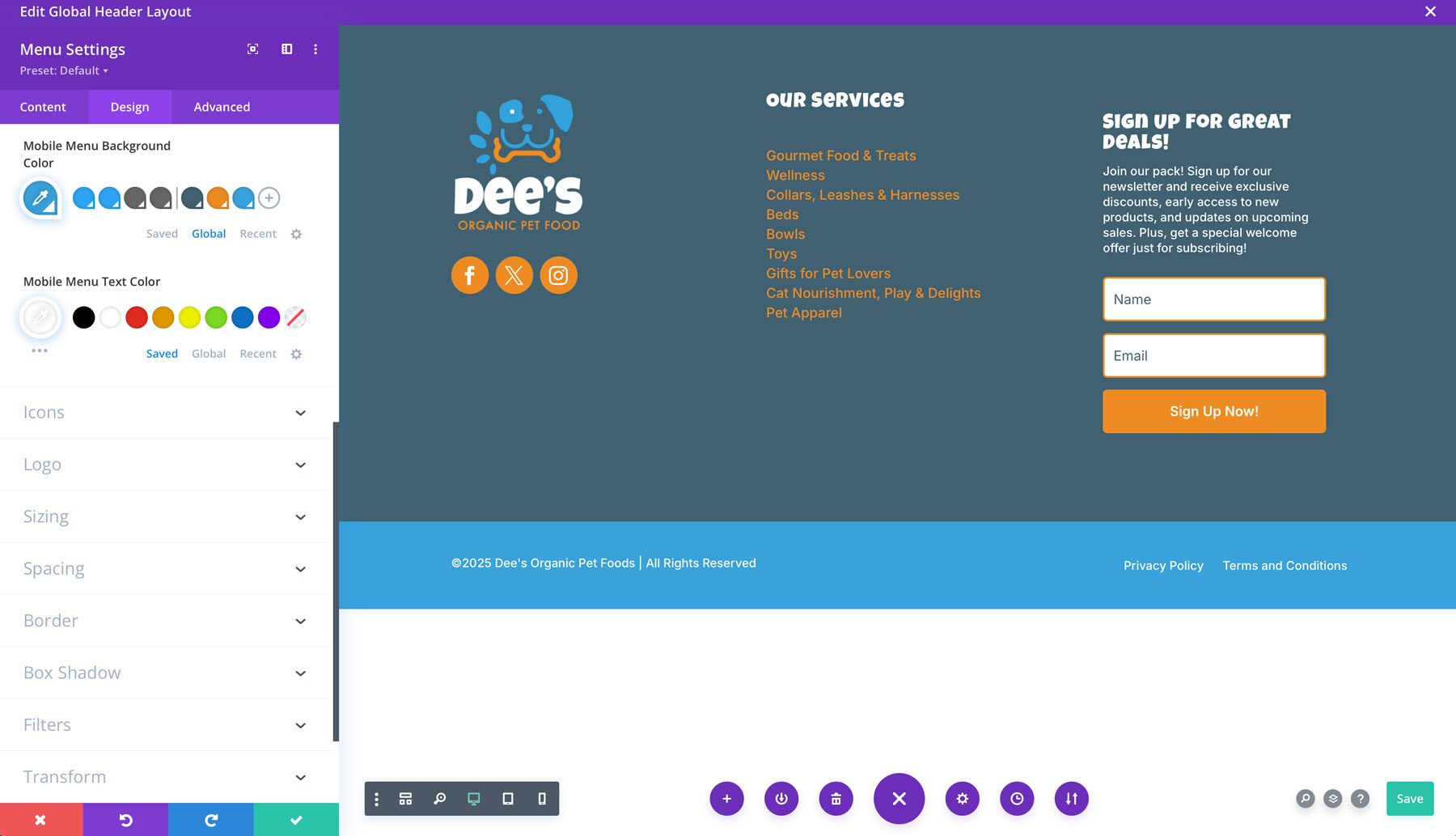
- Mobile Menu Background Color: #38a2db
- Mobile Menu Text Color: #ffffff
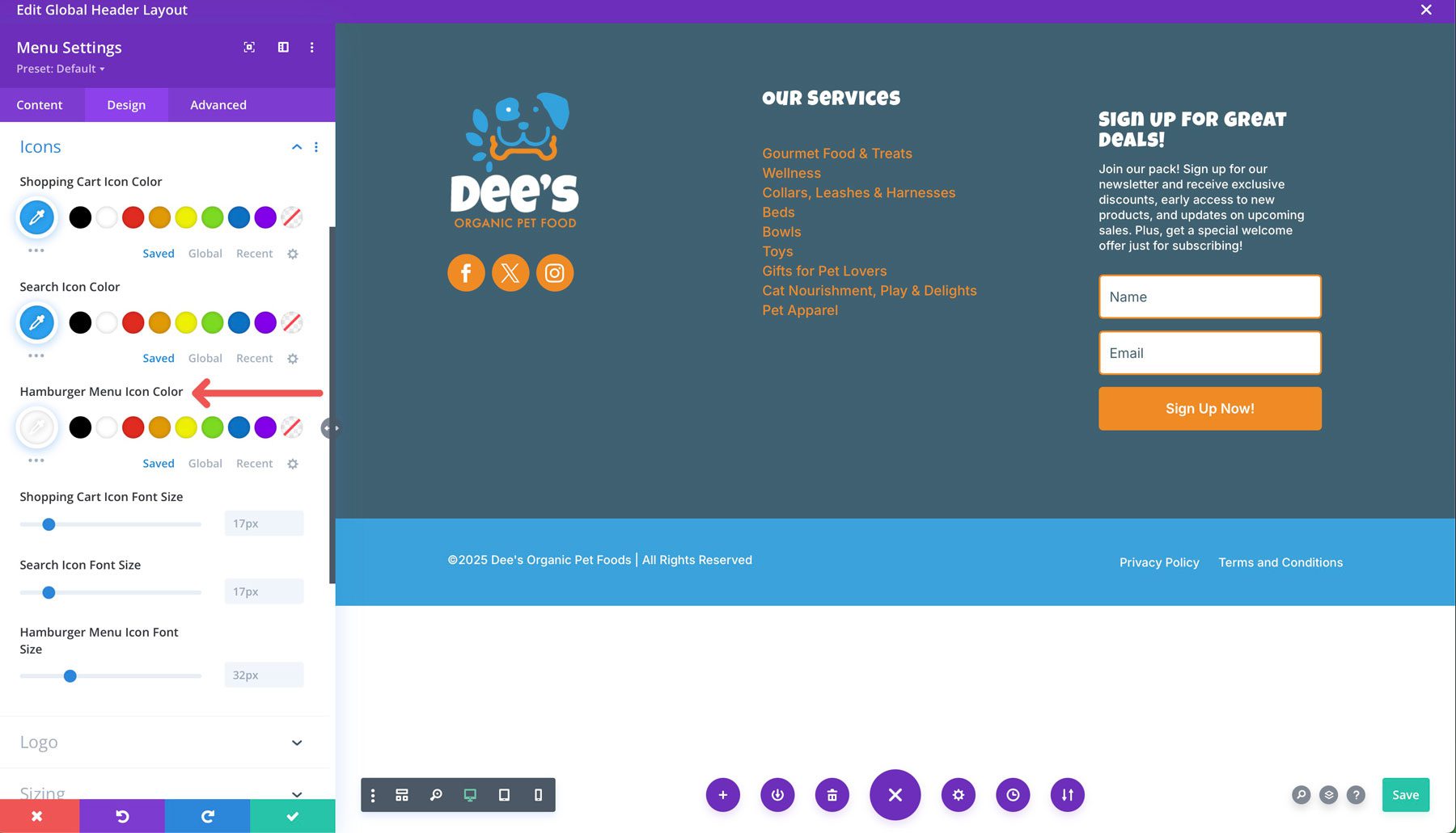
Finally, change the Hamburger Menu Icon Color under the Icons tab to #ffffff.
Adding The Finishing Touches
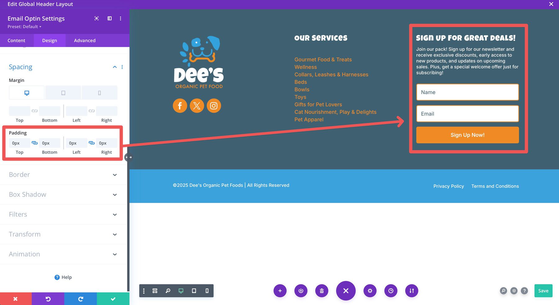
Now that our footer design is complete, there are a few stray fixes we’ll need to do. As you’ll notice, the title of the email opt-in module doesn’t quite align with the service menu heading in the neighboring column. That’s because Divi adds some padding to it by default. To fix this, open the email option module’s settings and navigate to the design tab. Under the spacing dropdown menu, add 0px padding to the top & bottom and left & right to remove the awkward spacing.
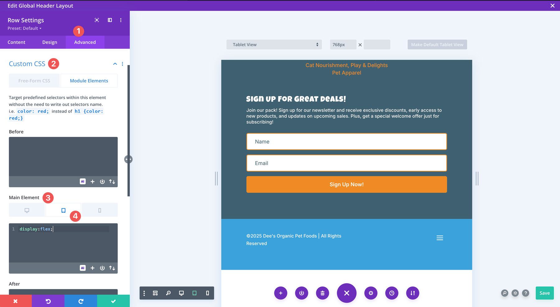
Lastly, while our copyright info and legal menu are aligned on the desktop, they don’t quite line up on smaller screens.
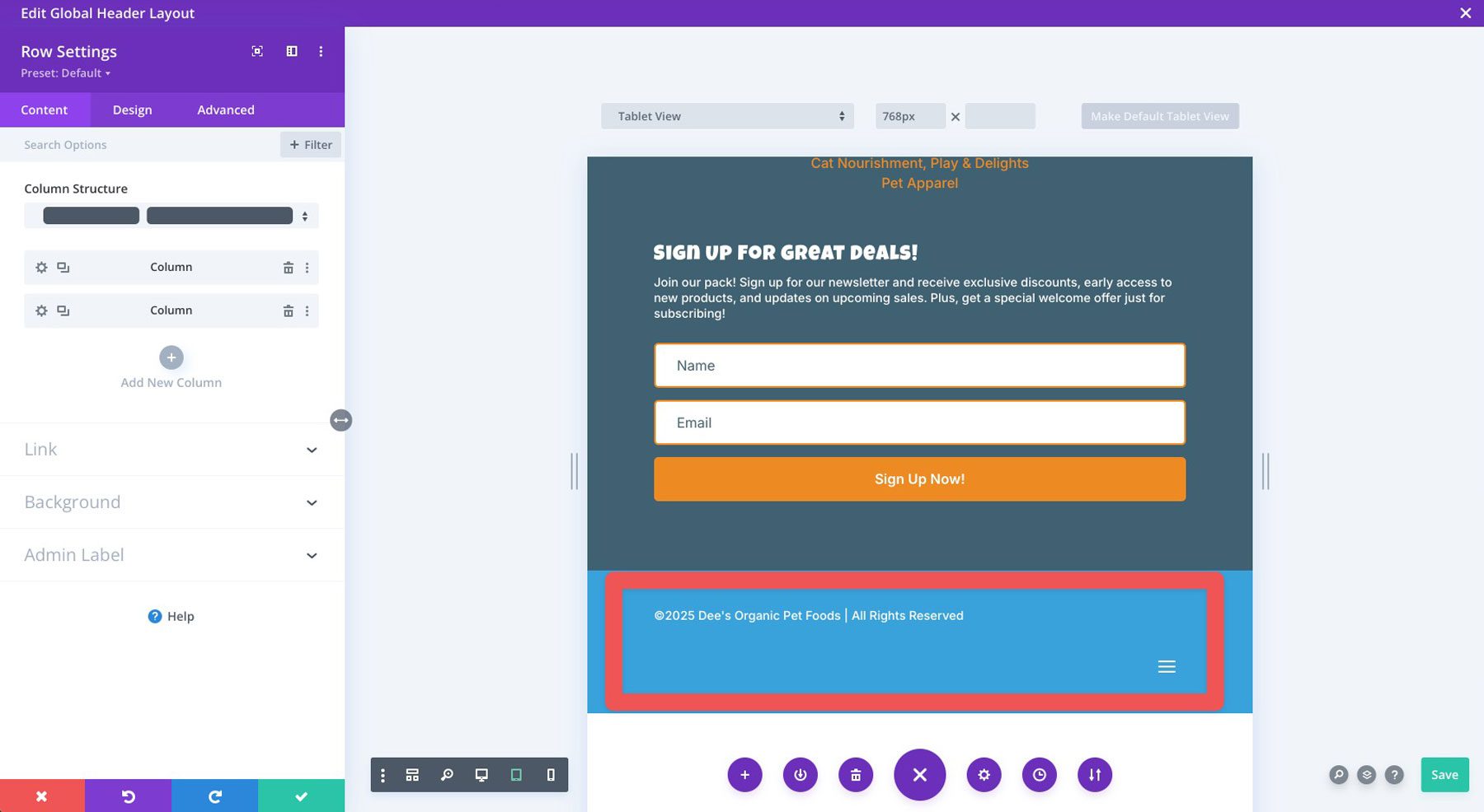
To fix this, click the advanced tab for the row. Under Custom CSS, choose the main element and navigate to the responsive settings. In the CSS field, add the following for the tablet:
display:flex;
Once you complete the changes, click the green save button to save your footer.
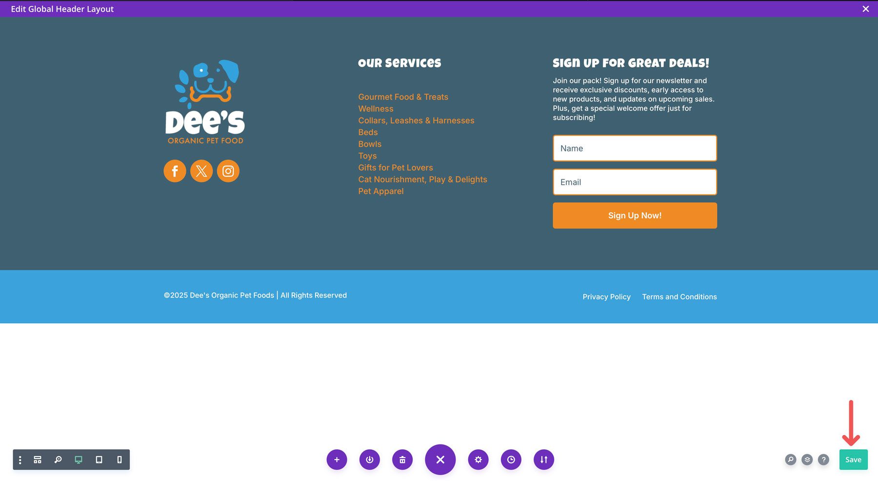
Click the X at the top right of the Theme Builder to exit.
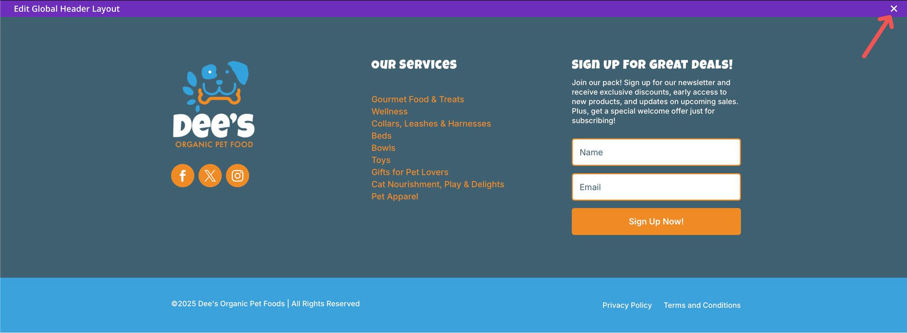
Finally, click the save changes button to make your footer live.
As you can see, Divi makes it easy to design a website footer in a few minutes.
A well-designed website footer is more than just an afterthought. It’s an important part of any successful website, offering valuable real estate for important information, brand reinforcement, and the overall user experience. By incorporating key design principles like readability, brand consistency, and SEO-rich content, you can design a footer that effectively serves your visitors and boosts your online presence. Designing a beautiful and functional footer with tools like Divi is incredibly easy. By following these steps, you can create a footer that meets your needs and leaves a lasting impression on your audience.
We’ve created a handy table that showcases all of the Divi theme’s features to help you understand its true power.
| Divi | ||
|---|---|---|
| Starting Price | $89/year | Visit |
| Free Layouts | 2600+ | Learn more |
| Design Modules | 200 | Learn more |
| Divi Quick Sites | Starter Site or AI-Generated Website | Learn more |
| Visual Builder | Drag-and-drop page builder | Learn more |
| Theme Builder | Full-site editing capabilities | Learn more |
| eCommerce Integration | 20+ WooCommerce-specific modules | Learn more |
| Theme Integrations | Divi integrates with popular WordPress plugins | Learn more |


Hi, you added a global header here, but didn’t you mean to say “global footer”?
I did, thank you. I corrected it.
Hi Deanna, so for mobile view, you “hide” the links for privacy policy or terms and conditions page in a burger menu?
I am not shure if this is a good – or even legal –idea.
Thomas,
Great point. To rectify that, you can add a text module with links to the pages directly under the mobile menu for the privacy and terms pages. To control visibility, click the advanced tab of the text module you add, and then under visibility, click the desktop checkbox to avoid showing it on larger screens. That way you won’t have two hamburger menus stacked on mobile devices.
Deanna