
")
Your website’s header matters more than you might think. It’s where visitors first land and figure out how to navigate your site. Many website owners settle for basic headers with a logo and navigation menu. Too many websites have plain headers that don’t help visitors. Just having your logo and some links isn’t enough anymore. Your header should guide people through your site while looking sharp on every screen.
With the right tools (like Divi), you can build a header that your visitors will love. Let’s explore what makes headers work and how to create one that stands out.
Website Headers: Why Are They Important?
Your website’s header works like the entrance to your favorite store. Just as you look for signs to find what you want in a shop, visitors use your header to make sense of your website. A well-made header points people exactly where they need to go — no confusion, no fuss.
Most people make snap decisions about websites in mere milliseconds. Your header shapes that first impression. When it looks clean and works smoothly, visitors stick around. But if it’s messy or hard to use, they’ll leave faster than you can blink.
The best headers feel natural, as if they’re not even there. They move smoothly as you scroll, look great on phones and computers, and put everything right where you’d expect to find it. From helping people find their way around to showing off your brand, your header quietly handles all the heavy lifting.
A good header isn’t just nice to have — it’s the backbone of any website that wants to keep visitors happy and coming back.
Key Elements Of An Effective Header
Great headers share certain features that make them work. Clear navigations, smart spacing, and other essential components help visitors navigate your site. Let’s break down what makes a header truly effective.
Have you ever noticed how some websites make it difficult to find what you need? A clear navigation structure fixes that headache.
Your menu should feel as natural as walking through your favorite store — with every department where you expect it. Keep the main menu tight with 5-7 essential options that guide visitors to key pages. When you need more space, tuck related pages into logical dropdown menus.
Think about the flow — place your heavy-hitting pages up front where they’re easy to spot. Skip the clever names. “Services” beats “What We Do” every time because visitors know what they’re looking for. Simple, clear labels turn confused browsers into happy customers.
Brand Identity Elements
Your header doubles as your brand’s front door — make it count. Beyond just dropping in your logo, think about the complete picture your header paints. Colors, fonts, and spacing tell visitors what you’re all about before they read a single word. Your logo needs breathing room — not too big to overwhelm, not too small to miss.
Smart brands keep their header style consistent with their overall look but are not afraid to let key elements stand out.
Remember those split-second decisions visitors make? A polished header with strong brand elements helps them feel like they’ve landed in the right place. Keep it clean and memorable, but most importantly, keep it accurate to your brand.
Call-To-Action Placement
The top of your site needs a clear next step for visitors. Avoid situations where visitors have to search hard for the contact button or signup link. Your most valuable action deserves the spotlight — usually in that golden top-right corner where eyes naturally land. But here’s the thing — stuffing your header with five different buttons just creates confusion. Pick your power move.
Want more leads? Make that contact button pop. Selling subscriptions? Put your trial offer front and center. Remember to use colors that catch attention without appearing like a neon sign convention. Your header Call-To-Action (CTA) should feel like a helpful suggestion, not a desperate sales pitch.
Search Functionality
Nobody likes hunting around for content — but not every site needs a search bar. For content-heavy sites like blogs or online stores, search is a lifesaver. But for simple five-page business sites? It’s just extra clutter. When you do need to search, placement matters. Most folks look to the right side of your header, next to your main menu.
Keep it visible but not pushy — it should help, not dominate. Some sites hide their search behind a tiny icon, but that’s like putting your store directory in the basement. Before adding a search, ask yourself: will visitors use it? A search bar adds weight to your site’s load time, and finding zero results is worse than having no search at all.
Contact Information
Phone numbers and business hours belong in headers when they help visitors take action. Local restaurants want hungry customers to place orders immediately, and retail shops need their hours front and center so people know when to stop by.
But here’s the catch — if you’ve already got a contact button leading to a full contact page, you probably don’t need to show your email address too. And it’s smart to use contact forms instead of displaying email addresses directly to keep those spam folders lighter. The best headers match contact details to what visitors need, whether that’s a quick phone call or detailed directions to your store.
Common Challenges In Creating Headers
Building headers sounds simple until you try it. Between balancing design elements and maintaining consistency across pages, header design presents unique hurdles. Let’s examine the most common roadblocks and how to overcome them.
Balancing Design And Function
Pretty headers are nice, but they need to work first. You’ve seen those fancy headers with transparent backgrounds and fade effects — they look great until you can’t read the menu text against a bright image.
Or those minimalist headers that hide important links behind tiny hamburger menus on desktop screens. Good header design finds the sweet spot between looking sharp and being useful. Your menu items should be easy to read, your buttons easy to click, and your branding always clear.
Stick to web-safe fonts, maintain good contrast, and test your header against different backgrounds. When in doubt, pick function over flash.
Space Management
Headers are like the top shelf of your website — valuable space that everyone sees first. Pack it too full, and nothing stands out. Make it too tall, and you’re forcing visitors to scroll past a giant banner just to see your content.
Most successful headers sit between 60-100 pixels tall, giving enough room for your logo and navigation without dominating the page. Leave some whitespace between elements so your menu items don’t bump into each other and your CTA button can breathe. Mobile screens make this space even tighter, so every pixel counts.
Have you ever clicked the wrong menu item because everything’s crammed together? Good menu organization prevents those mishaps. Group related pages under clear categories instead of listing everything at once.
About, Team, and Company History? Those can live under one dropdown. But don’t go crazy with submenus – nobody wants to play hover-menu ping-pong just to find your contact page. Keep your most important pages at the top level, where they’re easy to spot. And use plain language. Your visitors shouldn’t need a decoder ring to figure out where to click.
Loading Speed Issues
Headers load on every page of your site, making them a crucial factor in your overall site speed. Heavy headers packed with large images, complex animations, and multiple scripts can seriously slow down your website.
This is especially noticeable with sticky headers that follow visitors as they scroll. When visitors have to wait for your header to load before they can navigate your site, you’re starting their experience on the wrong foot. And since Google considers page speed in rankings, a slow-loading header isn’t just annoying — it could hurt your search visibility.
Brand Consistency
Headers tell visitors they’re in the right place. When someone hops from your social media to your website, your header should feel familiar — the same colors, logo treatment, and overall vibe. Mess this up, and you’ll confuse visitors — nobody wants to second-guess whether they’ve landed on the official site or some knockoff.
Your header design needs to work alongside your business cards, social profiles, and marketing materials. It’s not just about slapping your logo up there; it’s about creating a consistent experience that builds trust.
How To Design A Header That Work (Thanks, Divi!)
With the right tools, header design becomes much simpler. Divi’s visual builder takes the guesswork out of creating headers that look professional and work smoothly. Let’s find out more.
What Is Divi?
Divi is a WordPress theme that turns your website ideas into reality. Its visual editor shows you exactly how your site will look as you build it—no guessing, no surprises.
Want to build a business website, set up an online store, or start a blog? Divi has all the tools built in. Pick your elements from 200+ modules, drop them where you want them, and adjust until they’re perfect — no coding is needed.
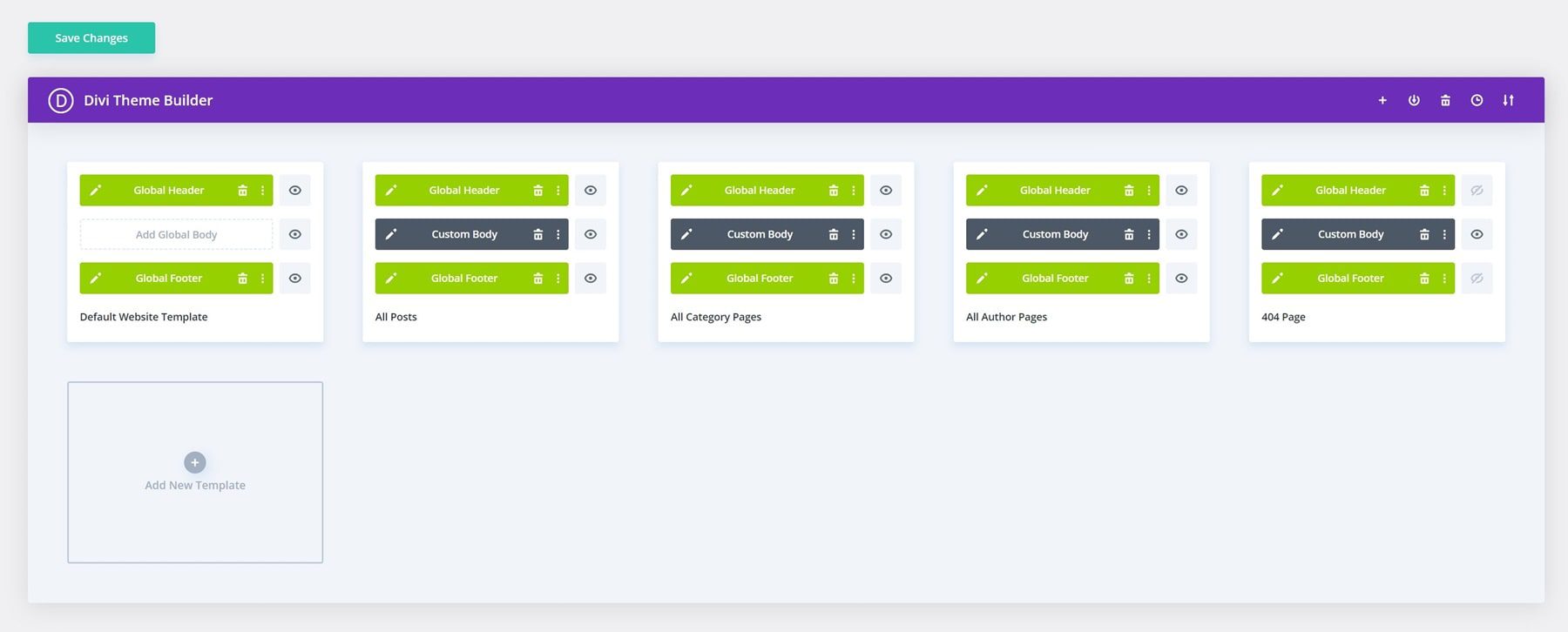
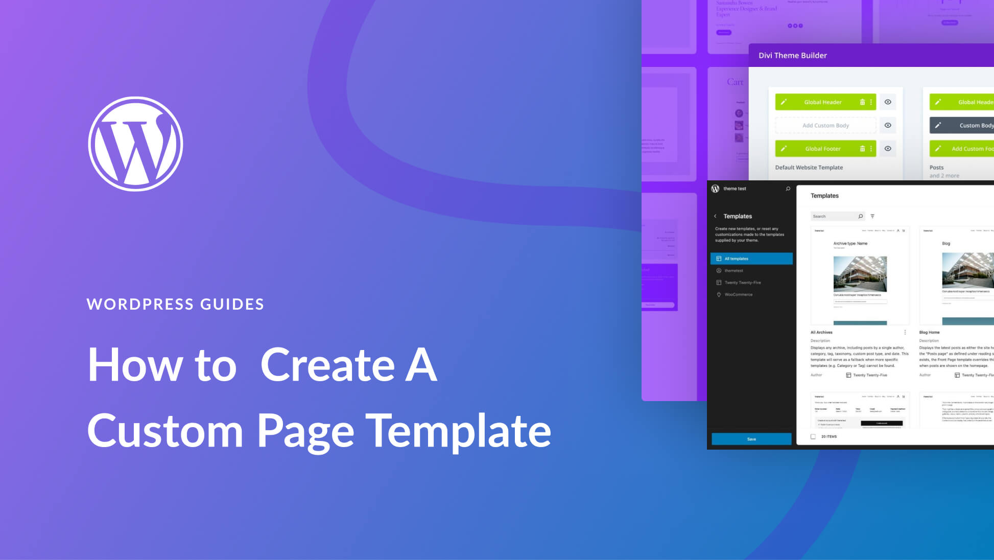
The Theme Builder takes this further by letting you design templates for different parts of your site. Create custom headers and footers, layouts for product pages, blog templates, category archives, or even 404 pages. You decide what goes where, and Divi makes it happen.
Everything happens right on your live site — no more switching between editors and preview screens. Want to change how your whole site looks? Divi’s global settings mean you can update colors, fonts, and styles everywhere with one click.
Do you need to adjust designs for mobile? The visual builder shows you exactly how your site looks on any device. It’s all the power of custom web design without the usual headaches.
Your Website, Your Way. With Divi.
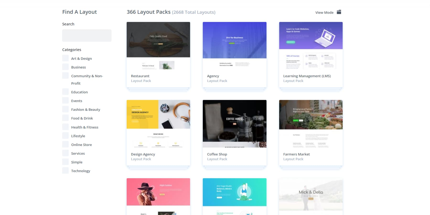
Divi comes loaded with 2000+ pre-made website designs. Just pick one you like and adjust it to match your brand. Your pages and overall layout will look clean and professional from the start. It’s like having a designer’s toolkit at your fingertips — minus the designer price tag.
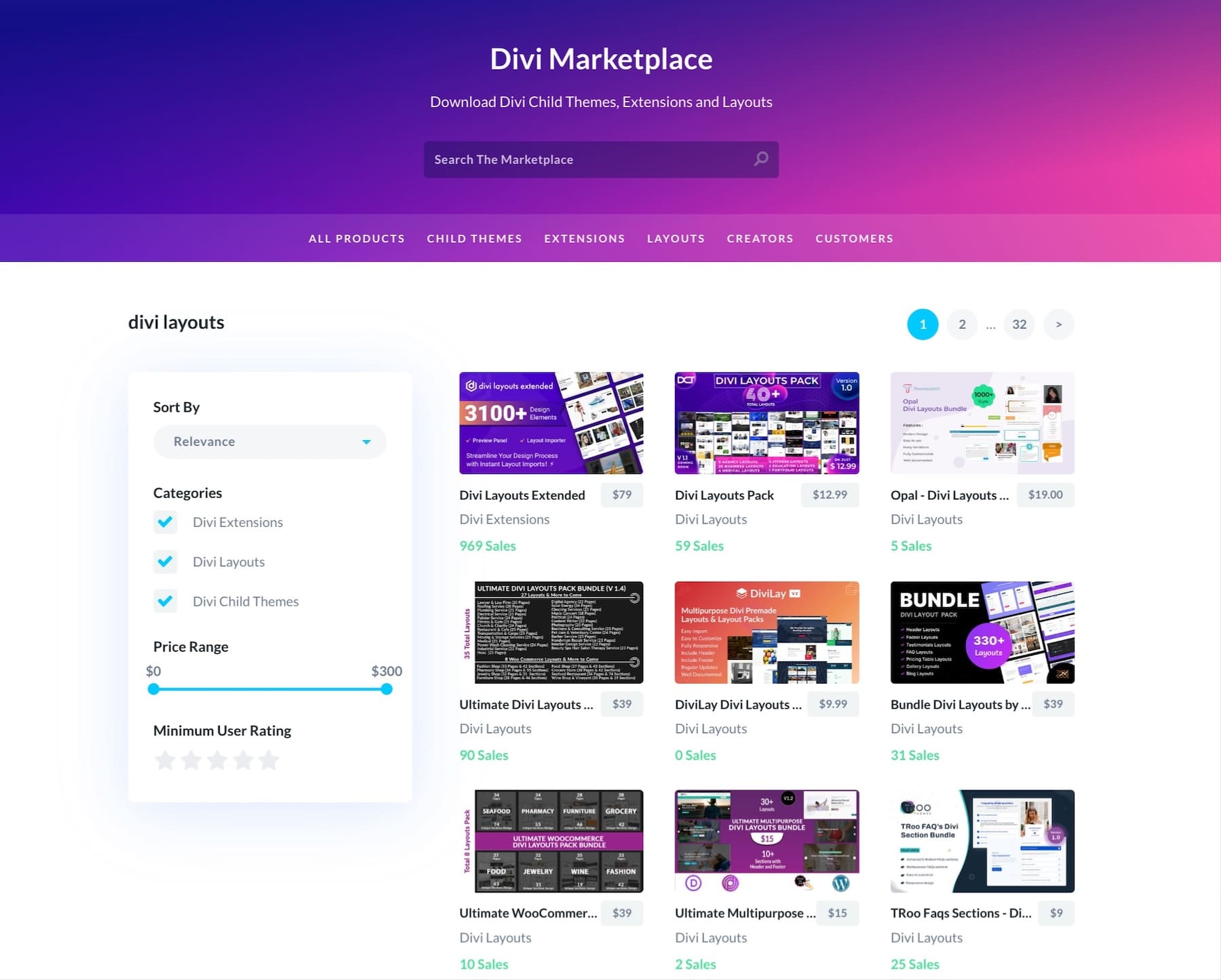
We’ve built Divi to grow with you. Our Marketplace offers professional child themes and design packs when you need them. And since we’re always updating the platform, you’ll stay current with the latest web standards.
Plus, Divi is backed by a whole community. Over 76,000 Divi users share ideas and solutions in our Facebook group daily. Stuck on something? Our support team and detailed knowledge base have your back.
Want to do more with your site? Divi works seamlessly with over 75 popular WordPress plugins and services. For developers, our open-source architecture includes hooks, filters, and a complete API — perfect for custom solutions and integrations.
Best of all? There’s no ceiling with Divi. Build as many pages as you need, add all the products you want, and create unlimited websites with a single license. Pick a good host like SiteGround that can grow with you, and you’re set. Your website can be as big as your ambitions.
Divi AI: Your Design Copilot
Now, Divi brings AI right into your design workflow. Do you need fresh content that sounds like your brand?
Looking to build new sections quickly? Divi AI handles it all. Tell it what you need, and it will create website sections that match your vision.
You can even edit your images right there in Divi
Or generate new ones that fit your brand perfectly.
Accelerate Your Workflow With Divi AI
Want to build a complete website fast? Divi Quick Sites uses AI to create custom sites based on your business. Just share some details about what you do, and you’ll get unique layouts filled with relevant content and images that match your brand. Setting up an online store? It’ll even configure WooCommerce for you. This is more than picking templates — it’s about getting a website that feels built just for you.
Behind Divi’s AI website builder sits our collection of hand-crafted starter sites. Our design team creates each one with custom photography and illustrations. Pick your favorite, drop in your business assets, and launch your site in minutes.
Every site you build with Divi Quick Sites — whether through AI or our pre-built collection—includes a complete design system. Your menus, colors, and fonts work as one from the start. Add something new to your pages? Global presets make sure it matches perfectly. Your theme settings keep everything consistent, and every module automatically pulls from your brand colors and typography.
We’ve handled the design foundations so you can focus on what matters — your content, images, and brand. That’s the beauty of a real design system.
How To Design A Header, Step by Step
Building a header doesn’t need to be complicated. We’ll explore three approaches to header design. Though we’ll showcase these methods using Divi’s Theme Builder, your choice of tools slightly affects how you create headers. However, the core principles stay the same. Let’s explore:
From Scratch (The Most Flexible Way)
Before designing, set up your navigation structure in Appearance → Menus. Having your menu structure ready will save significant time during the design phase.
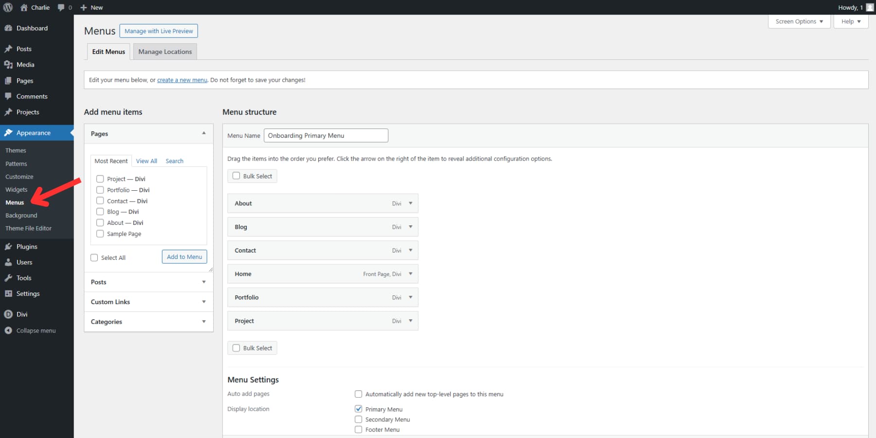
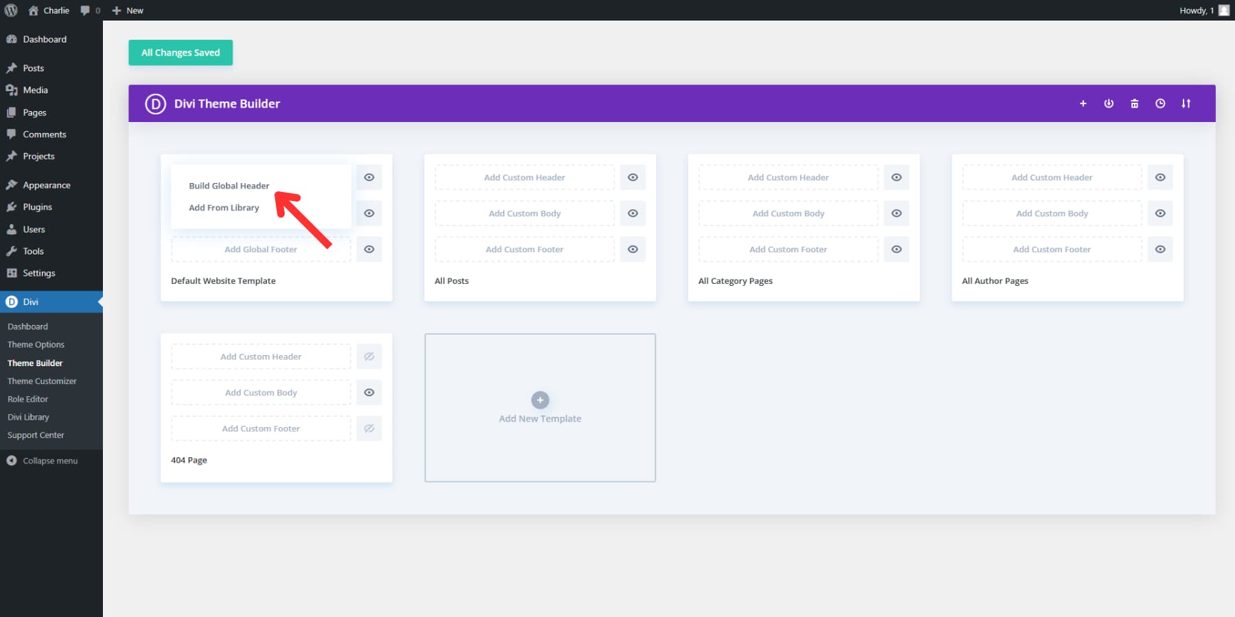
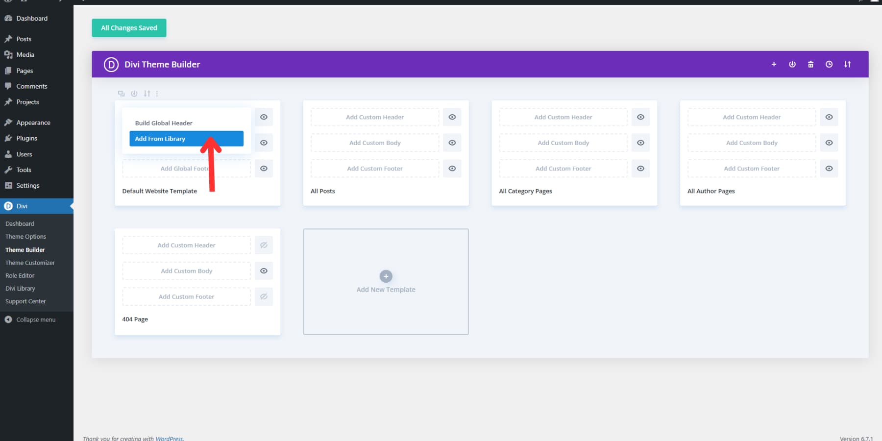
Open Divi’s Theme Builder through your WordPress dashboard → Divi → Theme Builder. Your default template sits at the top — this template controls your entire website’s appearance. Click the Add Global Header area and select “Build Global Header” to launch your workspace.
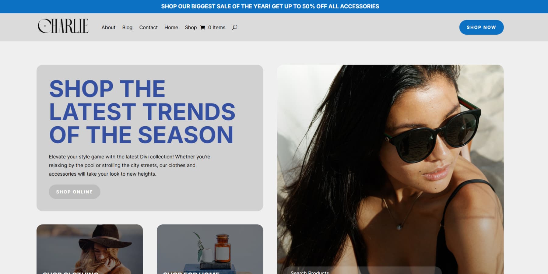
Start by adding two regular sections to the canvas. For this particular example, the first section will have a promotional message about sales and other information, and the second section will have our menu and CTA button.
Settings for the promotional banner:
- Open section settings:
- Set the background color to match your brand
- Add 0px padding to the top and bottom of the section
- Open row settings:
- Turn on the custom gutter width option and set the gutter width to 1
- Width and max-width to 80% and 1800px respectively
- Set top and bottom padding to 0px
- Add a heading text module:
- Add your promotional text or contact information
- Then, set the heading as h6, select a brand color that has enough contrast over the background clear for readability
- Set the text size to 14px and line height to 1.4em
- Then add a 12px margin on top
Then, for the menu section:
- Set a background color to match your brand
- Top and bottom padding set to 0px
- Add a two-column row
- Add 8px padding to the top and bottom of the columns
- The wider row column be our menu row, and the second column for our CTA
- Now, add a menu module to the wider column.
- Select the menu and logo, and link the logo to the homepage.
- From the Elements tab, enable the shopping cart icon, shopping cart counter, and search icon (if needed)
- Select the font color to match your brand or something neutral like black or white.
- Select the same color for icons and cart quantity text
- Set the logo height to 60-80px for the best visibility
- Now, in the second column:
- Add a button module and a CTA text
- Set the button link
- Set the alignment of the button to the right
- Enable custom styles for buttons and set button text size as 14px
- Select your brand color as the background and a neutral/contrasty color for the button text
- Set the button radius if it matches your brand
- Set the padding as 12px for top and bottom and 24px for left and right for ample clicking space
The final result:
For a finishing touch, consider adjusting options, such as:
- Text size: 16px for easy reading
- Link spacing: 25px keeps things tidy
- Dropdown background: A slight opacity (0.9) adds depth
- Active link color: Make it pop, but match your brand
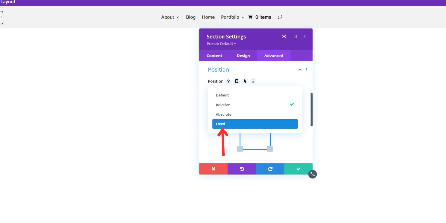
Want that smooth sticky header effect? Select “Fixed” as the section’s position in your section settings and add a subtle box shadow (try rgba(0,0,0,0.1) with 10px spread). Your visitors will thank you for keeping navigation handy as they scroll.
Pro tip: use display rules in the Theme Builder to create alternative header layouts for specific pages, such as blog posts. This lets you adapt your header for different sections while maintaining brand consistency.
Before closing your visual builder, hit the save button to lock in your header design. That’s it—your custom header is ready to welcome visitors!
Preview your header on a few different pages to ensure everything looks perfect before calling it done. Your new header should appear consistently across your entire website unless you’ve set specific page exceptions.
Using A Template (The Well Balanced Way)
Designing a header from scratch can be like climbing Mount Everest. But what if you could skip the steep climb and take a well-marked trail instead? That’s precisely what starting with a template offers.
First things first, hunt down a header template that matches your brand. Divi’s ecosystem is packed with options. Browse through Divi’s official resources, where you can download several header styles for free. Or dive into our Marketplace. Here are some popular options to check —
1. Headers for Divi
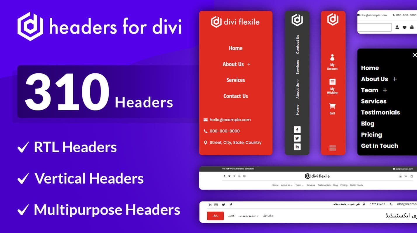
Headers for Divi provides you with a set of 310 custom header layouts made for the Divi. This extensive collection ensures you have plenty of design options to find the right match for your website. You’ll benefit from features such as inventive slide-in and off-canvas menus, vertical and rotated menus, and 10 headers specifically for RTL websites. Vertical headers, which are not as common as horizontal ones, can be difficult to picture, but these templates simplify the process. This collection is ideal if you’re building websites for clients and require various header choices to start your designs, all available for just $9.
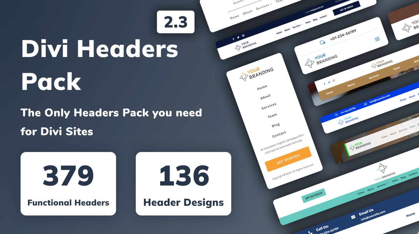
2. Divi Headers Pack
You can get over 980 customizable headers with the Divi Headers Pack for Divi’s Theme Builder. It includes designs like RTL, creative, and WooCommerce-enabled headers. These headers are responsive and built with Divi modules, so you can easily edit them. This pack is perfect if you’re using Divi and want unique headers for your website. Priced at $19, it comes with detailed instructions to help both beginners and advanced users set up headers smoothly.
3. Header Layout Pack
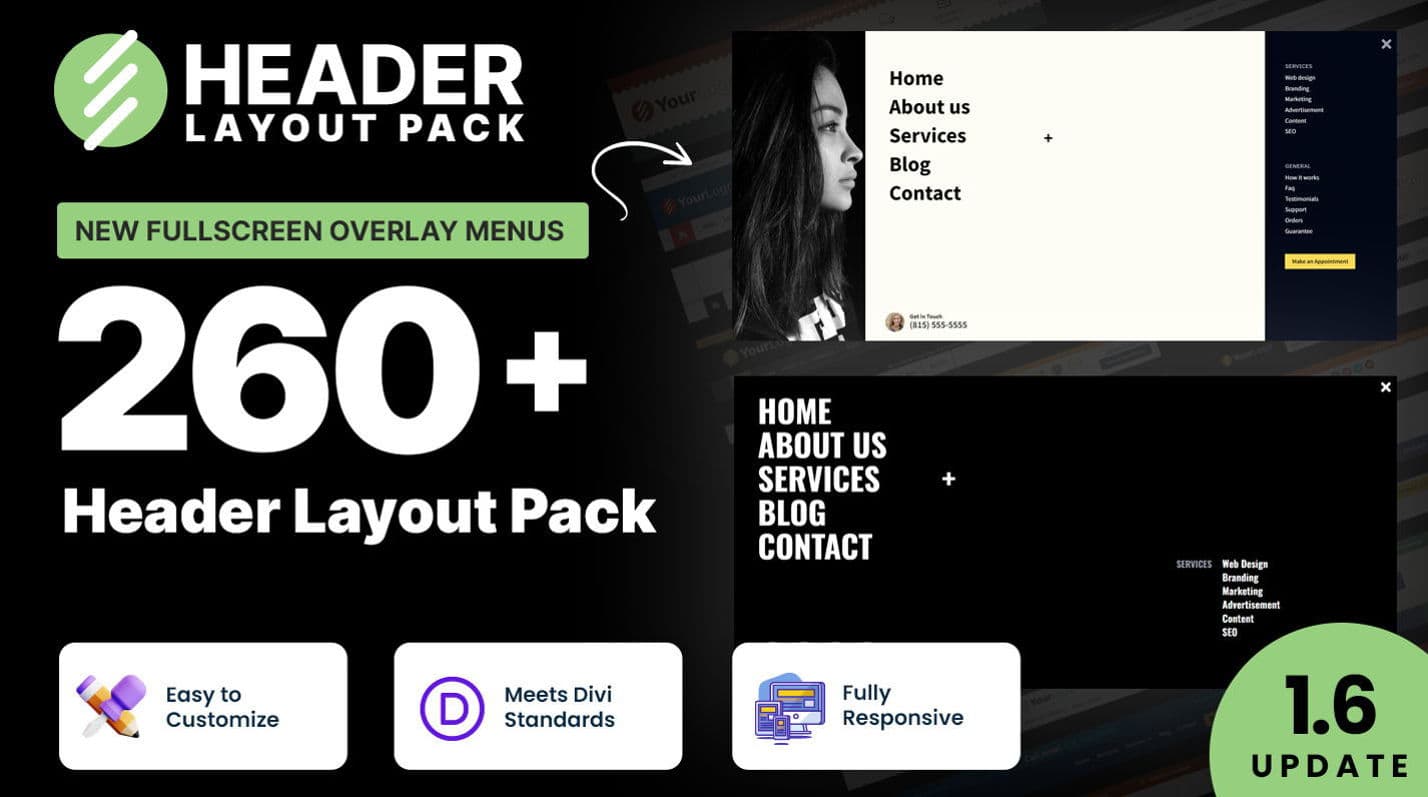
With Mark Hendriksen’s Header Layout Pack, you get over 260 customizable header and menu layouts. These range from simple to advanced, including options for WooCommerce and square logos. You’ll find fullscreen overlay menus, slide-in headers, and mega menus, all with custom CSS styling. Plus, you have the support of a top marketplace creator. This pack is perfect for freelancers and agencies. The standout feature is the mega menu headers, which make complex navigation easy to manage. This pack also costs $9.
4. Header Layouts Bundle
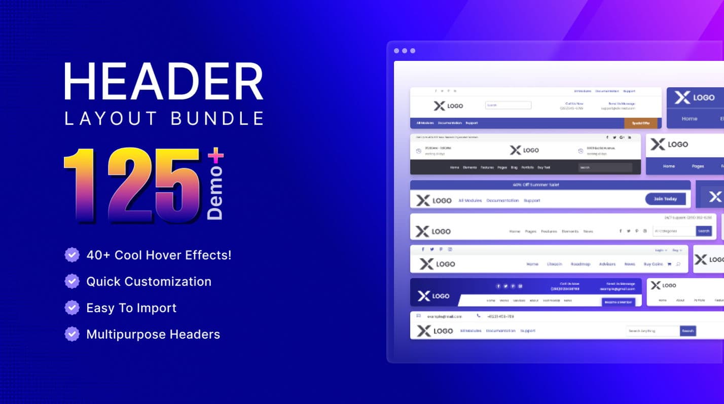
With the Header Layouts Bundle by Divi Next, you get 126 unique header designs for the Divi Builder that are easy to customize without needing advanced settings or custom CSS. Enjoy over 40 stylish hover effects and adaptable designs that work well on any device. You also receive professional support and regular updates, all for just $9. This bundle is perfect if you want a versatile and easily customizable header collection for your website.
Once you’ve found your perfect match, the process is straightforward. Download the template as a zip file, unzip it, and keep it ready. Importing is straightforward — go to Divi → Divi Library and use the Import & Export option. Want the entire layout? Import it. Would you prefer just a few sections? No problem. You have complete control.
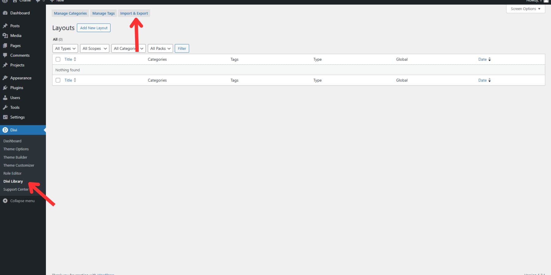
Once imported into the Divi Library, you need to add the layout to your Divi header. Go to Divi → Theme Builder → Global Header, and Add From Library.
After importing, make the template truly yours. Remove placeholder sections that don’t fit your vision. Swap in your brand’s colors and logo. Adjust spacing and alignment until everything feels just right. Your professional, polished header is now ready to welcome visitors and make a killer first impression.
Divi Pro Will Make Your Workflow More Adept
Divi Cloud’s efficient organizational capabilities can improve your workflows. It offers an unlimited storage solution for your favorite headers, footers, layouts, and design elements, all in one central location. You can sync these elements across multiple websites and effortlessly share them with your team.
When you upgrade to Divi Pro, you gain access to more than just the Divi Cloud. You also benefit from Divi VIP features that include a fast 30-minute support response time available 24/7 and a considerable 10% discount on marketplace items. Additionally, Divi Teams allows you to add up to four team members (additional members for $1.50/user/mo), enabling them to use the expansive Divi feature set. The Pro package also includes Divi AI, all bundled together to provide excellent value. This amalgamation of services can save you nearly $200 each year, as opposed to purchasing each component separately.
Using Divi AI (The Easiest Way)
This is the easiest approach to creating a header on Divi, requiring the least effort. It’s perfect if you want to design your menu quickly and if your website doesn’t have advanced needs. Remember, you’ll need a Divi AI subscription to use this option.
Navigate to the Theme Builder and select “Build A Global Header.” Once the visual builder opens, locate the blue + button below to add a new row. From the options presented, select “Generate Section With Divi AI.”
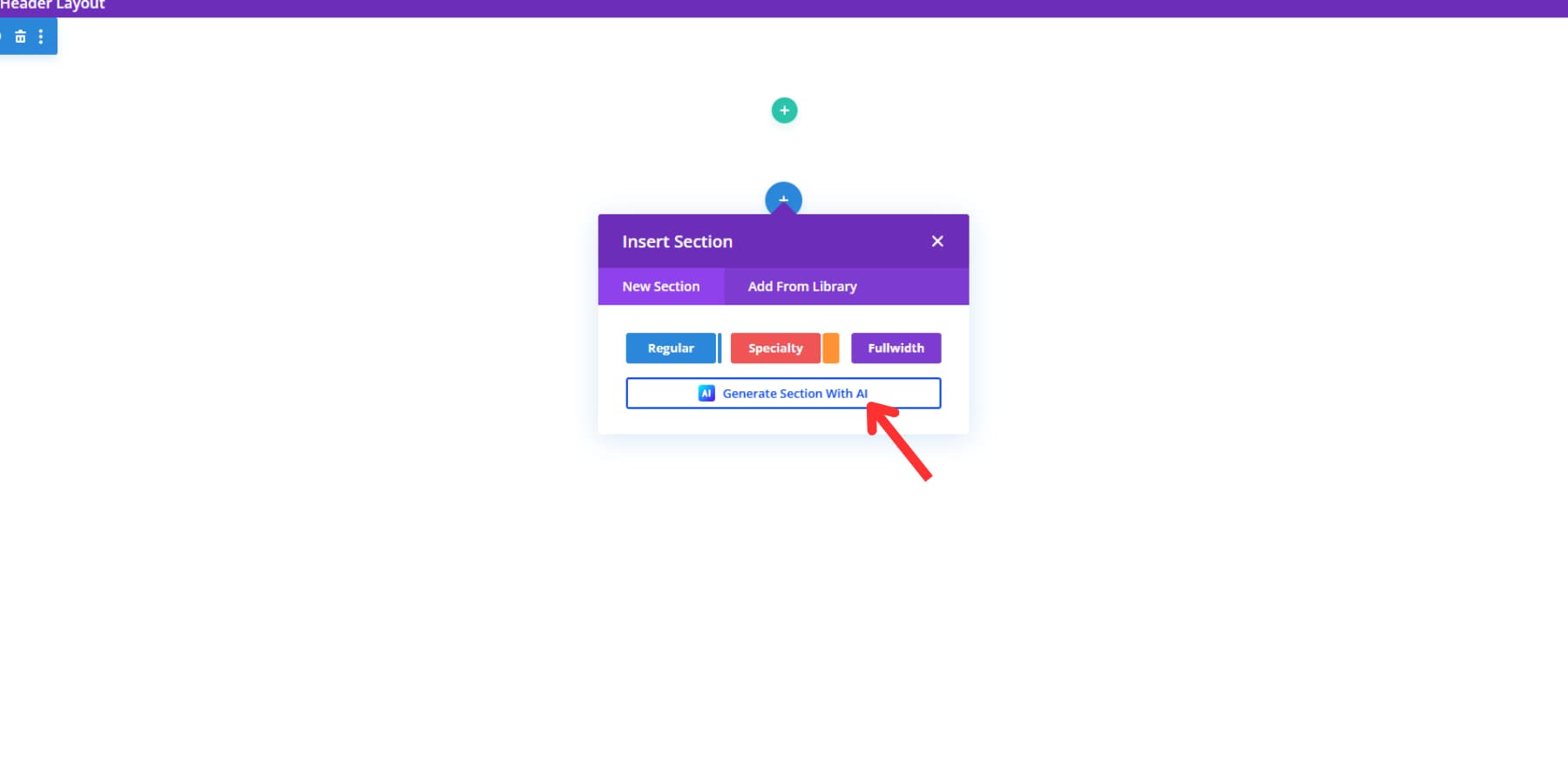
A dialogue box appears with a field labeled “Describe The Section You Want Divi AI To Create.” This is where precision matters. The more detailed your description, the better your results. Here’s a proven prompt example:
“Create a modern header with a logo area, followed by a menu. Add a bold ‘Get in Touch’ button on the right side using our secondary brand color. Keep the design clean and user-friendly with our primary color as the background.”
Select “placeholder image” in the images section — you’ll replace this with your site logo later.
Next, expand the “Customize Fonts & Colors” dropdown. While “Let AI Choose For Me” is the default option, you have full control here. Access the dropdowns to select specific fonts and colors, or choose “Website Default” to maintain consistency with your site settings. This ensures Divi AI draws from your established brand elements.
Click the generate section button, and Divi AI will produce your header within seconds.
A Few Manual Adjustments…
Go ahead and delete the previous empty section that was inserted by default.
You’ll notice several elements that require attention — email addresses, phone numbers, button links, and, most importantly, your site logo. Adjust these through the standard visual builder interface, just as you would with any Divi element.
Then, go ahead and save the header. How easy was that! Do remember that AI design is still in its nascent stage, so expect some discrepancies. You might have to adjust a few things yourself. Anyway, we believe AI is to aid designers, not replace them. This is still a much time-saving way.
Making A Mobile-Friendly Header
Mobile users make up most web traffic today, yet many headers fall apart on smaller screens. Creating a header that works well on phones requires careful planning and smart design choices. Let’s explore how to build headers that shine on every device.
Have you ever tried navigating a website on your phone and felt like you were solving a puzzle? Mobile menus can make or break the user experience. Clever designers know that cramming desktop navigation onto a tiny screen doesn’t work.
Divi understands this challenge, offering flexible menu solutions that adapt seamlessly.
Think of your mobile menu like a well-organized toolbox — everything should be within easy reach but not cluttered. Large, tappable buttons, clear hierarchies, and intuitive slide-out designs keep visitors moving. The secret isn’t just about looking good but creating a smooth path from curiosity to action.
Touch-Friendly Elements
Want to make your mobile elements more finger-friendly? Divi’s padding settings are your secret weapon. Instead of tiny, hard-to-tap buttons, use the module settings to expand touch targets. In the Divi Builder, navigate to any button or menu item’s design settings. Bump up the padding — try 20px on top and bottom and 30px on the left and right.
This creates a larger, more forgiving interaction zone that prevents misclicks. Pro tip: use the responsive editing tools to adjust padding differently for mobile. What looks good on a desktop might need a more generous touch area on a smartphone. Remember, a few extra pixels can mean the difference between a smooth user experience and frustrated tapping.
Screen Size Adjustments
Not all screens are created equal. Your header needs to look sharp on everything from giant desktop monitors to tiny phone screens. Divi’s responsive editing lets you customize every pixel precisely. Slide between device views and watch your design transform. Hide bulky elements on mobile, resize logos, and adjust font sizes.
Tap into Divi’s visibility settings to swap elements seamlessly. For example, a three-column desktop header might become a streamlined, single-column mobile version. The trick isn’t shrinking your design but reimagining it. Your goal is to create a fluid experience that feels intentional, not compressed.
Priority Content Display
Your most critical actions can’t hide inside a hamburger menu. Keep your primary call-to-action and contact information visible and accessible. Divi lets you strategically place these elements — think of a contact button on the right side, always in view.
The hamburger menu becomes a secondary navigation tool, not your primary interaction point. Users shouldn’t hunt for ways to reach you. A phone number or “Get Started” button should be immediate and clear. Consider using icons alongside text to save space. Remember, mobile users are often on the go, seeking quick information or immediate action.
Performance Optimization
Have you ever watched a website crawl on mobile? It’s painful. Divi’s Visual Builder creates code that search engines love. With its Dynamic Module Framework, you only process the necessary functions, cutting down on unnecessary load. Critical CSS is built into the builder, making your pages render faster.
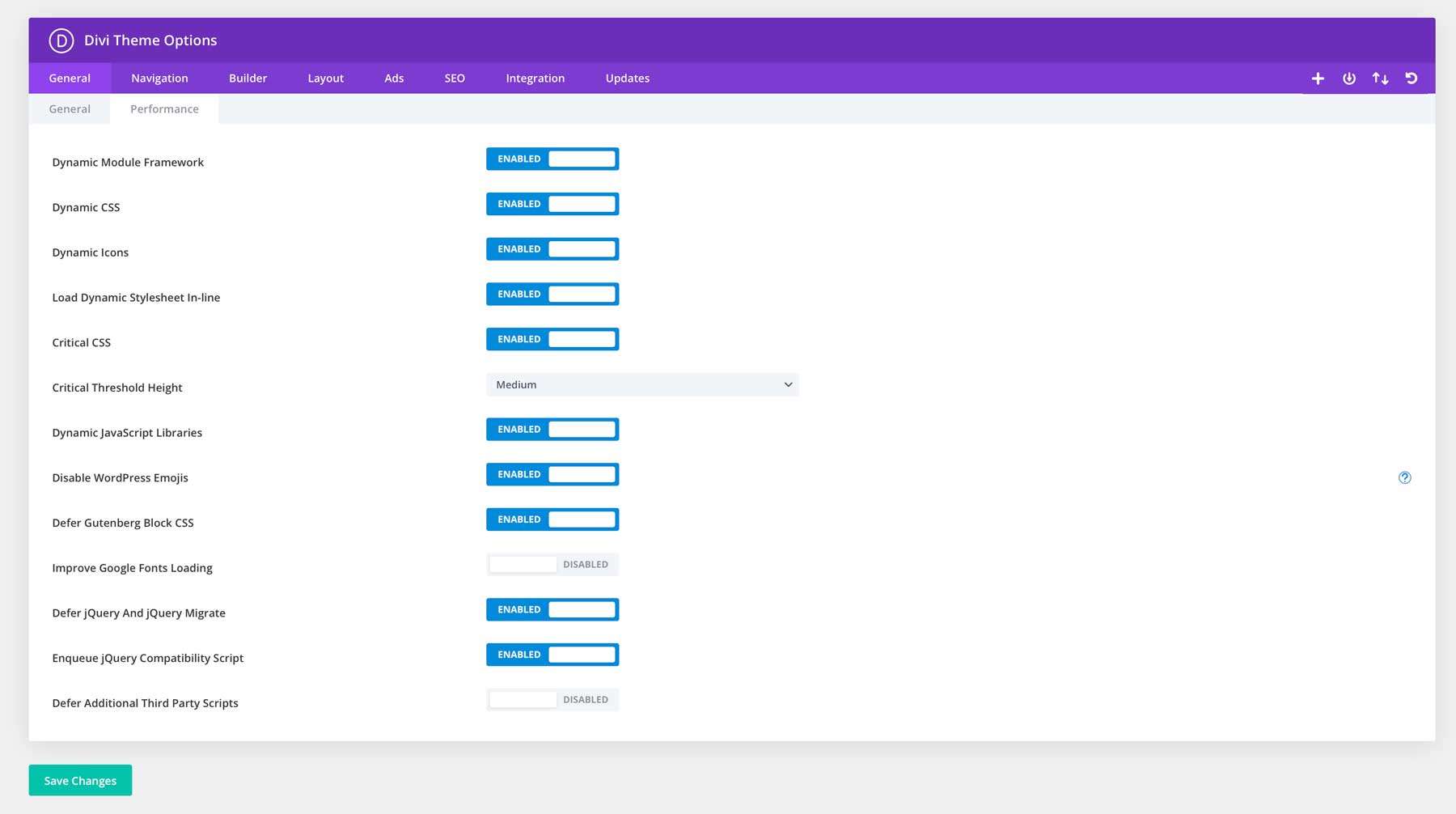
To boost performance, pair Divi with WP Rocket and EWWW Image Optimizer. These tools help by minifying assets, using browser caching, and loading content dynamically, ensuring your site stays light and quick.
Choosing SiteGround’s hosting further speeds up your site. This means your header loads instantly, keeping users engaged and your site performing well on all devices.
Swap That Basic Header Today
Imagine walking into a room where everyone immediately notices you. That’s what a great header does for your website. With Divi, creating that standout header becomes incredibly simple. Combine it with these tools, and you have a surefire way to design a great header:
| Tool | Purpose | |
|---|---|---|
| Divi Pro | Bundle of Divi AI, Divi Cloud, Divi VIP and Divi Teams. Save around $200 when compared to purchasing a la carte. | Get |
| Divi Cloud | Design Element Storage and Sharing | Get |
| Divi VIP | Premium Support and Marketplace Discounts | Get |
| Divi Teams | Collaborative Web Design | Get |
| Divi AI | AI-Powered Design Assistant | Get |
| SiteGround | WordPress Hosting | Get |
| WP Rocket | Performance Optimization Plugin | Get |
| EWWW Image Optimizer | Image Compression Tool | Get |
Divi’s Marketplace has a lot of layout packs that will help you expedite the process, such as —
| Layout Pack | Feature | |
|---|---|---|
| Headers for Divi | 310+ Custom Header Layouts | GET |
| Divi Headers Pack | 980+ Customizable Headers | GET |
| Header Layout Pack | 260+ Header and Menu Layouts | GET |
| Header Layouts Bundle | 126 Unique Header Designs | GET |
Divi’s visual builder lets you design professional headers in minutes, with no coding required. Combine it with SiteGround’s hosting and WP Rocket‘s performance optimization, and you’ll have a website that looks amazing and loads lightning-fast. Millions of Divi users know the secret: powerful design doesn’t have to be complicated. Ready to revamp your website’s first impression? Divi makes it possible — no tech skills are needed.


Leave A Reply