
")
Every homepage tells a story. Some ramble and lose their audience, while others pull visitors in from the first scroll. The secret isn’t in flashy tricks or following rigid templates — it’s about understanding what makes people click, read, and take action.
The best homepages share key design elements that make them work. Let’s explore how to arrange these pieces to create a homepage that captures and keeps attention. Along the way, we’ll show you how Divi makes the whole process smoother.
Why Your Homepage Matters
Your homepage arguably is the most important part of your website — it’s your storefront, boardroom, and elevator pitch rolled into one. Think of it as the face of your business that greets every visitor, whether they’re typing in your web address or clicking through search results.
Most visitors spend less than 50 milliseconds deciding if they want to stick around. That quick judgment shapes how they view everything else about your business. A well-designed homepage doesn’t just look good — it shows visitors exactly what they need to know and where to go next.
But here’s what many website owners miss: your homepage is less about cramming every detail about your business and more about creating clear paths that guide different types of visitors to their goals. When done right, it turns casual browsers into interested leads and helps current customers find what they need fast.
The Impact Of First Impressions
Picture stepping into a new coffee shop. Within seconds, you decide whether to stay for a drink or walk right out. Your website’s homepage creates that same gut reaction for every visitor there.
| What Visitors Notice | Why It Matters | Results |
|---|---|---|
| Overall Look | Sets brand tone | Build credibility |
| Easy Navigation | Shows respect for time | Keep visitors engaged |
| Clear Message | Answers "Why you?" | Convert browsers to buyers |
Good design speaks volumes about your business. Think about the websites you love visiting. They feel inviting and well-organized, like your favorite local shop. But when homepages are messy or confusing, visitors leave quickly.
Here’s the good news: you don’t need to be a design genius to create a great first impression. Focus on your visitors’ needs, guide them clearly, and watch those quick visits become longer stays.
Elements Of A Great Homepage
What makes some homepages instantly click with visitors while others fall flat? From that first scroll to the last — let’s break down the elements that make the difference.
Good website navigation works like a well-planned road trip. Your main menu should point visitors to their destination without any detours. Stick to 5-7 clear menu items — the pages visitors use most. Tuck similar pages into neat dropdown menus that open with one click. The best navigation feels invisible. Each link should lead somewhere helpful, and every path should make sense.
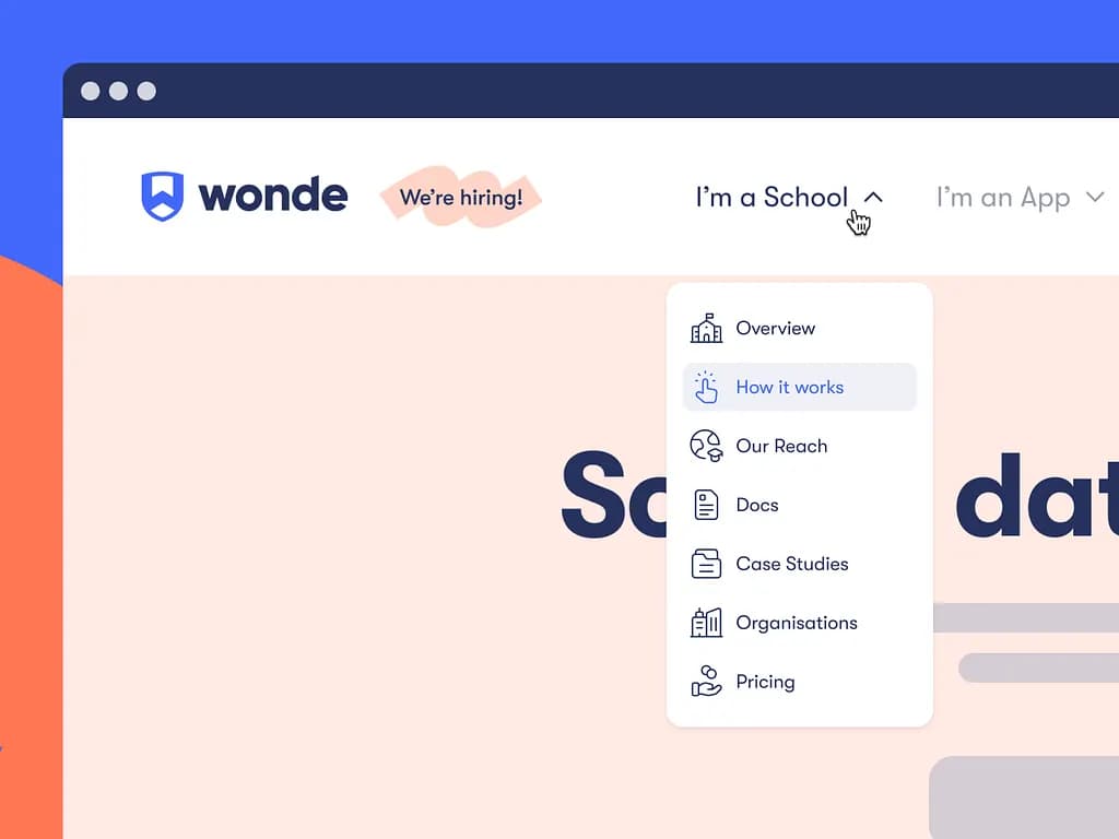
An example of a good header design on Wonde.com. Image provided by Anna Meleshina on Dribbble
Put your most important pages first, keep the labels clear, and add a search box for quick finds, especially if you have a magazine or an eCommerce website. When navigation works right, visitors spend less time looking and more time doing what matters.
Hero Section That Converts
Your hero section needs to pack a punch in those crucial first seconds. Skip the generic welcome messages — lead with your strongest pitch instead. A great hero section combines a clear headline that speaks to your visitor’s biggest need, supporting text that backs up your promise, and one solid call-to-action button that stands out.
Use real photos of your work or team rather than stock images, and make sure your message matches what your ideal customer wants to hear. The best hero sections look pretty and make visitors want to scroll down for more.
Compelling Value Proposition
A value proposition isn’t just another tagline or slogan — it’s why people should pick you over everyone else. Write it in plain words that your grandmother would understand. Focus on the problem you solve or the life you make better for your customers. The best value propositions take your biggest strength and turn it into a clear promise.
Maybe you help small businesses grow faster or make complex tech simple for everyone. Whatever it is, put it front and center where visitors can’t miss it. Back it up with a quick example or a striking number that proves your point.
Strategic Call-To-Action Placement
Your call-to-action buttons need to do more than say, “Click Here.” Place them where they make sense in your visitor’s journey — not wherever they fit. Start with one main action you want visitors to take, and make that button stand out with contrast and white space around it.
An example of a good CTA by Louis Nguyen on Dribbble
Add secondary CTAs as backup options, but keep them visually different from your main goal. The best buttons use action words that tell visitors what happens next: “Start Your Free Trial” works better than “Submit.” Space them naturally through your page, where visitors are ready to take action.
People trust what others say about you more than what you say about yourself. Sprinkle proof throughout your homepage that shows visitors they’re in good hands. Mix different types of trust builders — client logos, real testimonials, review scores, case study snippets, and hard numbers that show results.
Use real customer photos with their testimonials, keeping them short and specific. Include any awards, certifications, or media mentions that are relevant to your field. Back up your promises with genuine and relevant proof that matters to your visitors. Avoid fake-looking stock photos and generic quotes.
Visual Design That Speaks Volumes
A well-thought-out design pulls visitors through your page like a good story. Leave enough breathing room around your content — crowded pages make people click away fast. Stick to your brand colors, but don’t go overboard. Two or three main colors work better than a rainbow.
Pick fonts that play well together, ensuring everyone can read them easily on any screen. Add photos and graphics that help tell your story, not just fill space. When visitors scroll your homepage, each section should flow naturally to the next one. The best designs stay out of the way and let your message shine.
Common Homepage Design Mistakes
Even the prettiest homepages can fail if they’re built on shaky ground. Before you start designing, let’s look at the pitfalls that can turn visitors away faster than a broken link.
Overcrowded Page Layouts
Most homepage layouts fail because they try too hard to impress. Website owners pack their pages like sardines — stuffing headlines, images, and buttons into every pixel of space. Take a look at the top websites in your field. Notice how they use empty space? That’s not an accident.
Your homepage needs room to breathe. Think of brands like Apple — they pick one strong message and let it stand out.
When you try to make everything important, nothing is. Start by removing half of what you think you need, then half again. What’s left is usually what matters most to your visitors.
Inconsistent Branding Elements
Your homepage should maintain a consistent style. Avoid using different fonts in various sections, changing button styles partway through, or choosing colors that clash with your logo. These small errors quickly accumulate. Your brand needs to feel solid from top to bottom.
Pick your core design elements and stick with them. That means keeping your headings consistent, using the same button styles throughout, and maintaining your color scheme across every section. When your branding stays steady, visitors trust you more. They might not notice why, but they’ll feel it.
Unclear Value Proposition
Many homepages dance around what they offer — using fancy words that sound good but say nothing. “We leverage innovative solutions” or “transforming digital experiences” might look impressive, but your visitors will bounce faster than a rubber ball.
Your value proposition needs to hit hard and fast. Tell people exactly what you do and who you help. “We help small businesses double their sales in 90 days” beats corporate jargon every time. Skip the buzzwords and focus on results. Your visitors should understand what you offer before they reach for their scroll wheel.
Non-Responsive Mobile Design
Phone screens now rule web traffic, yet some homepages still consider mobile users an afterthought. Watch how people browse on their phones — they’re walking, multitasking, or catching up during quick breaks. Your homepage needs to work just as smoothly on a phone as on a laptop.
That means readable text without zooming, buttons big enough for thumbs, and menus that make sense on smaller screens. Skip those wide tables and sprawling images that force visitors to scroll sideways. When mobile design clicks, your traffic stats show it — bounce rates drop, and engagement jumps.
Slow Page Loading Times
Three seconds — that’s all you get before visitors start leaving. Bulky images, heavy animations, and too many plugins turn your snappy homepage into a slow crawler. Those fancy video backgrounds and image sliders might look cool in the design phase, but they’re often real-life conversion killers. Load speed matters more than ever, especially on mobile networks.
Keep your image sizes in check, cut back on unnecessary scripts, and test your homepage speed regularly. Your visitors won’t wait around while that perfect hero image loads — they’ll just hit the back button and try your competitor instead.
Generic Stock Photography
Stock photos of people in suits shaking hands or staring at laptops — these clichés make your homepage blend in with thousands of others. Your visitors can spot cookie-cutter images from a mile away.

Those perfect office shots and staged team meetings don’t tell your story — they just fill space. Real photos of your actual team, workspace, or products build more trust than the best stock photo money can buy. Even simple product shots on a clean background beat those glossy but fake alternatives.
Neglected Call-To-Action Hierarchy
Some homepages scatter CTAs like confetti, hoping visitors will click something — anything. Others bury their most important actions under layers of content. Every button on your page competes for attention, and when everything shouts “click me,” nothing stands out.
Your homepage needs a clear action hierarchy. Pick one main goal, make that button stand out, and let supporting CTAs take a back seat. Think of your buttons like a conversation — each one should make sense at that point in the page.
Drag, Drop, Done: Design Homepage With Divi
Web design has come a long way from when you had to pick between learning code or using basic templates. You can now bring your homepage ideas to life exactly as you picture them, and Divi makes this process feel like playing with building blocks.
You can create the perfect website homepage by pointing, clicking, and dragging elements around until they’re exactly where you want them. There are no hidden menus or complicated settings to dig through — everything you need sits right on your screen.
While other design tools might give you a handful of options, Divi opens up a whole toolbox. You get over 200 ready-to-use modules, plus all the core design features you’d expect. This means you can build any homepage layout you can think of. Whether you’re building your first homepage or your hundredth, you’ll find everything to make it stand out.
Starting from scratch can freeze your creativity instead of sparking it. That’s why Divi gives you over 2,000 ready-to-use designs.
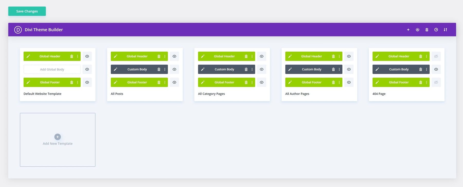
The Theme Builder allows you to design templates for various parts of your site. You can create custom headers and footers, layouts for product pages, blog templates, category archives, and even 404 pages. Decide what goes where, and Divi will make it happen for you.
Divi AI: Jack Of All Trades, Yet Master Of All
Isn’t starting from scratch frustrating? You know the drill — switching between tools for writing, searching for photos, and hunting down design ideas. Divi AI changes all that.
Want to write homepage content that connects with visitors? Tell it about your business, and it’ll help you write headlines and product descriptions that sound natural. No cookie-cutter text here — your homepage will speak in your voice, whether you’re a fun startup or a seasoned pro.
Maybe your team shots need a boost, or you’re stuck with boring stock images. Pop them into Divi AI and tell it what you’re after. Before you know it, you’ll have photos that look sharp and fit your brand.
Adding new sections to your homepage is just as easy. Need a spot for customers to reach you? Or a place to show off your best work? Tell Divi AI what you want, and it’ll create it to match your site’s look without you having to fiddle with settings.
Now, you can spend less time wrestling with tools and more time growing your business. Simple as that.
Upgrade Your Workflow With Divi AI
Break Free From Limitations
WordPress and Divi work together like peanut butter and jelly. While Divi makes your site look great, WordPress opens up a world of possibilities with thousands of plugins at your fingertips.
Want your site to show up higher in Google? Add an SEO plugin. Ready to sell memberships? There’s a plugin for that too. Whatever you dream up for your site, there’s probably a way to make it happen.
The best part? Everything just works. Unlike other website builders that start to slow down when you add new features, Divi plays nice with over 75 different tools right out of the box. Stack on as many plugins as you need — your site will keep running smoothly.
Got questions? You’re never alone. Jump into the Divi Facebook community, where over 76,000 users share tips and show off their latest designs. Need something special? The Divi Marketplace is packed with extras made just for Divi sites — from ready-to-use designs to powerful add-ons created by folks who know Divi inside and out.
How To Design A Homepage: A Simple Guide
Let’s discuss designing promising homepages. We’ll walk you through the process using Divi, but don’t worry if you’re using something else — these tips will help you create better home pages no matter what builder you choose.
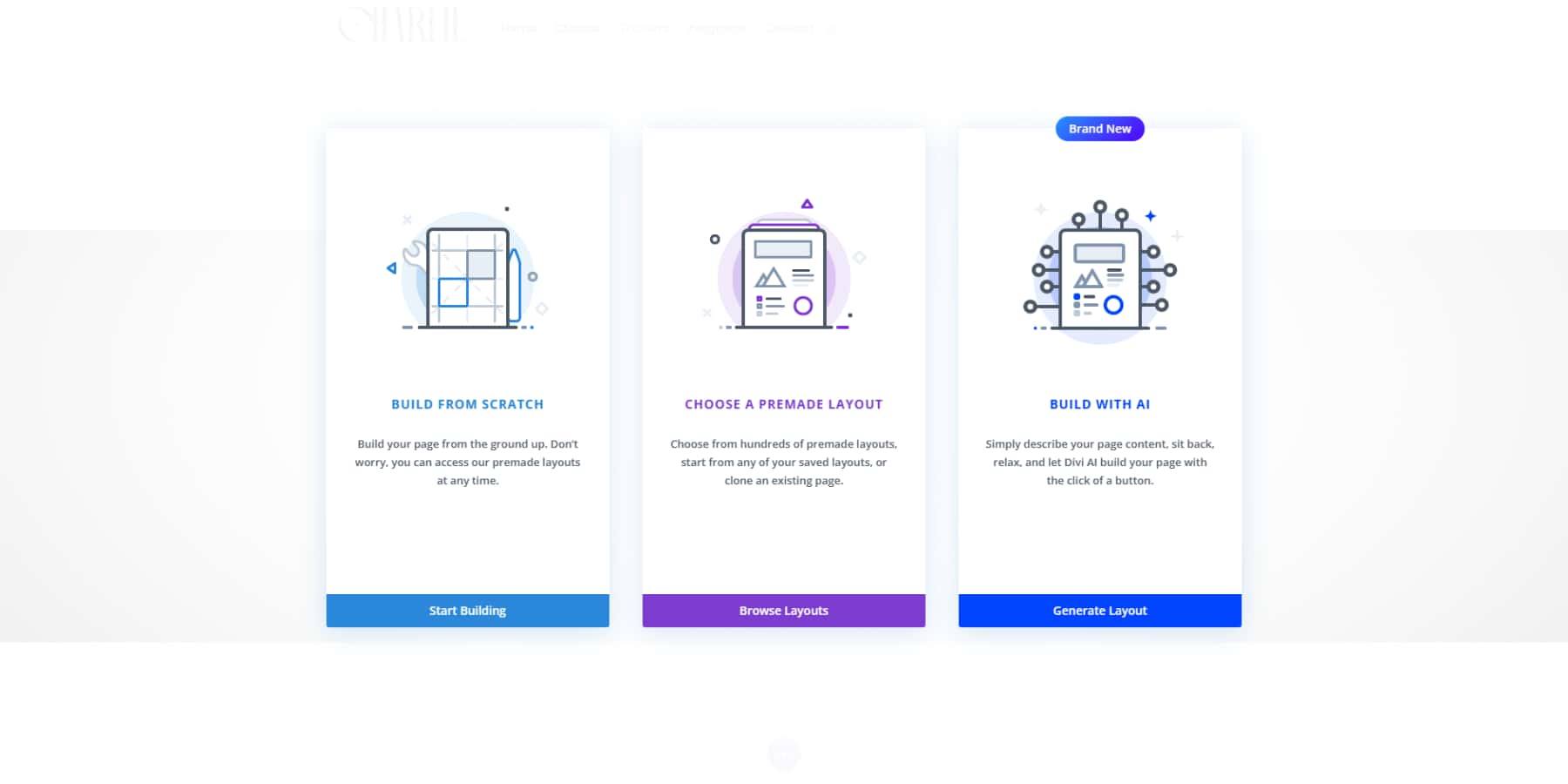
Starting From Scratch (Most Flexible)
Starting from scratch is probably the easiest way to proceed. Add a new page, open the Divi Builder, and hit “Build From Scratch” to get a fresh start.
Let’s talk about that first impression. Your homepage needs a strong opener — we call this the hero section. Grab a full-width header, drop in your best one-liner, and stick a button underneath that tells people exactly what to do next. Nothing fancy, just clear and direct.
Most folks want to know they can trust you. Toss in some logos of companies you’ve worked with, or better yet, let your happy clients do the talking with a simple testimonial slider.
Keep your main services simple. Those little blurb modules with icons work like a charm line up three or four to show what you’re about. Need to say more? The toggle module lets people click to read extra details without cluttering your page.
Divi comes packed with over 200 modules, but don’t go crazy. Pick what you need, add some breathing room between sections, and always check how it looks on your phone. Trust us — mobile views can be tricky.
Last up, make it easy for people to reach you. A simple contact form or a “let’s talk” button at the bottom does the job nicely.
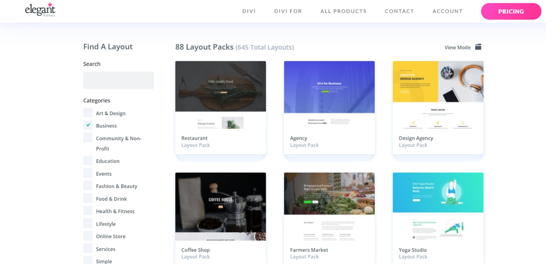
Using A Template (Time-Saving)
Divi’s design library makes finding the perfect page layout a breeze. The builder puts hundreds of ready-to-use designs right at your fingertips. Quick filters and a handy search bar help you spot exactly what you need without endless scrolling through pages of options.
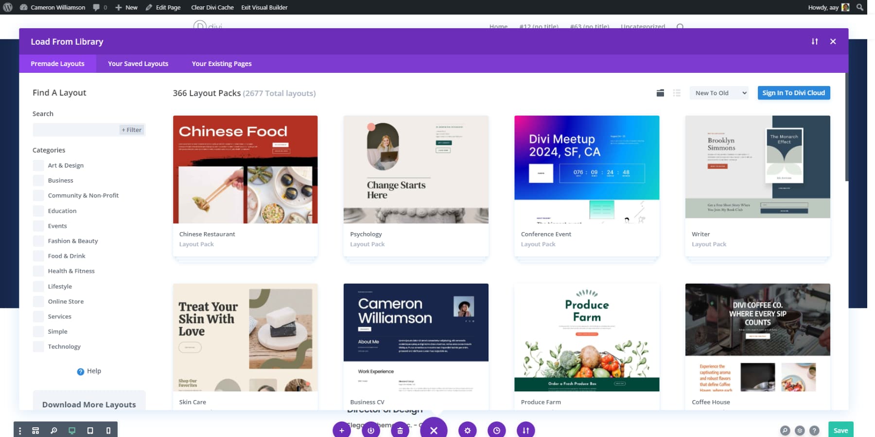
The layouts cover every industry imaginable. Restaurant owners can browse through food and drink designs packed with menu sections. Business websites get professional layouts with team galleries. Artists and designers will find portfolio layouts that put their work center stage.
Behind the scenes, Divi’s library holds over 300 complete website packs and more than 2,000 individual layouts. Each one comes from our expert design team, who understand what makes a website work. We’ve handled all the technical details — testing every layout across phones, tablets, and computers to ensure your site looks perfect everywhere. Simply pick your favorite design and start customizing it to match your vision.
More Options From Our Marketplace
The Divi Marketplace offers you a variety of professional themes and extensions that inspire fresh ideas. Let’s explore the most popular child themes from our marketplace:
Flexile
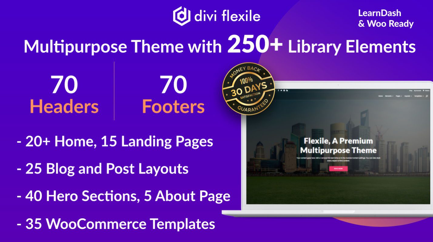
With Divi Flexile, you can easily create any type of website without needing to code. Enjoy over 20 homepage layouts, 25 inner pages, and 70 headers and footers. You’ll find 40 hero sections and WooCommerce integration with product, cart, and checkout templates. Use the one-click demo import to get started quickly and explore 100+ Divi library elements for design flexibility. You can use it on unlimited websites, and it is available only for $19.
Divi Cart Pro
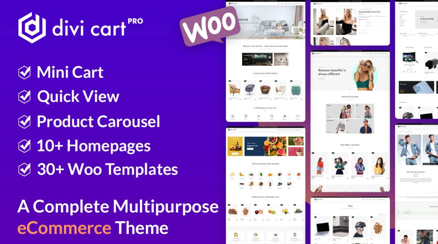
Divi Cart Pro is a premium eCommerce child theme for Divi, available for $39. With it, you get four native modules: Mini Cart, Custom Shop, Product Carousel, and Categories. It includes over 10 homepage layouts, 10 product page layouts, and 20 section layouts. You can easily customize cart and checkout templates. The theme is responsive, supports multilingual sites, and integrates seamlessly with WooCommerce. You can create multiple storefronts without third-party plugins.
Avanti
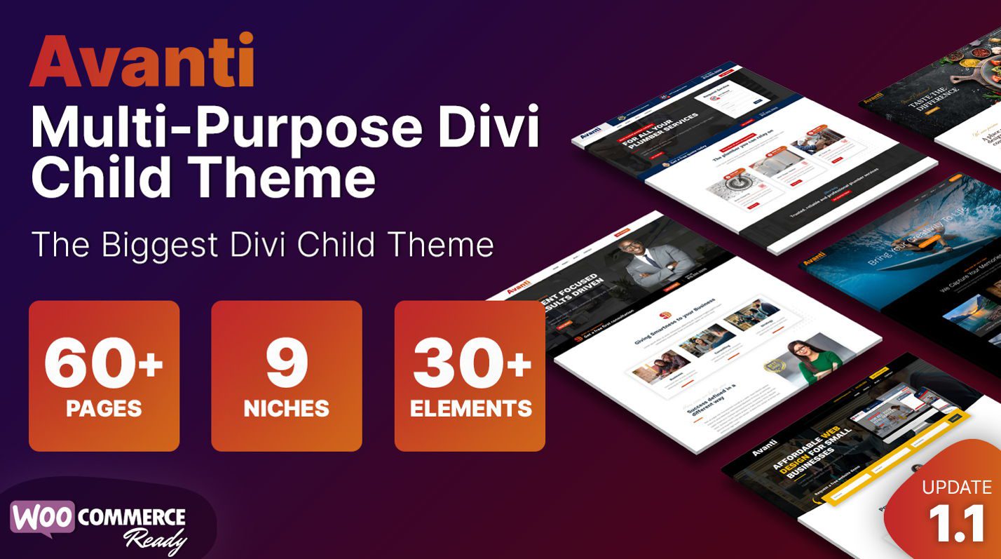
With Avanti, you get a versatile Divi child theme featuring over 60 pages for different niches, all integrated with WooCommerce. Enjoy four custom slide-ins, two flip boxes, and more than 30 prebuilt elements to boost engagement and design flexibility. Install it easily with a one-click demo import tool. For just $35, you receive unlimited website usage and a one-year subscription for support and updates.
Phoenix Super Theme
With the Phoenix Super Theme, you get a modern and beautifully responsive design, perfect for tablets and mobile devices. It focuses on clean lines, white space, and solid typography to make your site visually appealing. You can create stunning websites with ease, knowing that it looks great on any screen. The theme is available for $99, offering you a feature-rich solution for your design needs.
Molti
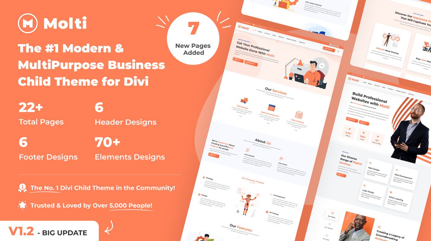
With Molti, you can easily create diverse business websites using its modern and multipurpose design. You get access to 22+ beautifully crafted pages, along with 6 header and footer designs. The fully responsive layout ensures your site looks great on any device. You can import demos with just one click and change accent colors effortlessly, saving you time. Enjoy stunning animations and versatile functionalities, perfect for sites like consulting or eCommerce. The price is $25.
How To Use Templates In Divi
There are three ways to use a template or a layout on Divi:
- Load a premade layout directly: Add a new page and click ‘Use Divi Builder.’ When the visual editor opens, you’ll see three choices: Choose a Premade Layout. Browse through Divi’s collection, select your favorite, and start editing. That’s it.
- Import from the Marketplace: Do you have a layout pack from the Marketplace or our blog? First, unzip the downloaded file. Head to Divi → Divi Library and look for the Import & Export option. You can bring in the whole layout or just the parts you want. Once imported, open the visual builder, select ‘Choose a Premade Layout,’ and find your design under ‘Your Saved Layouts.’
- Use a Child Theme: Some marketplace layouts come as Child Themes. To use these, go to Appearance → Themes → Add New Theme and upload the Child Theme file. The process works just like installing any other WordPress theme.
Save Time & Money with Divi Pro
Store all your favorite website pieces in one spot with Divi Cloud. Headers, footers, layouts — keep them all organized and ready to use. Do you need to share designs with your team or use them on different sites? Divi Cloud handles that seamlessly.
Stepping up to Divi Pro opens up even more possibilities. You’ll get VIP treatment with lightning-fast support — our team responds within 30 minutes, day or night. Plus, save 10% on marketplace goodies and bring up to four team members along for the ride via Divi Teams. Need more hands on deck? Add extra team members for just $1.50 each per month.
The Pro package includes Divi AI and unlimited cloud storage. Bundle it all together, and you’ll save around $200 compared to buying everything separately.
Divi Quick Sites
Want an even faster option? Check out our starter sites. These aren’t just templates — each one comes packed with custom photos and original artwork you won’t find anywhere else.
Go to Divi → Divi Quick Sites tab, click the “Generate a New Site” button, select “Use pre-made starter site,” browse through the designs, and pick one that feels right for your brand. Drop in your basic details, select colors and fonts (optional), and let Divi Quick Sites do its thing. You’ll have a complete website ready before you can finish your coffee.
The best part? Everything works in perfect harmony — from your color scheme to your fonts. Once your site is live, you can jump in and make tweaks just like any other Divi site.
Using AI To Build A Homepage (Easiest)
Remember the days when building a website meant weeks of work? Not anymore. With Divi Quick Sites and Divi AI, you can have your homepage up and running before lunch.
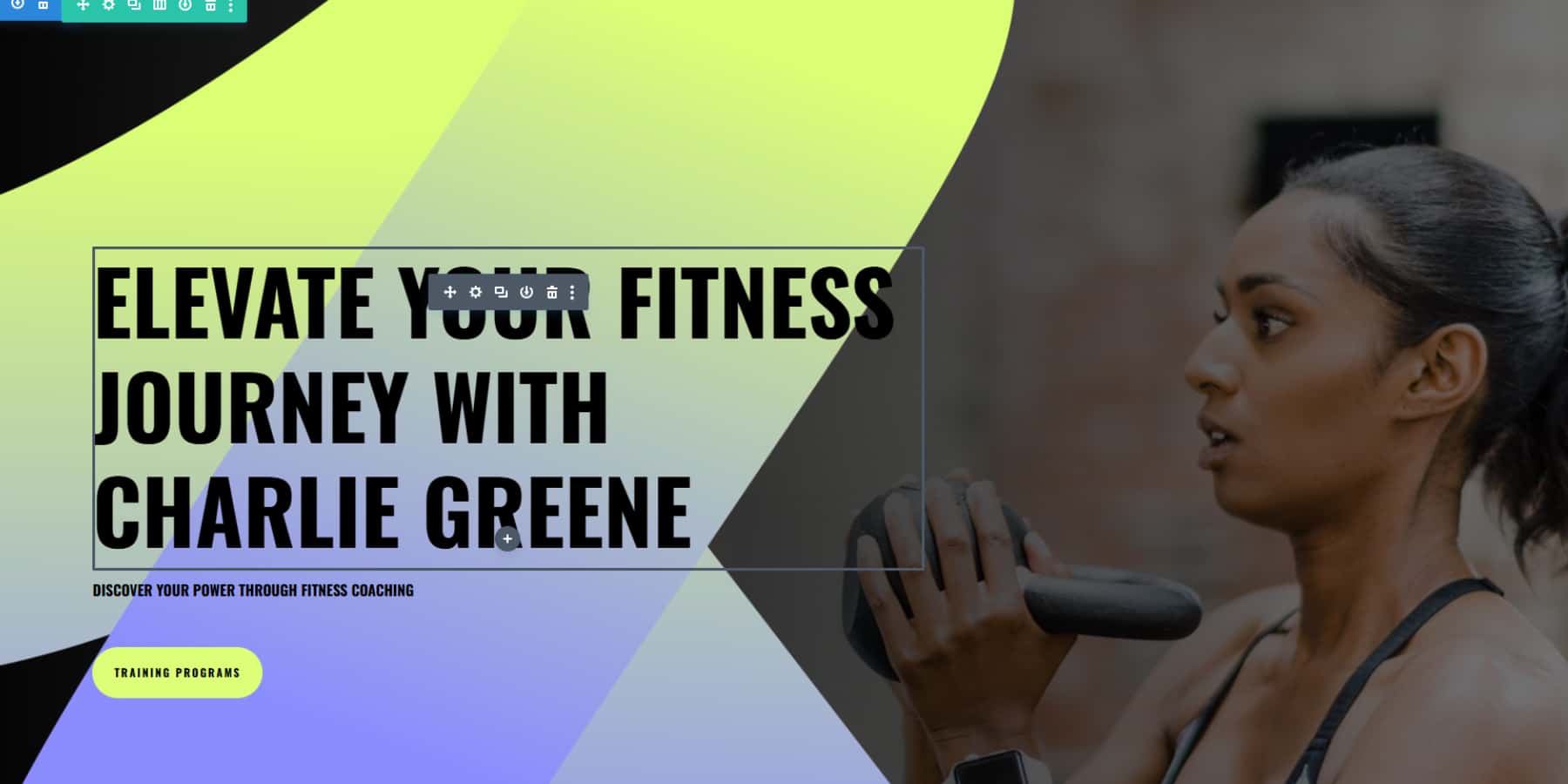
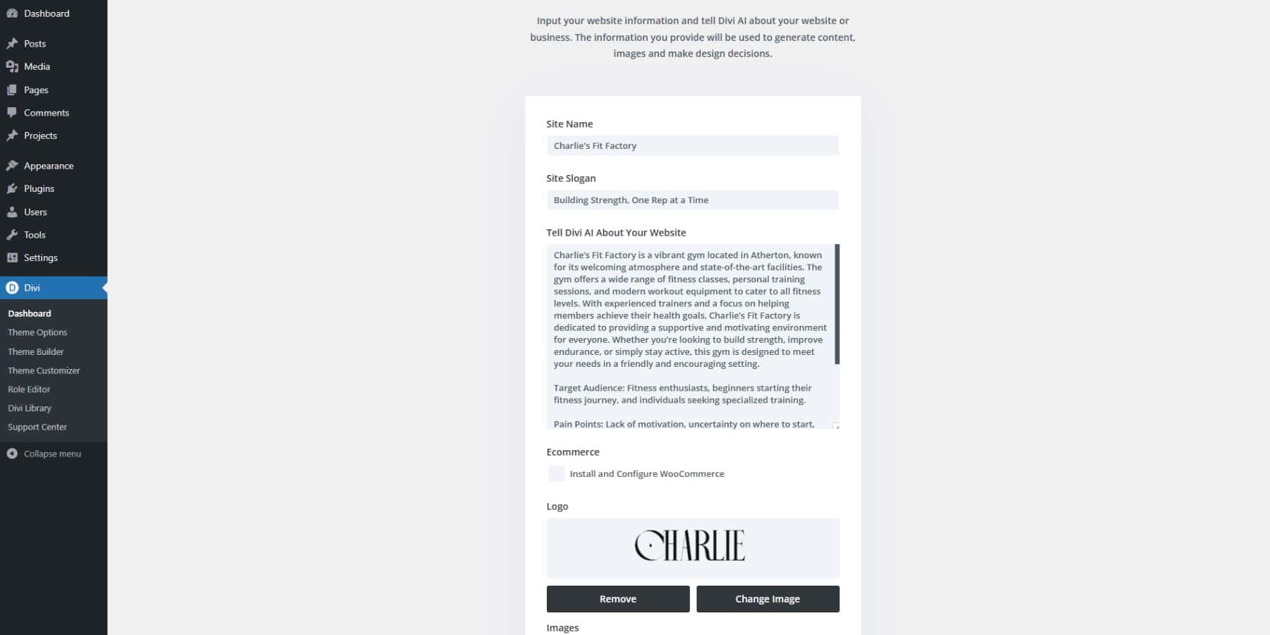
Just pop over to your Divi dashboard and click “Generate a New Site.” Then, select Generate your Site with AI option and tell it what your business is about in detail. The more the details, the better. Remember, you would need a Divi AI subscription for this path. For example:
Site Name: Charlie’s Fit Factory
Site Slogan: Building Strength, One Rep at a Time
Then, in the Tell Divi AI About Your Website field:
Charlie’s Fit Factory is a vibrant gym located in Atherton, known for its welcoming atmosphere and state-of-the-art facilities. The gym offers a wide range of fitness classes, personal training sessions, and modern workout equipment to cater to all fitness levels. With experienced trainers and a focus on helping members achieve their health goals, Charlie’s Fit Factory is dedicated to providing a supportive and motivating environment for everyone. Whether you’re looking to build strength, improve endurance, or simply stay active, this gym is designed to meet your needs in a friendly and encouraging setting.
Target Audience: Fitness enthusiasts, beginners starting their fitness journey, and individuals seeking specialized training.
Pain Points: Lack of motivation, uncertainty on where to start, need for guidance to achieve fitness goals.
What We Offer: Comprehensive fitness programs, state-of-the-art equipment, certified personal trainers, group classes, and nutrition counseling.
Call-to-Action: Sign up for a Free Trial Class.
Do you have products to sell? Select the install WooCommerce option, and it’ll also set up your store pages. Next up, images. You may select the Divi Quick Sites option to create something perfect from Unsplash’s huge collection or let Divi whip up custom images. If you have images already, you can also select the “use placeholder” option.
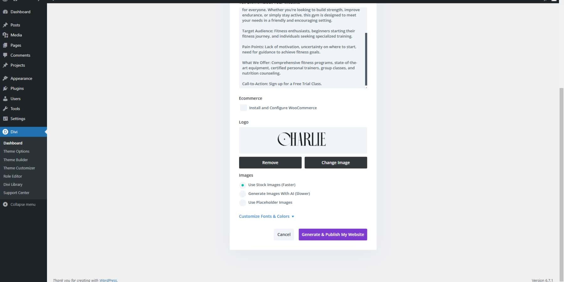
Next, you can play with colors and fonts. Pick your own if you know what you want, or let Divi suggest some winning combinations. When you’re happy with how it looks, hit “Generate & Publish” and watch the magic happen.
A few minutes later, you’ll see your homepage spring to life.
Maybe you run a cozy coffee shop downtown or launch the next big tech startup — whatever your story, Divi Quick Sites gets it right. Your coffee shop won’t sound like a corporate robot, and your startup won’t read like a casual blog.
Something not quite right? No problem. Use the visual builder to tweak until everything is where you want it.
Think of it as having a professional web designer in your pocket — one who works at lightning speed but still lets you call the shots.
Moreover, if you want to design additional sections with AI, click the add new section button (blue +) and select generate section with AI. Describe and watch as Divi AI puts a section together for you.
Beyond Design: Optimizing Homepage
A beautiful design catches the eye, but smart optimization keeps it glued. Here’s how to turn your homepage into a conversion powerhouse that both search engines and visitors will love.
Creating Search Engine Magnets
Your homepage needs to speak two languages — one for visitors and one for search engines. While visitors scan your content, Google crawls it to understand what you offer. Good SEO helps you show up when people search for businesses like yours.
Keyword research tools like SEMrush help you find the exact words your audience types into Google. Once you know these keywords, Divi AI can help weave them naturally into your content. Want to check if your page hits all the right SEO marks? RankMath plugs right into Divi’s visual builder — it’s like having an SEO expert look over your shoulder while you work. This WordPress plugin shows you exactly what to fix as you build your page.
![]()
Moreover, try these proven homepage SEO tips:
- Put your main keyword in your headline
- Name your images with descriptive alt text
- Use clear headings to break up your content
- Write a meta description that makes people click
Supercharging Page Performance
A fast homepage keeps visitors happy and Google smiling. Divi’s visual builder does the heavy lifting behind the scenes — it creates clean code while you design and loads only what each page needs. The builder’s Dynamic Module Framework and Critical CSS features mean your homepage loads lightning-fast right from the start.
Want to push your speed even further? Pair Divi with WP Rocket to cache your content and EWWW Image Optimizer to shrink those large photos without losing quality. Top it off with SiteGround hosting’s built-in speed tools, and you have a homepage that loads in a snap. Remember — every second counts. A one-second delay can cost you 7% of your conversions.
Quick speed boosters:
- Compress your header images
- Enable browser caching
- Pick a fast hosting plan
- Remove unused plugins
- Minimize redirects
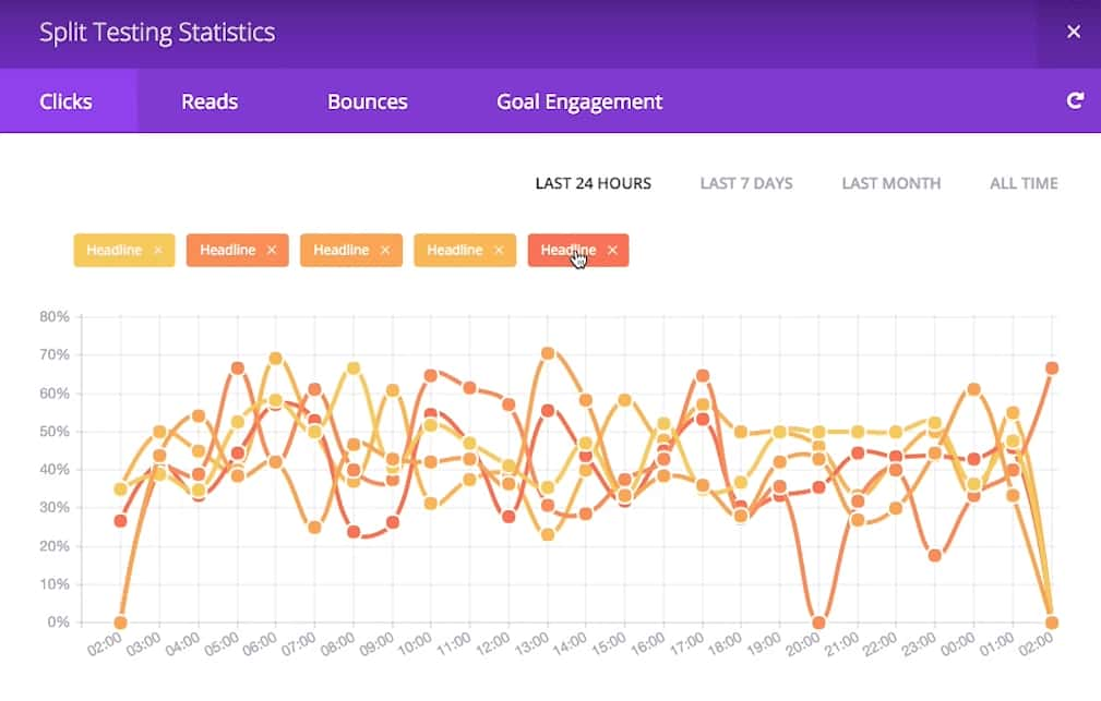
Using Split Testing
Ever wonder why some websites seem to know exactly what makes people click? They’re probably using split testing — showing two different versions of their homepage to different visitors and seeing which one works better. It’s like having two ice cream flavors and letting customers tell you which one they prefer by what they buy, not just what they say they like.
Divi makes these experiments simple with its built-in tool called Divi Leads. Want to test if a video background beats a static image? Or if “Start Free Trial” works better than “Try Now”? Just create both versions in the visual builder, and Divi shows each one to half your visitors. It tracks everything — clicks, signups, sales — and tells you which version wins. No guessing, just clear data about what your visitors prefer.
Analyze User Behaviour
Split testing shows you what works, but analytics tells you why. By watching visitors move through your homepage, you’ll spot patterns you’d never notice otherwise. Maybe people scroll right past your best features, or they get stuck halfway down the page — these insights help you fix what’s broken.
Tools like Hotjar show how visitors interact with your homepage through heatmaps and session recordings. You’ll see where they click, how far they scroll, and even watch recordings of actual visits. Pair that with MonsterInsights, which brings Google Analytics into your WordPress dashboard, and you’ll get the whole picture.
These tools turn complicated data into clear actions — like determining whether your mobile menu needs work or if your call-to-action button is in the wrong spot. These minor fixes, guided by real data, can turn your good homepage into a great one.
Crush Your First Impression
Building the perfect homepage is less than following a formula and more about creating an experience that speaks to your visitors and drives results. Throughout this guide, we’ve explored the essential elements, common pitfalls, and proven strategies that make homepages work.
The real magic happens when you combine the right tools with your vision.
| Tool | Purpose | |
|---|---|---|
| Divi | Multi-Purpose WordPress Theme & Page Builder | Get |
| Divi AI | AI-Powered Design Assistant | Get |
| Divi Cloud | Design Asset Storage | Get |
| Divi Teams | Team Collaboration | Get |
| Divi VIP | Quick support response times + discounts on Marketplace purchases | Get |
| Divi Pro | All of the above bundled into one (save upto $200) | Get |
| SEMrush | SEO Research Tool | Get |
| RankMath | SEO Plugin | Get |
| WP Rocket | Caching Plugin | Get |
| EWWW | Image Optimization | Get |
| SiteGround | Web Hosting | Get |
| Hotjar | Analytics Tool | Get |
| MonsterInsights | Analytics Plugin | Get |
Looking for a head start? Our marketplace offers specialized themes designed for almost every industry and style:
| Tool | Features | |
|---|---|---|
| Flexile | Multipurpose Child Theme with 20+ Layouts | GET |
| Divi Cart Pro | Child Theme best suited for WooCommerce stores | GET |
| Avanti | Versatile Child Theme with 60+ Pages | GET |
| Phoenix Super Theme | Modern Responsive Child Theme | GET |
| Molti | Business Child Theme with 22+ Pages | GET |
But great design needs a solid foundation. Pair Divi with SiteGround’s robust hosting, and you’ll have a stunning homepage that performs flawlessly. Your perfect homepage is just a few clicks away — and Divi’s got everything you need to make it happen.


Leave A Reply