
Websites and apps have all sorts of visual elements that have to coexist – buttons, columns, icons, images, lines, media and typography. All of those elements need a canvas (the blank web page), and that canvas needs blank space, i.e., negative or white space. The viewer’s eye can’t process what it sees without it.
Subscribe To Our Youtube Channel
What is Negative Space?
Positive space is the part of the work that’s filled with the subject or other focal points. Negative space takes up the rest. It may be blank or white, contrasting in color or design, a subtle background image – whatever it is, it will feel empty instead of full or cluttered. However, just because negative space is hollow, that doesn’t mean it’s unimportant – it draws attention to the positive space, and sometimes even becomes positive space itself when looked at differently.
Examples of Negative Space
Negative space – and its counterpart, positive space – is in all sorts of art and design, including web design. Let’s look at the FedEx logo. You see purple and orange letters, right? There’s an arrow in there, though, in the white space:
![]()
That hidden FedEx arrow uses negative space in a similar way to drawing and painting – the outline is created just like the positive space is created. In an example like this, the negative space isn’t created simply because it’s where positive space isn’t.
The NBC peacock does the same thing:

While the point of negative space is usually to put the focus on the positive space, it sometimes becomes the focus in clever designs. Here’s another example – look at how the wolf’s teeth form a tree:
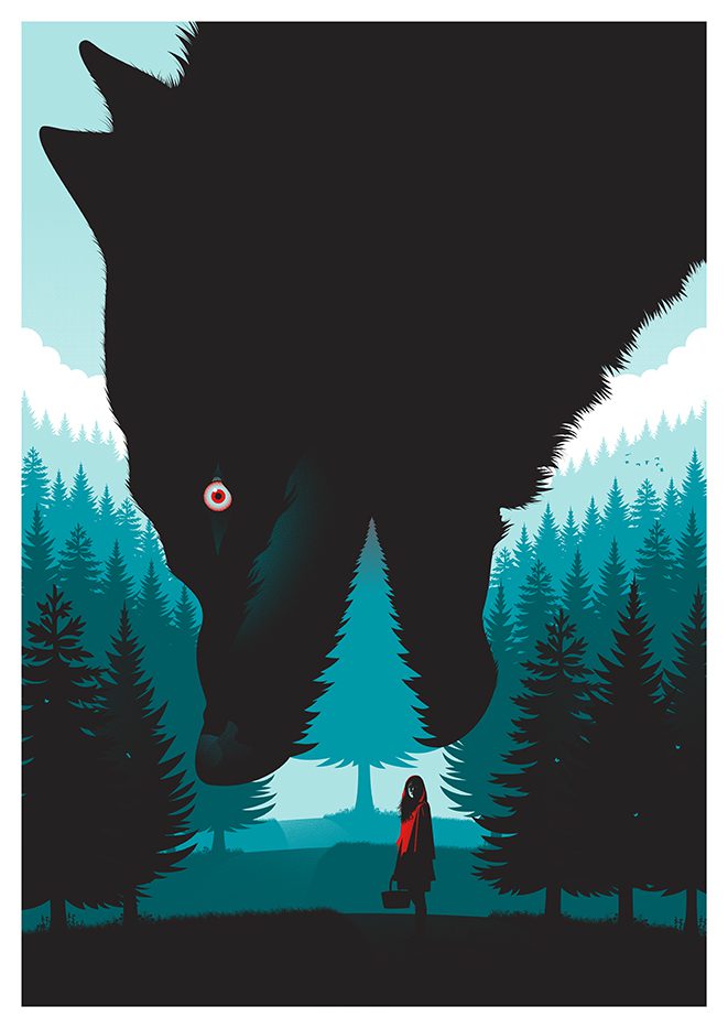
There’s a term for this: figure-ground reversal. It basically means that the foreground and background colors swap places to change perspective and interpretations. If you’re into this, check out M.C. Escher’s work, especially his transformation prints.

Negative space plays the same role in photography. Look at this portrait I took of my cousin’s son, Julian. The black background puts all the focus on him:

You can find negative space in nature, like in the space between flower petals, and in functional design, like in the space through the handle of a coffee mug.


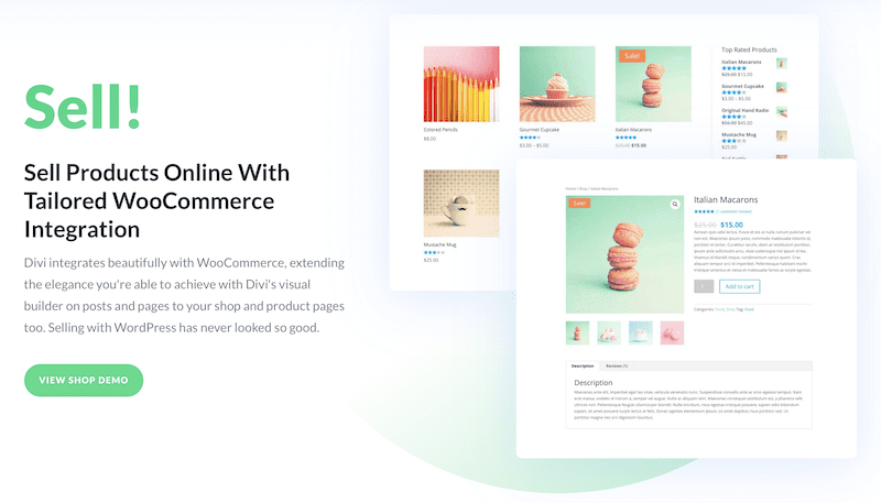
We use it on our website, too. Our homepage has a bunch of information, but it’s not overwhelming because of the way we’ve spaced it out. And even though the background has hints of color and some shapes to add to the design, it’s in no way distracting – it still gives the appearance of being pleasingly empty without being boring (and it’s on-brand).
Types of Negative Space
There are a few types of negative space. Micro and macro refer to the size of negative space in a composition. Active and passive refer to what those areas do for the user.
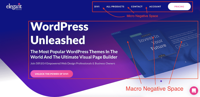
Micro vs. Macro Negative Space
Micro negative space refers to the small spaces between elements – the spacing between lines of text or the area between links in a navigation menu. This impacts how legible content is for the reader. If there’s not enough space between lines or if text goes outside margins, the user will have a hard time reading and understanding it.
Macro negative space is larger; it’s the space around the layout and the spaces between large design elements. An example is the area between content blocks. It’s the empty parts of the container that hold the entire design.
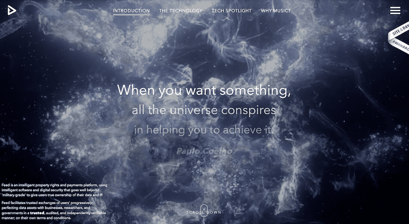
Websites with small amounts of macro negative space tend to be highly informative. Websites with large amounts of macro negative space are often minimalist or showcase luxury. The first example is of small macro negative space, and the second is of large macro negative space:


Active vs. Passive Negative Space
Active negative space adds to the page structure, improves the flow of content and guides the user where you want them to go. Passive negative space improves the look of the website but doesn’t move the user through any specific flow. When space is off-center and asymmetrical, it’s usually active. When it’s balanced and symmetrical, it’s usually passive – it evokes less movement, which doesn’t force the user to look at it a certain way. Here’s an example of active negative space:
And here’s an example of passive negative space:
Negative Space and Composition
Negative space is important to composition for several reasons:
- You need to see the space in a composition in order to keep it well-proportioned.
- It also allows you to play with the relationships between different objects in a design.
- In web design, it can play a role as important keeping people on your page.
- The amount of space around an element determines how much focus is on the element – more space means more focus.
Choosing the Right Balance of Negative and Positive Space
How much negative and positive space you use will depend on the look you’re going for and what you want to evoke in the viewer.
- If you want an aesthetically pleasing design, you’ll probably use equal parts negative and positive space.
- For design that looks purposely stark and minimalist, you’ll go for more negative space.
- To look overpowering and in-your-face, you may opt for more positive space.
Designers have to play with spacing until they strike the right balance for the brand and the website’s intended purposes.
Decluttering Text-Heavy Websites with Negative Space
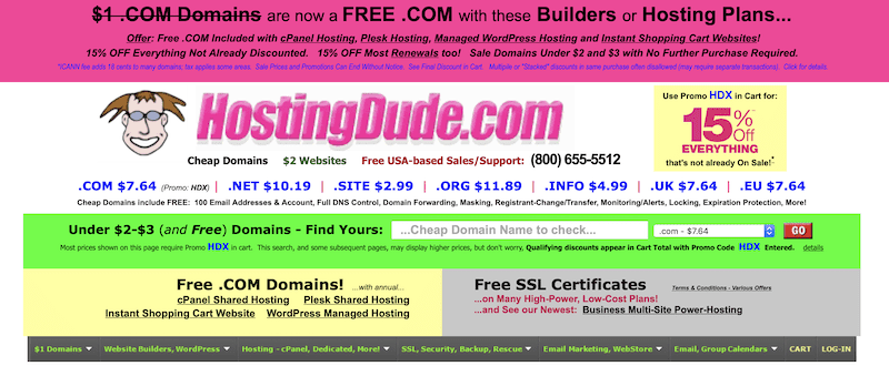
When you have to squeeze a ton of information onto one page, figuring out where to place the negative space becomes tricky – especially if that information is text-heavy, which can look cluttered fast. HostingDude is a great example of too much positive space:
The New York Times, on the other hand, has figured out how to pack their homepage with their news without driving your eyes crazy, and it’s all thanks to the spacing (and color choices). While there’s not a lot of room for macro space, they’ve taken advantage of micro space:
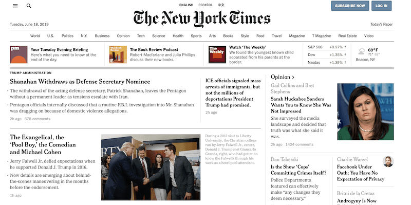
Even though the elements on HostingDude are closer together, the elements on the New York Times website look more unified thanks to the extra space between them. The eye has an easier time making sense of the page, which gives it a more complete, cohesive design. When the eye has the opportunity to rest, it’s better able to take in what it’s seeing. Negative space believes that less is more.
Breaking Up Text with Negative Space
You’ve seen how designers can create an aesthetically pleasing, text-heavy homepage, but what about the longer blocks of text themselves? Mixing short paragraphs with long ones, bolding headlines, creating lists and adding media throughout an article all help build negative space around the words, making it more inviting for the reader. Appearance matters, even with copy, and great designers take that into consideration.
Explaining the Point of Negative Space to Clients
Website designers can clash with clients about negative space. Clients see even more room to squeeze in important, money-making information. They feel that blank space is space wasted. Designers, on the other hand, see the visual break the eye needs to actually soak up the information that already exists. They know that all space on a website is important, even the space that’s free of content.
This is where mockup and prototyping tools come in handy. Show the client two versions of their website, one with a pleasing amount of negative space and one that’s overloaded with positive space. Have them look at the websites side-by-side and ask them to play around with them. My guess is that they’ll have an easy time navigating the well-designed website and feel lost on the poorly-designed one.
Wrapping Up
Websites have a bunch of different elements, and if you want those elements to live in harmony and attract the viewer, you need white space around them. The amount of white space you use and how it functions depend on (a) your branding and (b) what actions you want the user to take. You can get creative with white space, too, like by inverting the colors or drawing with negative space to define it in an interesting or eye-popping way.
Whatever approach you take, white space should feel balanced – that doesn’t necessarily mean symmetrical, though. Instead, it means the elements exist on a page without competing with one another and while drawing the type of attention you want them to have. For the viewer, balance means being able to look at a website without getting confused or overwhelmed.
Experiment with the white space on your website. Add some in, take some out. Reduce macro and increase micro, or vice versa. Test how more or less white space around certain elements encourages the user to take action. The beauty of white space is that it’s an artistic technique, which means there are no hard-and-fast rules.
Designing a travel website? You’re probably going to use a lot of macro space. Check out our roundup of Divi Child Themes for Travel Websites.
Featured Image via StockVector / Shutterstock.com


This has helped me a ton a debt of gratitude is in order for the data
Thanks a lot for the post!
I was not a big fan of negative space but I find it very easy to create negative space designs in DIVI. I just love Divi theme features. Thanks, DIVI TEAM.
Excellent, glad to hear!
This has helped me a lot thanks for the information
Negative space is part of the very essence of existence. All things ‘are’ by virtue of what they ‘are not’.
Love it, thanks Simon!
Dude!