Great design speaks without saying a word. The most successful websites blend visual appeal with intuitive functionality, creating experiences that keep your users returning for more. Modern User Interface (UI) design trends have matured beyond flashy animations and bold colors into a sophisticated approach that puts user needs first.
The most successful websites stay ahead by adopting trends that enhance user experience while maintaining their unique identity. With powerful tools like Divi, transforming these contemporary design approaches into engaging websites becomes a creative endeavor rather than a technical challenge.
The Art & Science Of UI Design
Modern UI design is like blending psychology with visual art. While beautiful designs catch your eye, the smart arrangement of elements keeps you engaged. Think of UI design as architecture — every button, color, and interactive element has a purpose.
Subscribe To Our Youtube Channel
Today’s UI design goes beyond just looking pretty. It creates digital spaces where you naturally know how to navigate and achieve your goals. This balance between looks and function decides if you’ll return to or leave a website. The science of UI design comes from studying how you behave and what you need to succeed. These insights shape decisions about button placement and color combinations.
The artistic side — typography, color choices, and layout — creates memorable experiences. Exceptional UI design guides you forward while fading into the background. You know the design works when you complete tasks without thinking about the interface. This seamless support of your goals shows the true mastery of modern UI design, where art and science blend perfectly.
Impact Of UI Design On Your Business
The impact of modern UI design on business success goes beyond making things look good. A well-designed interface shapes how potential customers view and interact with your brand. Those first few moments when visitors land on your website can make or break their decision to stay — that’s where strong UI design proves its worth.
Compare UI design to a well-organized restaurant menu. When you’re handed a cluttered, confusing menu, you spend more time decoding it than choosing your meal. But a clear, thoughtfully designed menu helps you find exactly what you want without frustration. Your website works the same way — clean design and clear pathways help visitors find what they need without second-guessing.
Good interface design quietly guides visitors toward their goals while building trust in your brand. From smooth checkout processes to easy-to-find contact forms, every interaction shapes their experience. Companies prioritizing quality UI design see more engagement, better user satisfaction, and stronger customer relationships. Whether selling products or services, thoughtful design turns browsing visitors into paying customers.
Bad UI Design Decisions Kill Conversions
Poor UI design choices can quickly derail even the most promising business ventures. When visitors struggle with your interface, they’re not just fighting with your website but losing trust in your brand. Let’s briefly discuss how common UI design mistakes affect your website visitors.
| Design Issue | Business Impact |
|---|---|
| Cluttered Interface | Users spend more time searching for information, leading to higher bounce rates |
| Slow Load Times | Every second delay reduces conversions by 20% on mobiles. |
| Poor Mobile Responsiveness | Almost 60% of users might abandon sites that aren't mobile-friendly |
| Complex Navigation | Users leave within a few clicks if they can't find what they need, according to Hick's Law |
| Confusing Forms | Each unnecessary form field might decrease completion rates by 30%, according to a study |
| Low Contrast Text | Reduces readability, Nearly 30% of users potentially abandon content |
| Inconsistent Design | Increases cognitive load, leading to a higher abandonment rates |
| Hidden Pricing | 48% of users exit when presented with hidden/extra prices |
The numbers paint a clear picture — poor UI design directly impacts your bottom line. Every friction point in your interface allows users to leave, taking their business elsewhere.
Modern UI Design Trends For Websites
Not every design trend deserves a spot in your website’s interface. While flashy new patterns emerge daily, successful websites focus on UI trends that enhance user experience rather than distract from it. Let’s explore the design innovations reshaping the web and delivering real value to users.
Variable Typography
Variable typography revolutionizes how text adapts across different screen sizes — moving beyond basic responsive design into true fluid scaling.
While traditional websites use fixed font sizes that jump between breakpoints, variable typography creates smooth, continuous scaling that responds naturally to the viewport width. This approach ensures text maintains optimal readability whether viewed on a smartwatch or an ultra-wide monitor.
Divi approaches variable typography through several practical methods. Using viewport width (VW) units combined with Divi’s responsive breakpoints offers designers control over how text scales across devices.
The visual builder enables real-time previews while setting specific sizes for phones, tablets, and desktops — making responsive typography accessible without deep CSS knowledge.
For more advanced implementations, Divi’s flexibility allows designers to incorporate custom CSS using calc() functions and media queries. This combination of Divi’s built-in responsive controls and custom code capabilities means designers can create sophisticated typography systems that scale beautifully across devices.
Divi provides the foundation for building typography that adapts seamlessly to any screen size, whether using basic responsive breakpoints or implementing custom fluid typography solutions.
Motion Design & Interactions
Motion design and interactions have evolved far beyond decorative flourishes — they’ve become fundamental to how users understand digital interfaces.
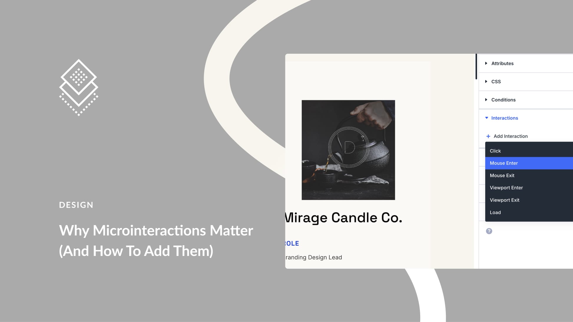
Subtle movements guide attention, provide feedback, and create spatial relationships that help users navigate complex information. When a button subtly lifts on hover or content smoothly transitions between states, these micro-interactions create an interface that feels responsive and alive.
Divi’s animation toolkit makes implementing these motion principles both powerful and accessible. You can choose from various animation types — Fade, Slide, Bounce, Zoom, Flip, Fold, and Roll — each with precise timing, direction, and intensity controls. These animations can be applied to any page element, from individual modules to entire sections.
Strategic animation helps users build mental models of how interfaces work. Elements that slide in from the right suggest forward progress, while upward movements often signal successful actions.
Divi’s scroll effects system enhances these patterns by letting content respond dynamically to user behavior — whether that’s through subtle fades, smooth parallax effects, or attention-grabbing transformations.
Combined thoughtfully, these motion capabilities create natural and engaging interfaces without overwhelming visitors.
WebGL & 3D Elements
3D elements and WebGL are transforming how content is presented on the web. Adding depth to your interfaces — through subtle product rotations or full 3D environments — creates experiences that stick with visitors long after leaving your site.
You’ll find several 3D-ready solutions in the Divi Marketplace, from product viewers to carousels. Want to add your own custom 3D experiences? Drop in popular WebGL libraries like Three.js. Or, you can use custom code.
Combining Divi’s solid foundation with modern 3D capabilities allows you to push creative boundaries without fighting technical limitations. Your visitors get smooth, immersive interactions while you control how and where to use these eye-catching effects.
Advanced Color Systems
Color systems go way beyond picking pretty shades — they’re about building visual hierarchies that guide your users and strengthen your brand. Modern web design demands sophisticated color management that adapts across different contexts while maintaining accessibility.
You’ll find Divi’s color system ready for complex color challenges. The Global Colors feature lets you define and update color schemes across your entire site from one place. Need to tweak that brand blue? One change updates every instance. Plus, the visual builder shows you exactly how colors interact in real time, from buttons to backgrounds.
Setting up dark mode or alternate color schemes? Divi’s Theme Builder lets you create different color variations for specific sections of your site. The color picker includes opacity to speed up your workflow. When working with gradients, you can fine-tune multiple color stops and angles to create depth that catches the eye without overwhelming your content. Your colors stay consistent and accessible across devices, giving visitors a polished and intentional experience at every touchpoint.
Data Visualization
Data visualization transforms complex numbers into stories visitors can understand at a glance. From simple charts to interactive infographics, well-designed data displays make information digestible and memorable.
While Divi focuses on core design features, you have multiple paths to adding compelling data visualizations to your sites. The image module handles static visualizations beautifully, maintaining crisp quality across screen sizes. Need something more dynamic? The Divi marketplace offers specialized modules for tables, graphs, and charts that bring your data to life, like Graphina.
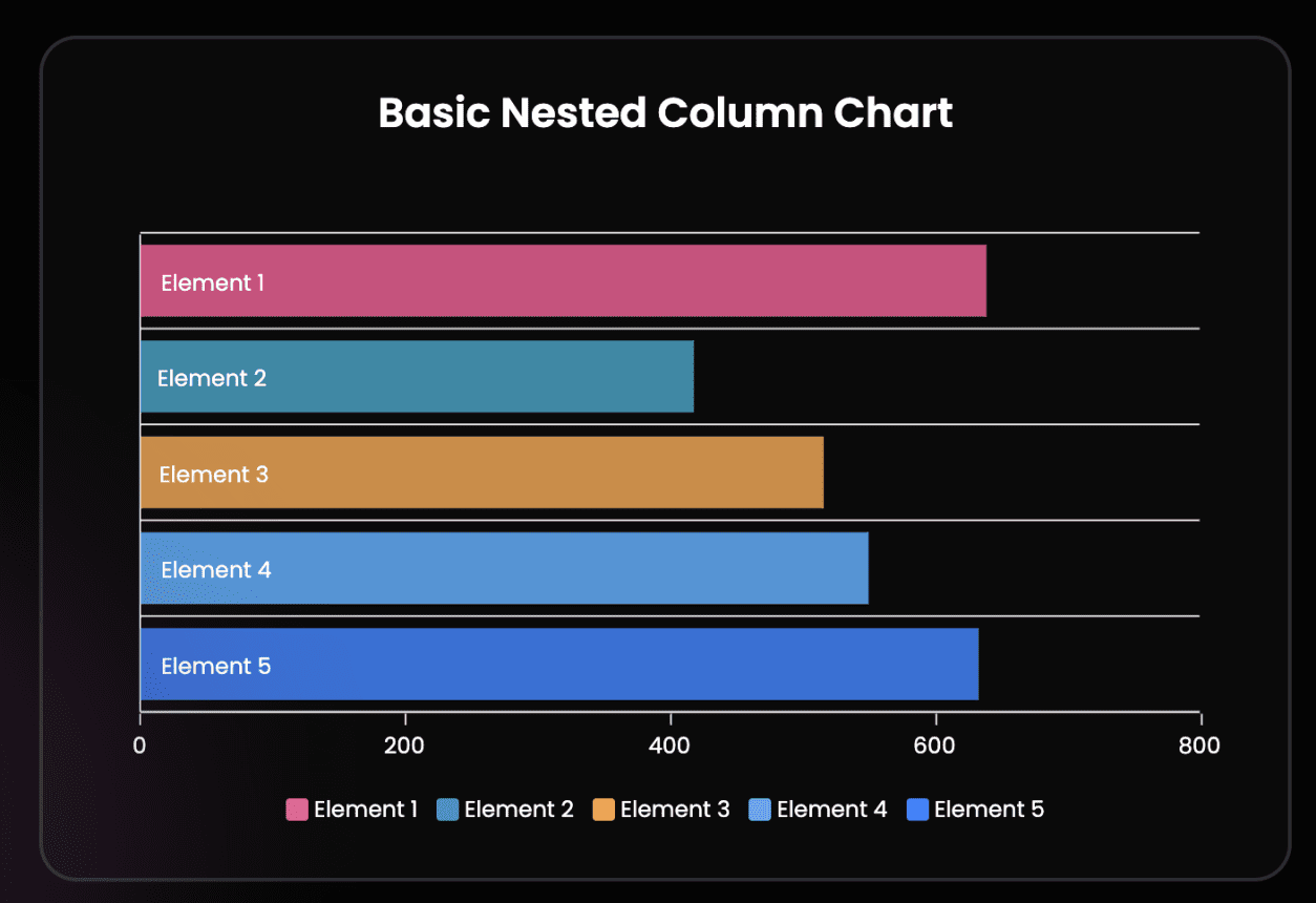
Whether showcasing quarterly results or breaking down survey data, these tools help you present information that makes sense for your audience. The key is choosing visualizations that enhance understanding without overwhelming your visitors.
Card-Based Interfaces
Card-based interfaces organize content into digestible, scannable blocks that help visitors process information quickly. These modular elements create a visual hierarchy while maintaining clean layouts across different screen sizes.
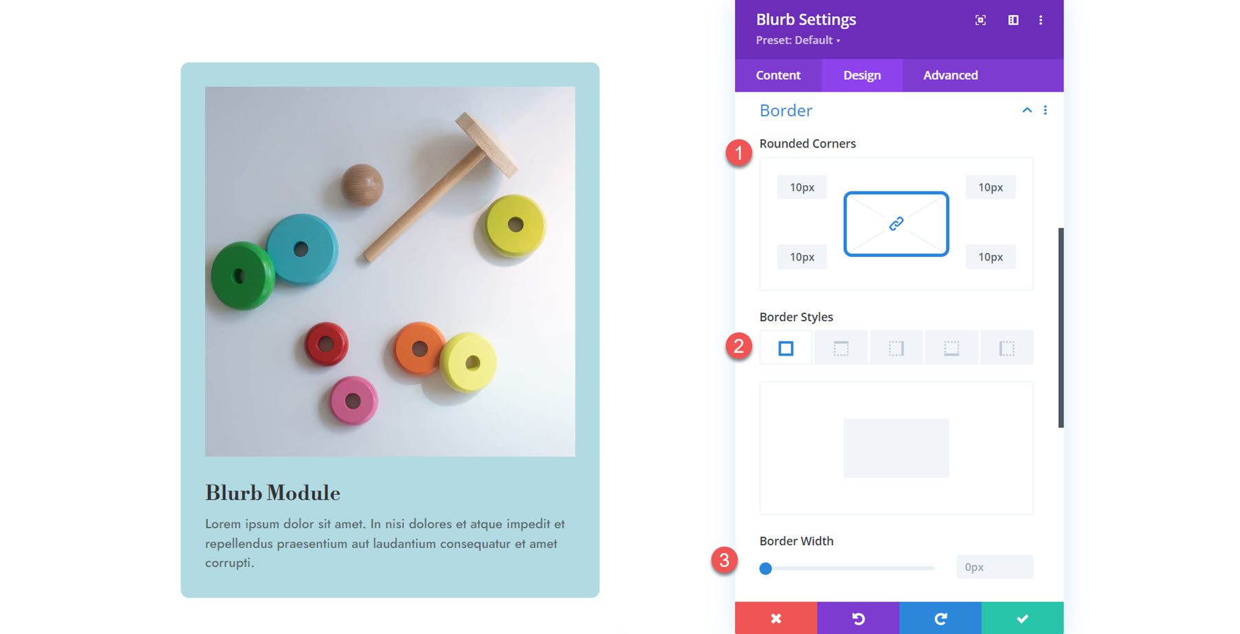
Divi’s Blurb modules excel at creating card layouts that grab attention. You’ll find preset styles ready to customize, from subtle shadows to hover effects that make cards feel responsive. The visual builder lets you adjust spacing, borders, and typography to match your brand’s personality while aligning everything perfectly.
Your cards can showcase team members, pricing plans, features, or blog posts — anything that benefits from a straightforward, contained presentation.
With Divi’s responsive controls, your card layouts automatically adjust to look great on phones and tablets. This flexibility helps you build modern and intentional interfaces, giving your content room to breathe while guiding visitors through your site.
Minimalist navigation strips away unnecessary complexity to focus on what matters most — helping your users find their way. Gone are the days of overwhelming mega-menus and endless dropdown options. Modern websites need navigation that adapts to user behavior while maintaining brand sophistication.
Divi’s navigation system lets you build these streamlined experiences through its Header and Menu modules. Want a clean header that collapses on the scroll? Or secondary menus that appear only when needed? The visual builder makes these patterns accessible without diving into complex code.
Plus, the Theme Builder lets you create different navigation styles for specific sections of your website — perfect for maintaining simplicity while providing context where it counts.
The platform’s sticky navigation takes your minimal design further. Your headers can transform as visitors scroll, condensing into sleeker versions that keep essential links available.
Whether you’re building a startup’s landing page or refreshing a corporate website, Divi provides the tools to craft navigation that guides users without getting in their way. The result? Websites that feel sophisticated and intentional, where finding information becomes second nature.
The Easiest UI Web Design Tool
WordPress paired with Divi creates an unbeatable foundation for modern website design. The versatility to adapt to changing design trends comes built into both platforms. WordPress powers over 40% of websites globally, and the reasons are clear. Its massive ecosystem of themes and plugins offers unprecedented design flexibility.
Being open-source means WordPress constantly evolves through active developer contributions, keeping pace with emerging web technologies. The platform’s adaptable nature allows core customizations to match specific design requirements.
Though WordPress delivers exceptional functionality, combining it with a robust design framework unlocks its full potential. Divi is our premier solution, elevating WordPress websites beyond their standard capabilities.
Divi’s Visual Builder simplifies complex web interface design, allowing users to create intricate and effective web interfaces without the need for coding skills. It’s a great tool for both accomplished professionals and beginners in web design. Divi’s handy drag-and-drop feature lets you easily transform creative ideas into meticulous website interfaces.
UI Design At Lightning Speed With Divi AI
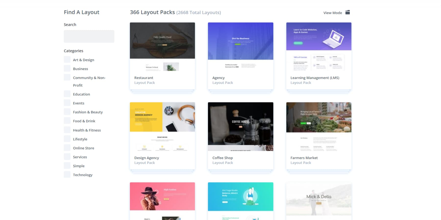
Divi has an extensive library of 2000+ pre-designed layouts spanning multiple industries and design styles. Whether refreshing a creative portfolio, modernizing an eCommerce platform, or updating a business website with contemporary design elements, these ready-to-use resources streamline the implementation process.
Building website user interfaces that look amazing shouldn’t take weeks of work. That’s exactly why Divi’s AI toolkit is such a game-changer. Need a complete website right now? Divi Quick Sites with AI handles that in minutes.
Want to fine-tune your content and images? Divi AI has your back.
Some design trends that typically need custom coding? Just tell Divi AI what you’re after and it creates the code for you. No programming experience is needed — the AI handles the technical heavy lifting.
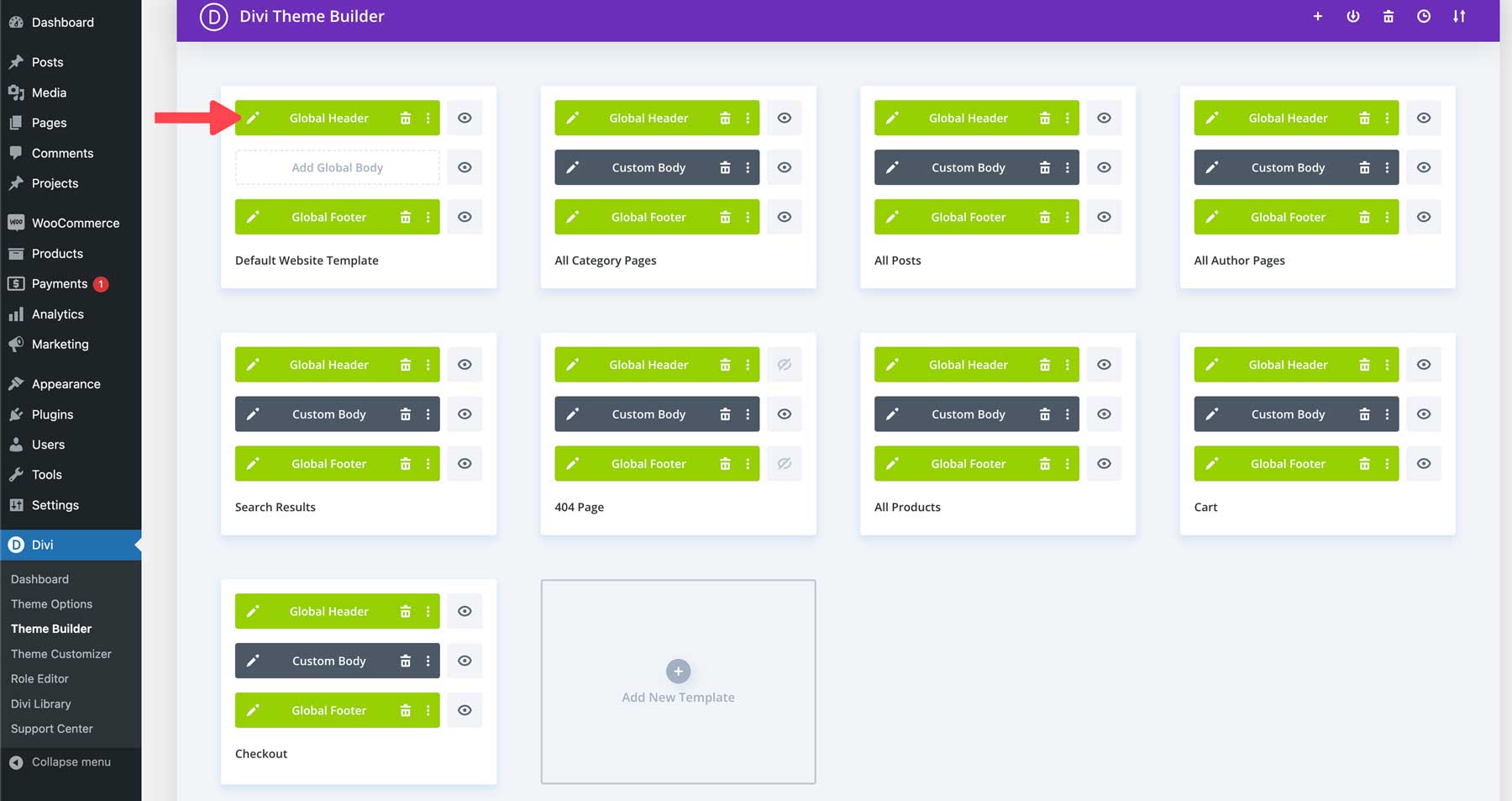
The Theme Builder is one of Divi’s most powerful features. It gives you complete control over your site’s core elements—headers, footers, and other site-wide components that need perfect consistency across every page. Pair that with Divi’s responsive design, and your site looks pixel-perfect across all devices, from desktop monitors to mobile phones.
Divi Quick Sites: More Than Just AI
Divi Quick Sites packs more than just AI power. Our design team has crafted a collection of starter sites loaded with custom photography and unique illustrations. Pick one that matches your style, plug in your business details — and you’ve got a professional website ready to go in minutes.
The best part? Every Divi Quick Site, regardless of whether AI-generated or Starter Site-based, comes with a complete design system that is baked right in. Navigation menus, color schemes, and global presets are all set up and ready to roll.
When you add new elements to your pages, they automatically inherit your site’s style settings. Theme settings keep everything looking sharp across your entire site — while design modules pull from your preset colors and typography.
This solid design foundation means you can spend time on what counts — fine-tuning your content, choosing the right images, and ensuring your brand stands out. No more getting stuck on the small stuff.
Built To Evolve
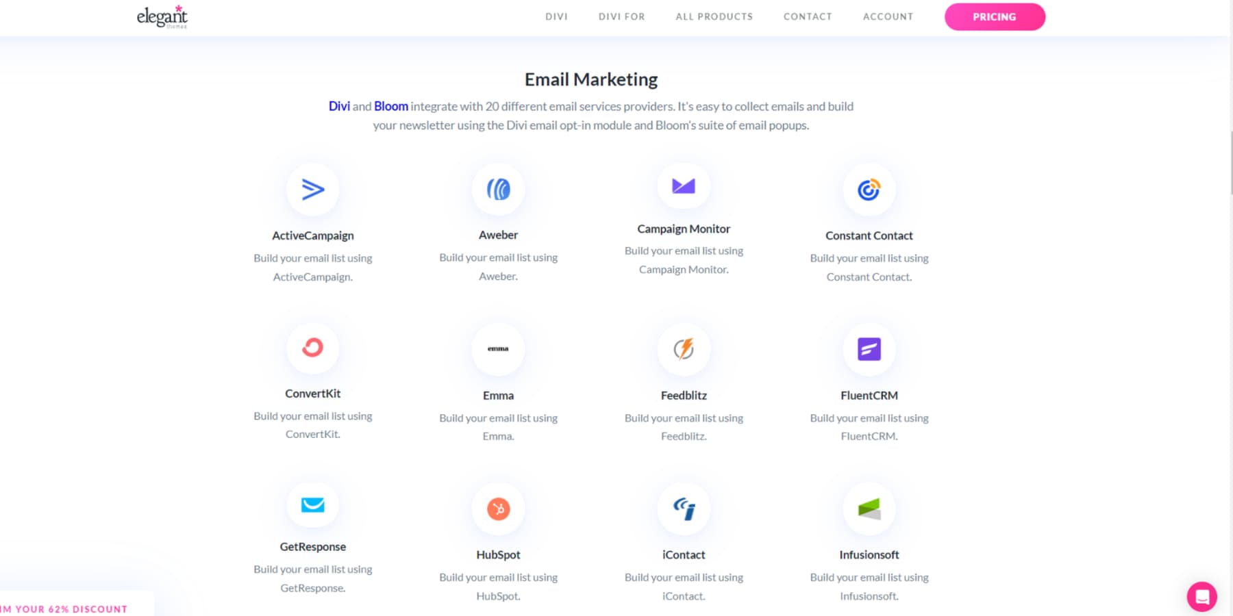
WordPress’s massive plugin library takes Divi’s design power to the next level. The ecosystem offers thousands of ready—to—go plugins, from serious SEO tools to slick membership systems and custom forms. Divi has built-in support for 75+ popular plugins and services, so integration is seamless.
The WordPress-Divi combo stands out thanks to its incredible community support. With our treasure trove of tutorials, detailed documentation, and thriving Facebook group of over 76,000 members, you’re never flying solo.
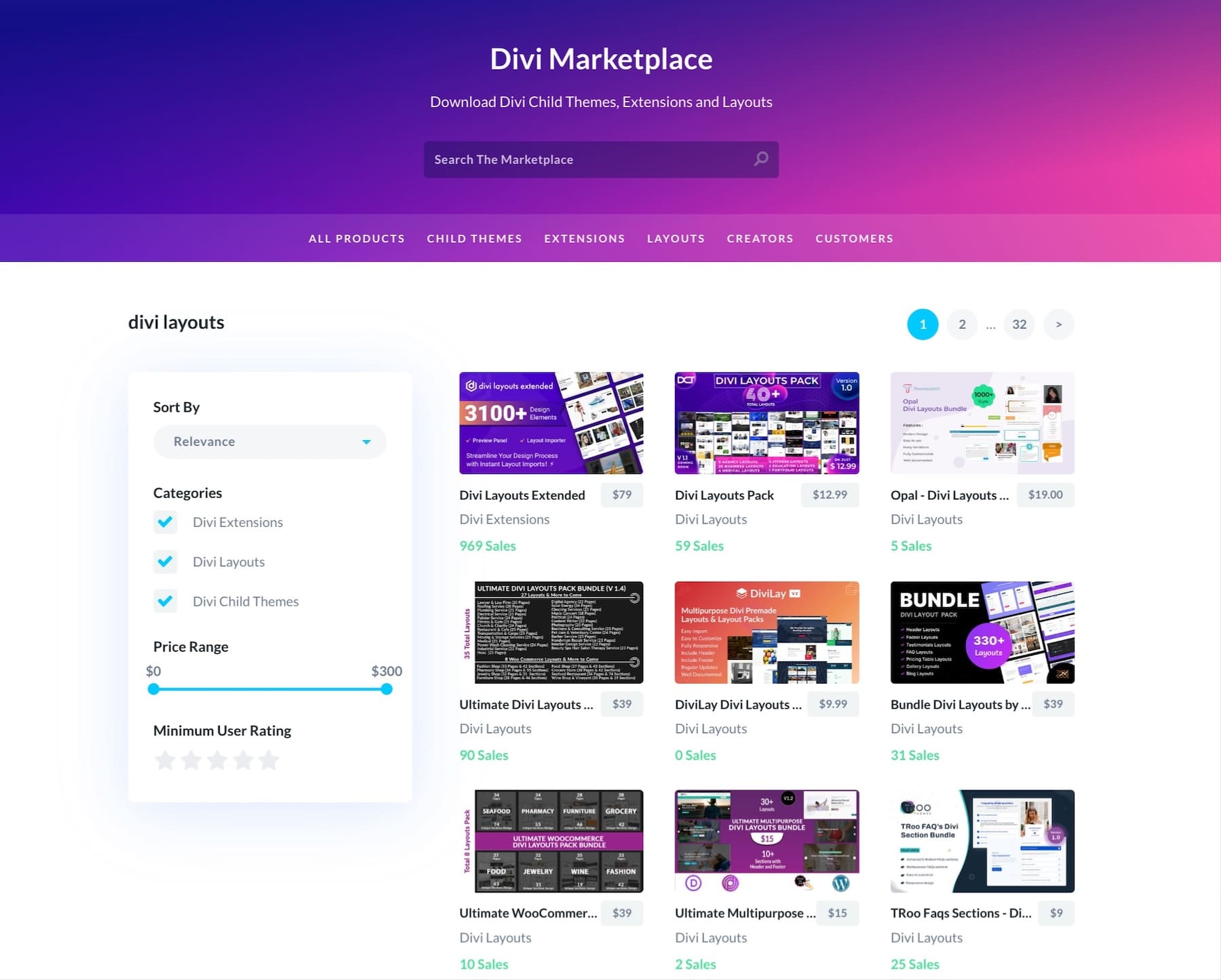
The Divi Marketplace adds another layer of possibilities, packed with child themes, extensions, and design packs crafted by talented developers in our community.
But here’s what sets Divi apart — we constantly push updates that keep pace with modern web design. That means your site stays fresh and current without the headache of rebuilding from the ground up every time design trends shift. Our upcoming revamp, Divi 5.0, will make adapting modern UI design trends even more blissful.
Bulletproof Your UI Design System
Strong design systems turn trendy interfaces into lasting experiences. By weaving your chosen UI elements into a cohesive framework, you protect your website against design fragmentation and ensure consistent quality. Let’s explore how to build a bulletproof system that makes your modern interface stand the test of time.
Scalable Design Implementation
Building a scalable design system means thinking beyond today’s needs. Your interface elements — from buttons to form fields — should work seamlessly whether you manage ten pages or a thousand.
Divi’s Global Presets and Styles create this foundation, letting you define reusable elements that maintain consistency across your site. Need to update your call-to-action buttons? One change in your preset updates every instance site-wide.
The Theme Builder extends this power by letting you create dynamic templates that automatically style new content. Combined with custom CSS variables and responsive breakpoints, these tools ensure your design system grows alongside your website without breaking a sweat.
Speed That Shows
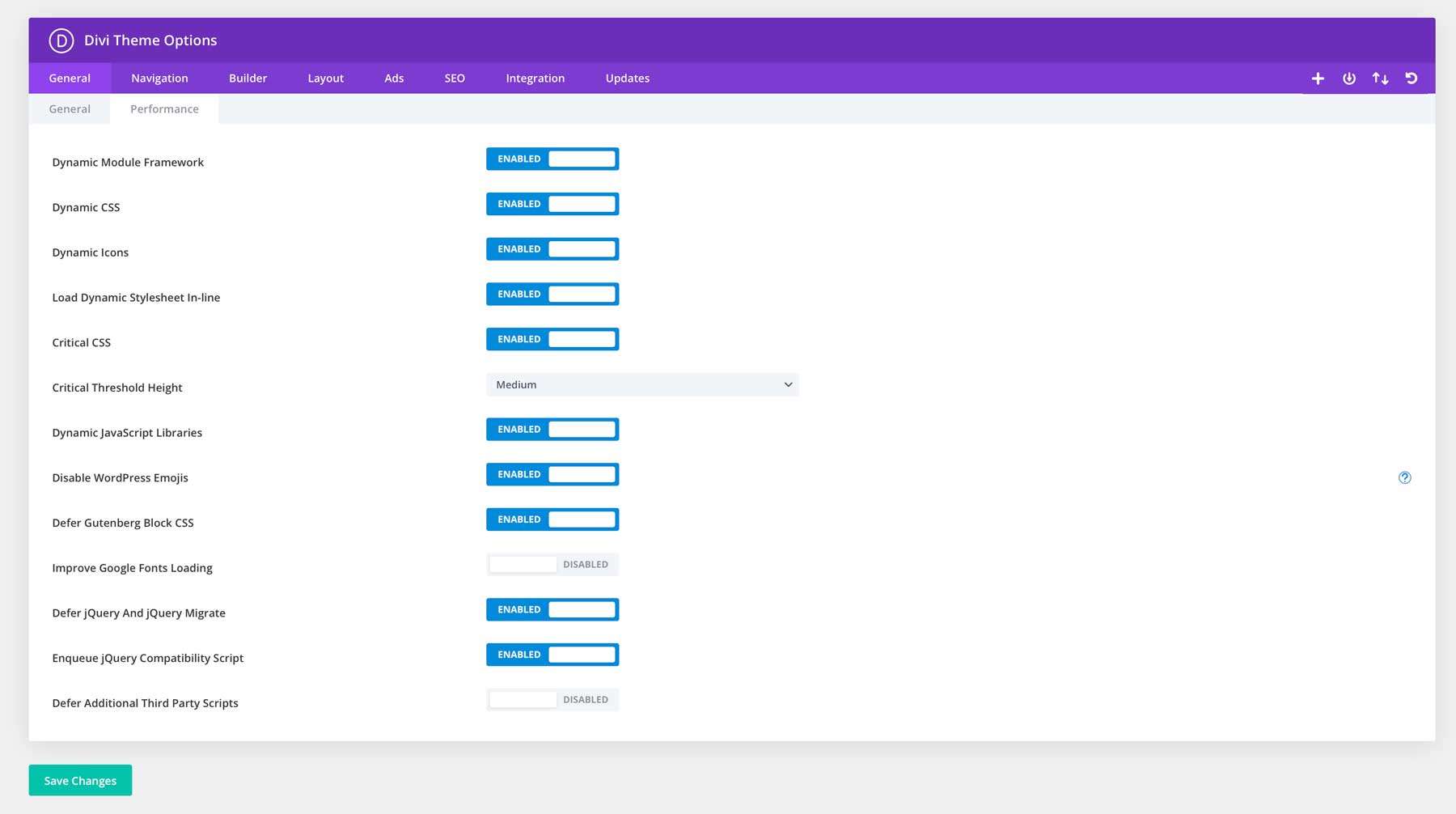
Your beautifully crafted interface means nothing if visitors bounce before it loads. Divi’s core optimization features tackle this challenge head-on, with its Dynamic Module Framework processing only the functions you’re actually using. The builder’s integrated Critical CSS and dynamic JavaScript handling means your modern interface elements load efficiently while keeping code bloat to a minimum.
Partner with WP Rocket’s advanced caching capabilities and watch your site performance soar. EWWW Image Optimizer handles the heavy lifting of visuals, compressing images without sacrificing quality. Running all this on SiteGround’s performance-optimized servers creates a foundation for speed that visitors notice — and search engines reward.
Your design system stays snappy and responsive, turning those first crucial seconds into engaged browsing sessions.
Track & Optimize
Building stunning interfaces isn’t a one-and-done process — it’s about understanding how visitors interact with your design choices and refining them based on accurate data.
MonsterInsights makes this measurement straightforward, showing how users move through your site and which design elements drive engagement. By connecting directly with Google Analytics, you’ll spot patterns in user behavior that basic analytics might miss.
Want to see exactly how visitors interact with your interface? Hotjar’s heatmaps and session recordings reveal the story behind the numbers, showing where users click, scroll, and potentially get stuck. These insights help you make informed decisions about everything from button placement to content hierarchy.
Combined with Divi’s flexible builder, implementing these optimizations becomes a natural part of your design evolution rather than a complete overhaul.
From Concept To Conversion: Your Next Move
Modern UI design trends aren’t about making your website shiny but creating experiences that work for your visitors. Some design patterns stick around because they solve real problems, while others fade as quickly as they appear. The key is knowing which elements serve your website’s purpose.
Divi strips away the complexity of implementing these design patterns. Whether you’re refreshing an existing site or building from scratch, the visual builder turns modern UI concepts into working features without diving into code. Global styles keep your design consistent, the Theme Builder handles dynamic content, and AI-powered tools speed up the process.
Stop wrestling with complex code or settling for limited design tools. With Divi, you can build stunning websites that perform even better.




Leave A Reply