Remember when having a website was enough? Now, your competitors have online booking, instant quotes, and slick mobile designs. What if building a business website was actually straightforward? This comprehensive small business web design guide cuts through the confusion, showing you exactly what works best for small business websites today.
Let’s get to it!
Understanding Your Website Needs
While small business web design might seem straightforward, creating a website that truly serves your customers takes careful planning. Before we explore platforms and designs, let’s focus on what makes small business websites work in today’s market.
Subscribe To Our Youtube Channel
Essential Pages For Small Businesses
Not every page on your website carries equal weight. While some businesses go overboard with dozens of pages, you really only need a few key pages to make an impact. Here’s what deserves your immediate attention when building your small business website:
Homepage That Hooks
Your homepage must instantly answer three vital questions: what you offer, who it’s for, and why visitors should care. Instead of overtly relying on flashy animations or text walls, treat your homepage like a focused conversation with potential customers. Lead with headlines that address specific needs rather than just stating your business name. Divi provides endless homepage layouts, the one showcased below is part of the Leather Company Layout Pack.
Then, weave your strongest selling points naturally throughout, using strategic proof points like testimonials and certifications to build confidence and guide visitors toward action without overwhelming them.
About Page That Builds Trust
Most About pages fail by defaulting to generic mission statements and corporate headshots instead of building genuine connections. Transform your business by sharing the authentic story behind it — whether it started with personal frustration or a market gap you discovered.
Rather than hiding behind corporate jargon, demonstrate your real impact through specific achievements and customer successes. By showing genuine team moments and how you’ve helped others overcome similar challenges, visitors will see trusted advisors rather than just another service provider.
Services Or Products Pages
A compelling services page acts like a skilled salesperson, guiding prospects to solutions rather than just listing offerings. Focus on outcomes rather than technical jargon, breaking complex services into digestible sections that highlight specific benefits, and transform your service list into a conversion tool.
Match common customer challenges with relevant solutions, using case studies to help prospects visualize impact. Address potential objections within service descriptions, building confidence while demonstrating why your approach delivers superior results.
Contact Information That’s Easy to Find
Your contact page should eliminate friction between interest and action, not just list contact details. Offer multiple contact methods with clear context about when to use each, including response times and business hours.
Boost confidence by adding social proof near contact forms, integrating maps for physical locations, and showing office or team photos. Keep forms simple while explaining what happens after submission — these elements transform a basic contact page into a conversion tool.
Privacy Policy & Terms
Legal pages shouldn’t be mere compliance checkboxes — they build trust while protecting both businesses and customers. Create clear, accessible documents using plain language summaries alongside necessary legal terminology.
Break down complex requirements into straightforward sections about data handling, cookies, and visitor rights. Keep these pages current with your business practices and legal requirements, including last updated dates and contact information for privacy questions. While not exciting, these pages are fundamental to maintaining a professional, trustworthy online presence.
Features Your Customers Expect
Today’s website visitors have high expectations shaped by their daily interactions with major brands online. However, meeting these expectations doesn’t mean matching Amazon’s feature set. Let’s explore the fundamental elements of effective small business web design:
Fast Loading Times
Imagine waiting for a restaurant’s menu — after about 20-30 minutes, you’d likely order elsewhere. The same happens with websites, where 47% of visitors expect pages to load in under two seconds. Successful small business web design relies on converting visitors into customers.
While big brands retain customers through loyalty, small businesses must excel at speed to compete. This means optimized images, clean code, and quality hosting — not budget plans that save pennies but cost customers. With Google now ranking sites on speed, fast loading isn’t optional — it’s essential for keeping visitors from bouncing to competitors.
Mobile-First Navigation
With mobile users representing over 60% of web traffic, smooth phone navigation isn’t optional — it’s crucial for business success. Your mobile design should understand how people actually use phones to interact with your business, whether checking hours during lunch or finding directions on the go.
Every interaction should feel natural, with easily tappable buttons, clear information hierarchy, and touch targets sized for real fingers. The goal isn’t to shrink your desktop site but to create an experience that keeps mobile visitors focused on their tasks rather than struggling with navigation.
Clear Calls-To-Action
Your business website needs clear conversion paths, unlike subtle artistic designs. Effective calls-to-action guide visitors naturally by appearing exactly where they’re most likely to act. Instead of showing every possible option, prioritize actions based on customer journey stages – like “Book Now” on your homepage and “Get a Quote” on service pages.

An example of an engaging CTA section from onima.bio
Through strategic placement and design testing, these CTAs become natural next steps rather than pushy sales tactics. They transform browsers into buyers without feeling aggressive when paired with clear value propositions.
Easy Contact Methods
Modern websites need multiple contact options that match how people actually prefer to communicate — from chat for quick questions to detailed forms for specific services. The most effective contact sections provide context for each method, including response times and ideal uses. Build trust by displaying statistics and clear business hours while ensuring contact options work seamlessly across all devices.
When phone numbers are tappable on mobile and forms remain user-friendly regardless of screen size, you remove barriers that might prevent customers from reaching out at crucial moments.
Location & Hours
Physical businesses need more than a pinned location — they need a context that helps visitors plan their trips with confidence. Present operating hours clearly, including holiday schedules, while providing interactive maps alongside written directions.
Adding storefront photos and details about parking or landmarks addresses common concerns before they arise. Regular updates to this information, especially during seasonal changes or special events, show respect for customers’ time and attention to detail. This comprehensive approach to location information demonstrates professional courtesy that builds trust with potential visitors.
Social Proof
Strategically showcase testimonials, reviews, and success stories to build trust with potential clients through existing customer relationships. Rather than displaying every positive comment, highlight diverse experiences that meet customer needs.
Organize social proof by service type or challenge, making it easy for prospects to find relevant examples. Include specific results and solutions to help visitors envision similar outcomes. Keep testimonials fresh and current, as recent feedback carries more weight than older reviews. Balance professional credentials with real customer experiences to create a compelling story about your business’s impact.
Design Elements That Convert
In small business web design, knowing what to avoid is just as crucial because good design isn’t just about looking pretty — it’s about making the visitors trust your business. Rather than chasing trends, we’ll look at design elements that have proven to drive real business results for small companies.
Strategic Color Choices
Color psychology subtly guides visitor behavior, with thoughtful color theory creating emotional connections and directing attention. While major brands invest millions in color research, small businesses can apply proven principles to enhance conversions.
Primary action colors should naturally stand out without being aggressive, while color schemes should resonate with your target demographic — vibrant for younger audiences and subdued for professional services. Testing color combinations, especially in conversion areas, often reveals how minor adjustments can significantly boost engagement and action rates.
White Space & Readability
Strategic white space guides visitors naturally through your content, making complex information digestible instead of overwhelming. Font choices, sizing, and careful spacing create natural reading rhythms that enhance comprehension and reduce cognitive load.
Key elements like line length, paragraph spacing, and contrast ratios significantly impact engagement time. By balancing information density with visual clarity and using white space to highlight important messages and Call to Action (CTAs), you create an environment where visitors stay engaged through crucial conversion points.
Compelling Headlines
Strong headlines spark curiosity and address customer pain points, transforming casual browsers into engaged readers through strategic wording and positioning. Rather than generic welcomes, effective headlines blend benefits with emotional triggers, helping visitors instantly grasp value.

An example of a great header text from zeroco2.eco
While clever wordplay has its place, testing often reveals that direct approaches work best. Your headlines must maintain their impact across all devices, from mobile to desktop, and through consistent testing and refinement, you’ll develop messaging that captures attention and drives meaningful engagement with your content.
Quality Images & Graphics
Professional visuals tell your brand story better than words, with authentic team and product photos creating stronger customer connections than stock imagery. Strategic image placement guides visitors through their journey, while custom graphics simplify complex information while maintaining brand consistency.
Through proper optimization and compression, these purposeful visuals enhance your message without compromising site performance.
Trust Signals
Small businesses often compete against more prominent, established brands for customer trust. Strategic placement of credibility indicators — from security badges to industry certifications — can build confidence at crucial decision points. Rather than overwhelming visitors with every award or certification, focus on trust signals that matter most to your specific audience.
Consider how different types of proof resonate at various stages of the customer journey. Payment security badges near checkout buttons, professional affiliations on service pages, and client logos on your homepage all serve distinct trust-building purposes.
By carefully integrating these elements, you can create a subtle but powerful credibility framework. Fresh testimonials and recent awards carry more weight than older accolades, making regular updates to your trust signals valuable for maintaining relevance.
Common Mistakes To Avoid
Sometimes, knowing what not to do is just as valuable as knowing what to do. Avoiding these common mistakes will save you time, money, and potential headaches down the road.
Outdated Information
Outdated website information quickly erodes visitor trust. Regular content audits and systematic updates help maintain your site’s relevance and reliability. While automated tools can flag old content, human review remains crucial for ensuring accuracy across all pages.
Beyond basic updates to dates and hours, review service descriptions, team profiles, and case studies to accurately reflect your current business. Establish clear update protocols and assign specific content responsibilities to prevent gradual decay. Even an outdated year in the copyright message in the footer makes you look utterly unprofessional.

Though tedious, regular checks of contact details, pricing, and service offerings protect your professional reputation and prevent customer frustration.
Generic Content
A common mistake in small business web design is copying large corporate websites instead of focusing on what actually converts customers. Don’t let your business blend into market noise by copying competitors or relying too heavily on industry templates. While templates offer a starting point, generic content fails to showcase your unique value proposition.
Instead of using standard industry phrases and stock descriptions, highlight how your specific approach, values, and experiences differentiate you. Share genuine insights, real customer stories, and authentic perspectives to forge stronger connections with your target audience. Even routine pages like services or about sections become more compelling when infused with your unique voice and specific examples of how you solve problems differently than competitors.
Hidden Contact Details
Don’t bury contact information in footers or behind multiple clicks — it creates unnecessary barriers between your business and potential customers. While clean design matters, making visitors hunt for basic contact details risks losing them when they’re ready to reach out.
Instead, integrate contact information naturally throughout your site, especially on pages where customers typically make decisions. Offer multiple, clearly displayed contact options that let visitors choose their preferred communication method.
Strategic placement of phone numbers, email addresses, and contact forms can maintain design aesthetics while ensuring accessibility. Remember to optimize for all devices, with tappable phone numbers on mobile and easily spotted contact buttons throughout the user journey.
Inconsistent Branding
Don’t let inconsistent visual styles, voice, or messaging confuse visitors about your business identity. While brands naturally evolve, maintaining consistent elements builds recognition and trust. Every visual component — from logos to color schemes — should flow cohesively across your site. This consistency extends beyond visuals to your messaging, where consistent terminology, value propositions, and brand voice create stronger mental connections with visitors.
Many small businesses struggle when different team members write in varying styles or design elements drift over time. Regular brand audits help catch these inconsistencies, allowing for thoughtful updates that strengthen rather than dilute your brand identity.
Small Business Web Design: Choosing The Right Platform
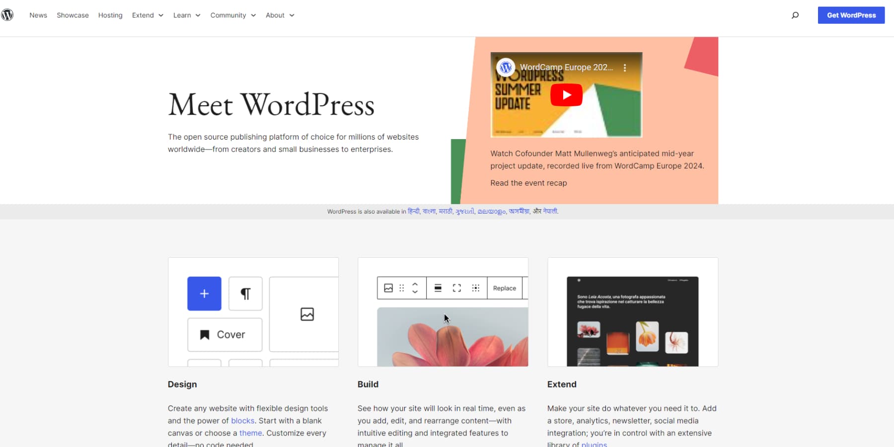
Regarding small business web design, platforms can make the difference between a website that’s a daily headache and one that practically runs itself. While there are plenty of options out there, just one that stands out for small businesses: WordPress.
Why WordPress Stands Out For Small Businesses
WordPress powers over 43% of all websites for a good reason — it strikes a perfect balance between power and practicality for small businesses. While other platforms charge monthly fees for basic features, WordPress just needs hosting and a domain to start. You own everything, from your content to your design.
The platform shines when it comes to growth potential. Your initial investment in learning WordPress pays off as your business evolves. Need to add online booking next quarter? Want to start selling products online? WordPress handles these expansions through its ecosystem of plugins and themes, saving you from costly platform migrations.
Sure, there’s a learning curve — any professional tool has one. However, WordPress’s visual editor or the popular page builders make routine updates straightforward, while its robust backend provides the depth that serious businesses need.
Plus, with millions of developers and users worldwide, you’re never far from solutions to common challenges. It’s not the only way to build a website, but WordPress remains hard to beat for businesses seeking long-term value and control over their digital presence.
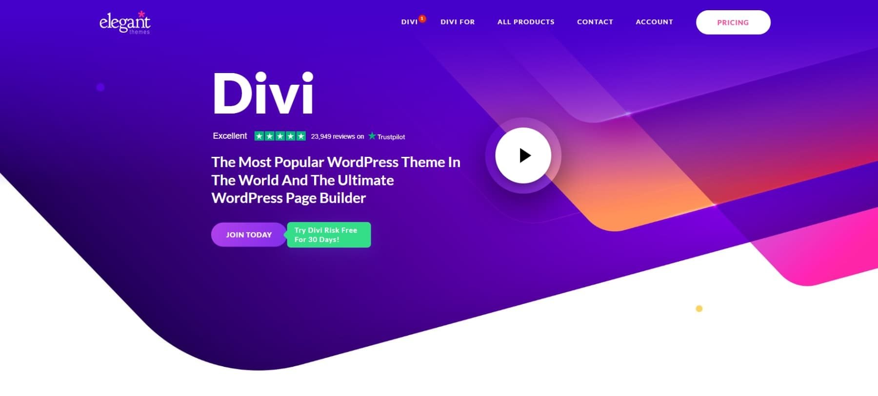
Why Divi Is The Best WordPress Theme
Like every glove needs a hand, every WordPress website needs a theme to harness its power. Many WordPress themes are available today, but none hold a candle to our Divi. Divi’s Visual Builder lets you craft professional pages through intuitive drag-and-drop controls without touching a line of code. If you can use MS Word or PowerPoint, you can use Divi to build websites.
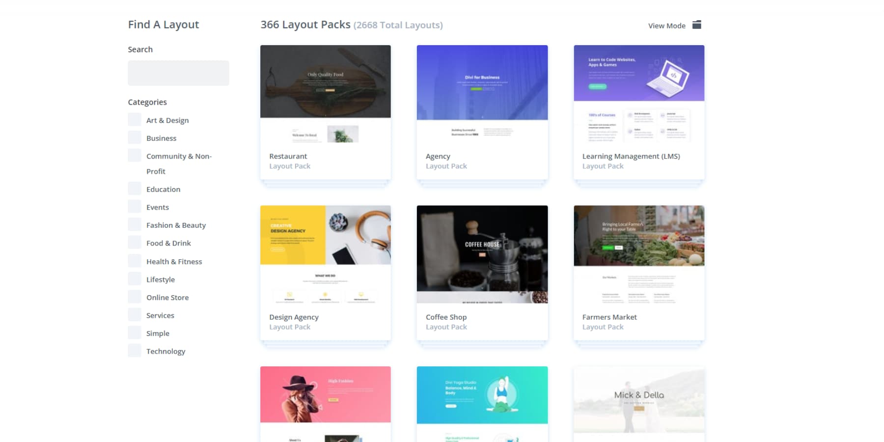
Ever stare at a blank website canvas, wondering where to start? Divi transforms that overwhelming moment into an opportunity for creativity. Divi’s 200+ design modules are your digital building blocks — from simple text boxes to complex portfolio galleries, each element just clicks into place. For those moments when inspiration runs dry, dive into a collection of over 2000 premade layouts and website packs that serve as professional starting points.
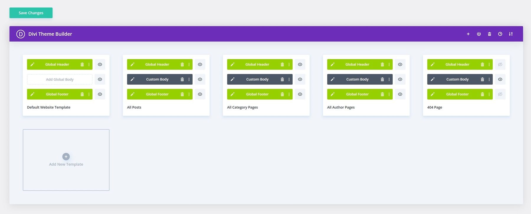
The Theme Builder takes customization even further, giving you pixel-perfect control over every aspect of your site. Headers, footers, blog templates, archive pages — nothing stays locked in a rigid template when working with Divi.
Divi and WordPress are a powerhouse combination. While Divi masters your design, WordPress’s vast plugin ecosystem lets you bolt on any feature you can imagine — from SEO tools that help dominate search rankings to membership systems that drive revenue. And unlike other platforms, Divi seamlessly integrates with these plugins without breaking a sweat.
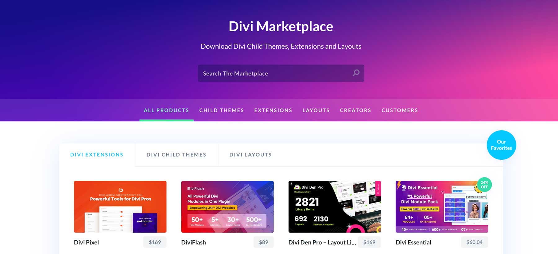
Stuck on something? Join our 76,000-strong Facebook community, explore step-by-step tutorials, or browse our detailed documentation. When you’re ready to level up, our Marketplace offers premium child themes, extensions, and design packs crafted by Divi’s most talented developers specifically for your small business website.
AI Unifies Power, Simplicity, & Uniqueness
Want to skip the design process entirely? Or perhaps you’re looking for something more unique? Divi Quick Sites with Divi AI acts as your web team, designing unique layouts, writing compelling content, and creating custom images based on your business details. Unlike other AI website builders, it understands web design principles and your business and ensures brand consistency, delivering purposeful results rather than random.
If AI isn’t your style, Divi Quick Sites’ starter sites offer human-crafted excellence. Our design team has created complete website packages featuring exclusive imagery and thoughtful layouts. Pick your foundation, add your business details, and watch as Quick Sites assembles everything — from menus to theme settings — in under a minute, specifically for your business.
You’re never stuck with the first draft. Divi’s visual tools allow you to customize every element, refining and perfecting until your site truly reflects your vision.
Beyond essential design tools, Divi AI serves as your digital creative partner. Through simple text commands, every creative task becomes effortless, from writing compelling copy that matches your brand voice to generating authentic-looking images.
You can even edit or enhance your images with Divi AI.
Maybe you need to add a new section to your site. Divi AI is still here to help.
No more juggling between different tools or waiting for freelancers – just describe what you need. Divi AI handles everything from content creation to section building, maintaining your site’s consistency while saving work hours.
Divi Pro Means Business
Running a small business means every dollar counts. Divi’s Pro tools deliver enterprise-level features without the enterprise price tag. Here’s what you get:
Divi Teams ($1.50/person monthly) creates a unified workspace where your staff can access Divi’s complete toolkit, including support, documentation, and AI. You will still have complete control over what a team member can do. Say goodbye to messy handoffs and scattered communications when updating your site.
Divi Cloud ($6 monthly) works like your website’s asset vault. It stores layouts, designs, and brand elements in one spot, ready to deploy instantly across all your projects. No more digging through old files or rebuilding sections from scratch — everything you need is just a click away.
Divi VIP ($6 monthly) ensures your website design journey never misses a beat with guaranteed 30-minute response times for all your team members, 24/7 availability, and an additional 10% off Marketplace purchases. Because website issues shouldn’t cost you sales.
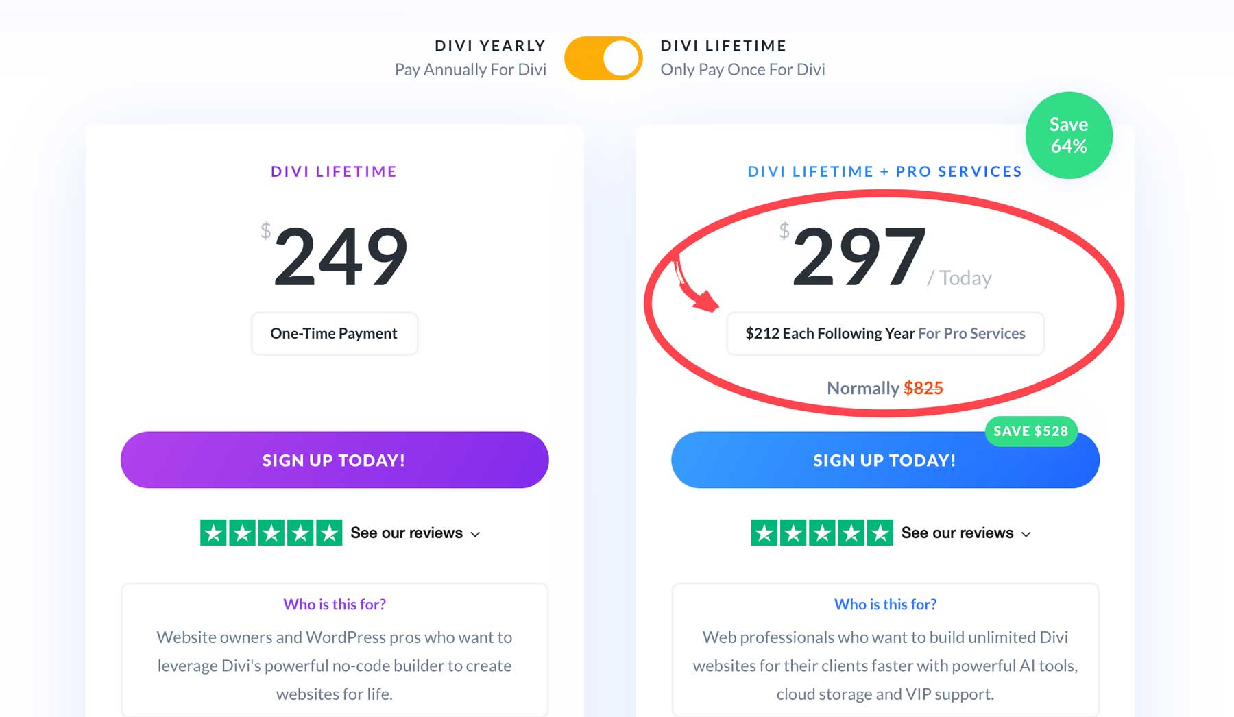
If just getting Divi wasn’t a smart enough move, Grab a Divi Pro membership at $277/year and save $388 compared to buying features separately. You’ll get Divi AI, Divi Cloud, Divi VIP, and Divi Team (access for up to four members) and also save around $390. Want even better value? The Lifetime + Pro bundle gives you permanent Divi access plus yearly Pro services at $297 the first year, then $212 annually — savings of a whopping $528.
Divi Pro doesn’t just streamline your workflow — it could be the backbone that keeps your business website running smoothly while your competition struggles with the basics.
Supercharge Your Website With Divi Pro
Other Essential Tools For Your Small Business Website
Running a successful website involves more than just choosing the right platform. Behind every smooth-running small business site lies a carefully selected toolkit that handles everything from security to marketing. While WordPress and Divi create your foundation, these essential tools fill crucial gaps, automate tedious tasks, and help turn your website into a genuine business asset.
SiteGround: For Hosting Your Small Business Website
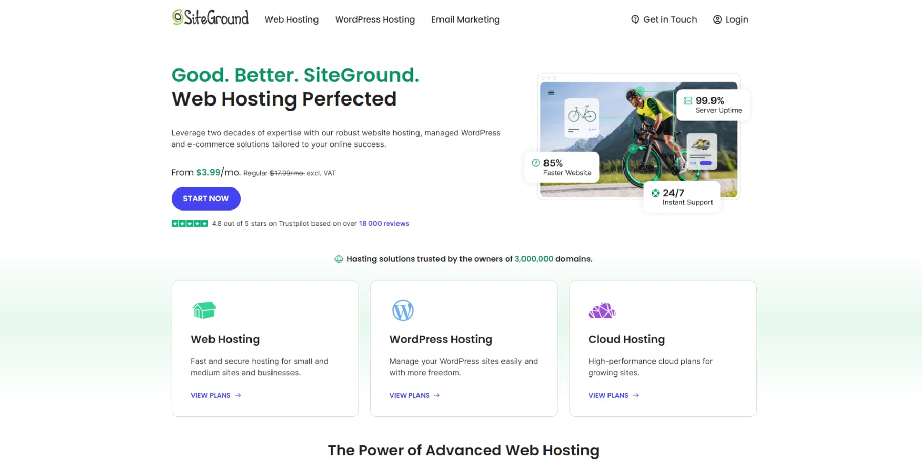
Unlike typical hosting companies renting you server space, SiteGround powers WordPress websites that mean business. Your installation comes pre-configured, so you can focus on building your vision instead of wrestling with technical settings.
SiteGround obsesses over the details that keep your business running smoothly: lightning-fast loading speeds, rock-solid uptime, and automatic daily backups. When you need support, you’ll talk to experts who understand WordPress, not confused chat agents reading from scripts.
Smart business owners know reliable hosting isn’t a place to cut corners. SiteGround’s first-year pricing delivers premium performance without breaking the bank, including everything your business needs: bulletproof security, advanced caching, and tools that feel like they were designed for humans to use.
Launch Your WordPress Website With SiteGround
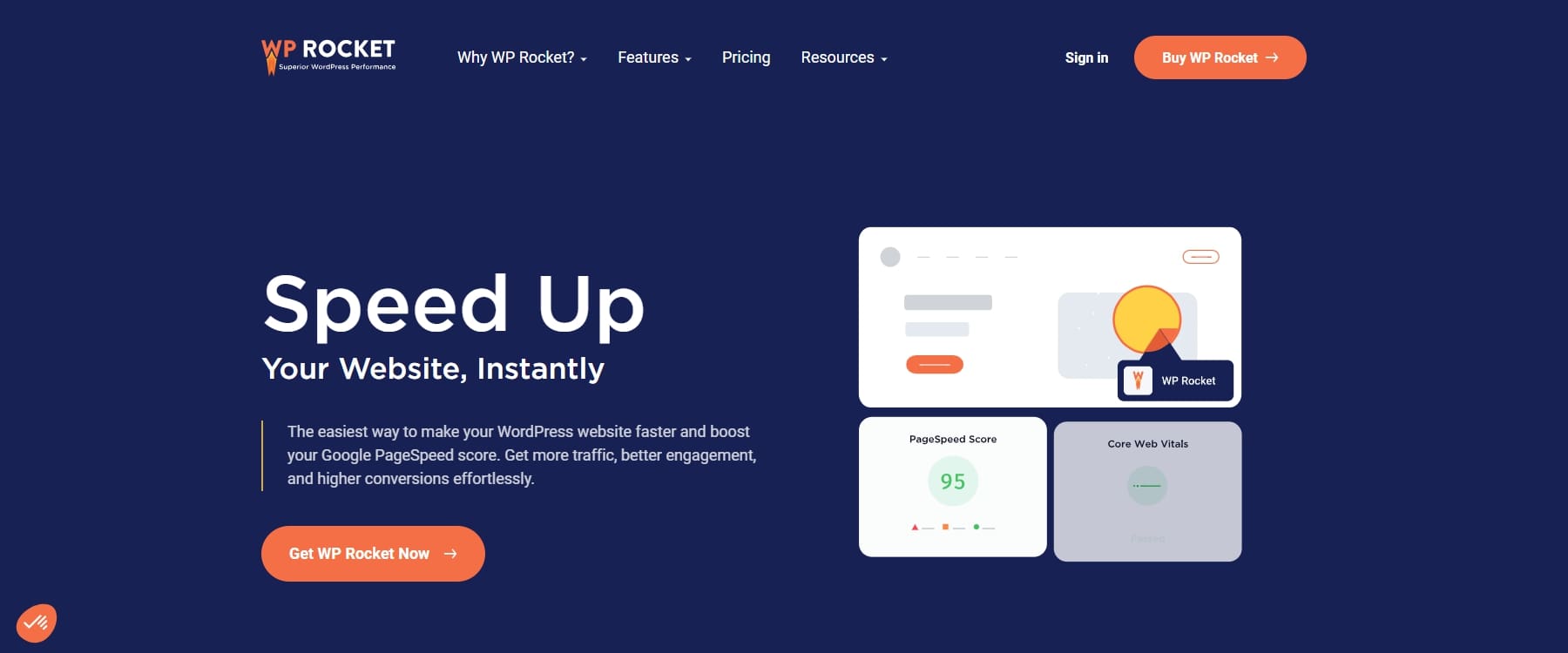
WP Rocket: For Caching And Optimization
When it comes to WordPress caching, WP Rocket stands out from the pack. This premium plugin delivers serious speed improvements through smart CSS and JavaScript optimization, intelligent cache preloading, and seamless CDN integration — all without requiring a PhD in web development. While it’s a paid-only solution, WP Rocket’s user-friendly approach and proven performance make it a worthwhile investment for businesses serious about their site speed.
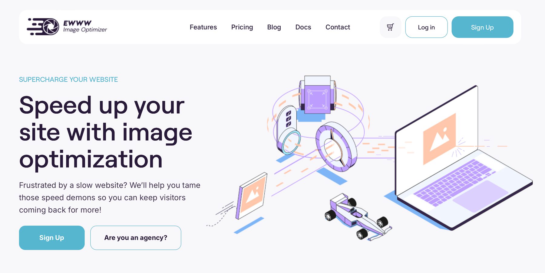
EWWW: For Image Optimization
Keep your site running fast, even with heavy images. EWWW Image Optimizer automatically compresses your uploads and can tackle your entire media library in bulk. It intelligently reduces file sizes without sacrificing quality, converts images to speedy WebP format, and handles the technical details so you don’t have to.
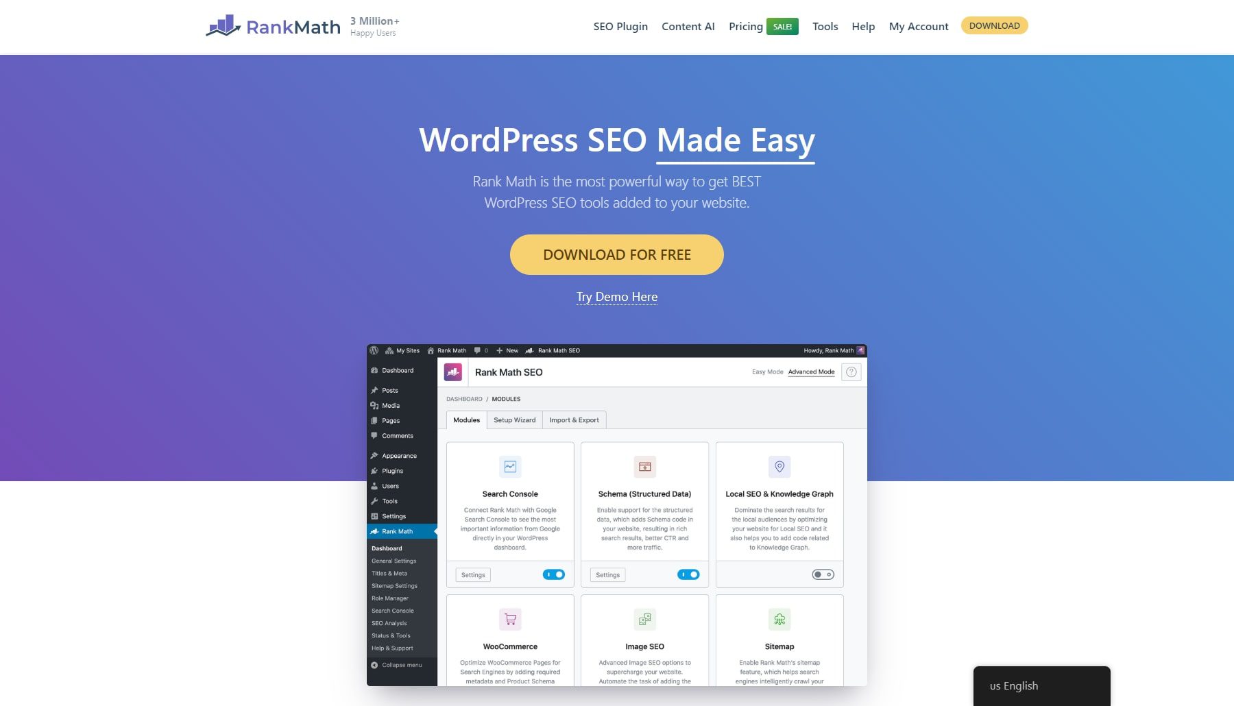
Rank Math: For SEO
While other SEO plugins slow you down, Rank Math works right where you do — giving you real-time optimization tips as you write and integrating directly into Divi’s visual builder. Monitor your ranking keywords, track Google performance, and catch site issues from a single, blazing-fast dashboard.
Think of it as your personal SEO command center. From AI-powered content suggestions to advanced optimization tools, Rank Math brings enterprise-level SEO power to every WordPress site.
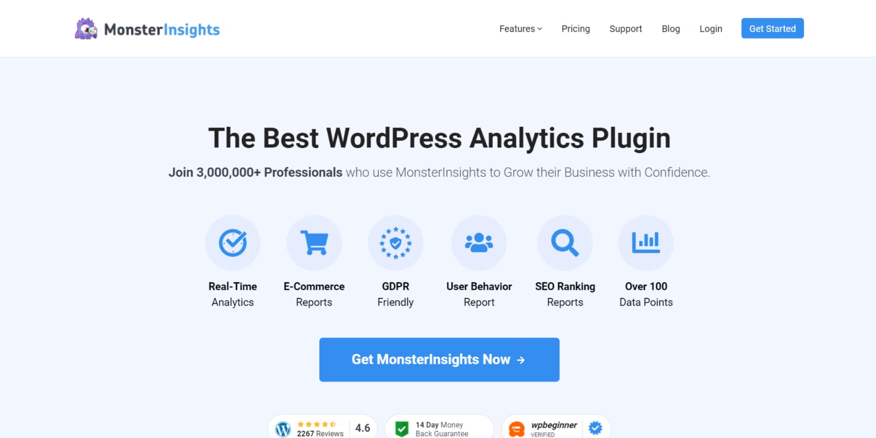
MonsterInsights: For Analytics And Result-Tracking
Stop guessing what your visitors want. MonsterInsights brings Google Analytics right into WordPress, showing you exactly where your traffic comes from, which pages perform best, and how visitors interact with your site — all in a clean, easy-to-read dashboard.
Trusted by 3+ million websites, it tracks everything that matters: conversions, eCommerce performance, affiliate links, and more. Plus, it’s fully GDPR-compliant, so you can make data-driven decisions without privacy concerns.
UpdraftPlus: For Backups
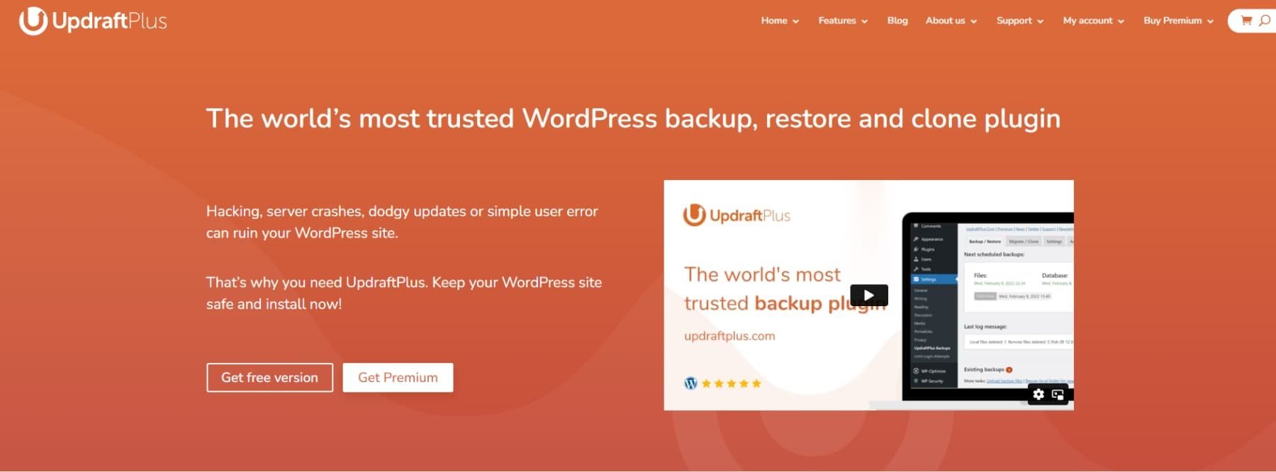
Trusted by over 3 million websites, UpdraftPlus makes WordPress backups painless. Schedule automatic backups, store them wherever you want (cloud or local), and restore your site with a few clicks when needed. While the free version covers the basics, the premium version adds powerful features like incremental backups and more storage options.
Want to see why it’s the most trusted backup solution for WordPress? Check out our deep dive.
Solid Security: For Keeping Your Site Safe
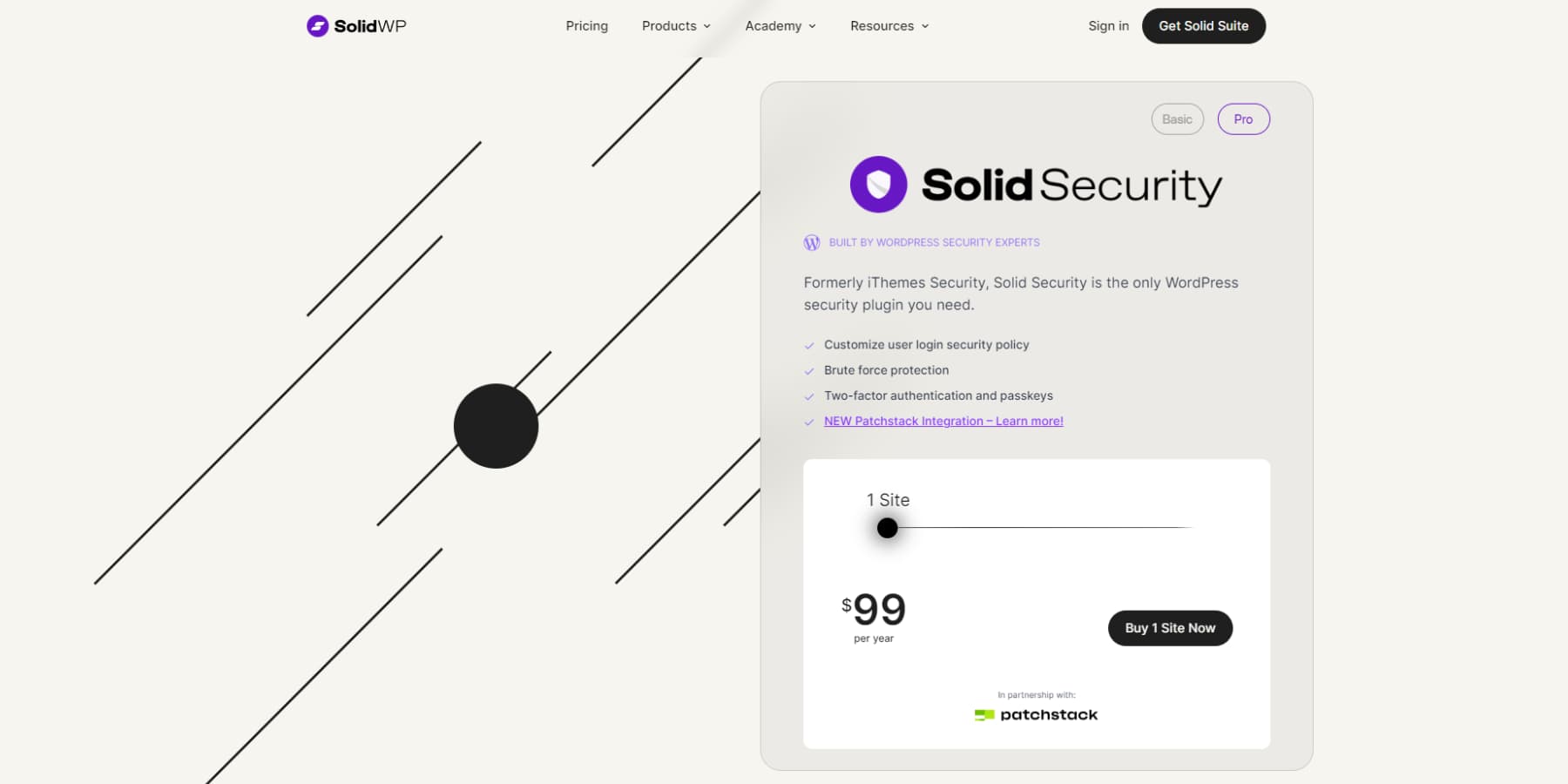
Get enterprise-grade protection without the complexity with Solid Security. Formerly iThemes Security, this plugin guards your site with 30+ security features, including password protection, user activity monitoring, and brute force defense. Plus, it includes premium Patchstack malware protection (a $89/month value) at no extra cost.
Perfect for beginners and pros alike — flip the switches you need, and your site is secured. No security expertise required, no complicated setup, just peace of mind knowing your WordPress site is protected from every angle.
Small Business Web Design: Step-By-Step Process
Even the most impressive websites start with simple building blocks. By tackling your website project in phases, you’ll avoid feeling overwhelmed and steadily progress toward your goals. Let’s walk through each step of turning your website vision into reality.
Planning Phase
The most successful small business web design projects start with clear goals and audience understanding. Think of this as your website’s foundation – get it right, and everything else becomes easier. Start by answering the crucial questions: What’s your site’s main goal? Who exactly are you trying to reach?
A business site needs elements different from a portfolio, and an eCommerce store has its own unique requirements. Map out your visitors’ journey — from their first click to their final action, whether that’s making a purchase or sending an inquiry.
Don’t just list pages; plan their purpose. Your homepage might need to capture attention, but your About page needs to build trust, and your services page needs to convert. Document your must-have features, whether it’s an online store, portfolio showcase, or lead generation forms.
Divi’s extensive module library covers virtually every functionality you might need, from contact forms to dynamic galleries. This planning phase is also perfect for gathering brand assets like logos, colors, and fonts – all of which can be easily implemented in Divi’s Theme Builder and Global Presets for consistent branding across your site.
Design Phase
Here’s where your website starts coming to life, but don’t jump straight into picking colors and fonts. Start with wireframes – think of them as your website’s blueprint. They help you focus on what matters: user flow and content hierarchy. Where should your call to action go? How will users find your most important information?
With Divi Quick Sites, you can describe your business, select the ‘use placeholder images’ option, and watch as AI generates an outline for your website that aligns with your vision, giving you a head start on information architecture.
Divi further makes it easy to bring these wireframes to life with the drag-and-drop visual builder and its AI tools. Establish a consistent design system with your brand colors, typography, and spacing with Global Prestes and Theme Builder.
Pay special attention to responsive design – your site needs to look great on all devices. Whether you’re building from scratch or customizing templates, keep your original goals and user journey in mind.
Development Phase
This is where your design transforms into a functioning website. Start by setting up your core functionality—from contact forms to eCommerce features. With Divi’s 200+ modules, you can build complex features without touching code, but don’t add functionality just because you can. Each feature should serve your site’s goals and enhance user experience.
Focus on performance from the start. Optimize your images, implement caching, and ensure your site loads quickly. Test every interactive element thoroughly — broken forms or glitchy animations can destroy user confidence.
If you’re building an eCommerce site, run multiple test transactions. For membership sites, verify that your content restrictions work as intended. This is also the time to implement SEO best practices, ensuring your site is discoverable when it goes live.
Launch Preparation
The final stretch requires careful attention to detail. Create a comprehensive pre-launch checklist that covers both technical and content aspects. Test your site across different browsers and devices – Divi’s responsive controls help, but you must verify everything works in real-world conditions.
Check all your forms, track your test submissions, and ensure confirmation emails work correctly. Set up your analytics tools to track performance from day one. Configure essential security measures, including SSL certificates and backup systems. Review your content for typos, broken links, and formatting issues.
Consider a soft launch with a small audience to catch any problems you might have missed. Finally, prepare your post-launch marketing strategy – even the best-designed website needs promotion to reach its intended audience.
Maintaining Your Website
Small business web design doesn’t end at launch — ongoing maintenance ensures it stays current and usable. But don’t worry—maintenance doesn’t have to eat up your time. With the right tools and approach, you can keep your site running smoothly with minimal effort. Here’s how to do it wisely.
Regular Updates
Think of updates like oil changes for your car – skip them, and you’re asking for trouble. WordPress core, themes, and plugins need regular updating to patch security vulnerabilities and maintain performance. Set up a staging environment first (most quality hosts offer this) to test updates before applying them to your live site. Divi users can leverage Safe Mode to test any update-related display issues.
Create an updated schedule that works for you – weekly for security patches and monthly for significant updates. Keep an eye on your backup system (UpdraftPlus is solid here) before running updates. Remember, not every update needs immediate attention, but security updates should never wait. If something goes wrong, you can always restore from a backup.
Content Management
A common mistake I notice in small business web design is websites with content that hasn’t been updated for months and even years. Fresh content keeps your site relevant and helps with SEO, but it needs structure. Create a content calendar that aligns with your business goals and audience needs, and use Divi AI to write blog posts with little to no effort.
Use WordPress’s built-in scheduling features to maintain a consistent posting rhythm. Keep your media library organized. Regular content audits help identify outdated information, broken links, and opportunities for improvement. Most SEO plugins help you identify these issues. Monitor your analytics to understand which content performs best and why.
Remember to update existing content—refreshing old posts with new information can be as valuable as creating new ones.
Security Considerations
Security in small business web design often gets overlooked until it’s too late. Start with strong passwords, limited login attempts, and regular malware scans. Tools like Solid Security make this easier by providing comprehensive protection. Enable two-factor authentication for all admin accounts and maintain a list of authorized users.
Maintain and monitor security logs for suspicious activity and set up automated alerts for potential threats using an activity log plugin such as WP Activity Log. Consider using a Web Application Firewall (WAF) for additional protection. Most importantly, maintain regular backups stored in multiple locations – your hosting provider’s backups shouldn’t be your only safety net. Remember, prevention is always easier than recovery.
Using Divi Dash To Manage Your Website(s)
Many small business web design projects fail not from poor initial setup but from lack of ongoing maintenance because of how long it usually takes. Running a small business website shouldn’t feel like a second job. That’s where Divi Dash comes in – a free tool for all Divi users that turns website maintenance from a headache into a hands-off process. Even if you’re managing just one site, it’s like having a virtual assistant handling all those routine tasks you’d instead not think about.
The real beauty is in its simplicity. You can update plugins and themes on your website with just a click. No technical expertise is needed—the intuitive interface lets you manage everything from a single dashboard.
WordPress updates, theme changes, and plugin management happen automatically on your schedule. For small business owners already juggling multiple responsibilities, this automatic maintenance ensures your site stays secure and performs optimally without constant oversight.
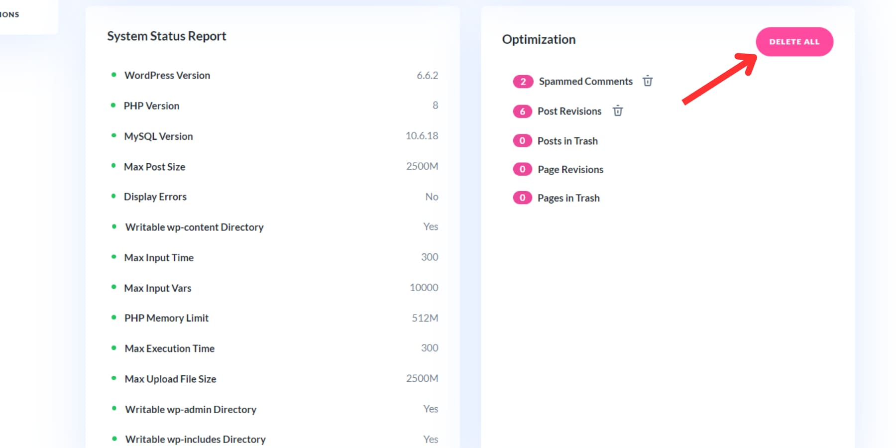
Beyond updates, it keeps your site running smoothly by cleaning up database clutter, removing spam comments, and managing old content revisions.
Even with a single site, team collaboration becomes seamless. Assign roles to team members, coordinate tasks, and maintain security with user management features and activity logs.
If you work with clients, Divi Dash’s cloud-based system keeps all website and client information organized and lets you assign and customize what your clients do — no more messy spreadsheets.
It’s a comprehensive solution that transforms complex website maintenance into a simple, automated process while integrating smoothly with the Divi ecosystem.
Build Your Small Business Website Today
The days of complicated web design are behind us. Whether launching your first business website or upgrading an outdated one, you now have all the pieces to create something that genuinely works for your business. Remember, a great website isn’t about following every trend or matching your competitors – it’s about creating an effective platform that serves your customers while making your life easier.
That’s where our carefully curated toolkit comes in. We’ve handpicked the best solutions to make your web journey smooth and effective:
| Tool | Purpose | |
|---|---|---|
| Divi | WordPress Website Builder | Get |
| Divi AI | AI Content & Design Assistant | Get |
| Divi Cloud | Website Asset Storage | Get |
| Divi Teams | Collaborative Website Management | Get |
| Divi VIP | Premium Divi Support | Get |
| Divi Dash | Website Maintenance Tool | Get |
| SiteGround | Web Hosting | Get |
| WP Rocket | Caching & Performance Optimization | Get |
| EWWW | Image Optimization | Get |
| Rank Math | SEO Plugin | Get |
| MonsterInsights | Google Analytics Integration | Get |
| UpdraftPlus | Website Backup Solution | Get |
| Solid Security | WordPress Security Plugin | Get |
With Divi, you’re not just getting a website builder but a complete business solution that grows with you. From AI design and content assistant to automated maintenance, Divi handles the technical heavy lifting so you can focus on what matters – running your business. And we’re not stopping at design. SiteGround will keep your site lightning-fast and secure, while tools like WP Rocket and Rank Math ensure you’re not just online but dominating your digital space.
Ready to build a website that works as hard as you do? Get started with Divi today and revamp your online presence from a source of stress into a valuable business asset.




Leave A Reply