Have you ever noticed how some websites feel like a smooth jazz concert while others hit you like a broken trumpet? That’s the UI and UX design at work. While one makes your website look like a million bucks, the other ensures it works like a charm.
When it comes to UI vs. UX design, you might ask yourself: what’s the difference? And why do successful websites need both? In this post, we’ll explain the difference, show you how to avoid common design disasters, and discuss how Divi’s intuitive features help balance UI and UX.
Understanding UI vs UX Design
Think of UI and UX as the dynamic duo of design. While they’re often lumped together, each plays a distinct role in creating websites that work. Let’s break down these differences and see how they complement each other in creating exceptional user experiences.
Subscribe To Our Youtube Channel
What Is User Interface (UI) Design?
User Interface (UI) design shapes how your website looks and feels. It’s the digital equivalent of interior design – from choosing the perfect button colors to picking fonts that pop without straining eyes.
UI designers obsess over visual hierarchies, spacing between elements, and creating interfaces that guide users naturally through your pages.
Think of the buttons, menus, and forms on your favorite websites. That satisfying click animation, the way icons subtly highlight on hover, or how text remains readable against any background — that’s UI design at work. Good UI turns complex interactions into simple, beautiful experiences that feel natural rather than forced.
What Is User Experience (UX) Design?
User Experience (UX) design focuses on visitors’ journey through your website. While UI handles the visuals, UX tackles the strategy behind every click, scroll, and interaction. It’s about understanding user behavior and crafting natural and rewarding pathways.
Take an ecommerce site, for example. UX designers map how customers browse products, add items to their carts, and complete purchases, ensuring each step flows logically into the next.
They analyze user research, create wireframes, and test different approaches to find the best one. Good UX anticipates user needs before they arise, whether by adding a quick-view feature for products or placing the search bar exactly where users expect to find it.
When done right, visitors might not notice UX design – they’ll know the website works exactly as it should.
UI vs UX Design: The Difference?
While UI and UX work together to create successful websites, their roles and focus areas differ significantly. Here’s a practical breakdown that demonstrates how each discipline approaches website design:
| User Interface (UI) Design | User Experience (UX) Design |
|---|---|
| Creates visual elements and styles | Plans user flows and interactions |
| Focuses on aesthetic appeal | Prioritizes functionality and usability |
| Designs individual screens and components | Maps entire user journeys |
| Handles colors, typography, and spacing | Conducts user research and testing |
| Makes interfaces beautiful and engaging | Makes experiences intuitive and efficient |
Understanding these distinctions helps create websites that excel in both form and function. Visitors enjoy seamless experiences wrapped in attractive, purposeful design when UI and UX align perfectly.
Critical Touchpoints Of UI & UX
Where do UI and UX intersect to create magic? These crucial meeting points determine whether visitors stay or bounce. From navigation flows to conversion points, these touchpoints shape how users interact with — and remember — your website.
Excellent navigation strikes the perfect balance between beauty and usability. Picture menus that catch your eye and help you find exactly what you need – that’s where UI and UX join forces.
Clever navigation design considers both visual hierarchy and user behavior. Headers should stick where users expect them, dropdowns must expand naturally, and mobile menus must feel snappy rather than sluggish. Color contrast keeps links visible, while subtle animations give users feedback without slowing them down.
The best navigation systems feel almost invisible because they work so well. When users can move through your site without thinking twice about where to click next, you know both your UI and UX teams have nailed it. Whether someone’s browsing your blog or hunting for a specific product, they should never feel lost or frustrated.
Forms That Convert, Not Confuse
Forms make or break user experiences. A well-designed form turns signups, checkouts, and contact requests into smooth interactions instead of frustrating obstacles.
Good form design starts with layout. Fields should follow a logical order, with clear labels and helpful placeholder text. Visual cues like progress bars and error messages must guide users without overwhelming them. Smart UI choices, like properly sized input fields and touch-friendly buttons, keep users moving forward.
The real magic happens when UI and UX work together — think inline validation that catches mistakes before submission, keyboard shortcuts that speed up data entry, or smart defaults that reduce user effort. These small touches add up to forms that feel effortless rather than tedious.
Mobile Design That Makes Sense
Mobile design isn’t just about shrinking desktop layouts – it’s about rethinking how people interact with smaller screens. Touch targets need breathing room, content must adapt gracefully, and interactions should feel natural under thumbs rather than mouse pointers.
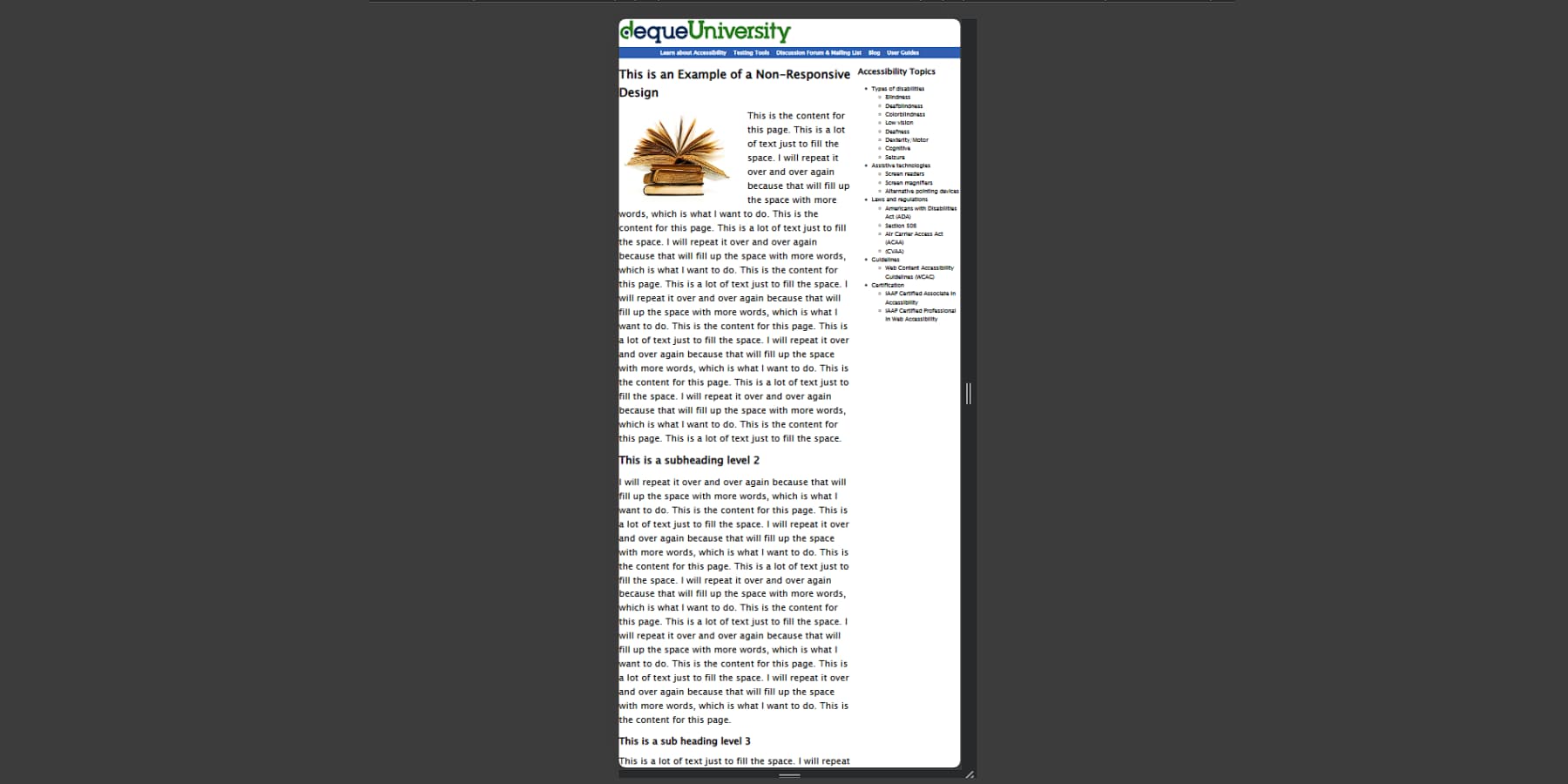
Successful mobile experiences put essential content front and center. Menus collapse smartly, images scale without losing impact, and buttons stay large enough for real-world use. The best mobile designs understand the context — like parking lot shoppers checking store hours or commuters browsing articles one-handed on the train.
Font sizes must stay readable without zooming, forms should fill with the right keyboard types, and load times must stay snappy even on slower connections. When mobile design works well, users forget they’re on a smaller screen and focus purely on what they came to do.
Color & Typography In Synergy
Beyond mere aesthetics, color and typography bridge the gap between visual appeal and functional design. While brand guidelines might dictate your primary palette, the real art lies in how these elements guide users through your content.
Watch how leading websites use color contrast to draw attention exactly where it’s needed — subtle enough to avoid overwhelming visitors yet strong enough to highlight key actions. The best designs create natural visual hierarchies, letting users instinctively know where to look next.
Typography plays an equally crucial role in this dance. Through careful selection of font pairings and thoughtful spacing, content becomes more than just readable — it becomes engaging.
When combined with purposeful color choices, these elements create an experience that pulls users through your content while keeping them comfortable enough to stay awhile.
Common UI/UX Design Challenges In Web Design
Even seasoned designers sometimes trip over these common hurdles. From overdesigned interfaces to forgotten mobile experiences, these mistakes can tank your website’s performance. Let’s explore how to spot them early and keep your projects on track.
Style Overpowers Substance
Designers often get swept up in the latest trends and flashy effects, losing sight of why websites exist in the first place. Those sleek parallax scrolling effects and cutting-edge animations might wow your design peers, but they’re useless if visitors can’t book an appointment or find basic contact information.
Consider those trendy ghost buttons that look fantastic in mockups. Place them on a busy background image, and suddenly, your checkout button becomes a game of hide-and-seek.
The same goes for award-winning portfolios with experimental navigation that sends visitors on a wild hunt for the menu.
The best designs know when to step back. Visual elements should complement your message, not fight for attention against core website functions. Sometimes, letting go of that extra animation means giving users what they need.
Performance vs. Visual Impact
Loading spinners shouldn’t be the most memorable part of your website. Yet many designers pack their pages with heavy video backgrounds, uncompressed images, and fancy JavaScript animations without considering the cost.
That slick product showcase might look amazing on your fiber connection, but try loading it on the phone with spotty 3G.
Speed isn’t just about patience — it affects your bottom line. Research shows that even a one-second delay can drop conversions by 7%. Users bounce from slow sites, and search engines notice. A beautiful website means nothing if visitors leave before seeing it.
The smart design balances visual punch with performance. That means compressing images without sacrificing quality, using video sparingly, and ensuring every fancy feature earns its keep. Your users will thank you for their time and attention.
Inconsistent Design Language
Nothing screams “amateur hour” like a website that can’t decide what it wants to be. Picture this: the homepage uses modern, minimalist buttons, but when you click through to product pages, you’re hit with glossy 3D elements from 2010. Or fonts that change personality between sections, making your site look like a ransom note.
Brand consistency builds trust. When design elements play musical chairs across your website, users question whether they’re even on the same site.
It’s not just about looks — inconsistent navigation patterns force visitors to relearn how to use your site on every page.
Good design creates patterns users can rely on. From color schemes to button styles, keeping things predictable helps visitors focus on what matters: your content. Think of your design system as a conversation — it should speak the same language throughout.
Responsiveness Treated As An Afterthought
Picture building a house and only checking if the doors work after moving in. That’s what happens when designers treat mobile design as a last-minute checkbox. Squeezing a desktop site into a phone screen never works — ask anyone who’s pinched and zoomed their way through a poorly adapted website.
Mobile users have different needs and behaviors. Someone checking your restaurant menu on their phone probably wants your address and hours first, not your mission statement. Yet too many sites bury this crucial info under layers of desktop-first content.
Smart designers start with mobile layouts and build up from there. Every element needs to earn its place on smaller screens. This approach doesn’t just make phones happy — it forces you to prioritize what matters across all devices.
Divi: Where UI Meets UX Design
Building standout websites with great UI and UX isn’t just about having the right tools — it’s about how seamlessly those tools work together. Divi shines on WordPress by turning complex design tasks into visual workflows anyone can master.
Open up the Visual Builder, and you’ll find yourself crafting pages in real time, choosing from hundreds of modules that handle everything from introductory text to complex interactions.
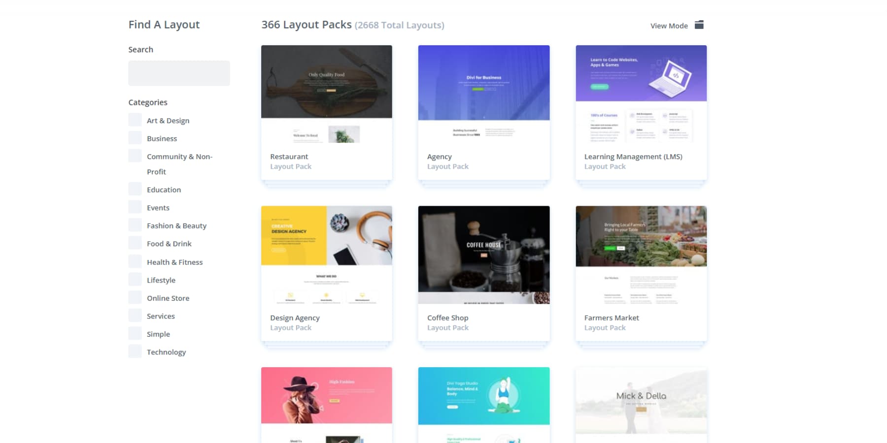
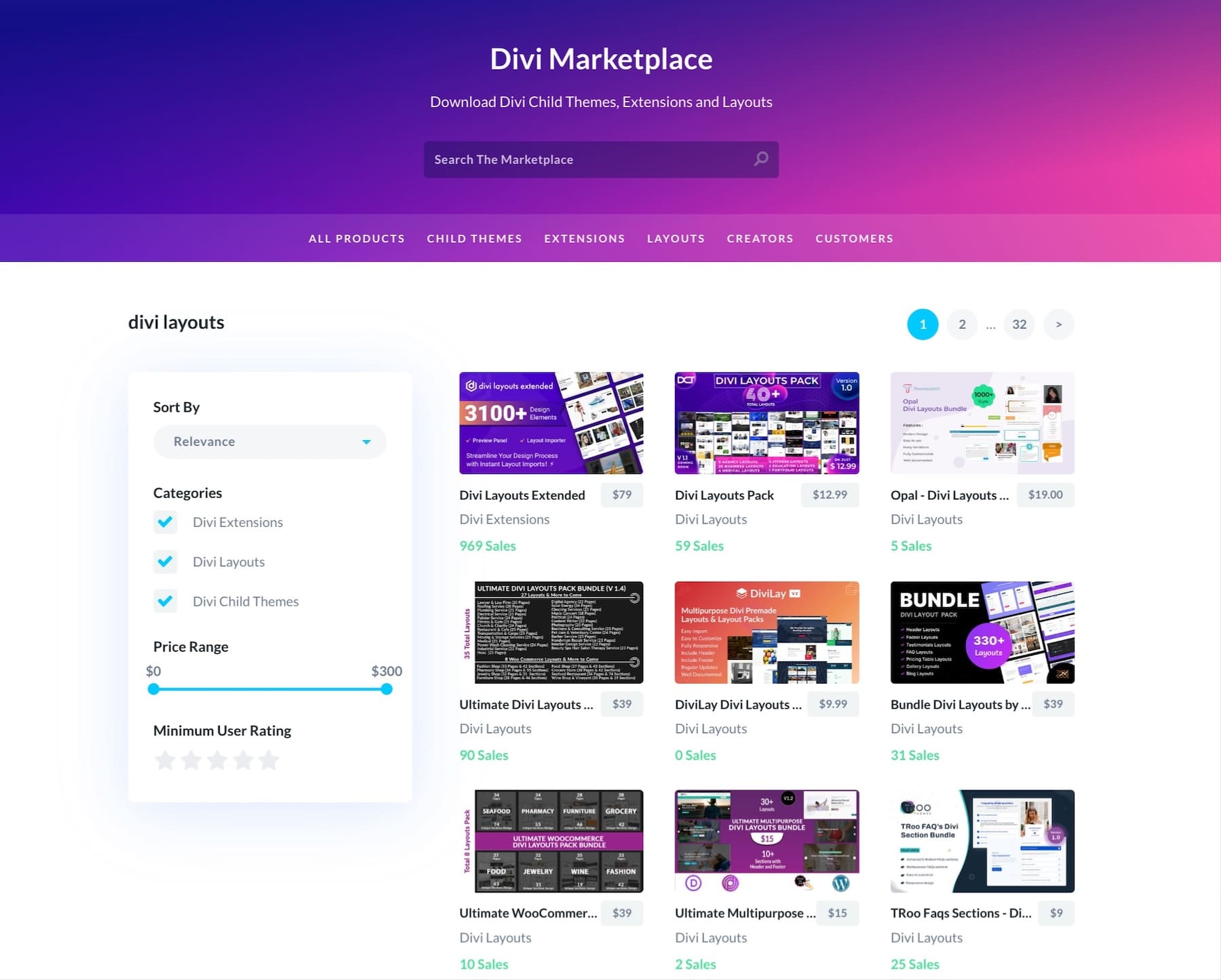
Starting a new website design project? Skip the blank canvas anxiety. Dive into Divi’s library of layout packs — there are over two thousand to choose from.
But these aren’t just random designs — each template flows naturally into the next, creating consistent experiences across your site. Do you need to customize how your blog posts look or create a unique header on every page? The Theme Builder puts those traditionally technical tasks at your fingertips, with no coding required.
Smart Design Just Got Smarter With Divi AI
Divi’s latest updates blend AI into the design workflow, transforming how we approach UI and UX decisions. The system acts as your design partner, generating on-brand content,
Great visuals,
And even new sections based on simple text prompts.
Gone are the days of piecing together websites from scratch. Divi Quick Sites now harnesses AI to build complete, custom websites tailored to your business. Beyond layouts, it produces relevant content and brand-matched visuals — even setting up full eCommerce functionality when needed with WooCommerce.
Behind the AI magic sits a collection of hand-crafted starter sites, each loaded with custom photography and illustrations from our design team. Simply choose a template, add your business details, and watch your complete website take shape in minutes if you don’t prefer AI-generated designs.
The true strength of these sites lies in their built-in design systems. Every element, from navigation patterns to color schemes, follows established UI/UX principles.
Global presets automatically match new components to your site’s style, while theme settings maintain visual consistency across pages. With these fundamentals handled, you can focus on what makes your brand unique.
Built for Scale, Backed By Community
The intersection of UI and UX thrives in Divi’s 76,000-member-strong Facebook community. Our Facebook group members share interface innovations and user experience solutions daily, while our marketplace features UX-optimized themes and design systems from experienced developers.
Between our support team and knowledge base, complex design challenges transform into opportunities for better user experiences.
With Divi’s unlimited website license and WordPress’s robust foundation, scaling user interfaces becomes second nature. Hosting partners like SiteGround ensure smooth performance scaling as user bases grow, maintaining seamless experiences even as traffic increases.
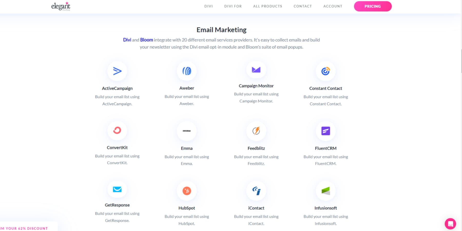
Divi extends WordPress’s interface capabilities through deep integration with essential design and analytics tools. The theme connects dozens of services (75+, to be exact).
You can even leverage familiar WordPress architecture to craft custom interface solutions. Regular updates keep pace with evolving design standards, fostering an ecosystem where interfaces adapt to changing user needs.
UI vs UX Design: Power Moves
Ready to level up your design game? These tried-and-tested strategies help bridge the gap between beautiful design and practical functionality. Learn how to create websites that both dazzle and deliver results.
Start With User Flows, Not Features
Before diving into color schemes or button designs, map out how users will move through your website. User flows reveal natural paths through your content, highlighting where design needs to support key actions.
Using tools like Divi’s Visual Builder, you can quickly prototype these journeys and test different approaches. With Divi’s Theme Builder, you can create consistent experiences across these pathways, ensuring users never lose their way regardless of how they interact with your site. You can even use Divi Quick Sites with AI to expedite this process.
Start by identifying entry points from search results, social media, or direct traffic. Then, chart organic paths toward conversion goals, noting where users might need extra guidance or reassurance. This approach often reveals opportunities to streamline navigation or simplify complex processes.
Use Systems That Scale
Building websites that grow with your business means thinking beyond one-off design decisions. Design systems unite UI elements and UX patterns into reusable components that maintain consistency as your site expands.
Divi’s Global Colors and Typography settings turn this systematic approach into reality — update one element, and changes cascade throughout your site. Save global elements settings for common elements like buttons, cards, and forms, then reuse them across pages, knowing they’ll maintain brand consistency.
Layer in spacing rules and grid systems that adapt seamlessly across screen sizes. This foundation lets you focus on solving new design challenges rather than reinventing basic elements. Your future self (and any team members) will thank you for building with scalability in mind from the start.
Responsive Design From Day One
Mobile-first isn’t just a buzzword — it’s how most people experience your website. Testing responsive behavior only after finalizing desktop layouts leads to compromised designs and frustrated users.
Divi’s responsive editing controls let you fine-tune layouts for every screen size while you build. Watch how headlines wrap, adjust spacing that works across devices, and ensure touch targets stay comfortable for thumb-scrolling users.
Consider content priority, too — what’s crucial on mobile might differ from desktop viewing contexts. Divi’s responsive visibility options help you show and hide elements based on screen size, maintaining clean layouts without sacrificing important information.
By treating responsive design as a core requirement rather than an afterthought, you create natural experiences on any device.
Test What Matters
Skip vanity metrics and focus on testing elements that impact user behavior and business goals. Rather than obsessing over generic bounce rates, track specific interaction points where users advance toward conversion.
WordPress integrates seamlessly with Google Analytics and heat mapping tools, showing exactly where users click, scroll, and potentially get stuck.
Test variations of key pages using Divi’s built-in A/B testing feature. Compare headlines, layouts, or call-to-action placements to see what resonates with your audience. But keep tests focused and meaningful.
Instead of testing every button color, concentrate on changes that could significantly impact user decisions. Remember: successful tests often reveal why something works, not just what performs better.
Measure What Moves The Needle
Understanding which design choices drive real results starts with a proper analytics setup. MonsterInsights transforms complex Google Analytics data into actionable insights in your WordPress dashboard. Track how design changes affect key metrics like time on page, form completions, and conversion paths.
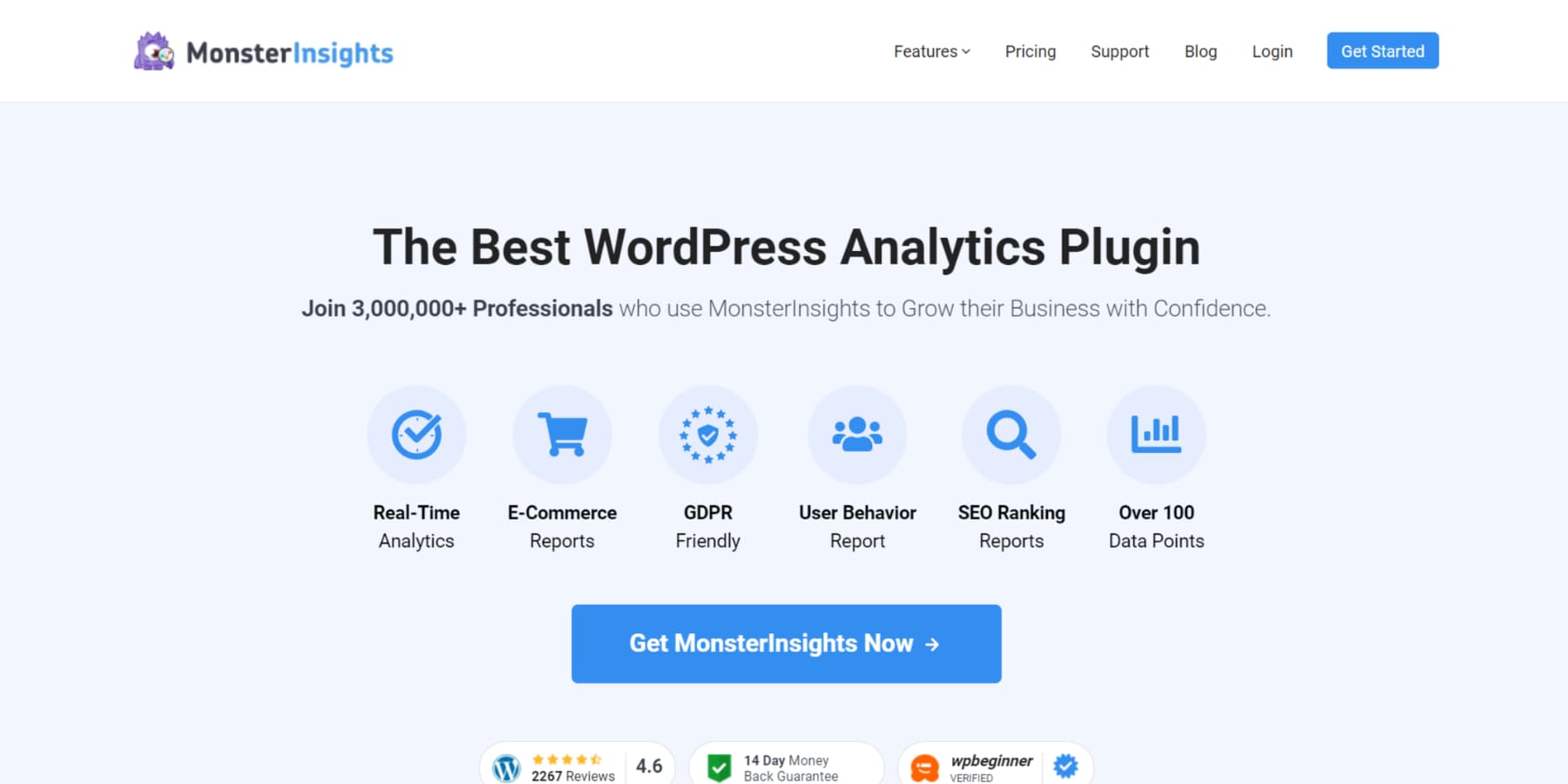
Instead of drowning in data, focus on metrics that align with business goals — newsletter signups, product purchases, or consultation bookings. MonsterInsights’ enhanced eCommerce tracking shows how your product page designs influence buying decisions.
Pair these insights with Divi’s visual builder and A/B testing to quickly adjust layouts based on user behavior. You can continuously refine your design to better serve users and business objectives by measuring meaningful interactions rather than surface-level metrics.
Break The UI vs UX Mindset
Think of UI and UX as dance partners rather than competitors — each bringing unique moves to create something spectacular. The best websites blend stunning visuals with smooth functionality, turning casual browsers into loyal visitors.
Divi makes this partnership effortless, handling the technical complexities while you focus on crafting memorable experiences. Every element works together, from eye-catching layouts to intuitive user flows, to serve your website’s purpose.
Your next project deserves more than just a pretty face or bare-bones functionality. Let Divi help you create websites where design and experience flow together naturally.



Thanks, picked up someone great insights.