Great user interface design is the difference between a website that converts and one that confuses. When users land on your site, they make split-second decisions about whether to stay or leave — largely based on how intuitive and appealing your interface feels.
The best UI designs appear deceptively simple, but they’re built on sophisticated principles that guide users naturally through content and actions. From strategic color choices to intelligent layout architecture, we’ll explore the essential elements that make interfaces work harder for your website.
Implementing these professional user interface principles becomes remarkably straightforward with tools like Divi.
Understanding User Interface Design
The foundation of any successful website lies in how users interact with it. UI design goes beyond aesthetics — creating a seamless bridge between user needs and website functionality. Let’s break down the core concepts that drive effective interface design.
Subscribe To Our Youtube Channel
What Is A User Interface (UI)
User interface encompasses the visual and interactive elements that shape how people engage with your website. The purposeful combination of buttons, menus, icons, color schemes, spacing, and typography guides visitors through their digital journey.
While many see UI as purely visual design, its true power is translating complex website functionality into intuitive interactions.
When done right, UI design removes friction points and creates clear pathways that help users accomplish tasks efficiently — whether that’s making a purchase, finding information, or submitting a form.
Core Principles Of UI Design
Successful user interface design follows established principles that enhance usability while maintaining visual appeal. These fundamental guidelines ensure your website remains accessible and engaging, regardless of your audience’s technical expertise.
| Principle | Description | Impact on Users |
|---|---|---|
| Clarity | Every element serves a clear purpose without unnecessary decoration | Reduces cognitive load and helps users navigate confidently |
| Consistency | Design patterns, colors, and interactions remain uniform throughout | Creates familiarity and speeds up task completion |
| Feedback | Visual cues confirm user actions and system status | Builds trust and reduces user uncertainty |
| Accessibility | Interface elements accommodate various user needs and abilities | Ensures broader usability and compliance |
| Recovery | Easy ways to undo actions and correct mistakes | Encourages exploration without fear of errors |
| Efficiency | Minimize steps needed to complete common tasks | Reduces frustration and improves satisfaction |
These principles work together to create interfaces that feel natural and responsive. By incorporating them thoughtfully into your design process, you’ll create websites that look professional and deliver meaningful user experiences.
Different Types Of UI Design
Ever notice how differently you interact with Netflix on your laptop compared to your TV’s display? That’s because UI design shifts dramatically across different platforms. As architecture adapts to its environment, interface design molds itself to fit specific user needs and contexts.
- Website UI Design: The backbone of online presence. From simple portfolio sites to massive eCommerce platforms, these interfaces guide visitors through content while making navigation feel natural and effortless.
- Web Application UI: Think Slack or Notion. These browser-based tools pack complex features into clean, accessible interfaces that users spend hours working in.
- Mobile App UI: Built for thumbs and taps, these interfaces make the most of limited screen space while keeping interactions smooth and intuitive.
- Product UI: Found everywhere, from coffee makers to Tesla displays, these interfaces blend digital controls with physical hardware, creating seamless real-world interactions.
- Desktop Application UI: The powerhouse of productivity tools, where robust functionality meets familiar operating system patterns.
Let’s focus on website UI design — it’s where most businesses start their online journey, and mastering its principles sets a solid foundation for understanding interface design.
User Interface Design vs User Experience Design
“Is this button the right shade of blue?” That’s UI design. “Should this button even exist?” That’s user experience (UX) design. While these two fields often get mixed up, they’re as different as architects and interior designers — both essential but with distinct roles.
UI design crafts what you see and click on your screen. The colors, shapes, buttons, and menus make up your website’s visual language: every font choice, shadow, pixel of spacing — that’s UI design at work.
UX design, on the other hand, tackles the behind-the-scenes strategy. It maps user journeys, spots pain points, and identifies the smartest ways to help people accomplish their goals. But that’s a whole other beast — one we won’t be wrestling with today.
This guide zeroes in on UI design — the art of turning good ideas into great-looking, clickable reality. We’ll show you how to build interfaces that look sharp and give users exactly what they need right where they expect to find it.
Elements Of Effective UI Design
Great interfaces don’t happen by accident. They’re built using carefully considered elements to create intuitive user experiences. Here’s how each component contributes to a cohesive, engaging design system.
Layout Architecture: Space & Structure
Effective layout architecture forms the backbone of user interface design. It strategically uses white space, grids, and content organization. A well-structured layout guides users naturally through your content while maintaining visual harmony.
By employing the principle of spatial relationships, designers can create clear hierarchies that help users process information efficiently. Grid systems provide the framework for consistent spacing and alignment, while thoughtful white space distribution prevents cognitive overload and enhances content readability. Smart structural choices help establish natural content flows that keep users engaged and oriented.
Color Psychology In Practice
Strategic color implementation goes beyond aesthetics — it shapes user behavior and emotional responses while reinforcing brand identity. Effective color schemes balance contrast ratios for readability with psychological triggers that guide user actions.

Primary colors often define key interaction points, while secondary palettes support visual hierarchy and information architecture. Understanding color relationships helps create accessible designs for all users, including those with color vision deficiencies.
Bright color choices can direct attention, indicate system status, and create emotional connections that enhance the user experience.
Typography That Communicates
Typography is a functional and expressive element in interface design, extending far beyond simple text display. Strategic font choices and hierarchies guide users through content while maintaining brand personality.
Proper spacing, line height, and character width enhance readability across different screen sizes and contexts. Font pairings create visual interest and distinguish between different types of content, while consistent type scales establish clear relationships between elements.
Well-planned typography systems help users scan content efficiently and understand information hierarchies intuitively.
Visual Hierarchy: Leading The Eye
Visual hierarchy determines how users process information on your website, establishing clear pathways through content based on importance. Size, contrast, color, and positioning create focal points that naturally draw attention to key elements.
Strong hierarchical structures help users understand relationships between different pieces of content without conscious effort. By carefully orchestrating these visual relationships, designers can create intuitive and organized interfaces.
Strategic use of scale and weight in design elements ensures users notice important information first while maintaining access to supporting details.
Form Meets Function
The intersection of aesthetics and functionality defines successful interface elements, where every design choice serves a clear purpose.
Interactive components like buttons, forms, and menus must balance visual appeal with practical usability. Smart design patterns anticipate user needs while maintaining visual consistency across different states — hover, active, disabled, or selected.
Elements should provide clear feedback and afford obvious interaction opportunities without sacrificing design integrity. This marriage of form and function creates interfaces that look professional and deliver seamless user experiences.
Current UI Design Trends For Websites
The user interface scene constantly evolves, bringing fresh approaches to interface design. Understanding these trends helps create modern, relevant experiences while avoiding short-lived fads that could date your website.
Minimalism vs Maximalism
The pendulum of interface design swings between two distinct approaches. While minimalism strips away excess to focus on essential elements, maximalism adds layers of creative expression through bold typography, vibrant colors, and intricate patterns. Neither approach is inherently better — successful implementations depend entirely on your brand, audience, and content.
Minimalist designs excel at directing attention to key actions, while maximalist interfaces create memorable, emotionally rich experiences. The key lies in commitment to your chosen direction — half-measures in either style often fall flat. We’re seeing more brands confidently embrace their preferred aesthetic rather than following temporary design trends.
Mobile-First Focus
Mobile interfaces have evolved far beyond scaled-down versions of desktop sites. Today’s mobile-first approach shapes every design decision from the ground up — from typography that stays readable on small screens to touch targets that accommodate real human fingers.
Navigation patterns have matured to prioritize thumb-friendly zones and gesture-based interactions that feel natural. The challenge lies in maintaining visual impact while streamlining content for smaller viewports.
Innovative designers are finding creative ways to preserve brand personality within mobile constraints, using progressive disclosure and contextual interfaces that adapt to user behavior and device capabilities.
Micro-Interactions & Motion
Subtle movements and responsive animations have become essential elements of modern interfaces — not just for delight but for providing crucial user feedback. These micro-interactions create moments of engagement through subtle hover states, smooth transitions, and purposeful motion that guides users through their journey.
The key is restraint — motion should feel natural and purposeful, never overwhelming or gratuitous. Well-executed animations acknowledge user actions, reveal relationships between elements, and maintain spatial awareness during navigation. Whether a gentle button state change or a fluid page transition, these small details work together to create interfaces that feel alive and responsive.
Dark Mode Design
Dark interfaces have evolved beyond a mere trend to become a core design consideration. Beyond aesthetic appeal, dark modes offer genuine benefits — reducing eye strain, conserving battery life, and creating immersive experiences for media-rich content.
The challenge lies in maintaining visual hierarchy and readability while working with reversed contrast ratios. Success requires more than inverting colors — it demands careful consideration of color relationships, shadow effects, and content legibility.
We’re seeing designers move beyond simple black backgrounds to explore rich, deep colors that create sophisticated dark experiences while maintaining brand consistency across both light and dark variants.
Top UI Design Tool For Websites
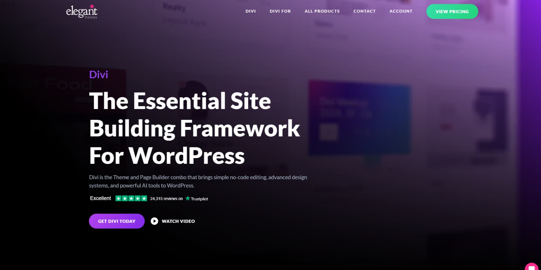
Divi puts robust web UI design right at your fingertips. While other platforms bog you down with complexity, the visual builder lets you craft stunning interfaces through simple drag-and-drop controls. Best of all, you won’t need to touch a single line of code.
Once you open Divi’s design panel, you’ll find over 200 specialized modules ready to enhance your interface. Grab the elements you need — hero sections, pricing tables, or navigation menus — and watch your design take shape. Plus, you maintain complete creative control over every detail.
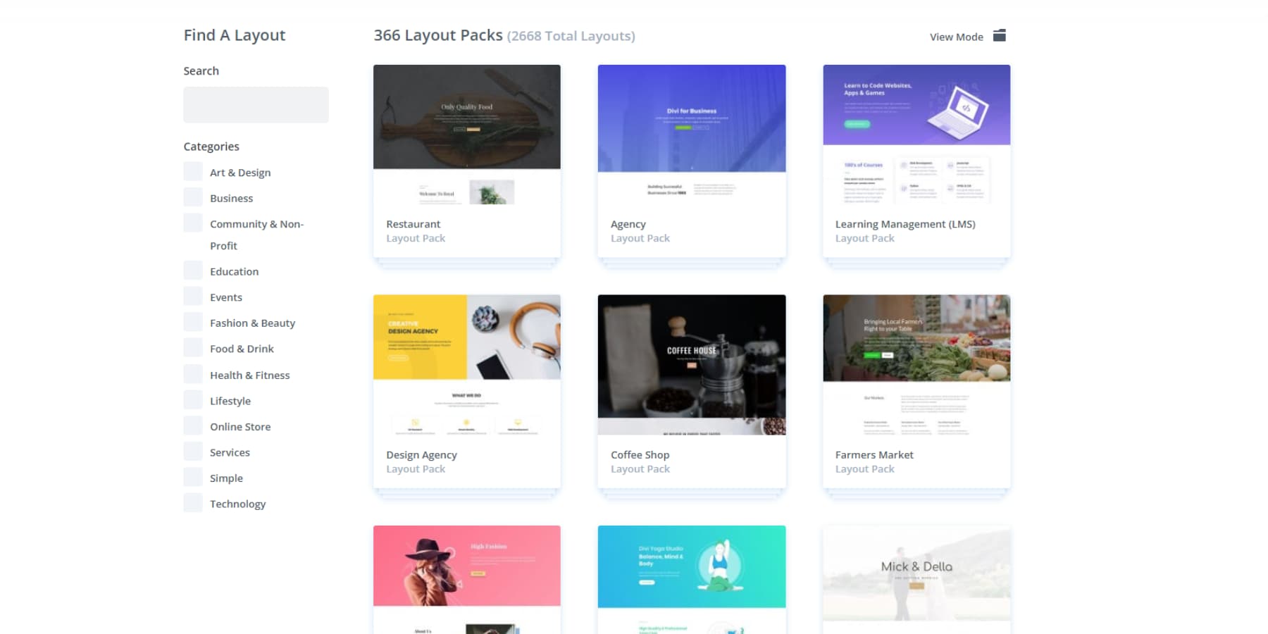
Getting started on a new interface project? Divi’s massive library of 2000+ pre-built layouts has you covered. These professional templates give you a solid foundation upon which to build. Pick a design that matches your vision, then customize it to fit your brand’s aesthetic and user experience goals perfectly.
Design Freedom Meets Function
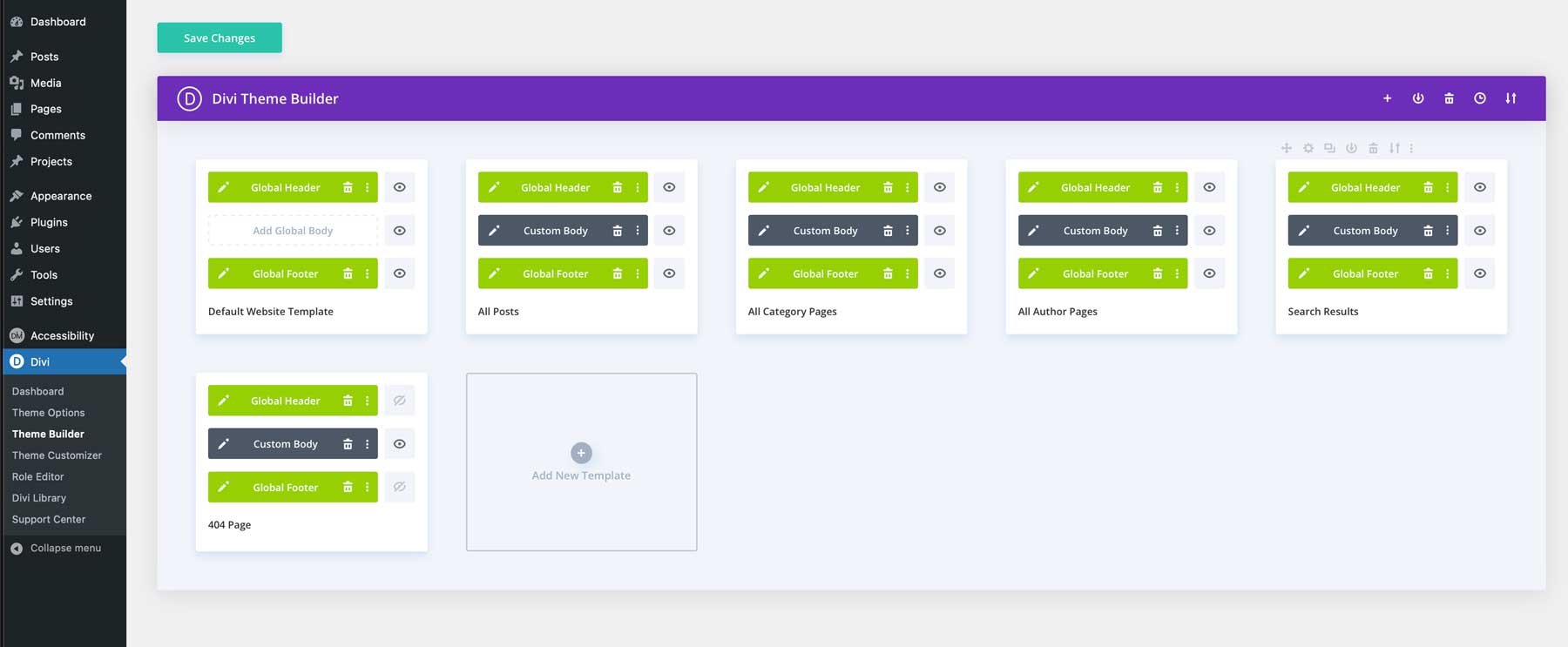
Your design control doesn’t stop at individual pages. With Divi’s Theme Builder, you can shape every corner of your interface — from dynamic headers that adapt to user scrolling to custom blog layouts that showcase your content perfectly. You’ll never feel boxed in by rigid templates again.
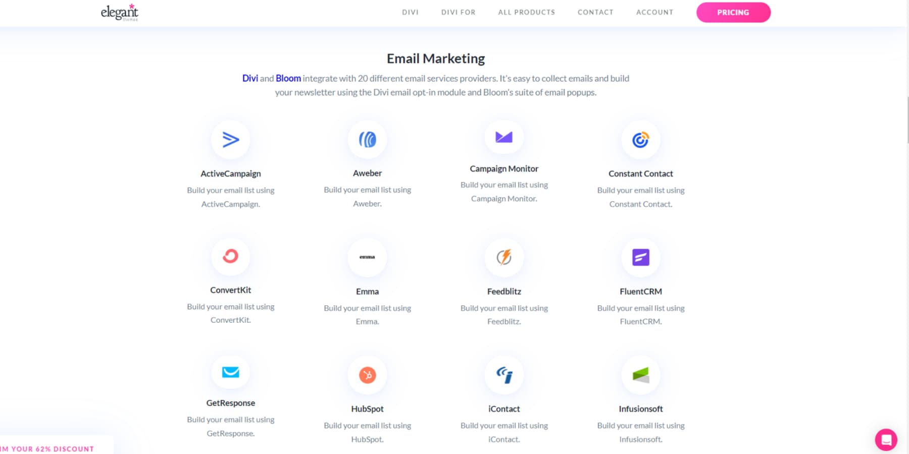
What makes Divi particularly special? It’s built on WordPress, giving you access to thousands of powerful plugins. Need advanced SEO capabilities? Looking to add member-only sections? The WordPress ecosystem lets you expand your site’s functionality, while Divi keeps everything looking polished and professional with its out-of-the-box integration with 75+ tools and services.
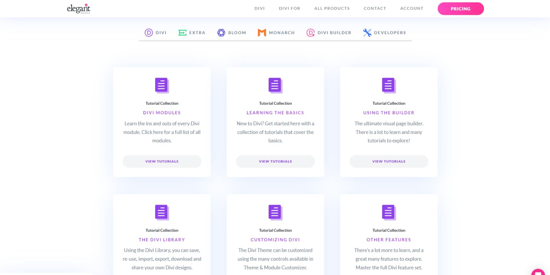
You’re never alone on your design journey. Tap into Divi’s thriving community of 76,000+ designers through our Facebook group, where you’ll find inspiration and solutions. Or browse our extensive documentation and video tutorials for step-by-step guidance.
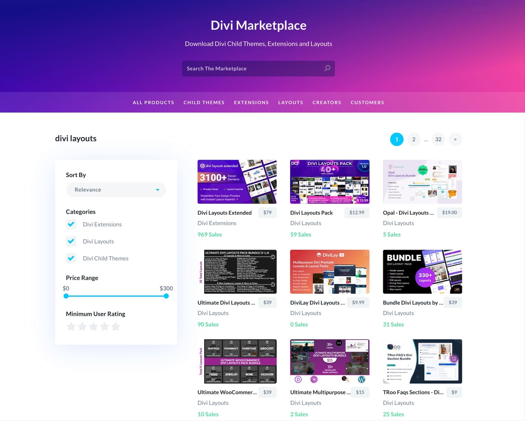
When you’re ready to take your interface to new heights, explore our Marketplace — it’s packed with premium layouts and extensions created specifically for businesses like yours.
From Blank Canvas To Custom Site In Minutes
Skip weeks of design work with Divi’s intelligent solutions. Divi Quick Sites with AI builds custom interfaces tailored to your business — complete with layouts, content, and images that actually make sense together. The system understands both design principles and brand consistency, delivering results you can trust.
Want the quickness but without AI-generated designs? Browse through Divi Quick Sites’ collection of starter sites. Each package comes loaded with professional layouts and custom imagery thoughtfully designed by our team. Pick your favorite, add details, and watch Divi Quick Sites assemble your entire website interface in about 60 seconds.
The best part? Nothing is set in stone. Use Divi’s visual editor to tweak colors, adjust spacing, or completely reimagine sections until every interface element perfectly matches your vision. Your design, your way — just faster.
Divi AI: A Design Assistant That Gets It
Beyond Divi Quick Sites, think of Divi AI as your personal design partner. Just describe what you want — anything from snappy headlines to fresh product images — and get results that actually fit your brand. No more bouncing between different tools or waiting on freelancers.
Want to update those product photos?
Add a new feature section?
Simply type out your needs. Divi AI handles the editing, writing, and design while keeping everything looking like it belongs together.
It’s like having a skilled designer on call whenever you want, taking care of the time-consuming tasks so you can stay focused on what matters. Whether you’re tweaking images or building new sections, Divi AI adapts to your style and keeps your website interface looking sharp.
User Interface Design 101
Success in user interface design requires more than following best practices — it demands a deep understanding of how users think and behave. Let’s explore the fundamental principles that guide effective interface creation.
Understanding User Behavior
User behavior shapes every aspect of interface design. Website visitors often scan content in predictable patterns, such as the F-pattern for text-heavy pages or the Z-pattern for commercial sites. However, effective UI design goes beyond these basic patterns. By analyzing heat maps and user session recordings, you can spot where your visitors click, hover, and spend the most time.

Understanding these natural browsing patterns helps you create familiar and intuitive interfaces. Successful designs account for scanning behaviors, click patterns, and attention spans across different devices.
Rather than forcing your users to learn new patterns, smart interfaces adapt to existing behaviors while gently guiding visitors toward important actions. This behavior-first approach leads to higher engagement rates and more successful user journeys.
Design Systems & Components
Creating a consistent design system doesn’t mean starting from scratch. With Divi’s Global Elements and Presets, you can establish a unified visual language across your entire website. These building blocks — from buttons and forms to navigation menus — become your reusable components that maintain brand consistency.
Your design system should include standardized spacing, typography scales, and color palettes that work together harmoniously. Divi’s visual builder lets you save these design decisions as global presets, making it easy to maintain consistency as your site grows.
When you update a global element, the changes apply everywhere that component appears. This systematic approach speeds up your workflow and ensures your interface remains cohesive across all pages and sections.
Content Hierarchy Basics
Organizing content effectively means creating clear visual relationships between different elements on your page. Think of your content like a well-structured conversation — each piece should naturally lead to the next. With Divi’s visual hierarchy tools, you can quickly establish these relationships through intuitive spacing, sizing, and positioning controls.
The visual weight helps establish these relationships. Larger text, bolder fonts, and contrasting colors naturally draw the eye to important information first. Divi’s typography controls and spacing options make it simple to fine-tune these hierarchical relationships without touching code.
However, the hierarchy goes beyond size—strategic use of white space, indentation, and grouping helps users understand how different content relates. Remember that good hierarchy isn’t about making everything stand out—it’s about helping users quickly find what matters most while keeping secondary information accessible but not overwhelming.
Straightforward navigation serves as your website’s GPS, helping visitors understand where they are and where they can go. Beyond basic menus, effective wayfinding includes breadcrumbs, clear section headers, and thoughtful link placement that creates natural pathways through your content.
Divi’s Theme Builder lets you craft custom navigation experiences — from sticky headers that stay visible while scrolling to dynamic mega menus that organize complex site structures.
Consider how your navigation adapts across different devices. What works on a desktop might feel clunky on mobile. With Divi’s responsive controls, you can fine-tune your navigation for every screen size, ensuring users know their location and available options.
Brilliant navigation patterns reduce cognitive load and help visitors find what they’re looking for without frustration — whether they’re first-time visitors or returning users.
Elevating Your User Interface Design
Moving beyond basics, sophisticated UI design incorporates dynamic elements that enhance user engagement. These advanced techniques transform static layouts into responsive, interactive experiences.
Motion Design & Micro-interactions
Subtle animations and micro-interactions breathe life into your interface, providing visual feedback that guides users through their journey. Divi’s motion effects help you create these engaging moments — from smooth hover states to scroll-triggered animations.
These small but purposeful movements confirm user actions, reveal relationships between elements, and maintain spatial context during transitions.
The key lies in restraint. Animations should enhance the user experience, not distract from it. Whether it’s a gentle button transformation or a smooth section transition, these thoughtful details work together to create responsive and refined interfaces.
Dynamic Content Presentation
Modern interfaces demand content that adapts to different contexts and user needs. Divi lets you create flexible layouts using smart tags that automatically pull in user-specific information, post data, or custom field content. Connecting your design to your database allows you to display personalized content without rebuilding pages.
Think beyond static layouts. With Divi’s Dynamic Tags, you can create templates that automatically update based on categories, authors, or custom taxonomies. Whether showcasing related products, filtering blog posts, or displaying user-specific information, these dynamic elements keep your content fresh and relevant.
Divi’s conditional display options let you show or hide content based on user roles, logged-in status, and more, enabling truly personalized experiences.
Speed Optimization Techniques
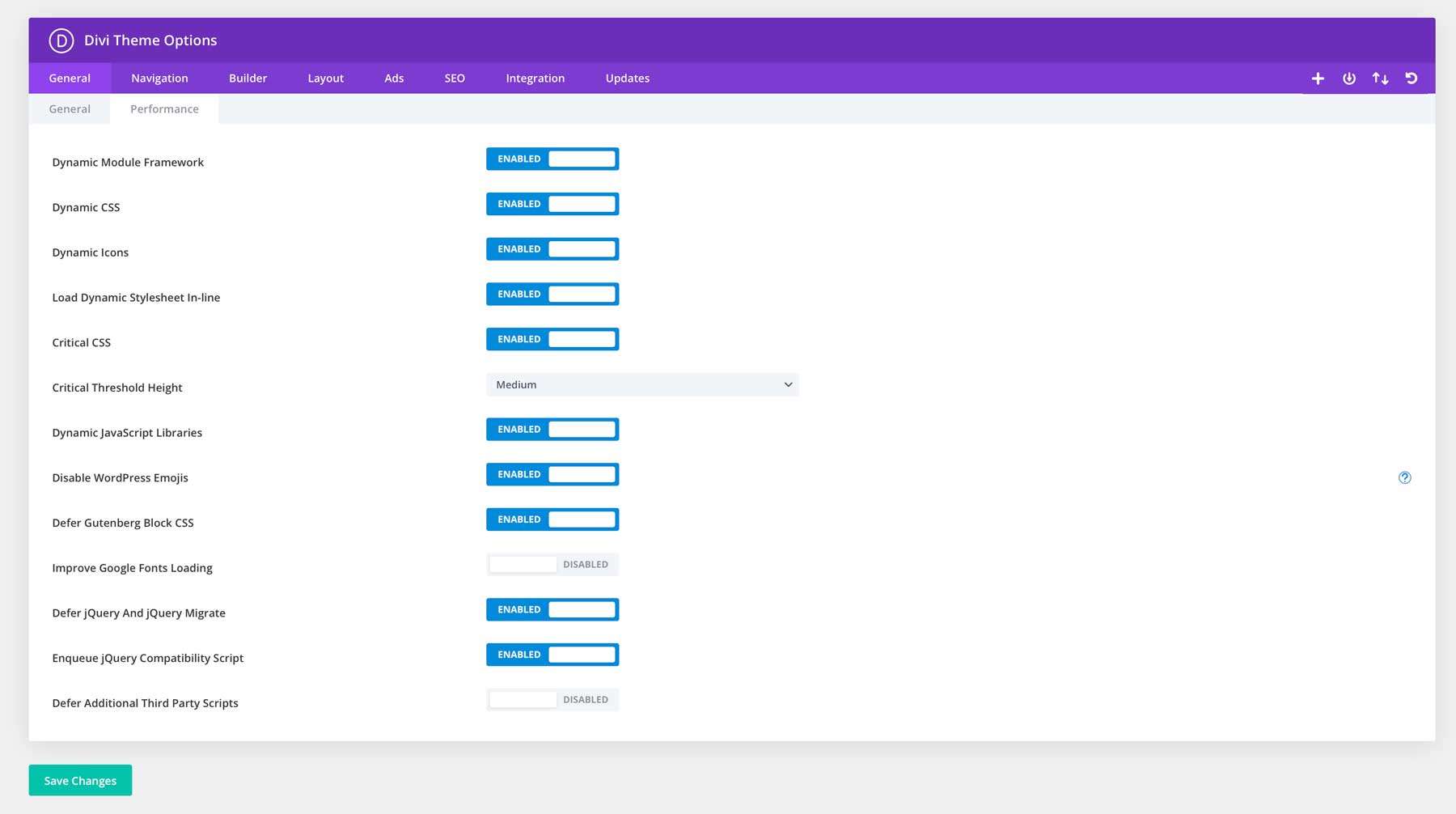
Beyond user interface basics, an excellent user interface also depends on its load speed. Divi’s core leverages the Dynamic Module Framework to process only the functions in active use, while its Dynamic JavaScript and CSS reduce unnecessary code bloat. The builder’s integrated Critical CSS enables faster initial page rendering, giving visitors immediate visual feedback.
Combining Divi with WP Rocket‘s advanced caching and lazy loading features, EWWW Image Optimizer‘s compression tools and SiteGround’s robust hosting infrastructure creates a foundation for lightning-fast interfaces. These optimizations work together to keep your site snappy and responsive, meeting modern user expectations for speed.
Building Future-Ready UI Interfaces
Creating interfaces that stand the test of time requires strategic planning and scalable solutions. These are some tips on how to build flexible systems that adapt to changing user needs and technological advances.
Scalable Design Patterns
A genuinely scalable interface works like a well-planned garden — growing organically while maintaining its intended design. Rather than boxing yourself into rigid layouts, consider how each element connects and flourishes within your website’s broader ecosystem. While Divi’s Global Presets provide excellent building blocks, the real magic happens when planning for natural expansion.
Intelligent navigation systems welcome new sections without overwhelming users, content areas seamlessly adapt to fresh material, and design elements maintain their visual relationships even as features multiply.
By combining Divi’s modular framework with strategic planning, your interface evolves from a simple landing page to a sophisticated website without losing its core design language. This approach transforms growing pains into smooth transitions, ensuring your site remains polished, whether managing ten pages or a thousand.
Cross-Platform Consistency
Modern websites must deliver seamless experiences whether users arrive from their phones, tablets, or desktop computers. Beyond basic responsiveness, cross-platform consistency means maintaining your brand’s visual language and functionality across every touchpoint.
While Divi’s responsive controls handle much of the heavy lifting, thoughtful planning ensures that your interface speaks the same design language everywhere.
Typography should remain readable across devices without losing its personality, interactive elements must work equally well with mouse clicks or touch gestures, and spacing needs to adapt while preserving content relationships.
By leveraging Divi’s device-specific customization options alongside platform-agnostic design principles, your interface can feel native to each environment without creating separate versions. The goal isn’t perfect replication — instead, it’s about maintaining familiarity while respecting each platform’s unique characteristics.
Responsive Design Strategy
Building on cross-platform principles, your responsive design journey should start with the smallest screen. When you begin with mobile layouts, you’ll naturally focus on core content and essential interactions, creating stronger foundations for larger displays.
This reverse engineering streamlines your entire design process, preventing the common pitfall of stripping down desktop experiences, which often leads to compromised mobile interfaces.
Working mobile-first from the start helps you identify potential layout challenges early. Content hierarchies become clearer, touch targets stay consistently usable, and typography maintains readability as you scale up rather than down.
The visual builder’s breakpoint controls let you fine-tune these transitions between screen sizes, ensuring your elements expand naturally rather than jump between states. This mobile-first approach, combined with Divi’s responsive features, creates interfaces that feel purposefully designed for every device your users might choose.
Design System Documentation
A design system without documentation is like a map without a legend — leaving teams to guess at patterns and principles. Proper documentation ensures everyone understands your interface elements and why they work the way they do. From spacing hierarchies to interaction patterns, this shared knowledge base keeps your design decisions consistent and intentional across the entire website.
The challenge usually lies in balancing documentation time with actual design work. Here’s where working with Divi brings a unique advantage — its extensive resource library already documents the technical foundations, from module behaviors to feature explanations.
You’ll only need to focus on recording your specific choices, such as custom color palettes, typography scales, or unique component variations. The visual builder’s Global Colors, Typography Presets, and saved modules naturally reinforce these standards, making it easier to maintain consistency without creating lengthy style guides from scratch.
That said, keeping track of your specific design choices still matters. You might want to note your color palette rationale, document your spacing rhythm, or record custom CSS snippets for unique features. But rather than starting from scratch, you can build upon Divi’s existing framework — adding only what’s unique to your project.
Final Thoughts
The most impactful user interfaces emerge from deep user understanding rather than trend-chasing or competitor mimicry. Through thoughtful design choices and strategic implementation, your interface can guide visitors naturally while expressing your brand’s unique personality — whether crafting a simple portfolio or building a complex eCommerce platform.
Combining proven UI principles with Divi’s powerful design toolkit allows your creative vision to take shape without getting tangled in technical complexity. Over 4 million websites have already discovered how Divi transforms design challenges into opportunities for exceptional user experiences. The path to extraordinary interface design starts with the right tools — grab Divi now and watch your design possibilities expand.



Leave A Reply