What makes certain websites memorable while others fade away? It’s not by chance or flashy animations. The skillful use of visual design elements and principles guides, engages, and converts visitors.
Many web designers focus on trendy colors or styles, missing the core elements that make a design effective. Successful websites that achieve tangible business goals come from a deep understanding of how these elements work together.
In this post, we’ll explain how these elements work together, showing you practical ways to implement them in your next project. Better yet, you’ll discover how modern design tools like Divi make this process feel natural and intuitive. Let’s find out what makes great web design tick.
- 1 Visual Design Elements And Principles: The Importance
- 2 Visual Design Elements And Principles: Building Blocks
- 3 Design Principles That Deliver Results
- 4 Common Visual Design Challenges
- 5 Combine Visual Design & Website Building With Divi
- 6 Building A Robust Visual Design Approach
- 7 Optimizing Visual Design Workflow
- 8 Design Better, Starting Now
Visual Design Elements And Principles: The Importance
Good visual design transforms your website from a simple information container into a powerful communication tool. When you use these fundamental elements and principles correctly, they create experiences that guide users naturally through your content while supporting your brand messages.
Subscribe To Our Youtube Channel
Strong visual design makes your website attractive and lays the groundwork for successful digital experiences. Research shows that users decide within 50 milliseconds whether they like a website, making thoughtful design crucial for engagement.
Well-executed design elements help you build credibility, direct attention, and create emotional connections with your visitors.
These principles aren’t just random rules but proven approaches based on how people process visual information. Effectively using visual hierarchy, balance, and contrast creates intuitive experiences that feel natural to users. This careful attention to design fundamentals impacts important metrics like bounce rates, time on site, and conversion rates.
Understanding these core principles allows you to make informed design decisions instead of chasing trends. Mastering these fundamentals allows you to build polished experiences that serve your business goals and user needs.
Visual Design Elements And Principles: Building Blocks
Before diving into complex design theories, let’s explore the fundamental pieces that make effective visual design. These core elements aren’t just theoretical concepts but practical tools you’ll use in every project.
Line, Shape, And Form
Look at any successful website, and you’ll notice how your eyes naturally follow the content — that’s no accident. Great designers create invisible pathways that lead you from one important element to the next. Your attention moves smoothly from headlines to buttons without even realizing there’s a planned structure guiding you.
When you browse modern websites, you’ll spot how depth adds meaning to different sections. A subtle shadow here, a gentle hover effect there – these small details help you understand what’s clickable and most important on the page. It’s like having a quiet conversation with the design itself.
You might notice how content follows familiar patterns, like an F or Z shape on the page. This matches how you naturally read and scan information. Headers lead to features and testimonials, making it easy to take in everything without feeling lost. These simple but smart choices help you find exactly what you want.
Color And Typography
Ever notice how certain websites just feel right when you’re reading them? That’s because they’ve nailed their font choices and color combinations. Good typography isn’t just about picking pretty fonts — it’s about making sure you can read everything easily, whether you’re on your phone or desktop.
Colors do more than make things look nice — they help you understand what’s important on the page. When you see that bright button against a clean background, your brain instantly knows that’s where you should click. The best websites use colors like a quiet guide, helping you navigate information without feeling overwhelmed.
Think about your favorite news site or app — you probably know exactly where to look for headlines, links, and important updates. That’s smart typography at work. By thoughtfully mixing font sizes and weights, designers create clear paths through content that feels natural. It’s like having a friendly conversation rather than trying to decode a puzzle.
Space And Texture
Space is often the most overlooked aspect of visual design. Give your content room to breathe. When you pack too many elements together, your visitors feel overwhelmed. But add some strategic white space, and suddenly, everything becomes easier to read and understand. It’s like walking into a well-organized room versus a cluttered closet.
Good texture brings websites to life. You’ll spot it in subtle grain effects, paper-like backgrounds, or even how sections overlap. Most modern websites skip heavy textures, but they still create depth through simple tricks — like how a card lifts slightly when you hover over it or how a background shifts as you scroll.
Look at sites like Apple. Have you noticed how they use generous spacing and subtle textures to make their content feel premium? That’s not by accident. They know that the right balance of space and texture turns flat designs into engaging experiences.
It’s like the difference between reading a cramped newspaper and a well-designed magazine — one fights for your attention while the other invites you in.
Balance And Contrast
Have you ever stared at a website, and something just felt… off? That’s probably because its balance was wonky. Think of your website like a seesaw — when one side gets too heavy with images or text, the whole thing tips over. Good balance doesn’t mean everything needs to be perfectly symmetrical — it just means your content feels steady and natural.
Contrast is what makes important stuff pop. It’s not just about black versus white — it’s about ensuring visitors can easily spot what matters. Think big headlines next to smaller text, bright buttons against calm backgrounds, or bold images alongside simple icons. When you nail contrast, your visitors instinctively know where to look and what to click.
The trick is getting these two to work together. A well-balanced page with smart contrast makes complex information digestible and engages visitors. It’s like a good conversation—everything flows naturally, and the important points stand out without shouting.
Movement And Pattern
Your website isn’t just a static page — it’s a living thing that responds to every scroll and click. Good movement guides visitors through your content like a gentle current. Think of subtle animations when sections appear, smooth transitions between pages, or how images gracefully fade in. But remember — too much motion makes people sick, so keep it purposeful.
Patterns create the backbone of your design. You’ll see them everywhere — in how navigation menus are laid out, how blog posts are structured, or how product cards line up. Visitors learn how to use your site when you consistently repeat design elements. It’s like muscle memory — they’ll know exactly where to find what they need.
The best websites blend movement and patterns seamlessly. Each scroll reveals new content in predictable ways, making exploration feel natural and rewarding. It’s like reading a well-paced story where each chapter flows perfectly into the next.
Design Principles That Deliver Results
Moving beyond basic elements, these principles determine how design components work together. They differentiate between a collection of pretty elements and a cohesive design that drives action.
Visual Hierarchy
Your website isn’t just a static page — it’s a living thing that responds to every scroll and click. Good movement guides visitors through your content like a gentle current. Think of subtle animations when sections appear, smooth transitions between pages, or how images gracefully fade in. But remember — too much motion makes people sick, so keep it purposeful.
Patterns create the backbone of your design. You’ll see them everywhere — in how navigation menus are laid out, how blog posts are structured, or how product cards line up. Visitors learn how to use your site when you consistently repeat design elements. It’s like muscle memory — they’ll know exactly where to find what they need.
The best websites blend movement and patterns seamlessly. Each scroll reveals new content in predictable ways, making exploration feel natural and rewarding. It’s like reading a well-paced story where each chapter flows perfectly into the next.
Proportion And Scale
Great web design uses size relationships to create impact and guide understanding. Each element on your page needs a purposeful size that harmonizes with the surrounding content to tell your story. The scale helps visitors understand what matters most at a glance.
Proportion isn’t just about making important things bigger. It’s about creating meaningful relationships between elements. Your headline might be twice the body text size, while subheadings sit comfortably between the two. Navigation links could be smaller than the main content but larger than the footer text.
Smart scaling creates natural patterns that organize information effectively. Magazine layouts demonstrate this perfectly — varying the scale of elements helps break up content chunks and maintains visitor interest throughout the page. When proportion and scale work together, your content becomes more scannable and engaging.
Emphasis And Dominance
Every successful webpage needs a star — one element that immediately captures attention and sets the tone. Dominance creates clear focal points that guide visitors through your content naturally. Without it, pages become a confusing mess where nothing stands out.
The strong emphasis comes from the strategic use of contrast, size, and positioning. A bold headline against plenty of white space, a vibrant call-to-action button, or a full-width hero image command attention because they break established patterns. But dominance works best when it’s selective.
Create clear visual priorities by emphasizing only your most crucial elements. Let supporting content take a step back through softer colors or smaller sizes. This balanced approach keeps your design focused while maintaining readability — giving visitors clear direction without overwhelming them.
Repetition And Rhythm
Web designs need a steady beat — a visual rhythm that makes content flow naturally. Repetition builds this rhythm by consistently styling elements, from button shapes to image treatments. It’s the foundation of predictable, user-friendly experiences.
Strong visual patterns emerge when elements repeat with purpose. Headers maintain consistent spacing, cards share identical layouts, and interactive elements behave similarly across pages. This consistency becomes your design’s signature — making navigation intuitive and content more digestible.
But rhythm isn’t monotonous repetition — it’s about creating patterns that feel alive. Mix regular intervals with occasional variations, like music uses different note lengths. Use consistent spacing between sections but vary content width or alternate between full-width and contained layouts — these subtle changes keep visitors engaged while maintaining coherence.
Common Visual Design Challenges
Even seasoned designers face recurring hurdles when implementing visual design principles. Let’s tackle the most frequent roadblocks head-on.
Maintaining Consistency
Getting every design element to play nicely together across your website feels like herding cats. Even when you’ve nailed down your style guide, keeping fonts, colors, and spacing consistent becomes tricky — especially when multiple team members jump in. Small inconsistencies start creeping in, from slightly different button styles to mismatched heading sizes, inconsistent padding between sections, or varying photo styles.
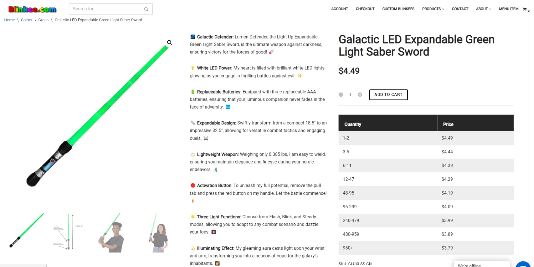
Blinkee is world-“infamous” for its inconsistent design language
These tiny differences might seem minor initially, but they add up quickly. Your carefully crafted brand identity starts to feel disjointed, and visitors notice something’s off — even if they can’t quite put their finger on it. The challenge multiplies with each new page, feature, or team member you add, turning what should be a straightforward design process into a constant battle against visual entropy.
Responsive Design Issues
On desktop screens, elements that look great side-by-side often stack awkwardly on mobile devices. Headlines that grab attention on larger screens may crowd smaller ones. Images that impact a desktop can slow down mobile loading significantly. Even your carefully chosen fonts might become hard to read on smaller screens.
The complexity increases when you consider different operating systems and browsers, each interpreting your design in its own way. What works perfectly in Chrome may shift unexpectedly in Safari, leaving you constantly adjusting your design.
Navigation menus that expand elegantly on a desktop can become cumbersome on mobile, and hover effects lose their purpose on touch screens. These responsive design challenges require deciding which design elements to keep across devices and which to modify or remove. These choices can greatly impact the user experience.
Performance vs Aesthetics
Visitors expect websites to load instantly while delivering magazine-quality visuals. Yet these demands often conflict directly with each other. That gorgeous hero image might force mobile users to wait precious extra seconds. Those subtle parallax effects could make scrolling jerky on older devices. Even simple design choices, like custom fonts or shadow effects, impact performance.
The challenge intensifies when designing for global audiences with varying internet speeds and device capabilities. What feels snappy on your fiber connection might become frustratingly slow on someone else’s 3G network — turning your carefully crafted visual experience into a test of patience.
Every design decision becomes a balancing act between visual impact and performance optimization, forcing tough choices about which elements truly justify their performance cost.
Brand Alignment
Making your website’s visual design match your brand’s personality isn’t just about slapping on a logo and calling it done. Brand alignment means every design choice — from micro-interactions to image style — needs to reinforce your brand’s core message. Yet many websites feel disconnected from their brand identity, creating jarring visitor experiences.
The disconnect often starts when trendy design elements clash with established brand values. A serious law firm’s website suddenly sports playful animations. A luxury brand’s site uses budget-looking stock photos. A youth-focused brand ends up with stuffy corporate layouts. These misalignments confuse visitors and erode trust — like showing up to a black-tie event in beachwear.
The challenge deepens when marketing teams and web designers interpret brand guidelines differently. Without clear direction, your website risks becoming a patchwork of competing visual styles that undermines brand recognition and authority.
Combine Visual Design & Website Building With Divi
A well-designed website starts with the right tools — ones that understand the art of visual design. Divi stands apart by focusing on the small details that bring websites to life.
You’ll notice this difference in everything from spacing adjustments to color choices, making each design decision feel as natural as sketching with pencil and paper. Good design tools should work alongside you — not against you. That’s why Divi works as your creative partner, turning your ideas into stunning websites without needing complex code with its visual drag-and-drop builder.
With over 200+ design modules and more than 2000 complete website templates, you can quickly create or redesign anything from galleries to homepages in just minutes.
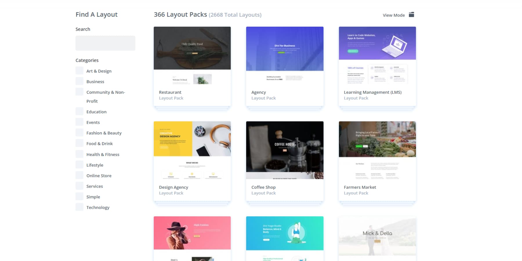
The visual builder follows your lead when you adjust white space or create new layouts. This natural back-and-forth lets you focus on what matters—making your design look precisely how you want it.
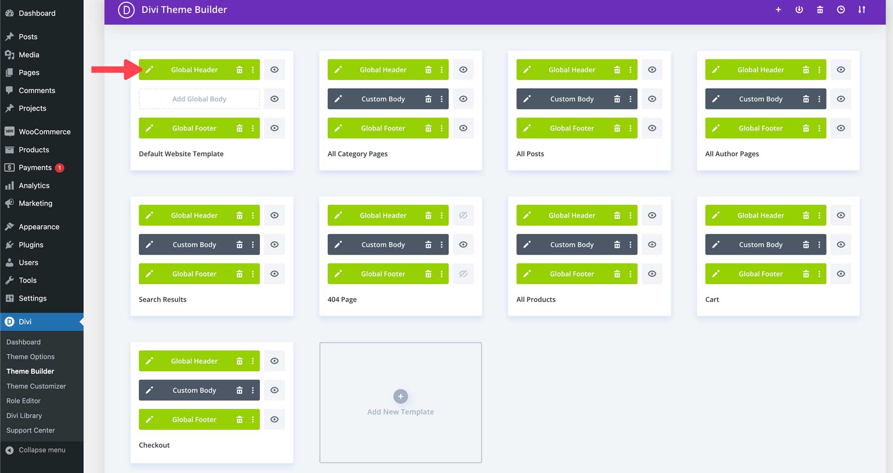
A consistent visual story across your website builds trust and recognition — that’s where Divi’s Theme Builder shines. Instead of wrestling with different styles for each page, you can craft headers, footers, and site-wide elements that perfectly match your visual design principles. Each element works harmoniously, creating a seamless experience as visitors move through your content.
These visual design elements must work together — from the spacing between menu items to how your footer adapts on mobile screens. Divi’s Theme Builder makes this natural, letting you apply design principles like hierarchy and balance across your entire site. Whether showcasing creative work or displaying products, your design stays cohesive and intentional on every page.
Visual Design Smarter, Not Harder With Divi AI
Visual design becomes even more powerful when paired with smart technology. Divi Quick Sites with Divi AI understands the principles of good design — delivering complete websites that balance white space, typography, and visual hierarchy right from the start.
Your design vision comes to life in minutes, not days, with every element thoughtfully placed and ready for your personal touch.
Modern design challenges need modern solutions — that’s where Divi AI steps in. Rather than spending hours tweaking layouts or searching for the right visual balance, you can focus on the bigger picture. Need a heading that perfectly emphasizes your key message?
Or an image for your product?
Or perhaps a contact form for your customers to contact you?
Simply describe what you’re looking for, and watch as Divi AI naturally combines design principles without you having to dive into complex code.
These tools work together to ensure your visual design stays cohesive and impactful. From creating balanced color schemes to suggesting intuitive layouts, Divi’s AI capabilities make professional design principles accessible to everyone.
Thoughtful Design, Endless Adaptability
Looking for a more curated approach to visual design? Divi Quick Sites offers a collection of distinctive starter sites, each crafted with unique visuals and thoughtful layouts you won’t find elsewhere. Pick the design that speaks to your style, add your brand elements, and launch with confidence, knowing every menu, page, and section follows proven design principles.
Small details make big differences in visual design. Each starter site combines carefully chosen colors, typography, and spacing to create clear visual paths for your visitors. From smooth-flowing navigation to eye-catching blog layouts, every element serves a purpose while maintaining professional polish. The best part? You can fine-tune any element using Divi’s visual builder.
These designs aren’t static templates but flexible foundations that adapt as your needs change. The visual builder lets you adjust everything from subtle spacing to complete layouts, ensuring your site’s design principles stay strong as you grow. Add new pages, update content, or refresh your look while maintaining the professional edge of your site.
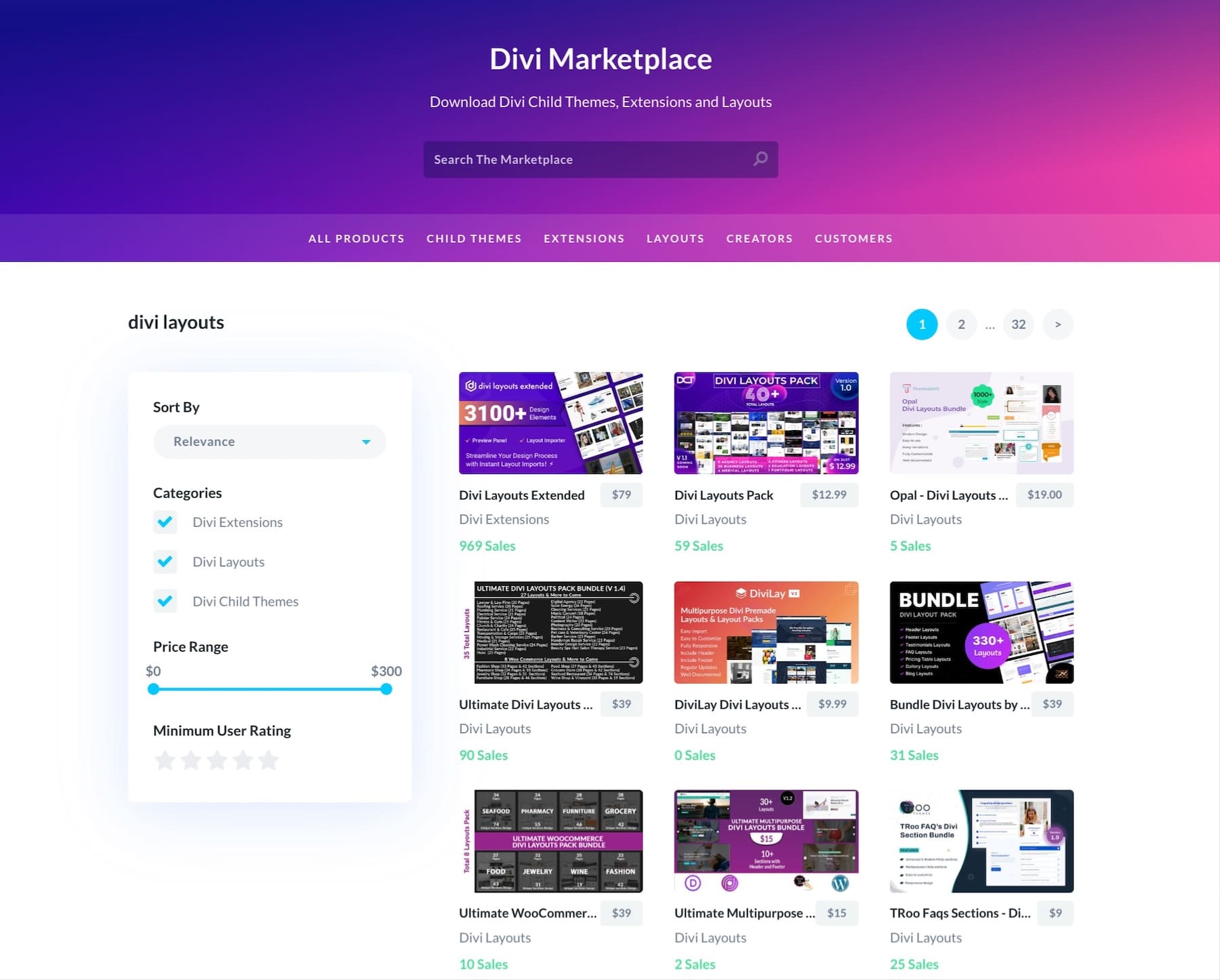
Visual design trends evolve — and Divi evolves with them. Regular updates bring fresh features that align with current design principles and web standards, keeping your toolkit sharp and relevant. The Divi Marketplace adds more value, contributing professional child themes, extensions, and design packs that showcase modern visual approaches.
Your design needs might expand beyond basic visual elements — that’s why Divi works seamlessly with 75+ WordPress plugins and services. This compatibility means you can enhance your site’s visual design while adding powerful features, from advanced galleries to dynamic content displays.
Building A Robust Visual Design Approach
Turn scattered design decisions into a systematic approach that scales. Here’s how to build a quality foundation while saving time and effort on every project.
Setting Design Standards
Creating clear design standards saves countless hours of back-and-forth revisions and ensures your website maintains visual harmony. Start by defining your core styles — from exact color codes to specific font sizes for different heading levels. Document spacing rules between elements and sections to maintain a consistent rhythm across pages.
Using Divi’s Global Presets makes implementing these standards effortless. Rather than manually updating each element, changes to global styles automatically apply site-wide. Build a collection of go-to button styles, dividers, and section layouts that match your brand guidelines. These become your visual building blocks.
Remember to set standards for image treatments, too. Consistent image handling strengthens your visual identity whether you prefer rounded corners on photos or specific overlay effects. Keep these standards in a shared document that your team can easily reference, ensuring everyone works from the same visual playbook.
Using A Reusable Component Library
Building websites with reusable components transforms scattered design elements into a systematic library. Think of components as your design DNA — each button, card, and section becomes a standardized piece you can quickly deploy across pages. This approach cuts design time dramatically while maintaining visual consistency.
Break down complex layouts into smaller, reusable parts. Headers, testimonial blocks, and feature sections become modular components you can mix and match. With Divi Cloud, your team can access these components from anywhere — no more downloading files or manually checking for options. Save a styled testimonial block once, store it in Divi Cloud, and your entire team can instantly use it across different projects.
Focus on creating flexible components that work across different contexts—like cards that look good, whether they display team members, services, or blog posts. Store these in your Divi Cloud library, and watch how quickly your team can build consistent, professional layouts without starting from scratch every time.
Visual Design Documentation
Clear documentation prevents design chaos, especially when working with teams. Beyond basic style guides, document the reasoning behind design decisions — why certain layouts work better for specific content types or how different components should interact. This knowledge-sharing prevents future design conflicts and speeds up onboarding for new team members.
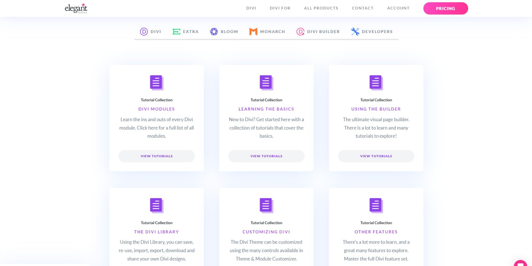
Divi’s extensive documentation is an excellent foundation here — every feature and module is thoroughly explained, with practical examples and use cases. Plus, our 24/7 support team stands ready to clarify any questions, ensuring you’re never stuck wondering how to implement a specific design element.
Create living documentation that evolves with your projects. Record successful design patterns, note which components work best in different scenarios, and maintain a clear hierarchy of design decisions. Screenshots and video recordings of your building process help team members understand what to do and why certain approaches work better than others.
Cross-Platform Consistency
Maintaining design consistency across different devices and platforms can feel like solving a puzzle. Your website needs to look polished whether visitors browse on their phones, tablets, or desktop computers — each with different screen sizes and capabilities.
Focus on establishing breakpoint standards that determine how layouts adapt across devices. Set clear rules for how images scale, text wraps, and menus transform. Divi’s responsive editing controls make this process intuitive — you can fine-tune every element’s appearance for each device size right in the visual builder, ensuring your design principles stay intact regardless of screen size.
Optimizing Visual Design Workflow
Smart designers know that efficiency doesn’t mean cutting corners. Here’s how to streamline your process while maintaining design integrity from concept to launch.
Refine Design Processes
Streamlining your design workflow starts with identifying repetitive tasks that slow you down. Create a systematic approach for common design elements — from creating new pages to implementing brand colors. Divi’s right-click options and keyboard shortcuts reduce repetitive actions, letting you work faster without sacrificing quality.
Build your process around reusable elements. Start projects by setting up global styles and saving commonly used sections to your Divi Cloud library. This foundation makes it easier to maintain consistency while moving quickly. Remember to regularly review and update your workflow — what worked for smaller projects might need adjustment as you tackle larger ones.
Version Control Methods
Smart version control prevents design disasters and keeps your work secure. Before making major design changes, create backup points you can return to if needed. UpdraftPlus works seamlessly with WordPress and Divi, letting you save complete snapshots of your website with just a few clicks — think of it as your design time machine.
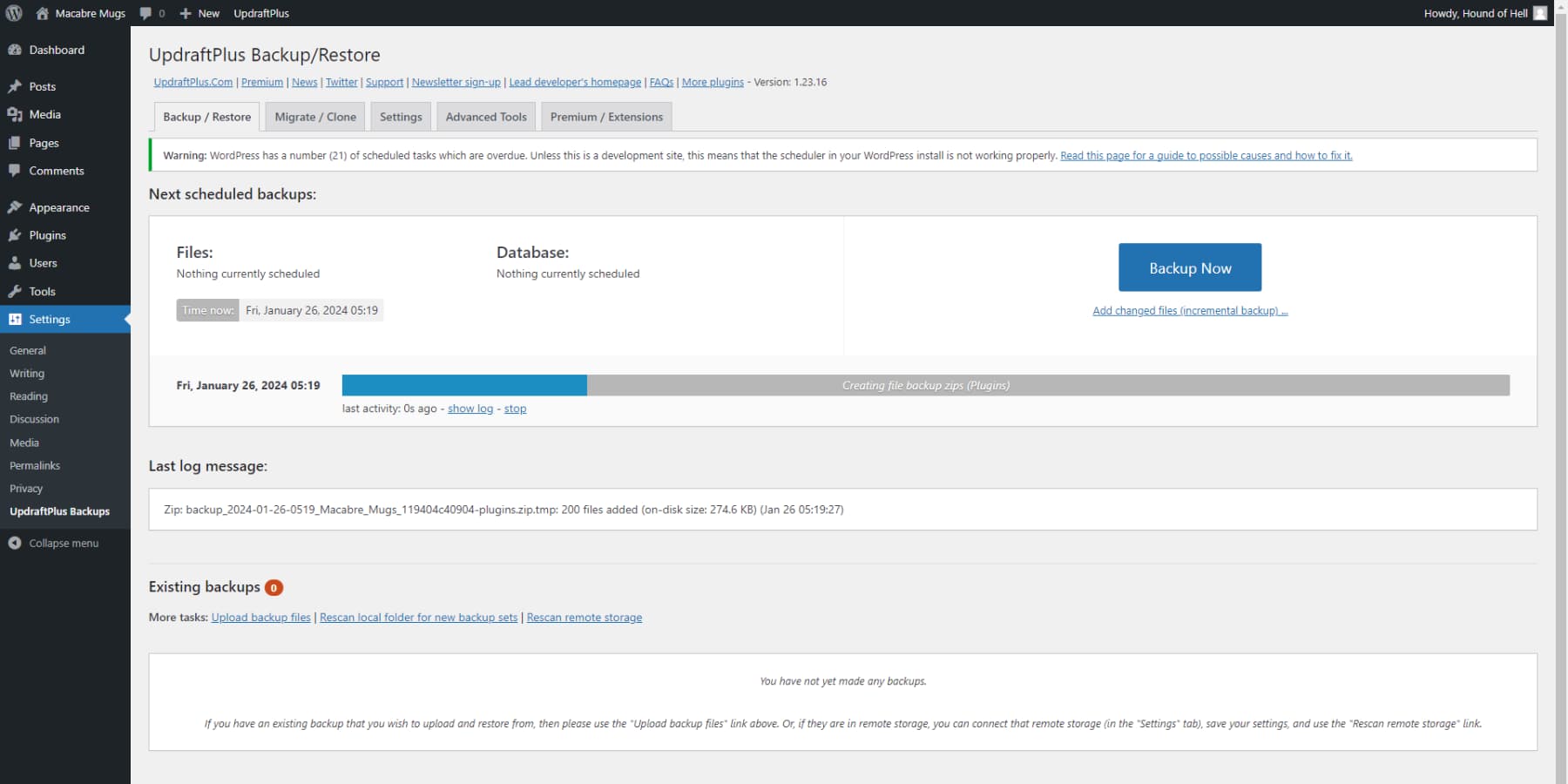
Track different design versions as you experiment with layouts or test new features. Document significant changes and their impact on user experience. This systematic approach helps you understand what works best for your audience while maintaining a safety net for bold design experiments. Regular backups ensure you can confidently push creative boundaries without risking your live site’s stability.
Design System Management
Effective design systems grow with your projects while maintaining consistency. Rather than creating one-off solutions, build a living system that evolves with your needs. Set clear rules for adding new design elements — from spacing standards to interaction patterns — ensuring additions strengthen rather than dilute your visual language.
Organize your design assets logically, making them easy to find and implement. Create clear categories for layouts, modules, and style variations. Regular audits help identify which elements are working well and which need refinement. This systematic approach saves time while ensuring your design system remains a valuable resource rather than a cluttered collection.
Performance Optimization
Your stunning design needs speed to match its looks. Start with a solid foundation using SiteGround’s optimized hosting. Their servers are specifically tuned for WordPress, ensuring faster load times right from the start.
Divi’s visual elegance extends deep into its technical foundation. While you design in real time through the visual builder, Divi generates streamlined code that keeps your site swift and search-engine friendly. This isn’t just about looks—it’s about performance.
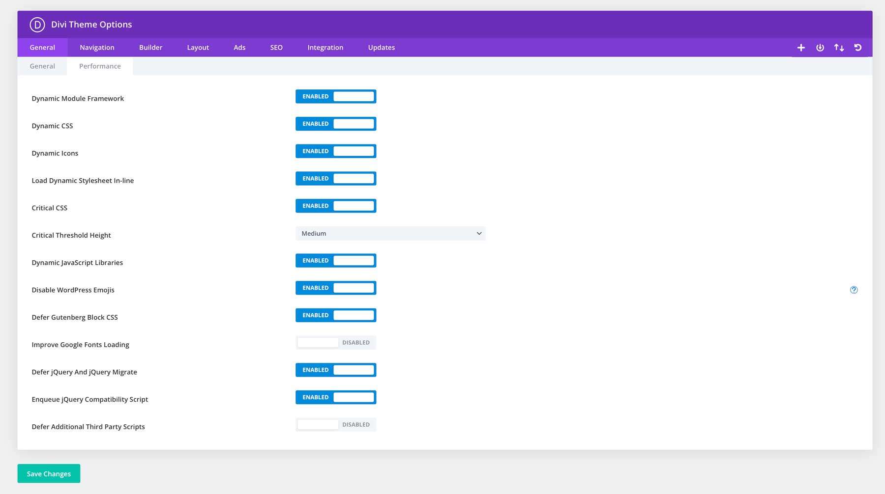
Intelligent optimization runs through Divi’s core architecture. The Dynamic Module Framework loads only what your design needs, nothing more. Dynamic JavaScript and CSS work behind the scenes to keep your code lean, while Critical CSS ensures your designs appear quickly for visitors. These technical details might sound complex, but they work seamlessly within the visual builder — letting you focus on design while Divi handles the heavy lifting.
WP Rocket takes performance further by intelligently caching your pages and optimizing code delivery. Its lazy loading features ensure images and videos load only when needed, keeping your design snappy without sacrificing visual impact. For image-heavy designs, EWWW Image Optimizer automatically compresses your visuals without noticeable quality loss — perfect for maintaining crisp, professional looks while keeping load times low.
These tools work seamlessly with Divi, letting you focus on design while they handle the technical work.
Design Better, Starting Now
Visual design principles aren’t just theory — they’re your toolkit for creating websites that genuinely connect with visitors. By mastering these elements and implementing them thoughtfully, you’ll craft experiences that guide, engage, and convert.
While other designers get stuck in endless revision cycles, you could launch beautiful, effective websites in half the time. Divi’s Visual Builder, Quick Sites, and AI assistant make creating professional designs that convert easier than ever.
Why fight your design tools when you can join the Divi revolution and start creating websites that make your competition nervous?



Leave A Reply