

Think about the last time you walked into a store that just felt right. The entrance, the layout, the first few steps — everything clicked. Your website’s header works the same way. It’s that crucial first moment when someone lands on your site, and their gut tells them whether to stick around or bounce.
Some of the web’s biggest brands nail this moment perfectly, while others fumble it completely. Taking notes and replicating these ideas is easier than ever, especially if you’ve got Divi in your toolbox. Let’s explore what makes headers actually work and ideas you can adapt for your website today.
The Psychology Behind Memorable Headers
Your website’s header sets the tone when someone lands on your page. Sure, you could throw together a logo and navigation menu, but the real magic happens when you dig into the psychology of how people interact with headers.
Think about walking into a well-designed room. Nothing feels forced or out of place. That’s exactly how a good header works:
- Our brains are lazy — in a good way. We’ve spent years learning where to look for certain things on websites. Put navigation where visitors expect it, and they’ll browse your site without missing a beat. Fight against these patterns, and you’ll lose them before they start.
- Colors hit harder than most realize. That knot in your stomach when you see a bright red warning sign? That’s your brain’s instant reaction to color at work. Smart header design taps into these gut feelings to set the right mood.
- Breathing room matters more than you’d think. Pack your header too tight, and visitors’ eyes get cramped. Give each element just enough space, and suddenly, everything flows — like a well-paced conversation rather than someone talking too fast.
When these elements come together naturally, visitors don’t notice your header — they just intuitively know where to go next. That’s the sweet spot.
Building A Header That Works
Headers make or break your website’s first impression. You’ve got about three seconds to hook someone before they bounce. Let’s skip the fluff and look at what makes visitors stick around — and what sends them running for the exit button.
Logo Placement: Where Eyes Naturally Travel
Your website logo needs a home where visitors naturally look first — typically in the top left corner. But here’s what most designers miss: the logo’s size and position create an invisible anchor point for everything else on your page. Think of it like setting up dominos — that first piece determines how the rest will fall.
When a logo sits too high, it creates awkward dead space below. Too low, and your header feels top-heavy. The sweet spot? About 20-30 pixels from the top edge, giving enough breathing room without floating in space. The width matters, too — your logo should take up roughly 15% of your header width on desktop screens. Any larger and it overshadows your navigation; any smaller and it loses authority.
Some brands are breaking this rule successfully by centering their logos, but there’s a catch — it only works when your entire layout follows through with that centered symmetry. Some websites pull this off beautifully because their whole interface builds around that centered focal point. The key is understanding these “rules” aren’t rules at all — they’re more like guidelines that work until you have a good reason to break them.
Think about the last great conversation you had. Nobody handed you a script — you naturally knew when to listen, when to respond, and where the chat was heading. Great website navigation works the same way. It’s not just a menu; it’s a dialogue with your visitors.
Most navigation menus fall into the same trap — they’re either stuffed with every possible option or stripped down to the point of uselessness. The sweet spot? Five to seven main menu items. That’s not a random number — it’s based on how our brains process information in chunks. Ever notice how phone numbers are broken into three- and four-digit groups? Same principle.
The order matters more than you’d think. Put your most valuable pages first and last — that’s where people’s eyes linger. Those items in the middle? They need to flow logically, like stepping stones across a stream. And while clear, inviting labels work best (“Our Story” beats a bland “About”), don’t get too creative. Nobody wants to click on “Witness Our Journey From Humble Startup to Profit-Maximizing Overlords” to learn about your company. Keep it simple, keep it clear, but make it interesting enough to click.
Call-to-action buttons in your header aren’t just decorative elements—they’re conversation starters. But most websites get it wrong by cluttering their headers with too many choices, paralyzing visitors with decision fatigue.
Here’s the golden rule: stick to two buttons max. One that shouts (think “Get Started” in a bold, contrasting color) and one that whispers (maybe “Log In” as a subtle text link or ghost button). This isn’t just aesthetic preference — it’s psychology. Hick’s Law shows that every additional choice increases decision time logarithmically.
In other words, adding that third or fourth button multiplies the mental effort required. It’s like when you’re at a restaurant with a 20-page menu (yes, we’re looking at you, Cheesecake Factory 👀) versus a leaner one-pager. Which one makes you more likely to order quickly and confidently?
Placement matters as much as quantity. Right-aligned buttons feel natural because they sit where most languages end their sentences. The space between your navigation and these buttons? That’s not empty space — it’s breathing room that helps visitors process their options.
And remember those mobile screens: buttons need enough padding to be thumb-friendly without dominating the entire header.
Creating Visual Paths That Feel Intuitive
Look, your header isn’t just a box at the top of your page — it’s the starting point of every user’s journey. While most designers obsess over colors and fonts, they miss something crucial: how elements guide attention.
The most effective headers create natural movement without trying too hard. It’s not about arrows pointing to your CTA or overdone hover effects. Instead, it’s about understanding how subtle details like spacing, alignment, and contrast work together to move eyes exactly where you want them.
Here’s what works: Use your logo as the starting point. Let white space create natural breaks between elements. Align your nav items with purpose, not just because it looks neat. And most importantly — test it. Watch how real users move through your header. You’ll spot patterns you never noticed before, and fixing those awkward spots becomes obvious.
Meet Divi: Header Design Made Easy
Divi is a complete WordPress website builder that puts you in control. As you build, you’ll see your website take shape in real time, just like watching a sketch come to life.
With Divi’s 200+ design modules, you can point, click, and craft every part of your website exactly how you want it.
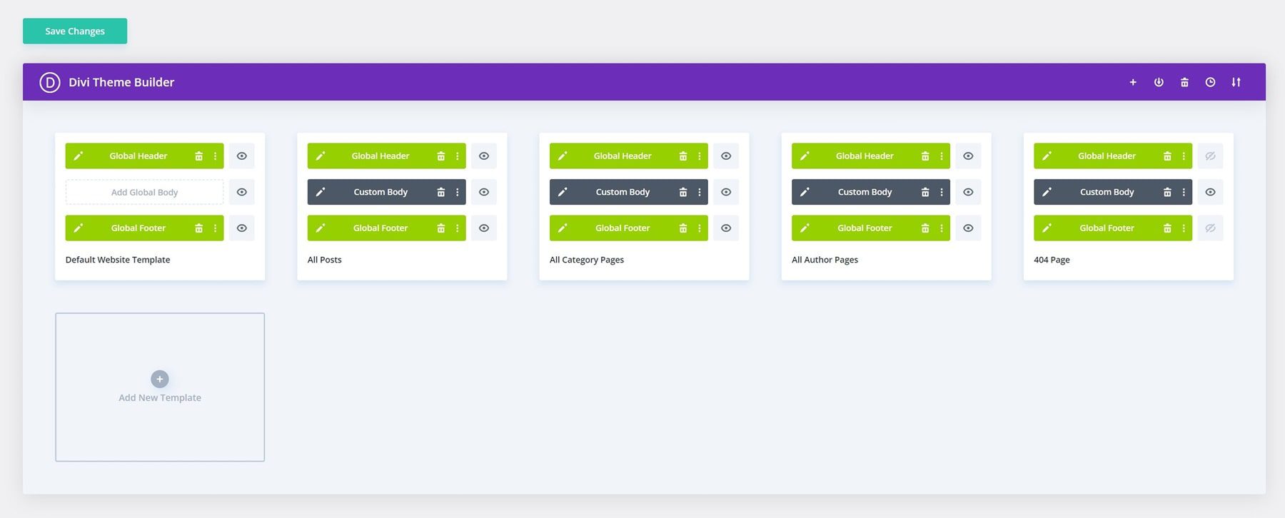
Divi’s Theme Builder lets you create reusable designs for every key section of your website — with headers being the most crucial element that appears across all pages. Your header template, once designed, automatically applies to your entire website. Plus, you can create different header designs for specific sections, like a unique header for your shop pages and another for your blog.
Want to update your site’s look? Divi’s global settings mean one click changes everything — from colors to fonts across your website. And when it comes to mobile design, you’ll see exactly how your site looks on every device while you work. No more guessing or constant preview switching.
Build Stunning Websites Faster
Never start staring at a blank canvas with Divi’s massive library of 2000+ website layouts. Each comes with carefully crafted designs you can tweak to match your style. Pick a layout you like and make it yours — change colors, swap images, adjust spacing. We’re always adding new designs, too, so you’ll never fall behind the latest web trends.
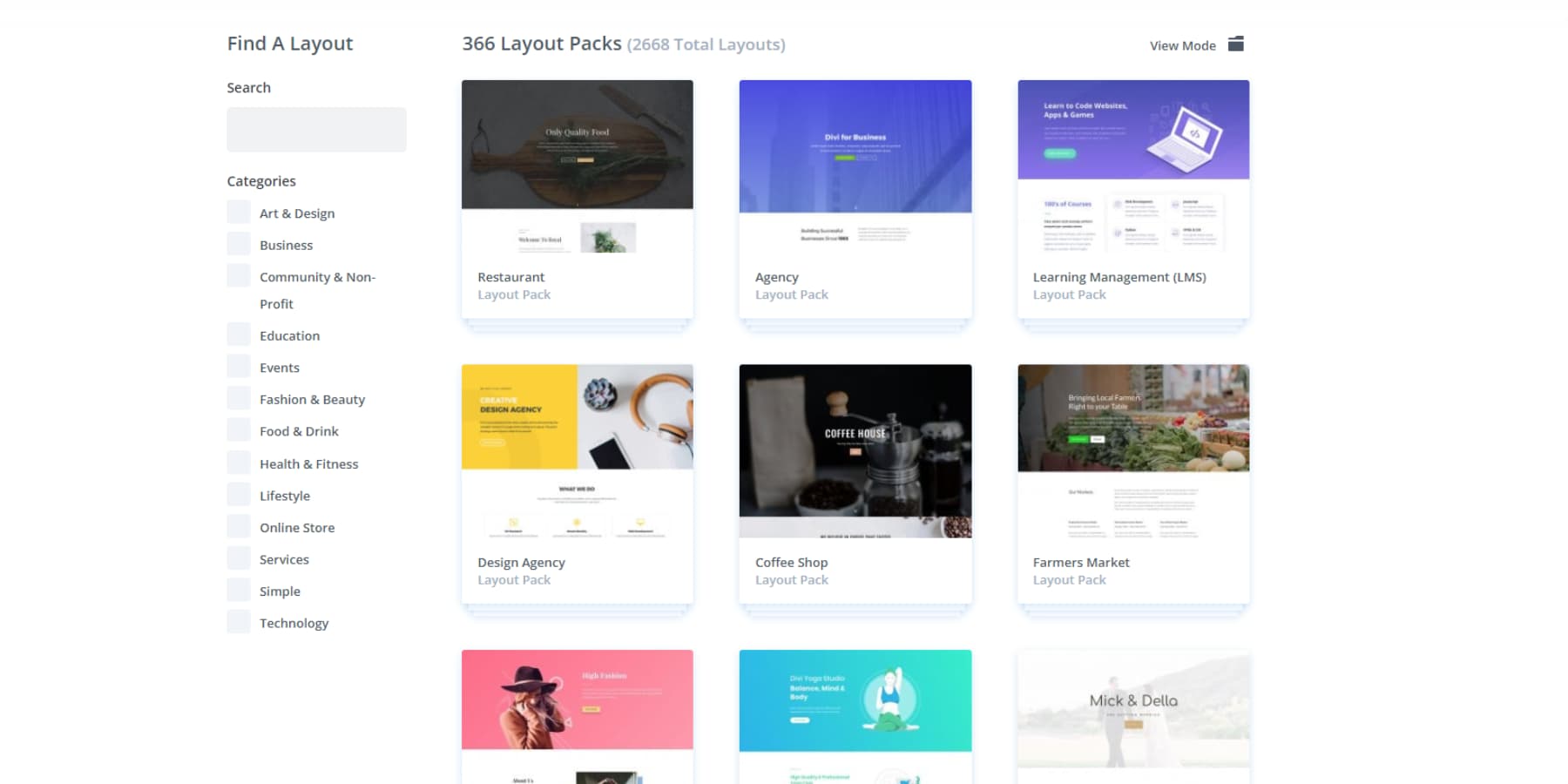
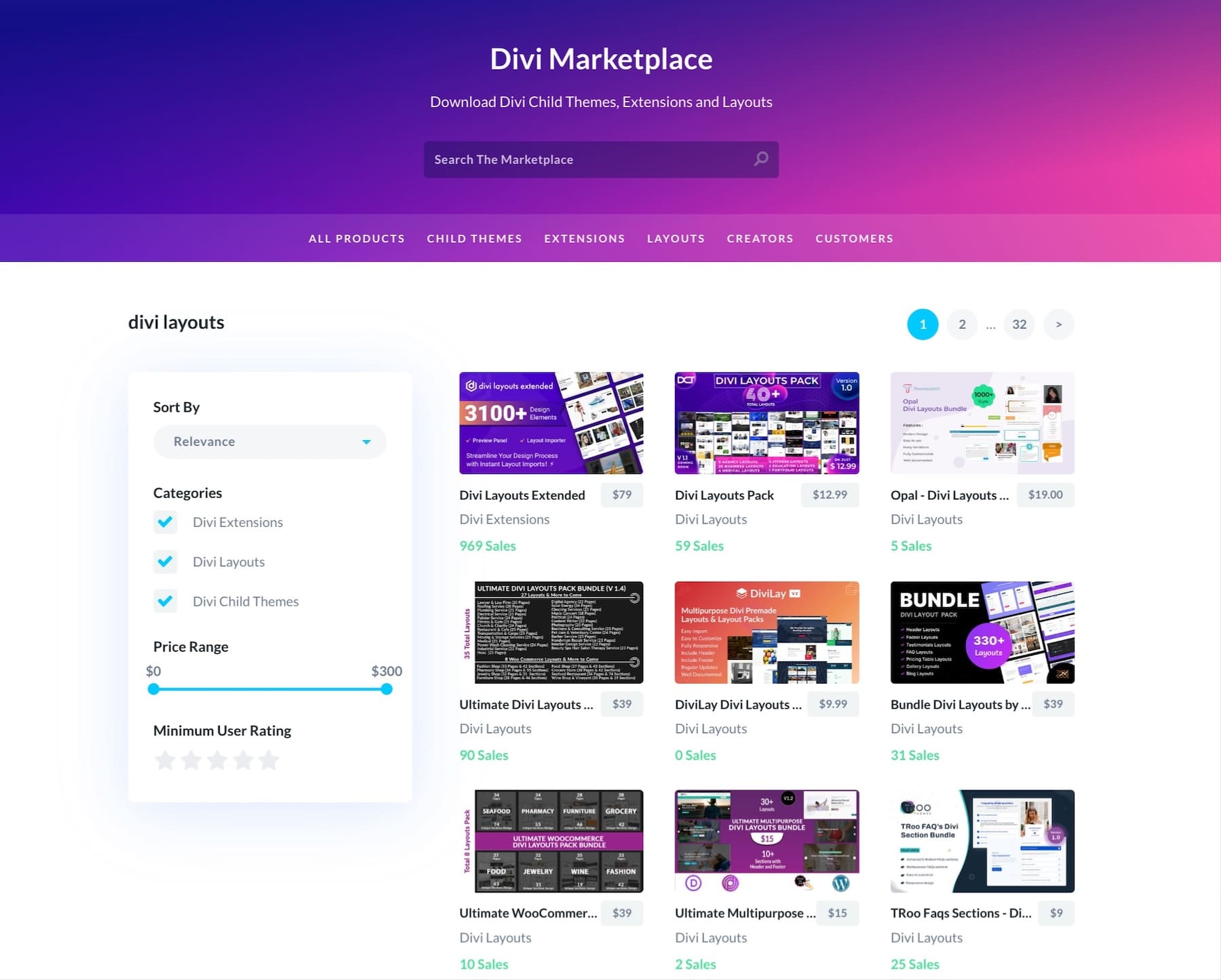
Looking for something extra special? Visit the Divi Marketplace. You’ll find unique header designs and complete layout packs created by seriously talented designers there.
You won’t be alone on your design journey, either. Our Facebook group is buzzing with 76,000+ Divi users sharing tips and helping each other. And if you ever hit a snag, our support team knows their stuff — they’ll help you nail that perfect header design.
Want to add more muscle to your header? Divi works smoothly with tons of WordPress plugins. Whether you need SEO tools, speed optimization, or marketing integrations, it works out of the box with 75+ plugins and services. And for the code-savvy folks out there, our open-source setup gives you all the hooks and filters you need to build custom solutions.
Let Divi AI Do The Work
Divi just got even better with built-in AI. With a few clicks, you can add fresh, on-brand content to any section.
You can even edit your images in Divi or generate new ones that fit your look perfectly.
Building new layouts? Tell Divi AI what you need, and it’ll create sections that match your style.
Need a complete website fast? Divi Quick Sites has your back. Tell Divi about your business, and our AI builds custom layouts packed with content and images that match your brand. Running an online store? It’ll set up WooCommerce for you, too. This goes way beyond templates — you get a website that feels custom-made.
We’ve also got a killer collection of hand-crafted starter sites. Our design team creates each one with custom photos and graphics. Grab the one you love, drop in your logo, and launch in minutes.
Every site you build with Divi Quick Sites — AI-generated or from our pre-built collection — comes with a solid design system. Your menus, colors, and fonts work together from the start. Adding something new? Global presets keep everything matching. Your theme settings handle the consistency, and every module pulls your brand style automatically. We take care of the design basics so you can focus on what counts — your content and brand.
Divi Pro: Big Savings, Big Results
Smart businesses know the value of professional tools. Divi Pro delivers premium features that streamline your workflow and boost productivity along with Divi AI (which costs $16.08/mo when purchased separately):
- Divi Cloud, normally $6 monthly, stores your layouts, designs, and brand elements in the cloud. Grab what you need for any project without digging through files or rebuilding from scratch.
- When purchased as is, Divi Teams costs $1.50/person monthly. It gives your team unified access to Divi’s complete toolkit. You can keep full control over permissions while your staff collaborates seamlessly on site updates, backed by our support, documentation, and AI features.
- Divi VIP, also $6 monthly when bought alone, delivers guaranteed 30-minute response times, round-the-clock support, and an extra 10% off Marketplace purchases.
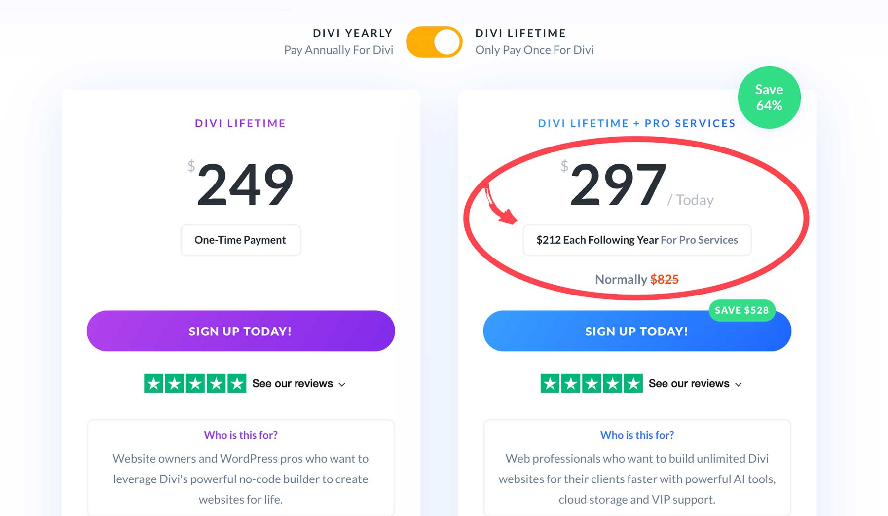
But here’s the smart move: A Divi Pro membership at $277/year bundles everything together — Divi AI, Cloud, VIP, and Team access for up to four members — saving you $388 compared to separate purchases.
Want lifetime access? Grab the Lifetime + Pro bundle at $297 for your first year, then just $212 annually. You’ll get permanent Divi access plus yearly Pro services — saving $528 overall.
While others piece together basic solutions, Divi Pro gives you a complete toolkit that keeps your website running like clockwork.
Website Header Ideas Worth Your Time
Forget those flashy header trends that look cool but do nothing for your visitors. These ideas focus on what matters: getting people to the right place, fast. No gimmicks, just headers that work.
The Minimalist Header’s Quiet Confidence
Forget what you’ve heard about minimalist headers being boring. When done right, they’re like a firm handshake—confident without trying too hard. The best minimalist headers nail the basics: clear navigation, smart spacing, and just enough personality to be memorable.
Working with Divi’s modules makes this style surprisingly simple to execute. Give your header plenty of room to breathe with generous padding (60-80px). Pick fonts that work together naturally. For example, a clean sans-serif for your menu items might be paired with something bolder for standout text. Stick to colors that mean business—you don’t need a rainbow when two or three shades work perfectly.
Want to know what makes minimal headers pop? It’s all about that one perfect accent. It could be a smooth hover effect on your menu item or a CTA button that stands out enough to catch attention without shouting. The goal isn’t to strip everything away — it’s about keeping what works and ditching what doesn’t.
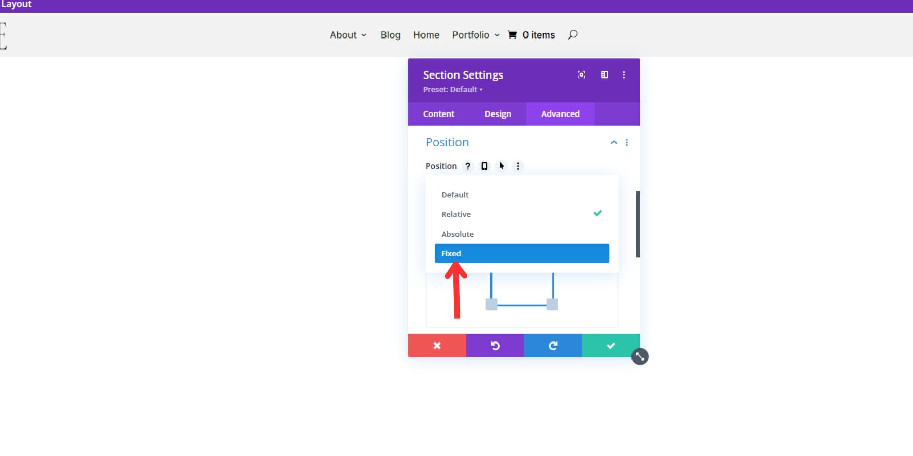
Sticky Headers That Never Disappear
Sticky headers solve a real problem — keeping navigation handy without cluttering the screen.
However, most websites mess up the execution by keeping their headers exactly the same while scrolling. That’s like wearing a winter coat in summer — technically functional, but missing the point entirely.
Divi’s position options nail these transitions perfectly. Want to level up? Combine sticky properties with scroll-based animations for headers that respond naturally to scrolling — think smooth fades that feel intentional, not forced.
Ever notice how some websites feel more open, more inviting right from the top? That’s often the magic of a transparent header at work. Rather than slapping a solid bar across the top of your page, these headers let your background content shine through — and they’re a game-changer for modern web design.
![]()
Think about walking through a glass door versus a solid one. That’s the difference a transparent header makes. Your navigation stays right where visitors expect it, but now they get an uninterrupted view of your hero section, whether that’s a stunning photo, a video, or a gradient background.
Divi makes transparent headers surprisingly straightforward to build. The Theme Builder has all the settings to adjust background transparency and text contrast. The trick is finding that sweet spot where your navigation stays readable without blocking your hero content.
Here’s what really makes transparent headers worth your time: they adapt to any content you put behind them. Running a photography business? Your images get more room to breathe. Launching a startup? That sleek, modern vibe comes built-in. Plus, with Divi’s theme builder, you can create different page header styles — perfect when your homepage needs a different look than your blog.
Animated Headers With Purpose
Motion brings websites to life, and animated headers pack serious conversion power when done right. These aren’t just fancy tricks — they’re strategic design choices that guide visitors through content while making websites feel more polished and professional.
Divi’s animation toolkit turns these advanced techniques into point-and-click simplicity.
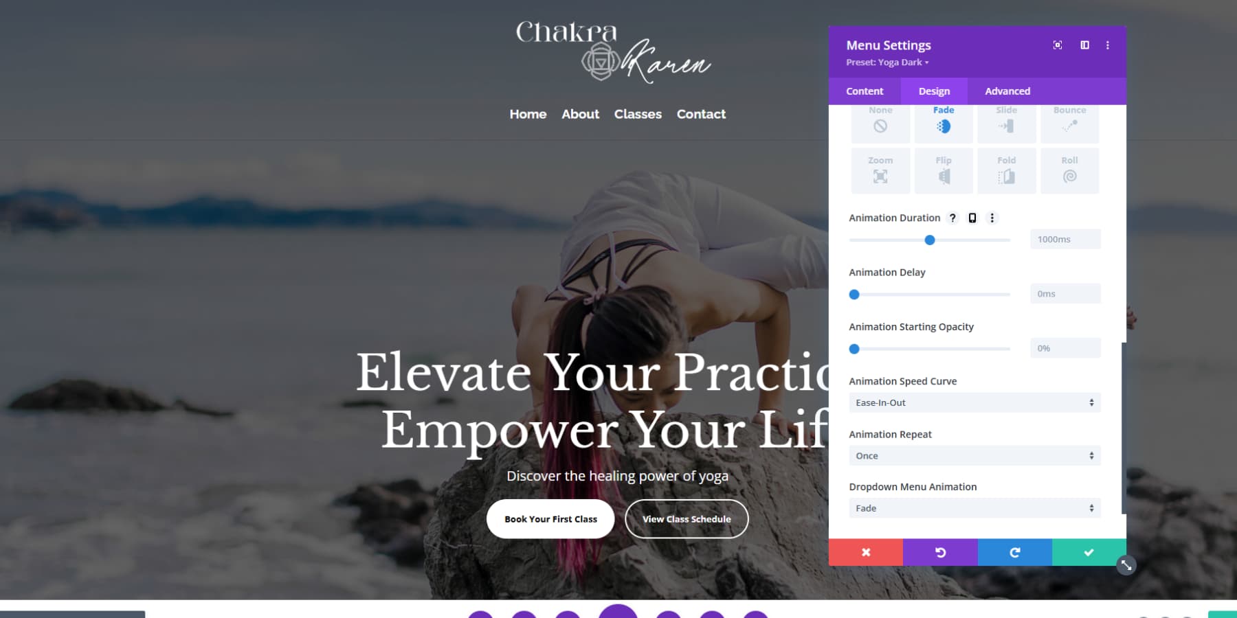
The sweet spot? A 400ms fade-in for the main header, with easier 600ms movements for hero section items. Layer different animations using staggered delays, and suddenly, that header tells a story instead of just sitting there.
Pro tip: treat animations like seasoning — just enough to enhance, not enough to overpower. A well-timed logo reveal paired with smooth menu transitions will outperform a dozen random effects every time. Divi’s intensity controls help nail that perfect balance between subtle and striking.
Headers With Personalization
Static headers waste prime website real estate. When your header adapts to different contexts and user behaviors, it transforms from basic navigation into a powerful conversion tool. Smart personalization guides visitors toward relevant actions while making your site feel more thoughtfully crafted.
Divi’s conditions option lets you create headers that respond to real user context. For example, you can show time-sensitive announcements during specific hours, adjust navigation for logged-in members, or display different content based on previous page visits.
For online stores, your header can shift based on cart status — turning casual browsers into buyers with well-timed prompts.
But here’s the thing about personalization — subtlety wins. Before diving into condition settings, determine exactly how your header should behave. Test each scenario thoroughly, especially when combining multiple conditions. Skip the fancy tricks unless they serve a clear purpose.
The best-personalized headers feel invisible, quietly guiding visitors without drawing attention to the technology behind them. When done right, users shouldn’t notice the personalization — they should just find what they need faster.
Headers That Break Tradition
Most headers look the same — logo on the left, menu on the right, stuck in a horizontal bar at the top. The best sites today are rethinking this tired layout, proving that headers can do more than just look pretty.
Split your navigation into unexpected zones, tuck your menu into a side panel, and let your header morph as visitors explore different sections. These aren’t just design stunts—they’re fresh ways to guide visitors through your content. Look at editorial sites using full-screen menus that showcase featured stories or photography portfolios where minimal headers let the images command attention.
Divi’s Theme Builder lets you experiment with these bolder choices without wrecking your site’s usability. Play with visibility settings to control what shows where, manage overflow for creative layouts, and test different approaches for various sections. But remember — breaking convention means extra testing. Your artistic header should still make sense on phones and tablets. Push boundaries, but keep your visitors’ needs front and center.
Build A Pro Header Today
The best website headers do more than look good — they guide visitors, boost conversions, and make your site feel professional. You’ve seen the strategies that work, from smart sticky navigation to headers that adapt to your visitors’ needs.
Ready to build yours? Start with a solid foundation: SiteGround’s lightning-fast hosting and WP Rocket to keep everything smooth. Then, watch your header ideas come to life with Divi’s visual builder. Need more firepower? Divi Pro brings AI-powered layouts, cloud storage, and priority support to your toolkit and everyone on your team.
Your perfect header is waiting. Let’s build it together.


Leave A Reply