Personal websites are often used to create online resumes or a course of life (called a Curriculum Vitae, or CV). Sometimes they’re used as the About page while other times they’re the entire website. They can be a single page or a multi-page site.
You don’t have to build them from scratch. There are lots of pre-made Divi layouts for resume websites available to give you a head start on your next project. In this article, we’ll look at 10 Divi layouts for resume websites. The layouts are in no particular order.
Subscribe To Our Youtube Channel
10 Divi Layouts for Resume Websites
1. Resume
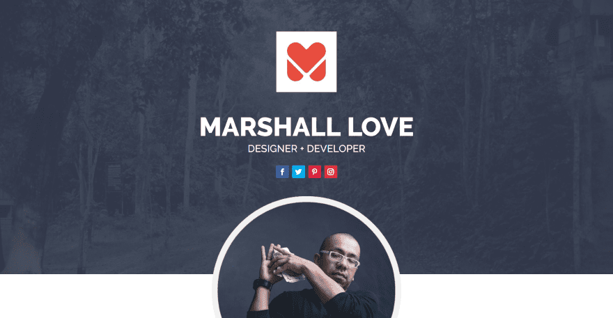
Resume is a one-page layout designed specifically for resumes and personal projects. It includes 6 main sections. The hero section shows a full-width background with a dark overlay. Over this is the logo, name, title, and social follow buttons. A circled image of the person overlaps this and the next section, which provides About Me information. This section includes a button to download the resume, contact info, and blurbs for hobbies and interests. A Resume section shows items on a vertical timeline that alternates sides. Milestones are shown with number counters and include icons. Blurbs show services provided. Circle counters describe the skills. The work process is displayed with a graphic of the steps. It also includes a portfolio, CTA, and contact form.
Price: $20 | More Information
2. CV Expresso Lite
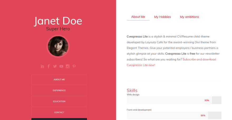
CV Expresso Lite is a one-page layout with a split-screen design. The left side of the screen includes a red background with the name, title, circled image, social buttons, and links to the sections of the page and a download button. Links remain on-screen on scroll. The right side includes tabs for about, hobbies, and ambitions. Skills are shows within bar counters. Experience and education are shown on vertical timelines with the dates on one side and the descriptions on the other. The Contact section lines up the items vertically and includes large icons and text. A back-to-top button with an up arrow is centered at the bottom of each section.
Price: Free | More Information
3. Personal Page
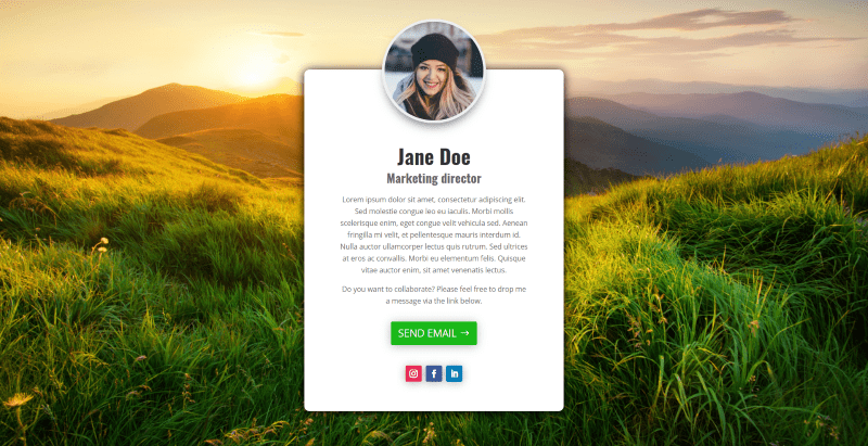
Personal Page was made to create a personal landing page. It provides all of the personal information on a single screen to help focus on conversions. It includes CSS to ensure that it covers 100% of the screen. It provides an area for the full-screen background image. A box with rounded corners and shadow effects sites in the middle of the screen. A circled image overlaps the top of the box. The box includes the name, title, information, a button for email, and social follow buttons. If the background image isn’t large enough to fill the screen it will leave an empty space at the bottom and the information box overlaps the bottom.
Price: $4.99 | More Information
4. CV Layout Pack
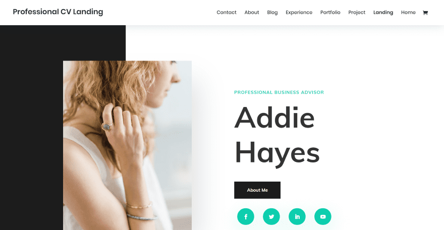
CV Layout Pack includes 8 pages with a page dedicated to each of the elements of the resume. The home page includes a two-color background and displays an image that overlaps the columns. It also shows the title, name, button to see the About Me page, and social follow buttons that overlap the next section. A section for experience shows information on one side and the experience in the other. An Awards section uses a similar design. Another section includes large text with a CTA. Skills are shown within bar counters and bullets. It also includes client logos, projects in two columns that alternate, and a contact section in two columns.
Price: Free | More Information
5. Actor CV Layout Pack
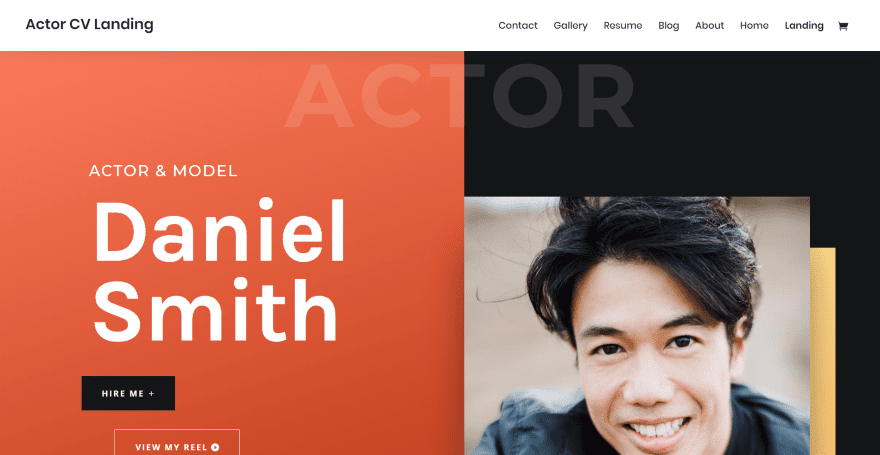
Actor CV Layout Pack was made for actors and models. It includes 7 pages. The landing page displays a split-screen with the title, name, and buttons on one side and an image on the other that overlaps a block of background color. The title is placed across the top in large text that blends in. Social buttons sit vertically between the two columns. A two-column About section includes an image, text, and button to open a video. Full-width testimonials are used to show reviews. A resume section shows information with number counters and lists of work and education. It also includes projects for recent work, a gallery, a blog section that overlaps several backgrounds, a two-column contact section, and a full-width CTA.
Price: Free | More Information
6. About Me
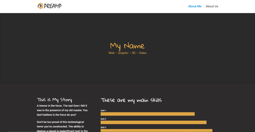
About Me is a single page layout for any type of About page including CV and resume pages. It has a dark background with white and bold yellow text and graphics. The title area of the page shows the name and titles. Following this is a two-column section with information in one side and bar counters in the other to show skills. Achievements are shown within blurbs. Other sections follow this design and add images or other information. The Skills section uses yellow dividers and shows skills in an alternating layout. A full-width slim CTA in bold yellow separates each of the sections. Another includes social follow buttons and a button to download the resume.
Price: $17 | More Information
7. DDD About Me
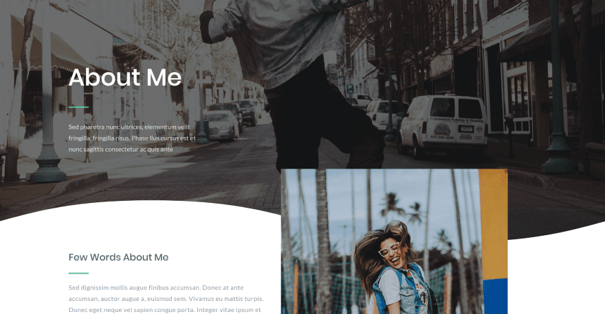
DDD About Me is a one-page layout to create any type of About Me page with a strong focus on resumes and CVs. The hero section shows a full-width image with the title and information in an overlay and a wavy divider. The next section includes more information and an image that overlaps them and continues into the next section, which displays skills in bar counters. Images of work are shown in a three-column mosaic layout. Styled testimonials display circled images at the top of the testimonial cards. The footer provides information and social follow links.
Price: Free | More Information
8. 1 page personal resume/CV
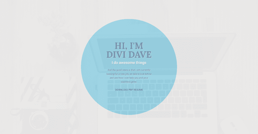
1 page personal resume/CV was designed specifically for resumes and includes CSS within a code module. The header displays a full-screen background image with a highly opaque overlay. In the center is a blue circle with an introduction and a button to download the resume in true parallax. The next section shows an image overlapping one side with a text module overlapping it. The other side provides information and has a shadow on hover. Skills are shown within bar counters. Work history is placed within a vertical timeline. Blurbs provide qualifications and references. Each of the rows includes text modules for labels that overlap the left side. It also includes a testimonial slider, blurbs for why to hire, and a contact section in true parallax.
Price: Free | More Information
9. About Page with Resume Timeline
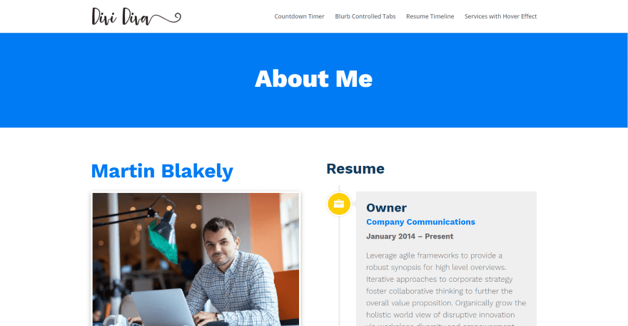
About Page with Resume Timeline is a one-page layout with freelancers in mind. A full-width title introduces the page. The page includes a two-column design with information on one side and the resume within a timeline on the other. The About information includes the name, image with border and shadow effects, text, and a testimonial slider with a blue background. The resume timeline was built with blurb modules. Each blurb slides into place as you scroll. They include the title, company, dates, and details. Each blurb module connects to the timeline to icons. The layout includes CSS in a code module.
Price: Free | More Information
10. Freelance About Layout
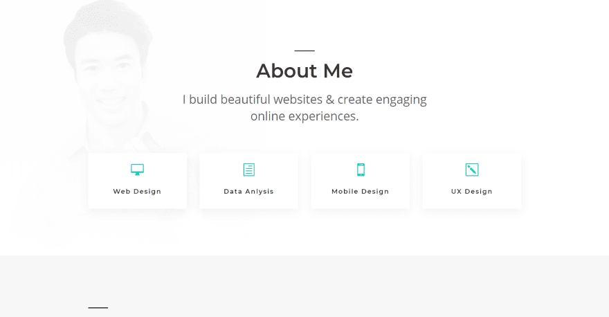
Freelance About Layout is a one-page About Me layout that’s designed with resumes and CVs in mind. It shows a background image behind a highly opaque overlay. The foreground shows the name and description followed by blurbs to show skills. Following this is a two-column section called My Story and three columns that list experience, education, and awards. A section describing what the person can do includes an image on one side the skills with bar counters on the other. It has a link to see examples of work. A contact section works as a CTA and includes contact info and a contact form over a background with a dark overlay.
Price: Free | More Information
Ending Thoughts
That’s our look at 10 Divi layouts for resume websites. They include everything you need to highlight and display your work history, education, and skills for potential employers to make their decision. Whether you need a one-page or multi-page design, if you’re interested in building a resume website these Divi layouts can help you get started.
You can also use a timeline plugin to help you create work history timelines without using a pre-made layout.
We want to hear from you. Have you used any of the Divi layouts for resume websites? Let us know what you think about them in the comments.
Featured Image via iiierlok_xolms / shutterstock.com


Are the CV Layouts included in the membership?
Hi.
How can I download the layouts according to number 4 & 5 ??
There are only the image packs for downloading..
Berst – Frank
I got it 🙂
The extent of the influence of Resume Website design on client interest. because at this time many are looking for using Linkedin.
I like the CV layout pack. Is there any layout for specific CV like for accountants, engineers or doctors etc? This is important as the format of CV is different for specific industry.
Hi,
Great resource, thanks for putting this together! We’re big fans of the Divi theme, but we’ve noticed a couple of limitations when it comes to the H1 tag…