Project pages are great for showing potential clients the type of work you do. They often include case studies, which helps show your expertise and gives them a realistic idea of what to expect. There are several ways to create project pages with Divi. In this article we’ll look at 10 Divi sites with awesome services pages to help inspire you for your next Divi website.
Project pages typically include elements such as images, galleries, sliders, video, testimonials, and calls to action. I’ll show an image of the section I like and discuss what I liked about it. The websites are in no particular order. Hang around until the end for a few links to help you level up your own unique project page.
1. BCBD
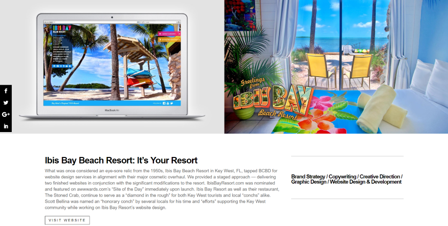
This one shows a screenshot of the project within a laptop screen on one side and a larger screenshot on the other. Under the images is a two-column section with a title, description, and link to the website in one column, and a list of services provided in the other column. Under this is a section with screenshots of the website as displayed on different devices, a testimonial from the client, a divider, and a button to see the next project.
2. Jupper
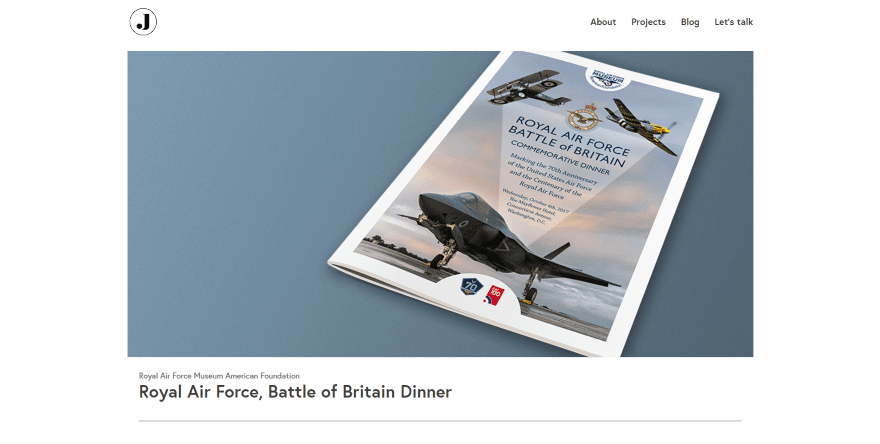
This project page displays an image of the project followed by the client’s name, name of the project, and a divider. The next section shows a description within the left column and an image of the finished product on the right using a box shadow. More images with box shadows show the finished product in a single column followed by a call to action. The CTA uses dividers for the top and bottom and utilizes text with clickable email.
See Website (Website is down.)
3. Communication Design Partnership
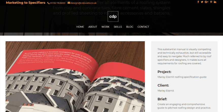
This one shows a full-width header with a background image, logo, menu, tagline, divider, and a company description. Scrolling reveals a 2/3, 1/3 row with a large image of the project in the larger column and description in the smaller column. The description includes a breakdown of the project including a title, client name, brief description, solutions, and links to download the project as a PDF, to a contact form, and back to the portfolio page. A set of images from the project along with styled text are used as a CTA.
4. Cubic Fox
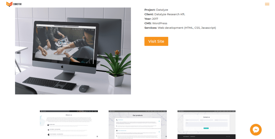
This project page displays an image of the project on a computer screen sitting on a desk. Text is placed next to the image and shows the project name, client, year, CMS, the services provided and a link to view the website. Under this are three screenshot examples of the project. Clicking on any of the images opens them in a lightbox. I like the screen-shot because it’s a real-world example.
5. Kim Vestergaard
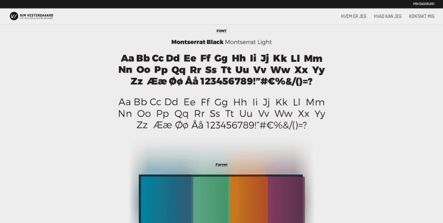
This site shows a small section in black with links to different areas of the website. Scrolling reveals images from the project in a single column. The images show the typeface used, the color palette, the project design (which is a logo), and then lots of examples of how it’s used. The examples show the logo over different colors, as a desktop background, within a header, on a website using different devices, within examples of poster ads, and on social media.
6. Learning

This one uses a clean design with a full-width image and project title in parallax. Under this is a title and then two columns. The first column is text and provides the project description and includes a testimonial in bold. The second column uses a gray background to stand out and provides the information about the school. Under this section is a link to download the project information as a PDF. Another full-width section provides links to related projects followed by a full-width CTA.
7. Patti Houston
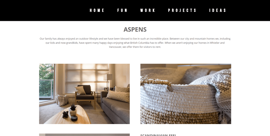
This one shows the project title and description followed by images of the project in a multi-column layout, alternating from a two-column to a one-column and short and tall images. One section includes text next to an image to provide more information about the project. Post navigation provides links to the previous and next projects. A divider separates the project from a CTA that’s built with text and a button. I love the layout of this one.
8. Blue Water Builders
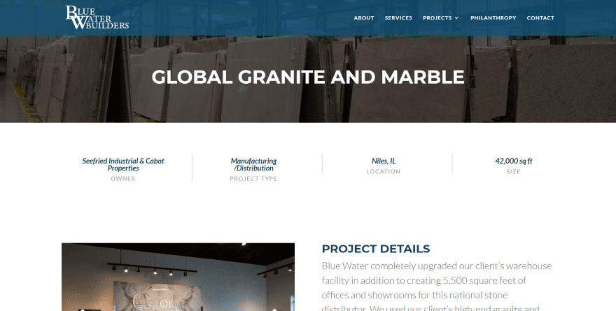
This project page displays a full-width header with a background image with an overlay and title. Project information is provided within a full-width section as text divided by vertical dividers. Two columns show the project image gallery and details with text. Following this is a section with company logos to see other projects, a map to see the project in person, and post navigation to the next and previous project.
9. Kenny Payero
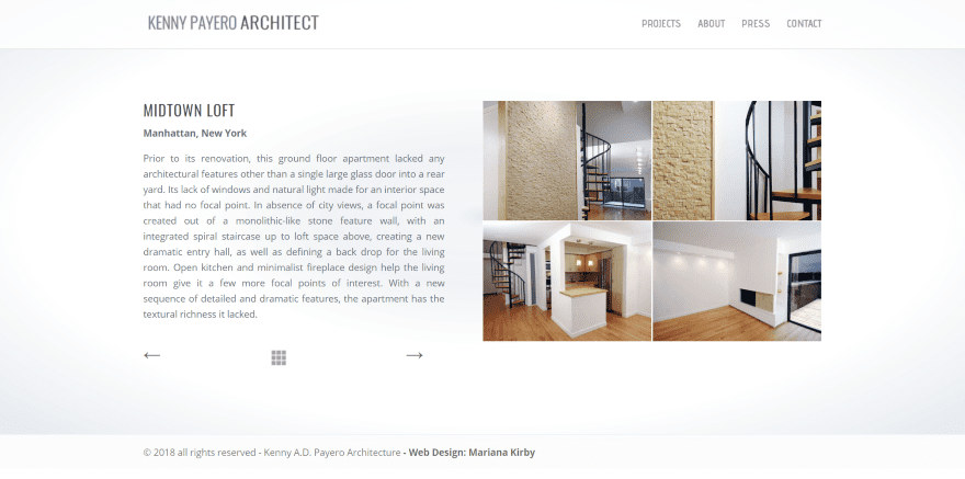
This one displays the project within two columns. The first shows the title, location, a description, post navigation to move to the previous and next project, and a button made of squares that takes you to the portfolio page. The second column displays images of the project within a grid. Clicking any image opens it in a lightbox.
10. The Zimmerman Group

This is one of the most elaborate on the list. It uses a full-screen header with background image, gradient, and client name as the project title. Scrolling reveals two columns with information about the client and blurbs of the services provided next to an image. Following this is a video about the client, images of the project including the website and ad campaigns (including a cool timeline), a project overview over a background gradient, and a CTA.
Ending Thoughts
That’s our look at 10 Divi websites with interesting services pages to help inspire you for your next Divi design.
There are lots of design and how-to articles here at the ET blog that are perfect for building project pages. The project page is a custom post-type that can be built with the Divi Builder and they often utilize elements such as galleries and page designs such as blog posts to show the work. I’ve included links to tutorials that cover both galleries and blog posts, and general page layouts.
- 3 Free Beautiful Project Page Layouts (& How to Build More with the Divi Builder)
- How to Use a Filterable Portfolio and Post Navigation to Organize Case Studies with Divi
- How to Create a Scrollable Text Preview Tablet with Divi
- What 11 of the Best Portfolio Websites Can Teach Us About Showcasing Our Work
- How to Create Stunning Gallery Testimonials with Divi
- Creating a Grayscale to Color Gallery with the Divi Gallery Module
- Free Divi Photo Gallery Layout Pack: 5 Stunning Gallery Page Layouts in One Convenient Download
- Using the Divi Gallery Module to Create a Tiled Gallery with Custom Padding
- Free Divi Blog Post Layout Pack Will Take Your Builder Powered Articles To The Next Level
- The Secret to Designing Broken Grid Layouts in Divi
- How to Design a Unique Diagonal Layout with Divi
We want to hear from you. Which of these websites with awesome project pages are your favorites? Let us know in the comments.
Featured Image via PODIS / shutterstock.com




I really like the Kenny Payero site. It’s clean and easy to navigate from one project to another.
Is there a way within Divi to add that type of navigation for projects? Or does it have to be built with links to specific before and after projects? I’m just thinking that if we end up removing or adding a project in the middle of things, we’d have to change all the links. But it would be nice if there’s a premade gizmo that would autogenerate new links for the navigation.
Great blog! Thanks for sharing.
Nice collection. Thanks for sharing this. Keep Posting…
Great article Randy! It makes me thinking about rebuilding our portfolio page 🙂
Thanks, this was helpful and interesting!
Chris,
I saw this in developer view
Help me out — I don’t see any evidence the Ibis Bay Beach Resort website was built with Divi.
bcbd website was built with the DIVI theme.
It’s all over the source code. Just use the “view source” function in your browser.