Pages for frequently asked questions (FAQ’s) are great for providing potential clients the answers they need to common questions. This helps them to understand your expertise and lets them know what to expect. There are lots of ways to create FAQ pages with Divi. In this article, we’ll look at 10 Divi sites with cool FAQ pages to help inspire you for your next Divi website.
FAQ pages typically include elements such as images, toggles, accordions, and tabs because they make it easy to hide large amounts of information until it’s needed. They also usually include a call to action. In this post, I’ll show an image of the section I like and discuss what I liked about it. The websites are in no particular order. Hang around until the end for a few links to help you level up your own unique project page.
1. Eddy Solutions
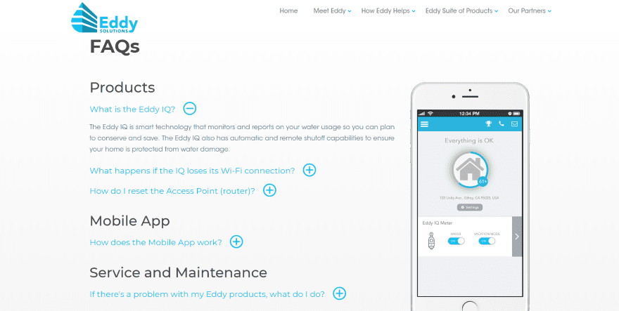
This site places FAQ’s within a two-column layout that includes the FAQ’s on one side and a product image on the other. The toggles show the title and button with styling to match the site’s branding. The toggles are placed under headings to help make them easy to follow. Under the questions is a full-width section with large text and a clickable phone number inviting the reader to call them for more information.
2. All Girl Shave Club
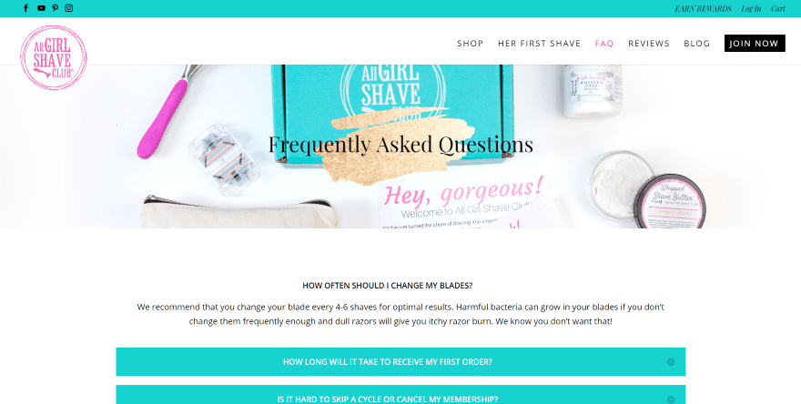
This site places the FAQ’s within an accordion in a single-column layout. A full-width header introduces the page. The accordion includes styling to match the site’s colors. The greenish background for the title changes to white and the text changes from white to black when the accordion is opened. Following this is a full-width CTA that uses similar imagery as the header.
3. Sparkly Maids
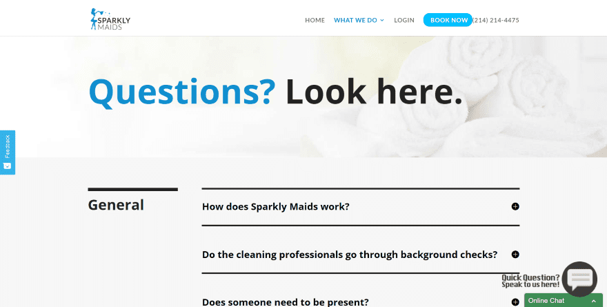
This site introduces the page with a full-width image and two-color, extra-large, title in an overlay. The FAQ’s are placed within a two-column layout that shows a topic name and a top border to help divide the questions on one side and the questions on the other. The questions are placed within toggles that include a top border and styled buttons – all blending with the section’s background.
4. The Scruffy Gentleman
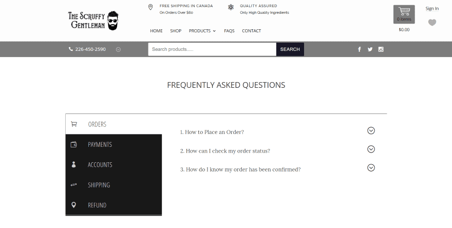
This site’s FAQ page shows a search box with a phone number and social icons followed by a title for the page. The FAQ uses vertically-aligned tabs to show the topics for the FAQ’s. The selected tab is white with black text while the other tabs are black with white text. They also include icons so you can know what the topic is at a glance. Within the tabs are toggles that display the question until they’re opened. Under the tabs is a link where you can contact them for more information.
5. LaRox
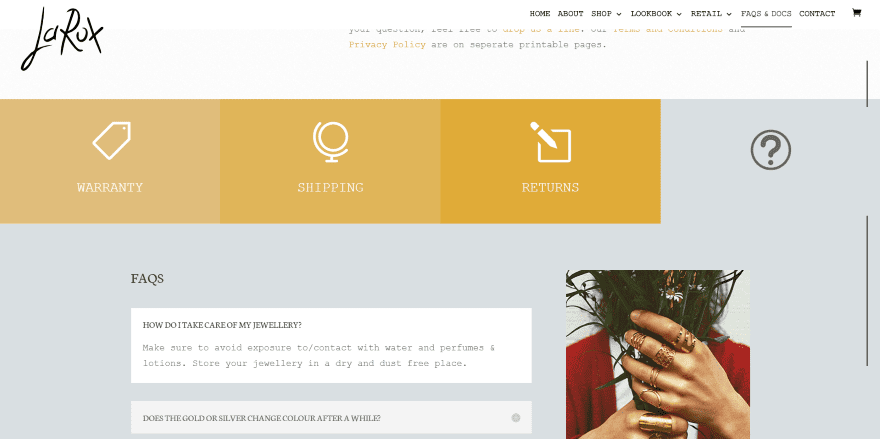
This site introduces the page with a title on one side and description on the other with links to important pages. Following this is a full-width section that includes four blurbs. Each blurb includes a different shade of the branded colors, a large icon, and a title. Clicking on them opens the information for that topic. Clicking FAQ’s reveals an accordion that tips in from the side and an image that slides into place.
6. Xcellence Reality
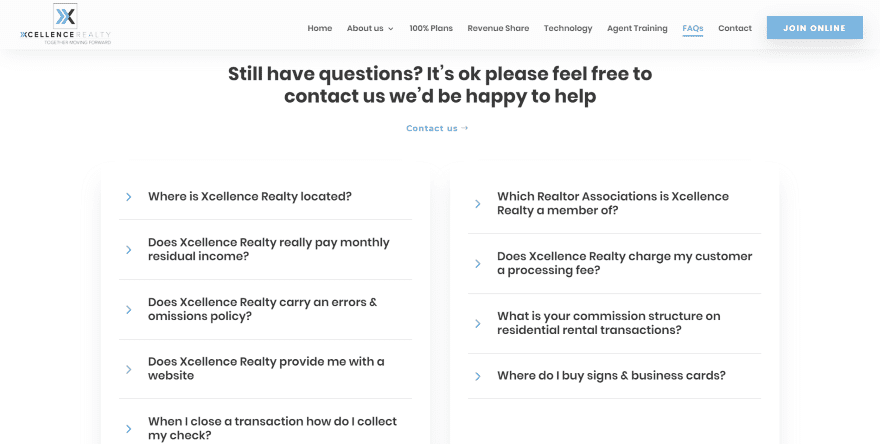
This site introduces the FAQ page with a full-screen image background and a title information in an overlay. Following this is a section of text with a link to the contact page and a two-column section with FAQ’s within accordions. The accordions are styled with black text, a bottom border, and arrows to the left. Opening an accordion removes the arrow and changes the title to blue. Under the FAQ is a full-width CTA that uses the same blue as its background and white text.
7. Phil Simon
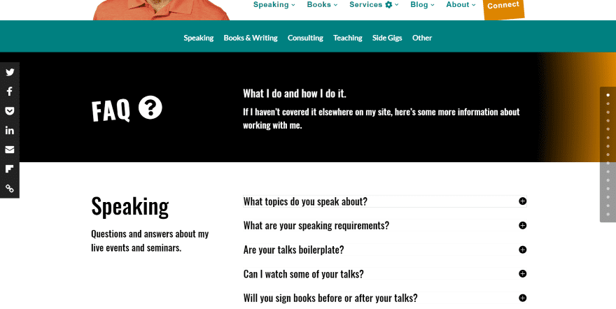
This site introduces the page with a full-width section that includes a title and description text placed over a black background that changes to a brown gradient on the far right. Under this is a section with two columns that places a topic title to one side with a description and a set of toggles on the other side. Following this is a full-width section with a graphic and a full-width section with a quote. Both of these sections are slim and work as dividers. Other FAQ sections follow this- each one being separated by the slim section with a graphic.
8. Soul Stirring Branding
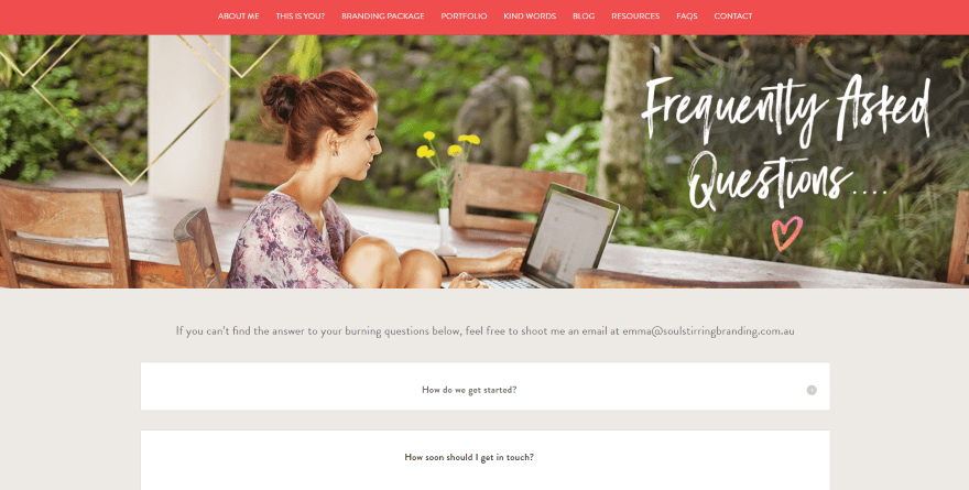
This one shows a full-width image with a hand-written font to one side as the page’s title. The FAQ’s are provided within an accordion in a single-column layout. They show a centered title with a button that matches the background. Opening an accordion shows the text with center-alignment and includes lots of space between the title and the text. Following this is a full-width contact CTA with the same font over a background image, and styled images that link to pages. The accordion is simple but creates a level of elegance that blends well with the site’s design.
9. Emlekek Konyve
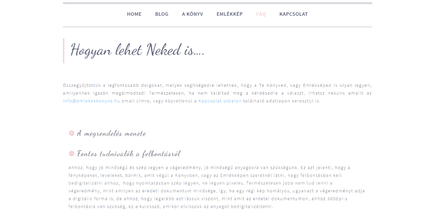
This one uses elegant fonts and soft colors that match the site’s branding. The page title is displayed as a quote followed by a short description with links to other useful pages. The FAQ’s are displayed within toggles and include the same elegant font for their titles. Following this is a CTA with a tan background and an extra-wide button with a background that matches the toggle’s buttons and quote.
10. Perry Yan Magic
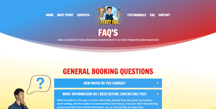
This FAQ page uses lots of cartoonish colors which works perfectly with this website’s design. The header includes the title of the page and a short description. The FAQ’s are placed within a single column with an image to one side to provide a visual representation of what that set of questions is about. The FAQ’s themselves are provided within toggles and are divided into topics, which are separated by styled titles. Each topic is placed in a different section and each section has different background and toggle colors. The sections also use styled separators. Following this is a CTA in parallax with a red and blue gradient overlay.
Ending Thoughts
That’s our look at 10 Divi websites with cool FAQ pages to help inspire you for your next Divi design.
There are several design and how-to articles here on the ET blog that cover FAQ pages and modules such as accordions, toggles, and tabs. I’ve included links to those tutorials as well as the FAQ pages for the free Divi Layout Packes.
- The Free Divi FAQ Layout Pack is the Answer to Boring FAQ Page Designs
- How Divi Can Help You Guide Visitors Through Long Web Pages
- 3 Potentially Overlooked Divi Module Elements You Could Be Styling (and How)
- Therapist FAQ Page
- Accountant FAQ Page
- Copywriter FAQ Page
- Cryptocurrency FAQ Page
- Doctor’s Office FAQ Page
- Best WordPress FAQ Plugins
We want to hear from you. Which of these websites with cool FAQ pages are your favorites? Let us know in the comments.



¿ Cómo puedo envíar el diseño de mis páginas web con divi ?
As per usual the author has not checked the sites prior to posting. What is the point of these “lists”?
LA ROX is interesting. Text needs to be darker, make it easy to read even on desktop. Mobile in sunlight would be even more difficult.
#6 Your header has a typo (Reality instead of Realty), just sayin’ #can’thelpmyselfediting
Is #4 using tabs within tabs ?
I also noticed that Donal! Would love to try achieve the same functionality Elegant Themes? As far as I was aware this couldn’t be done? Please assist. 🙂
In fact it’s more than it seems. This is html code in the text content of the tab and css code.
not based on my look at the code for the site.
Due all respect to the owners of each site, but Some of them are really below average!! how did they make the list?!
I did noticed that too. But I think the point here is for us to see what other designers are doing and improving on it.
I see that #3 used a free layout from ET:
https://www.elegantthemes.com/blog/divi-resources/free-divi-faq-layout-pack
In help building the FAQ’S section.