Services and products for animals is a huge industry. Fortunately this huge industry has a strong need for websites just like any other industry. Those websites provide information about the products, services provided by local companies, and lots more.
In this article we’ll take a look at 10 examples of animal websites built with Divi to help inspire you for your next Divi design.
Some of the sites include online shops to sell products while others provide information about services. Others provide news and some even include animals for sale. Most focus on dogs, cats, or horses. Whether you need inspiration for descriptions about services or product, use of images, videos, layouts, maps, etc., these 10 animal websites are sure to have something to inspire you for your next Divi design. The websites are in no particular order.
Warning – cute animals ahead. Proceed at your own risk.
1. Doggy Dates
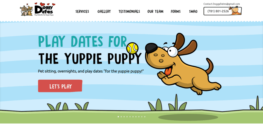
Doggy Dates uses a full-screen image slider with tagline and CTA. The next section shows numbered steps that include branded cartoon drawings. Following this is an information section in two columns with a sign-up form. The next section is a testimonial with review over a patterned background with section styling. A contact section shows opening hours within a cartoon, a CTA in parallax, and a custom footer with menu, contact info, and locations serviced. The menu also includes a CTA. The site uses branded fonts and cartoon drawings.
2. Integrative Vet Med Israel
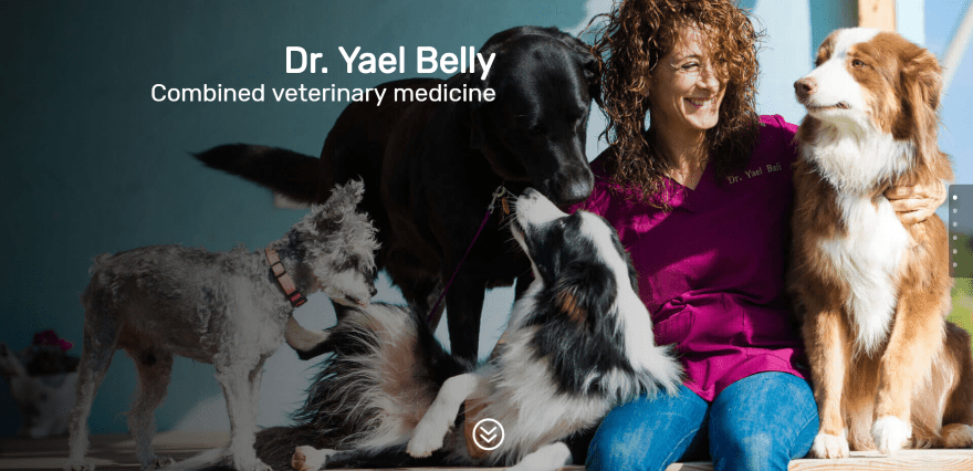
Integrative Vet Med Israel displays a full-screen image with title. Scrolling reveals a slim email opt-in form in full-width, an about section with blurbs using circled images, a full-with image gallery, a section with information about the practice, full-width map, a contact form in an overlay in parallax. The site is multilingual and makes good use of background overlays.
3. Poo Patrol
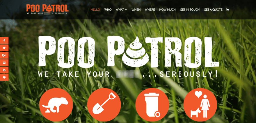
Poo Patrol has a full-screen background image with logo, tagline, and icons in an overlay. A one-sentence description is given within a full-width section with branded color and fonts. A couple of two-column sections display a large image on one side with information on the other with section separation styling. Icons show the services that are provided. Testimonials use images of dogs. Images shows dogs in hats, glasses, and clothing. The services can be purchased through the site using WooCommerce. The site makes great use of color, icons, and images.
4. Bishopton Dog Walking Service
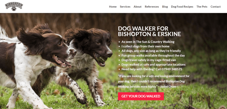
Bishopton Dog Walking Service displays a full-screen image with company description, services, benefits, contact info, testimonial, and CTA on one side of the screen. Scrolling displays the services with images and text descriptions and a CTA. Testimonials are displayed over a background image. Information includes images with descriptions and links to the various pages. A full-width contact form is placed over a background image. Following this is an about section, a full-width search box, and a custom footer with social buttons and contact info.
5. Hilltop Farm
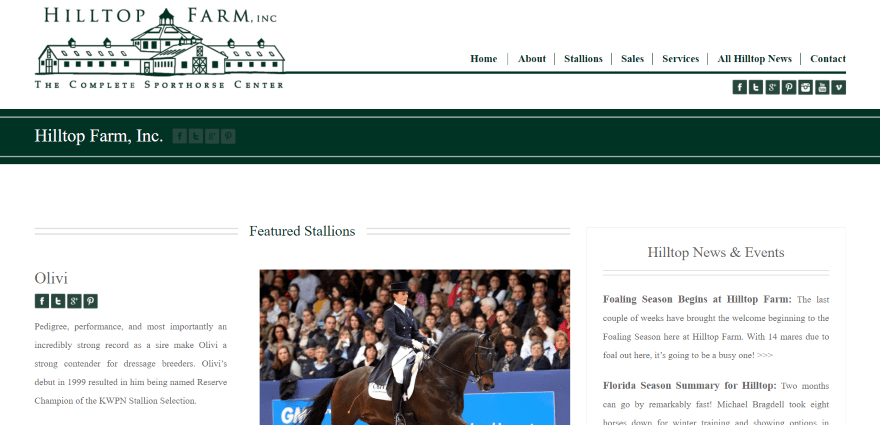
Hilltop Farm uses a two-column layout, creating a magazine look, which displays featured stallions with thumbnails under the article, featured horse for sale, and an integrated Instagram section. The sidebar includes links to news and events, a CTA, testimonial, and video. The custom footer displays a full-width logo followed by posts from the categories, contact info, a newsletter sign-up form, and a ticker with company logos. It uses lots of finishing touches such as lines within section titles and the primary menu.
6. Hyperion Stud
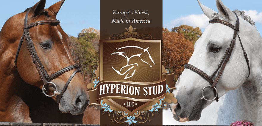
Hyperion Stud is unique in that it displays a full-screen background image with a logo, hamburger menu, and social links in the center in parallax. Scrolling reveals company information with a CTA in parallax, a gallery with hover effects and a CTA in the center, blurbs with circled images in parallax, a full-screen video, and a custom footer with contact info and social feeds. Navigation is provided by a mega-menu with images and links with elegant line styling that matches the footer.
7. Horse of my Dreams
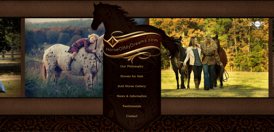
Horse of my Dreams uses a scrolling gallery with leather graphics behind a full-screen centered menu. Scrolling reveals a full-width testimonial over a leather graphic. The rest of the homepage uses a leather pattern over a wooden background. An about section displays text with an image and phone number. A sales section includes image with links and information. An information section uses text and images. A two-column section shows images with links to sold horses and testimonials. The footer includes an elegant logo. The gallery pages darken the edges of the photos, giving them an elegant look. The site makes interesting use of background patterns and images.
8. Hoosier Doggy
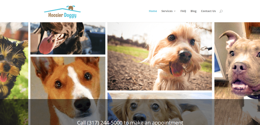
Hoosier Doggy displays a full-screen image montage with a CTA in an overlay. The next section uses blurbs about the services with icons that match the branding. A full-width CTA is placed over a patterned background. Next is a link to live web cams powered by Online Doggie where you can choose one of 6 camera’s, the zoom level, and take a snapshot, allowing anyone to see the facility and animals any time they wish.
9. Spartanburg Humane Society
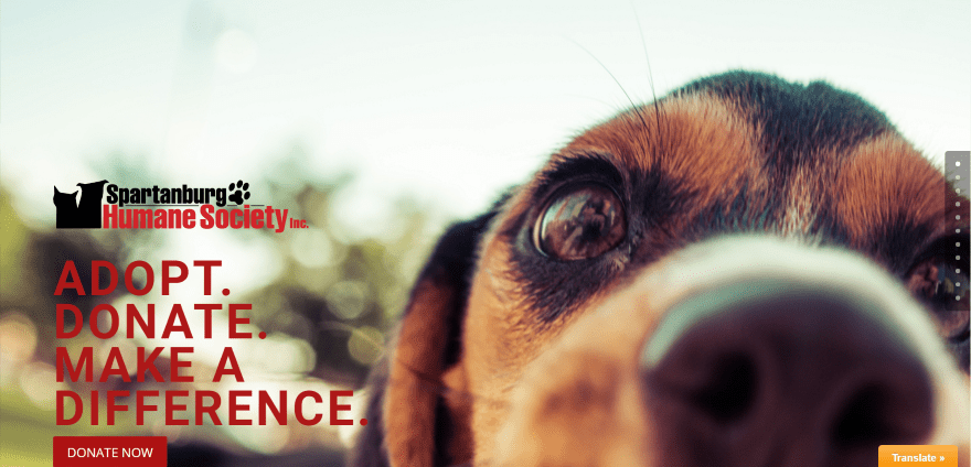
Spartanburg Humane Society includes a full-screen image with logo, tagline, and donate button in an overlay. A welcome message appears in the next section as full-width text. Information, services, and statistics are given in two-column sections with image and text. The statistics section provides PDF downloads. The various programs are described with bullets. The contact section uses tabs to display the contact form, locations, department phone numbers, and management teams. The locations are shown on the full-width map. Each of the sections are separated by full-width images with the section names in overlays in parallax. Events are shown with an embedded calendar by The Events Calendar.
10. Natures Pet Foods
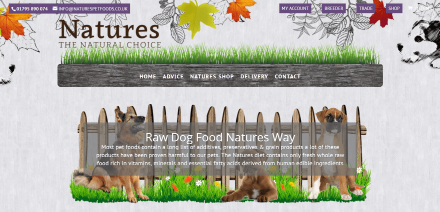
Natures Pet Foods displays all of the content over a full-screen background with leaves and dogs at the top of the image. All other content moves in parallax over this image. The primary menu is placed over an image just under the logo. An image slider displays dogs with information in an overlay. Products are displayed within a full-width slider. The next section displays information in two columns followed by links to pages that include images of dogs, an about section with images and links to pages, and contact info within the footer. The shop is powered by WooCommerce and includes hover animation.
Final Thoughts
These 10 examples of animal products and services websites built with Divi demonstrate that with Divi you can create any kind of animal website, whether it’s just a simple brochure for a service or product, or a site with multiple products, store, events, etc. No matter what type of website you need to build for animals, you can build it with Divi.
These sites a great for providing ideas for product or service descriptions, colors, video, icons, effects, navigation, shops, galleries, and more. These websites are sure to inspire you for your next animal website design.
What are some of your favorite elements of these animal websites built with Divi? Let us know in the comments below!
Featured Image via america365 / shutterstock.com


Agreed! The pet industry market is a booming one indeed, on top of being on the top 5 of the most stable industries around. 🙂 In fact, we have been catering to this industry for both national and international clientele since 2003. And now with even greater success – since we’ve been exclusively using DIVI. Yay! (Psst – our own website is also built using DIVI.)
Beautiful examples, congratulations!
What did you use to do the genealogies of animals in some cases?
In the horse site templates to be more specific.
I’ve designed several animal sites in Divi! They are my favorite ones to do. 🙂
no cats??????
kitties yes 9 lives!!
Some have cats, they’re just not in the photos.
don’t forget to write about labradorsalento.it
Elegant Themes and Divi deserve appreciations, but designer/s ought to have honors for their creativity instead of instruments they used. It is true, Div is ideal for making life easier, but can’t create ideas.
This is very timely Randy as I am currently building this website for horses kylecanyonhorsestable dotcom
Very beautiful. I use Divi on all of my websites now, customization is easy and flexible, and I can pretty much edit most of the things smoothly.
One drawback is that sometimes the Visual builder is not working really well, where it add in lots of empty spaces to other places, when I’m editing other parts of the page. Some bugs going on here.
Great, thanks for posting.
I’m super stuck and have been reading tutorials all over the web and not found the answers I need.
I want to create a user opt-in custom taxonomy (Let’s call it user_interests) that can be used to display a custom list of posts that are unique to that particular user.
User will opt-in to user_interest tags/categories/whatever during sign up or when editing profile.
Then the WP loop should include these values to display posts
Any ideas, help would be really appreciated, thanks.
Cool, thanks for adding my website to that list, that’s very kind.
You’re welcome Jamie!
All I design are poultry show and breeders web sites with Divi, its finally great to see a post regarding that.I have a huge client base.
That’s great Ruth!
Interesting sites, but those two Horse sites are BEAUTIFUL!
I would love to learn how they created those layouts and effects with Divi.