Sports covers a lot of topics and this means there are a lot of websites to be inspired by and a need for many more. They use branded colors and images and provide lots of stats and information on events using some sort of event calendar plugin. Sports websites are always in need of unique and interesting designs. In this article, we will look at 11 examples of sports sites using Divi to inspire your next Divi design.
Some are about sports, some are about teams, and a few sell sports-related products. Some provide training and one is a popular sports reporter. All have something interesting. The websites are in no particular order.
1. Elite Loyalty Sports
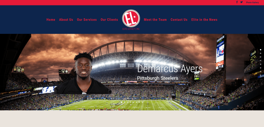
Elite Loyalty Sports mostly uses a one-page design full-width image background with image slider showing team players. Next is a clean about section with tan background. The next section use two-columns to display services. Following this is a full-width tagline in true parallax in an overlay, a four-column section with clients in project modules, team members with large circular images, a contact form, and a styled footer with contact info. The page called Elite in the News displays links to articles with spinning hover effects. The site uses branded colors and makes great use of images.
2. Kirk Cousins
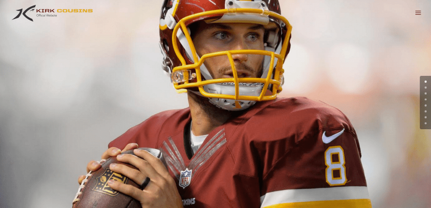
Kirk Cousins includes a full-screen image with branded logo, hamburger menu with right-side vertical menu, and dot navigation. Scrolling reveals football stats for the 2016 season. Following this is a section with embedded videos with links. Next is information about the book with CTA, information about the training camp with CTA’s and supporting videos, a slider with sponsor’ logos in white against the red branded background, a CTA with hover effects, and footer menu. The site makes great use of branded color.
3. OZ Tennis Leagues
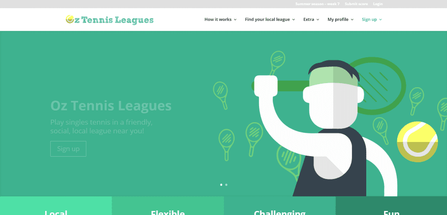
OZ Tennis Leagues displays a full-screen image slider with CTA. The top bar includes links for calendar, submitting scores, and for login. A four-column section that matches the branded colors provides info followed by a three-column section with matching icons. The page includes CTA’s, a project section, testimonial slider, stat counters, CTA, and partner logo. Social icons in the footer are in different colors. Tables are created with Table Press and payments are handled through Stripe. The sites makes great use of branded color.
4. Run and Fun
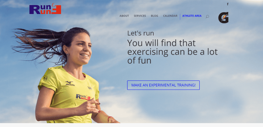
Run and Fun displays a full-screen image in parallax with tagline and CTA. The logo in the right corner changes and each one links to a different website. Following this is a section of blurbs with information. Company stats are shown in the next section using number counters. Information is shown in a three-column section followed by a testimonial slider, CTA over a patterned background in parallax, blog posts, project gallery, information about a book with CTA, and contact form. Events are displayed using the EventOn plugin.
5. Croatia Football Training Camp
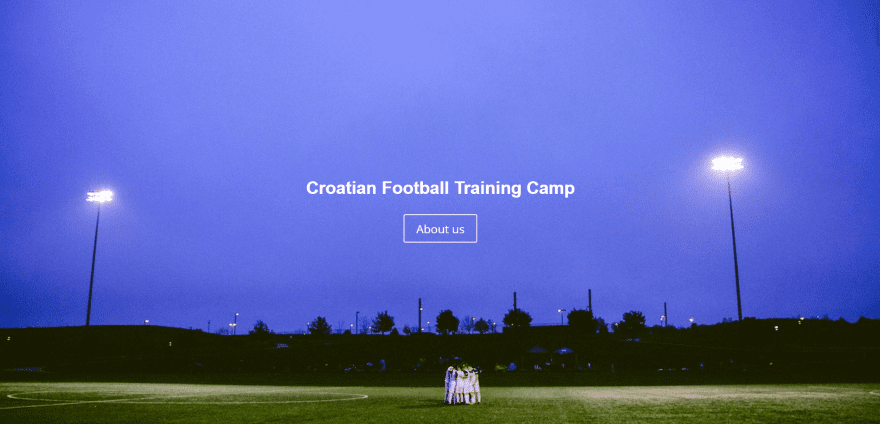
Croatia Football Training Camp displays a full-screen image with link to the About Us page. Scrolling reveals the menu, and about section with embedded map, client logos, and a contact form. Small sections in parallax are used as titles for the sections. Each of the camps have their own pages which use the same layout and includes image sliders, about sections, videos, and contact info. The site uses a consistent design throughout providing the needed information in a logical format.
6. Stewert Motorsport
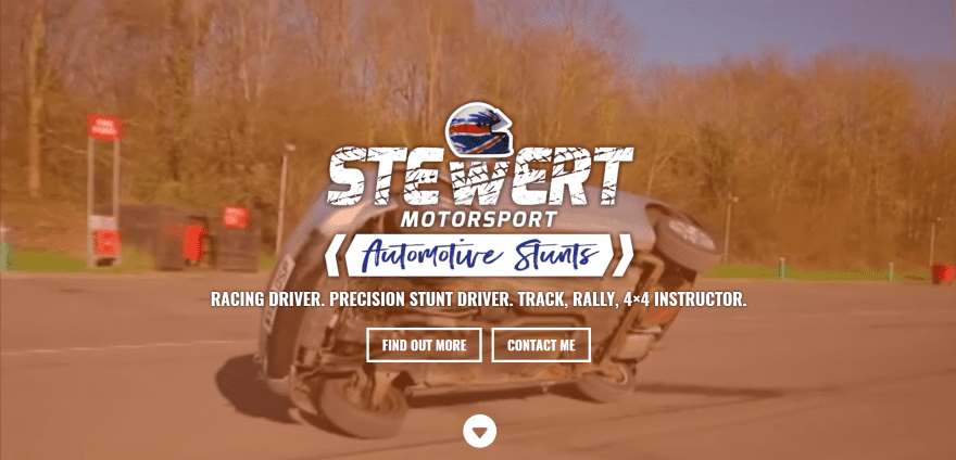
Stewert Motorsport displays a full-screen background video with logo, tagline, and CTA’s in an overlay. Scrolling reveals a logo and menu, each with different colored backgrounds. A three-column section shows circled images with information and CTA’s. It includes several about sections with image sliders and Facebook feeds in a sidebar. Following this is a quote in parallax and a contact form. The site uses branded fonts and bold colors.
7. Seaholm Boy’s Swimming and Diving Team
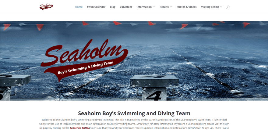
Seaholm Boy’s Swimming and Diving Team displays a full-width image slider with logo in an overlay and an about section. The next section uses a colored background with blurbs and links to pages next to an event calendar. Following this is a section with colored blocks with CTA’s and a countdown timer. Tables are displayed with Table Press and include download and print features. Events are displayed using the Timely All-in-One Event Calendar. The site makes great use of color.
8. FPro Sports
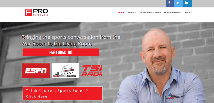
FPro Sports uses a full-screen image with tagline, a media logo slider, and CTA in true parallax. The top bar includes styling and social buttons. The next section uses a left sidebar to showcase Twitter feeds and CTA’s while the body section displays info and CTA’s. Following this is a two-column section with posts. Inside the War Room is a blog page with posts and hover effects. The site makes excellent use of color and CTA’s.
9. Mayhem in the Mountains
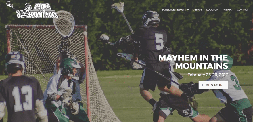
Mayhem in the Mountains is mostly a one-page design that includes a full-screen image with CTA in parallax. Scrolling shows an information section, an information section with CTA, a section with schedule and pricing, a section with downloadable registration form, a link to accommodations directory, a contact form, and custom footer with sponsors’ logos. Parallax can faintly be seen in most of the backgrounds. It’s just enough to add some visual flare without it bringing attention to itself. The Schedule/Results pages display events using the SportsPress plugin. The site makes excellent use of parallax and overlays.
10. Spiral Cycles
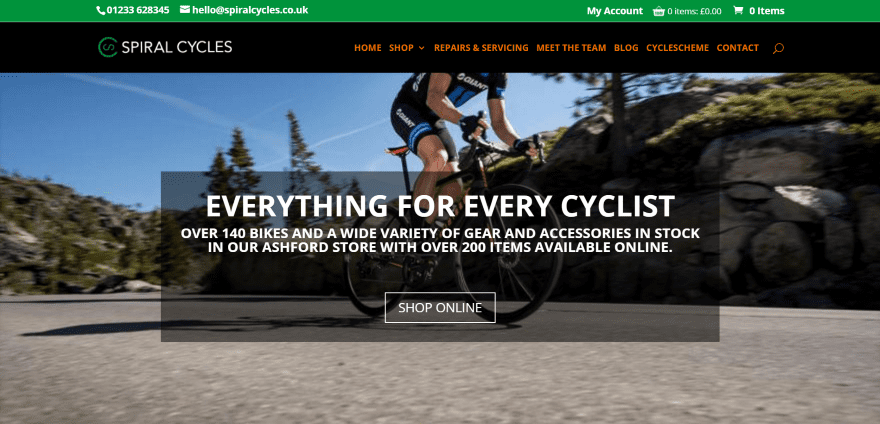
Spiral Cycles uses a full-screen image with tagline and CTA in an overlay. Scrolling shows an about section, three CTA’s in boxes, a full-width map that doesn’t auto-scroll, a shop section, CTA, and testimonials. The footer includes Tweets and a menu. The shop loads more products as you scroll. Services are displayed with a pricing table. The site makes great use of color and layout design.
11. Ocean Kayak
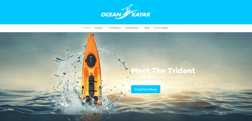
Ocean Kayak uses a full-screen image slider in parallax with CTA overlay. Scrolling shows an overlapping section with three product categories using hover effects and two text boxes with unique image placement. Next is an information section with video followed by a CTA and footer with menu. The page Find a Dealer uses a searchable map. The kayak product pages display products in project modules. The product pages use detailed product descriptions using text and images in a two-column design. The site makes great use of product imagery.
Final Thoughts
These 11 examples of sports sites using Divi are excellent examples of the various types of sites that can be created with Divi. You can create amazing designs for any type of sports website and include all of the necessary features including events, stats, shop, images, etc.
These sites a great for providing ideas for layouts, colors, fonts, images, video, navigation, event calendars, stats, and more. They are sure to inspire you for your next sports design using Divi. If you are ready to build your own sports website, we also suggest taking a look at our list of the best WordPress sports plugins that you can use to get your new website up and running.
What are some of your favorite elements of these Divi sports sites? Let us know in the comments below!
Featured Image via Alexander Ryabintsev / shutterstock.com




Here’s one I designed a little while ago for Stadium Triathlon Club / Karri Valley Triathlon in Perth, Western Australia: stadiumtriclub.com
The client has tinkered with the site quite a bit, so not as nice & clean as it once was unfortunately 🙁
Is spiral cycles using shopify ? or what are they using for their shoping cart ? Thanks