Business consulting has been popular for many years and the need for consulting agencies will continue into the future. This means there will always be business consulting agencies that need websites to display their services. This article with 12 examples of business consulting agency websites built with Divi will provide the Divi designer with plenty of inspiration
Whether the business consulting agency provides services such as business strategy, planning, leadership, employee motivation and training, social impact, or even courses and workshops, these sites can help with inspiration for your next design. The websites are in no particular order.
1. Called to Business
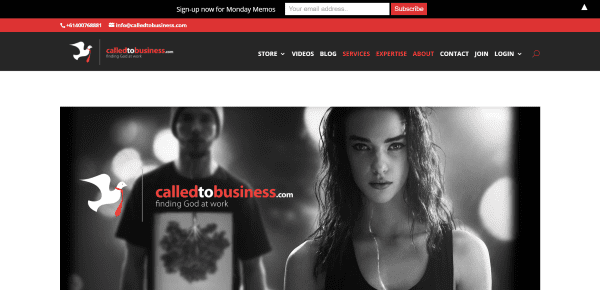
Called to Business includes an image with logo and tagline and an interesting menu design that displays two branded colors. Scrolling reveals an about section with mission statement, a section with multiple videos and a company quote, a section with services, a CTA with parallax, a section with course descriptions, a post slider, a shop section powered by WooCommerce, a social follow section with parallax, testimonials, an FAQ with accordions, and a contact form. A custom footer includes the same two-color menu. This site makes great use of branded color.
2. Avitus Group
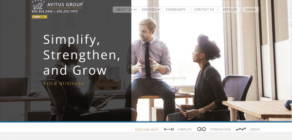
Avitus Group uses a full-width image with overlay on one side with a tagline and a dropdown box to choose your language. It includes a mega menu with transparent boxes around the links. Under the image is a small menu with icons. Each of the following sections relate to this menu. The sections include the icons. They have an image with text and a section separator leading to blurbs with CTA. A custom footer displays the logo, menu, and social follow buttons. The Community page includes blog feeds, Facebook feeds, icon links, and a contact form. The site is elegant and makes great use of images and layout design.
3. Consult Covenant
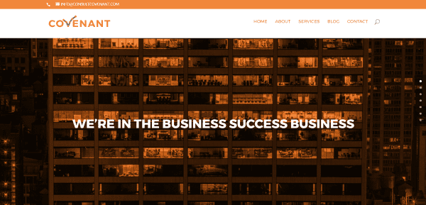
Consult Covenant has a one-page design with full-screen image and tagline, a small section with link to the blog, an about section with large icons for the services, several sections with alternating text and images that include accordions that discuss the services, blog posts with overlays, an email signup, a contact form, and large footer with widgets. Navigate using the curtain menu or dot navigation. Even the well-designed icons and backgrounds match the branded orange, white, and light gray colors.
4. Dekadi
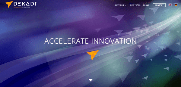
Dekadi includes a full-screen image with down arrow. The menu displays a CTA and flags to choose your language. Services are shown as posts with hover effects. Next is a small section with contact CTA, a team section with circular images and bullets followed by social links, a section showing the compiled skillset, another small CTA section, partner logos, and contact information. All but the services are a one-page design. The Services pages use a mapping system to step you through the process. Some include tabs which change the map accordingly. The sites makes brilliant use of icons and color.
5. KickStart Alliance
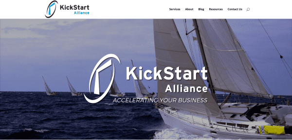
KickStart Alliance has a full-screen image with logo and tagline, a small slider showing client logos, an about overlay in parallax, a section showing the benefits of partnering with the company, a section showing services with icons, blog posts, workshops with CTA, a list of books by one of the co-founders with clickable links, a list of online courses, and a large footer with contact, posts, and newsletter signup form. Each of the sections have CSS separators. The site makes elegant use of color and overlays.
6. The Loop
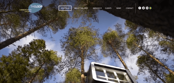
The Loop shows off a full-screen video with transparent menu. The menu includes a boxed-in CTA, line separator, and social links. The homepage also includes a mission statement, images with hover effects that link to pages, and a section with blurbs and more links to pages, a testimonial slider, integrated Twitter feeds, and a client list with links to projects. The custom footer provides contact info and a menu with slanted dividers.
7. Giving Strong
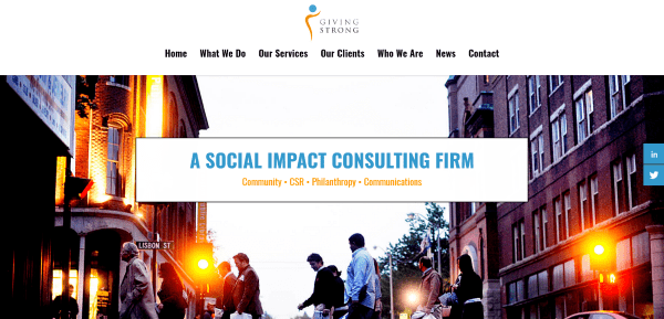
Giving Strong has a one-page design that includes a full-width image, an about section, a section about their services with bullets and images, client logos, about the founder, full-width newsletter signup, blog posts, contact form, and large footer. Throughout the layout are several sections with full-screen images in parallax. The site makes good use of branded colors.
8. Visualize
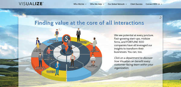
Visualize includes a full-screen image with transparent slider overlay and a transparent overlay with client logos. Following this is a two-column about section, a section to choose your global location, and a section with links. Choosing your global location takes you to a team member page with contact info and testimonials. The client success page shows the projects by client with links to each story. The site has a lot of information but is successful at displaying it in a way that’s easy to navigate and read.
9. Apricum Group
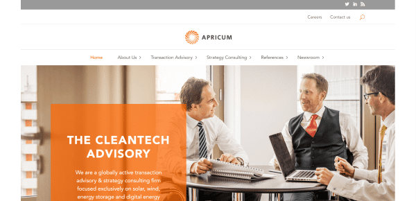
Apricum Group has a boxed design with full-width image with an overlay with the company’s mission statement. The next section includes images with hover effects that links to services. A multi-column section shows the benefits of partnering with the firm. Following this is a slider with client icons, a section with testimonials, a CTA section, blog posts, and a custom footer with newsletter signup form, contact info, and social follow buttons. The site makes elegant use of layouts and overlays.
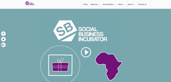
Social Business Incubator includes a full-screen background with embedded video, an about section, a section with multiple CTA’s, a section with blog posts and schedule, and a full-screen image in parallax. It has a unique navigation structure in that each of the pages include multiple sections that are tied to the menu. Click on the top tier and go to the top of the page that includes all of the sections or select a link within the menu and go straight to that section. The site makes excellent use of branded icons, colors, and charts.
11. Pellucid
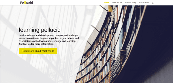
Pellucid has a simple homepage with a full-screen image that includes company info and CTA and a three-column section providing information about the company and the services they offer. This simplicity is maintained throughout the website. The page titled What We Do provides more information about the services along with company quotes. The Contact page displays a full-width map that doesn’t auto-scroll and a contact form. This is a simple and clean site with good use of branded colors.
12. Bid Network
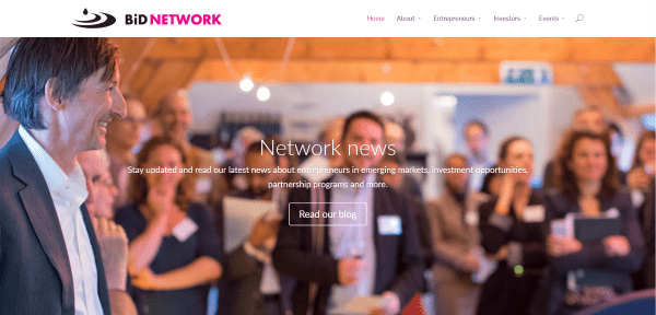
Bid Network includes a full-screen slider over a parallax background, a small section with a company statement, a section showing success stats, a section with links to various pages, and a newsletter signup form. The Events page displays events as blog posts with links to register. Depending on the type of event, registration is done through a contact form or through another website. The individual events pages use lots of accordions, galleries, layouts, and parallax with overlays.
Final Thoughts
These 12 examples of business consulting agency websites built with Divi go to show that Divi can be used to create interesting designs for any type of consulting agency website, whether it’s just a simple brochure or a site with events, courses, and workshops – no matter how complex or simple.
These sites a great for providing ideas for layouts, colors, use of images, effects, video, animations, navigation, and more. These websites are sure to inspire you for your next business consulting agency design.
What are some of your favorite elements of these Divi business consulting agency sites? Let us know in the comments below!
Featured Image via Iconic Bestiary / shutterstock.com




I quite like “Consult Covenant” example. Do you have this layout available for your customers to import?
Hello and sory for my bad english
Divi example website is good to see what Divi can do
I really like your youtube channel and Mak tuturial is easy for do follow
I just wonder why ET not make more Divi page layout similar like Avada and Beaver Builder so that customer can easily import the design into website. No more complex thing (or just lazy like me). just change text, image and colors and get website done. everything is already made for customer! not creating a website from scratch. I think it will boost more sales too. ^^
Thank you.
Right now we create a wide variety of layout packs, which are not quite what you’re talking about but very close and extremely useful. That said, an even quicker and more streamlined process of getting from install to final website is something we’re very interested in and working on behind the scenes for a future release.