Many companies create websites around their products. They provide information about the product, or range of products, that includes features, testimonials, where to buy, and more. Product websites are popular because companies always need them. Several product websites were built with Divi and are great for web-design inspiration. In this article we’ll take a look at 12 examples of product websites built with Divi.
So what do I mean by “product website?” After all, online stores sell products, so isn’t any website with products on it a product website? I’m getting more specific than that. Rather than sites that include products these are sites about the products. Some of them do have stores, but you could take the store away and the site still stands on its own as a website about the product. In other words, the purpose of the website is to promote the product no matter who sells it.
Whether you need inspiration for product descriptions, use of images, videos, layouts, location finders, and more, these 12 product websites are sure to have something to inspire you for your next Divi design. The websites are in no particular order.
1. Paleo Grubs Book
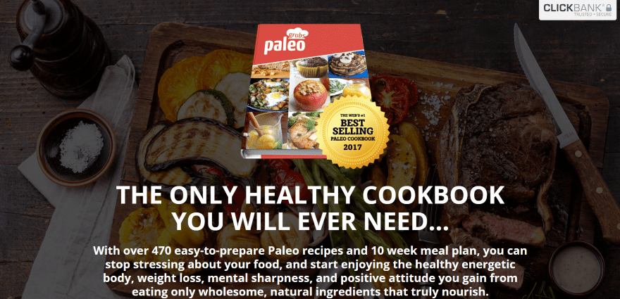
Paleo Grubs Book displays an image of the product with a description and ClickBank badge in an overlay. The next section shows a video and a section with a Facebook Like button. A section shows an example page from inside the book followed by a bonus CTA, testimonials, a product guarantee, a purchase CTA, FAQ, and contact info. This is a single page with no navigation. The layout is clean with a clear product description and CTA.
2. Importantly You
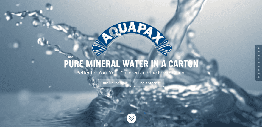
Importantly You includes a full-screen video behind the logo, tagline, CTA’s, and dot navigation. Scrolling reveals the primary menu, the product image and description over a full-screen image in parallax, a section with Instagram feeds, several information sections, and a contact form. It also includes an award section and a large blog section. Between the sections are a few statements in parallax. The Stockists pages display maps with CTA’s in the sidebar.
3. Enkei
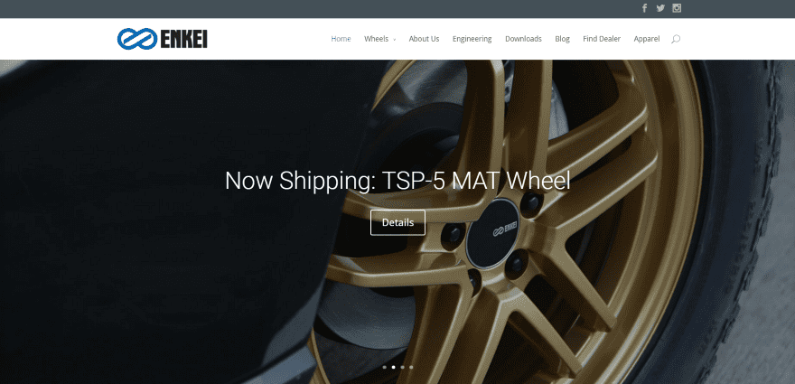
Enkei displays a full-screen image slider with CTA. Following this is a four-column product category section, recent blog posts with embedded videos, and CTA. The shop and product pages use clean images on white backgrounds. Currently the dealer locator request uses Facebook for contact info. The site is easy to navigate and makes great use of images and color.
4. EFL Shutters
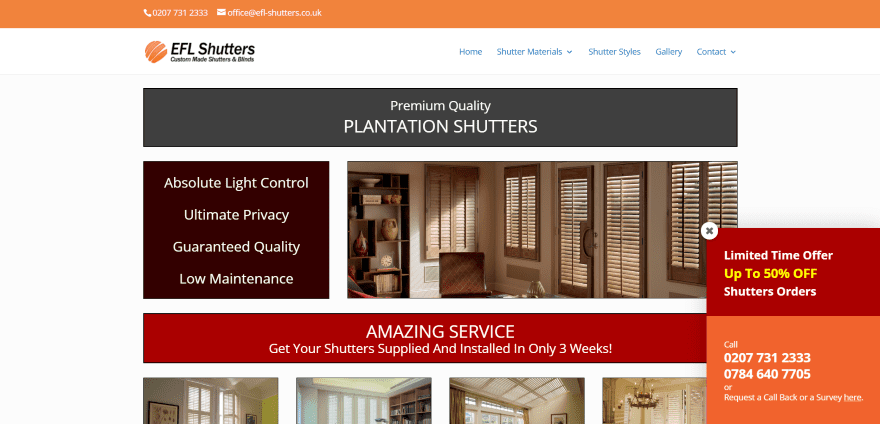
EFL Shutters uses a one-page boxed design that displays a multi-column layout. The layout includes a title, text with information, image, full-width text, and four columns with images. Scrolling displays multiple column designs for information, contact, multiple sections about the product lines and styles, a photo gallery, and list of areas served. Sections with branded colors are used as titles for the various portions of the homepage. The site makes great use of color and images.
5. Slidenjoy
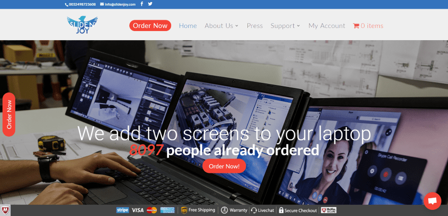
Slidenjoy displays a full-screen image with tagline and multiple CTA’s in parallax. A chat, CTA, and payment info remain on screen when scrolling. The next section includes media logos with links to reviews. Following this is a full-screen video, Facebook Like, pricing table, and several sections with information and images, contact info, and subscription. The product description sections use various layouts separated by parallax sections that are reminiscent of the elegant and informative descriptions on Amazon with short text and large images. The site makes excellent use of layout design.
6. Noah and the Last Days
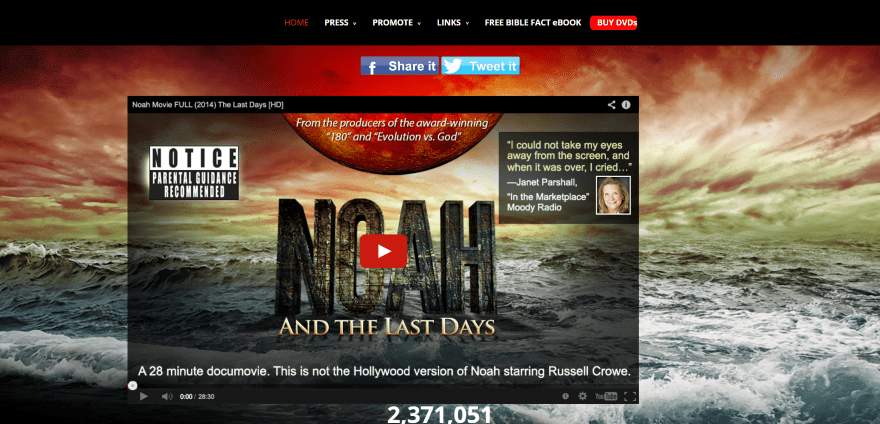
Noah and the Last Days displays a full-screen image with embedded video that blends into the image with social button above the video. Scrolling displays a three-column CTA, full-width quote, another three-column CTA, and a four-column testimonial section. The fonts for headings and CTA’s match the colors from the background image. The site makes excellent use of imagery and CTA’s.
7. Vanderhall USA
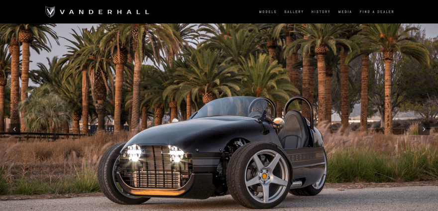
Vanderhall USA displays a full-screen image slider. Some of the slides display information about options and one displays a CTA. Next is a four-column section with product categories and links to build your own custom design. Under this is a full-width image and footer with menu and links. The product pages display features in four columns over a background that’s just noticeable. WooCommerce is used for choosing options. The site makes great use of images, fonts, and color.
8. Gocycle
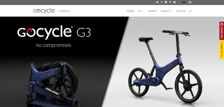
Gocycle uses a simple homepage with a full-screen image slider, full-width testimonial slider that displays testimonials, reviews, and awards, and footer with menu and links. Links remain on the right of the screen on scroll. The Design and product pages blend text and images to create an interesting layout for the product overview. The dealer locator uses a location finder. The site makes excellent use of images, layouts, and branded color.
9. Vidi Cameras
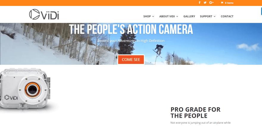
Vidi Cameras uses a full-width video with tagline and CTA in an overlay, an image of the product, and tagline. Scrolling displays three images with CTA’s to the various categories. Following this is a full-width image with text overlay on one side with info, a full-width four-column grid with Instagram feeds, and custom footer with social buttons and simple newsletter form. The shop is powered by WooCommerce and includes lots of images and videos within the descriptions. The site makes great use of layouts and images.
10. Egg Stroller
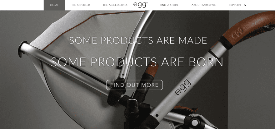
Egg Stroller uses a full-screen slider with tagline and CTA. The slider displays background images that slowly zoom out until the slide changes. The next section is full-screen and displays two columns with text with CTA’s and an image. Products are displayed in a full-width image slider followed by a footer and a strip with company logos. Products are displayed with WooCommerce. The store finder includes a location feature. The site makes great use of images and layout design.
11. M-Brace

M-Brace uses a full-screen image slider with CTA’s, a link to the latest event, and a custom footer with menu. The menu displays styling that overlaps the image slider. The product pages display two columns with images on one side and text on the other. The shop page is powered by WooCommerce. Events are shown in toggles. The site is multilingual and makes great use of branded color.
12. Beauty to go Madrid
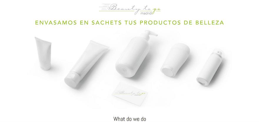
Beauty to go Madrid uses a one-page design without navigation. It displays a full-screen image with logo and tagline. Scrolling shows company information, embedded videos, blurbs with hover animation, a link to an external article, and a full-width image slider. Following this is a two-column section with product information, an embedded video gallery, lots of product images, and contact form. The site uses a clean layout and makes good use of product imagery.
Final Thoughts
These 12 examples of product websites built with Divi go to show that Divi can be used to create any kind of product website, whether it’s just a simple brochure for a single product or a site with multiple products, store, store finder, etc., there’s something here that can help spark ideas.
These sites a great for providing ideas for product layouts, images, colors, video, icons, effects, navigation, and more. These websites are sure to inspire you for your next product website design.
What are some of your favorite elements of these Divi product sites? Let us know in the comments below!
Featured Image via Jiw Ingka / shutterstock.com


If only 1 website uses woocommerce here, then I now completely see why Divi is a complete mistake for woocommerce stores.
Very nice, Love the work and quite inspiring indeed.
2. Importantly You
Horrible UI! This video takes forever to load and they don’t hide it on mobile.
Plus, several errors in console.
7. Vanderhall USA
Some bad ass cars!! 🙂
Great article
Great job. And excellent article
Thanks for the ideas. How is the box design set up as shown in #4 (EFL Shutters)?
Only Vidi Cameras uses WooCommerce. The rest are just ‘normal’ websites with a storelocator or something alike.
Very beautifull examples. Thanks!
It would be super if future Divi theme allows to edit woocommerce pages; cart, chectout, my-account, emails like change button colors, font colors etc
Yes please… or give information for edit the functions
I like the active menu in #10. How do I achieve such?
It looks like they’re using a plugin called Supermenu.
Great designs, but how about loading times.
[https://vanderhallusa.com/] took 5.5 seconds to load the first slide!
According to GTMetrix:
– Pagespeed score: 22%
– YSlow score: 61%
Way too long, way too low scores!
Way too long.
Notice Divi Themes will get your website to look exactly the same (cookie cutter) as other businesses. You need to be more creative and understand how to hard code to customize it to make stand out of the crowd.
My biggest takeaway is that Divi can be used at the highest levels of web design. Though it’s user-friendly for beginners & intermediate designers, it rocks in the hands of advanced designers.
I encourage Elegant Themes to keep pushing for the best functionality and design for e-commerce; it’s greatly needed.
Thanks for THE examples. Very helpful.
Helpful article, but I got completely distracted by the camera in #9 🙂
I like that VIDI uses DIVI. 😀