Non-profits and charity organizations have turned to the web to get their message to the public and share the news about the work they do. Of course this means they need websites to display their information, share their news, ask for workers and volunteers, and ask for donations. Several of these organizations have websites built with Divi. In this article we take a look at 13 examples of non-profit and charity sites using Divi.
Whether you need inspiration for donation systems, use of images, videos, layouts, etc., these 13 non-profit and charity websites are sure to have something to help you with inspiration for your next design. The websites are in no particular order.
- 1 1. World Help
- 2 2. Light House Foundation
- 3 3. Cura Brazil
- 4 4. Jungle Aid
- 5 5. Families Course
- 6 6. Wheelchairs Against Guns
- 7 7. The Pledge To End Bullying
- 8 8. Car Donation
- 9 9. Global Autism Project
- 10 10. Camas Washougal Community Chest
- 11 11. Frontenac Youth Services
- 12 12. GodFreds Foundation
- 13 13. Mortar
- 14 Final Thoughts
1. World Help
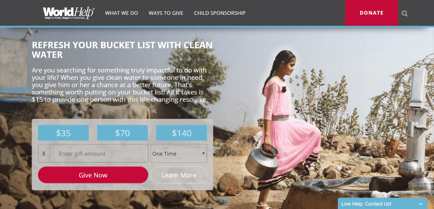
World Help includes a styled mega menu with CTA (call to action), sponsor cards within the drop-down menu, and a blue line with shadow to set the menu apart from the rest of the page. The full-screen image has a donation box in an overlay using a donation widget. A live chat stays on screen on scroll. The next section provides links to pages and includes hover effects. The next sections include a child search to help you choose who to sponsor, interactive world map, blog posts, newsletter signup, and custom footers with links and icons. The site makes excellent use of color and layout design.
2. Light House Foundation
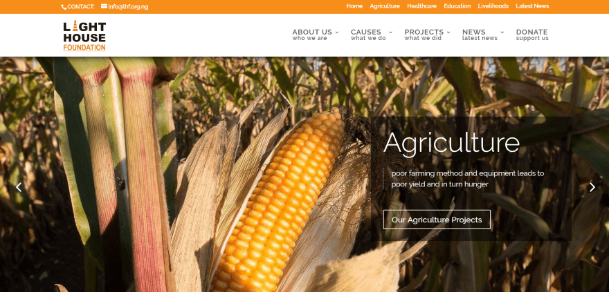
Light House Foundation displays a full-screen image slider with CTA’s, a top menu bar with links, a section with CTA’s, a four-column section with links showing their focus, a section in parallax showing past projects, a section about the team using a slider, a section showing partners, and footer with links. Donations are handled through the Total Donations plugin. The site makes great use of color and overlays.
3. Cura Brazil
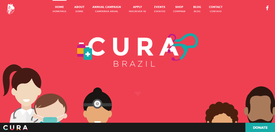
Cura Brazil displays a full-screen background image with logo in Flat Design colors. A CTA remains at the bottom of the screen and shows a logo and donate button that slowly changes color. Scrolling reveals a full-screen video with section styling, an about section with artistic use of true parallax and a CTA, a section with stats, a team section with a chart showing the number of team members by category, a styled section with application button, and subscription form. The site is a great example of using Flat Design and parallax usage.
4. Jungle Aid
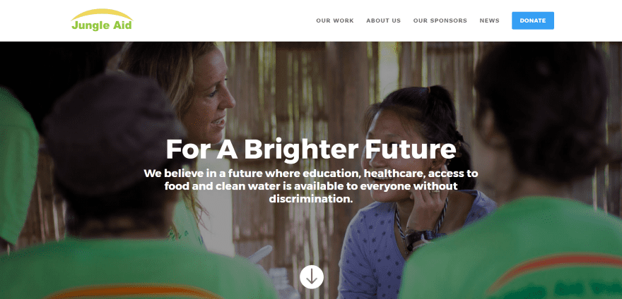
Jungle Aid includes a full-width image with tagline, an about section with text and embedded video, a four-column section showing their services within blurbs, a section with progress stats, blog, sponsor logos displayed within a slider, full-width subscription form, full-screen image, and links. A few of the sections include appropriate images, such as plants and doctor’s tools, on both sides of the screen in parallax. The menu includes a CTA. The site makes great use of color and icons.
5. Families Course
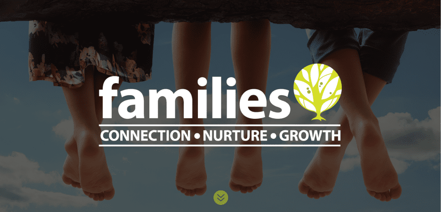
Families Course displays a full-screen image with tagline. Scrolling reveals a menu, an about section with image and text, a section with three styled blurbs, several sections with alternating text and images, a testimonial over an image with overlay in parallax followed by a section with the company’s logo. The site makes excellent use of color and fonts.
6. Wheelchairs Against Guns
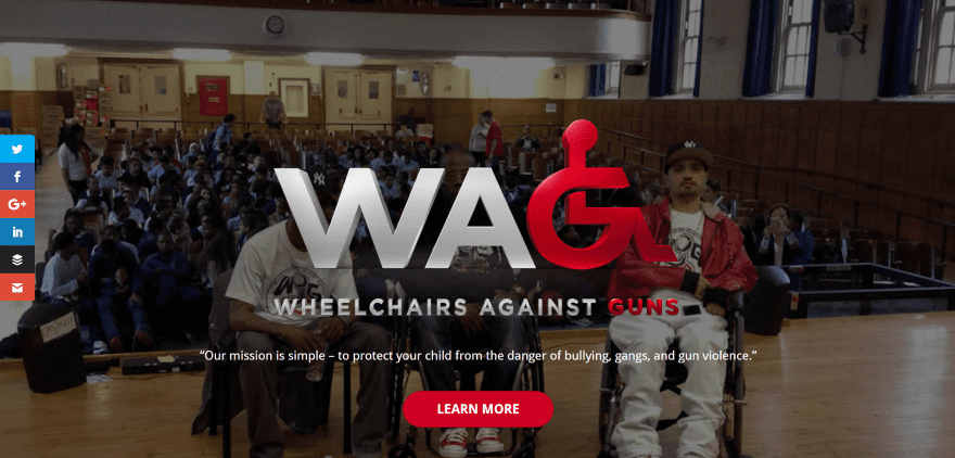
Wheelchairs Against Guns displays a full-screen image with logo, mission statement, and CTA in parallax. Scrolling shows the menu with CTA, a styled section with stats, an about section with text and embedded video, an information section, testimonials, a support CTA with social icons, and contact info. The site makes great use of color and section styling.
7. The Pledge To End Bullying
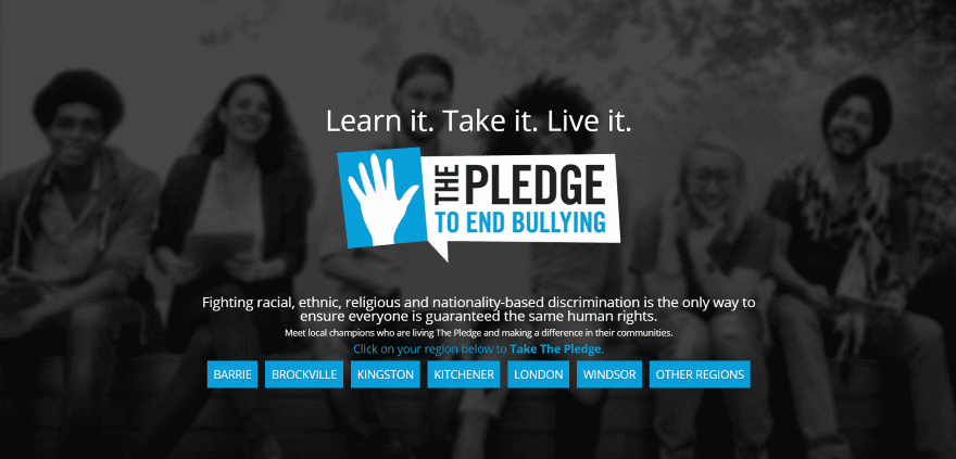
The Pledge To End Bullying has a full-screen image with overlay, logo, tagline, mission statement, and buttons for each of the regions that are covered. Scrolling reveals a section with sponsor logos and a two-column about section. It doesn’t include a menu or footer until you click on a region. The regional pages include an information section with embedded video, a signup form, stats, and lots of information. The top menu includes links.
8. Car Donation
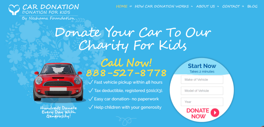
Car Donation displays an image with background, CTA, information, and contact info – so all of the most important details are placed “above the fold”. Scrolling displays icons with step-by-step instructions, information with contact info and CTA, a section showing how the donation is used, an information section about the charity with CTA, and a custom footer with links. The site makes great use of appropriate images, color, and fonts.
9. Global Autism Project
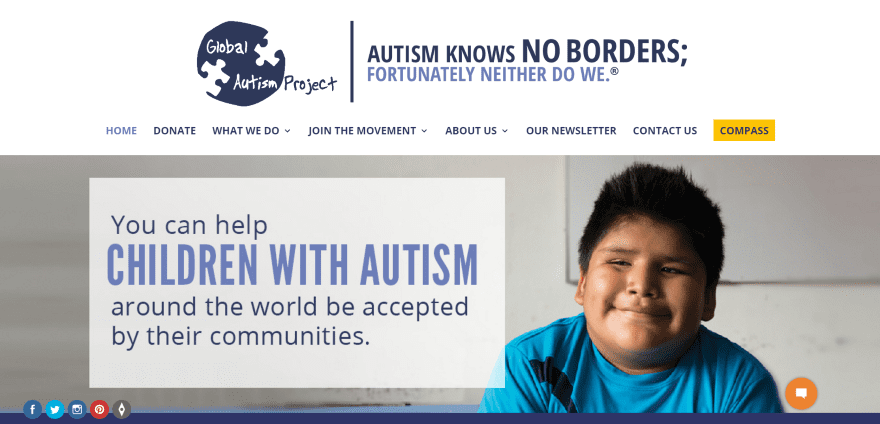
Global Autism Project displays an extra-large logo above the menu that disappears on scroll. The full-screen image is clickable and includes a message to readers. The menu includes a CTA. Social buttons and a chat-box remain floating on screen. Following this is a full-width signup form, a full-width image with information, a CTA, information about working with them, a blog slider, and signup form. Donations are handled through an embedded Donately form. The site makes good use of branded colors and icons.
10. Camas Washougal Community Chest
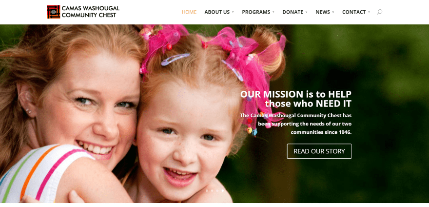
Camas Washougal Community Chest includes a full-screen image slider with mission statement and CTA. Scrolling reveals an about section with large block icons as links to various pages. Following this is an about section with CTA and footer – both using branded colored backgrounds. Forms are downloadable PDF’s. The site is simple and maintains a clean layout.
11. Frontenac Youth Services
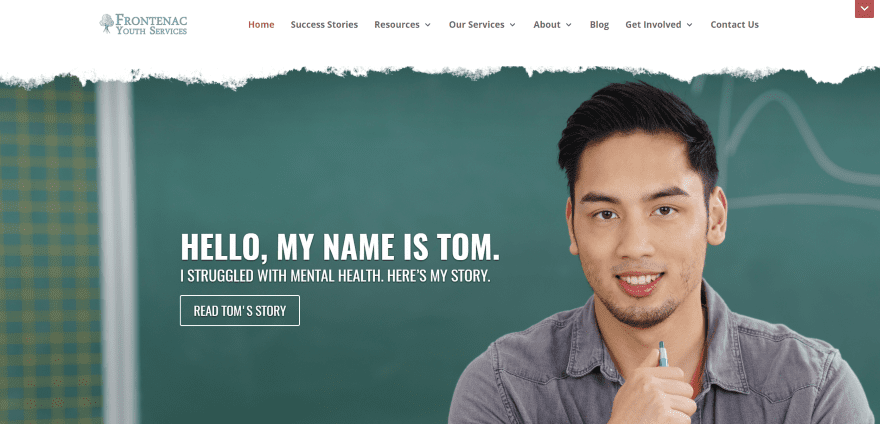
Frontenac Youth Services includes a full-screen image with CTA. The image has a torn look across the top, giving it a styled look. A message bar with contact info remains at the top of the screen and can be closed and opened by the reader. The next section uses stylized images with links to services. A two-column section displays a donation CTA and bar chart followed by a CTA in parallax and an overlay, and a blog section. The Success Stories page uses an interesting design with backgrounds and overlays. The background shows through for the title while the article uses an overlay. The articles are displayed with various column designs. The site makes great use of images, color, and backgrounds.
12. GodFreds Foundation
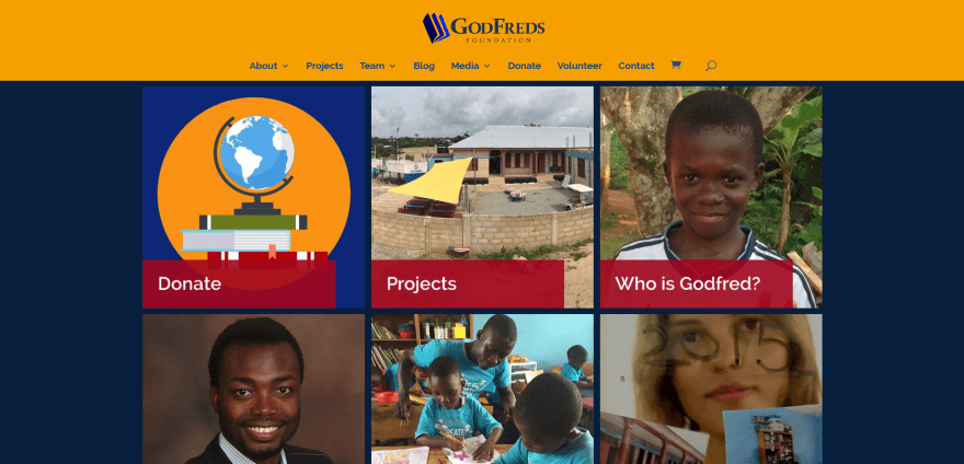
GodFreds Foundation displays a page grid with links to the various pages. Following this is a blog section, an embedded video, stats using circle counters, and a footer with links, search, and Facebook feeds. Donations are handled through a Total Donations form. The Volunteer page uses a two-column layout with an embedded WuFoo form and a styled FAQ column. The site design is simple and uses bold colors that match with the branding.
13. Mortar
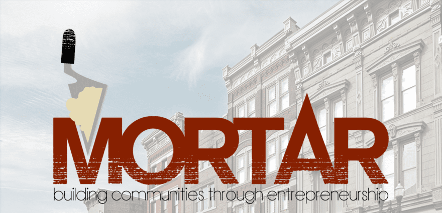
Mortar displays a full-screen image with logo and tagline in parallax. Scrolling reveals a full-width menu, an about section that includes an embedded video, an information section with text and an image, a section with stats that uses the same branding design as the logo, an information section followed by blurbs, and contact info. Between several sections are a sections with media quotes in parallax. WooCommerce is used for the shop. Donations are handled through PayPal. The site makes great use of color branding.
Final Thoughts
These 13 examples of non-profit and charity websites built with Divi go to show that Divi can be used to create interesting designs for any type of charity website, whether it’s just a simple brochure or a site with donation system, events, and even courses – no matter how complex or simple.
These sites a great for providing ideas for donation systems, layouts, colors, images, video, icons, effects, navigation, and more. These websites are sure to inspire you for your next non-profit design. If you are looking for more tips on how to design your non-profit website, check out these non-profit web design tips.
What are some of your favorite elements of these Divi non-profit and charity sites? Let us know in the comments below!
Featured Image via VLADGRIN / shutterstock.com


Thanks for this awesome & detailed article.
Hi, any tips on how the accomplish a filter as is in “Sponsor a child” section in https//worldhelp.net.
Any idea what the donation widget is on the first “world” site? Thanks!
So this site were not done just with divi right? I inspect one and had bootstrap.
These charity Divi website designs would be ideal for any type of website. My favourites are Cura Brazil and Car Donation, their designs were very compelling and I liked the organisations immediately and that’s the job of a website isn’t it.
Some great beautiful examples!
Hello, I’m a divi user.
I really liked the first part of the web “familycourse.com”. The initial effect, an image that occupies the entire screen and scrolling (or pressing the button) displays a menu, with a second part of the web that looks like another web page.
How they did it?
Can you give some advice to get that effect?
(Sorry for my language, I do not speak English)