Marketing and branding is an important part of any business and marketing agencies need great-looking websites to show their services and benefits. There are a lot of marketing agency websites built with Divi. In this article we take a look at 16 examples of marketing agency websites built with Divi to help inspire you for your next marketing agency website project.
These sites can help bring inspiration for layouts, fonts, colors, images, navigation systems, case studies, CTA’s (call-to-action), and lots more. Services include branding, strategy, social media, logo design, and more. A few include web development, but not as their primary service. The websites are in no particular order.
- 1 1. Rachel Taylor
- 2 2. Natalie’s Box
- 3 3. Matt Janaway
- 4 4. Wheelhouse Branding
- 5 5. Fetch Profits
- 6 6. Super SEO Pymes
- 7 7. Farrell Media Group
- 8 8. BreakthroughEmail
- 9 9. Wake Digital Marketing
- 10 10. Love Marketing
- 11 11. Il Tuo Web Marketing
- 12 12. Potatio
- 13 13. Hype Marketing
- 14 14. Heather in a Hat
- 15 15. Are Collective
- 16 Final Thoughts
1. Rachel Taylor
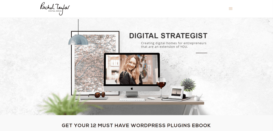
Rachel Taylor has a full-screen image with tagline, full-width newsletter signup form, a section with blurbs describing services, a text CTA, a section with client logos, testimonials, and a custom footer with a graphic design. The portfolio page uses hover effects and display samples in a three-column grid. Clicking on them takes you to the detailed project page. The Work With Me page uses an integrated CTA from Type Form. The site makes good use of color and images.
2. Natalie’s Box
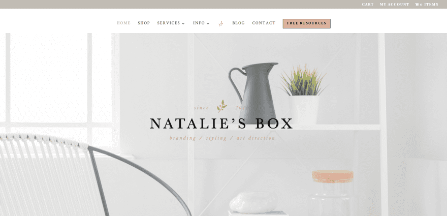
Natalie’s Box has a full-screen image that zooms with logo and tagline. Following this is a full-width about section. The next section shows what’s new in the shop with a link. A multi-layout section shows recent work followed by a CTA. An about section displays an image with text and link to read more. Next is a signup form and text links to social networks. The menu includes a CTA. The site uses elegant fonts throughout and makes great use of color.
3. Matt Janaway
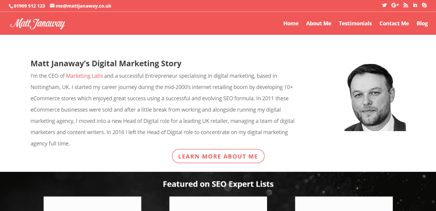
Matt Janaway displays an about section with text, image, and CTA. Scrolling reveals links to three lists with icons and snippets. Next is a section with information about experience and work method. The next sections include a slider with client logos, awards, blog posts, testimonials, CTA’s, and full-width map without auto-scroll, and contact form. The site makes great use of branded color.
4. Wheelhouse Branding
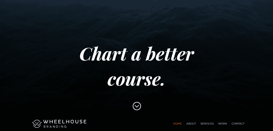
Wheelhouse Branding displays a full-screen video background with tagline with logo and menu at the bottom (which remain at the top of the screen after scrolling). Scrolling reveals an artistic map background in parallax with information and a drawing of an anchor in an overlay. The next section shows scrolling client logos followed by a description of their work methodology, CTA’s, and logo with Facebook follow icon. The pages use full-screen images in monochrome. The Work page displays case studies within a large image grid with hover animation.
5. Fetch Profits
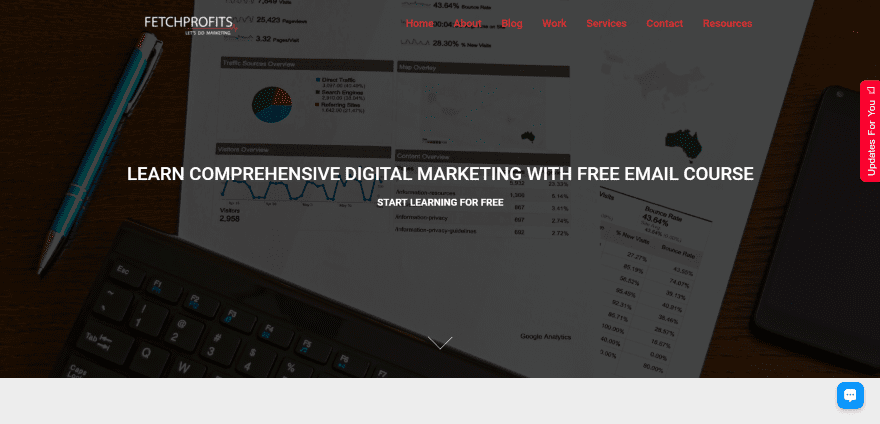
Fetch Profits has a full-screen background image with CTA in an overlay. Next is a full-width about section with text on one side, a link to a YouTube video in a parallax section, client icons, stats in colored boxes with icons, testimonials, a full-width CTA, a blog section, a contact section with social icons and contact form, and a large footer with links. The Work page displays examples as projects and are filterable by topic. The Services/Blogging page includes embedded Canva images.
6. Super SEO Pymes
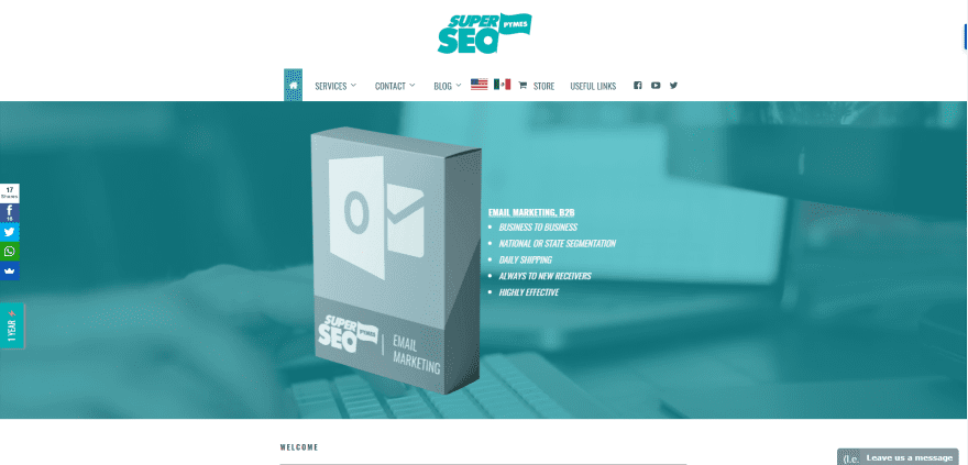
Super SEO Pymes includes a full-width background video slider with overlay. Scrolling reveals a welcome message with a shadow effect revealing a custom footer in parallax (this footer effect appears on each of the pages). The menu displays large images in categories and remains open even when your mouse moves away. Even the contact form works from the megamenu. The Services pages show a full-width slider and background in parallax with overlay, and detailed information about the service. The site makes great use of color overlays and has one of the more interesting footers and megamenus.
7. Farrell Media Group
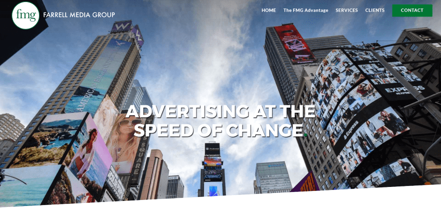
Farrell Media Group displays a full-screen image with tagline in parallax and section styling. The menu includes a CTA. Scrolling shows a full-width about section with text. Next is a three-column section with services in true parallax with hover animation. A two-column section displays information on one side with a list of industries on the other followed by contact information in the footer. The Services page displays a breakdown of each service within boxes. The site makes great use of animations and section styling.
8. BreakthroughEmail
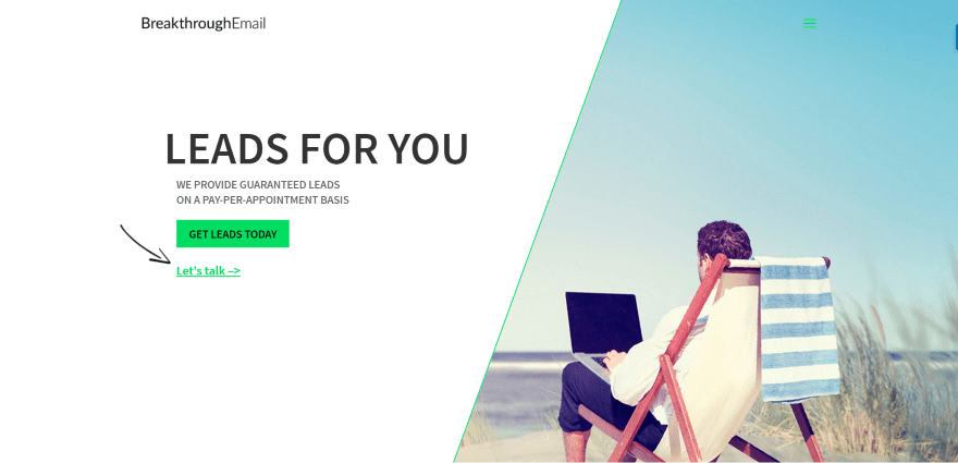
BreakthroughEmail uses a one-page design that displays a tagline with CTA on one side and image on the other. Scrolling shows a section with step-by-step information about the system and a section with images showing the benefits. Next is a full-width testimonial section that displays large images, logos, and testimonials. A list of clients shows logos of clients separated by dollar amount. An embedded form lets you give details about your project followed by contact info and a full-width map.
9. Wake Digital Marketing
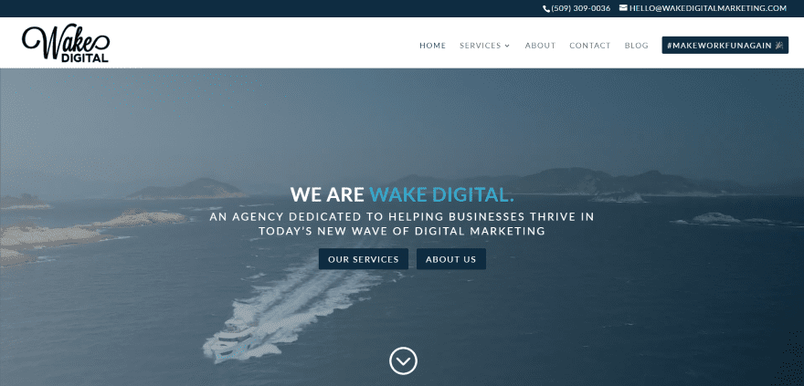
Wake Digital Marketing uses a full-screen video background with description and CTA’s. The menu also includes a CTA. Next is an information section with text. A section about specialties shows the services within cards that includes icons and hover animation. A Why Us section shows the benefits of working with them followed by a list of clients’ icons and a CTA with contact form. The site uses a clean design.
10. Love Marketing

Love Marketing uses a full-screen image with CTA’s in parallax and a transparent menu. Scrolling reveals several sections with CTA’s next to an image, and several sections with full-screen images and information in an overlay. The footer includes an email signup form. The various pages follow the same design and include toggles for expanded information.
11. Il Tuo Web Marketing
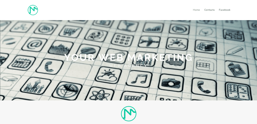
Il Tuo Web Marketing displays a full-width video background with tagline in an overlay. Scrolling reveals services in blurbs with icons that use color branding. Next is an information section, a contact section with background color that matches the icons, and a side-by-side map and contact form. The site is simple (the only other page is a contact form) and makes great use of branded color.
12. Potatio
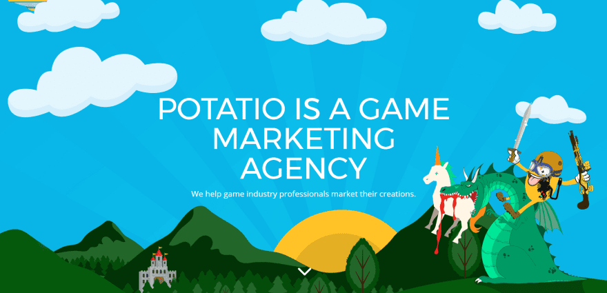
Potatio displays a full-screen drawing with information and tagline. Scrolling reveals the menu which includes a CTA, an about section with a link to services, artwork showing the different types of games they work with including links and hover animation, a section with stats, contact form, and social buttons in the footer. All of the pages follow the same design but are focused on their topic which includes supporting data and information. The site makes great use of color branding.
13. Hype Marketing
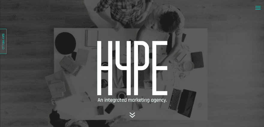
Hype Marketing loads up with an animated logo over a full-screen background video. Following this is an about section, a section that covers services using a dark background and color-branded icons, a portfolio section using a project module, client icons, and footer with menu and color-branded social icons. The Services pages describe the service in parallax over a full-width image using a similar layout to the homepage. A contact link remains on screen and opens a transparent contact form using the branded colors over the current page when clicked. The site makes great use of color branding.
14. Heather in a Hat
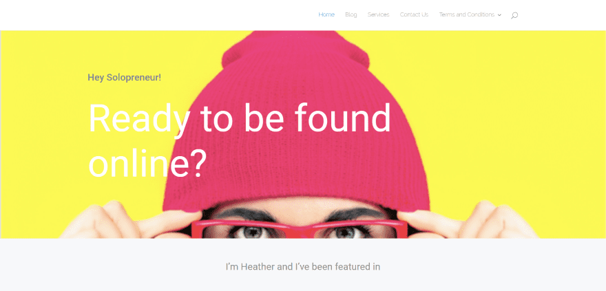
Heather in a Hat displays a full-width image with company message, a list of media icons where the company has been featured, a two-column section with CTA and image, and a three-column section with services. The Services page displays text with CTA’s and images in two alternating columns followed by a pricing table. The Contact page includes an embedded LinkedIn card. The site uses a simple and clean design.
15. Are Collective
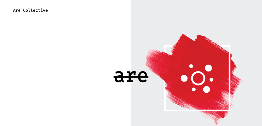
Are Collective uses a simple but unique one-page design with the logo in the left corner, an image on the right side, and a creative design for the company name in the center. Scrolling reveals a resume-style layout with the title on the left and information on the right. The sections include Profile, Experience, Connect, and Contact. The site doesn’t include a navigation structure but does include links to their other pages which includes a magazine made with Extra and a couple of sites made with Divi. The site has a simple but interesting design.
Final Thoughts
These 16 examples of marketing agency websites built with Divi are great examples to show that any type of marketing agency website can be made with Divi. Any type of site from a simple brochure to a site with pricing tables, portfolios, and case studies.
These sites a great for sparking ideas for layouts, colors, images, use of video, navigation, etc. These websites are sure to inspire you for your next marketing agency design.
What are some of your favorite elements of these Divi marketing agency sites? Let us know in the comments below!
Featured Image via elomda / shutterstock.com


Hi, nice sites! Where can I find a tutorial on how to do the slanted divider as used on Farreellmediagroup.com’s site? Love it!
Hi.
Thanks for sharing Randy, but it seems that Hype is no more using Divi 😉
Have a great day 😀 !
Amicably,
Pierre.
I like the example no. 4
‘…displays a full-screen video background with tagline with logo and menu at the bottom (which remain at the top of the screen after scrolling)’
but how is that sticky header at the bottom created?
Quite a nice list, I love it. I’ve been a ET member for a very long time and I also want to share my company re-brand that I recently launched. I’ve gotten some amazing feedback.
wonderful! Thanks Mr. Brown for the inspiration!
Nice digital marketing sites. Thank you for sharing
Great post. I got good ideas from it. I have been wondering how was the masonry portefolio achieved?
http://racheltaylor.com.au/folio/
Seems like she is using a plugin but I can not figure out which one…
Thanks Gabriel! Indeed I am using a plugin, its called Essential Grid by themepunch. Available for purchase on CodeCanyon. Very versatile plugin, highly recommend it 🙂